 by Tom Gurney
Tom Gurney BSc (Hons) is an art history expert with over 20 years experience
Published on June 19, 2020 / Updated on September 29, 2026
Email: tomgurney1@gmail.com / Phone: +44 7429 011000
About the painting
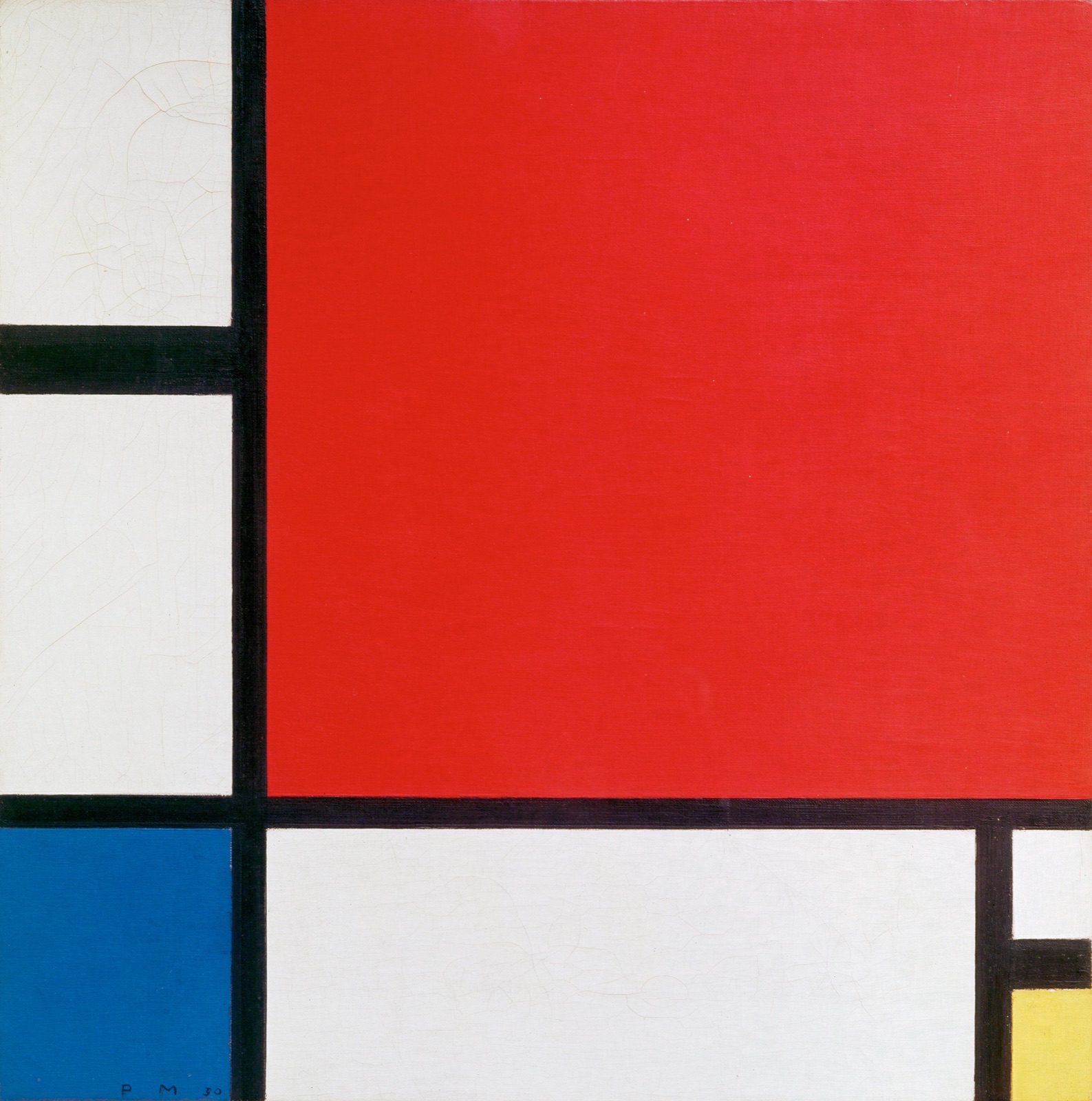
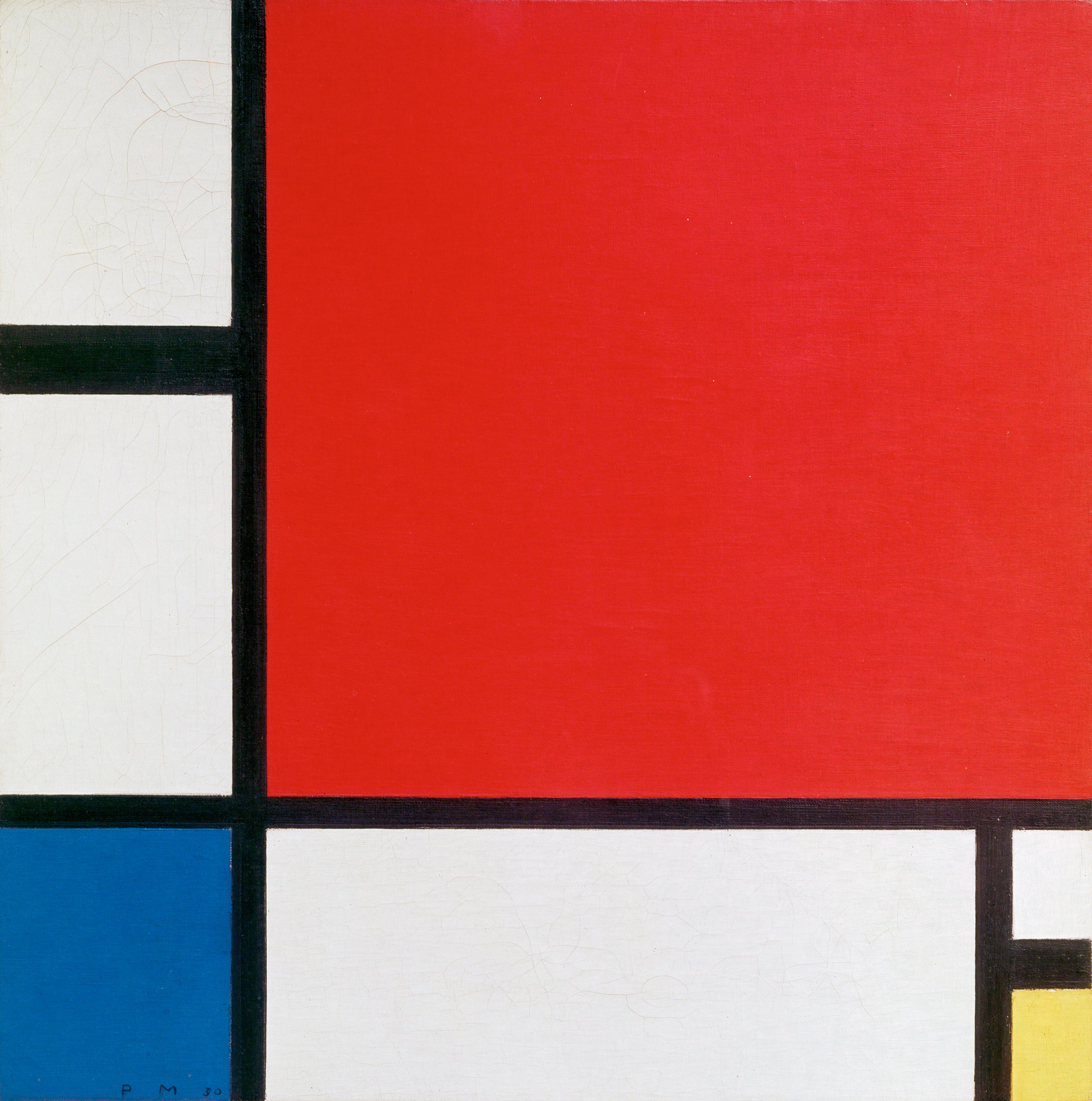
Piet Mondrian's Composition with Red, Blue and Yellow is a small square painting with an unusually commanding red field. A broad black vertical divides the left side from the red, while a black horizontal divides the upper portion from blue, white and yellow areas below. The picture may look instantly familiar, but its exact identity matters: this is the 1930 painting in Kunsthaus Zürich, made at the request of the architect Alfred Roth. It is not the similarly titled Composition II of 1929 in Belgrade. The Zürich museum catalogues this painting as oil on canvas, with an image measuring 45 × 45 cm and inventory number 1987/0028.[1][2]
Mondrian painted very different arrangements with the same basic means. Looking closely at this one reveals the particular decisions that make it more than an example of a style: the large red plane, the unequal white intervals, the small yellow accent and the black bars that both separate and connect the parts. Its date, patron and later history are unusually well documented. Roth's connection to the work is recorded in a dedication on its reverse, dated Paris, 30 January 1930.[1]
At a glance
- ArtistPiet Mondrian (1872–1944)
- TitleComposition with Red, Blue and Yellow; also recorded as Komposition mit Rot, Blau und Gelb and Composition en rouge, bleu et jaune
- Date1930
- MediumOil on canvas
- Image size45 × 45 cm, according to Kunsthaus Zürich
- CollectionKunsthaus Zürich, inventory 1987/0028
- Catalogue raisonnéJoosten B217
- HistoryMade at the request of Alfred Roth and donated by him to Kunsthaus Zürich in 1987[1]
Where this painting sits in Mondrian's career
Contents
- What do you see in the painting?
- Annotated details in the 1930 composition
- Why use red, blue, yellow, white and black?
- Alfred Roth and the dated dedication
- A second version: the 1930 near-repeat
- Where does the painting fit in Mondrian's career?
- The Zürich collection and the painting's reception
- Is this the same painting as Composition II in Belgrade?
- What makes this composition memorable?
What do you see in the painting?
The red area immediately draws the eye. It occupies much of the upper right, running to the top and right edges. On its left is a much narrower column of white, divided into two unequal fields by a horizontal black bar. A substantial black vertical stands between this column and the red. Beneath the red, another thick horizontal turns the lower portion into a sequence of much smaller areas. Blue fills the lower left. A broad white field sits beside it. At the far right, a tiny white interval appears above the yellow at the bottom corner. The different areas are neither regularly spaced nor equally weighted.
This matters because the painting is easy to misremember as a straightforward grid. Mondrian did not fill a sheet of graph paper with three colours. He put a few divisions in particular positions, then made the surrounding white as active as the colours. The blue occupies a compact corner; the yellow is smaller still; the red is immense by comparison. The black bars have their own visible width, so they act as forms as well as boundaries. These relationships can be seen in the Kunsthaus image presented by Google Arts & Culture.[1][15]
Kunsthaus's account of the painting on Google Arts & Culture draws attention to two broad, divided strips along the edges and to black bars placed well away from the centre. That observation is helpful when looking at a small reproduction. The structure is not a uniform lattice, and its strongest intersection does not sit at the geometrical middle of the square. Instead, the bars and fields pull attention toward the lower left, then let the dominant red push attention back across the canvas. The museum describes the deep blue, yellow and pale areas as counterweights to that red expanse. These are features of the actual arrangement, not a general rule that every Mondrian square follows.[15]
The picture's balance is therefore not a mirror image from left to right or top to bottom. The large red expanse is set against a dispersed set of smaller blue, yellow, white and black areas. Looking from the red to the blue, then across the white toward the yellow, the eye must continually adjust its sense of weight. The white fields give the colours room without behaving as empty background. The forms that touch an edge can also suggest that the painted relationships continue beyond the square, although that is a visual interpretation rather than a documented statement of Mondrian's intent.
The placement of yellow is particularly revealing. A viewer might recall only the large red and the blue below. Yet the yellow's limited area prevents the lower right from becoming merely a continuation of the broad white below the red. It makes that edge visually different from the other corners. Remove it in imagination and the relationships change; enlarge it and they change again. This simple thought experiment helps explain why a tiny painted field can matter as much to the whole composition as a much larger one. It is an observation about the picture's construction, not a claim that Mondrian assigned yellow a private symbolic message.
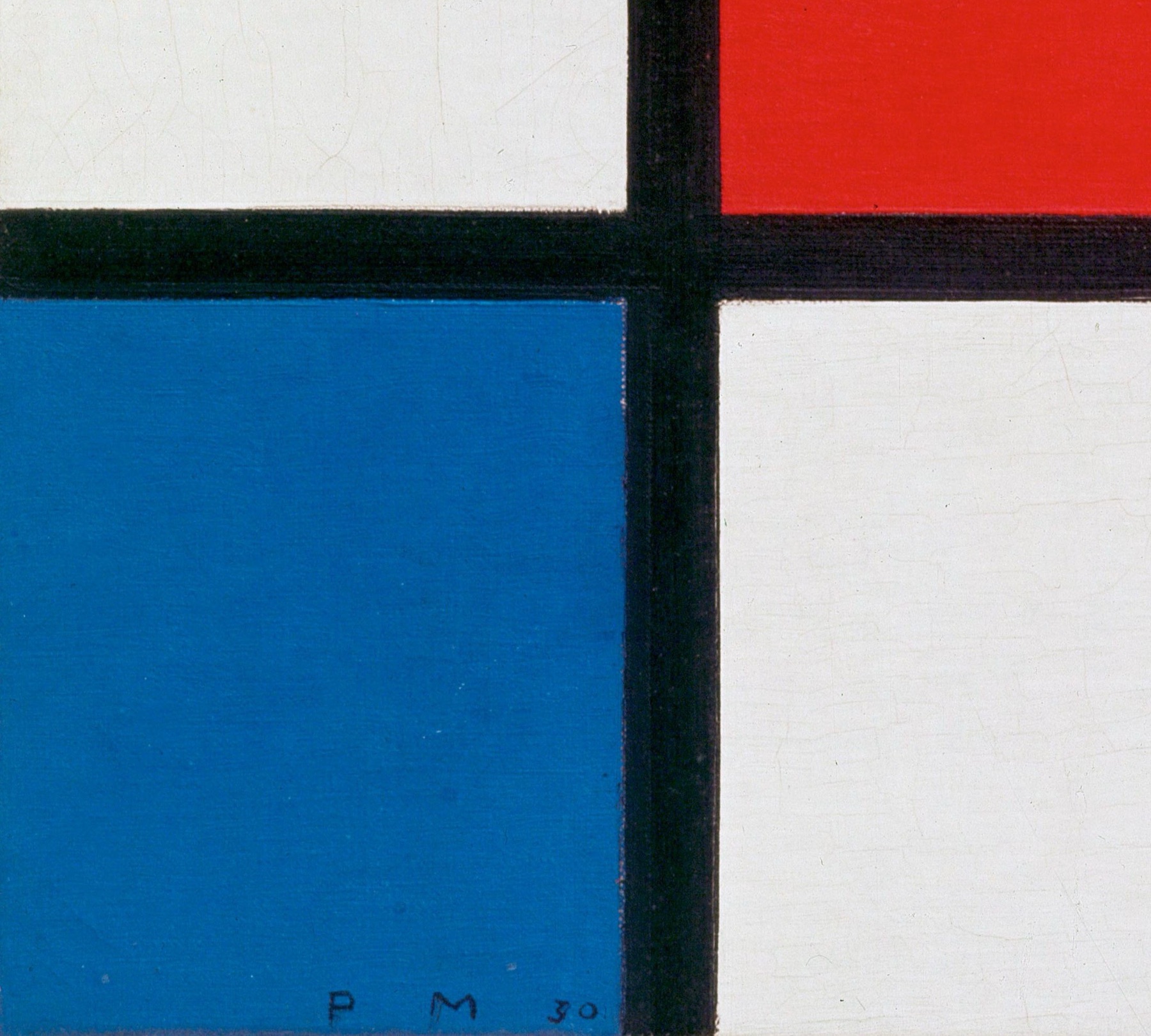
The reproduced image is sufficient to follow the arrangement but cannot establish fine details about the original surface. Claims about pigment, repairs, individual brushstrokes or the exact order of painting would require technical evidence from the object itself. What can be said from the museum record is that this is an oil painting on canvas, and that Mondrian marked its lower left with the initials and date “PM 30.”[1]
Annotated details in the 1930 composition
Select a numbered point to examine how Mondrian gives unequal areas visual weight. These details come from a high-resolution reproduction of the Zürich painting identified in the Kunsthaus record.
 1
2
3
4
5
1
2
3
4
5
Choose a number to reach its detail, then select a detail image to open the gallery. Open the full-resolution image.
Details from COMPOSITION WITH RED, BLUE AND YELLOW
Five close views of the 1930 Zürich painting.
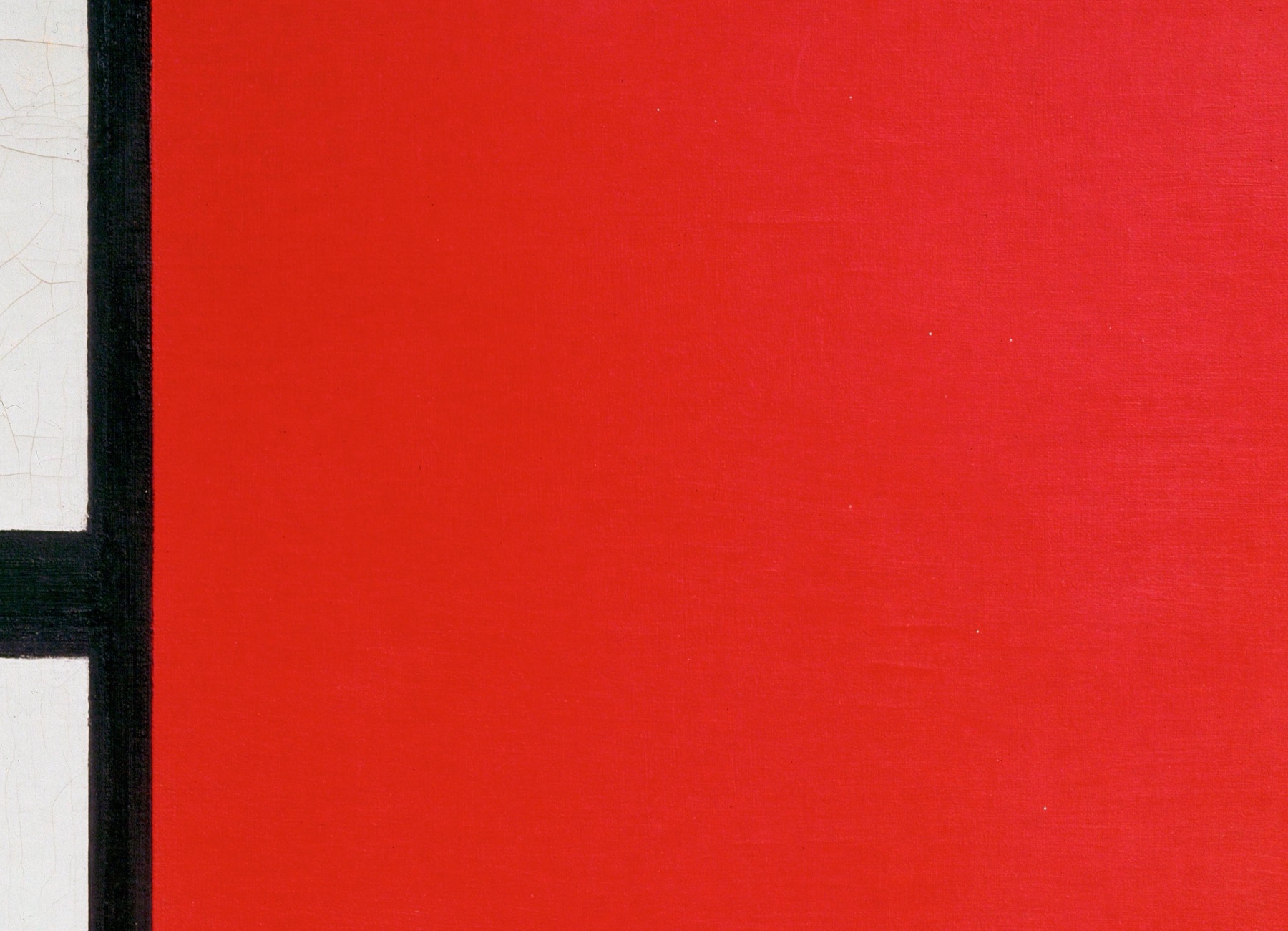
The red field dominates
Red fills most of the upper right and runs to two edges. Its size makes the small blue and yellow fields matter as counterweights, even though neither is remotely equal in area.
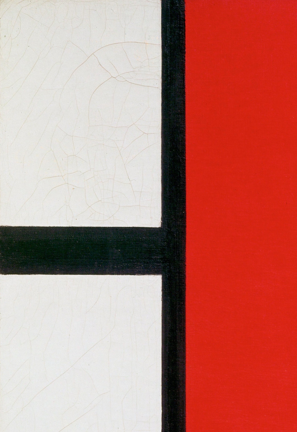
White is divided, not empty
A black horizontal cuts the narrow left strip into two white fields. They differ in height, so this side of the canvas sets its own rhythm beside the red.
Blue anchors the lower left
The compact blue field meets the bottom and left edges. The painted initials and date, “PM 30,” are visible near its lower edge; the Kunsthaus record also documents this front inscription.[1]
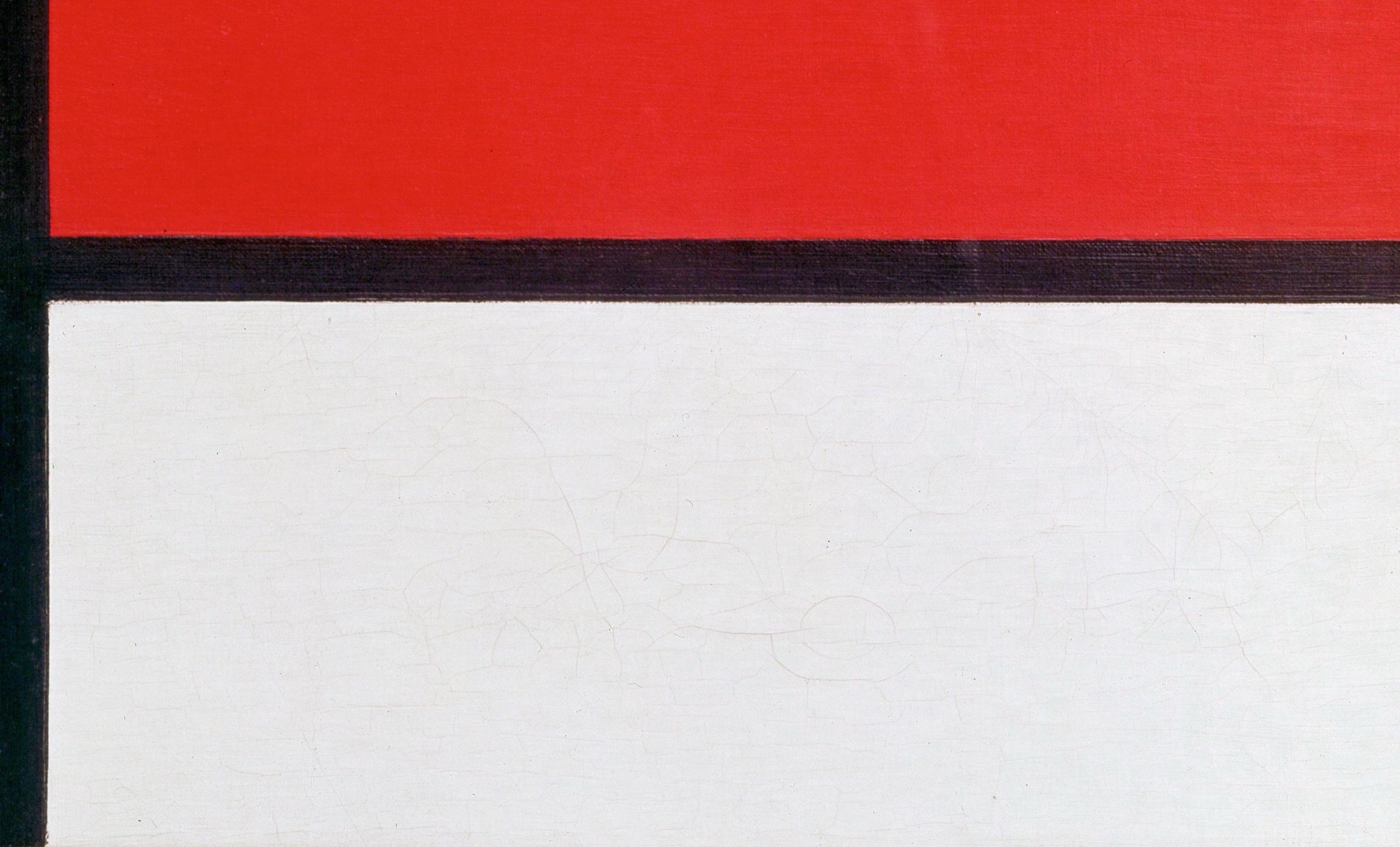
The lower white field has weight
The long black bar beneath the red establishes a firm change in scale. Below it, a wide white field gives the much smaller blue and yellow areas room to register.
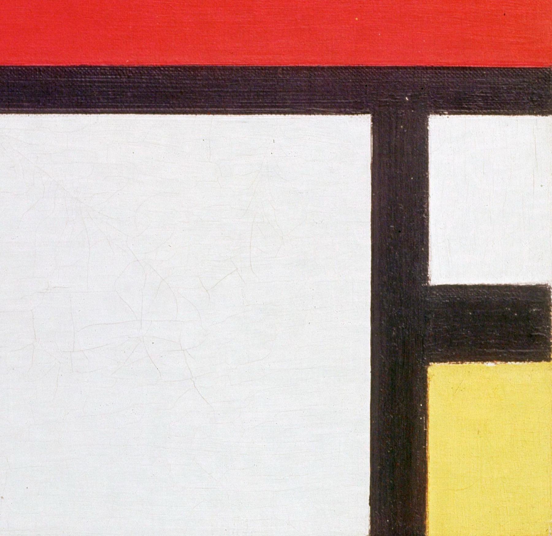
Yellow changes the right edge
The small yellow field is squeezed into the lower-right corner. A short black bar separates it from the white interval above, making this edge more complex than a single unbroken border.
Why use red, blue, yellow, white and black?
Mondrian's mature approach, which he called Neo-Plasticism, reduced painting to straight horizontal and vertical divisions, rectangular planes and a restricted group of colours. Red, blue and yellow were joined by white, black and sometimes gray. That reduction was a means of exploring relationships within a picture rather than a claim that every painting should look the same. The Museum of Modern Art describes Neo-Plasticism as a philosophy that moved away from depicting the natural world in favour of this limited visual vocabulary.[3][4]
The 1930 Zürich composition makes the principle unusually clear. No figure, building or landscape tells us what to look at first. The red's extent pulls strongly; the blue and yellow, though small, remain unmistakable; and the black divisions make the distances between fields impossible to ignore. White is a painted participant in those distances. The picture gives the viewer a way to experience contrasts of size, direction and colour without turning any one area into a depiction of something outside the canvas.
It is tempting to assign red, blue and yellow fixed meanings or moods. The sources for this particular work do not justify such a code. Mondrian's larger writings and museum interpretations do speak of equilibrium and of art's relation to life, but this does not make the red an agreed symbol for one emotion or the blue for another. The stronger reading begins with the actual arrangement and asks how its unequal parts are held together.[4][5]
The distinction between balance and symmetry is especially useful here. Symmetry would repeat similar forms across an axis. In this painting the coloured areas do not repeat. Their relation depends on opposition and difference: large against small, vertical against horizontal, colour against white, and black bars against open planes. A MoMA discussion of Mondrian's development describes his search for balance through such opposing elements. This allows an apparently stable square to feel unsettled enough that the viewer keeps testing how its parts relate. It also makes clear that his later works changed the visual language again; the Zürich painting is a moment in an evolving practice, not its final statement.[5]
Alfred Roth and the dated dedication
This painting has a more personal documentary trail than its spare title suggests. Kunsthaus Zürich records that Mondrian made it at the request of Alfred Roth, a Zürich architect. On the back of the canvas, Mondrian wrote a dedication to Roth in French, signed and dated in Paris on 30 January 1930. It speaks of creating relationships and seeking their equilibrium in art and in life. The statement connects Roth's work as an architect and Mondrian's work as a painter through an idea they could share, without reducing the painting to an illustration of architecture.[1]
The dedication is also valuable evidence for the date. The museum notes “PM 30” on the front and the fully dated text on the reverse. These records are stronger than a generic online caption that calls a similar composition “1929” or “1930” without identifying which canvas it means. A year in a search result cannot resolve the many paintings in Mondrian's catalogue that share versions of “Composition” and the primary colours. The Zürich work is Joosten B217 in the catalogue raisonné, and RKD lists it separately from the Belgrade painting.[1][2]
The museum's provenance record names Mondrian, then Roth as the owner until 1987, when Roth gave the painting to Kunsthaus Zürich. It does not supply a full sequence of transactions or a purchase price, so neither needs to be invented. The donation is the reason the work is now part of Zürich's collection of classical modern art, where the museum explicitly identifies Mondrian's painting and credits Roth's gift.[1][6]
The presence of a personal dedication also changes how we can speak about an abstract work. The painting offers no portrait of Roth and no drawing of a building. Nevertheless, its reverse names a recipient and articulates an idea important to both art and life. The inscription does not give an instruction to decode each rectangle; it gives evidence of the conversation around this particular canvas. That distinction lets the words illuminate the work without turning the picture into a diagram of the words. It also reminds us that a work with a highly general title can have a very specific human history.[1]
Roth's architectural setting
The ETH Zürich archive dates Roth's acquaintance with Mondrian to the period when Roth was working with Le Corbusier and Pierre Jeanneret. It says that Roth's engagement with the colour ideas of De Stijl and Le Corbusier contributed to his own thinking about colour in architecture, including work around 1930 at the Neubühl housing estate. This gives the recipient of the dedication a more precise professional setting than “architect” alone. It does not establish that Mondrian designed any part of Neubühl or that the Roth painting was a plan for it.[18]
Kunsthaus records a stamp on the painting's reverse naming Roth as an architect and giving a Zürich Doldertal address. The stamp is another piece of object-specific evidence for its association with him, alongside the handwritten dedication and the museum's ownership record. It should not be mistaken for Mondrian's own inscription: the front initials and dated French dedication are attributed to the painter, while the reverse stamp identifies Roth professionally.[1]
Together, these records suggest why Mondrian addressed Roth as both friend and colleague. Painting and architecture were distinct practices, but both men were interested in how relations among parts might shape a whole. The evidence allows that shared concern to illuminate the commission. It does not justify a claim that each coloured field corresponds to a wall, room or building designed by Roth.
A second version: the 1930 near-repeat
The Roth painting is also important because Mondrian did not leave its arrangement as a single experiment. Kunsthaus Zürich says he repeated the composition in a work catalogued as B219, enlarging it by five centimetres while keeping the width of the black strokes. RKD records B219 under the different title Composition no. II, dated 1930; its collection field predates the later auction record. The two paintings are related, but they are separate physical objects with separate catalogue numbers.[1][2][16]
Even if an arrangement is repeated, a change in scale can alter what the viewer experiences. A fixed-width black bar occupies a different proportion of a larger square. The museum's description invites that comparison, but it does not say that every painted edge, colour or surface detail was copied exactly. The documented point is that Mondrian revisited the compositional scheme and altered its scale. This fits an artist who worked through variations rather than treating a single grid as a formula.
For readers looking through Mondrian reproductions, the near-repeat creates another reason to identify the collection and catalogue number as well as the title. A web image captioned Composition II in Red, Blue, and Yellow may refer to a different object or use a later descriptive title. The Zürich painting's museum inventory 1987/0028 and catalogue number B217 provide a reliable way to follow this particular work.[1][2]
What the later B219 record establishes
Sotheby's 2022 catalogue identifies the related Composition No. II as Joosten B219, a 1930 oil on canvas measuring 51 × 51 cm at the canvas and presented in an artist's frame. Its stretcher bears the French title Composition en rouge, bleu et jaune and the marks “Haut” and “II”. That French colour title can look like an alternate name for B217, but the B219 catalogue number and its separate physical record identify the larger canvas. The Kunsthaus's 45 × 45 cm figure is for the painted image of B217, so it should not be directly subtracted from Sotheby's canvas measurement to challenge the museum's account of enlargement.[1][16]
B219 also has a documented path quite unlike Roth's painting. Sotheby's traces it from a loan to Otto Carlsund in 1930–35, through later owners and dealers, and into the 2022 New York sale. It lists the work at the 1930 Cercle et Carré exhibition in Paris and an Art Concret presentation in Stockholm that year. Those exhibition and ownership details belong to B219, not to the Roth canvas. The Zürich painting's securely documented path is Mondrian, Roth and Roth's 1987 gift to the museum.[1][16]
This distinction matters beyond specialist cataloguing. Sotheby's reports that B219 sold for $51 million in November 2022. It would be incorrect to attach that auction result to the painting reproduced on this page. The Zürich B217 remains the museum's 1987 Roth gift. Similar title words, the same year and a related layout are insufficient to merge their financial or exhibition histories.[17]
Watch: Piet Mondrian
See his studio, the move toward geometric abstraction and the rhythms of his New York paintings.
Piet Mondrian: Abstract Painting as We Know It
Curator Michael White explores the paintings and Mondrian’s studio as an abstract space.
Watch on YouTubeWhere does the painting fit in Mondrian's career?
By 1930 Mondrian had spent years reducing and revising the visual elements of his art. His earlier career included landscapes, trees, flowers and Cubist experiments. During and after his association with De Stijl, he developed the horizontal-and-vertical language now closely associated with his name. MoMA's retrospective account places the mature Neo-Plastic style by the end of 1920 and describes a group of especially austere paintings from about 1929 to 1932. The red, blue and yellow Zürich work belongs within that concentrated period.[4][7]
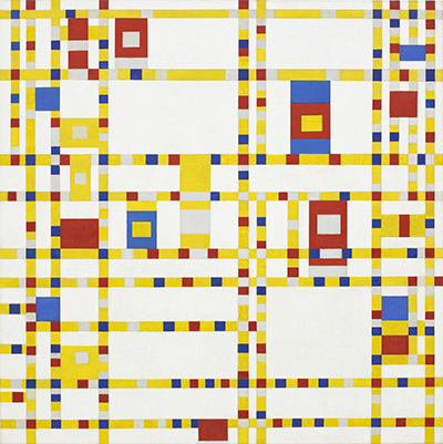
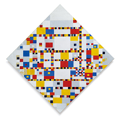
Its date does not mark the end of Mondrian's abstract painting. He continued working in Paris through the 1930s, moved to London in 1938 and to New York in 1940, and made later works such as Broadway Boogie Woogie and Victory Boogie Woogie. In those late paintings the visual rhythm and treatment of lines changed markedly. Looking back from them helps show what is distinctive about 1930: a few broad black divisions and large, relatively quiet planes can sustain a remarkably active balance.[4][7]
Mondrian was working in Paris when he dated the Roth dedication. His studio at 26 rue du Départ, used from 1921 to 1936, was itself arranged with painted planes and objects; it was more than a neutral place in which pictures happened to be made. The Mondrian Papers discusses evidence for that studio environment, while MoMA's retrospective describes it as a laboratory for his pictorial ideas. The studio offers context for his interest in relations among forms and spaces, although there is no need to claim that this exact Roth canvas appears in any surviving studio photograph.[8][9]
Mondrian's work also took shape among other artists working with geometry in Paris. Joaquín Torres-García, for example, knew Mondrian and made Color Structure in 1930. MoMA describes that work's hand-drawn divisions, material texture and less regular colour as important to Torres-García's approach. Comparing it with the Roth composition is useful because both use rectilinear organisation and primary colours, yet the result is very different. The comparison keeps Mondrian's exact choices visible instead of treating every coloured grid of the period as interchangeable.[10]
The Zürich collection and the painting's reception
Kunsthaus Zürich lists the painting in its collection under several title languages, with a catalogue reference, inscriptions, provenance and a substantial literature list. This level of documentation is why its object record is the first place to check a disputed date, dimension or owner. Its listed scholarship includes Joop Joosten's catalogue raisonné and later Kunsthaus publications. A bibliography entry shows where the painting has been discussed; it does not, by itself, establish that every interpretation in those books has been checked here.[1]
The museum also records the painting in the catalogue of its 1955 Mondrian exhibition. Kunsthaus's exhibition history says that the show, curated by Max Bill, brought together 119 works and reached audiences in Switzerland and neighbouring countries. The exhibition was an important moment in the artist's reception in Zürich. The object record's catalogue listing does not on its own prove precisely how or where this canvas hung in the galleries, so the more accurate claim is that the work is documented in the exhibition literature.[1][11]
The two related compositions appear as neighbouring entries in that 1955 catalogue trail: Kunsthaus's B217 record cites no. 102, while Sotheby's B219 history cites no. 101. This is a useful cross-check for readers encountering old exhibition references. A citation to no. 101 refers to the larger B219, even if a later writer shortens both names to a composition in red, blue and yellow. Catalogue inclusion also predates Roth's 1987 gift; it should not be read as evidence that the museum owned B217 in 1955.[1][16]
Today the picture may be encountered first on a phone screen rather than in the museum. The Kunsthaus object record gives its physical and documentary identity, while the museum-supplied Google Arts & Culture page offers another way to look at the image. These sources should be read together: the image helps distinguish the arrangement, and the museum record confirms which canvas, date, size and gift history belong to it.[1][15]
Is this the same painting as Composition II in Belgrade?
No. RKD lists the Zürich painting as B217, dated 1930, and the National Museum of Serbia's Composition II as B212, dated 1929, inventory Istr. 43. The Belgrade museum independently presents its painting as Composition II of 1929 and records a distinct collection history. The works can look related in small reproductions, but their titles and the placement of coloured and black areas must not be merged into a single description.[2][12]
The Belgrade work has its own story. The National Museum says it was in the collection by the 1930s and appeared in its permanent display from the 1950s. Its 2014–15 exhibition explored how later artists and curators responded to it. Those facts belong to the Belgrade painting, not to Roth's Zürich gift. A separate account of Composition II in Belgrade can explore them without making the Zürich picture carry another object's history.[13][14]
There is still another 1929 Composition no. II in MoMA's collection, catalogued by RKD as B209. This crowded family of titles explains why an image, a title or a year alone can be misleading. The safest identification combines the actual arrangement with a holding institution and catalogue or inventory number. For the painting on this page, those identifiers are Kunsthaus Zürich, 1987/0028, B217.[1][2]
| Painting | Secure identifier | Distinguishing history |
|---|---|---|
| The painting on this page, Composition with Red, Blue and Yellow (1930) | B217; Kunsthaus Zürich 1987/0028 | Made for Alfred Roth; given by him to Kunsthaus in 1987.[1] |
| Related Composition No. II (1930) | B219; Sotheby's 2022 lot 105 | Larger canvas with a separate exhibition and ownership history; sold in 2022.[16] |
| Composition II (1929) | B212; National Museum of Serbia Istr. 43 | Different painting in Belgrade, covered on its own page.[2][12] |
What makes this composition memorable?
Its simplicity is not the absence of decisions. Mondrian gave the red an extraordinary amount of space but set against it a sequence of smaller areas that stop the picture from settling into an obvious centre. The eye can follow the major vertical and horizontal divisions, then notice how the white areas differ, how the blue and yellow sit near corners, and how much work the black bars do. None of those observations needs an invented story or colour symbolism. They arise from what the painting makes visible.
The Roth dedication gives that close looking a documentary companion. Mondrian associated the making of relationships and the search for equilibrium with work in art and life. The canvas is one concrete, dated attempt to find such a relationship among unequal parts. Its later near-repeat shows that the attempt was open to further revision. Seen this way, Composition with Red, Blue and Yellow is neither a mechanical template nor the final point of Mondrian's career. It is a particular painting whose visual order, patron and history can be followed with unusual precision.[1]
Mondrian artworks directory
Frequently asked questions
When was Composition with Red, Blue and Yellow painted?
Where is the original painting?
It belongs to Kunsthaus Zürich, which records it as inventory 1987/0028. Alfred Roth donated it in 1987. The museum's collection record establishes ownership; current gallery display should be checked with the museum before a visit.[1]
How large is it?
The museum states that the painted image measures 45 × 45 cm. Some other reproductions give a slightly different overall measurement. Specifying that the Kunsthaus figure is for the image avoids treating measurements of different parts of the object as a contradiction.[1]
What does the painting mean?
The painting does not depict a scene or supply a fixed symbolic meaning for each colour. Its visual relationships—different sizes, directions, colours and white intervals—create a balance without mirror symmetry. Mondrian's dated dedication to Roth speaks of relationships and equilibrium in art and life, providing a rare written clue to the ideas behind this particular canvas.[1][4]
Was this the Mondrian sold for $51 million in 2022?
Discussion
Which part of Mondrian's arrangement changes your first impression of the large red field?
Reader Insights
Follow the black bars from the upper left to the blue and yellow corners. Where does your eye stop?
Which smaller field seems to answer the red most strongly, and does that change after a second look?
How does this Zürich painting differ from the separately catalogued 1929 Composition II in Belgrade?
Join the Conversation
Share what you notice in this painting below.
References
- Kunsthaus Zürich, collection record for Piet Mondrian, Composition with Red, Blue and Yellow, inventory 1987/0028. View source.
- RKD – Netherlands Institute for Art History, Mondrian catalogue raisonné sequence B206–B225, including B209, B212, B217 and B219. View source.
- The Museum of Modern Art, “Neo-Plasticism.” View source.
- The Museum of Modern Art, “Piet Mondrian,” artist account. View source.
- The Museum of Modern Art, Fourteen Mondrian, pp. 60–63. View source.
- Kunsthaus Zürich, “Classical Modernism,” collection introduction. View source.
- The Museum of Modern Art, “Major Mondrian Retrospective Opens at the Museum of Modern Art,” 1995. View source.
- The Mondrian Papers, “Mondrian in three dimensions; an unknown sketch.” View source.
- The Museum of Modern Art, “Piet Mondrian: 1872–1944,” exhibition account. View source.
- The Museum of Modern Art, collection record for Joaquín Torres-García, Color Structure (1930). View source.
- Kunsthaus Zürich Digilab, “Piet Mondrian,” history of the 1955 exhibition. View source.
- National Museum of Serbia, “Piet Mondrian, Composition II, 1929,” object page (in Serbian). View source.
- National Museum of Serbia, “Piet Mondrian: The Case of Composition II,” publication notice (in Serbian). View source.
- National Museum of Serbia, 2014 annual report, p. 46 (in Serbian). View source.
- Kunsthaus Zürich via Google Arts & Culture, “Composition with Red, Blue and Yellow,” museum-supplied image, interpretation and object details. View source.
- Sotheby's, 2022 sale catalogue, lot 105, *Composition No. II* (Joosten B219): dimensions, inscriptions, provenance and exhibitions. View source.
- Sotheby's, report of the November 2022 sale of B219 for $51 million. View source.
- ETH Zürich gta Archiv, Alfred Roth archive description and account of his work with colour in architecture. View source.
- Lead and annotated image credit. Piet Mondrian, Composition with Red, Blue and Yellow, 1930, Kunsthaus Zürich, inventory 1987/0028. High-resolution reproduction supplied by the site owner as public domain.
 The Red Tree Piet Mondrian.jpg)