by Tom Gurney
Tom Gurney BSc (Hons) is an art history expert with over 20 years experience
Published on September 28, 2026
Email: tomgurney1@gmail.com / Phone: +44 7429 011000
About the painting
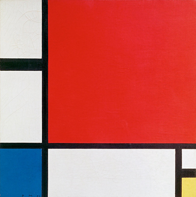
Piet Mondrian's Composition II of 1929 belongs to the National Museum of Serbia in Belgrade. It is a painting of sharply unequal coloured and white areas held together by broad black divisions. Its name can easily be confused with other Mondrian works called Composition II, or with the red, blue and yellow painting in Zürich that appears so often in search results. This Belgrade canvas has its own firm identity: 1929, RKD catalogue number B212, National Museum inventory Istr. 43.[1][2]
The painting also has a history beyond its image. The National Museum records it in Belgrade from 1931, notes its place in the permanent display from the 1950s and devoted a 2014–15 exhibition to how people have interpreted and responded to it. Looking at the exact arrangement, and then at this documented history, gives the work more individuality than its spare title suggests.[3][4]
At a glance
Where this painting sits in Mondrian's career
Contents
- What does the painting show?
- Why is the title so easy to confuse?
- When did it come to Belgrade?
- How has the museum presented it?
- Where does it fit in Mondrian's art?
What does the painting show?
Composition II contains no landscape, person or pictured object. Mondrian arranged horizontal and vertical black divisions around fields of red, blue, yellow and white. The red field begins well inside the upper part of the square rather than occupying the whole width; blue is confined to a smaller area low on the left; and a little yellow sits close to the lower right. In a small reproduction, the black area immediately above the yellow is especially easy to overlook. The National Museum's image and the matching, public-domain-marked Commons reproduction make those relationships visible.[2][5]
The black bars are not a background grid of equal squares. Their positions create coloured and white areas of different sizes. Some intervals feel broad and open, while others become narrow accents. The red attracts the eye first, but the small yellow and blue areas prevent a reading that stops there. A useful way to look is to follow one black line to the picture's edge, return to the red, then notice how much space separates it from the blue. The balance depends on these particular distances, rather than on a mirror image across the centre.
White matters as much as the three primary colours. It keeps the bars apart and gives the coloured planes different amounts of room. Nor do red, blue and yellow act as a code with a fixed meaning attached to each one. A claim that the blue stands for a specific feeling or that the red depicts a real object would require evidence the museum's object identification does not provide. Here the sounder interpretation starts with the differences among sizes, directions and colours that a viewer can see.
It is worth returning to the lower right after a first look. The yellow area is small, but the neighbouring dark block and the surrounding white make it distinct. If that accent were enlarged or removed, the overall balance would change. Mondrian's economy of means makes such a tiny decision consequential. The same can be said of the width and placement of the black divisions. Their exact relations are part of this painting's identity, even though many works of the period use a similar vocabulary.
Why is the title so easy to confuse?
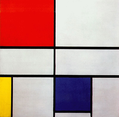
Mondrian repeatedly used descriptive titles such as Composition and numbered versions of them. The RKD catalogue places several similarly named paintings alongside the Belgrade work in its 1929–30 sequence. It lists a 1929 Composition no. II in the Museum of Modern Art in New York as B209, the Belgrade Composition II as B212, and a 1930 Composition with red, blue and yellow in Kunsthaus Zürich as B217. These entries point to three different objects, not three names for one canvas.[1]
The distinction matters because an image search or a short caption may omit the collection and catalogue number. The Zürich painting is the 1930 work made at the request of architect Alfred Roth, later donated to Kunsthaus Zürich. That patron, date and donation history belong to B217. They should not be carried over to the Belgrade painting simply because both employ red, blue, yellow, white and black.[1][6]
Likewise, the older page titled Composition II on this site pictures a different Mondrian composition. A shared title is not enough to identify the Belgrade work. For this page, the strongest short identification is National Museum of Serbia, Istr. 43, B212, 1929. It connects the painting to the museum's own record and to the catalogue sequence, even when a reproduction is small.[1][2]
Watch: Piet Mondrian
See his studio, the move toward geometric abstraction and the rhythms of his New York paintings.
Piet Mondrian: Abstract Painting as We Know It
Curator Michael White explores the paintings and Mondrian’s studio as an abstract space.
Watch on YouTubeWhen did it come to Belgrade?
The National Museum's 2014 annual report says the painting has been in its care since 1931. The report adds that the institution at the time was the Museum of Contemporary Art in Belgrade. The museum's publication notice describes the work more broadly as part of its foreign-painting collection since the 1930s. These statements are compatible: one supplies a year, the other a decade.[3][4]
The available museum documents do not give a full acquisition narrative on the cited pages. They do not by themselves establish the exact chain of ownership before 1931 or a purchase price. What they do establish is that the painting entered a Belgrade museum very early in its life and remained significant enough to become a sustained point of reference there. The museum says it appeared in the permanent display from the 1950s. That is a history different from the Zürich canvas, which Alfred Roth donated to Kunsthaus Zürich in 1987.[3][6]
The gap between painting date and museum arrival is short: Mondrian dated the work 1929, and the museum reports possession from 1931. Yet those two facts alone do not tell us how viewers initially understood the composition or where it hung in each intervening year. The later exhibition devoted to its reception is valuable precisely because the story of a painting includes what subsequent institutions and artists made of it, as well as the circumstances of its creation.
How has the museum presented it?
From 27 November 2014 to 22 February 2015, the National Museum mounted Piet Mondrian: The Case of Composition II. Its annual report says the exhibition concentrated on the painting's reception. It brought together artistic and curatorial projects that had treated Composition II as a point of reference, along with archival and documentary material about the work's life in the museum. The report describes approximately thirty artistic exhibits, photographic presentations, television material and scanned documents available on screens.[4]
The exhibition's authors were Jelena Dergenc and Simona Ognjanović, who also wrote study texts for its catalogue. The museum's separate publication notice describes the catalogue as bilingual, in Serbian and English. The notice is evidence that such a catalogue exists; it does not mean that every argument in the book has been consulted here. The public museum records are sufficient to establish the exhibition's subject and the painting's importance to the institution, without assigning unverified interpretations to its curators.[3][4]
An exhibition about reception asks a different question from a standard account of Mondrian's style. It asks what later viewers, artists and museums did with the picture. The work's clear divisions and few colours make it easy to recognise and quote, but repetition can also flatten the specificity of the original. The Belgrade exhibition's archival dimension offered a way to recover that specificity: a single canvas had a location, inventory identity and history of display, even as its visual language travelled widely.[4]
Where does it fit in Mondrian's art?
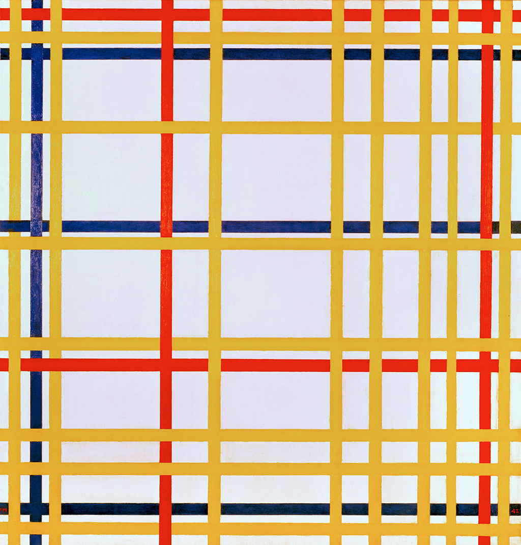
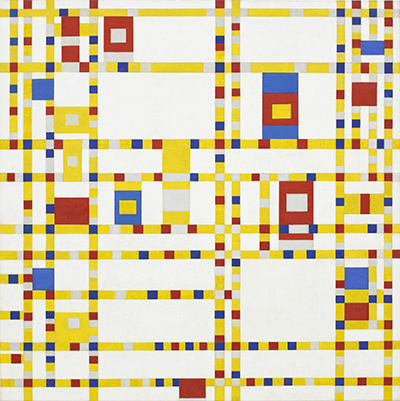
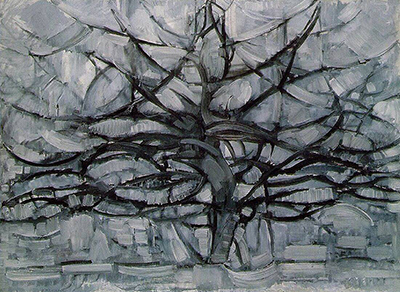
The 1929 date places this painting within Mondrian's mature abstract work. By then he had moved well beyond the landscapes, trees and Cubist paintings of earlier decades, using straight divisions and a limited palette to explore relations of unequal parts. The Belgrade composition is neither an early step toward abstraction nor a late New York painting. Its relative stillness makes a useful comparison with the more broken and rhythmic lines of Broadway Boogie Woogie from the 1940s.[1][7]
That comparison does not make the 1929 work a rigid formula. The image has uneven intervals, small accents and a particular distribution of colour. Mondrian made numerous compositions in this period, and the RKD sequence makes their variety visible. The Belgrade painting deserves attention as one of those individual solutions, with a documented life in Serbia that sets it apart from the similarly titled canvases in New York and Zürich.[1]
Mondrian artworks directory
Frequently asked questions
Is this the famous red, blue and yellow Mondrian painting in Zürich?
No. The Belgrade Composition II is B212, dated 1929, in the National Museum of Serbia. The Zürich Composition with Red, Blue and Yellow is B217, dated 1930, in Kunsthaus Zürich. RKD gives separate entries and institutions for them.[1]
Where is the original Composition II ?
When did the museum acquire it?
Why did the museum make an exhibition about one painting?
Its 2014–15 exhibition explored how artists, curators and the institution itself had responded to Composition II. It combined later artistic projects with archives and other material about the work's life in Belgrade.[4]
Discussion
Which small area changes the balance of this Belgrade painting most for you?
Reader Insights
Follow the black bars from the upper left to the blue and yellow corners. Where does your eye stop?
Which smaller field seems to answer the red most strongly, and does that change after a second look?
How does this Belgrade painting differ from the separately catalogued 1930 Zürich painting?
Join the Conversation
Share what you notice in this painting below.
References
- RKD – Netherlands Institute for Art History, Piet Mondrian: 1929–1930 (B206–B225), entries B209, B212 and B217. View source.
- National Museum of Serbia, “Piet Mondrian, Composition II, 1929,” object page. View source.
- National Museum of Serbia, “Piet Mondrian: The Case of Composition II,” bilingual catalogue notice. View source.
- National Museum of Serbia, 2014 annual report, p. 46. View source.
- Wikimedia Commons, “Piet Mondrian Belgrade.jpg,” reproduction and public-domain marking. View source.
- Kunsthaus Zürich, collection record for Composition with Red, Blue and Yellow, inventory 1987/0028. View source.
- The Museum of Modern Art, “Major Mondrian Retrospective Opens at the Museum of Modern Art,” 1995, pp. 2–4. View source.
- Lead image credit. Piet Mondrian, Composition II, 1929. National Museum of Serbia, Belgrade; inventory Istr. 43.
 The Red Tree Piet Mondrian.jpg)