 by Tom Gurney
Tom Gurney BSc (Hons) is an art history expert with over 20 years experience
Published on June 19, 2020 / Updated on September 28, 2026
Email: tomgurney1@gmail.com / Phone: +44 7429 011000
About the painting
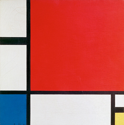
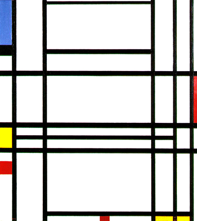
Piet Mondrian's Composition No. 10 places its strongest colours in small, widely separated pieces around a network of black horizontal and vertical lines. Blue occupies the upper left, yellow and red punctuate the left and lower edges, and other small colour fields interrupt the right side. Large white areas give those accents room to work. The pictured painting matches the second state of RKD B288.317, which RKD dates 1939–42 and records in a private collection. The catalogue also preserves an earlier unfinished state of the same work. Those two states explain the long date span more clearly than treating 1939–42 as an uncertain single year.[1][2]
At a glance
- ArtistPiet Mondrian (1872–1944)
- TitleComposition No. 10; also described as Composition No. 10 with Blue, Yellow and Red
- DateEarlier state listed by RKD in 1938; pictured second state dated 1939–42
- MediumOil on canvas
- DimensionsApproximately 79.5 × 73 cm, reported in a published study
- CollectionPrivate collection, according to RKD
- Catalogue numberRKD B288.317, second state[1][2][3]
Composition No. 10 among Mondrian's late works
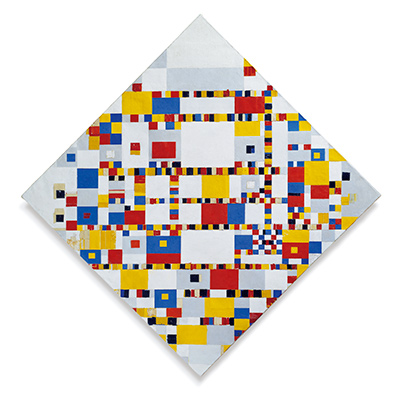
Victory Boogie Woogie (B324)
1942–44Contents
- What does the composition show?
- Why does the catalogue give two states?
- How do the lines and colours create balance?
- Where is the original painting, and how does it differ from nearby works?
What does the composition show?
The picture is slightly taller than it is wide. Thick black verticals run near the left and right edges, with another important vertical dividing the wide central area from the colours on the left. Black horizontals cross these lines at uneven intervals. The upper centre contains a large white rectangle, while another broad white field occupies much of the lower centre. Between them, closely spaced horizontal bands create several thin white strips. The structure is a grid only in the loose sense that verticals and horizontals meet: it is not a repeated pattern of equal squares.
The blue area near the upper left is the largest saturated colour field. A bright yellow patch appears lower on that same edge, followed by a small red piece farther down. At the bottom, another tiny red mark interrupts a black line near the centre, while yellow reappears at the lower right. A red sliver on the right edge answers the colour on the left. The exact positions matter. The colours do not form one cluster; they make the eye cross and recross the white space between edges.
Several lines almost touch the boundaries of the canvas, and some appear to continue past what the reproduction can show. This makes the painted rectangle feel like a selected section of a larger arrangement. Yet the small colour accents fix its particular balance. Cover the blue upper-left field and the picture becomes much less weighted at the top. Cover the yellow at the lower right and that corner loses its answer to the yellow on the left. Such tests describe a viewer's experience of the reproduced composition, not Mondrian's documented intention for any one colour.
The small image on this page cannot reveal the original painting's brushwork or precise surface condition. It does, however, show the main relationships clearly enough to distinguish this canvas from the many Mondrian compositions with black lines and primary colours. Its densely divided middle, big central whites, upper-left blue and tiny edge accents are specific to this picture.[2]
Why does the catalogue give two states?
RKD places B288.317 (first state) in its London 1938–39 section and calls that state an unfinished Composition no. 10, dated 1938. It places B288.317 (second state) in the New York 1940–44 section and dates the pictured finished arrangement 1939–42. The paired number records a documented change to the same work across its development; it does not identify two separate paintings that merely share a title. RKD's two reproduced states show why a catalogue can discuss an earlier arrangement and the later familiar image together.[1][2]
The locations of those catalogue chapters fit Mondrian's movements from Europe to New York, but the chapter headings alone do not establish exactly where every stroke was painted. It is safer to say that RKD associates an earlier unfinished state with its London period and the later state with its New York-period catalogue. The completed image is the one reproduced on this page. The date range 1939–42 belongs to that later state, while 1938 identifies the earlier recorded state.[1][2]
In RKD archival material the fuller designation includes “with Blue, Yellow and Red.” That phrase distinguishes the final colour arrangement but should not be read as a separate canvas. Titles and catalogue numbers changed as Mondrian's works were revised and later documented. The established site title Composition No. 10 remains useful when paired with the exact catalogue number and image state.[4]
Watch: Piet Mondrian
See his studio, the move toward geometric abstraction and the rhythms of his New York paintings.
Piet Mondrian: Abstract Painting as We Know It
Curator Michael White explores the paintings and Mondrian’s studio as an abstract space.
Watch on YouTubeHow do the lines and colours create balance?
The strong black lines do not simply outline coloured rectangles. They also make white intervals of very different sizes. Near the centre, the thin horizontal strips quicken the rhythm; above and below them, much larger spaces let the eye pause. The left-hand colours are aligned along an edge, while the little marks at the bottom and right refuse to let that edge dominate. This alternation of dense and open areas gives the painting movement without depicting a moving object.
Blue, yellow and red are often described as Mondrian's primary-colour vocabulary. Here they are far from equal in scale. Blue is a tall upper-left field; yellow appears in small pieces; red is divided into still smaller interruptions. Their unequal amounts keep a viewer moving around the canvas rather than arriving at one central colour. White takes up most of the surface, but the strong black crossings give that white different shapes and weights. The black is therefore as active as the coloured planes.
The pairing of broad and narrow spaces also keeps the picture from becoming a mechanical checkerboard. A central horizontal may span a large white field, while another ends against a vertical close to the edge. The little red at the lower centre can seem almost accidental at first, but it becomes more pronounced after following the line it interrupts. Looking back to the upper-left blue then exposes the long diagonal distance between the two accents, even though the painting itself is made of horizontal and vertical forms.
A published study of Mondrian's Neoplastic paintings lists Composition No. 10 with Blue, Yellow and Red among works it analysed and gives the canvas as 79.5 × 73 cm. This measurement is useful for scale, but RKD's online chapter is the stronger public source for the object's catalogue number, two states and collection designation. The painting is considerably larger than the small reproduction on this page.[3]
Where is the original painting, and how does it differ from nearby works?
RKD lists the second state in a private collection. It does not name a public museum in its current chapter record or provide a full ownership chain there. That limit matters: the page can identify the catalogued object and state without inventing a present owner, sale history or permanent display location. A rights-managed image listing gives a similar private-collection location, but no replacement image is needed for this page.[2]
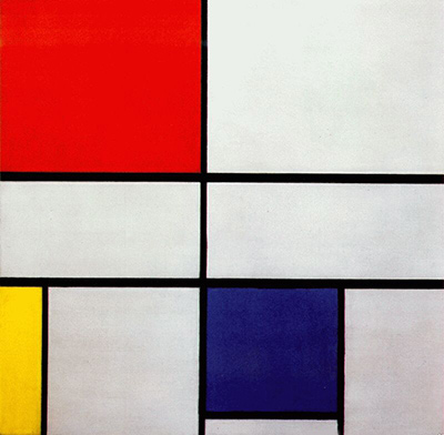
The nearby numbered compositions in RKD's New York chapter are distinct. Composition no. 9 is B287.316, recorded at the Phillips Collection in Washington, and Composition no. 11 is B296.318, recorded at the Albright-Knox Art Gallery in Buffalo. The numbers mark separate canvases, while each work can also have its own earlier and later states. Composition No. 10 is the privately held B288.317 painting with blue at upper left and small red and yellow accents at the edges.[2]
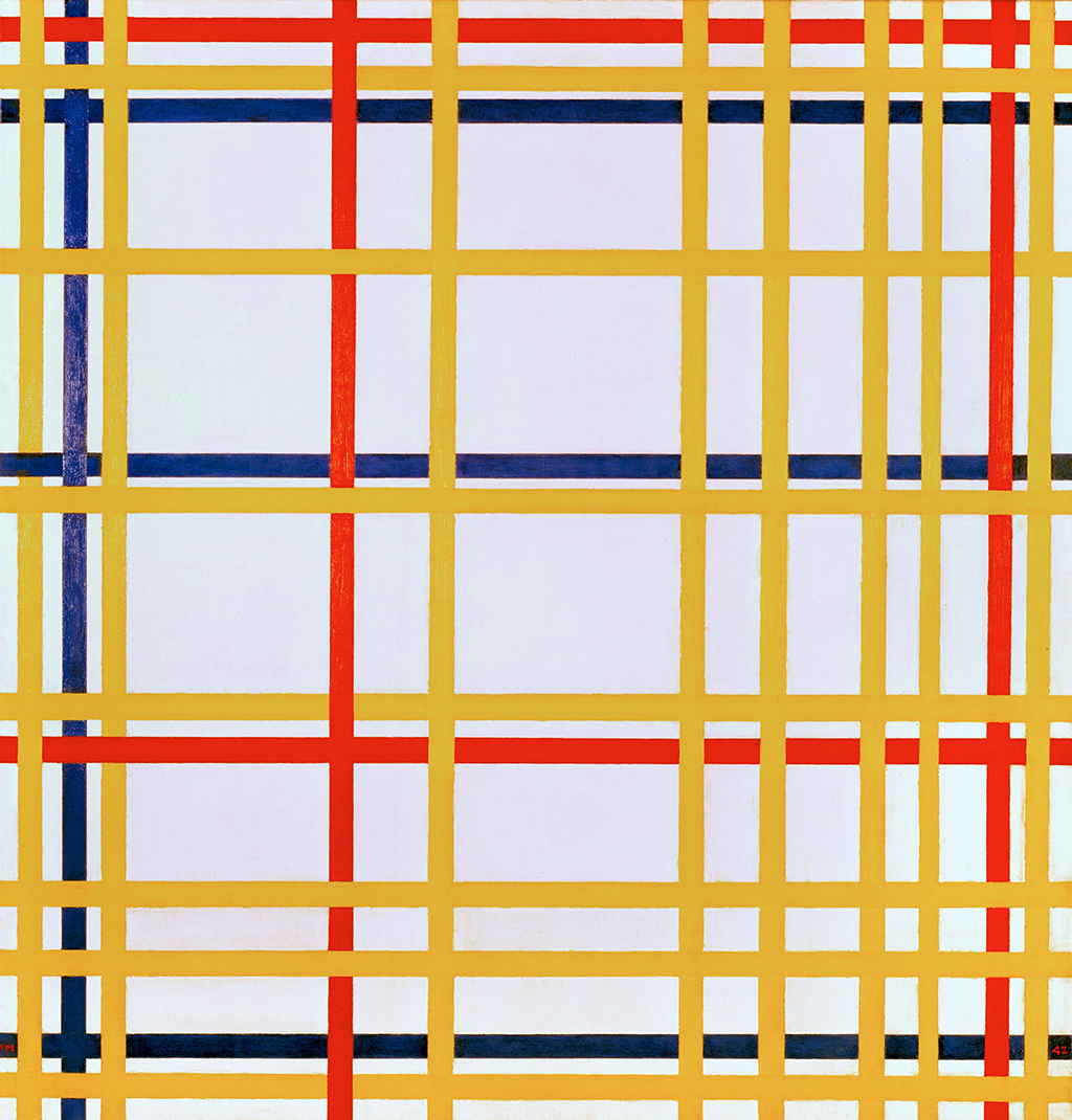
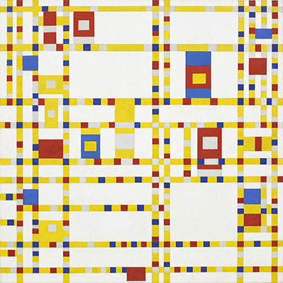
The site's later Broadway Boogie Woogie offers another comparison. Mondrian made it in 1942–43, and its lines are broken into many coloured units. In Composition No. 10, solid black lines still dominate the structure. The comparison shows different solutions within his late work, not a rule that every painting must be read as a step toward Broadway.[2]
Mondrian artworks directory
Frequently asked questions
When was Composition No. 10 painted?
What is its catalogue number?
It is B288.317 in the RKD Mondrian catalogue. The pictured version is its second state.[2]
Where is the original painting?
RKD records the second state in a private collection and does not identify a public museum for it in its chapter listing.[2]
What are its material and dimensions?
It is oil on canvas. A published technical study reports 79.5 × 73 cm.[3]
Is it the same as Composition No. 9 or No. 11?
No. RKD catalogues No. 9 as B287.316, No. 10 as B288.317, and No. 11 as B296.318.[2]
Discussion
Does the upper-left blue field or the broad central white area first hold your attention?
Reader Insights
Follow the central black horizontals toward the right edge. Where does your eye stop?
Which small yellow or red accent most changes the balance of the large white fields?
How does this solid black grid differ from the coloured lines of Broadway Boogie Woogie?
Join the Conversation
Share what you notice in this painting below.
References
- RKD – Netherlands Institute for Art History, digital Mondrian catalogue raisonné, London 1938–39, B288.317 first state. View source.
- RKD, digital Mondrian catalogue raisonné, New York 1940–44, B288.317 second state and neighbouring works. View source.
- Andrzejewski and colleagues, “Inferring Compositional Style in the Neo-Plastic Paintings of Piet Mondrian by Machine Learning,” published research, figure 1 and work list, including Composition No. 10 with Blue, Yellow and Red. View source.
- RKD, Robert P. Welsh archival inventory, entry B288.317 with its earlier and later titles. View source.
- Lead image credit. Piet Mondrian, Composition No. 10, second state dated 1939–42, oil on canvas, about 79.5 × 73 cm, RKD B288.317; private collection.
 The Red Tree Piet Mondrian.jpg)