 by Tom Gurney
Tom Gurney BSc (Hons) is an art history expert with over 20 years experience
Published on June 19, 2020 / Updated on September 29, 2026
Email: tomgurney1@gmail.com / Phone: +44 7429 011000
About the painting
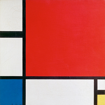
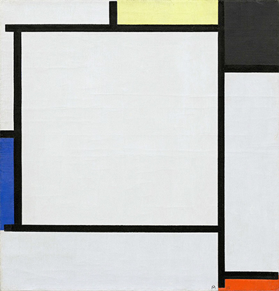
A large white area takes up much of Mondrian's Tableau 2. Black lines frame it, while smaller fields of blue, yellow, orange-red and black sit near the edges. The work is RKD B146, dated 1922 and held by the Solomon R. Guggenheim Museum as 51.1309. These identifiers separate it from other paintings called “Tableau no. 2” or “Composition no. II.” Mondrian reused numbered titles, but this particular image has its own distribution of white and colour.[1][2]
At a glance
Mondrian across periods
Contents
- How is the painting arranged?
- Why does “Tableau 2” need a catalogue number?
- What does the white space do?
- A sparse painting still has many decisions
- Three works with similar names
- Comparing an open field with a crowded one
How is the painting arranged?
The large central white plane is the first thing many viewers notice. It does not fill the whole canvas. Black horizontal and vertical bars cut around it, leaving thinner white and coloured rectangles along the upper, side and lower edges. A blue section sits to the left, yellow near the top, and a small warm red-orange mark appears toward the lower right. Black is both boundary and filled area.
 The Red Tree Piet Mondrian.jpg)
The lines do not create identical squares. Some stop at another bar; others continue to the canvas edge. Narrow sections sit beside broad ones, and the colour fields are deliberately unequal. The result is a balance of different visual weights rather than a symmetrical diagram. The broad white centre has its own force because the smaller bright areas press against it from the margins.
The slight difference between the painting's height and width, 55.6 × 53.4 cm, is also worth noting. It is near square but not perfectly square. The existing site's 400 × 416 image preserves this vertical tendency. Replacing it with a generic square Mondrian design would erase a small but real aspect of the object.[2]
Why does “Tableau 2” need a catalogue number?
The RKD list for 1922 contains B146, Tableau 2, at the Guggenheim. Elsewhere in the catalogue, numbered Tableau titles appear in 1913–14, and other “2” titles recur. For example, Tableau no. 2 / Composition no. V is a 1914 MoMA work with a dense field of Cubist rectangles, very different from this 1922 black-line composition. The Tableau no. 2 / Composition no. VII at the Guggenheim is 1913, not B146.[1][3]
An artwork page should therefore connect a title to image, date, catalogue number and collection. That approach allows all three distinct paintings to have pages without making search readers think they are alternative names for one canvas.
What does the white space do?
White is not merely an unused background. It is the largest painted relation in the picture. The coloured fields around it alter how wide and stable the white appears. A dark block can make a nearby edge feel heavier; a tiny red accent can pull attention far from the broad centre. Mondrian's limited palette gives each placement more work to do.
The Guggenheim's discussion of Mondrian's grids describes Tableau 2 as an example of his early 1920s nonrepresentational work and contrasts its enclosed lines with the outward-running lines of a later lozenge painting. That comparison helps explain why the boundary of this canvas matters. The eye can move around the internal rectangles, but the structure also feels held inside the small near-square surface.[4]
Watch: Piet Mondrian
See his studio, the move toward geometric abstraction and the rhythms of his New York paintings.
Piet Mondrian: Abstract Painting as We Know It
Curator Michael White explores the paintings and Mondrian’s studio as an abstract space.
Watch on YouTubeA sparse painting still has many decisions
The reduced number of coloured planes can make this 1922 work seem immediately legible. Stay with the white areas, however, and their unequal shapes become active. A line's stopping point changes whether a field feels enclosed or open to the canvas edge. Small differences in the intervals between bars prevent the design from becoming a regular grid. The limited colour works because it is placed within those unequal intervals, not because every primary hue is present in equal measure.
Three works with similar names
This Guggenheim Tableau 2 is RKD B146. The 1913 Tableau no. 2 / Composition no. VII is Guggenheim 49.1228, a larger Cubist composition associated with a tree. The 1914 Tableau no. 2 / Composition no. V is MoMA 633.1967, a wide, delicately coloured canvas possibly developed from a Paris facade. They are not alternate titles for the same image. A search result showing only “Tableau 2” can erase the differences in date, composition and collection; the catalogue numbers keep them apart.[1][4]
Comparing an open field with a crowded one
The white space in B146 is not an absence to be filled by a hidden subject. It allows a few boundaries and colour planes to act across a larger interval. Compare it with the packed marks of the 1913 Guggenheim B35: there, nearly every area offers a new junction; here, a small change in line position can reorganise a broad field. The comparison is useful precisely because the paintings share part of a title while their visual problems differ. Keeping the 1922 date and Guggenheim object identity attached to B146 prevents that contrast from being blurred by search results.[1][4]
Mondrian artworks directory
Frequently asked questions
Which Tableau 2 is shown here?
The 1922 RKD B146 at the Guggenheim, accession 51.1309.[1]
Is it a 1913 Cubist painting?
No. The Guggenheim's 1913 Tableau no. 2 / Composition no. VII is a different work with accession 49.1228.[3]
What is the main visual feature?
A broad white centre is balanced by unequal black bars and smaller coloured rectangles around it.
Discussion
How do small edge colours affect the white centre?
Reader Insights
Where do black bars stop or continue?
Why does B146 differ from 1913 and 1914 Tableau no. 2 works?
Why does B146 differ from 1913 and 1914 Tableau no. 2 works?
Join the Conversation
Share what you notice in this painting below.
References
- RKD – Netherlands Institute for Art History, Paris 1922–23 catalogue, B146, dated 1922, Guggenheim 51.1309. View source.
- Wikimedia Commons/RKD image metadata, B146 object data reporting oil on canvas and 55.6 × 53.4 cm; the Guggenheim artwork record is linked as the source object. View source.
- Guggenheim Bilbao, educator guide for the separate 1913 Tableau no. 2 / Composition no. VII, accession 49.1228. View source.
- Solomon R. Guggenheim Museum, essay on Composition No. 1: Lozenge with Four Lines, comparing its outward-running structure with Tableau 2. View source.
- Lead image credit. Piet Mondrian, Tableau 2, 1922, oil on canvas, 55.6 × 53.4 cm, Solomon R. Guggenheim Museum, 51.1309, RKD B146.