 by Tom Gurney
Tom Gurney BSc (Hons) is an art history expert with over 20 years experience
Published on June 19, 2020 / Updated on September 29, 2026
Email: tomgurney1@gmail.com / Phone: +44 7429 011000
About the painting
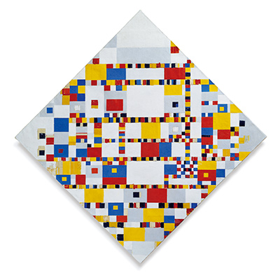
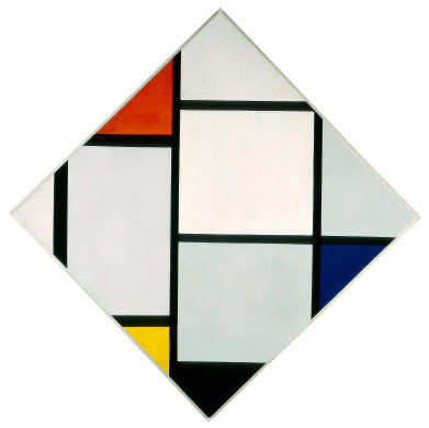
Mondrian set a square canvas on a point to create this large diamond. Black horizontals and verticals meet its sloping edge, cutting red, yellow, blue and black into sharply bounded peripheral pieces. The National Gallery of Art dates the work c. 1924/1925 and records it as 1971.51.1.[1]
At a glance
- ArtistPiet Mondrian (1872–1944)
- TitleTableau No. IV; Lozenge Composition with Red, Gray, Blue, Yellow, and Black
- Datec. 1924/1925
- MediumOil on canvas
- Dimensions142.8 × 142.3 cm measured as a diamond
- CollectionNational Gallery of Art, Washington
- Accession1971.51.1
- FormatSquare canvas hung on one corner
Mondrian across periods
Contents
- A diamond with upright lines
- What does the edge do?
- Collection history
- A square and a diamond at once
- Why the cropped forms matter
- A painting revised over time
- What the Gallery's research adds
A diamond with upright lines
The support is rotated, but Mondrian did not rotate its internal grid to match. The black lines stay horizontal and vertical relative to the room. Where they meet the diagonal edge, the partial rectangles become triangles and trapezoids. The largest middle area is white; red sits left of the upper point, yellow toward the lower left, blue below the right point and black near the foot. These accents are small compared with the open centre.[1]
 The Red Tree Piet Mondrian.jpg)
The National Gallery describes this as an early mature lozenge composition. It notes that Mondrian repainted the picture around 1925, thickening the black lines. The broad date acknowledges that later adjustment, rather than pretending the current surface was made in one untouched session.[1]
What does the edge do?
A conventional rectangular canvas can make a grid feel self-contained. Here the diamond edges slice through fields before they reach their imagined limits. A black line may end abruptly against the diagonal support, while an incomplete colour plane seems to continue beyond it. The Gallery connects this effect with Mondrian's idea of “cutting”: the painting implies an arrangement larger than the object we see.[1]
The visual balance is asymmetrical. Red and blue do not occupy mirrored positions, nor are the white areas equal. The apparently strict structure depends on carefully unequal intervals. That is why the image rewards slow comparison of the small coloured edge pieces with the large central white field.
Collection history
The work was a gift of Herbert and Nannette Rothschild and entered the National Gallery in 1971. Its accession number separates it from Mondrian's 1921 Chicago lozenge, RKD B127, and the later nearly colourless diamond works.[1]
Watch: Piet Mondrian
See his studio, the move toward geometric abstraction and the rhythms of his New York paintings.
Piet Mondrian: Abstract Painting as We Know It
Curator Michael White explores the paintings and Mondrian’s studio as an abstract space.
Watch on YouTubeA square and a diamond at once
The support is close to square, measuring 142.8 by 142.3 centimetres overall, but its display on a point changes the viewer's first impression. The outer contour suggests a diamond while the internal divisions insist on level horizontals and upright verticals. These two coordinate systems meet at every sloping edge. The result is visually active without any diagonal line being painted inside the composition. The National Gallery explains that Mondrian had experimented with a square canvas on point in 1918 and later joined that format to his reduced palette.[1]
Look at the centre first. One complete white square remains enclosed, while many surrounding compartments are clipped by the perimeter. The red, yellow, blue and black accents cluster nearer that perimeter and do not form a balanced four-corner pattern. Even the areas called white are not visually identical: the National Gallery's description notes hints of gray and pale blue. The eye moves from one difference in weight or temperature to another rather than finding a single dominant coloured block.[1]
Why the cropped forms matter
The edges are active participants in the design. A horizontal black line that would divide a rectangular canvas into complete bands meets the rising diagonal and is abruptly cut off. Coloured fields become triangular simply because their rectangular continuations are outside the support. Mondrian described his diamond compositions in terms of cutting, according to the National Gallery. The viewer is invited to imagine a structure continuing past the object while still attending to the precise boundary in front of them.[1]
This should not be mistaken for an infinitely repeatable wallpaper pattern. The particular widths of the black lines, the placement of the central white square and the unequal colour accents produce this painting's balance. Try mentally moving the blue accent from below the right point to the opposite edge: the whole image would read differently. The apparent economy of means makes each placement consequential.
A painting revised over time
The National Gallery dates the work to about 1924–25 and says Mondrian thickened the black lines around 1925. Its current appearance therefore includes a later decision by the artist. The second-state catalogue designation in RKD is useful for this reason: it reminds readers that an abstract composition can have a material history even when no figure or story changes. One should not use an early date to imply that every visible boundary was fixed at the first sitting.[1][2]
The National Gallery's interpretation connects horizontal and vertical opposition to Mondrian's idea of dynamic equilibrium. The diamond format makes that claim tangible. The lines remain steady in relation to the room, yet the angled support repeatedly interrupts them. Stability and interruption are visible together, without requiring the coloured areas to become symbols for specific objects or emotions.[1]
What the Gallery's research adds
The National Gallery mounted an exhibition on Mondrian's diamond paintings in 1979, bringing paintings and working drawings together to study how he constructed them. E. A. Carmean Jr.'s accompanying research argues, from an earlier photograph and stylistic comparison, that the first state of the Washington diamond may date to 1921. The museum's current object record uses c. 1924/1925 for the work as displayed. These are different kinds of date claim: one is a proposed beginning for an earlier state, the other the public date for the revised object. Neither should be silently substituted for the other.[1][2]
The research also examines how changing the width of a black line changes the neighbouring white and coloured areas without necessarily moving their outer boundaries. That observation makes the reported thickening around 1925 more significant than a cosmetic touch-up. If a band becomes wider, the area beside it becomes smaller, and the equilibrium of the whole diamond shifts. The painting is thus a record of calibration over time, not merely an illustration of a settled design rule.[2]
The Gallery's 1979 exhibition brought eight paintings and eight working drawings together to examine diamond compositions. This context matters because the Washington canvas can otherwise look like a simple square rotated once. The research treats the format as a sustained problem of construction and revision. In the present painting, the upright internal axes meet a diamond perimeter, the fields are cut, and coloured fragments are held near the edges. The support's rotation is only the beginning of the design, not its complete explanation.[2]
Mondrian artworks directory
Frequently asked questions
Where is the lozenge painting?
At the National Gallery of Art, Washington, accession 1971.51.1.[1]
Why is it diamond-shaped?
A square support is hung on one corner while the internal lines remain horizontal and vertical.[1]
Why is the date approximate?
The Gallery dates it c. 1924/1925 and notes that Mondrian thickened the lines around 1925.[1]
Discussion
Which colour is nearest an edge?
Reader Insights
Why do the lines remain upright in a diamond?
How does cropping affect the central white field?
How does cropping affect the central white field?
Join the Conversation
Share what you notice in this painting below.
References
- National Gallery of Art, Official artwork record 1971.51.1. View source.
- National Gallery of Art, The Diamond Compositions research publication. View source.
- Lead image credit. Piet Mondrian, Tableau No. IV; Lozenge Composition, c. 1924/1925, oil on canvas, 142.8 × 142.3 cm, National Gallery of Art 1971.51.1.