by Tom Gurney
Tom Gurney BSc (Hons) is an art history expert with over 20 years experience
Email: tomgurney1@gmail.com / Phone: +44 7429 011000
How Light and Dark Build Visual Structure
Value in art means relative lightness and darkness. It does not mean price, monetary value, worth or artistic merit, and it is not a score that can be assigned to a work. A passage looks light, dark or somewhere between because we compare it with other passages around it and with the range established by the artwork as a whole.[1][2]
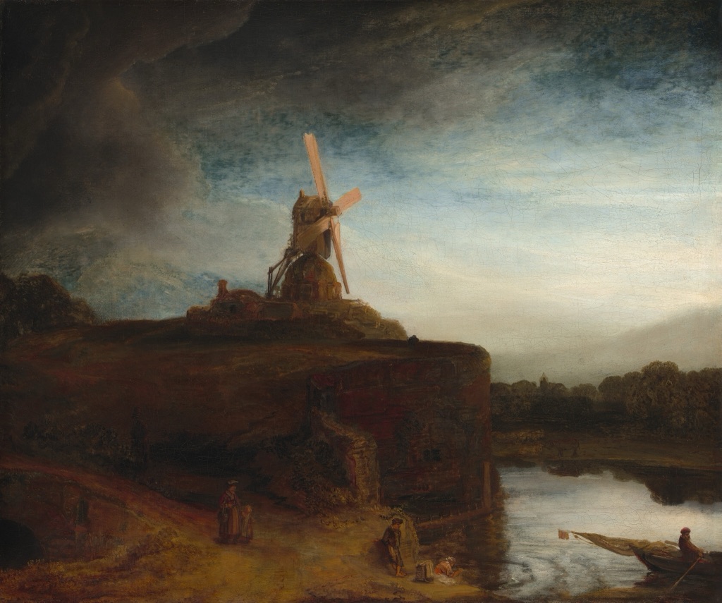
Rembrandt van Rijn · The Mill · 1645/1648 · National Gallery of Art, Washington · Public Domain. The mill's dark mass becomes legible through its relationship with the pale sky; a close reading appears below. Source details.
At a Glance
- Core ideathe relative lightness or darkness of a passage.
- Value rangethe span and distribution from light to dark.
- Broad rangewidely separated light and dark passages.
- Narrow rangemostly close light-dark relationships.
- Useful contrasthue names a colour family; value describes its lightness.
Contents
Value is visible in monochrome and in colour. Blue, red or green can each be relatively light or dark, just as black ink can spread from pale grey to dense black. Hue tells us which colour family we perceive; value asks how light or dark that colour appears.[1][3][4]
In UK-facing discussion, you may also meet tone or tonal value. These words overlap with value, but institutions do not use them in exactly the same way: one source may use tone broadly for light and dark passages, while another uses it more narrowly for a colour mixed with grey.[1][2] This guide therefore uses value as its main term and treats the alternatives as useful, variable vocabulary rather than separate types.
Range, grouping and key
A work's value range, sometimes called its tonal range, is the relative span and distribution of its lighter and darker passages. A broad range reaches from very light to very dark; a narrow range keeps most passages closer together. Neither is automatically better, more expressive or more accomplished.
Similar values may group or merge visually, while a larger separation can make areas easier to distinguish. That relationship may operate across a monochrome print, among several colours or over the surface of a pale ceramic object. It should be described from what is visible rather than measured against a fixed numbered scale.
Some art teaching uses high-key for an organisation that is mainly light and low-key for one that is mainly dark.[5] These are qualified descriptions, not universal types, and they do not determine mood, meaning, quality or success.
Four questions for recognising value
When you look at an unfamiliar artwork, begin with four questions:
- Where are the lightest and darkest passages, and how far apart do they seem? Compare their relationship rather than treating either passage in isolation.
- Is the overall range broad or narrow, and is much of the work mainly light, dark or intermediate? Notice the distribution as well as the two extremes.
- Where do similar values group or merge, and where do larger differences separate areas? Look for broad masses before chasing every small change.
- Do value changes help a form turn or a space recede, and what visible evidence supports that reading? Describe the shift you can see without making value a substitute for form or space.
Use the questions as prompts. Direct comparison is enough: there is no need to convert an image to greyscale, construct a value scale or assign every passage to a fixed step.
Broad ranges in colour and monochrome
Rembrandt: dark land against a pale sky
Rembrandt van Rijn's The Mill, 1645/1648, belongs to the National Gallery of Art, Washington (accession 1942.9.62).[6] A dark windmill and bank rise against a much lighter sky, while water below catches subdued light.
The range is broad, but it is not a simple black-and-white division. Browns, greens, blues and greys carry different values across the scene. The mill reads strongly because its dark mass is compared with the sky around it. Lighter water also helps open a sense of distance, a single bounded example of value contributing to represented space rather than defining it.
Goya: darkness gathering from a grey ground
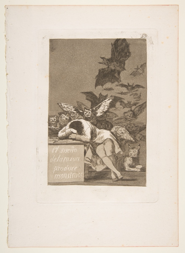
Francisco de Goya y Lucientes's plate 43 from Los Caprichos, The sleep of reason produces monsters (El sueño de la razon produce monstruos), 1799, is a print in The Metropolitan Museum of Art (accession 18.64(43)).[7] The complete sheet places a pale sleeping figure and desk within an aquatint ground as owls, bats and other creatures gather behind.
Pale paper, layered greys and concentrated black shapes create a broad monochrome range. Similar middle values bind much of the background together; sharper light-dark changes make the figure, desk edge and nearest creatures easier to distinguish. This is a value reading of the full sheet, not a retelling of its subject.
Dürer: line becoming value
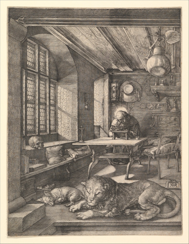
Albrecht Dürer's Saint Jerome in His Study, 1514, is an engraving in The Metropolitan Museum of Art (accession 19.73.68).[8] Window light crosses the room, its furniture and the sleeping animals while Jerome works at a desk.
The print has no painted colour, yet it contains many values. Dense engraved lines gather into dark walls, shadows and objects; sparse marks leave lighter passages of paper open. Line density produces tonal areas here, but the sustained study of line's paths, qualities and functions belongs to Line in Art.
Close values that still make structure
Hammershøi: muted values and a patch of light
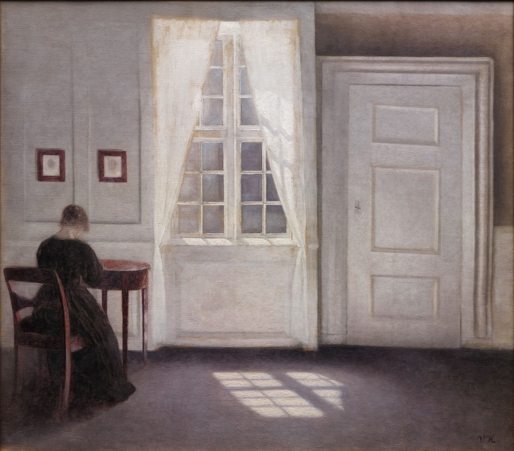
Vilhelm Hammershøi's Interior in Strandgade, Sunlight on the Floor, 1901, is held by Statens Museum for Kunst (KMS3696).[9] A woman seen from behind stands in a restrained interior near a bright window, with sunlight falling across the floor.
Much of the room stays within close, muted values. The window and floor light interrupt that narrow relationship without making every surrounding edge hard or every dark passage equal. The structure depends on small changes as well as a few larger ones. A narrow range is not an absence of value; it makes subtle differences carry more work.
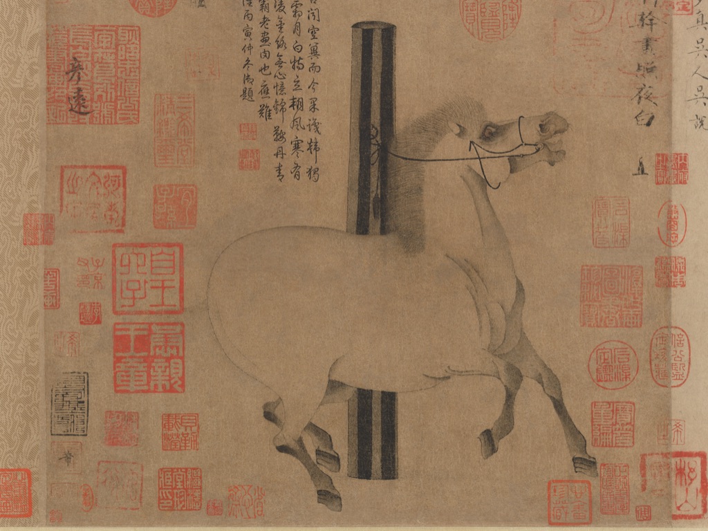
Han Gan: restrained ink across a handscroll image
Night-Shining White, ca. 750, is attributed to the Chinese artist Han Gan and is held by The Metropolitan Museum of Art (accession 1977.78).[10] The institution identifies the painting as a handscroll whose complete mounting includes later inscriptions and collector seals; the primary image shows the tethered horse within a compact painted field.
Fine grey and black ink describes the horse against pale paper. The range is restrained, yet small shifts around the head, neck, belly and legs keep the body legible. Red seals and later marks belong to the work's accumulated history, so they should not be mistaken for a neutral empty ground or removed from the full institutional image.
Mainly dark and mainly light organisations
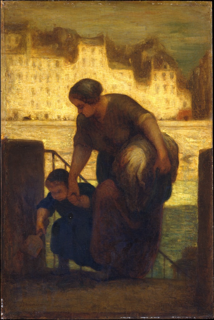
Daumier: a dark group against a pale riverside
Honoré Daumier's The Laundress, dated 186[3?] by The Metropolitan Museum of Art, belongs to that collection (accession 47.122).[11] A dark-clothed laundress carries a bundle and guides a child up steps, while a lighter riverbank and buildings spread behind them.
Much of the figure group is dark, so low-key is a cautious description of its overall organisation. The pale background still occupies a large part of the painting, and intermediate browns and greys prevent the work from becoming a theatrical spotlight effect. The term describes the distribution of values; it does not supply a mood or judgement.
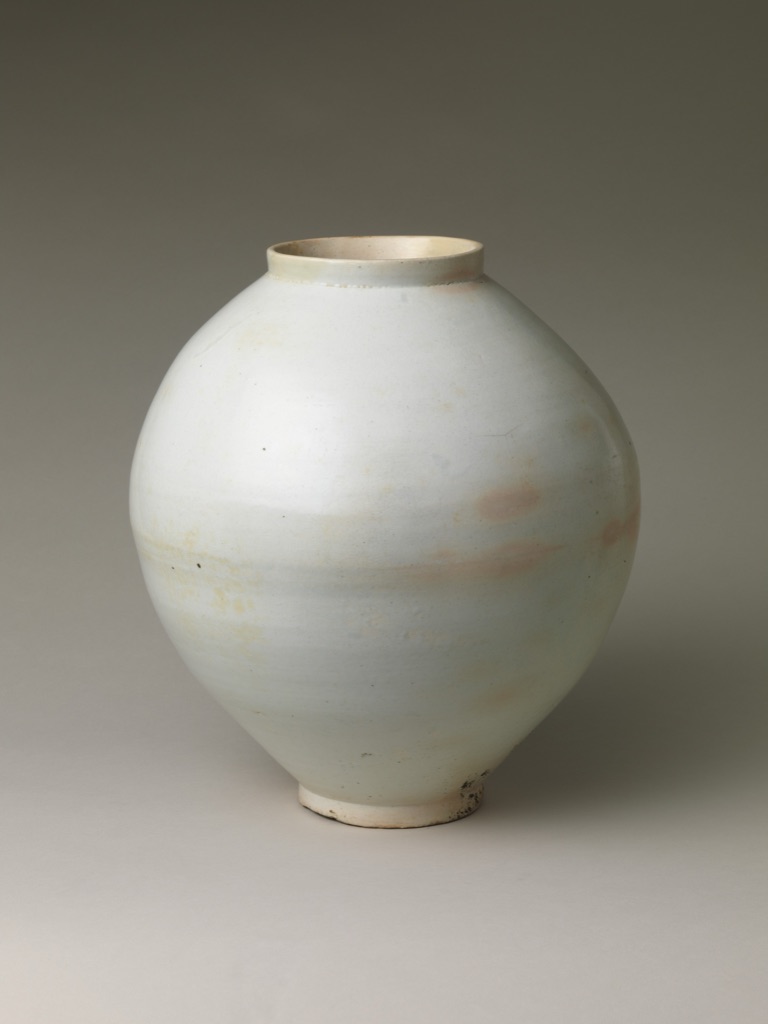
A Korean moon jar: close pale values around a volume
The Korean Moon jar, made by an unrecorded maker in the second half of the 18th century, is a white porcelain object in The Metropolitan Museum of Art (accession 1979.413.1).[12] The full object appears against a grey background, with gentle changes of light and shadow across its rounded body.
This mainly light, or high-key, arrangement still contains enough value change to make the jar's volume legible. A slightly darker edge and shadow answer lighter areas across the body, but those shifts do not turn value into form itself. Form remains the actual three-dimensional object and the volume we perceive; value is one relationship that helps us see it.
Value grouping across a colour scene
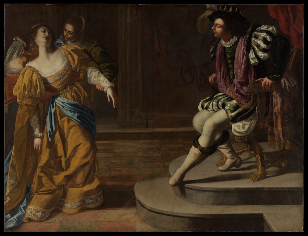
Artemisia Gentileschi: light and dark figure groups
Artemisia Gentileschi's Esther before Ahasuerus, from the 1620s, is in The Metropolitan Museum of Art (accession 69.281).[13] Esther and her attendants gather at the left, while Ahasuerus sits at the right within a dim interior.
Light cloth, skin and architectural passages collect into separated groups amid darker garments and shadow. Similar values help each cluster hold together; larger differences separate figures and open intervals between them. Those groupings contribute to the complete composition and can affect emphasis, but the immediate question here is simpler: where do light and dark gather, merge and pull apart?
Value and its neighbours
Value names relative lightness and darkness. Contrast describes perceptible difference across value and other qualities, so value difference can create contrast without becoming the whole meaning of contrast. Form concerns actual or represented volume, while space concerns areas, distances and depth relationships. Value may help us perceive either, but it does not replace them.
Composition considers the complete realised organisation to which value relationships can contribute. Texture concerns actual or implied surface quality; light and dark marks may help suggest a surface, but value alone is not texture. Colour includes hue, saturation or intensity, temperature and broader relationships, while line has its own paths, qualities and functions.
The Elements of Art places value beside the other visual resources. Contrast, form, space, composition and texture refine different relationships, while value keeps attention on relative lightness and darkness.
Look for value yourself
Choose an artwork and let your eyes settle before naming a range. Find the lightest and darkest passages, then look for the intermediate values that connect them. Ask whether most of the work stays close together or travels across a broader span.
Next, notice where similar values merge into a larger area and where a stronger difference separates one part from another. If a form seems to turn or a space seems to recede, point to the particular light-dark change that supports your reading rather than treating the effect as automatic.
Value is useful because it returns attention to relationships. It can be quiet or forceful, broad or narrow, carried by ink, paint or the illumination of an object. The more precisely you compare what is light, dark and between, the more clearly the artwork's visible structure begins to emerge.
Watch: Value from Tonal Modelling to Formal Analysis
Choose a close reading of tonal transitions, a lesson on represented volume, or a museum-led landscape analysis.
Virgin of the Rocks
Look closely at Leonardo's figures, grotto and tonal transitions in the National Gallery version.
Watch on YouTubeFrequently Asked Questions
Value is the relative lightness or darkness of a colour or passage within an artwork.
No. Hue identifies a colour family, while value describes how light or dark that colour appears.
Value range is the span and distribution of lighter and darker passages within a work.
High-key cautiously describes an organisation that is mainly light; low-key describes one that is mainly dark.
Changes from light to dark can help a flat image represent the turning surface of a three-dimensional form.
Discussion
Where does one light-dark relationship most strongly organise a work on this page?
Reader Insights
Locate the lightest and darkest passages before judging the whole range.
See where close values merge and stronger differences separate areas.
A colour can change in value without changing its basic colour family.
Join the Conversation
Share one precise tonal observation or a useful museum example below.
References
- Honolulu Museum of Art, Elements of Art | VALUE Glossary
- Museum of Modern Art, A Vocabulary for Discussing Art
- J. Paul Getty Museum, “Understanding Formal Analysis”
- National Gallery of Art, “Monet's Waterscapes”
- Colorado Mesa University, 2D Design Handbook
- National Gallery of Art, Rembrandt van Rijn, The Mill, 1645/1648
- The Metropolitan Museum of Art, Francisco de Goya y Lucientes, The sleep of reason produces monsters, 1799
- The Metropolitan Museum of Art, Albrecht Dürer, Saint Jerome in His Study, 1514
- Statens Museum for Kunst, Vilhelm Hammershøi, Interior in Strandgade, Sunlight on the Floor, 1901
- The Metropolitan Museum of Art, Han Gan, Night-Shining White, ca. 750
- The Metropolitan Museum of Art, Honoré Daumier, The Laundress, 186[3?]
- The Metropolitan Museum of Art, Moon jar, second half of the 18th century
- The Metropolitan Museum of Art, Artemisia Gentileschi, Esther before Ahasuerus, 1620s