by Tom Gurney
Tom Gurney BSc (Hons) is an art history expert with over 20 years experience
Page created on September 2, 2026 / Page updated on September 13, 2026
Email: tomgurney1@gmail.com / Phone: +44 7429 011000
Why Some Parts Command Attention First
Emphasis in art is the relative visual priority given to parts of an artwork. It is what makes one figure, object, area or relationship claim attention before—or more strongly than—what surrounds it. The effect is comparative: a bright shape can seem emphatic because nearby shapes are muted, or an isolated figure can dominate because everything else is grouped together.[1][2][3]
Those differences create a visual hierarchy. The most commanding part is dominant; other parts are subordinate, but they are not unimportant. They support, delay, carry onward or complicate what the eye notices first. A focal point is one possible concentrated result of emphasis, not another name for the whole principle.[4][5]
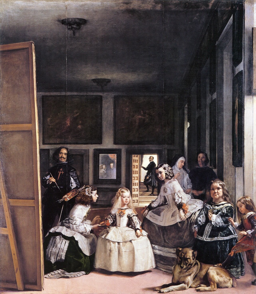
Las Meninas by Diego Velázquez, 1656, Museo del Prado, Madrid. Light, scale, placement, gazes and the distant doorway establish several unequal claims on attention rather than one isolated focal device. Image: Wikimedia Commons, public-domain reproduction.
At a Glance
- Core idearelative visual priority within an artwork.
- Hierarchydominant and subordinate parts support an order of attention.
- Focal pointone possible concentrated result, not the whole principle.
- Evidencecompare contrast, scale, placement, isolation, direction and grouping.
- Close neighbourcontrast concerns difference rather than priority itself.
Contents
Some artworks offer one powerful focal area. Others organise several areas in a sequence, or spread attention across a broad field. To recognise emphasis, notice where your eye arrives, compare that area with its surroundings, and identify the visible differences that give it priority.
Emphasis, hierarchy and focal points
Visual hierarchy describes an order of attention. Dominance sits at the strongest point in that order; subordination describes the quieter supporting relationships around it. A small bright form may dominate a large dark field, while several similar figures may remain subordinate because none separates itself from the group.[3][4][5]
A focal point is an area in which that priority becomes concentrated. There may be one, but there can also be several focal areas arranged by visual weight. They need not compete equally: one may attract the first glance, another hold it next, and a third become visible only after the larger structure is understood.[4][5]
Not every work needs an absolute centre. In a wide landscape or a densely populated scene, attention may travel among related clusters. The hierarchy can still be deliberate and readable even when no single point controls the whole experience. “Distributed” is useful descriptive language here, not a formal category that every artwork must fit.
One strong focal area
In Jacques Louis David's The Death of Socrates, the upright philosopher becomes dominant through a combination of light, placement and converging gestures. The surrounding figures remain essential: their lowered bodies and varied reactions make his vertical alertness more forceful. Emphasis emerges from the whole hierarchy, not from Socrates in isolation.
Several ordered focal areas
John Singleton Copley's Watson and the Shark does not settle into a single unmoving centre. The swimmer, the approaching shark and the crowded rescue boat create several urgent areas. Reaching arms, gazes, the harpoon and strong diagonals connect them, so attention moves through an ordered crisis rather than landing once.
Distributed attention
Pieter Bruegel the Elder's The Harvesters spreads incidents across a wide summer landscape. Resting figures under the tree, workers in the wheat, a distant village and the far water all reward attention. Some clusters are stronger than others, but forcing one absolute focal point would hide the way the scene opens gradually across distance.
These arrangements are not three compulsory types. They simply show that emphasis can be concentrated, sequenced or broadly shared according to the relationships visible in a particular work.
How to recognise emphasis
Begin with what you can see rather than guessing what an artist intended. Ask where attention gathers, what makes that area different, and how the rest of the work supports or resists it. The following cues often work together; they are looking questions, not a universal list of methods.[1][4][5]
- Contrast: Where is the strongest difference in light and dark, colour, shape or texture? Illumination is especially useful to describe as a value contrast rather than as a separate rule.
- Relative size: Is one form much larger or smaller than nearby forms? Scale matters through comparison inside the image, not through physical dimensions alone.
- Placement and isolation: Is something set apart, raised, brought forward or placed where surrounding space makes it conspicuous?
- Direction and convergence: Do diagonals, edges or repeated alignments point toward a particular area?
- Gesture and gaze: Do figures turn, reach or look toward something, allowing several bodies to reinforce the same priority?
- Grouping and interruption: Does one compact cluster carry greater weight, or does a changed form break an otherwise continuous arrangement?
After finding a cue, compare the dominant area with at least two subordinate ones. This prevents a bright colour, central position or recognisable face from being declared “the focal point” automatically. What matters is how several visual relationships work together.
Emphasis across eight artworks
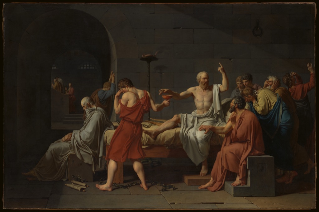
David: light, posture and converging gestures
Jacques Louis David's The Death of Socrates, 1787, is held by The Metropolitan Museum of Art, accession 31.45.[6] Socrates sits near the centre, reaching upward for a cup while speaking and pointing. His pale, upright torso meets the strongest concentration of light.
The surrounding figures make that dominance legible. Their bodies bend, turn away or close inward, while hands and arms repeatedly lead back toward Socrates. The cup-bearer's lowered head and the darker group at the right remain subordinate without becoming empty background; they give the central action emotional and visual pressure.
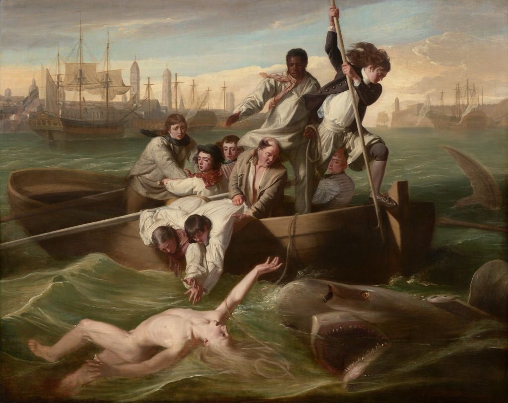
Copley: an urgent hierarchy with several centres
John Singleton Copley's Watson and the Shark, 1778, belongs to the National Gallery of Art, Washington, accession 1963.6.1.[7] A swimmer occupies the water below a boat crowded with reaching figures, while a shark enters from the right.
No single device controls the hierarchy. The swimmer's exposed body is isolated against the water; the shark's profile presses toward him; and the rescue group forms a dense counterweight above. Arms, faces, oars and the harpoon create directional connections among all three. The painting therefore makes several urgent areas readable without giving them identical visual weight.
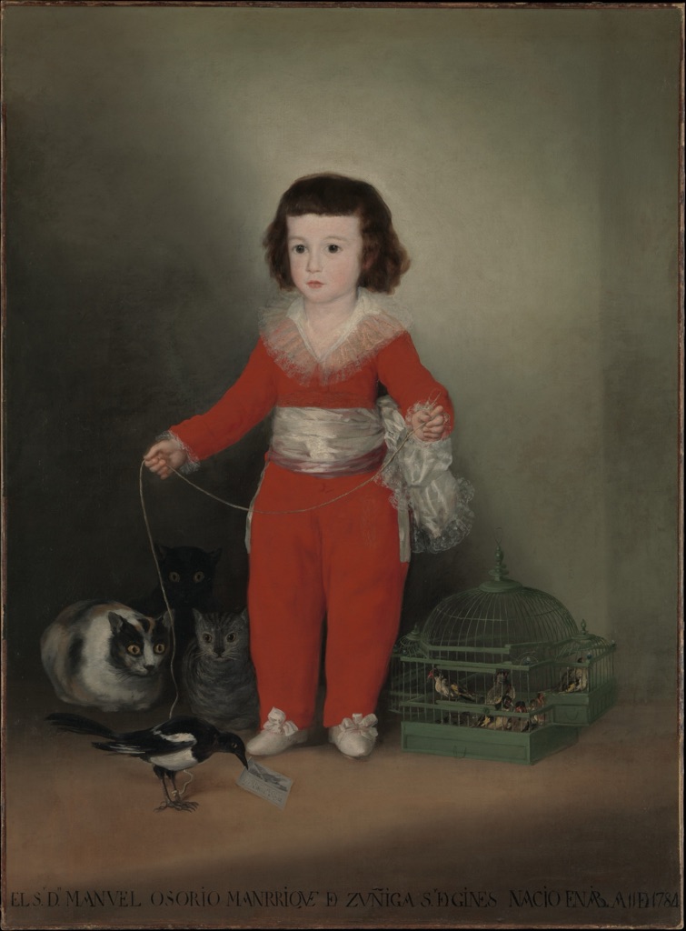
Goya: colour and isolation
Goya's Manuel Osorio Manrique de Zuñiga (1784–1792), 1787–88, is in The Metropolitan Museum of Art, accession 49.7.41.[8] The child stands upright in vivid red, separated against a subdued ground. His pale face and clothing establish a strong difference from the darker animals and surrounding space.
The red does not work alone. The figure is larger than the nearby creatures, placed above them and enclosed by relatively open space. The magpie, cage and cats complicate the lower part of the portrait, but their smaller scale and darker forms keep them subordinate. These are visible relationships; they do not require a speculative symbolic reading.
Homer: isolation amid competing dangers
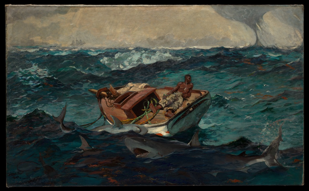
Winslow Homer's The Gulf Stream, 1899 and reworked by 1906, is held by The Metropolitan Museum of Art, accession 06.1234.[9] A man lies on the damaged deck of a small boat amid rough water, sharks and a distant waterspout.
The figure is not the largest form in the painting, yet his isolation makes him the human centre of concern. The boat creates a low platform around him, while sharks circle below and distant signs—a ship and waterspout—compete at the horizon. Emphasis here does not erase the surrounding dangers; it depends on their unequal but persistent claims on attention.
Rembrandt: a hierarchy made with light and dark
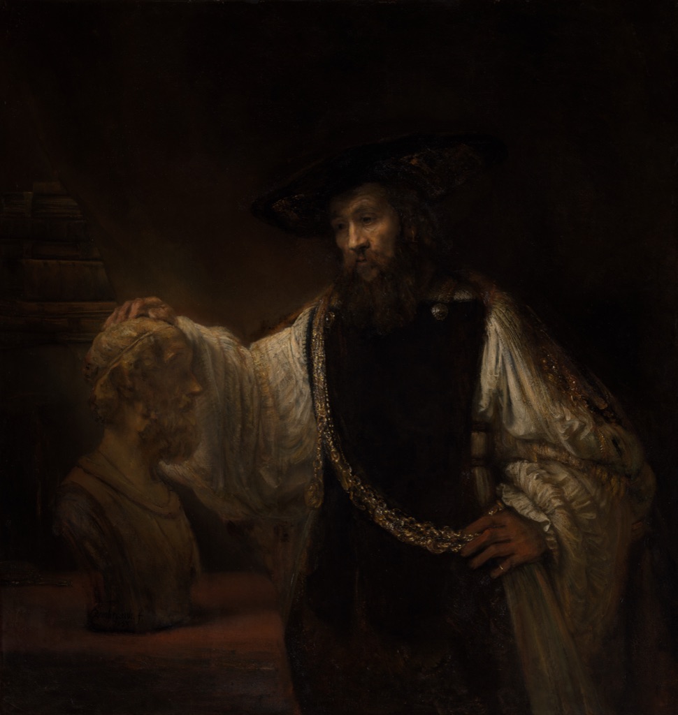
Rembrandt's Aristotle with a Bust of Homer, 1653, is in The Metropolitan Museum of Art, accession 61.198.[10] Against a broad dark field, light catches Aristotle's face, the hand resting on the bust, the pale stone head, the other hand and the gold chain.
Those illuminated passages do not have equal strength. The face and bright sleeve first establish the living figure; the touch on the bust connects Aristotle to Homer; smaller glints on the chain carry attention downward. Describing this as value contrast keeps the explanation visible and specific without treating illumination as a separate universal method or claiming a private intention.
Monet: scale, placement and cropping
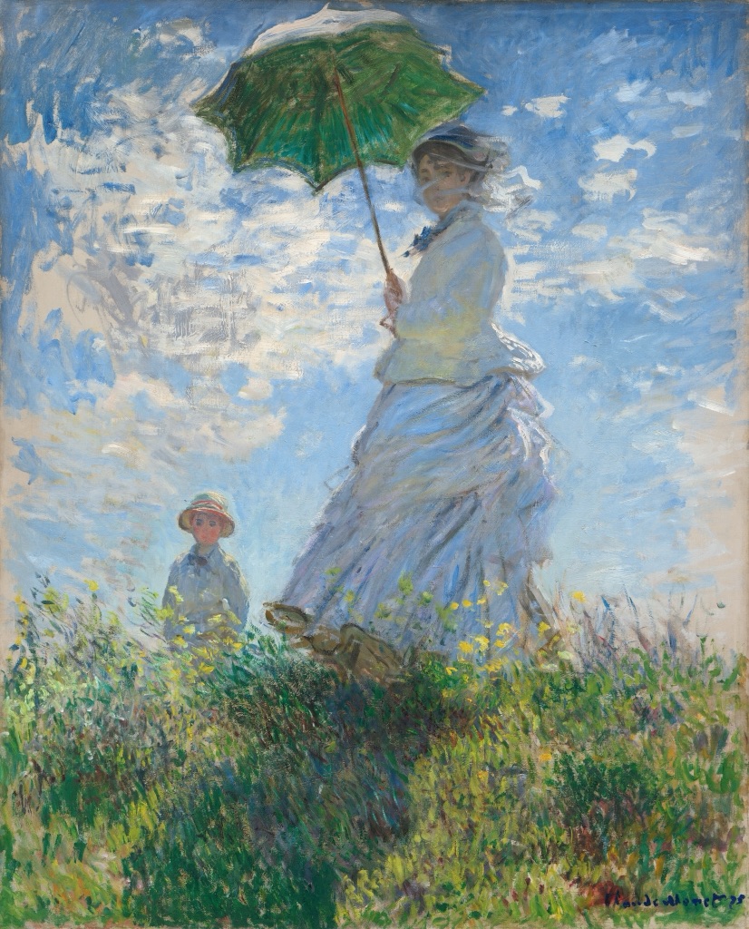
Claude Monet's Woman with a Parasol - Madame Monet and Her Son, 1875, belongs to the National Gallery of Art, Washington, accession 1983.1.29.[11] Camille Monet rises against the bright sky, seen from below, while Jean appears much smaller beyond the crest of the hill.
Camille's foreground scale, high placement and dark green parasol give her immediate priority. The figure is also cropped close enough to press against the edge of the image, while Jean remains fully visible but subordinate in the distance. Their relationship shows why relative size matters more than size alone: the hierarchy comes from how the two figures occupy the same pictorial space.
La Tour: quiet concentration
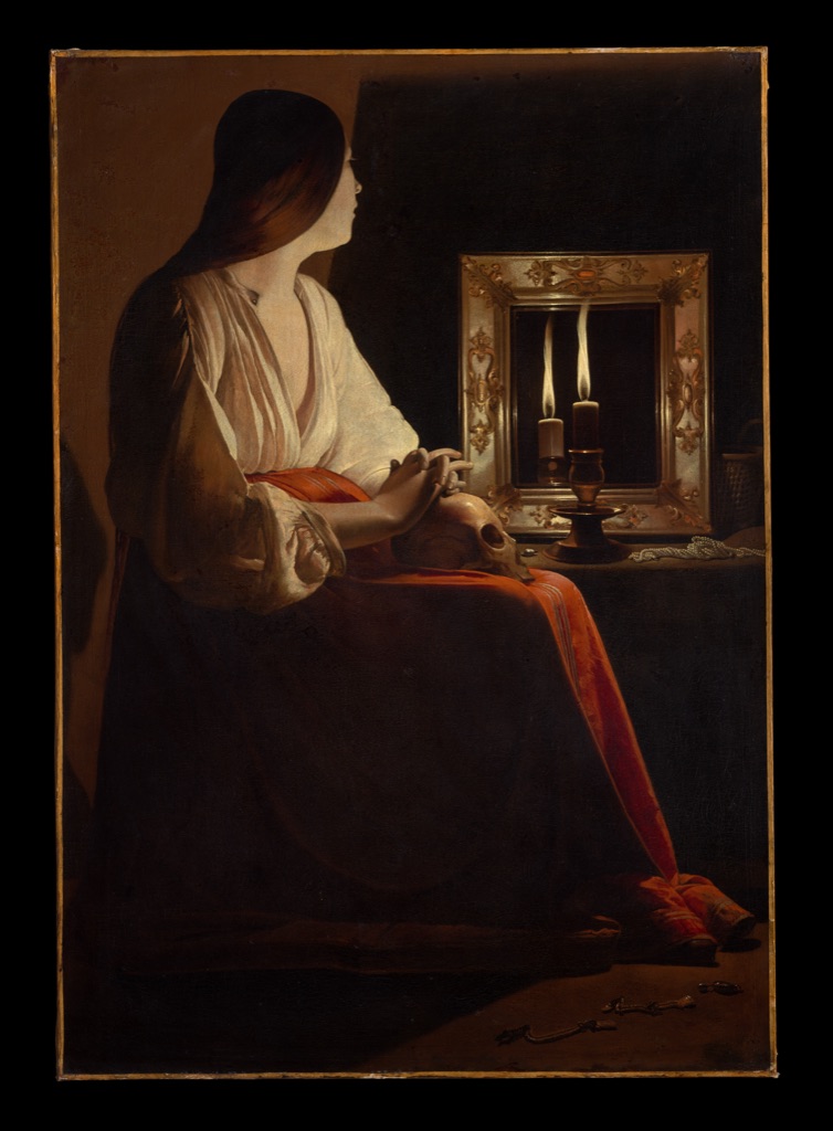
Georges de La Tour's The Penitent Magdalen, about 1640, is held by The Metropolitan Museum of Art, accession 1978.517.[12] A seated figure, candlelit mirror and skull emerge from a room largely held in darkness.
The emphasis is concentrated but not theatrical. The small flame establishes the strongest light; nearby face, hands and reflective surfaces become gradually visible around it. Isolation and a broad dark field slow the act of looking, allowing a quiet cluster to dominate without the crowded gestures or sharp directional movement seen in David and Copley.
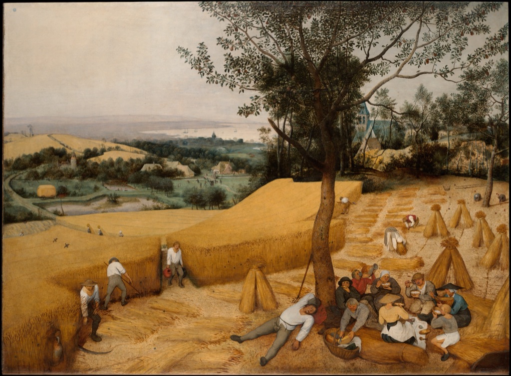
Bruegel: a hierarchy across a landscape
Pieter Bruegel the Elder's The Harvesters, 1565, is in The Metropolitan Museum of Art, accession 19.164.[13] Workers cut and carry wheat, figures rest beneath a tree, paths cross fields, and a village and water extend into the distance.
The shaded group at the left carries immediate weight, but it does not close the image. Lines of cut wheat and paths lead outward; small activities reappear across the middle distance; the high viewpoint keeps the far landscape available. Attention is distributed through unequal clusters, demonstrating that a readable hierarchy can unfold across a whole scene rather than terminate at one centre.
Emphasis and neighbouring principles
Contrast describes difference; emphasis describes the visual priority that difference may produce. A sharp light-dark contrast can make one area dominant, but difference may also be spread throughout a work without creating a single focal point. Balance concerns the distribution of visual weight, while unity concerns how parts cohere and variety concerns sustained difference across the whole.[1][2][3]
Pattern is organised recurrence; an interruption in a pattern may become emphatic because it changes the order. Rhythm concerns pace and interval, while movement concerns directed action or the path followed by the eye. A gesture may guide attention toward an emphatic area, but the direction and the priority are not the same principle. These relationships can overlap in one artwork without making the terms interchangeable.[1][2]
Related looking
The Principles of Art sets emphasis beside the other organising relationships. For a fuller account of recurrence and interruption, see Pattern in Art. The artworks above also connect to existing studies of Jacques Louis David and The Death of Socrates, Winslow Homer and The Gulf Stream, and Rembrandt and Aristotle with a Bust of Homer.
Other focused concepts remain distinct subjects: Contrast in Art; Unity in Art; Balance in Art; Variety in Art; Rhythm in Art; Movement in Art; Composition in Art. None is required to recognise the hierarchies shown on this page.
Look for emphasis yourself
Choose an unfamiliar artwork and give yourself only a moment before looking away. What do you remember first: a face, colour, bright interval, isolated object or dense group? Return to the work and locate two quieter areas. The comparison is more revealing than the first glance alone.
Now name the visible evidence. Is the dominant area larger, brighter, more isolated or differently placed? Do lines, gestures or gazes converge upon it? If several areas attract you, trace their order rather than forcing one winner. If attention is distributed, identify the clusters that keep it moving and the differences that stop the scene becoming uniform.
Finally, separate priority from direction and difference. Ask what stands out, what leads you there, and what contrasts with it. Emphasis becomes clearer when you can describe both the commanding area and the subordinate relationships that allow it to command.
Watch: Emphasis through Formal Analysis
Choose a whole-work formal analysis, a close reading of light and directional attention, or a visual-elements foundation.
Introducing Formal Analysis: Landscape
Trace how placement, contrast and scale create unequal priorities across a complete landscape.
Watch on YouTubeFrequently Asked Questions
Emphasis is the relative visual priority given to parts of an artwork.
Contrast, relative size, placement, isolation, direction, gaze, grouping and interruption can work together to create emphasis.
No. A focal point is one possible concentrated result of emphasis, while emphasis describes the broader visual hierarchy.
Yes. Several focal areas can be ordered or attention can be distributed across related clusters.
Contrast describes perceptible difference; emphasis describes the priority that visual relationships may produce.
Discussion
Which work on this page creates the clearest hierarchy without relying on a single focal point?
Reader Insights
An area becomes dominant through its relationship with quieter parts.
If several areas attract attention, notice which arrives first and what follows.
Support a hierarchy reading with scale, light, position, gaze, gesture or space.
Join the Conversation
Share one precise emphasis observation or a useful museum example below.
References
- J. Paul Getty Museum, “Understanding Formal Analysis — Principles of Design”
- Museum of Modern Art, “A Vocabulary for Discussing Art — Principles of Design”
- Massachusetts College of Art and Design, “Principles and Elements”
- Colorado Mesa University, “2D Design Handbook”
- Brigham Young University–Idaho Department of Art, “Design Principles — Focal Point”
- The Metropolitan Museum of Art, Jacques Louis David, The Death of Socrates, 1787
- National Gallery of Art, John Singleton Copley, Watson and the Shark, 1778
- The Metropolitan Museum of Art, Goya, Manuel Osorio Manrique de Zuñiga (1784–1792), 1787–88
- The Metropolitan Museum of Art, Winslow Homer, The Gulf Stream, 1899; reworked by 1906
- The Metropolitan Museum of Art, Rembrandt, Aristotle with a Bust of Homer, 1653
- National Gallery of Art, Claude Monet, Woman with a Parasol - Madame Monet and Her Son, 1875
- The Metropolitan Museum of Art, Georges de La Tour, The Penitent Magdalen, ca. 1640
- The Metropolitan Museum of Art, Pieter Bruegel the Elder, The Harvesters, 1565