by Tom Gurney
Tom Gurney BSc (Hons) is an art history expert with over 20 years experience
Page created on September 2, 2026 / Page updated on September 13, 2026
Email: tomgurney1@gmail.com / Phone: +44 7429 011000
Difference Gives the Eye Something to Compare
Contrast in art is a relative, perceptible difference between visual qualities or parts of an artwork. A pale shape is not contrast by itself; it becomes contrasting when you compare it with a darker value, a stronger colour, a different form or another surrounding quality. Contrast therefore belongs to a relationship, not to one isolated mark or object.[1][2]
The parts being compared do not have to touch. A bright opening in a distant sky can answer a pale building lower in the same scene, just as a dark figure can stand apart from a light field beside it. What matters is that the difference can be seen and compared within the work.
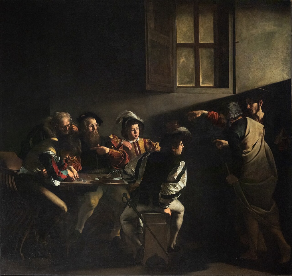
Caravaggio, The Calling of Saint Matthew, 1599–1600, Contarelli Chapel, San Luigi dei Francesi, Rome. The narrow beam and illuminated faces become legible against a much darker room, making the painting a useful early example of contrast in value and direction. Image: Wikimedia Commons, public-domain/CC0 reproduction.
At a Glance
- Core ideaa perceptible difference between visual qualities.
- Common comparisonsvalue, colour, scale, shape, texture and edge.
- Degreecontrast may be strong, restrained or varied within one work.
- Purposeto separate, clarify, distinguish or help organise attention.
- Close neighbouremphasis concerns priority rather than difference itself.
Contents
Contrast may be forceful or restrained. A black form against white paper creates a greater value difference than black against dark grey, but high contrast is not automatically more successful than low contrast.[3] Artists can use close relationships to slow the eye, preserve atmosphere or reveal small changes that a harsher opposition would overwhelm.
Contrast is a matter of degree
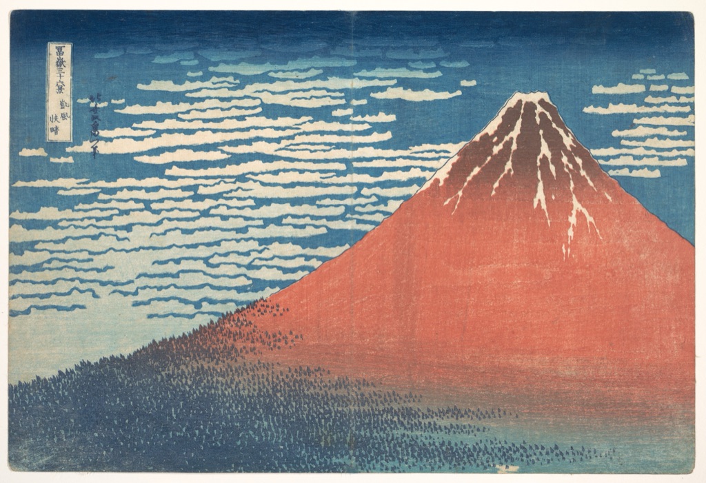
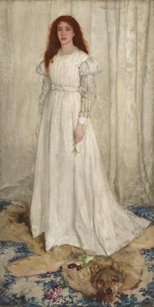
Begin by asking what differs. The answer might be lightness, colour, relative size, shape, form or visible texture. More than one relationship often operates at once: a large red mountain can differ from its surroundings in colour, scale and outline, while pale cloth against a white curtain may rely on quieter changes of value, edge and surface.[1][2]
Next ask how far apart those qualities appear. High and low are useful descriptions of degree, not two fixed kinds into which every artwork must fall. A painting may contain a strong dark-light division in one area and much closer colour relationships elsewhere. Neither passage cancels the other.
Finally, notice where the differences occur. Contrast may gather around one figure or edge, or recur across a broad visual field. “Concentrated” and “distributed” describe what you can see in a particular work; they are not a universal taxonomy. The aim is to describe a relationship precisely, not to force the whole image into a label.
How to recognise contrast
Look first, then name the relationship. These prompts are practical cues rather than a numbered system of contrast types.[1][2][4]
- Compare values. Where do the lightest and darkest passages meet or answer one another across the work? Where are the differences much closer?
- Compare colours. Which colours separate clearly, and which remain within a restrained family? A colour can be vivid without dominating every surrounding colour.
- Compare relative size. Does a large form meet much smaller ones, or do repeated forms change scale as they spread through the scene?
- Compare shapes and forms. Look for differences between angular and curved, compact and open, or solid-looking and flattened configurations.
- Compare visible surfaces. Rough and smooth, dense and thin, or patterned and plain passages can create texture differences without turning contrast into a texture lesson.
- Follow edges and directions cautiously. A crisp edge may become clearer beside dissolving paint, and one angled tendency may differ from another. These are observations about an exact work, not standalone universal methods.
After finding a difference, ask what it changes in the act of looking. It may separate a figure from its ground, make an interval easier to notice, distinguish repeated forms or help one area gain priority. That effect should be demonstrated rather than assumed.
Contrast across eight artworks
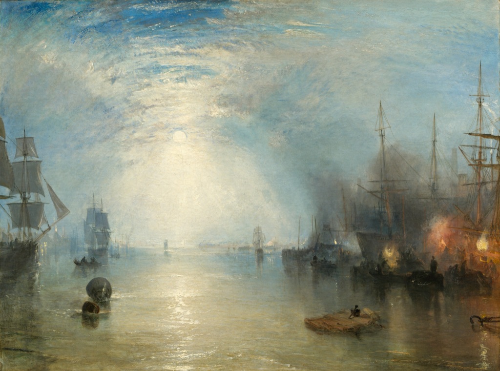
Turner: strong light, haze and distance
Joseph Mallord William Turner's Keelmen Heaving in Coals by Moonlight, 1835, belongs to the National Gallery of Art, Washington, accession 1942.9.86.[7] A pale moon opens the left side of the harbour, while orange fires burn among darker ships to the right.
The brightest differences gather around moon, water and flame, yet much of the painting is made from closer greys and browns. Masts and hulls sometimes read as silhouettes; elsewhere their edges dissolve into smoke and mist. Turner lets strong and restrained contrast coexist, so the atmosphere remains spacious rather than becoming a simple split between light and dark.
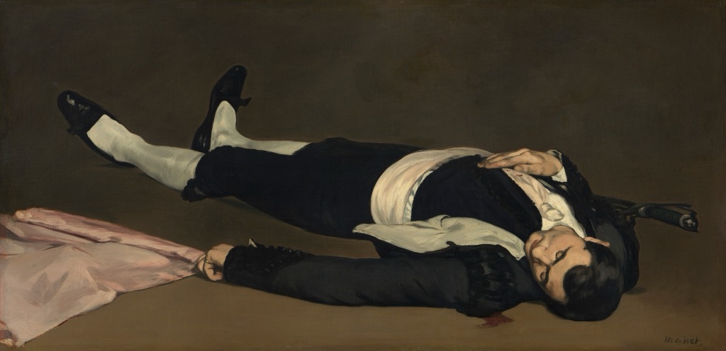
Manet: black, white and a close brown ground
Édouard Manet's The Dead Toreador, probably 1864, is in the National Gallery of Art, Washington, accession 1942.9.40.[8] A horizontal figure in black and white lies across a brown ground beside a pale pink flag.
The white shirt and stockings make clear value differences against the dark clothing, while parts of the black costume sit much closer to the surrounding brown. The flag introduces a lighter, warmer shape without becoming the only point of attention. Contrast changes from one edge of the figure to another rather than remaining equally strong around the whole silhouette.
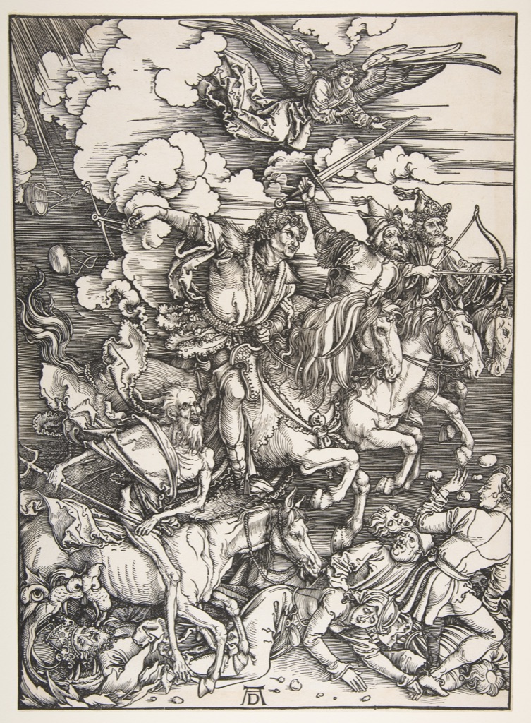
Dürer: dense line against open paper
The Metropolitan Museum of Art holds Albrecht Dürer's 1498 woodcut The Four Horsemen, from The Apocalypse, accession 19.73.209.[9] Riders, horses and fallen figures are compressed into a field of black lines, while unprinted paper remains visible between and around them.
Some areas grow dark through dense hatching and overlapping contours; others open into broad white intervals. The contrast is therefore built not only from black beside white but from changing line density. Diagonals differ from more stable margins and vertical accents, but their sustained action and the viewer's path through the scene belong to Movement rather than to this definition of contrast.
Hokusai: colour fields and relative scale
Katsushika Hokusai's South Wind, Clear Sky (Gaifū kaisei), also known as Red Fuji, from the series Thirty-six Views of Mount Fuji, ca. 1830–32, belongs to The Metropolitan Museum of Art, object JP2960.[10] The mountain occupies much of the print as a broad red form beneath blue sky and pale clouds.
Its scale separates it from the narrow band of dark trees below, while its warm colour differs from the cooler sky around it. Fine dark marks on the slope interrupt the large field without breaking its overall shape. This is a different work and a different lesson from the Great Wave: here the useful comparison lies in broad colour, shape and relative scale.
El Greco: differences spread through a landscape
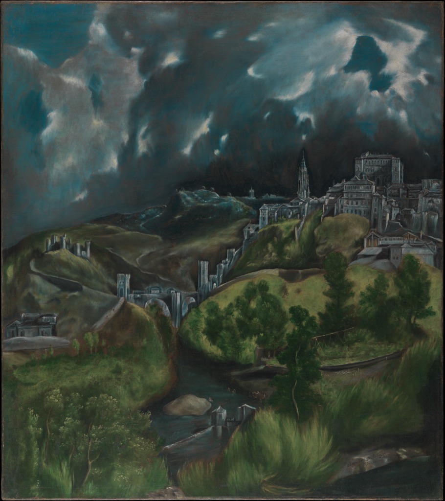
El Greco's View of Toledo, ca. 1599–1600, is held by The Metropolitan Museum of Art, accession 29.100.6.[11] Pale buildings rise from dark green hills beneath a blue-green sky broken by lighter clouds.
No single boundary contains all the contrast. Light catches separate buildings, slopes and cloud openings, so value differences recur across the vertical landscape. Some pale structures stand sharply against the land; other edges soften into surrounding greens and greys. The contrast is distributed, but it remains specific enough to distinguish city, terrain and weather.
Monet: close greens with local differences
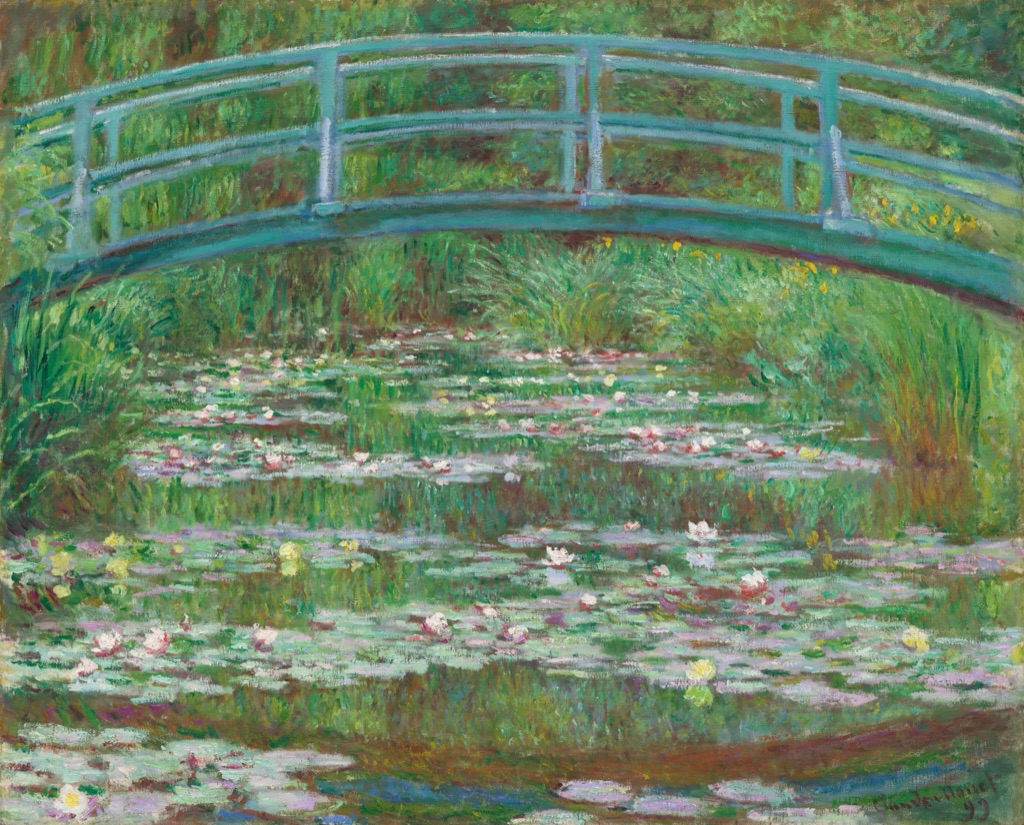
Claude Monet's The Japanese Footbridge, 1899, belongs to the National Gallery of Art, Washington, accession 1992.9.1.[12] The bridge arches through a field of blue-green and yellow-green paint above a pond scattered with pale water lilies.
The work does not depend on a severe opposition. Bridge, foliage, water and reflection remain within closely related colours, while local differences in value, edge and brushwork allow them to separate. The pale flowers register because the surrounding field is restrained. Low contrast here is not an absence of structure; it makes small variations matter.
Whistler: white against white
James McNeill Whistler's Symphony in White, No. 1: The White Girl, 1861–1863 and 1872, is in the National Gallery of Art, Washington, accession 1943.6.2.[13] A red-haired woman in a white dress stands before a white curtain, above a dark animal pelt and patterned rug.
Dress and curtain are close in value, but they remain distinct through folds, edges and differences of surface. The dark pelt below creates a much stronger value change, while hair, flowers and rug add bounded colour accents. Looking between these relationships shows why “white on white” does not mean uniformity: close values can still carry clear texture and form.
Bonheur: difference among repeated forms
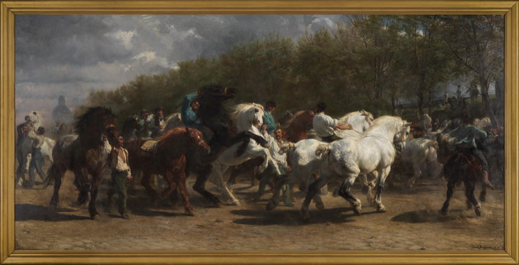
Rosa Bonheur's The Horse Fair, 1852–55, belongs to The Metropolitan Museum of Art, object 87.25.[14] Dark brown, black and white horses fill a panoramic market scene alongside handlers and distant groups.
The horses repeat as related forms, but differences in value, scale, overlap and density keep the mass legible. A pale horse becomes clearer among darker neighbours; a compact cluster differs from an open interval; larger foreground bodies answer smaller distant ones. Those comparisons help separate the crowd without reducing the scene to one dramatic light-dark effect. The animals' action belongs to Movement; here the focus remains on the visible differences among them.
Contrast and neighbouring principles
Contrast describes difference; Emphasis in Art describes relative priority and focal organisation. Contrast can help one area become emphatic, but a work may distribute strong differences across many parts without creating one dominant centre. Value and colour name visual elements or qualities; contrast describes a relationship between perceptibly different values or colours.[1][5][6]
Variety concerns sustained diversity, balance the distribution of visual weight, and unity the coherence of parts. Pattern is organised recurrence, although an interruption can contrast with the order around it. Movement concerns directed action or the eye's path. These principles may overlap in one artwork, but each question remains useful because it asks the reader to notice a different relationship.[1][4][5]
Related looking
The Principles of Art places contrast beside other organising relationships. Balance, emphasis, unity and composition may all involve difference, but contrast stays focused on what differs, by how much and where that difference becomes visible.
Focused subjects that remain distinct are Value in Art; Colour in Art; Shape in Art; Form in Art; Texture in Art; Variety in Art; Balance in Art; Unity in Art; Movement in Art; Composition in Art. Pattern remains organised recurrence, while Emphasis remains the useful working comparison for priority and focal organisation.
Look for contrast yourself
Choose an unfamiliar artwork and find one difference that is immediately visible. Name both sides of the comparison: not simply “bright”, but “a pale sleeve against a dark coat”; not simply “large”, but “one broad form beside several small ones”. Then find a second relationship elsewhere in the work.
Compare their degrees. Is one sharp and the other restrained? Do the parts touch, or do you compare them across the image? Notice whether the difference gathers around a particular area or appears in several places. These questions turn a quick impression into a description that another person can test by looking.
Finally, ask what the difference does. Does it separate figure from ground, distinguish repeated forms, clarify depth or help one area gain priority? Contrast becomes most useful when the answer identifies both the visible relationship and its effect without assuming that stronger always means better.
Watch: Contrast through Formal Analysis
Choose a museum-led formal-analysis introduction, a close reading of Caravaggio's dramatic value structure, or a foundations overview.
Introducing Formal Analysis: Landscape
Follow how value, colour, edges and scale become meaningful through comparison across a complete landscape.
Watch on YouTubeFrequently Asked Questions
Contrast is a perceptible difference between visual qualities or parts of an artwork.
Artists can create contrast through differences in value, colour, size, shape, form, texture, edge or density.
No. Black against white is strong value contrast, but any visible difference between qualities can create contrast.
No. Strong and restrained contrast can each serve different visual purposes.
Contrast describes difference, while emphasis describes relative priority or focal organisation.
Discussion
Which work on this page uses the most revealing combination of strong and restrained contrast?
Reader Insights
Replace “bright” with a comparison such as “a pale sleeve against a dark coat”.
One work can contain both sharp opposition and very close relationships.
Contrast can guide attention, but strong contrast is not automatically better.
Join the Conversation
Share one precise contrast observation or a useful museum example below.
References
- Museum of Modern Art, “A Vocabulary for Discussing Art — Principles of Design”
- Council for the Curriculum, Examinations and Assessment, “GCSE Art and Design Factfile — Composition”
- J. Paul Getty Trust, “Primary Forms — Bauhaus”
- J. Paul Getty Museum, “Understanding Formal Analysis — Principles of Design”
- Massachusetts College of Art and Design, “Principles and Elements”
- J. Paul Getty Museum, “Vocabulary for Describing an Artwork”
- National Gallery of Art, Joseph Mallord William Turner, Keelmen Heaving in Coals by Moonlight, 1835
- National Gallery of Art, Édouard Manet, The Dead Toreador, probably 1864
- The Metropolitan Museum of Art, Albrecht Dürer, The Four Horsemen, from The Apocalypse, 1498
- The Metropolitan Museum of Art, Katsushika Hokusai, South Wind, Clear Sky (Red Fuji), ca. 1830–32
- The Metropolitan Museum of Art, El Greco, View of Toledo, ca. 1599–1600
- National Gallery of Art, Claude Monet, The Japanese Footbridge, 1899
- National Gallery of Art, James McNeill Whistler, Symphony in White, No. 1: The White Girl, 1861–1863, 1872
- The Metropolitan Museum of Art, Rosa Bonheur, The Horse Fair, 1852–55