by Tom Gurney
Tom Gurney BSc (Hons) is an art history expert with over 20 years experience
Page created on September 2, 2026 / Page updated on September 13, 2026
Email: tomgurney1@gmail.com / Phone: +44 7429 011000
How Placement, Direction and Boundaries Make a Whole
Composition in art is the organisation of an artwork's parts so that they can be understood as a realised whole. It concerns not only what is present, but where things are placed, how they relate in scale and direction, what gathers together or remains apart, and what happens at the work's edges.[1][2]
One useful way to approach the idea is to treat the elements of art as visual resources, the principles of art as names for relationships among them, and composition as the particular whole those relationships produce. This is a practical bridge rather than a universal institutional formula: museums and teaching resources organise the vocabulary in different ways.[1][3][4]
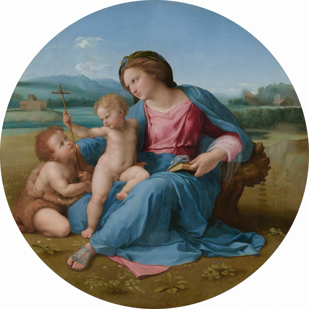
Raphael, The Alba Madonna, c. 1510. The round support, overlapping figures and exchanged gestures show how boundary, grouping and direction work together. Image: National Gallery of Art, public domain.
At a Glance
- Core ideacomposition is the organisation of parts, intervals and boundaries as a realised whole.
- Look forplacement, grouping, scale, direction, depth, cropping and active empty space.
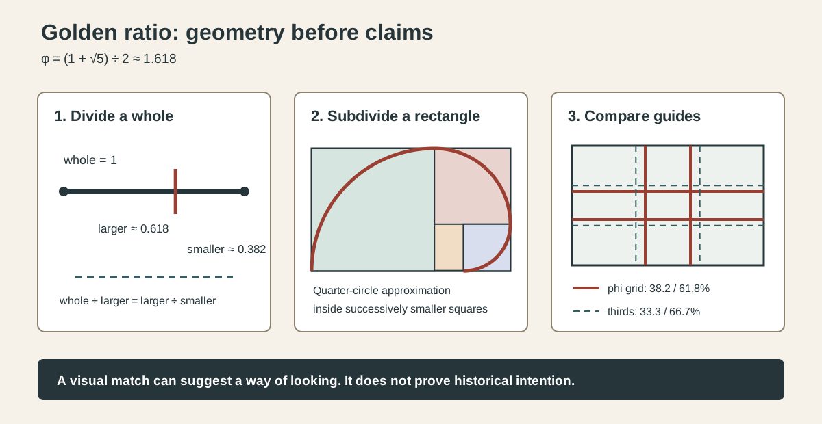
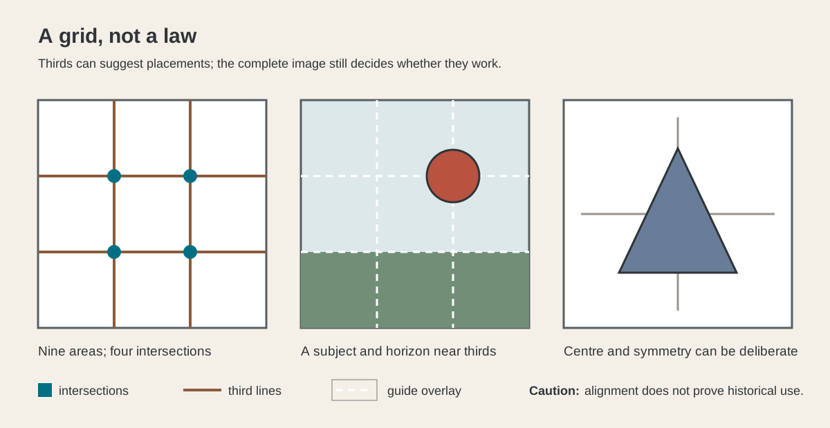
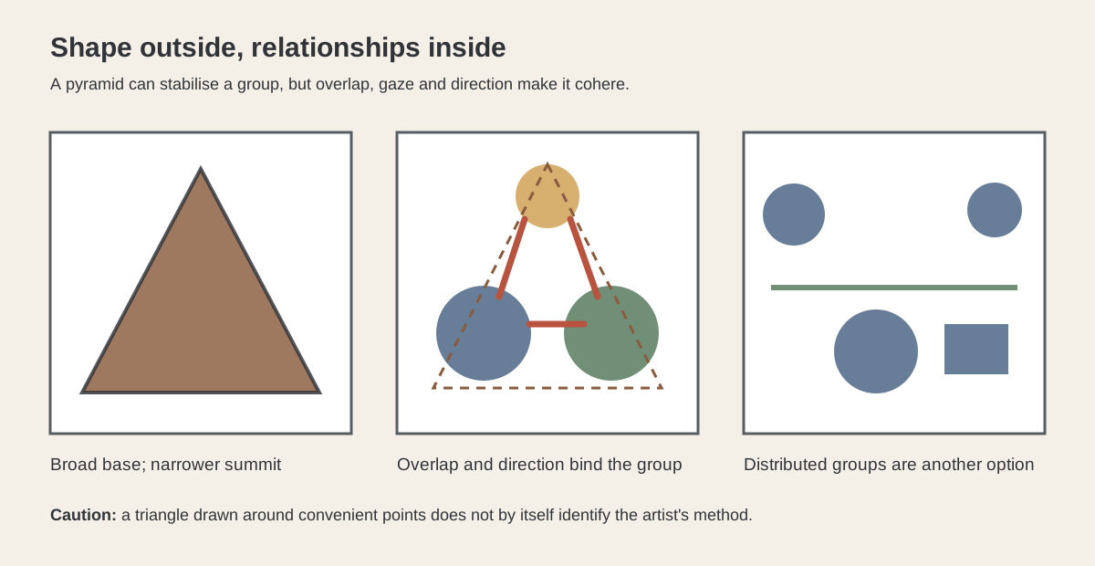
- Not a recipethirds, pyramids and ratios are possible tools rather than universal rules.
- Read relationallya part changes when its neighbours, scale or distance from the edge change.
- Explore methodscompare thirds , pyramids and other focused guides.
Contents
Composition is not the same as subject matter or style. It is not a guarantee of beauty, realism, symmetry or quality, and it is not a recipe that makes one arrangement correct. Two artists can work with similar figures, colours or spaces and organise them into very different experiences.
How parts become a whole
An artwork may contain a person, a chair, a wall and a window, but naming those things does not yet describe its composition. The compositional question is how their sizes, intervals and directions make a connected field. A small figure surrounded by open space does something different from the same figure pressed against other forms. A diagonal may connect areas that would otherwise feel separate. Repeated shapes can bind a wide object without making every part identical.
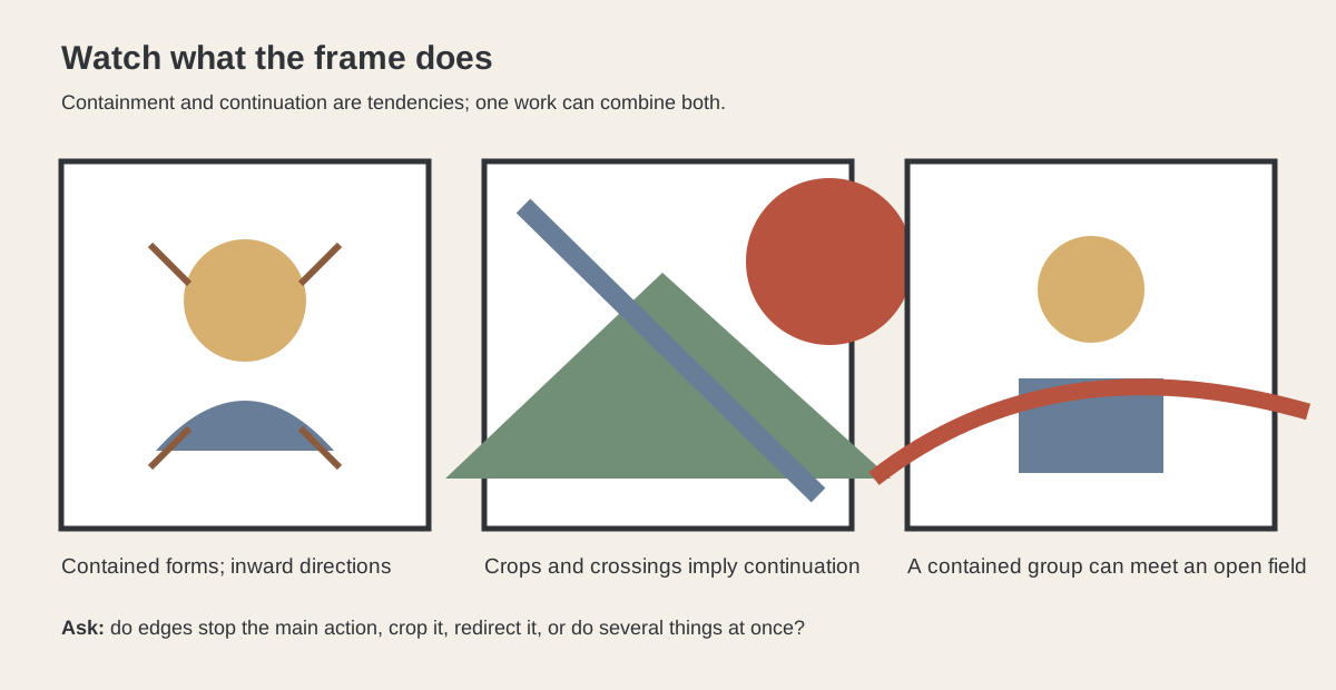
The boundary matters too. A painting's frame, a print's sheet edge or a sculpture's outer contour is not simply where the artwork stops. Forms can sit securely inside it, lean towards it or be cut by it. Cropping may imply that something continues beyond the visible field. Empty areas can give a group room to breathe or make it feel exposed.
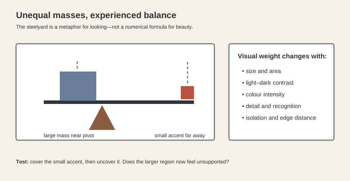
Composition is relational. No part carries the whole structure by itself. Placement changes scale; scale changes visual weight; an edge changes the effect of a direction. Words such as dominant and subordinate can help describe these relationships, but they are observations about a particular work, not fixed compositional types.
Four questions for reading a composition
When you meet an unfamiliar work, begin with four questions:
- What are the main parts and areas? Notice figures, objects, broad shapes, open fields and divisions before deciding what is most important.
- How are they placed, grouped and scaled in relation to one another? Compare clusters and gaps, large and small forms, central and off-centre positions.
- Which directions and depth-or-flatness relationships connect or separate them? Follow visible diagonals, verticals, curves, overlaps and changes of scale without assuming that every viewer must travel along one path.
- How do the frame, cropping and edges complete or interrupt the whole? Look for forms that meet an edge, continue beyond it or leave an active interval beside it.[2][4]
Use these questions as flexible prompts for looking. They can be used with paintings, prints and objects, and they do not require a rule of thirds, a golden ratio or a judgement that one arrangement is inherently better than another.
Placement, grouping and relative scale
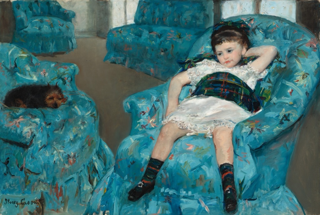
Cassatt: intervals around a resting figure
Mary Cassatt, Little Girl in a Blue Armchair, 1878, is an oil-on-canvas painting in the National Gallery of Art, Washington (accession 1983.1.18).[6] The child rests low and off-centre among several blue chairs. Furniture fills much of the room, yet the intervals between its rounded forms prevent the setting from becoming one solid block.
The repeated chairs connect the field, while their different angles keep the arrangement from becoming mechanically regular. The small dog on a separate seat extends the grouping across the width. The lesson is not simply that the picture is asymmetrical; it is that unequal positions and gaps can still belong to one organised whole.
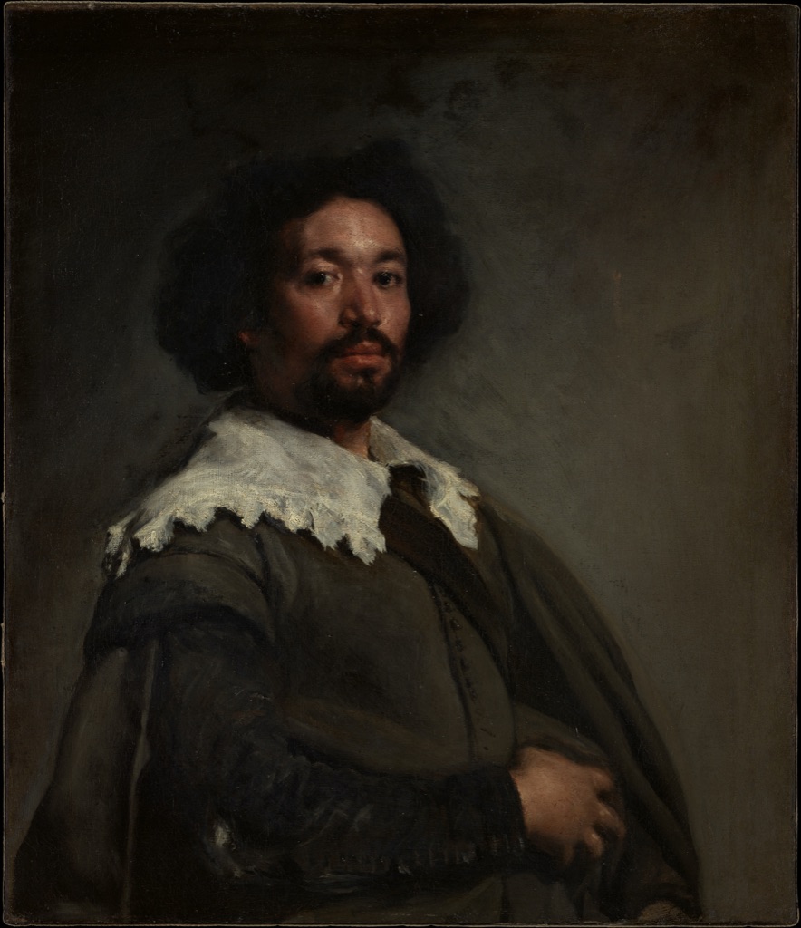
Velázquez: a figure held by a quiet field
Diego Velázquez, Juan de Pareja (ca. 1608–1670), 1650, is an oil-on-canvas portrait in the Metropolitan Museum of Art (accession 1971.86).[8] The sitter occupies a strong vertical area, while a broad muted background remains comparatively quiet. His head, collar and shoulders form a compact group rather than spreading across the canvas.
That surrounding field is not leftover space. It gives the figure room and makes the turn of the shoulders legible. The portrait shows how composition can be concentrated without becoming cramped and how a relatively simple placement can hold attention without a crowded scene.
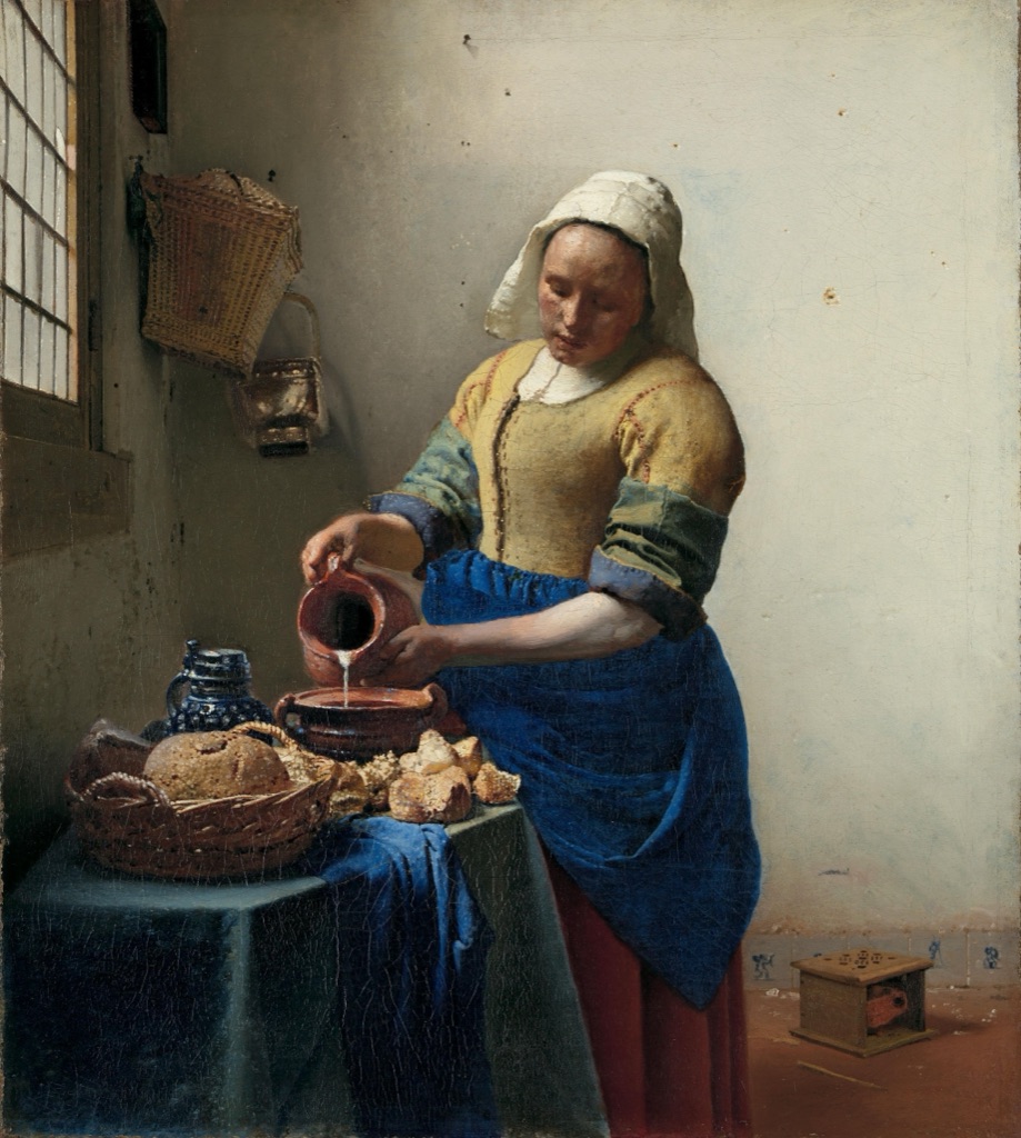
Vermeer: a compact group beside an open wall
Johannes Vermeer, The Milkmaid, c. 1660, is an oil-on-canvas painting in the Rijksmuseum (object SK-A-2344).[10] A standing woman, table, bread and vessels gather in the lower-left part of the room. Above and beside them, a large pale wall opens into a quieter area broken by a window, a few small objects and subtle marks.
The compact tabletop group feels substantial because it is measured against that open wall. Horizontal and vertical edges steady the room, while the woman's bent arms and the stream of milk create smaller connecting directions. The arrangement demonstrates that an apparently empty area may be one of the most active structural parts of a picture.
Direction, depth and the frame
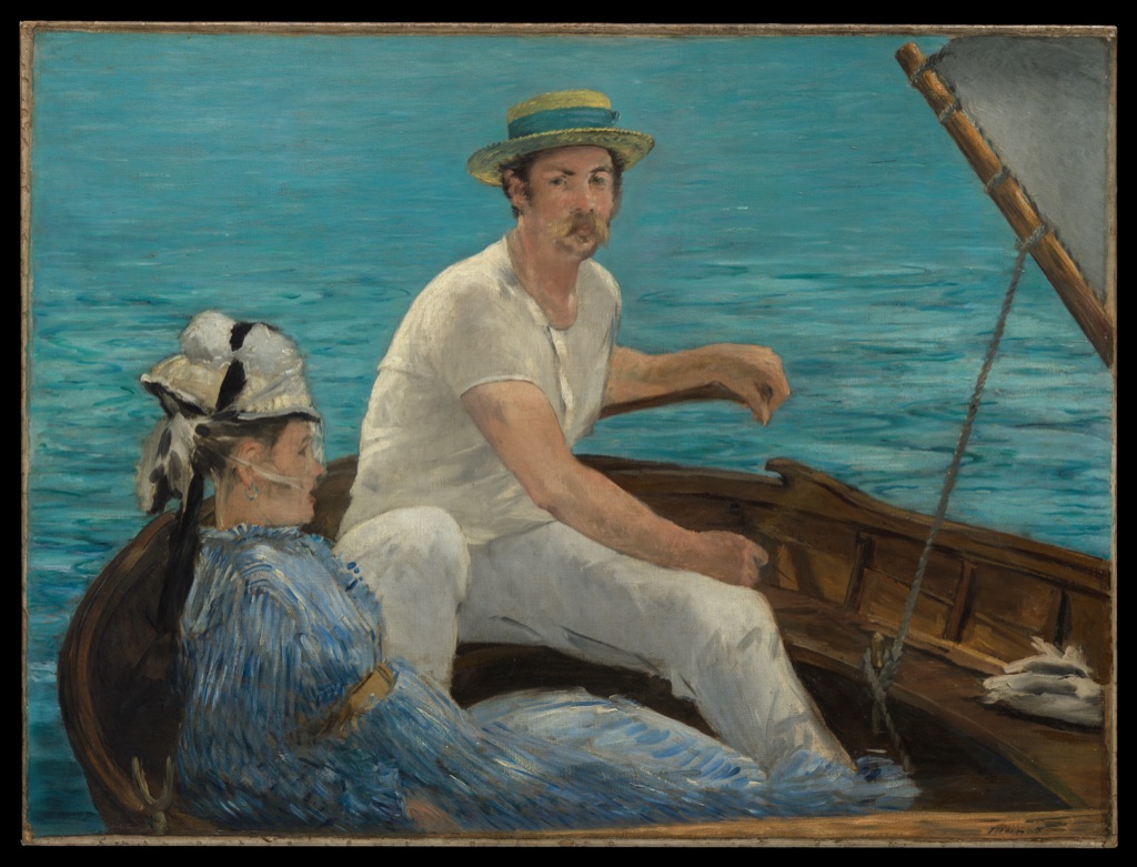
Manet: a boat pressed close to the surface
Édouard Manet, Boating, 1874, is an oil-on-canvas painting in the Metropolitan Museum of Art (accession 29.100.115).[5] The boat cuts across the lower field, the mast rises sharply, and a pale sail occupies a large triangular area. The man's body is cropped by the right edge, while the water closes off a distant horizon.
Those decisions compress the scene. Boat, people, sail and water seem close to the picture surface even though they describe an outdoor space. The cropping does not merely remove information; it makes the frame feel active and lets the diagonal boat continue imaginatively beyond what can be seen.
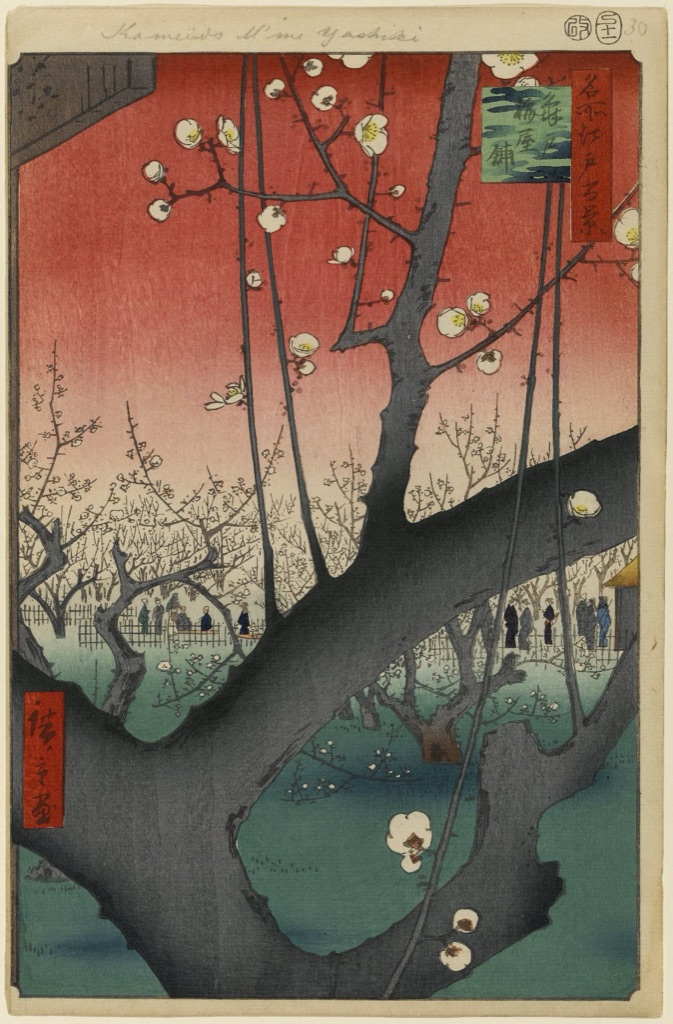
Hiroshige: an edge becomes the subject
Utagawa Hiroshige, Plum Estate, Kameido, no. 30 from One Hundred Famous Views of Edo, was made in the eleventh month of 1857 and is held by the Brooklyn Museum (accession 30.1478.30).[9] A huge plum branch enters from several edges and crosses the foreground. Beyond it, tiny visitors and flowering trees occupy a much smaller world.
The branch is both a form and a framing device. Its scale places it very near, while the reduced figures and garden establish distance. Because the trunk is cropped, the composition feels open to a larger setting beyond the sheet. Depth comes less from a continuous measured recession than from the striking relationship between near and far.
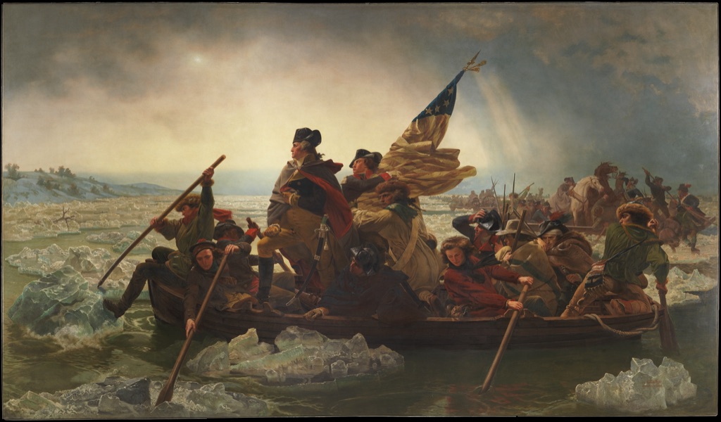
Leutze: one diagonal carrying a large group
Emanuel Leutze's Washington Crossing the Delaware, 1851, is an oil-on-canvas painting in the Metropolitan Museum of Art (accession 97.34).[11] A crowded boat rises diagonally through broken ice and dark water. Figures, oars, flag and sky do not point in exactly the same direction, but their angles gather around the boat's advance.
The diagonal is effective because other relationships support it: the boat stretches across the wide format, standing and seated figures produce a hierarchy of heights, and darker water gives way to a lighter horizon. This is a whole-work lesson rather than a formula that every dramatic scene must follow.
Crowded and distributed arrangements
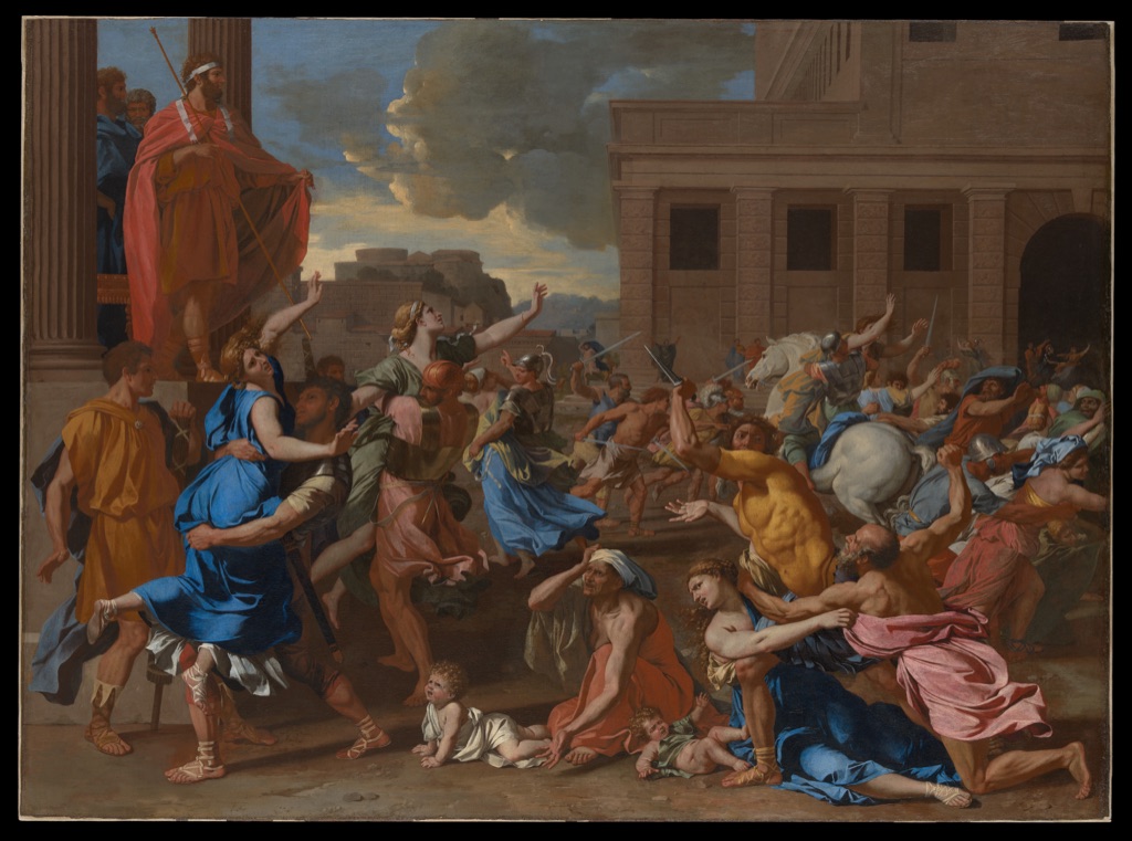
Poussin: organising many simultaneous actions
Nicolas Poussin, The Abduction of the Sabine Women, probably 1633–34, is an oil-on-canvas painting in the Metropolitan Museum of Art (accession 46.160).[7] Numerous figures move in opposing directions across a classical square. Some cluster tightly; others open intervals that reveal paving, architecture and distant sky.
The painting remains readable because action is distributed in groups rather than dissolved into an even crowd. Arms, bodies and architectural lines set up competing directions, while the broad setting keeps the separate encounters within one field. Composition here means coordinating difference, not making every movement agree.
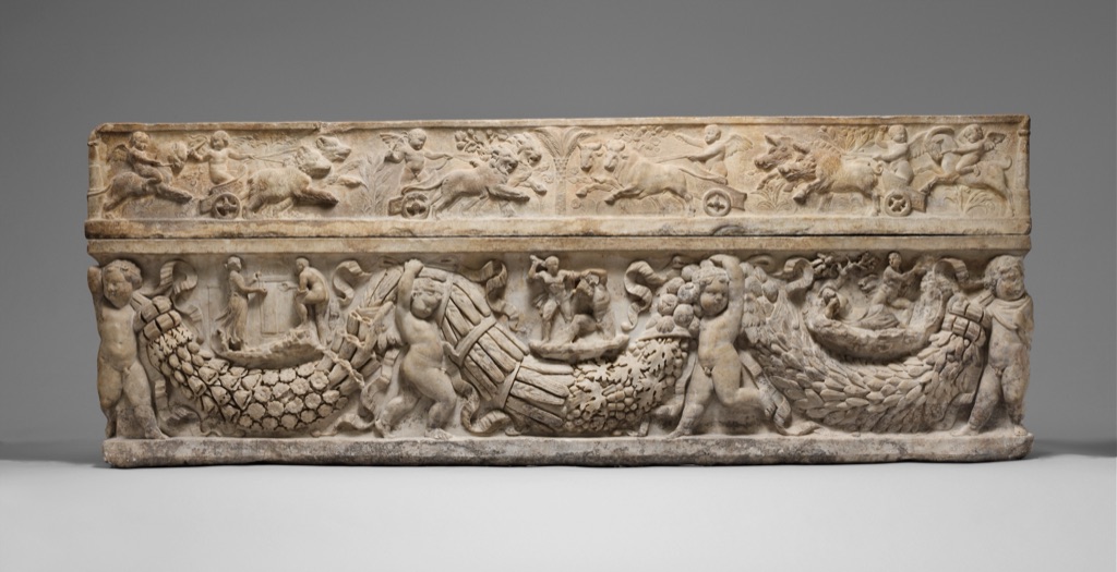
Roman sarcophagus: a whole stretched across an object
The Marble sarcophagus with garlands and the myth of Theseus and Ariadne, made by an unidentified Roman maker around 130–150 CE, is in the Metropolitan Museum of Art (accession 90.12a, b).[12] Repeated hanging garlands run across the long marble chest, while framed relief figures and motifs occupy the spaces above, below and between them.
Its composition belongs to an object rather than a flat picture. Repetition connects the length, but changes in figure, interval and relief prevent the surface from becoming uniform. The lid and chest form a complete structure, and the outer edges determine how the carved sequences begin, pause and end. The example shows that whole-work organisation can extend across material, contour and several connected zones.
Similar resources, different organisations
Cassatt and Poussin both use repeated figures or forms, gaps and directional changes, yet the resulting wholes feel markedly different. Cassatt leaves broad intervals around a low, resting figure; Poussin distributes active groups across an architectural field. The point is not that one is calmer and therefore better. It is that similar resources can be arranged to create different relations of density, pause and direction.
Manet and Hiroshige offer another comparison. Both let major forms meet or cross the edge, but Manet's crop presses boat and figures towards the painted surface, while Hiroshige's enormous foreground branch opens a dramatic jump to the distant garden. Cropping is therefore not a single effect. Its meaning depends on every other part of the composition.
Elements, principles and composition
The Elements of Art provide names for visual resources such as line, shape, form, space, colour, value and texture. The Principles of Art describe useful relationships such as balance, emphasis, movement, pattern, proportion, rhythm, unity, variety and contrast. Composition asks how the selected resources and relationships become this particular whole.[3][4]
That distinction keeps the bridge useful. A diagonal line can contribute to Movement in Art, while a dominant area can be examined through Emphasis in Art. Here, those observations return to the larger arrangement: how the line, dominant area, intervals, depth and boundary work together.
Look at the whole
Begin with the part that first catches you, but do not stop there. Ask what sits beside it, what answers it elsewhere, which intervals separate it from other forms and how close it comes to the edge. Then step back and see whether those relationships change when the work is taken as a whole.
A strong reading does not need to discover a hidden formula. It needs to remain specific. Name the large and small areas, the groupings and gaps, the directions and depth, and the decisions at the boundary. Composition becomes useful when it helps you explain how separate parts belong to one encounter. For other ways into art, return to Art Topics.
Composition methods
Explore focused guides to common compositional structures and the evidence behind them.
Watch: Composition through Formal Analysis
Choose a museum-led whole-work analysis, a close reading, or a foundations overview for considering composition.
Introducing Formal Analysis: Landscape
Follow how recurring shapes, colours and intervals contribute to a larger visual organisation.
Watch on YouTubeFrequently Asked Questions
Composition is the organisation of an artwork’s parts, intervals, directions and boundaries so they operate as a particular whole.
Identify the main parts, compare placement and scale, follow directions and depth cues, and inspect cropping and the frame.
No. It is one planning grid among many and cannot determine visual weight, meaning or quality by itself.
Elements name visual resources, principles name useful relationships, and composition asks how those resources and relationships become this whole.
Yes. Intervals and open fields can separate, connect, expose, balance or concentrate other parts of a work.
Discussion
Which artwork on this page changes most when you treat the frame and empty intervals as active parts?
Reader Insights
Begin with broad areas and groups before small details.
Compare scale, direction, gaps and overlaps.
Cropping and boundary pressure can organise the whole.
Join the Conversation
Share one precise observation or a useful museum example below.
References
- National Gallery, “Composition”
- University of Leeds, “Unit A5: Composition”
- J. Paul Getty Museum, “Understanding Formal Analysis”
- Smarthistory, “Understanding art: an introduction to formal analysis”
- The Metropolitan Museum of Art, Édouard Manet, Boating, 1874
- National Gallery of Art, Mary Cassatt, Little Girl in a Blue Armchair, 1878
- The Metropolitan Museum of Art, Nicolas Poussin, The Abduction of the Sabine Women, probably 1633–34
- The Metropolitan Museum of Art, Diego Rodríguez de Silva y Velázquez, Juan de Pareja (ca. 1608–1670), 1650
- Brooklyn Museum, Utagawa Hiroshige, Plum Estate, Kameido, 1857
- Rijksmuseum, Johannes Vermeer, The Milkmaid, c. 1660
- The Metropolitan Museum of Art, Emanuel Leutze, Washington Crossing the Delaware, 1851
- The Metropolitan Museum of Art, Roman, Marble sarcophagus with garlands and the myth of Theseus and Ariadne, ca. 130–150 CE