by Tom Gurney
Tom Gurney BSc (Hons) is an art history expert with over 20 years experience
Page created on September 3, 2026 / Page updated on September 13, 2026
Email: tomgurney1@gmail.com / Phone: +44 7429 011000
Using the 3×3 Grid as a Test, Not a Verdict
The rule of thirds is a placement guide that divides a rectangular image into nine equal areas. Two vertical lines and two horizontal lines mark the thirds; their crossings create four possible points of emphasis. An artist can place a subject, horizon or important change near one of those lines instead of beginning automatically at the centre.[1][2]
Despite its name, it is not a law of vision and it does not guarantee a successful composition. It is best treated as a quick way to generate and compare arrangements. A centred figure, a high horizon or a shape pressed against an edge can be equally purposeful when the rest of the work supports that decision.
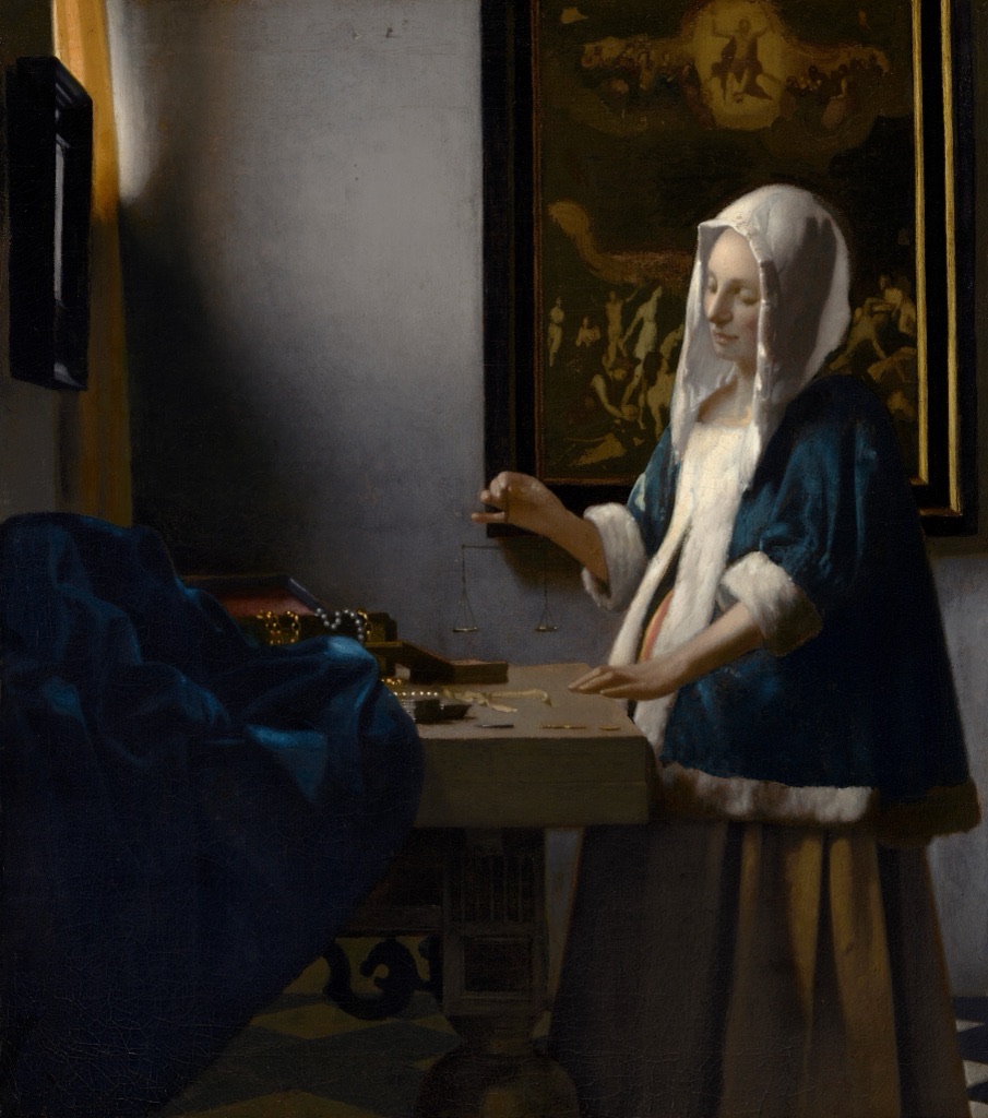
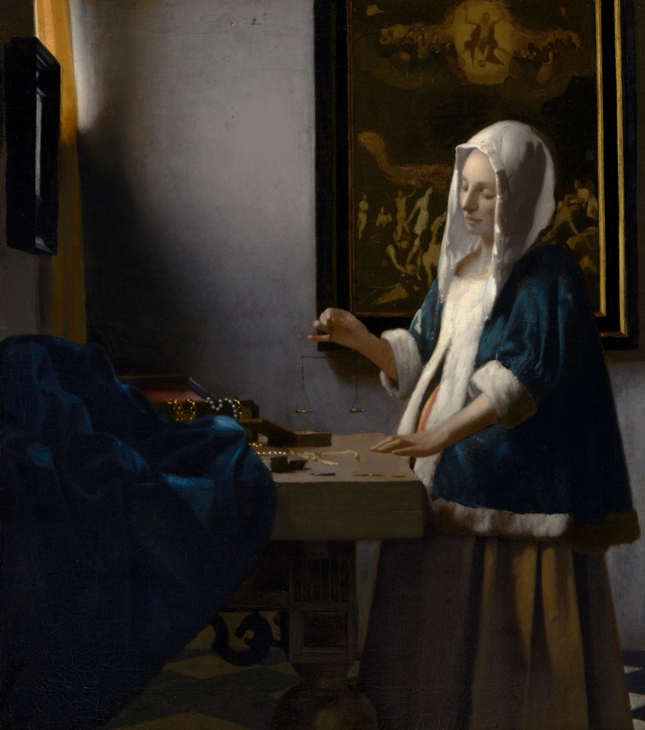
Johannes Vermeer, Woman Holding a Balance, c. 1664. Its organisation can be compared with a thirds grid, but balance depends on light, scale, intervals and subject relationships rather than grid intersections alone. Image: National Gallery of Art, public domain.
At a Glance
- Constructiontwo equally spaced verticals and two horizontals divide a field into nine rectangles.
- Useful fortesting subject placement, horizon height and directional space.
- Not a lawan intersection does not guarantee emphasis, balance or quality.
- Compare alternativescentre, shift, crop and change scale before deciding.
- Historical carea modern grid fitted to an old artwork does not prove the artist used it.
Contents
How the 3×3 grid works
Draw two vertical lines at one-third and two-thirds of the width, then repeat the division across the height. The result is three columns, three rows and four intersections. The lines offer more possibilities than the intersections alone: a standing figure might align roughly with a vertical third, while a landscape boundary may sit near a horizontal one.[1]
The guide is intentionally simple. It can be imagined through a camera viewfinder, drawn lightly on a sketch, or used when comparing alternative crops. It does not require every important feature to touch the grid. One strong placement may be enough; forcing several unrelated details onto the lines can make the exercise mechanical.
Read the guide
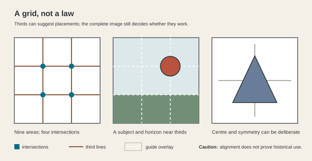
The first panel names the nine areas and four crossings. The second combines a subject near an upper-right crossing with a horizon near the lower horizontal third. The last panel shows a centred triangular form. That symmetrical alternative is not a mistake: it demonstrates that the grid is a choice, not a compulsory test.
Subject, horizon and directional space
For a single subject, begin with position and surrounding space. Moving a figure to the left third opens a larger field on the right. If the figure looks or moves into that field, the open area may become directional space. Reverse the relationship and the nearby frame edge can create pressure, abruptness or refusal.
A horizon near the lower third gives more of the image to sky; one near the upper third gives more to land or water. Neither placement is automatically better. The useful question is which region carries the visual information and atmosphere the work needs. A dramatic sky may deserve the larger share, while a complex foreground may reverse the emphasis.[1][2]
The same principle can organise groups. One cluster can occupy about a third of the width while a broader, quieter region answers it. The division need not be exact. A painter's eye, a viewfinder and a thumbnail sketch can all test whether the unequal areas feel connected.
Use the rule while making an image
Start with several small thumbnails rather than committing to one polished arrangement. Centre the subject in one, place it near each vertical third in two more, then vary the horizon or main horizontal boundary. Keep the subject and format broadly comparable so that placement, rather than extra detail, drives the comparison.
Next ask what fills the larger region. Empty space is not automatically active. Look for a direction, tonal field, secondary accent, repeated shape or edge that makes it belong to the subject. The rule supplies coordinates; it does not supply the relationships that turn those coordinates into a whole composition.
Photographers can make the same comparison in the viewfinder and refine it through cropping. University of Florida guidance presents the rule as a standard photographic technique and gives the familiar examples of eyes near an upper line and landscape horizons away from the middle.[1] Georgia Tech similarly describes it as a guideline for film and photography, especially useful for discouraging an unexamined central placement.[2]
Why it is a guide rather than a promise
Popular explanations sometimes say that people naturally prefer the four intersections or always find the centre dull. Those claims are stronger than the evidence allows. In experiments on the placement of a single object within a frame, Stephen Palmer, Yurika Hara and William Griscom found results that strongly contradicted the simplest prediction that third positions should be best and symmetrical positions worst.[3]
That finding does not make the rule useless. It changes what can honestly be claimed for it. The grid is a productive studio prompt, a shared vocabulary for discussing placement and a fast way to escape habit. It is not a biological formula for beauty.
The same caution matters with old paintings and prints. If a modern overlay passes near a face, hand or horizon, we can describe the alignment. We cannot infer that the artist used the rule without evidence from the making of the work. Cropping, reproduction boundaries and the freedom to choose among many features make accidental matches easy.
Four artworks: test the reading, not the artist
These works let us practise thirds-based observation without attributing the modern guide to their creators. In each case, first describe the complete arrangement. Then ask whether a grid adds a useful comparison.
Cassatt: a child among repeated intervals
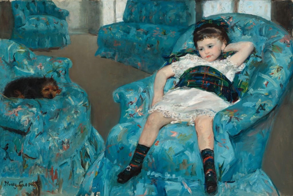
Mary Cassatt's Little Girl in a Blue Armchair, 1878, places a reclining child amid several large upholstered chairs. The National Gallery of Art holds the painting.[4] The child sits below and to one side of the geometric centre, while the chairs repeat across the wider room.
A thirds grid can help name the off-centre placement, but it cannot explain the whole design. The tilted chair backs, gaps of floor, small dog, floral upholstery and child's relaxed pose create a network of intervals. The larger lesson is how an unequal field stays connected through repetition and direction.
Manet: pressure at the frame
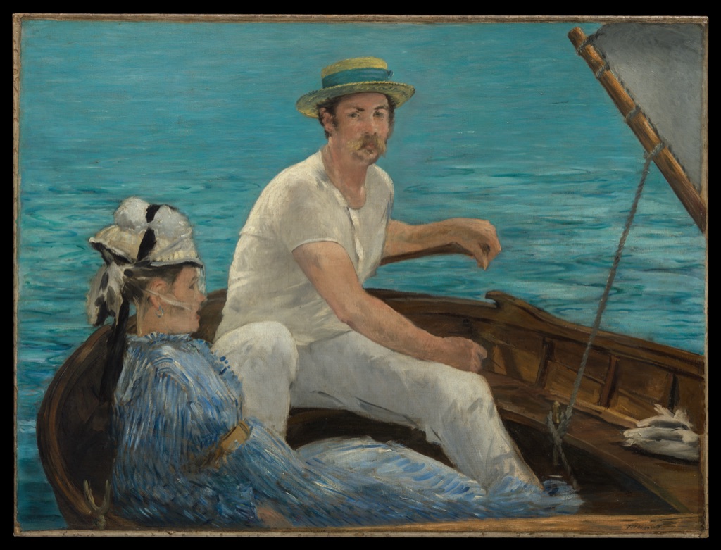
Édouard Manet's Boating, 1874, belongs to the Metropolitan Museum of Art.[5] A pale sail occupies a large upper area, the boat cuts across the foreground, and the man at the tiller is cropped by the right edge. Blue water closes the distance behind the pair.
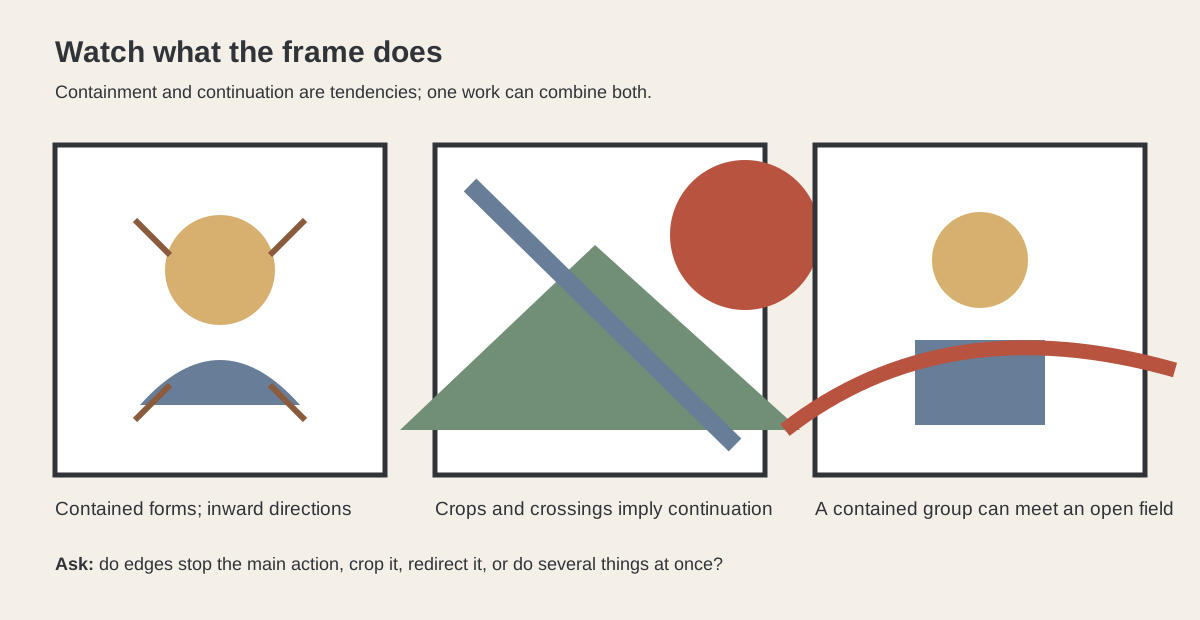
The figures can be compared with third lines, yet the crop matters more than a tidy crossing point. The man's body continues beyond the canvas, the mast establishes a strong vertical, and boat and sail divide the field on oblique paths. Manet shows why a placement guide must remain subordinate to edge, scale and direction.
Vermeer: a compact group and a broad wall
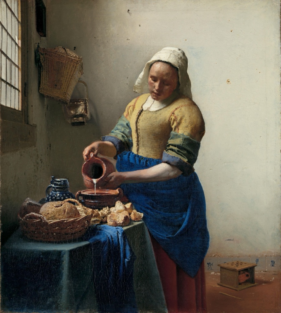
Johannes Vermeer's The Milkmaid, around 1660, is in the Rijksmuseum.[6] Woman, table, bread and vessels gather in the lower-left region, set against a tall pale wall. A window admits light from the left, while small wall details interrupt the quiet surface.
The unequal distribution resembles a thirds exercise: a dense area answers a larger open one. But the viewer's attention depends on light, colour and the woman's enclosed gesture as well as position. A grid identifies a division; the painting makes that division substantial.
Hokusai: scale across a low horizon
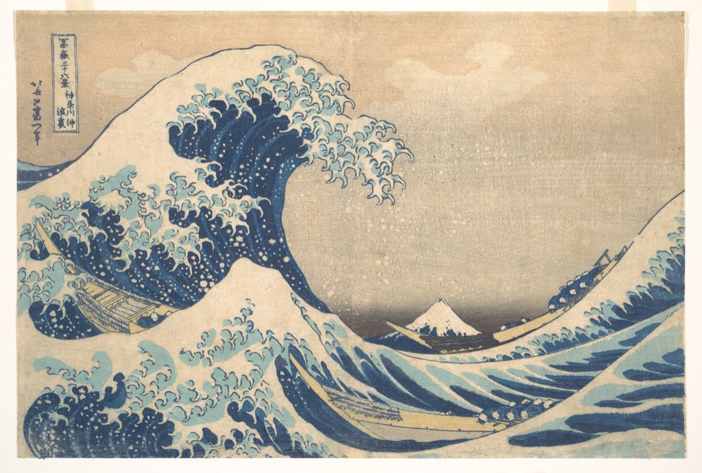
Katsushika Hokusai's Under the Wave off Kanagawa, about 1830–32, is represented here by a Metropolitan Museum impression.[7] The great foreground wave curves over three boats, while Mount Fuji appears very small near the horizon.
A low horizontal division is easy to notice, but the print does more than reserve a third for one zone. Near and far forms exchange shapes: claw-like foam echoes snow on Fuji, boats cut through the swell, and the wave's curve encloses distance. The grid can start the discussion, while relative scale and repeated contour carry it forward.
Rule of thirds, golden ratio and centring
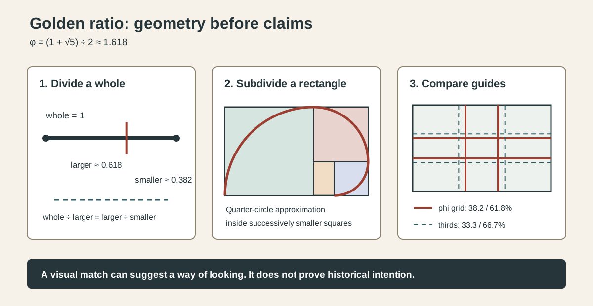
The thirds grid places its divisions at 33.3 and 66.7 per cent. A phi grid uses approximately 38.2 and 61.8 per cent, so its lines sit slightly nearer the centre. The Golden Ratio in Art guide explains that mathematical relationship and the evidence needed for historical claims.
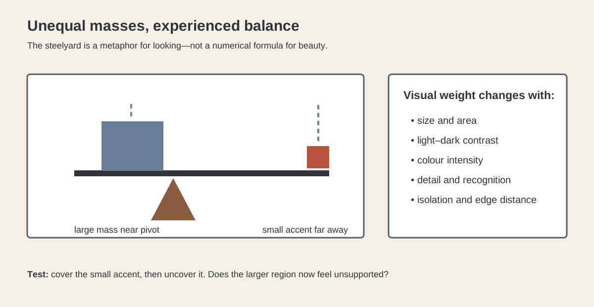
Neither guide invalidates centring. Symmetry can create stability, ceremony, confrontation or stillness. An off-centre placement can feel lively, but it can also seem arbitrary when surrounding forms do not answer it. The Balance in Art page helps describe visual weight; Emphasis addresses dominance, and Movement addresses directional relationships.
The broader Composition in Art guide keeps these options in context. Composition concerns the organisation of the whole field, including what happens between the proposed guide lines.[8]
A practical five-minute test
Choose a subject and one fixed format. Make four small boxes. In the first, centre the subject. In the next two, place it near the left and right thirds. In the fourth, push it closer to an edge. Add only the largest background division or horizon.
Compare the results without asking which one obeys the rule. Ask instead where attention gathers, which direction feels available, how the empty region participates and what the frame edge does. If one arrangement seems promising, develop it and allow later decisions to adjust the initial grid.
When analysing an existing artwork, use the same order. Observe first, overlay second, attribute intention last. The rule of thirds earns its place as a flexible way to see alternatives—not as a verdict delivered after four lines are drawn.
Watch: The Rule of Thirds through Formal Analysis
Choose a museum-led whole-work analysis, a close reading, or a foundations overview for considering the rule of thirds.
Introducing Formal Analysis: Landscape
Follow how recurring shapes, colours and intervals contribute to a larger visual organisation.
Watch on YouTubeFrequently Asked Questions
It is a planning and analysis grid that divides a field into nine equal rectangles using two vertical and two horizontal lines.
Intersections and lines offer positions to test, but the best placement depends on scale, direction, visual weight, cropping and the rest of the composition.
No. Centred, symmetrical, edge-weighted and many other arrangements can work without it.
No. Thirds divide at 33.3 and 66.7 per cent, while golden-section divisions fall near 38.2 and 61.8 per cent.
No. A modern overlay is an analytical test unless reliable process evidence establishes historical use.
Discussion
Which artwork on this page gains the least from a thirds overlay, and which visible relationships explain it better?
Reader Insights
The grid should prompt comparison rather than replace looking.
Shift subject, horizon, crop or scale separately.
A fitted overlay is not evidence of historical construction.
Join the Conversation
Share one precise observation or a useful museum example below.
References
- University of Florida IFAS, “Digital Photography Composition Techniques”
- Georgia Institute of Technology, “Photography Tips”
- University of California, Berkeley, Palmer Lab, “How the Rule of Thirds Is Wrong: Let Us Count the Ways”
- National Gallery of Art, Mary Cassatt, Little Girl in a Blue Armchair, 1878
- The Metropolitan Museum of Art, Édouard Manet, Boating, 1874
- Rijksmuseum, Johannes Vermeer, The Milkmaid, c. 1660
- The Metropolitan Museum of Art, Katsushika Hokusai, Under the Wave off Kanagawa, ca. 1830–32
- TheHistoryOfArt.org, “Composition in Art”