by Tom Gurney
Tom Gurney BSc (Hons) is an art history expert with over 20 years experience
Page created on September 3, 2026 / Page updated on September 13, 2026
Email: tomgurney1@gmail.com / Phone: +44 7429 011000
Testing a Famous Proportion without Inventing Hidden Proof
The golden ratio is a mathematical relationship in which a whole is divided so that the whole relates to its larger part as that larger part relates to the smaller. Written as phi, or φ, it is approximately 1.618. In art and design, that relationship can generate a rectangle, a set of division lines or a spiral-like construction that artists may use as a compositional guide.[1]
It is a real and rewarding piece of geometry. It is not, however, a hidden law that automatically makes an artwork beautiful. Some artists have deliberately worked with the golden section; many celebrated paintings have only been fitted with golden rectangles long after they were made. The useful question is therefore not merely “Can I place a spiral over this image?” but “What evidence shows that this proportion belonged to the artist's process?”[1][2]
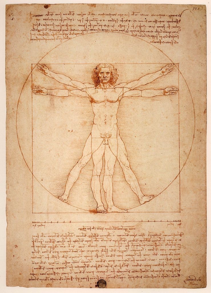
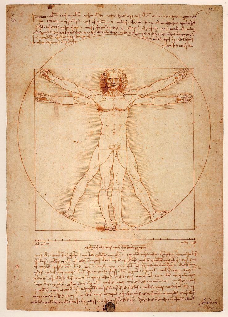
Leonardo da Vinci, Vitruvian Man, c. 1490. The drawing documents Vitruvian body proportions, but its fame does not itself prove a golden-ratio construction. Image: Wikimedia Commons, public domain.
At a Glance
- Definitionthe golden ratio φ is approximately 1.618, with a corresponding division near 61.8% and 38.2%.
- Useful forconstructing a declared rectangle or testing a precisely specified proportional claim.
- Not proof by overlaya near fit on a cropped reproduction cannot establish historical intention.
- Compare firsthalves, thirds, symmetry, perspective and ordinary grouping may explain the same structure.
- Best evidencefixed boundaries, landmarks, tolerance and documentary or technical support.
Contents
That distinction makes the golden ratio more interesting, not less. It lets us enjoy the clarity of the construction, try it as one way of arranging a picture and look critically at historical claims without confusing a persuasive overlay with proof.
What the golden ratio means
Imagine a line divided into a larger part and a smaller part. The division is golden when the length of the complete line divided by the larger part gives the same number as the larger part divided by the smaller. That number is φ, approximately 1.618. If the whole has length 1, the larger part is about 0.618 and the smaller about 0.382.[1]
A golden rectangle applies the same relationship to two dimensions: its long side is about 1.618 times its short side. Remove a square based on the short side and the rectangle that remains has the same proportions as the original. The process can be repeated, producing successively smaller squares.
The familiar curling line is made by drawing quarter-circles through those squares. It is a useful graphic approximation to a golden spiral, but care is needed with the name. Not every spiral in a plant, shell, wave or picture is a golden spiral, and resemblance is not measurement.
Fibonacci numbers are related to φ but are not another name for it. In the sequence 1, 1, 2, 3, 5, 8, 13 and onward, each number is the sum of the previous two. Ratios between consecutive terms—13 divided by 8, for example—approach φ as the numbers grow. They are increasingly close approximations rather than exact equality at every step.[1]
Read the diagram first
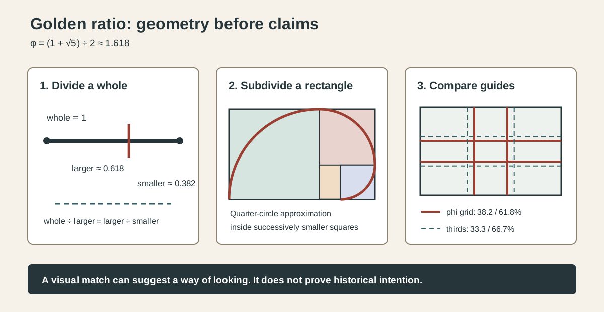
The first panel divides a line at about 61.8 per cent. The second nests squares within a golden rectangle and adds a quarter-circle spiral approximation. The third compares a phi grid, whose divisions lie at about 38.2 and 61.8 per cent, with a thirds grid at 33.3 and 66.7 per cent.
These guides are close enough to be confused at a glance but they are not identical. More importantly, matching an edge, face or horizon to one of their lines does not tell us when or why that feature was placed there.
A short history without the mythology
The relationship is ancient mathematics, but its modern aura accumulated gradually. Euclid described division in “extreme and mean ratio”. Luca Pacioli called it the “divine proportion” in a book published in 1509, for which Leonardo da Vinci supplied polyhedral illustrations. The phrase “golden section” appeared much later; the Mathematical Association of America's historical review dates the earliest use it discusses to a German book of 1835.[1]
Pacioli and Leonardo are therefore part of the ratio's cultural history, but their collaboration does not establish that Leonardo secretly organised every painting around φ. The same MAA review, drawing on Roger Herz-Fischler's research, stresses that Pacioli did not recommend the ratio as a system for determining the proportions of artworks or buildings.[1]
The belief that φ is everywhere in art, architecture, bodies and nature became especially powerful in the nineteenth and twentieth centuries. It remains easy to repeat because the claim combines exact-looking numbers with famous objects. George Markowsky's study of golden-ratio misconceptions found that the mathematics was often reported correctly while claims made for art, architecture and aesthetics were false or seriously misleading.[2]
How artists can use the golden ratio
As a studio guide, the ratio can be practical. A painter, photographer or designer can divide a rectangular field at 38.2 or 61.8 per cent, place a major boundary near one division, or use nested rectangles to vary the scale of connected areas. The spiral approximation can suggest a broad turn from a large region towards a smaller concentration.
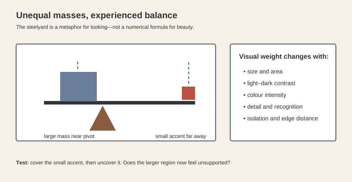
These are scaffolds, not instructions that every important object must touch a line. A phi grid may help an artist avoid an automatic centre or equal halves, yet balance still depends on colour, value, scale, detail, direction and empty space. A dark compact shape can outweigh a larger pale one. A small sharp accent near an edge may pull harder than a broad quiet field. The grid does not calculate those effects for us.
It also works best as one option among several. Compare it with the rule of thirds: a thirds grid is simpler and its divisions sit slightly nearer the outer edges. Compare it with Balance in Art: balance describes the experienced distribution of visual weight, while the golden ratio supplies one numerical scaffold. Compare it with Proportion in Art: proportion is the much broader subject of size relationships among parts and wholes.
What counts as evidence?
The strongest case begins before or during the making of a work. An artist might name the proportion, record measurements, leave a preparatory construction or produce a series whose procedure is documented. Technical examination may reveal a fixed scheme that can be tied convincingly to the finished object. A later scholar can also make a serious case by identifying landmarks and tolerances before testing the numbers.
A movable overlay is much weaker. If a rectangle can be resized, cropped, rotated and placed around any four convenient features, a near match is not surprising. Paintings contain many edges, heads, hands, horizons, doorways and tonal changes. Selecting among them after seeing the result makes almost any complex image appear numerically planned.[1][2]
This does not mean that measuring an artwork is pointless. Measurement can reveal rhythms and divisions worth discussing. It simply means the conclusion must fit the evidence: “this overlay draws attention to a relationship” is different from “the artist constructed the work with φ”.
Dorothea Rockburne: a documented use
Dorothea Rockburne's Golden Section Painting: Square Separated by Parallelogram, made in August 1974, offers the clarity that retrospective claims lack. MoMA records that Rockburne coated linen with gesso and varnish, then measured, cut and folded it along lines determined by the Golden Section. Here the proportion is not an invisible secret imposed by a later viewer; it belongs to the work's documented material procedure.[3]
The artwork itself is copyrighted, so it is not reproduced here. That absence also demonstrates an important rule for visual research: a useful factual source does not automatically grant image-reuse rights.
Four famous works: look first, measure second
The following works reward close compositional description. None is presented here as proof of an intentional golden-ratio design. They show how much can be understood before a numerical overlay is introduced.
Seurat: bands, intervals and a tempting grid
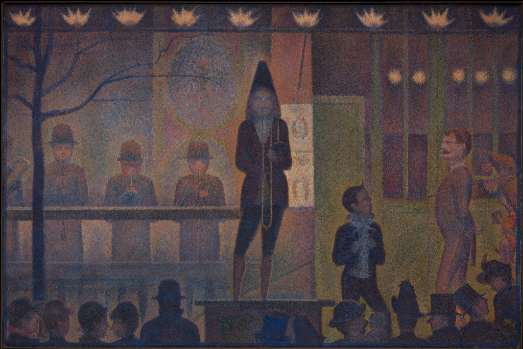
Georges Seurat's Circus Sideshow (Parade de cirque), 1887–88, is held by the Metropolitan Museum of Art. Performers occupy a shallow stage above a dark band of spectators. Gaslights repeat across the top; horizontal rails and platform edges divide the field; a stair cuts a diagonal at the right.[4]
Because the picture contains strong verticals, horizontals and repeated intervals, it has often invited geometric analysis. A golden overlay can make selected features look decisive, but the visible organisation already has a richer account: bands vary in depth, lights establish rhythm, the trombonist interrupts the sequence and the stair opens a directional exit. Any historical φ claim would need evidence beyond the fit of modern lines.
Raphael: a triangle inside a circle
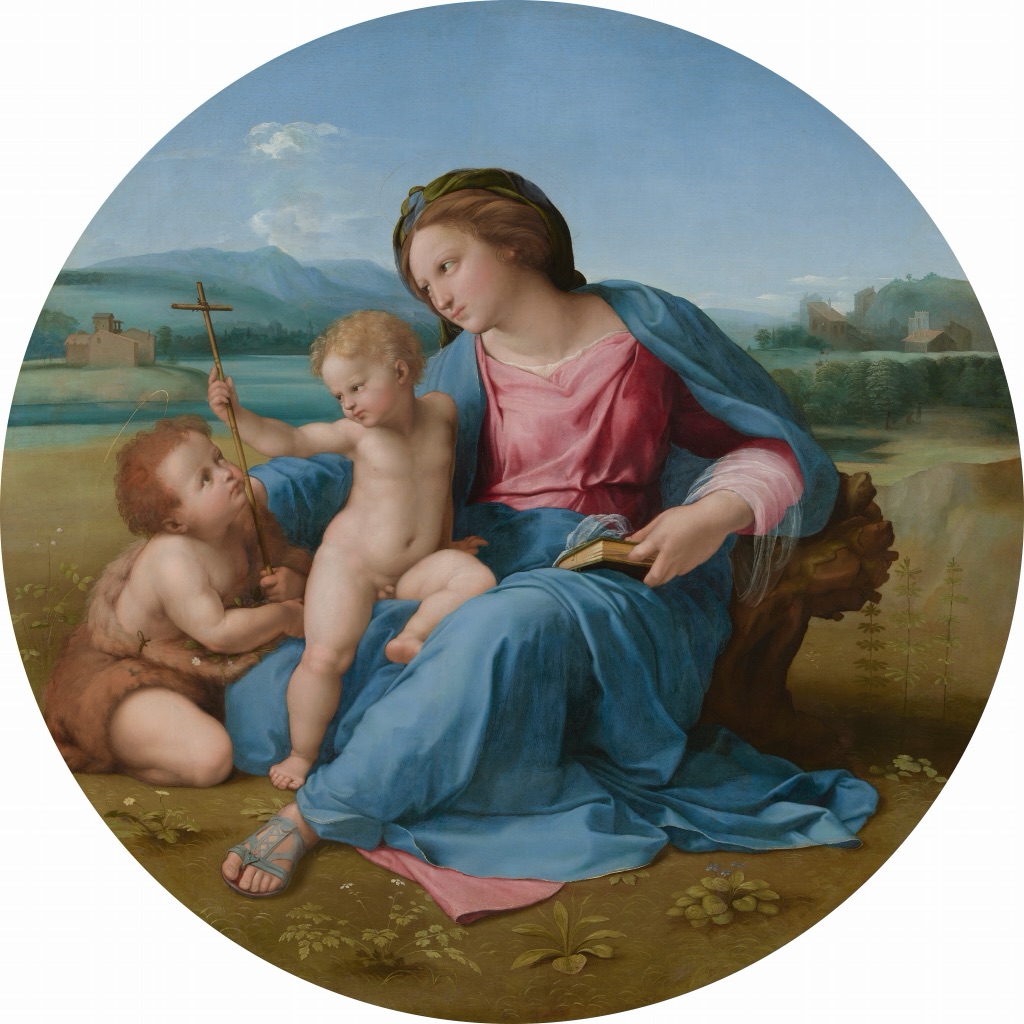
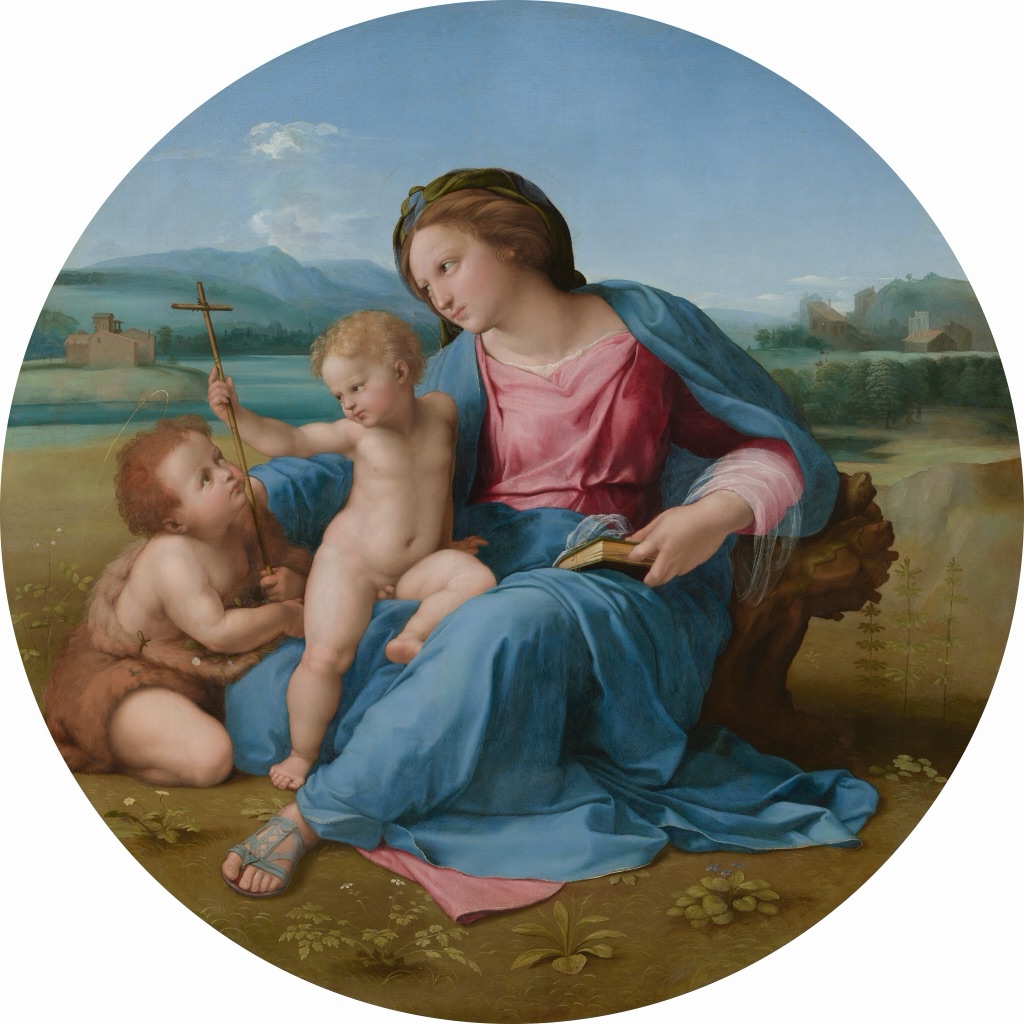
Raphael's The Alba Madonna, about 1510, groups Mary, the Christ Child and the young John the Baptist within a circular support. Their bodies and exchanged gestures form a broad triangle, while the curved edge gathers the landscape and figures into a tondo.[5]
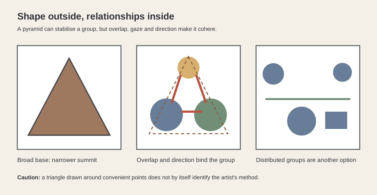
This is a good test of categories. A triangular or pyramidal group can be seen without calculating φ, and the circular support shapes every interval around it. Calling the composition “golden” would require a separate, sourced construction. What the eye can verify is already specific: the three figures interlock, the cross creates a diagonal and their lowered attention concentrates the scene.
Hokusai: a curve is not automatically a golden spiral
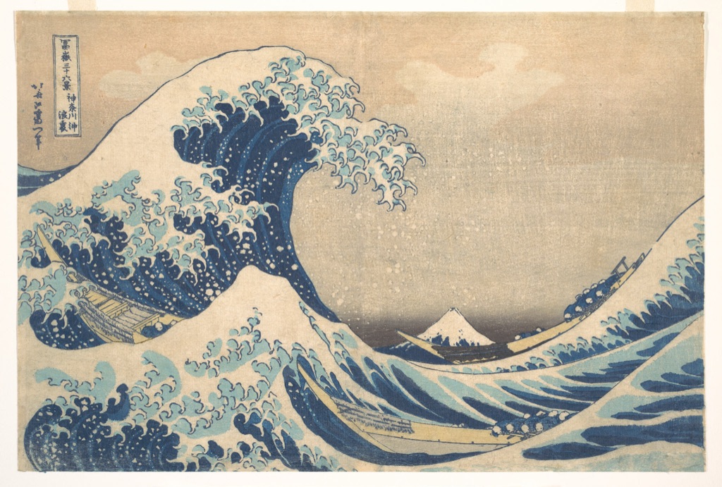
Katsushika Hokusai's Under the Wave off Kanagawa, also known as The Great Wave, was made around 1830–32. The Metropolitan Museum's impression shows the great curling wave above three boats, with Mount Fuji small on the horizon.[6]
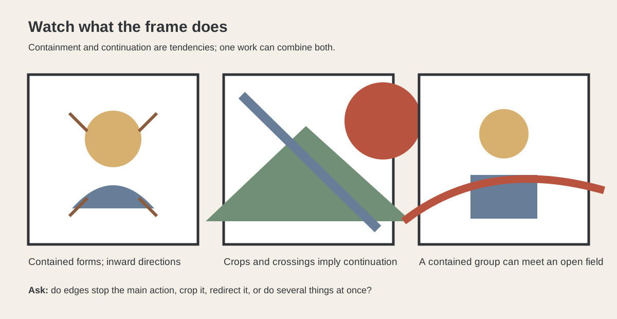
The wave's hooked crest and enclosing curve make the print an easy target for spiral overlays. Yet several centres, crops and scales could be chosen. The stronger first reading follows the design actually visible: the huge near wave and tiny distant mountain reverse expected importance; boats drive along diagonals; foam repeats the snow on Fuji; the print's edges cut through water and motion. A spiral can prompt looking, but resemblance alone cannot identify Hokusai's construction.
Fra Carnevale: geometry does not always mean phi
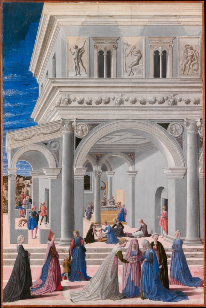
Fra Carnevale's The Birth of the Virgin, 1467, sets its figures within a tall palace interior. Floor tiles, columns, arches and diminishing figures make recession legible, while open areas of architecture balance the crowded birth chamber above.[7]
The painting is unmistakably ordered. Its geometric force comes through perspective, repeated architecture, scale and vertical layering. Those structures should not be relabelled as golden merely because φ is a famous number associated with Renaissance art. Naming the system we can see is more illuminating than reaching immediately for a universal formula.
Golden ratio, rule of thirds and proportion
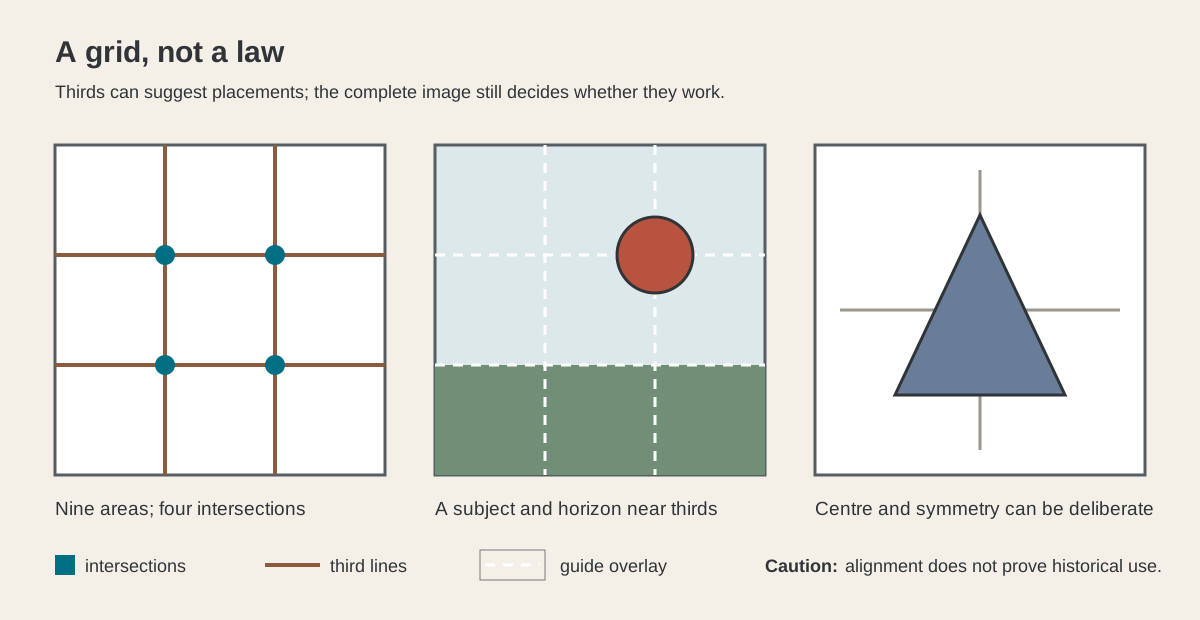
The phi grid and rule-of-thirds grid both create four intersections and discourage reflexive centring. Their positions differ: phi divisions are around 38.2 and 61.8 per cent, whereas thirds fall at 33.3 and 66.7. One is not simply the other under a historical name.
Neither grid replaces composition. Artists can centre a subject, crowd an edge, leave half a field quiet or use no grid at all. The decision succeeds through relationships across the complete work, not through compliance with a template. The Composition in Art guide explains that wider field; Emphasis and Movement help describe where attention gathers and how it travels.
The site's account of Leonardo's Vitruvian Man applies the same caution. The drawing joins body, geometry and text, but a popular golden-ratio story is not needed to explain its documented Vitruvian proportional study.[8]
How to test a golden-ratio claim
Start by recording the artwork's complete dimensions and visible boundaries. Ask whether the proposed rectangle uses the object itself, a later frame, a crop or a convenient group within it. Fix the landmarks before adjusting an overlay. Note the tolerance: a line that nearly meets a face can be made to look exact when the reproduction is small.
Then look for process evidence. Is the ratio named in a source? Do preparatory studies show the division? Has an institution or serious technical publication tested the construction? Can a simpler description—halves, thirds, symmetry, perspective, a triangle or ordinary visual balance—explain the same features with fewer assumptions?
Finally, keep observation separate from attribution. You may find a phi grid productive when making or analysing an image even when the historical artist never used one. The golden ratio is most useful when it sharpens looking and planning, not when it turns every curve or rectangle into proof of a secret code.
Watch: Golden Ratio through Formal Analysis
Choose a museum-led whole-work analysis, a close reading, or a foundations overview for considering golden ratio.
Introducing Formal Analysis: Landscape
Follow how recurring shapes, colours and intervals contribute to a larger visual organisation.
Watch on YouTubeFrequently Asked Questions
It is the proportion φ, approximately 1.618, sometimes used to construct or analyse divisions and rectangles.
No. Historical use must be demonstrated with documentary, preparatory or technical evidence rather than assumed from a modern overlay.
No. Golden-section divisions fall near 38.2 and 61.8 per cent; thirds fall at 33.3 and 66.7 per cent.
No. Many curves can resemble an adjustable spiral, especially when boundaries and landmarks are chosen after inspection.
Fix the complete object boundaries and landmarks, state tolerance, compare simpler explanations and look for reliable process or institutional evidence.
Discussion
Which example on this page most clearly shows the difference between a productive overlay and evidence of historical construction?
Reader Insights
Do not switch between object, frame and crop.
A near hit is not an exact construction.
A modern fit alone cannot establish artistic intention.
Join the Conversation
Share one precise observation or a useful museum example below.
References
- Mathematical Association of America, “The Golden Section”
- ERIC, George Markowsky, “Misconceptions about the Golden Ratio”, The College Mathematics Journal 23 (1992)
- Museum of Modern Art, Dorothea Rockburne, Golden Section Painting: Square Separated by Parallelogram, August 1974
- The Metropolitan Museum of Art, Georges Seurat, Circus Sideshow (Parade de cirque), 1887–88
- National Gallery of Art, Raphael, The Alba Madonna, c. 1510
- The Metropolitan Museum of Art, Katsushika Hokusai, Under the Wave off Kanagawa, ca. 1830–32
- The Metropolitan Museum of Art, Fra Carnevale, The Birth of the Virgin, 1467
- TheHistoryOfArt.org, “Vitruvian Man by Leonardo da Vinci”