by Tom Gurney
Tom Gurney BSc (Hons) is an art history expert with over 20 years experience
Page created on September 2, 2026 / Page updated on September 13, 2026
Email: tomgurney1@gmail.com / Phone: +44 7429 011000
How Colour Relationships Transform What We See
Colour is the element of art concerned with hues and with the ways their lightness, intensity and relationships appear in an artwork. A hue might be named red, blue or green, but colour becomes most informative when we compare it with what surrounds it. A red patch can appear forceful beside muted greys, closely related beside orange, or surprisingly cool beside a hotter red. Colour is therefore not only a list of names. It is a set of visible relationships.
Museums do not use every colour term in exactly the same way. The Getty describes hue, value and intensity as three characteristics of colour, while other technical sources may use saturation or chroma for overlapping aspects of strength or purity.[1][2] Here, hue means a colour family, value means its relative lightness or darkness, and intensity describes how vivid or muted it appears. Those are useful working distinctions, not universal official types.
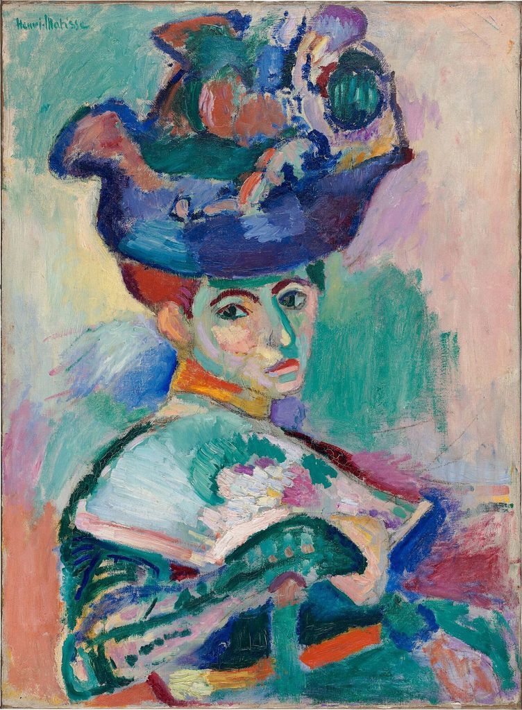
Henri Matisse, Woman with a Hat, 1905. Greens, pinks, blues and yellows change across face, clothing and background, showing why colour must be read through relationships rather than isolated names. Image: Wikimedia Commons, public domain.
At a Glance
- Core ideahue, value and intensity become meaningful through relationships.
- Look forarea, adjacency, recurrence, temperature and shifts from vivid to muted.
- Material matterspaint, light, glaze and screen colour do not arise through identical processes.
- Context matterscolour does not carry one universal emotion or symbol.
- Explore nextuse the artist’s colour wheel as one declared teaching model.
Contents
Colour is relational
We see colour through light, materials and perception. A painted yellow, a blue glaze and the blue light of a screen do not arise through identical physical processes.[3] For close looking, however, the first useful question is often simpler: what colour areas are actually visible, and how do they behave beside one another?
Adjacency matters. The same-looking colour can seem altered when its surround changes, and neighbouring colours can make one another appear more or less intense.[4] Relative area matters too: a small red accent within a large muted field is a different relationship from a canvas covered almost evenly in red and orange. Lightness can help colours merge or separate; Value in Art examines that light–dark relationship directly.
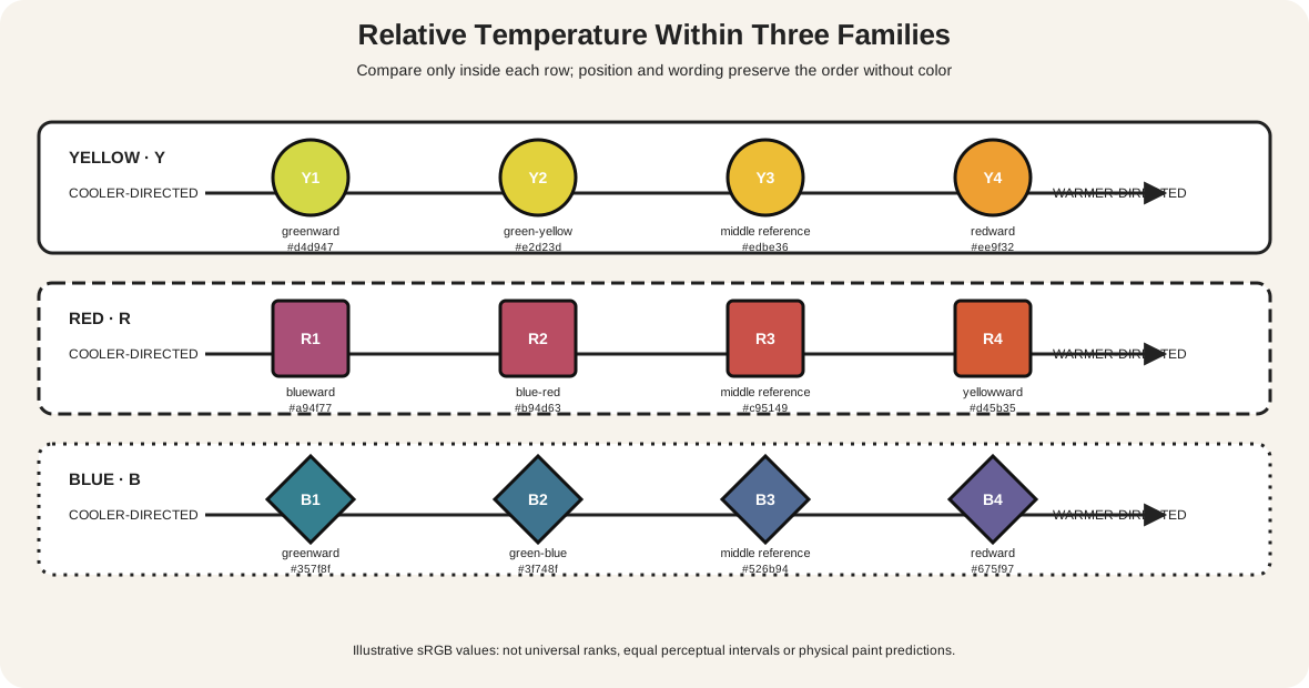
Warm and cool are best treated as comparative descriptions. Orange may look warm beside blue and comparatively cool beside a hotter red. They do not guarantee closeness, distance, calm, excitement or any other response. Cultural context, material, subject and the rest of the work remain essential.
Complementary colours are conventionally paired across a chosen colour model and can appear especially distinct when placed side by side.[13] The label names a relationship, not a guaranteed effect: the size, intensity and placement of each area still matter. A small muted green beside a broad red field behaves differently from equal areas of vivid red and green, so the visible evidence remains more useful than the category alone.
Four questions for recognising colour
Use these prompts to compare visible evidence rather than searching for one correct answer.
- 1
Which hues or colour families are most prominent? Name only what you can see before attaching an effect or meaning.
- 2
Where do colours appear intense, muted or closely related? Compare passages rather than scoring them against an imagined perfect colour.
- 3
What changes where colour areas meet, repeat or stand apart? Look for adjacency, separation and relative area.
- 4
How do lightness, area and context affect the relationship? Say which visible evidence supports the reading while keeping Value, Shape, Space or Emphasis secondary.
The questions also work when a work has a restricted palette. Colour does not become unimportant because there are few hues. A narrow range can make small shifts unusually legible.
Broad fields and related hues
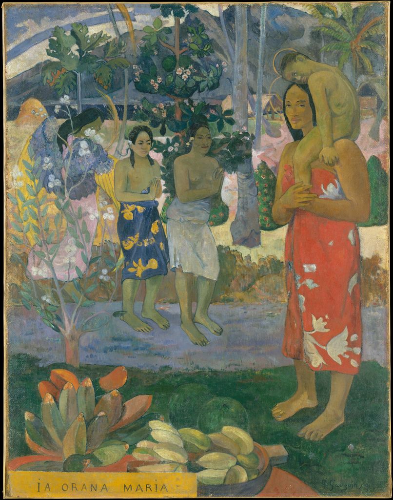
Gauguin: intense colours remain distinct
Paul Gauguin's Ia Orana Maria (Hail Mary), 1891, belongs to the Metropolitan Museum of Art.[5] Large areas of yellow ground, green plants, blue clothing and pink-red fabric remain visibly separate. Dark outlines help hold some areas apart, yet the colour fields do more than fill already finished shapes: their relative size and placement organise the whole surface.
The work combines a Christian subject with figures and landscape made during Gauguin's first stay in Tahiti. Its colour can be examined formally without treating the setting as an exotic palette or assuming that intensity carries a universal emotion. The historical and colonial setting remains part of responsible looking.
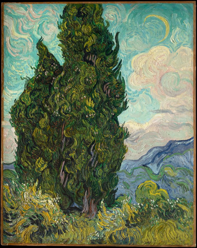
Van Gogh: colour families cross the landscape
In Cypresses, 1889, Vincent van Gogh sets a dark blue-green mass of trees against a pale sky, a yellow field and clouds edged with orange.[6] Greens and blues connect the cypresses to the sky, while yellows and oranges answer one another across field and cloud. None of those observations requires a fixed complementary-colour formula.
The site also has an artist-specific study of Van Gogh's use of colour. That page follows colour across his career. In this context, the single painting shows how related and opposing hue families can coexist in one complete work.
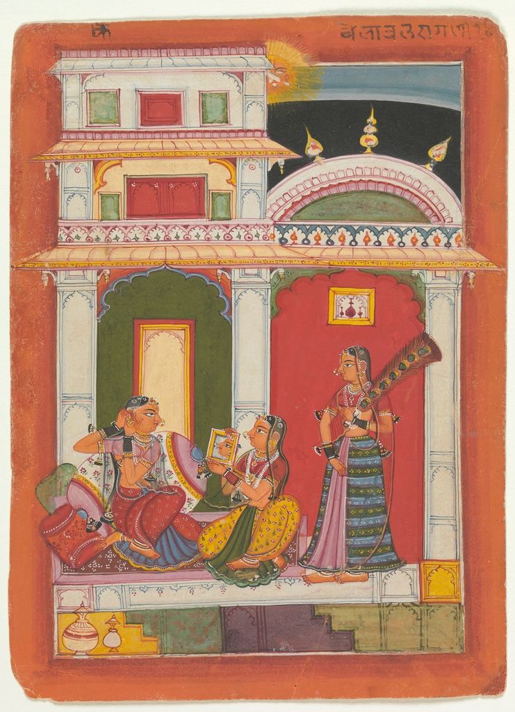
Vilaval Ragini: saturated areas within a folio
The Indian Vilaval Ragini, made around 1680 in Rajasthan, Sirohi, is a folio from a ragamala series in the Metropolitan Museum of Art.[7] A seated woman is framed by red, yellow, blue and green architectural and garden areas. The colours are strongly separated, but they remain parts of a small complete page rather than independent swatches.
Ragamala paintings relate musical modes to poetic and visual imagery. Modern colour vocabulary can help describe this folio, but it should not be projected backwards as the maker's own universal system. The exact literary and musical context matters more than a generic claim that red or blue must mean one thing.
Intense accents and atmospheric relationships
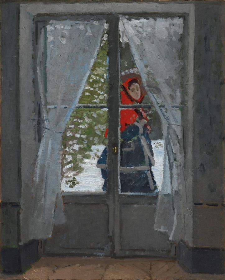
Monet: a small red changes a muted field
Claude Monet's The Red Kerchief, made about 1868–73, shows a snow-covered garden through a window.[8] Most of the scene is built from whites, browns, blue-greys and dark green. A small red kerchief appears behind the glass. Its area is tiny, but the surrounding colours make its intensity easy to recognise.
That does not mean red is inherently dominant. Emphasis in Art explains priority and focal hierarchy. Here the useful observation is conditional: this red appears especially vivid because of its size, placement and muted neighbours.
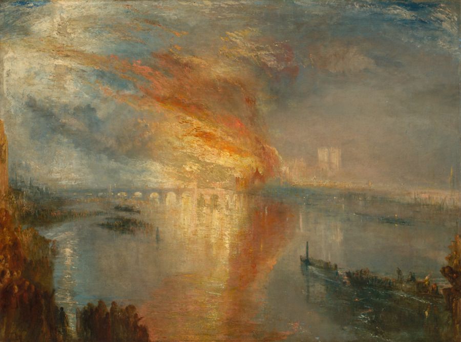
Turner: warm and cool spread through atmosphere
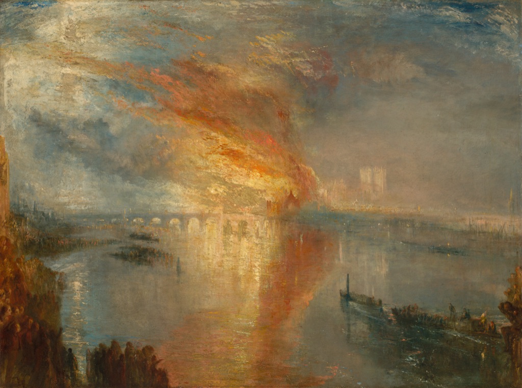
J. M. W. Turner's The Burning of the Houses of Lords and Commons, 16 October 1834, painted in 1835, spreads orange-yellow fire through blue-grey smoke, water and sky.[9] The colour areas interpenetrate rather than meeting as crisp blocks. Warm and cool remain useful comparative words because we can point to exact passages, but they do not prescribe a mood or tell us where every viewer must look.
Light and atmosphere make colour, Space in Art and Value closely connected here. The colour analysis concerns relations among the orange, yellow, blue and grey passages; space describes recession and atmosphere, while value describes their lightness and darkness.
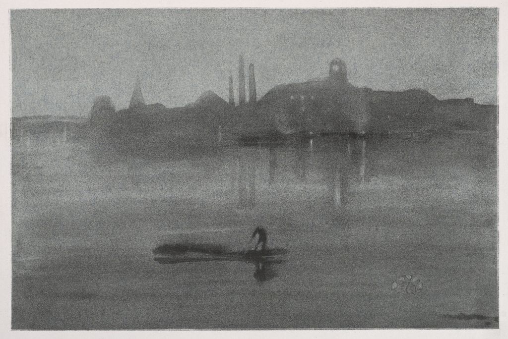
Whistler: a narrow range rewards comparison
James McNeill Whistler's Nocturne, 1878, is a small horizontal print in the Cleveland Museum of Art.[10] Muted blue-grey passages occupy most of the sheet, with small warmer and lighter notes interrupting them. The hues are not numerous, yet their slight differences become readable because the range is restricted.
This is a useful guard against equating colour with spectacle. Intensity is relative. A muted passage may be visually specific, and a small change within a narrow family may matter more than a large catalogue of unrelated hues.
Colour across objects and prints
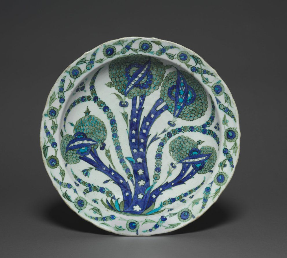
Ottoman dish: a restricted glazed palette
The Ottoman Large Dish with Artichokes, made in Turkey around 1535–40, combines turquoise-blue, green, dark outlines and a pale ground across a complete ceramic object.[11] The limited palette lets repetition and variation become visible without turning the dish into a Pattern in Art lesson. Blue and green recur, but they change in area, placement and adjacency.
The colours are also material: they belong to glaze on a curved ceramic surface. That fact does not make a pigment or firing tutorial necessary. It simply reminds us that colour is encountered through particular objects and processes, not as a detachable chart.
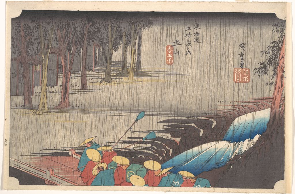
Hiroshige: restrained printed colours hold a rainy scene
Utagawa Hiroshige's Spring Rain at Tsuchiyama, from the series Fifty-three Stations of the Tōkaidō, 1834–35, uses blue, green, brown and grey across travellers, trees, water and slanting rain.[12] The print's colours are restrained rather than brilliant. Blue passages connect water, clothing and sky; green and brown keep land and vegetation distinct without isolating every area.
Line and Composition in Art are plainly present, but the colour lesson stays specific: related muted hues can join distant parts while still allowing local differences. There is no need to claim that blue creates one universal feeling.
Colour and its neighbours
Within the complete Elements of Art family, colour works beside line, shape, form, space, value and texture without replacing any of them.
Colour often helps another element or principle become visible, but that does not erase the boundary between them. Shape in Art examines bounded two-dimensional areas; Contrast in Art examines perceptible difference; Variety in Art examines diversity sustained across a work; and composition considers the realised whole. Colour asks which hues, intensities and relationships are doing the work.
This boundary is useful when a statement becomes too broad. “The red is brighter than the grey around it” identifies a colour and value relationship. “The red is the focal point” belongs to Emphasis. “The red balances the dark tree” belongs to Balance. Close looking improves when the evidence and the concept match.
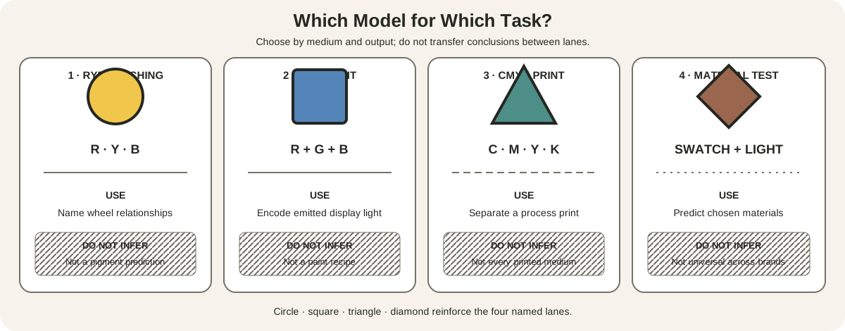
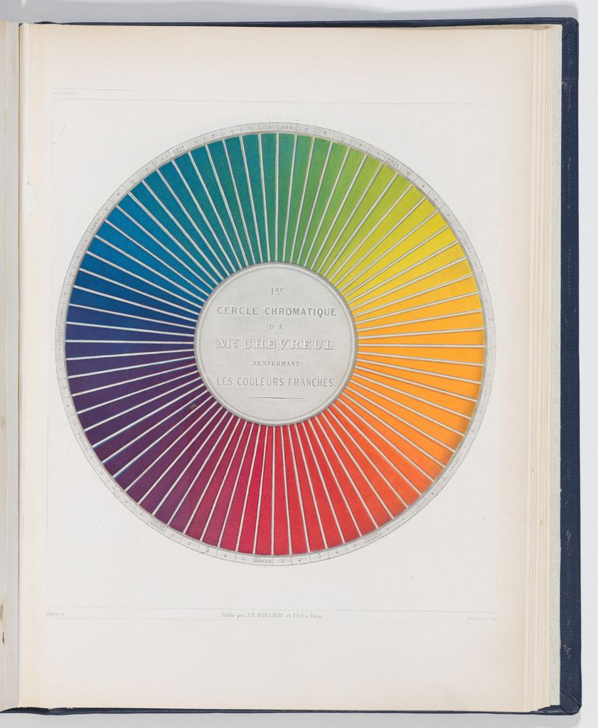
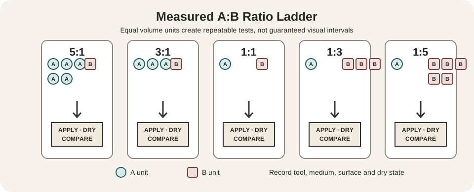
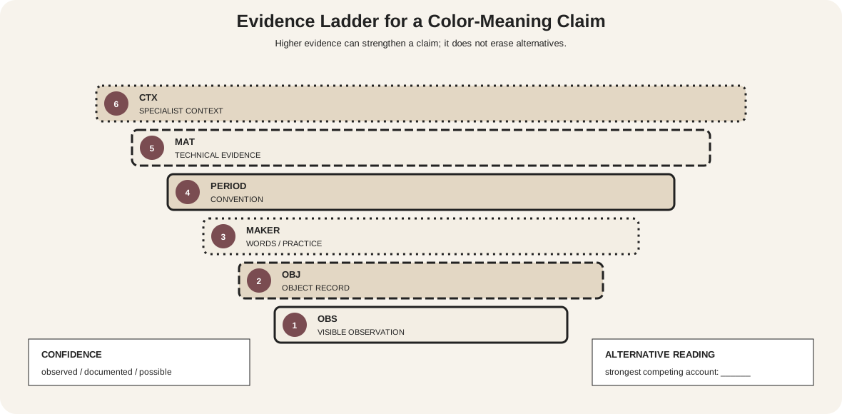
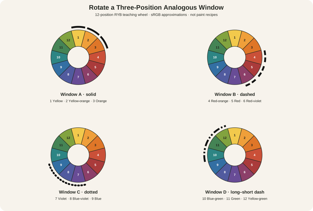
Explore the visual map: The Artist's Color Wheel explains the named 12-hue RYB teaching model and why its screen colors are not paint recipes. The Color Mixing Chart for Artists turns specific paints into a labelled, measured and dried studio reference. Triadic Color Schemes in Art maps the four equal-interval three-hue families and shows how area, value and chroma alter their balance. Analogous Colors in Art rotates neighboring hue ranges and tests their value, chroma and accent structure. Color Theory for Artists selects the right model and test for material, screen, print and contextual decisions. Primary, Secondary and Tertiary Colors defines tier membership across declared RYB, RGB and process-color systems. Hue, Value and Saturation in Art separates color family, light-dark structure and chroma across perceptual, digital and material comparisons. Tints, Tones and Shades in Art defines white, gray and black mixture operations while testing actual material changes. Color Harmony and Color Schemes in Art compares five scheme structures and the compositional variables that determine their result. Split-Complementary Colors in Art gives the exact anchor-and-flanks construction, every 12-position option and controlled role studies. Complementary Colors in Art maps all six opposite pairs and separates adjacent-field contrast from physical pigment mixing. Monochromatic Color Schemes in Art organizes one hue family through value, chroma, opacity, edge and material tests. Warm and Cool Colors in Art treats temperature as a relative comparison tested against context, value, chroma, area and material. Chromatic, Achromatic and Neutral Colors distinguishes hue-free values from low-chroma neutrals and records multiple neutralization routes. Painting with a Limited Color Palette selects and tests a small material set through gamut, value, handling and evidence-led expansion. Optical Color Mixing in Art tests how separated marks integrate across scale and viewing distance while remaining distinct from premixed paint. Additive and Subtractive Color traces emitted RGB, reflected paint, filtered glass and process print through distinct energy paths. Color Symbolism and Psychology in Art builds meaning claims from material, historical, cultural and psychological evidence without universal mood rules.
Look for Colour Yourself
Choose one complete artwork and begin with ordinary colour names. Then compare: which hues occupy the largest areas, where does intensity shift, what happens at adjoining edges, and how do lightness and context alter the relationship? Describe what is visible before deciding what it might suggest. Colour becomes clearer when it is treated neither as a code nor as decoration, but as a changing relation among parts of a work.
Watch: Color through Formal Analysis
Choose a museum-led whole-work analysis, a close reading, or a foundations overview for considering color.
Introducing Formal Analysis: Landscape
Follow how recurring shapes, colours and intervals contribute to a larger visual organisation.
Watch on YouTubeFrequently Asked Questions
Color is a visual element described through relationships among hue families, relative lightness or value, and intensity or saturation.
Hue names a colour family, value describes relative lightness or darkness, and intensity describes how vivid or muted a colour appears.
No. Meaning depends on material, historical and cultural context, subject, placement and surrounding colours.
They are best treated comparatively: a colour may look warm beside one neighbour and cool beside another.
Name the visible hues, compare their area and intensity, inspect adjoining edges, and separate colour evidence from conclusions about emphasis, balance or symbolism.
Discussion
Which artwork on this page changes most when you compare the relative area and intensity of its colours?
Reader Insights
Begin with visible colour families and relationships.
Area, adjacency and value can change how the same hue appears.
Material and cultural evidence should lead any claim about meaning.
Join the Conversation
Share one precise observation or a useful museum example below.
References
- J. Paul Getty Museum, “Understanding Formal Analysis.” https://www.getty.edu/education/teachers/building_lessons/formal_analysis.html
- J. Paul Getty Museum, “Glossary,” in The Alchemy of Color in Medieval Manuscripts. https://www.getty.edu/publications/resources/virtuallibrary/9781606061411.pdf
- National Gallery of Art, “The Elements of Art: Color.” https://www.nga.gov/educational-resources/elements-art/elements-art-color
- Art Institute of Chicago, “The Phenomena of Light and Color.” https://archive.artic.edu/sciarttech/2c1.html
- The Metropolitan Museum of Art, “Ia Orana Maria (Hail Mary).” https://www.metmuseum.org/art/collection/search/438821
- The Metropolitan Museum of Art, “Cypresses.” https://www.metmuseum.org/art/collection/search/437980
- The Metropolitan Museum of Art, “Vilaval Ragini: Folio from a ragamala series.” https://www.metmuseum.org/art/collection/search/37854
- Cleveland Museum of Art, “The Red Kerchief.” https://clevelandart.org/art/1958.39
- Cleveland Museum of Art, “The Burning of the Houses of Lords and Commons, 16 October 1834.” https://clevelandart.org/art/1942.647
- Cleveland Museum of Art, “Nocturne.” https://clevelandart.org/art/1941.89
- Cleveland Museum of Art, “Large Dish with Artichokes.” https://clevelandart.org/art/1995.17
- The Metropolitan Museum of Art, “Spring Rain at Tsuchiyama.” https://www.metmuseum.org/art/collection/search/36971
- Tate, “Complementary colours”