by Tom Gurney
Tom Gurney BSc (Hons) is an art history expert with over 20 years experience
Page created on September 2, 2026 / Page updated on September 13, 2026
Email: tomgurney1@gmail.com / Phone: +44 7429 011000
A Practical Map of Hue Relationships
A color wheel is a circular map of hues. It places selected color families in an order that makes three relationships easy to see: which colors are neighbors, which sit across the center, and which are spaced at regular intervals. Artists can use those positions to compare a palette, plan a study, or describe what they notice in a work of art. The wheel is a tool for asking better questions, not a rule that guarantees a successful painting.
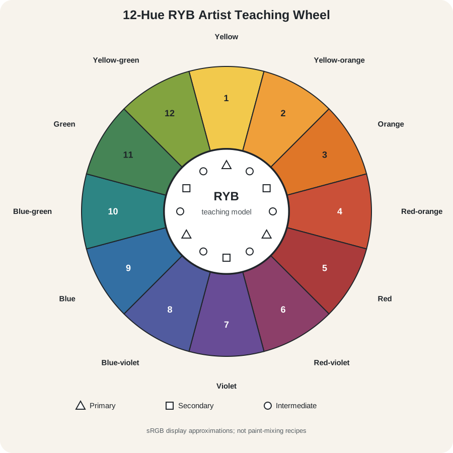
The diagram below is The 12-Hue RYB Artist Teaching Wheel. RYB means red, yellow, and blue—the traditional teaching primaries used in many painting classrooms. The National Gallery of Art uses this familiar paint framework while distinguishing it from the red, green, and blue light emitted by a computer screen.[1] That distinction matters: a wheel displayed on a screen is not a tray of paint.
At a Glance
- Core ideaa wheel maps selected hue families by position and interval.
- Declared modelthis page uses a 12-position RYB artist-teaching wheel.
- Read positionscompare neighbours, opposites and evenly spaced groups.
- Material limita screen diagram cannot predict exact mixtures from real paints.
- Accessibilitynumbers, names, marker shapes and patterns repeat colour information.
Contents
The 12-hue RYB artist wheel
Read the wheel clockwise from the top:
| Position | Hue name | Teaching tier |
|---|---|---|
| 1 | Yellow | Primary |
| 2 | Yellow-orange | Intermediate (tertiary) |
| 3 | Orange | Secondary |
| 4 | Red-orange | Intermediate (tertiary) |
| 5 | Red | Primary |
| 6 | Red-violet | Intermediate (tertiary) |
| 7 | Violet | Secondary |
| 8 | Blue-violet | Intermediate (tertiary) |
| 9 | Blue | Primary |
| 10 | Blue-green | Intermediate (tertiary) |
| 11 | Green | Secondary |
| 12 | Yellow-green | Intermediate (tertiary) |
The triangle markers identify the three teaching primaries: yellow, red, and blue. Square markers identify the teaching secondaries: orange, violet, and green. Circular markers identify the six positions between them. These in-between hues are commonly called tertiary colors in classroom wheels, although “intermediate” describes their position more plainly.
Names such as red-violet describe a region rather than one exact color sample. Two paint makers, two pigments, or two screens may show noticeably different versions of it. What remains stable in this diagram is the named order.
How to read color-wheel positions
Begin with location rather than effect. Choose one hue, find its number, and trace the shortest route to another.
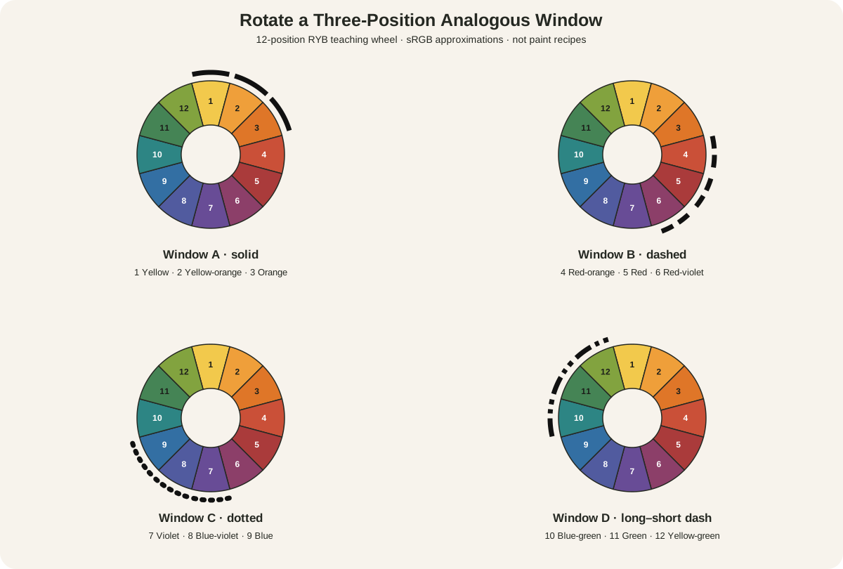
- Neighbors share a border or sit close together, such as yellow, yellow-orange, and orange. They are often called analogous when selected as a group.
- Opposites sit across the center, such as blue and orange in this RYB wheel. They are called complementary within the chosen model.
- Even spacing creates a repeated interval. Yellow, red, and blue occupy three evenly spaced primary positions; orange, violet, and green form another three-part interval.

Position describes a relationship, but it does not determine the result. A pinhead of muted orange beside a broad dark blue field will not behave like equal areas of brilliant orange and blue. Lightness, saturation, area, placement, surface, illumination, and subject all affect what viewers perceive. The Color in Art guide explains those broader relationships, while Contrast in Art examines how visible differences create separation and emphasis.
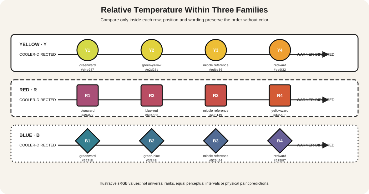
This is also why warm and cool should not be treated as permanent labels printed onto half a wheel. A red can look relatively cool beside a hotter orange-red, and a green can look warmer beside blue. Wheel position gives you a starting comparison; the colors actually present in the work provide the evidence.
RYB, RGB, and CMYK are not interchangeable
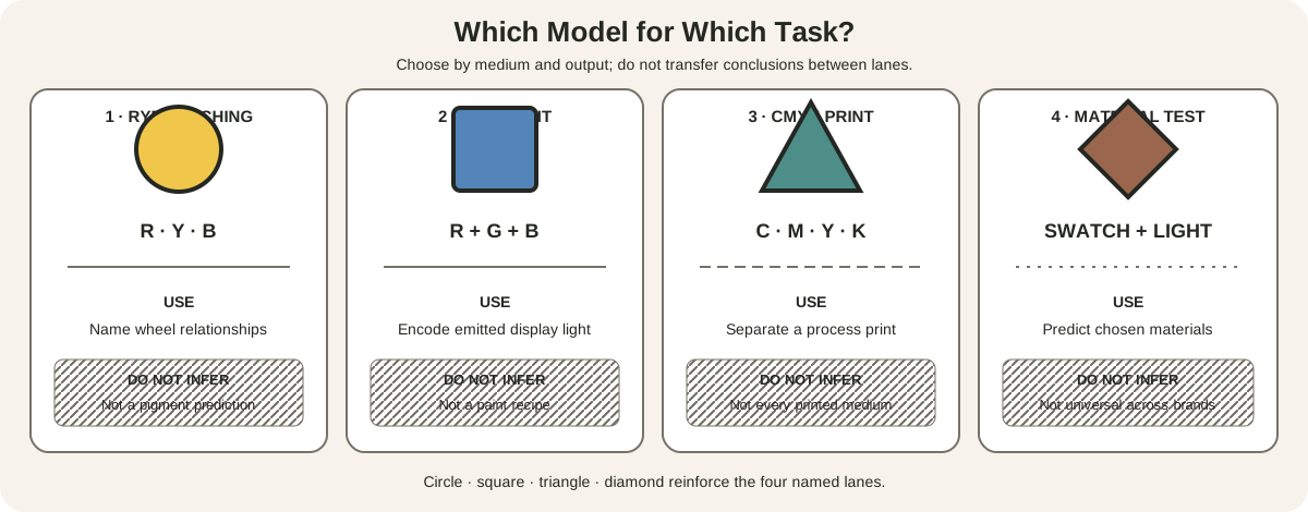
Several useful color circles exist because they describe different materials and purposes.
| Model | Common context | Primaries named by the model | What combines |
|---|---|---|---|
| RYB teaching wheel | Traditional studio instruction | Red, yellow, blue | A simplified account of paint relationships |
| RGB | Screens, projected or emitted light | Red, green, blue | Light adds together |
| CMYK | Process printing | Cyan, magenta, yellow, black | Inks filter light reflected from paper |
The colors in the wheel graphic are encoded for display in sRGB, the standard screen color space used by ordinary CSS colors.[2] They visually represent the RYB labels and positions. They do not prove that the corresponding physical paints will mix to those exact colors.
The distinction becomes obvious at the center of the systems. Combining red, green, and blue light at full strength produces white light in an additive RGB model. Combining paints generally makes a darker, lower-chroma mixture because pigments absorb parts of the light falling on them. Process printing uses cyan, magenta, yellow, and black inks rather than an RYB classroom trio. A digital wheel can illustrate all three systems, but it cannot turn them into the same process.
Why real paint refuses to follow a perfect diagram
“Red,” “yellow,” and “blue” are broad names. A tube of quinacridone magenta and a tube of cadmium red light are both red-family paints, yet they absorb and scatter light differently. Golden Artist Colors demonstrates that the selected primaries dramatically change the secondaries they can produce. Its practical mixing guide uses Phthalo Blue (Green Shade), Quinacridone Magenta, and Benzimidazolone Yellow Medium for a wide range, while its expanded wheel discusses additional pigments chosen for cleaner or more useful mixtures.[3][4]
That does not make the RYB wheel worthless. It changes the claim we should make for it. The wheel is reliable as a map of traditional named relationships. A painted test chart is the reliable record of what your own pigments do.
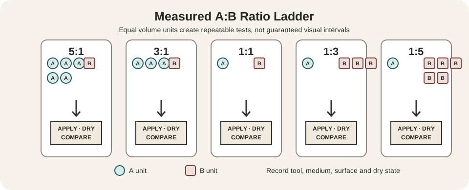
When testing paint, write the full pigment or tube name beside each swatch. Keep the proportions and medium reasonably consistent. Notice transparency, opacity, undertone, tinting strength, and the value of the mixture, not only its hue name. A violet made from one red and blue pair may be intense; another pair may produce a subdued brown-violet. The difference is material evidence, not a failure to obey the wheel.
Color circles have never had only one form
Artists, scientists, manufacturers, and teachers have organized color in many ways. Historical examples include circles, triangles, scales, charts, and three-dimensional systems. A Smithsonian survey follows this long effort from early color material through Newton, Moses Harris, Werner, and Paul Klee.[5] The variety is useful because no single flat circle records every feature of color or every material practice.
Michel Eugène Chevreul's 1864 book Des Couleurs et de leurs Applications aux Arts Industriels à l'Aide de Cercles Chromatiques contains printed chromatic circles divided much more finely than twelve broad wedges.[6] One plate moves through dozens of narrow steps around a large ring. It demonstrates two points at once: a circle makes continuity and neighborhood visible, and the maker still has to decide how many divisions the task requires.
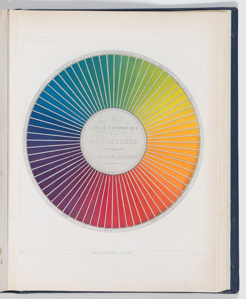
The twelve-part wheel is therefore best understood as a compact studio reference. It is quick to label, paint, and remember. A conservator identifying pigments, a printer controlling inks, or a digital color scientist needs other measurements and systems.
Use the wheel to look at a painting
The wheel becomes most useful when it sends you back to the artwork rather than replacing it.
Delacroix: map the colors, then compare their weight
Eugène Delacroix's Christ Asleep during the Tempest, about 1853, puts a crowded boat of red-brown figures against green-blue waves beneath a nearly black sky. The Metropolitan Museum of Art records Vincent van Gogh's response to its blue, green, purple, red, and small lemon-yellow halo.[7] Those named families can be located around the wheel, but their unequal areas and values explain more than position alone. The little yellow light is not equivalent to the wide green-blue sea merely because both receive a labelled wedge.
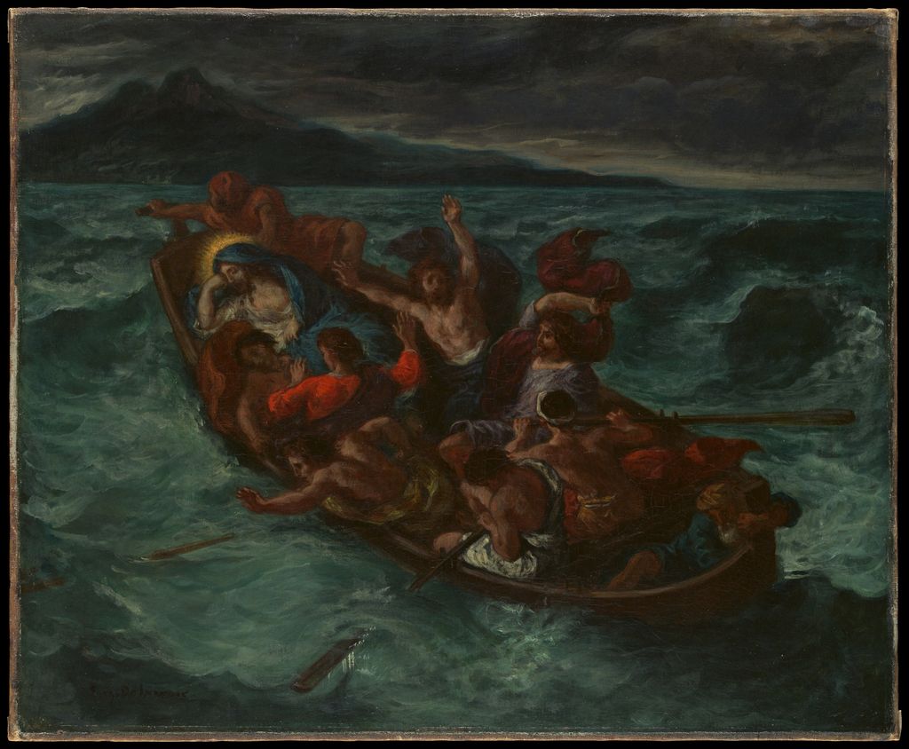
Try a two-stage reading. First, list the nearest wheel names without judging them. Second, note area, lightness, intensity, and location. That separation prevents a color category from becoming an unsupported claim about mood or importance.
Van Gogh: present color is also material history
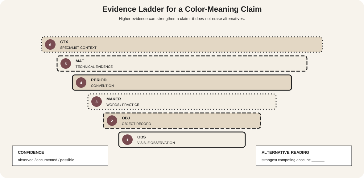
In Vincent van Gogh's Irises, 1890, blue-violet flowers spread above a green tabletop and pale vase. On the wheel, blue-violet and yellow-green occupy broadly opposing regions. Yet the current reproduction does not preserve a timeless formula. The Met explains that Van Gogh sought a soft, harmonious relation between violet flowers and a pink background, and that fugitive red pigments have faded.[8]
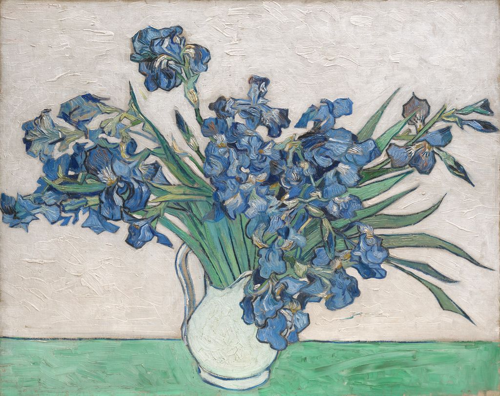
The wheel can still help describe the visible blue, violet, and green families, but the museum's technical history changes the interpretation. Color belongs to materials that age, conservation records, lighting, photography, and screens as well as to abstract positions. A responsible reading keeps those layers separate.
Make a wheel that records your own paints
Use a circle divided into twelve equal sections and label all positions before opening the paint. Choose a specific red, yellow, and blue, and write the full tube or pigment names on the page.
- Place the three chosen primaries at positions 1, 5, and 9.
- Mix each neighboring primary pair in controlled proportions for orange, violet, and green; place them at positions 3, 7, and 11.
- Mix each secondary with its neighboring primary to make the six intermediate positions.
- Let the samples dry fully, because many paints shift as water or medium evaporates.
- Compare your dry wheel with the screen diagram. Record differences rather than correcting them to match.
- Repeat one difficult mixture with a different named pigment. The comparison will show why a hue label is not a recipe.
Do not use unknown historic pigments, toxic materials, or conservation samples for this exercise. Ordinary artist paints should be handled according to their labels and studio-safety guidance.
Common color-wheel mistakes
Treating the wheel as a mixing guarantee. It predicts labelled relationships, not the spectral behavior of unspecified pigments.
Using RGB light to prove a paint result. A screen preview is additive light. Paint is a material layer that absorbs and reflects light.
Assuming opposite colors always look equally intense. Area, value, saturation, edge, and context can outweigh the simple opposition.
Calling every twelve-hue wheel the same historical system. Many diagrams share a circular format while differing in primaries, spacing, purpose, and theory.
Reading by color alone. Labels, numbers, positions, symbols, and patterns make the structure usable when hue differences are hard to distinguish. Web accessibility guidance specifically requires information conveyed by color to be available through another cue.[9][10]
Questions about the artist's color wheel
What is a color wheel in art?
It is a circular arrangement of hues that helps artists see selected relationships such as neighborhood, opposition, and regular spacing. The model must be named because paint, light, and printing systems use different primaries.
What are the 12 colors on a traditional artist's wheel?
Yellow, yellow-orange, orange, red-orange, red, red-violet, violet, blue-violet, blue, blue-green, green, and yellow-green.
Are red, yellow, and blue the only primary colors?
They are the traditional teaching primaries on this RYB wheel. RGB uses red, green, and blue light; process printing uses cyan, magenta, yellow, and black inks. Real paint mixing also depends on the specific pigments selected.
Which colors are opposite on this wheel?
Yellow and violet, red and green, and blue and orange occupy the three primary-secondary axes. The answer changes if a different model or wheel geometry is chosen.
Can a color wheel tell me which colors will look good together?
It can suggest combinations to test. It cannot judge the result without value, saturation, proportion, placement, material, subject, and viewing context.
Why do my mixed colors look duller than the wheel?
The wheel is an sRGB illustration, while paints contain specific pigments with their own absorption, transparency, opacity, and undertones. Record the exact paints and test alternative pigment pairs.
Watch: The Artist's Color Wheel through Formal Analysis
Choose a museum-led whole-work analysis, a close reading, or a foundations overview for considering the artist's color wheel.
Introducing Formal Analysis: Landscape
Follow how recurring shapes, colours and intervals contribute to a larger visual organisation.
Watch on YouTubeFrequently Asked Questions
It is a circular teaching map that arranges selected hue families so neighbours, opposites and repeated intervals can be compared.
It declares the traditional RYB artist-teaching model; RGB is used for emitted light and CMYK for a defined process-print workflow.
They are hue positions opposite one another within the declared model, such as blue and orange on this RYB wheel.
No. Real pigments differ in undertone, opacity, transparency, tinting strength, binder and other material properties.
The wheel is a screen illustration, while physical paints absorb and scatter light according to their actual pigments and formulation.
Discussion
Which wheel relationship becomes least reliable when translated into the real paints you use?
Reader Insights
Name RYB, RGB, CMYK or another system before using its labels.
Neighbour, opposite and interval are structural descriptions, not promised effects.
Record exact paints, proportions, ground and dried result.
Join the Conversation
Share one precise observation or a useful museum example below.
References
- National Gallery of Art, “The Elements of Art: Color.” https://www.nga.gov/educational-resources/elements-art/elements-art-color
- W3C, “CSS Color Module Level 4.” https://www.w3.org/TR/css-color-4/
- Golden Artist Colors, “Color Mixing Guide.” https://goldenartistcolors.com/resources/color-mixing-guide
- Golden Artist Colors, “Color Wheel.” https://goldenartistcolors.com/resources/color-wheel
- Smithsonian Institution, “Smithsonian Books Releases Color: A Visual History from Newton to Modern Color Matching Guides.” https://www.si.edu/newsdesk/releases/smithsonian-books-releases-color-visual-history-newton-modern-color-matching
- The Metropolitan Museum of Art, “Des Couleurs et de leurs Applications aux Arts Industriels à l'Aide de Cercles Chromatiques.” https://www.metmuseum.org/art/collection/search/335514
- The Metropolitan Museum of Art, “Eugène Delacroix: Christ Asleep during the Tempest.” https://www.metmuseum.org/art/collection/search/436176
- The Metropolitan Museum of Art, “Vincent van Gogh: Irises.” https://www.metmuseum.org/art/collection/search/436528
- W3C Web Accessibility Initiative, “Understanding Success Criterion 1.4.1: Use of Color.” https://www.w3.org/WAI/WCAG21/Understanding/use-of-color
- W3C Web Accessibility Initiative, “G111: Using color and pattern.” https://www.w3.org/WAI/WCAG21/Techniques/general/G111