by Tom Gurney
Tom Gurney BSc (Hons) is an art history expert with over 20 years experience
Page created on September 2, 2026 / Page updated on September 13, 2026
Email: tomgurney1@gmail.com / Phone: +44 7429 011000
Creating Range and Structure within One Hue Family
A monochromatic color scheme organizes one declared hue family through changes in value and chroma. A blue-family scheme may move from pale, muted blue-gray to dark, intense blue while remaining recognizably within that family.[1]
Monochromatic does not automatically mean one tube, one pigment, one digital value, black-and-white, simple or calm. It names the color-family constraint. Area, light-dark structure, opacity, edge, texture, support and material still have to be composed.
At a Glance
- Core structureone declared hue family organised through controlled variation.
- Independent controlsvalue, chroma, opacity, area, edge and texture can change separately.
- Terminologymonochromatic is not automatically identical to monochrome or achromatic.
- Material testtints, shades and diluted or layered applications may shift more than one property.
- Qualificationjudge family membership comparatively and acknowledge neutral supports or small exceptions.
Contents
What counts as one hue family?
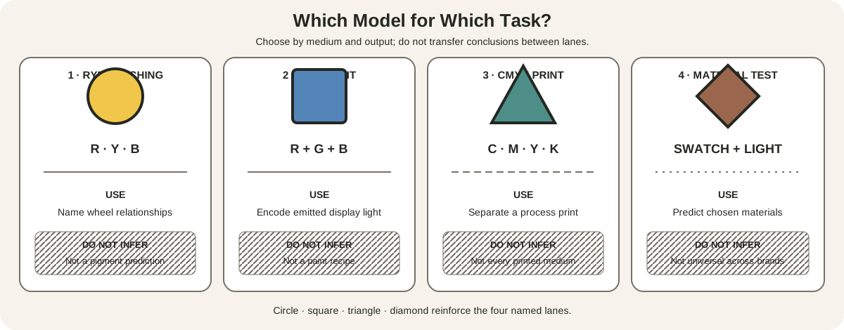
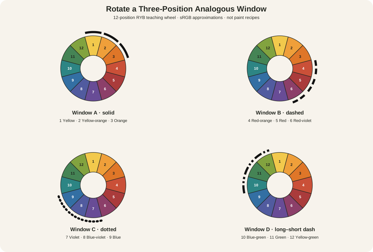
Begin by naming the model and family. On an artist's RYB teaching wheel, “blue” can be treated as one broad position. In a digital workflow, record the color space and numerical target. In paint, write down the actual products rather than assuming a wheel name identifies their pigments.
The family may include:
- lighter tints made with white or optical dilution;
- darker shades made with black or another darkening method;
- lower-chroma versions produced with gray, a neutralizing mixture or thin application;
- different opacities and surface effects;
- black, white, gray or the support, if their role is declared.
University of Tennessee teaching material defines monochromatic harmony through one hue and its tints and shades.[2] The National Gallery worksheet separately identifies tint as color plus white and shade as color plus black.[3] Those operations help build a family, but the finished visual result must still be observed. Additions can change chroma, undertone, opacity and sometimes apparent hue.
The site's tint, tone and shade guide develops those mixture names. Its hue, value and saturation reference separates the properties used to diagnose each sample.
One family, three independent controls
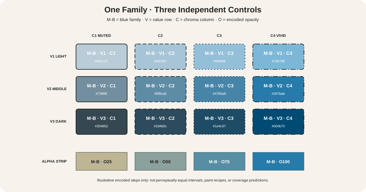
The matrix fixes one illustrative encoded family, M-B blue, while changing labelled controls.
| Coordinate | What changes | What stays fixed | What the graphic does not prove |
|---|---|---|---|
| rows V1–V3 | value instruction: light, middle, dark | family M-B and column chroma level | equal perceptual lightness intervals |
| columns C1–C4 | chroma instruction: muted to vivid | family M-B and row value level | equal perceptual chroma intervals |
| strip O25–O100 | encoded opacity over one ground | source swatch and ground | physical paint coverage or glaze depth |
Each cell prints its V/C coordinate and encoded fill. The opacity strip is separate because alpha compositing is not the same operation as adding white. CSS Color defines HSL and alpha within encoded color calculations; those values do not predict physical mixtures or perceptually equal steps.[5]
Use the matrix as a record format. Replace the demonstration fills with measured digital values or photographed, labelled paint samples. If a sample drifts toward green or violet, record that movement rather than forcing it under the blue heading.
Monochromatic, monochrome and achromatic
In color-scheme teaching, monochromatic usually means variations within one chromatic hue family. In museum and historical language, monochrome can also describe work made in one ink or a narrow black-gray range. That work may be achromatic rather than a one-hue wheel scheme.
Both uses are legitimate when their scope is clear. “Monochrome ink on silk” names a material and restricted tonal practice. “Monochromatic blue scheme” names one chromatic family. Do not assign black ink an arbitrary wheel position merely to make the two definitions identical.
An analogous scheme differs because it deliberately selects neighboring families, such as blue-violet, blue and blue-green. The accepted analogous-colors guide owns that multi-family construction. A blue painting does not become analogous simply because some passages lean warmer or cooler; decide whether those shifts function as separate structural families.
Same family, different structure
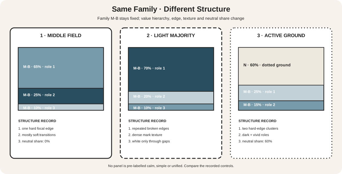
The second diagram holds M-B fixed across three plans.
| Study | Area and value | Edge and texture | Neutral participation |
|---|---|---|---|
| 1: broad middle field | middle M-B 65%; dark 25%; light 10% | one hard focal edge; otherwise soft | no separate neutral field |
| 2: light majority | light M-B 70%; dark 20%; middle 10% | repeated broken edges and dense marks | white support appears only through gaps |
| 3: active ground | neutral/white 60%; dark M-B 25%; vivid M-B 15% | two concentrated hard-edge clusters | support is the majority field |
No plan is automatically unified or restrained. Getty's formal-analysis guidance distinguishes hue from value and intensity while relating color to texture and spatial organization.[6] One-family identity therefore leaves substantial compositional freedom.
Make the studies at the intended proportions. Equal swatch chips hide dominance. A tiny dark mark on a pale field can carry more attention than its area suggests; a large middle-value field can recede if edges are soft; white support can become a positive shape rather than empty background.
Test family membership by comparison
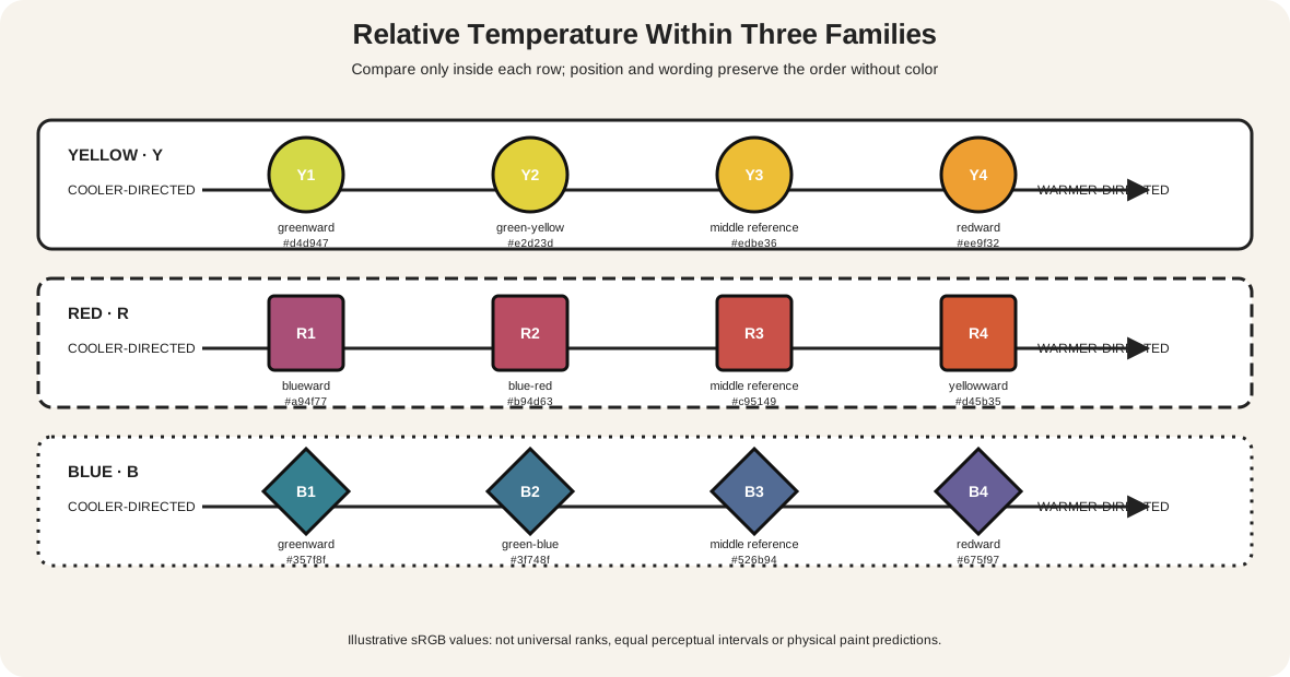
Do not decide whether a sample belongs to the family while viewing it alone. Josef Albers's Interaction of Color makes comparison and experiment central because an unchanged color can appear different against a new surround.[7] Build a reference row that stays visible while every uncertain sample is tested.
Place the family anchor at the left, a deliberately warmer boundary sample at the center and a deliberately cooler boundary sample at the right. Move each candidate between them on the same neutral ground. Label it “inside,” “boundary” or “separate structural family,” then repeat the judgement at the scale and ground intended for the work.
Next change only the surround. Put the same candidate on white, middle gray, black and the planned dominant field. If its apparent family changes, record the context rather than silently editing the classification. For paint, use dried samples with equal application and lighting. For digital work, keep the numeric candidate unchanged while backgrounds change.
This test is especially useful near blue/blue-green and blue/blue-violet boundaries. A small shift can remain a subordinate variation in one composition but become an independent analogous family when repeated, given area or used as a focal edge. The decision depends on role as well as proximity.
Build a monochromatic paint ladder
Choose one family target and list the paints available. One tube may be sufficient, but it is not required. Golden's materials guidance shows that pigments differ in undertone, opacity, tinting strength and behavior in tints.[4]
Prepare three linked ladders:
- Value: five repeatable light-to-dark steps, with every additive and ratio recorded.
- Chroma: the family at full useful intensity followed by controlled reductions.
- Thickness or opacity: thin and thick applications over the intended support.
Keep the first version systematic. If white is used, name it; if a complement lowers chroma, record that pigment and ratio; if water or medium creates a wash, keep the support constant. Let the samples dry, then note hue bias, value, chroma, opacity and gloss.
Do not assume a lighter application is a tint. Transparent blue over white paper may look lighter because more light returns from the support, while the material operation is dilution or reduced film thickness. Likewise, adding black can lower value and chroma unevenly. Classify what you did and separately describe what you see.
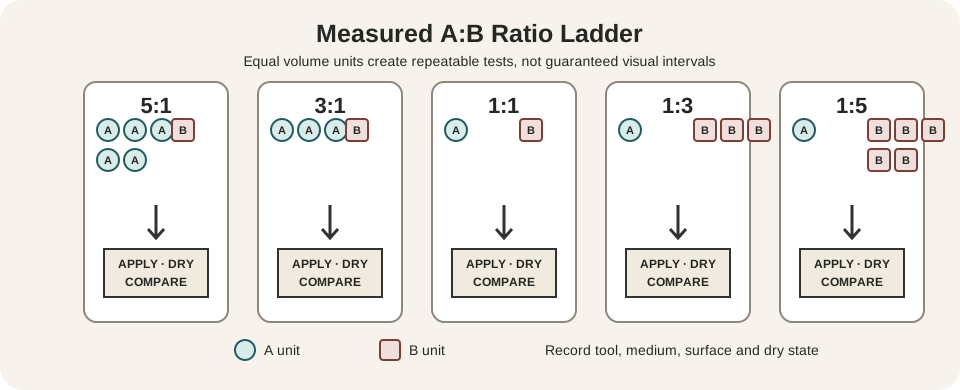
The color-mixing chart provides a repeatable physical record. Use its method before enlarging a painting, especially when a narrow family must still preserve several distinct values.
Build a digital one-family system
Declare the working color space. Choose one family anchor, then create value and chroma variants as named tokens rather than dragging an unrecorded picker. Store both the numerical values and intended roles: background, middle field, dark structure, accent and disabled state.
Test the tokens in actual areas. A palette strip can exaggerate differences that vanish when one value covers an entire screen. Check grayscale to see whether hierarchy survives, but remember that grayscale only assesses a light-dark transformation. It cannot prove that the original colors belonged to one chromatic family.
Opacity needs its own test. A 25-percent blue layer over white, gray and black produces three different composites even when the source value is unchanged. Record the ground and the resulting encoded value. If the work will be printed, proof in the destination profile and revise from the output, not from the screen alone.
The Metropolitan Museum of Art explains that capture, profiles, RGB editing, gamut and CMYK conversion mediate reproduced color.[8] A palette sampled from a museum JPEG describes that file under stated conditions, not the object's original pigments or gloss.
Decide whether a work qualifies
Ask five questions:
- What family or monochrome material is declared?
- Which passages carry the dominant structure?
- Are apparent family shifts structural, incidental, mixed or caused by reproduction?
- How are black, white, gray and the support counted?
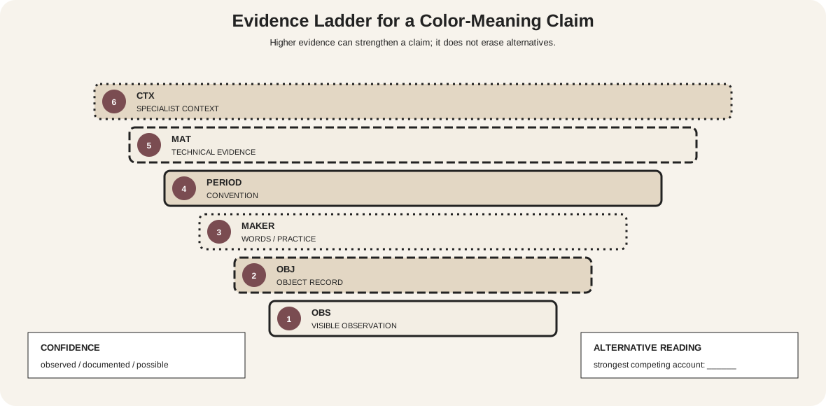
- Is the label based on museum evidence, present observation or documented intention?
If several neighboring hue families play independent roles, analogous may be more accurate. If only black, white and gray are present, call the work achromatic or monochrome ink and state the material. If one chromatic family dominates but small incidental colors appear, a qualified phrase such as “predominantly monochromatic brown palette” may be more truthful than a pure label.
Brown-family value in Carrière's The Contemplator
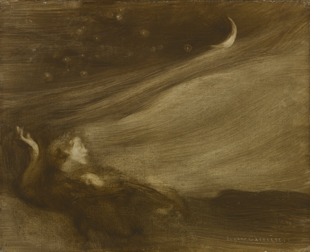
Eugène Carrière painted The Contemplator in 1901 in oil on fabric. The Cleveland Museum of Art explicitly describes its palette as monochromatic.[9]
In the reproduction, a narrow brown and ochre range moves from near-black passages to a pale diagonal sweep and small moon. The reclining figure emerges through blurred transitions rather than a crisp contour. Value and edge do most of the structural work, while limited hue range does not make the surface flat.
The museum evidence supports the palette term. It does not reduce the work to one known pigment, and the screen image cannot reproduce the painting's exact surface or dark-value separation. The example is a chromatic monochromatic case: brown-family color remains present even at low chroma.
Monochrome ink and active empty space
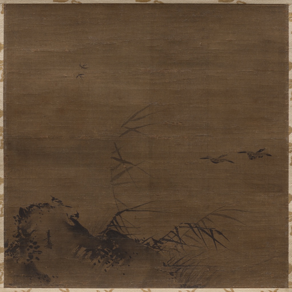
Waterfowl and Reeds, attributed to Liang Kai and dated to the early 1200s, is an ink-on-silk hanging scroll. Cleveland describes the artist's expressive monochromatic brushwork and identifies the one-corner composition as a way of rendering space.[10]
Dark ink clusters at the lower left around rock and reeds; thin strokes extend outward; small birds occupy the broad silk field. The support is not a leftover. Its large uninterrupted area creates distance and makes sparse marks legible.
This is monochrome in museum and material usage, not a chromatic wheel scheme built from one hue. The distinction strengthens the analysis: ink concentration, brush load, stroke, silk and open space supply variation without needing a blue, red or yellow family label.
Underglaze blue across white porcelain
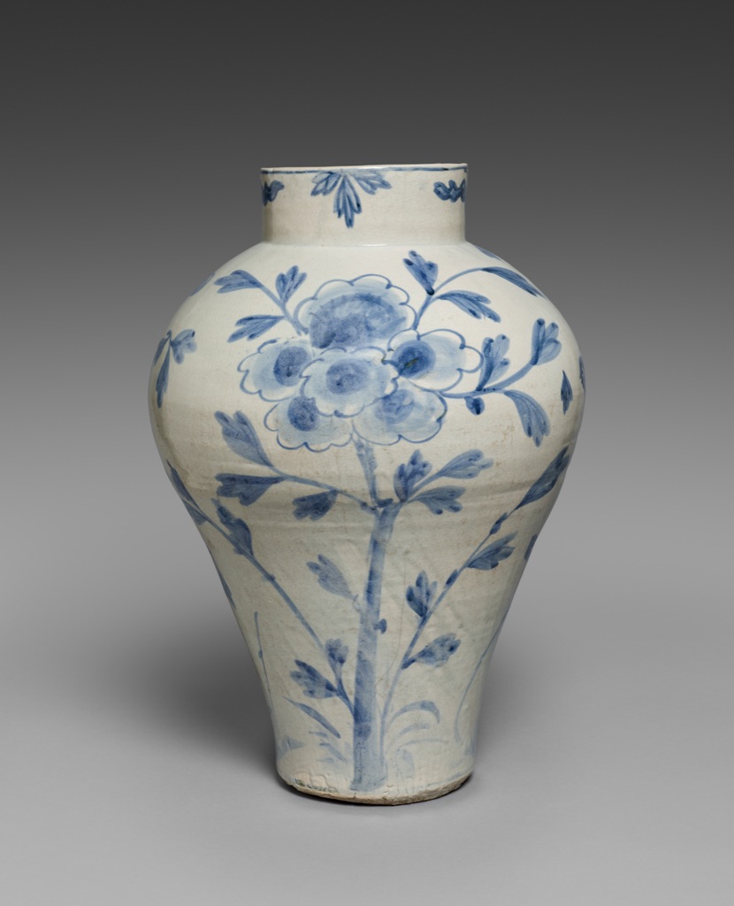
This Korean Vase with Bird and Flower Design dates from the late 1800s to early 1900s. Cleveland records porcelain with underglaze blue and identifies it as a typical 19th-century blue-and-white type.[11]
Blue lines and broader washes vary in density across peonies, leaves and a bird. The white body forms most of the visible area, while curvature changes illumination and gloss. The decoration can be discussed as one blue family, but the object is not simply a flat set of blue tints.
The material record matters: blue sits under glaze on a three-dimensional fired body. Brush load, absorption, firing, curvature and reflected light all affect its appearance. Treat white porcelain as active support and neutral field, and qualify any screen-sampled values as reproduction evidence.
Diagnose common mistakes
| Claim or symptom | Problem | Controlled next step |
|---|---|---|
| “I used one tube, so it is monochromatic” | one material can shift family or include additives | map the dried samples by hue, value and chroma |
| “Monochromatic means black-and-white” | chromatic and achromatic uses are conflated | name one hue family or name monochrome ink/gray |
| “The palette is too flat” | value or edge structure may have collapsed | keep family fixed; widen value or edge hierarchy |
| “Adding white only changes value” | chroma, opacity and undertone may also change | compare labelled dry samples |
| “A grayscale image proves the scheme” | hue-family information was removed | inspect the original under a declared model |
| “One family guarantees unity” | composition and material remain untested | compare area, texture, edge and neutral plans |
| “Sampled pixels equal the object” | capture and output are ignored | name file, profile, region and inference level |
Make one-family diagrams accessible
W3C guidance requires information not to depend on color alone.[12] Print M/V/C/O coordinates, write every control name, vary cell shapes and patterns, and include the complete values in an adjacent table. A viewer must be able to identify row, column, opacity and compositional role when every blue fill is hidden.
Test grayscale and common color-vision simulations, then remove fills entirely. Ordinary-size explanatory text should retain at least the standard 4.5:1 contrast ratio.[13] In functional interfaces, add labels and icons to states that differ only by one-family tokens.
Watch: Monochromatic Color Schemes through Formal Analysis
Choose a museum-led whole-work analysis, a close reading, or a foundations overview for considering monochromatic color schemes.
Introducing Formal Analysis: Landscape
Follow how recurring shapes, colours and intervals contribute to a larger visual organisation.
Watch on YouTubeFrequently Asked Questions
It organises a work primarily within one declared hue family while varying value, chroma, opacity or other structural properties.
No. Black-and-white work is achromatic, while a monochromatic scheme can be organised around any hue family.
Often yes, if the neutral support or additions are declared and the dominant one-family structure remains clear.
Change value, chroma, opacity, area, edge, texture and application deliberately rather than merely adding white.
Identify the dominant hue family, compare apparent exceptions, account for neutrals and material change, and state the criterion used.
Discussion
Which example on this page creates the greatest structural range while remaining within one colour family?
Reader Insights
Name the hue range that anchors the scheme.
Separate value, chroma, opacity and area when testing.
Neutral grounds or small accents should be acknowledged, not hidden.
Join the Conversation
Share one precise observation or a useful museum example below.
References
- Sessions College, “Color Wheel and Color Calculator.” https://www.sessions.edu/color-calculator/
- University of Tennessee Institute of Agriculture, “Clothing and Textiles Project Area Guide.” https://utia.tennessee.edu/publications/wp-content/uploads/sites/269/2023/10/W885.pdf
- National Gallery of Art, “The Elements of Art: Color Worksheet.” https://www.nga.gov/sites/default/files/migrate_images/content/dam/ngaweb/education/learning-resources/lessons-activities/elements-of-art/color-worksheet.pdf
- Golden Artist Colors, “Digital Color Wheel.” https://goldenartistcolors.com/inspiration/digital-color-wheel
- W3C, “CSS Color Module Level 4.” https://www.w3.org/TR/css-color-4/
- J. Paul Getty Museum, “Understanding Formal Analysis.” https://www.getty.edu/education/teachers/building_lessons/formal_analysis.html
- Yale University Press, “Interaction of Color.” https://yalebooks.yale.edu/book/9780300146936/interaction-of-color/
- The Metropolitan Museum of Art, “On Color Fidelity.” https://www.metmuseum.org/perspectives/color-photography-standards-van-gogh-sunflowers
- Cleveland Museum of Art, “The Contemplator.” https://www.clevelandart.org/art/1946.283
- Cleveland Museum of Art, “Waterfowl and Reeds.” https://www.clevelandart.org/art/1984.42
- Cleveland Museum of Art, “Vase with Bird and Flower Design.” https://www.clevelandart.org/art/1989.117
- W3C Web Accessibility Initiative, “Understanding SC 1.4.1: Use of Color.” https://www.w3.org/WAI/WCAG21/Understanding/use-of-color
- W3C Web Accessibility Initiative, “Understanding SC 1.4.3: Contrast (Minimum).” https://www.w3.org/WAI/WCAG22/Understanding/contrast-minimum.html