by Tom Gurney
Tom Gurney BSc (Hons) is an art history expert with over 20 years experience
Page created on September 2, 2026 / Page updated on September 13, 2026
Email: tomgurney1@gmail.com / Phone: +44 7429 011000
Choosing the Right Colour Model for the Task
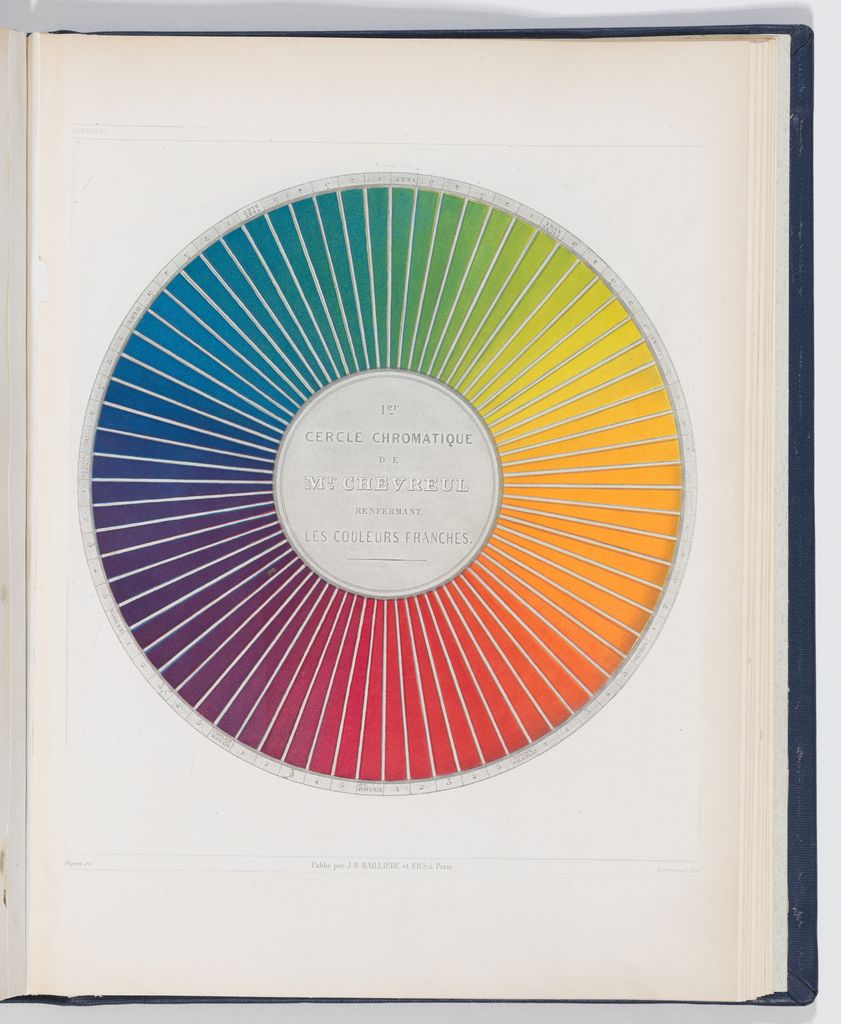
Color theory is a collection of models, vocabulary, observations, and practical methods for describing and testing color relationships. It helps an artist decide what to compare: emitted light or physical material, hue or lightness, an isolated sample or a sample in context, a screen image or a particular printed result.
It is not one universal rulebook. A traditional red–yellow–blue wheel, an RGB display, a CMYK printing process, and a box of real paints answer different questions. A useful theory makes those boundaries visible and leads to a test in the material, light, and setting where the artwork will be judged.
At a Glance
- Core ideacolour theory is a toolkit of models and tests, not one universal rulebook.
- Choose by taskRYB, RGB, CMYK and physical samples answer different questions.
- Separate dimensionsdescribe hue, value and chroma independently.
- Test in contextsurround, material, light, output and time affect appearance.
- Document decisionsrecord pigments, proportions, ground, profile and viewing conditions.
Contents
Start with the task, not a universal model
The National Gallery of Art distinguishes the red, yellow, and blue primaries traditionally taught for paint from the red, green, and blue light used by screens.[1] That distinction is a good starting point, but artists also need to separate an organizing diagram from actual behavior. A wheel can name neighboring, opposite, or spaced hue families; it cannot tell you exactly how two tubes of paint will mix.
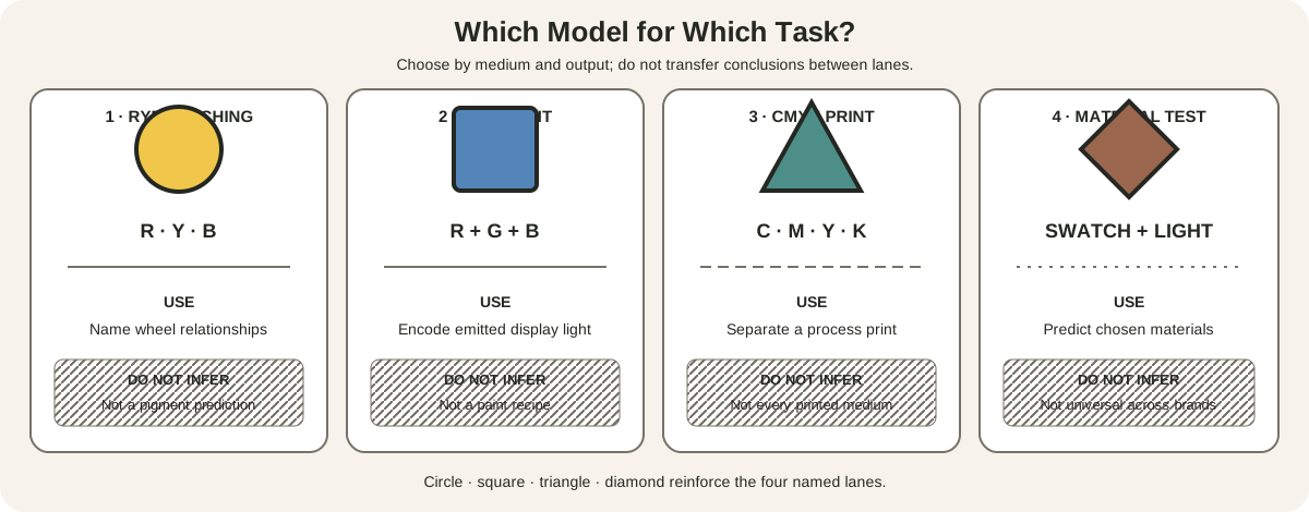
Use each lane for a defined job:
| Model or test | Best question | What it does not establish |
|---|---|---|
| 12-position RYB teaching wheel | How are traditional artist hue families named and positioned? | Exact spectral or pigment behavior |
| RGB emitted light | What values can a display encode and emit? | A recipe for mixing paint or ink |
| CMYK process printing | How will a separated image be rendered by a specified print process? | Every color visible on a screen or every artist-printing method |
| Real-material swatches | What do these named paints, inks, dyes, papers, or pastels do under this light? | A universal result for other brands, binders, grounds, or conditions |
For a full model comparison, use the site's wheel guide. Its declared RYB structure remains useful for relational vocabulary, provided its sectors are not mistaken for equal perceptual intervals or physical laws.
RGB concerns additive light. A screen controls red, green, and blue channels to produce displayed color. CMYK concerns process printing with cyan, magenta, yellow, and black separations. These digital values belong to device and output workflows. The International Color Consortium describes profiles that connect input, display, and output encodings through a defined color-management system.[9] A numeric color without its color space, profile, device, and viewing conditions is incomplete production information.
Paint, dye, pastel, glaze, and printing ink are material systems. Golden Artist Colors documents differences in opacity, transparency, masstone, undertone, and mixing behavior.[4] Two paints sold under similar family names can produce different mixtures because their pigments and formulations differ. For a physical decision, make a physical test.
The four lanes can interact without becoming interchangeable. An artist might organize a palette with an RYB wheel, photograph the study into an RGB file, convert a copy for a CMYK catalogue, and compare the proof with the original. Each stage is a translation with its own limits.
A six-step color decision
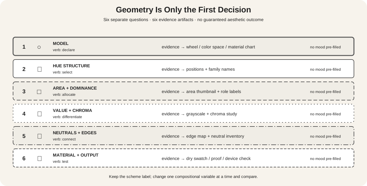
1. Identify the medium, light, and output
Write down what will carry the color: oil paint, watercolor, dyed fiber, colored pencil, projected light, an sRGB webpage, or a specified print process. Record the support and the important illumination. A transparent watercolor over white paper and an opaque paint over dark ground can share a pigment name but not an appearance.
Also name the intended result. A screen-only illustration, an original painting, and a reproduction that must survive several printers need different tests. Smithsonian's account of color and light begins with light, reflective surfaces, and perception rather than treating the sample as self-sufficient.[3] Do this before choosing a palette from a wheel or software panel.
2. Describe hue, value, and chroma separately
Hue names a family such as red, yellow-green, or blue-violet. Value compares relative lightness and darkness. Chroma describes relative intensity or distance from a neutral at a given value. Golden's mixing guide uses these dimensions to diagnose and adjust color.[5]
Separating them prevents vague instructions such as “make it more blue.” The required change might instead be darker, less intense, or cooler in relation to a neighbor. Use a grayscale view to inspect value, but remember that grayscale conversion is itself a rendering method rather than a direct measurement of paint.
3. Compare the color in context
Josef Albers's Interaction of Color centers learning on exercises and the relativity of color.[6] A sample can appear to change when its surround changes even though the sample remains physically identical. That means a palette chip viewed alone is not sufficient evidence for its role in a composition.
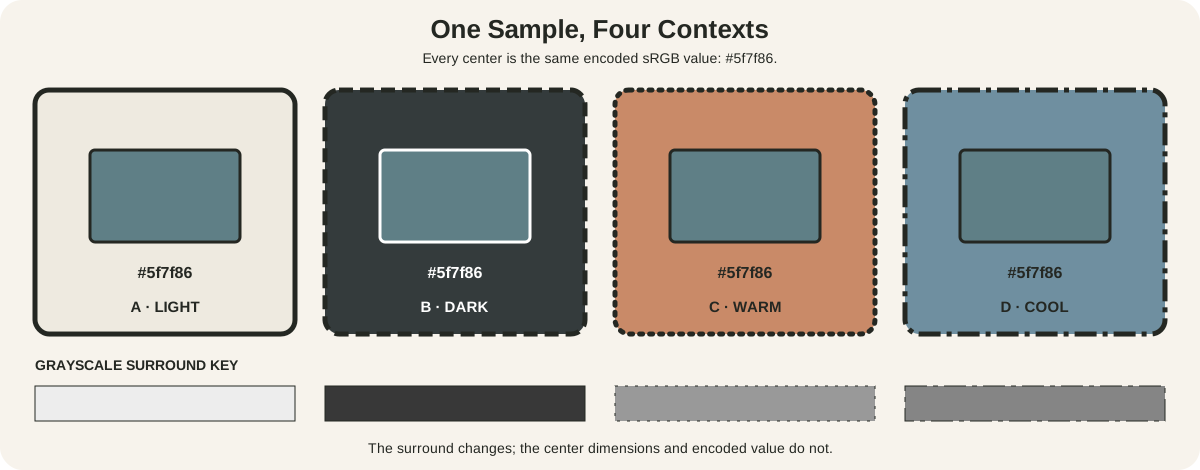
The center of A, B, C, and D is the same displayed sRGB value, #5f7f86. Only the surround changes. The printed labels, equal dimensions, and grayscale row establish what is fixed. Differences you perceive are contextual comparisons, not changes to the center's encoded value.
This demonstration does not promise identical experience for every observer or device. Display calibration, ambient illumination, adaptation, color vision, and browser rendering can all affect the result. Its practical lesson is narrower: compare an important color beside the colors and values that will actually surround it.
4. Select a relationship, then test its structure
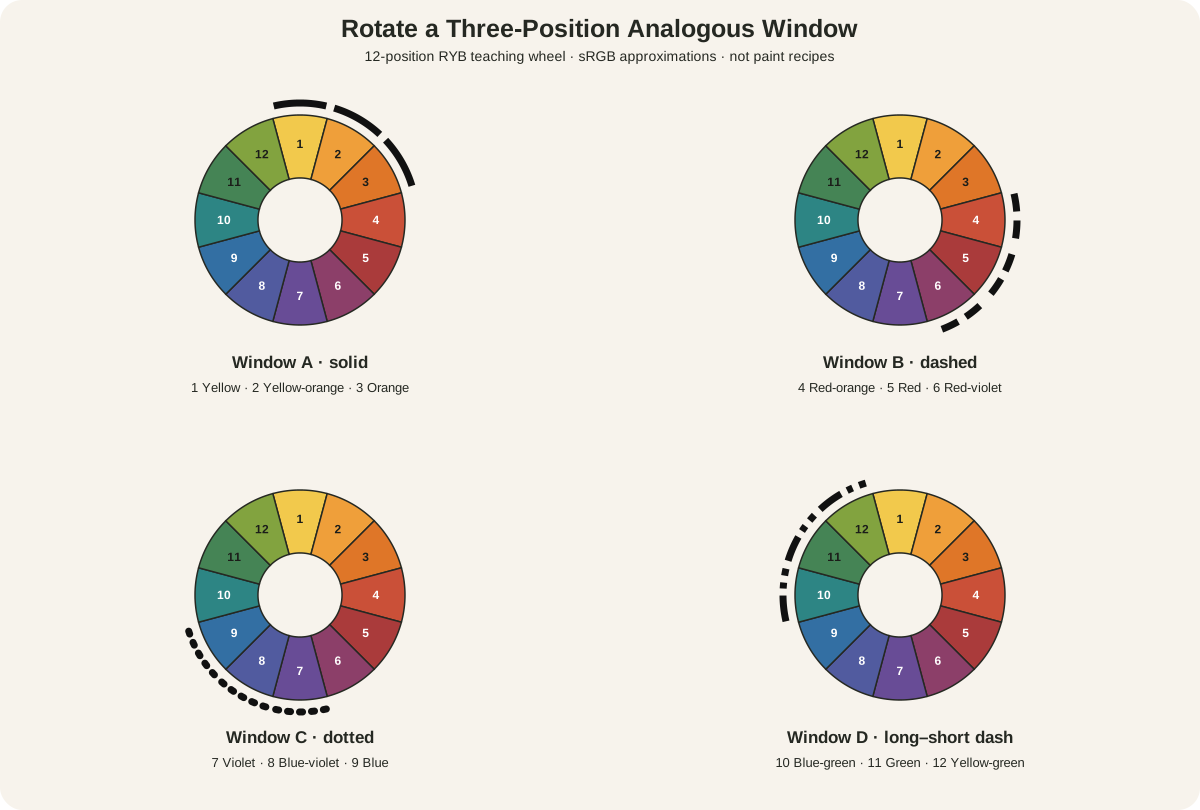
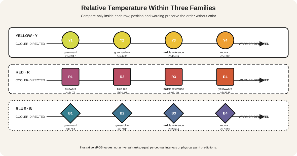
A wheel relationship can provide a starting constraint. Completed guides explain triadic color schemes and analogous colors. The label tells you how selected families are positioned on the declared wheel. It does not guarantee harmony, mood, legibility, realism, or quality.
Test value, chroma, area, placement, repetition, and edges. A small intense mark can outweigh a large muted field. Two distinct hues can merge when their values are close. A hard boundary can separate related colors; broken marks can make them mingle at a distance. The Metropolitan Museum of Art notes that color in works on paper interacts with form, line, and negative space and has been explained by multiple, sometimes contradictory theories.[8]
5. Test the actual material
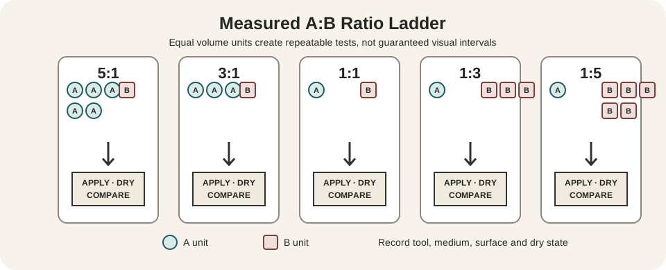
For paint, make labeled mixtures from the exact tubes and proportions you intend to use. Include the support or ground, thin and thick applications, mixtures with white where relevant, and a fully dried sample. Follow the site's complete measured mixing-chart method when a systematic test is needed.
For a screen work, inspect the intended color space on representative displays and keep essential distinctions independent of hue. For print, request or make a proof using the intended profile, stock, inks, and process. Do not infer a printer's result from a bright display alone.
6. Document the decision
Record pigment codes or digital values, proportions, ground, layer order, illumination, profile, output process, and observations. Documentation turns “this blue worked” into a result that can be checked or repeated. It also preserves exceptions: one ultramarine may granulate in watercolor, one red may become unexpectedly opaque, or one conversion may compress a group of intense colors.
Color belongs to light, material, and time
The Smithsonian's National Museum of Asian Art emphasizes that color changes with the quality of light and with an object's manufacture, medium, and aging.[2] This makes an artwork's color both perceptual and material. What a viewer sees today may include the artist's choices, later chemical change, fading, surface dirt, conservation treatment, and the current illumination.
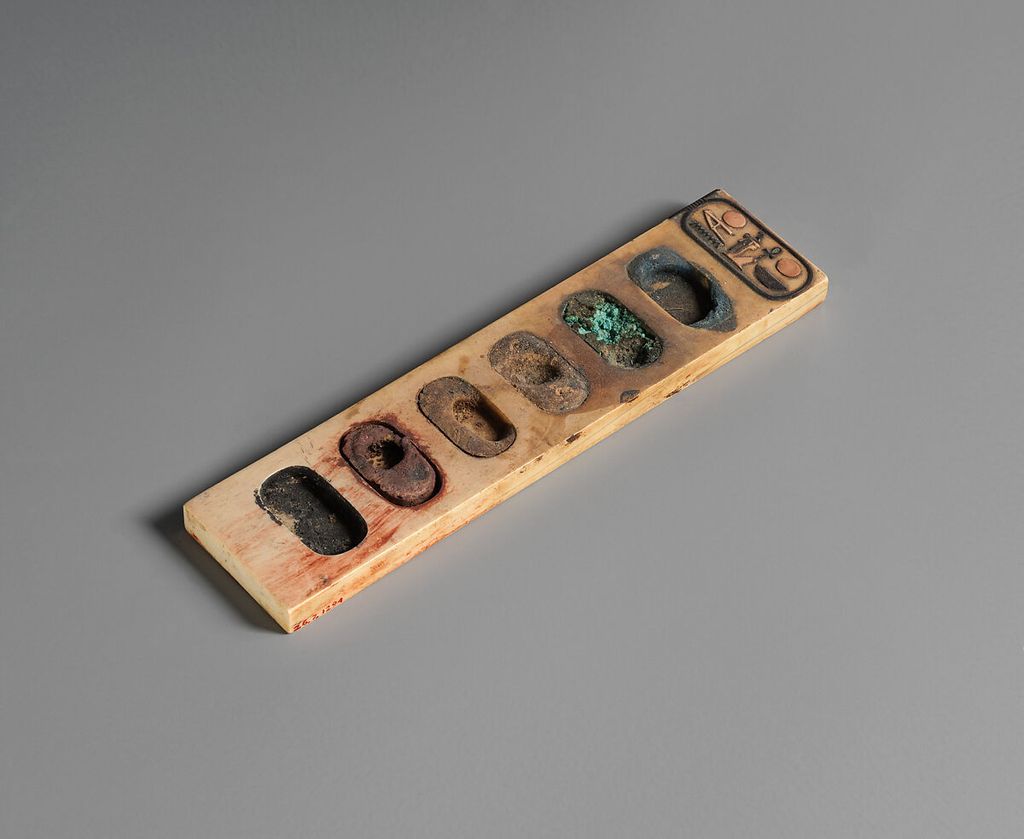
The Painter's Palette Inscribed with the Name of Amenhotep III is an ivory tool from ancient Egypt with six wells retaining cakes of blue, green, brown, yellow, red, and black pigment.[12] It makes a basic fact tangible: artists did not begin with disembodied sectors. Color was prepared, held, and applied as specific matter.
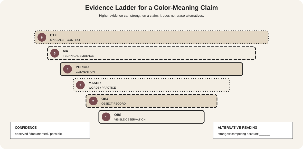
The palette does not prove that one modern wheel describes ancient Egyptian practice. Its value here is material evidence. The colors occupy wells of a working object; their present appearance comes through surviving pigment, ivory, age, museum lighting, photography, and an RGB display. When studying historical color, distinguish the object record from a modern classification placed upon it.
Material choices affect more than hue. Particle size, concentration, binder, opacity, support, and layer thickness can change scattering, coverage, gloss, and the visibility of underlayers. These variables help explain why a digital swatch is useful for planning a webpage but insufficient as a paint specification.
Color can be mixed on the surface and in viewing
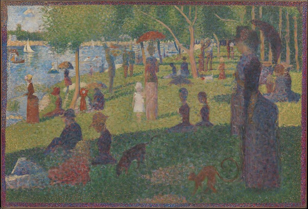
Georges Seurat's 1884 Study for “A Sunday on La Grande Jatte” uses small, patchy touches of color. The Met describes close green and yellow relationships as well as red and blue contrasts and connects the separated touches to Divisionism, in which colors were intended to blend in the viewer's perception.[13]
At close range, individual marks, edges, and interruptions remain evident. From farther away, some marks participate in broader fields. The work therefore directs attention to scale and viewing distance as parts of color organization. A mixture made by stirring pigments together is not identical to a field made from adjacent touches, even when both are casually described as mixing.
Do not reduce the study to a demonstration of one scientific formula. Its result also depends on the sizes and shapes of marks, the canvas, the surrounding colors, and the composition. The museum image lets us analyze visible placement, but it cannot reproduce the painting's physical surface, scale, or every color relationship.
Reproductions are interpretations of recorded color
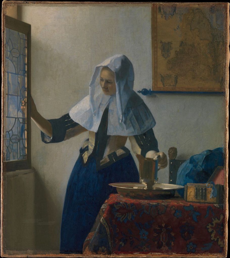
In Johannes Vermeer's Young Woman with a Water Pitcher, the Met draws attention to balanced primary colors and subtle effects of light.[14] In the museum image, the blue drapery changes across lit folds and shadow; pale wall, white cloth, warm map, red skirt, metal basin, and dark furniture establish contexts against which those blues are judged.
This is a more precise reading than extracting a few dominant swatches. The blue is not one flat value, and its role depends on distribution, surface, edge, neighboring lightness, and the represented illumination. The small red area has a different visual weight from the broad pale wall. Describing those observable relationships does not require claiming that Vermeer followed a modern scheme label.
The Met's color-fidelity project explains that cultural-heritage reproductions vary and describes scene-referred capture, output rendering, ICC profiles, RGB-to-CMYK conversion, and measured comparison.[7] A file can be carefully made and still require transformation for a particular display or print. Some source colors may sit outside an output gamut; paper, ink, monitor, and room light change the viewing event.
Treat a museum reproduction as evidence with provenance, not a transparent replacement for the object. Cite its source, do not sample it as though the numbers were paint formulas, and qualify claims that depend on exact color. When a color relationship is central, compare available technical images, conservation information, and the work in person where possible.
A compact observation exercise
Choose one artwork or study and prepare a six-row note sheet:
- Conditions: medium, support, viewing light, reproduction source, and output device.
- Families: three to five visible hue families, named approximately rather than sampled as presumed pigments.
- Value: lightest region, darkest region, and important middle-value connections.
- Chroma: most intense and most muted passages at comparable values.
- Context: one color that appears to shift beside two different neighbors.
- Material test: one claim that needs a swatch, mixture, proof, conservation record, or direct viewing.
Then make two small studies. Keep the shapes and values fixed while changing one hue relationship in the first. Keep the hue families fixed while changing area and value in the second. Label every version. This separates variables more effectively than changing an entire palette at once.
If the study is physical, observe it under at least two relevant lights and after it dries. If it is digital, compare the intended file on a second display and export a print proof if print matters. The goal is not to make every version identical; it is to identify which differences affect the decision.
Common misconceptions
| Misconception | Why it fails | Better practice |
|---|---|---|
| There is one universal set of primary colors | Primaries are defined within particular models and tasks | Name RYB, RGB, CMYK, or the actual material system |
| A wheel predicts paint mixtures | Ideal positions omit pigment and binder behavior | Make labeled mixtures from the intended materials |
| A hex code is an absolute appearance | Encoded values require a color space, device, light, and surround | Preserve profiles and inspect the intended output |
| A scheme automatically creates a mood | A scheme names a relationship, not a guaranteed response | Describe value, chroma, area, placement, subject, and context |
| The same color looks the same everywhere | Surround, illumination, adaptation, and output alter appearance | Compare it in its final context |
| A reproduction is the artwork's exact color | Capture and rendering translate an object into another medium | Treat the image as a sourced, mediated record |
| Color can carry an instruction alone | Some readers cannot distinguish the intended hues | Add labels, shapes, patterns, position, or text |
Make color information accessible
W3C states that color should not be the only visual means of conveying information.[10] Label swatches directly. Add numbers, shapes, line patterns, or positions to diagrams and charts. In a palette list, print names and values instead of relying on colored chips. Normal-sized text generally needs at least 4.5:1 contrast against its background.[11]
Color-vision simulations can expose fragile distinctions, but they are diagnostic views rather than representations of every person's experience. Check diagrams under protanopia, deuteranopia, tritanopia, and grayscale simulations, then verify that the redundant labels and structure still communicate the result.
Artwork alternative text should describe the subject, placement, major light-dark structure, and relevant color relationships. Avoid a list of colors with no spatial information. Accessibility usually improves the analysis because it forces each claim to be expressed more precisely.
Watch: Color Theory for Artists through Formal Analysis
Choose a museum-led whole-work analysis, a close reading, or a foundations overview for considering color theory for artists.
Introducing Formal Analysis: Landscape
Follow how recurring shapes, colours and intervals contribute to a larger visual organisation.
Watch on YouTubeFrequently Asked Questions
Use a declared artist's wheel for relational vocabulary, then test the actual paints and supports for material decisions.
They answer different questions: RGB models emitted light, while RYB is a traditional artist-teaching framework.
No. CMYK is a defined process-printing framework; paints differ in colorants, binders, layers, grounds and handling.
Identify medium, ground, illumination and output; compare hue, value and chroma; inspect the intended surround; then test and document.
Adjacent values, hues, chroma, area and edges change the comparison even when the physical or encoded sample remains unchanged.
No. It can describe and test visible relationships, while meaning also depends on subject, culture, history, material and use.
Discussion
Which colour decision on this page most clearly requires a physical test rather than a diagram or screen value?
Reader Insights
State whether the decision concerns paint, emitted light, print or another material.
Change hue, value, chroma or area one at a time.
A useful result includes ground, light, output and viewing context.
Join the Conversation
Share one precise observation or a useful museum example below.
References
- National Gallery of Art, “The Elements of Art: Color.” https://www.nga.gov/educational-resources/elements-art/elements-art-color
- Smithsonian National Museum of Asian Art, “Colors.” https://asia.si.edu/explore-art-culture/art-stories/colors/
- Smithsonian Libraries and Archives, “Color and Light.” https://library.si.edu/exhibition/color-in-a-new-light/science
- Golden Artist Colors, “Color Wheel.” https://goldenartistcolors.com/resources/color-wheel
- Golden Artist Colors, “Color Mixing Guide.” https://goldenartistcolors.com/resources/color-mixing-guide
- Yale University Press, “Interaction of Color.” https://yalebooks.yale.edu/book/9780300146936/interaction-of-color/
- The Metropolitan Museum of Art, “On Color Fidelity.” https://www.metmuseum.org/perspectives/color-photography-standards-van-gogh-sunflowers
- The Metropolitan Museum of Art, “Color and Form.” https://www.metmuseum.org/perspectives/color-drawings-and-prints
- International Color Consortium, “Profile.” https://www.color.org/profile/
- W3C Web Accessibility Initiative, “Understanding SC 1.4.1: Use of Color.” https://www.w3.org/WAI/WCAG21/Understanding/use-of-color
- W3C Web Accessibility Initiative, “Understanding SC 1.4.3: Contrast (Minimum).” https://www.w3.org/WAI/WCAG22/Understanding/contrast-minimum.html
- The Metropolitan Museum of Art, “Painter's Palette Inscribed with the Name of Amenhotep III.” https://www.metmuseum.org/art/collection/search/544518
- The Metropolitan Museum of Art, “Georges Seurat: Study for ‘A Sunday on La Grande Jatte.’” https://www.metmuseum.org/art/collection/search/437658
- The Metropolitan Museum of Art, “Johannes Vermeer: Young Woman with a Water Pitcher.” https://www.metmuseum.org/art/collection/search/437881