by Tom Gurney
Tom Gurney BSc (Hons) is an art history expert with over 20 years experience
Page created on September 2, 2026 / Page updated on September 13, 2026
Email: tomgurney1@gmail.com / Phone: +44 7429 011000
Choosing Fewer Paints for Clearer, Testable Decisions
A limited color palette is a deliberately small, declared set of colorants chosen for a particular job. It may contain three paints or eight. The count matters less than the evidence: can those actual materials produce the hue, value, chroma, opacity and surface range the work needs?
Restriction can simplify decisions and expose how paints interact. It does not guarantee harmony, realism, economy or historical authenticity. Those outcomes depend on the chosen pigments, mixture ratios, ground, handling and composition.
At a Glance
- Core idearestrict the starting paints to solve a defined visual or material problem.
- Choose by purposecoverage, value range, mixing behaviour and subject matter matter more than a famous palette name.
- Test firstchart originals, pair mixtures, a combined mixture and tints before painting.
- Add carefullyintroduce one paint only when a documented gap remains.
- Keep a recordnote pigment codes, ratios, ground, medium, drying and lighting conditions.
Contents
Start with a purpose, not a famous name
Choose the palette after defining the task. A landscape, figure study, screen print and travel sketch require different ranges. Begin with one of three plans:
| Plan | Priority | First tests | Likely gap |
|---|---|---|---|
| broad mixing range | many clear hue families | strongest pair mixtures and tints | earth colors or convenient darks |
| earth/figure range | low-chroma warm shifts and values | skin/ground comparisons and darks | high-chroma green or violet |
| subject-matched range | observed colors in one motif | target swatches and area roles | an accent outside the core range |
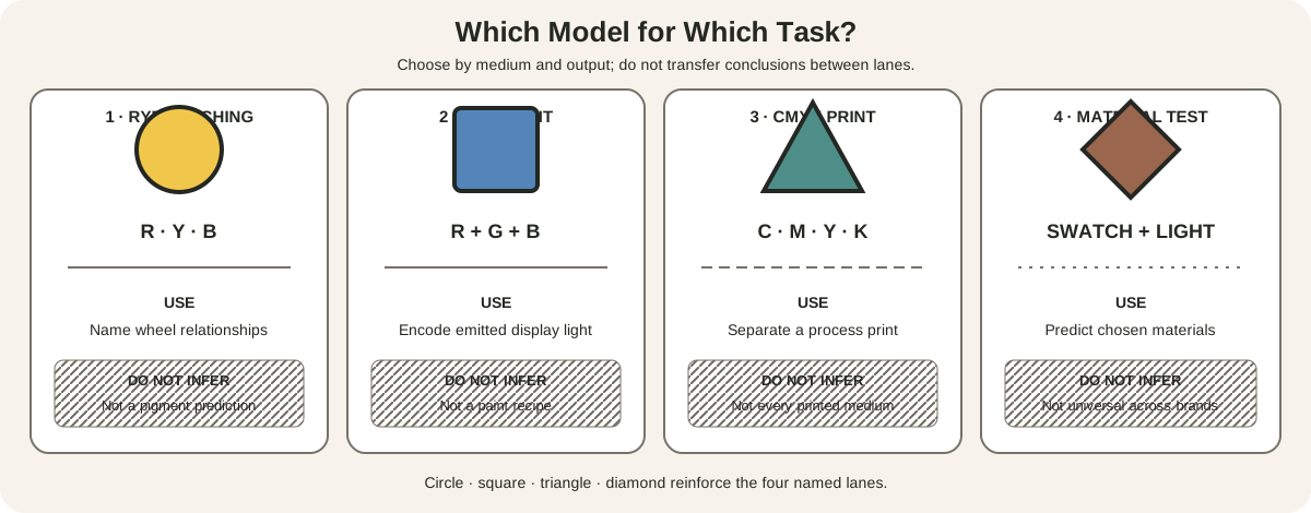
Write the product and pigment identifiers. “Red, yellow and blue” is not enough. Golden's mixing guide shows that the particular red, yellow and blue selected can dramatically change the resulting secondaries.[1] Its clean-mixing demonstrations compare organic and inorganic pigments whose mixtures differ in chroma.[2]
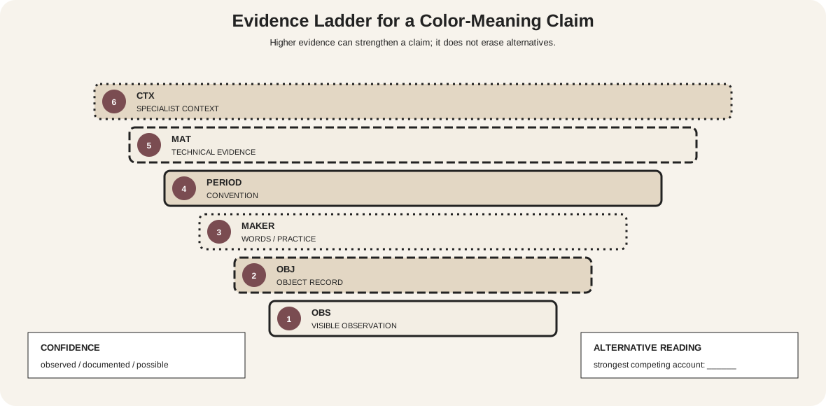
A named historical palette can be a useful exercise, but do not claim that an artist always used those exact materials without object-specific technical evidence. Treat the name as a modern study plan unless documentation supports more.
Golden's broader mixing resources frame limited palettes as choices that can suit a working style or provide a focused challenge.[3] That is the productive use of limitation: it makes the consequences of each material easier to see.
Run three pilot studies before the painting
Use the same candidate set in three small studies. The first is a gamut study: make the cleanest attainable orange, green and violet, then the most useful warm and cool neutrals. Place the results beside target samples from the subject. Do not judge from memory.
The second is a value study. Mix at least five ordered values while keeping their hue direction recorded. If the darkest mixture changes toward an unwanted family or the lightest loses too much chroma, write that down. The palette may still be suitable if the composition does not require the missing result.
The third is a handling study. Apply each important mixture thinly, thickly and over the planned ground. Test one hard edge, one softened edge and one scumbled or broken passage. Record drying shift, opacity, gloss and any separation. This reveals whether the set can make the required surface, not merely matching swatches.
Score each pilot against the brief rather than against an imaginary complete spectrum. A portrait palette might need subtle warm/cool changes at middle value more than a brilliant green. A botanical study might make that green essential. A print design may need three flat, repeatable mixtures and no continuous modeling at all.
Then choose among three decisions: accept the limitation and redesign the color role; replace one candidate with a better-serving paint; or document a gap and test P4. Preserve the rejected matrix. It explains why the final set was chosen and prevents repeated trial-and-error.
Repeat the pilots whenever the medium, brand, support or scale changes. A successful oil combination cannot be assumed to behave identically in watercolor or acrylic, even when product names appear similar.
Three paints, one complete test matrix
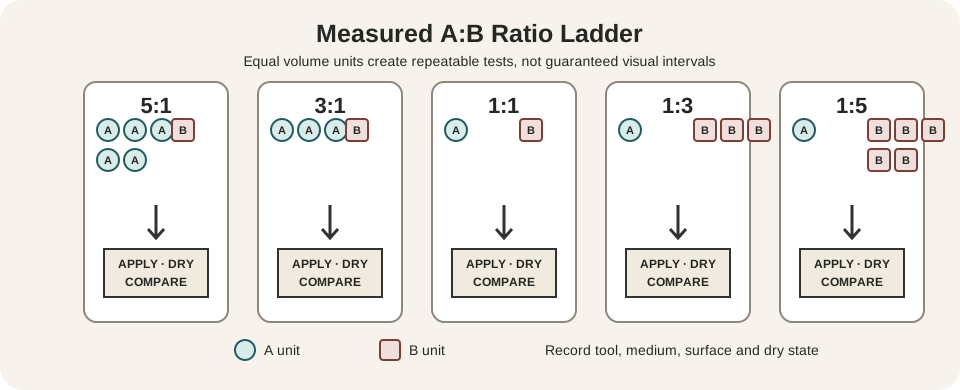
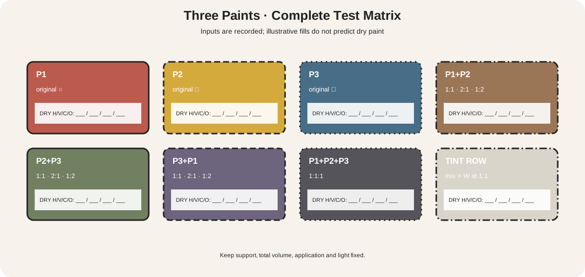
The matrix labels three candidate paints P1, P2 and P3. It contains:
- each original in thin and thick application;
- pair mixtures P1+P2, P2+P3 and P3+P1 at 1:1, 2:1 and 1:2;
- one recorded three-way mixture;
- a white-tint row using the same counted additions;
- blank dry-result fields for hue, value, chroma and opacity.
Illustrative diagram fills only separate the cells. They are not mixture predictions. Replace them with real samples on the intended support. Keep total paint volume consistent, label every ratio and let every swatch dry before judging.
The result is a map of the palette's actual working gamut. Look for the highest useful chroma in orange, green and violet directions; the lightest and darkest controllable values; neutralization routes; and opacity changes. A palette can cover many hue families yet fail because its light values become chalky or its darks lose separation.
The site's repeatable mixing chart provides a larger protocol for wet and dry evidence. Use that method when a matrix cell needs finer ratios.
Evaluate more than hue range
Five criteria deserve separate columns:
- Hue reach: which target families and biases are available?
- Value reach: can the set make light, middle and dark structure without unwanted shifts?
- Chroma reach: where are clean mixtures possible, and where are subdued colors preferable?
- Material behavior: what changes in opacity, tinting strength, drying, gloss, granulation or separation?
- Practical fit: are cost, availability, permanence and safe handling suitable for the project?
No single score replaces these records. An opaque earth red might be valuable for blocking a figure even if a transparent red produces a wider violet range. A strong staining blue may make many mixtures but be difficult to lift in watercolor. A palette selected for travel may prioritize reliability and small size over maximum gamut.
Safety belongs in the first selection, not as an afterthought. Read the current manufacturer label and safety data for each specific product, use ventilation and protective practice appropriate to the medium, and avoid assuming that a traditional pigment name describes a harmless formulation. Plan cleaning and waste handling before work begins. If a hazardous or unavailable material is replaced, test the substitute as a new paint: a similar marketed hue may differ in tinting strength, opacity, drying and mixture bias.
Cost comparisons also need a common unit. A stronger paint may require less material per mixture, while a weak but inexpensive color may be consumed quickly. Record actual use during the pilot rather than judging by tube price alone. The most economical palette is the one that reliably produces the needed results within safe working conditions.
The HVS reference helps separate family, light-dark structure and chroma. The neutral-color guide distinguishes low-chroma mixtures from genuinely achromatic values.
Add one paint only for a documented gap
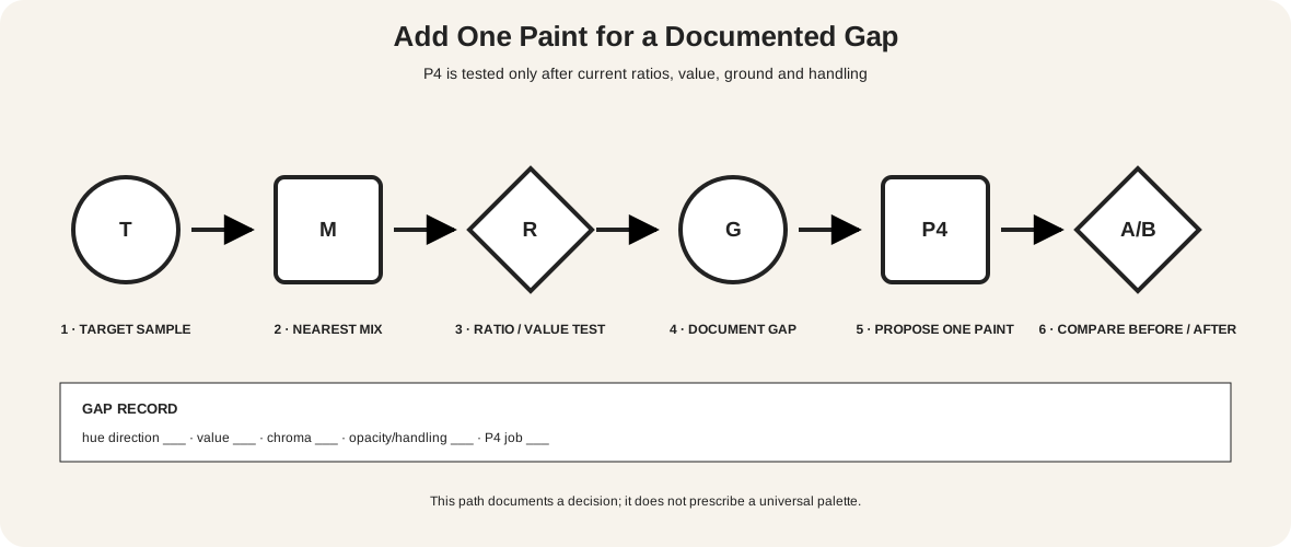
The decision path starts with target T, not with a shopping list.
- Place the target beside the nearest existing mixture
M. - Record the gap
G: hue direction, value, chroma, opacity or handling. - Try ratio changes using the current set.
- Test whether white, a ground change or application thickness solves the actual problem.
- Propose one paint
P4and state its job. - Repeat the same target test before and after adding it.
Keep P4 only if it closes the named gap without creating unacceptable tradeoffs. “I cannot reach a clean yellow-green at the required value” is actionable. “The palette feels dull” is not yet specific enough.
This rule avoids two opposite mistakes: refusing any expansion because limitation has become a virtue in itself, or adding tubes until the original learning advantage disappears. A limited palette is a controlled system, not a contest for the fewest materials.
Build usable darks and neutrals
Test at least two dark strategies. Mix the existing paints toward a chromatic dark, then compare it with a tube black if one is included. Record undertone in mass tone and when spread thinly. A dark that looks black in a pile may reveal blue, green, red or brown across a lighter ground.
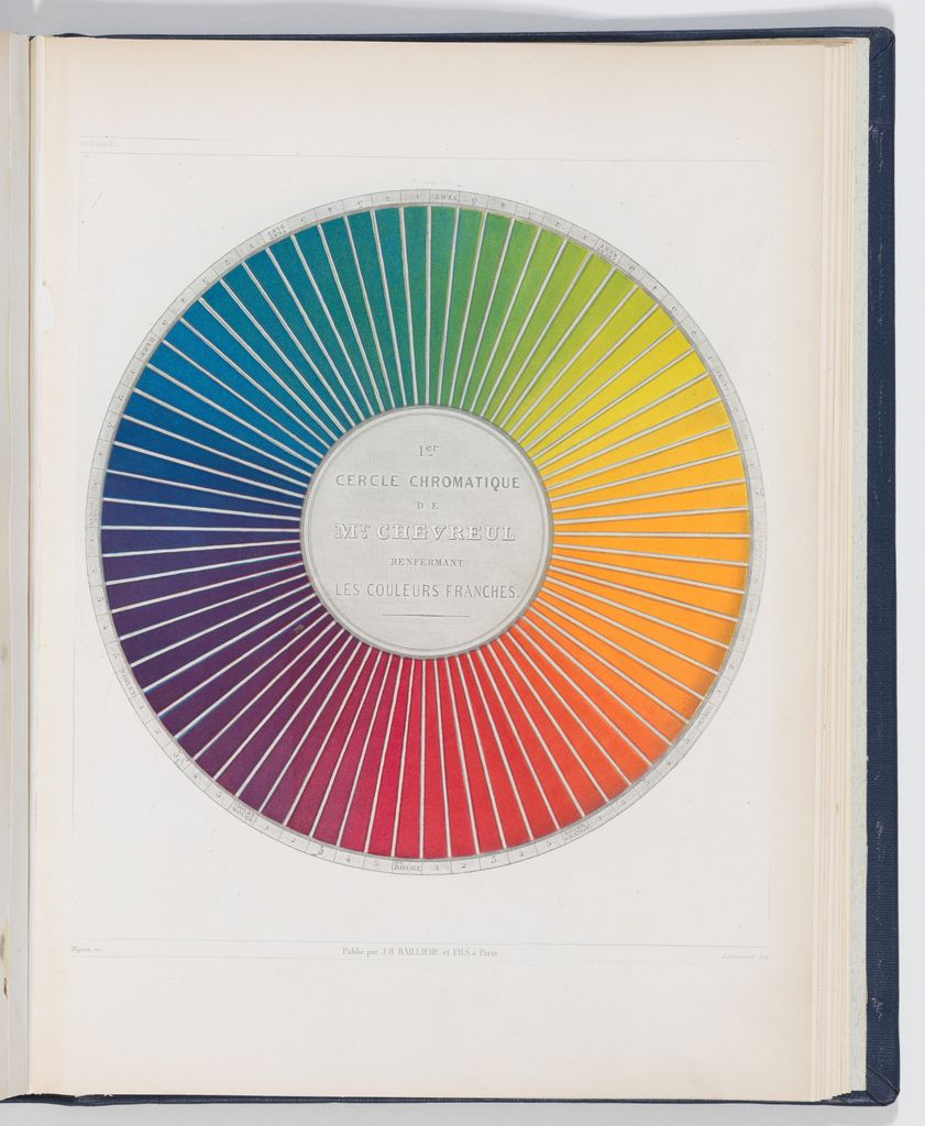
Create neutral rows from practical oppositions in the set. Do not assume wheel labels cancel perfectly. Pigment strength and ratio can leave a useful bias. Preserve it in the record rather than calling every subdued mixture “mud.”
If white is present, tint each original and important pair at the same counted ratio. White may expose undertone, raise value, reduce chroma and change opacity. The best full-strength color is not necessarily the best tint.
Assign compositional roles
A mixture chart proves availability, not composition. Give the selected colors jobs: majority field, structural dark, light, secondary family and accent. Test those roles in actual area proportions.
Make three thumbnail studies with identical shapes. In one, P1 occupies 70 percent; in another, P2 does; in the third, the support remains the majority. Keep a written area estimate. A tiny high-chroma accent may command attention while a larger muted field establishes the environment.
Change edge and opacity deliberately. A limited set can still produce hard and soft boundaries, transparent veils, dry brush, opaque blocks and exposed ground. Variation in handling prevents the idea of “few paints” from being confused with a uniform surface.
Getty formal-analysis guidance treats hue, value and intensity alongside texture and spatial organization.[4] Those relationships explain why two works using similar color families can behave very differently.
Preserve a studio record
Number every tube and matrix cell. Record date, medium, support, ground, lighting and drying time. Photograph the full chart with a neutral reference only as a secondary record; keep the physical chart because capture and display alter subtle colors.
The Metropolitan Museum of Art traces the transformations introduced by capture, RGB editing, profile choices, gamut limits and print conversion.[5] A sampled pixel is evidence about that reproduction, not a pigment identification. If a palette must translate to print, proof the intended process and note which mixtures move outside its reproducible range.
At the end of a painting, annotate what was actually used. An available paint that never entered the work should not be silently included in an account of the visible palette. Conversely, grounds, drawing media and finishing layers can matter even if they were not counted in the initial set.
Brown, red and black in Boucher's drawing
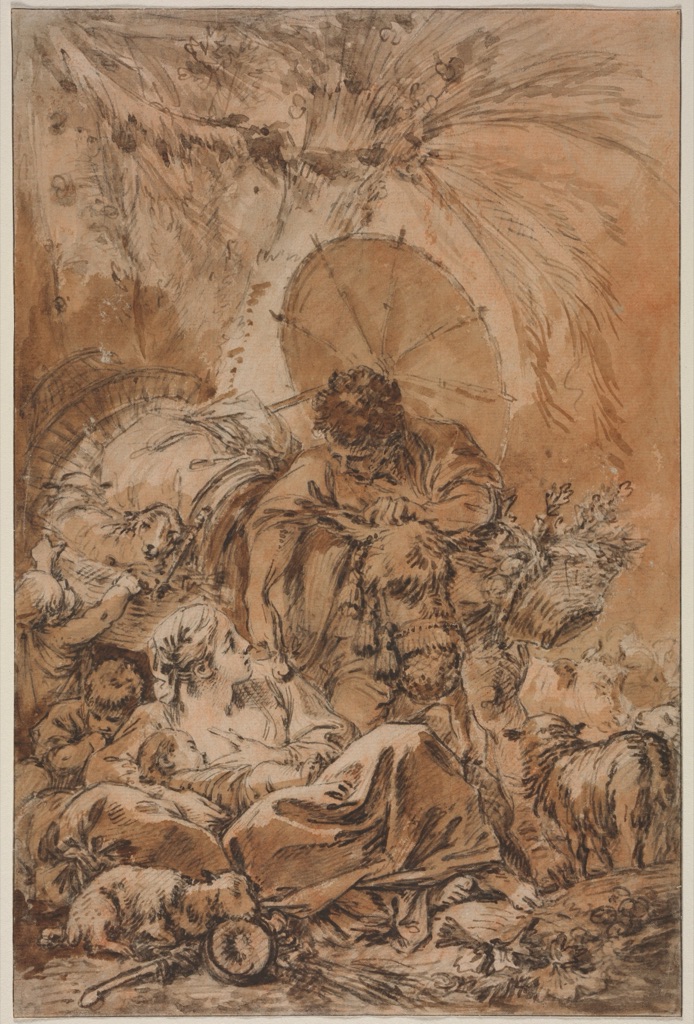
François Boucher's The Departure of Jacob, about 1755, combines brown-black ink, brown wash, red chalk wash and black chalk on cream laid paper. Cleveland explicitly describes a limited palette of brown, red and black used for shadows and highlights.[6]
The reproduction shows how few colorants can take different roles. Dark line locates figures and foliage; broad brown wash creates mass; red shifts the central group; black reinforces selected depths; cream paper supplies much of the light. The palette is limited, but the material operations are not identical.
This example also shows why support belongs in the analysis. Calling the sheet “three colors” without naming cream paper would hide the largest visible field.
Restricted atmosphere in Corot's pond
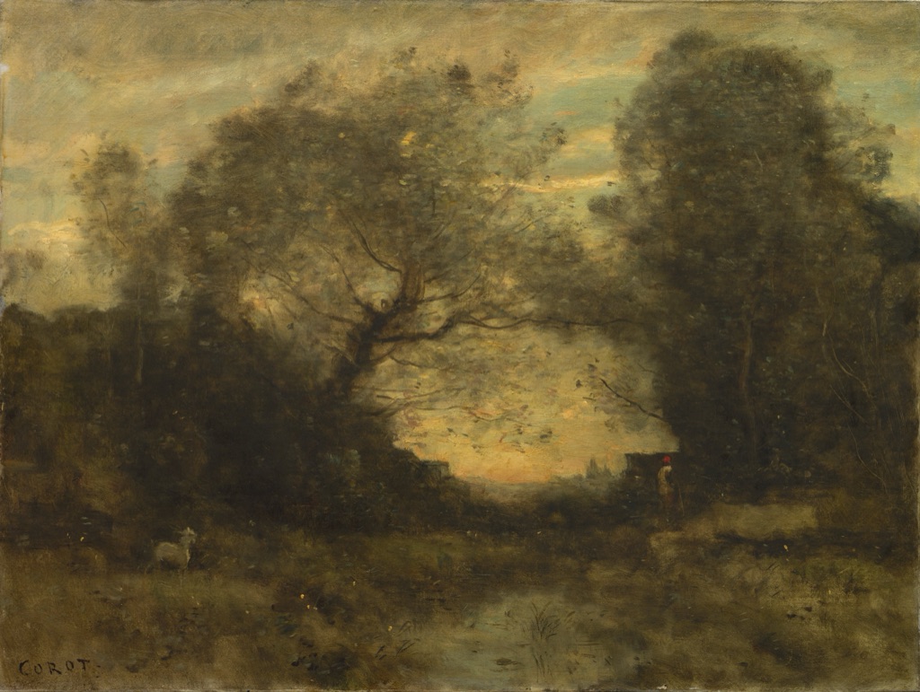
Camille Corot painted The Pond at the Entrance of the Woods about 1860–75 in oil on fabric. Cleveland connects its vaporous light and atmospheric effects with the restricted palette of his late style.[7]
Muted green and brown trees frame a pale opening of sky and reflected water. A small red note on the figure and a white goat remain visible at very small scale. Restriction here does not mean one hue family: several quiet families occupy different areas and values.
The museum record supports “restricted palette,” but it does not on its own list every pigment. Describe visible relationships separately from claims about the materials on the palette.
Role separation in Nicholson's Beef-eater
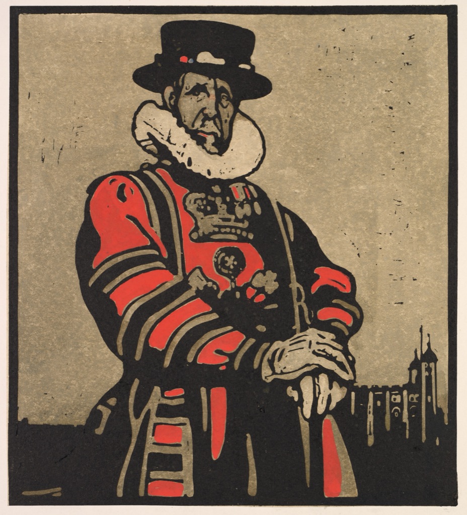
William Nicholson's London Types: Beef-eater is an 1898 woodcut hand-colored with watercolor.[8] The reproduction is organized by red, black and tan with white paper.
Red marks the striped tunic and emblem; heavy black outlines define the figure, hat and tower; tan creates face, gloves and ground; white paper forms the ruff and intervals. The limited set gains clarity through shape, edge and repeated role assignment.
Because the print combines woodcut and hand coloring, “palette” includes both printed line and applied watercolor. Medium-specific evidence is more accurate than treating every visible field as the same kind of paint.
Diagnose common problems
| Symptom | Likely cause | Next controlled test |
|---|---|---|
| violet is always dull | chosen red or blue bias limits the pair | compare alternative single-pigment candidates |
| light mixtures turn opaque | white changes more than value | test thin application and another white |
| no useful dark | current combination stalls at middle value | compare chromatic dark and documented black |
| everything looks similar | value and area roles collapsed | make grayscale thumbnails with exact areas |
| too many corrective additions | target gap was not named | return to T/M/G/P4 decision path |
| online palette does not match paint | encoded preview is treated as material result | use labelled dry samples |
| “historical palette” claim is uncertain | modern convention replaced object evidence | qualify it as a study palette |
Accessible palette diagrams
Color cannot be the sole means of communicating a mixture or state.[9] Print P1–P4, ratios, coordinates and operation names. Give originals, pairs, tints and darks different shapes or patterns. Include all data in adjacent text and tables.
Remove the fills: the matrix and decision path should remain reconstructable. Test grayscale and common CVD simulations. Ensure normal explanatory text meets the 4.5:1 contrast baseline.[10]
Watch: Painting with a Limited Color Palette through Formal Analysis
Choose a museum-led whole-work analysis, a close reading, or a foundations overview for considering painting with a limited color palette.
Introducing Formal Analysis: Landscape
Follow how recurring shapes, colours and intervals contribute to a larger visual organisation.
Watch on YouTubeFrequently Asked Questions
It is a deliberately restricted set of paints or colourants selected for a defined visual, practical or material purpose.
There is no universal number; use the fewest identified paints that can meet the documented needs of the work.
Chart each paint, pair mixtures, a combined mixture and tints, then assess dried value, chroma, opacity and handling.
Add one only after a specific hue, value, chroma, opacity or handling gap has been demonstrated in tests.
Yes, but results depend on the actual pigments and ratios; test mixtures rather than assuming a named combination will work.
Discussion
Which test on this page would most change the way you select paints before beginning a work?
Reader Insights
Start with the problem the palette must solve.
Measured dry samples reveal more than wheel geometry.
A single documented addition keeps cause and effect visible.
Join the Conversation
Share one precise observation or a useful museum example below.
References
- Golden Artist Colors, “Color Mixing Guide.” https://goldenartistcolors.com/resources/color-mixing-guide
- Golden Artist Colors, “Clean Color Mixing.” https://goldenartistcolors.com/resources/clean-color-mixing
- Golden Artist Colors, “Mixing Resources.” https://goldenartistcolors.com/inspiration/mix-main-page
- J. Paul Getty Museum, “Understanding Formal Analysis.” https://www.getty.edu/education/teachers/building_lessons/formal_analysis.html
- The Metropolitan Museum of Art, “On Color Fidelity.” https://www.metmuseum.org/perspectives/color-photography-standards-van-gogh-sunflowers
- Cleveland Museum of Art, “The Departure of Jacob.” https://www.clevelandart.org/art/1981.58
- Cleveland Museum of Art, “The Pond at the Entrance of the Woods.” https://www.clevelandart.org/art/1951.330
- Cleveland Museum of Art, “London Types: Beef-eater.” https://www.clevelandart.org/art/2013.87.4
- W3C Web Accessibility Initiative, “Understanding SC 1.4.1: Use of Color.” https://www.w3.org/WAI/WCAG21/Understanding/use-of-color
- W3C Web Accessibility Initiative, “Understanding SC 1.4.3: Contrast (Minimum).” https://www.w3.org/WAI/WCAG22/Understanding/contrast-minimum.html