by Tom Gurney
Tom Gurney BSc (Hons) is an art history expert with over 20 years experience
Page created on September 2, 2026 / Page updated on September 13, 2026
Email: tomgurney1@gmail.com / Phone: +44 7429 011000
Seeing Hue and Neutrality as a Measured Continuum
Chromatic colors have a discernible hue: they read as red, yellow, green, blue or a position between named families. Achromatic colors are organized without discernible hue around black, white and gray. Neutral colors is the broadest practical category here. It includes achromatic grays and low-chroma colors that still lean toward a hue.
These are working definitions, not hard borders shared by every textbook, museum and color system. A painter may call a quiet brown “neutral” while a measurement still records its orange bias. The useful question is not only which label wins, but what hue, value and chroma evidence the label summarizes.
At a Glance
- Chromatica visible hue family remains identifiable.
- Achromaticthe working appearance lacks an identifiable hue under declared conditions.
- Neutrala contextual description that may include grays, low-chroma mixtures and material whites or blacks.
- Keep value separateneutrality is not the same as middle value.
- Best practiceset a threshold, name the material or colour space, and record the viewing conditions.
Contents
Three terms, different jobs
The Getty Art & Architecture Thesaurus distinguishes perceived color dimensions and recognizes both chromatic and achromatic or neutral colors.[1] Getty conservation science describes color locations approaching a neutral area around an achromatic point as saturation decreases.[2] Together these sources support a continuum: hue becomes less evident as chroma falls, but the practical classification depends on the system and viewing conditions.
Use the terms this way:
| Term | Working test | Examples | Required qualification |
|---|---|---|---|
| chromatic | a hue family remains identifiable | vivid blue, muted olive, pale pink | name hue, value and chroma context |
| achromatic | no hue is intended or discernible | neutral gray ladder, black ink, white ground | identify material and illumination |
| chromatic neutral | low chroma with a residual hue bias | blue-gray, warm brown, dusty rose | state the bias and comparator |
| neutral | umbrella studio description | gray or subdued mixture | do not assume hue-free composition |
Brown is not automatically achromatic. Most browns have a low-value orange, red or yellow bias. Likewise, cream may lean yellow and charcoal may lean blue or brown. “Neutral” can describe their restrained role without erasing that chromatic information.
From identifiable hue toward neutral
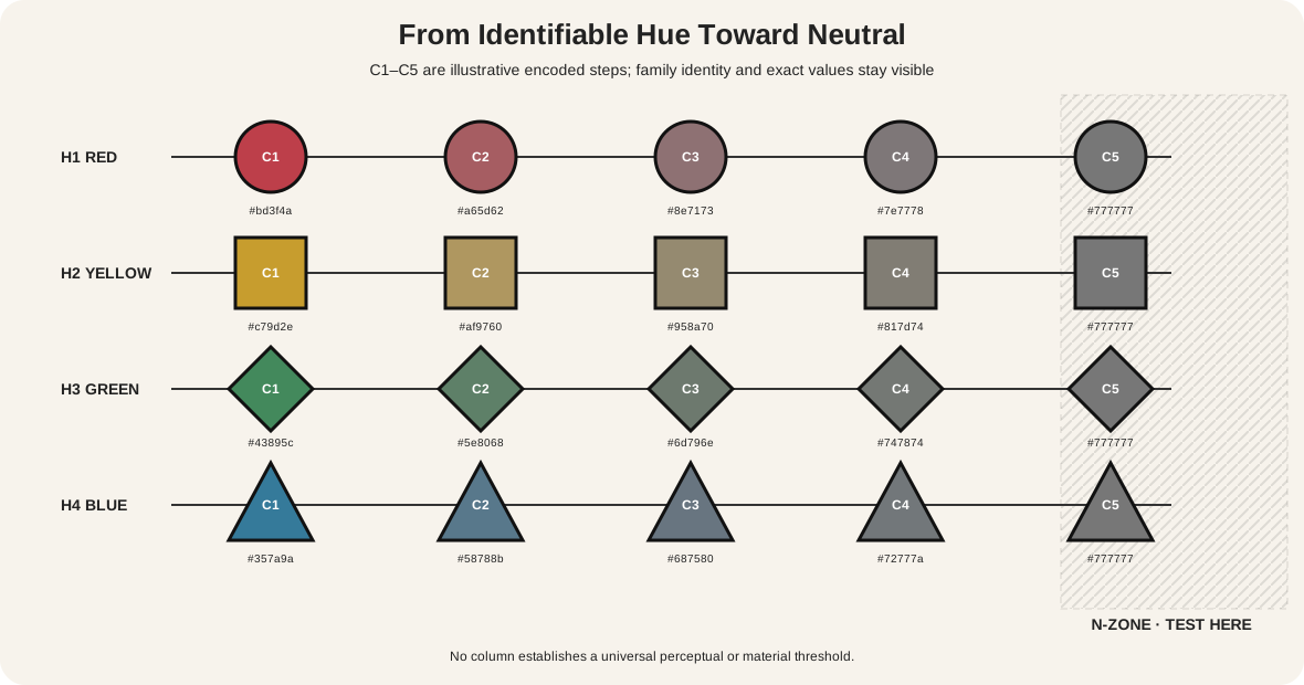
The first diagram has four five-step rows. Each begins with an easily named illustrative hue and reduces encoded chroma toward a hatched N-zone.
| Record | What changes | What remains available | What the graphic does not decide |
|---|---|---|---|
| row H1–H4 | family: red, yellow, green or blue | family ID and ordered samples | cultural meaning or material identity |
| step C1–C5 | illustrative encoded chroma | exact value and position | equal perceptual intervals |
| N-zone | working comparison region | residual-bias label | a universal neutral threshold |
The final colored step does not magically become achromatic. It may still be a chromatic neutral if a bias remains visible. The hatched zone asks for a classification under stated conditions rather than announcing one answer.
Compare each step beside a prepared neutral gray of similar value. Then place it on white, middle gray, black and the intended dominant field. Record whether the hue remains identifiable. Josef Albers's color exercises emphasize that surrounding colors can change appearance even when a sample itself is unchanged.[6]
Set a working classification threshold
There is no need to force every marginal sample into a timeless category. Establish a threshold that serves the current task. A conservation measurement, a paint-mixing chart and a user-interface palette may need different evidence.
For a studio chart, place the candidate between a neutral-gray reference and a clearly chromatic reference at similar value. View all three under one documented light and at the size used in the work. Three observers can record “no evident bias,” “weak warm/cool bias” or “named hue evident” without seeing one another's answers. Keep disagreements: they reveal that the sample sits near a practical boundary.
Repeat the test on the intended ground. A weak green bias that disappears on white may become obvious next to red-brown. If the classification changes, report both results: “near-neutral on white; green-gray beside the dominant red-brown.” That sentence is more useful than selecting one unqualified label.
For a digital system, define the numerical method and its purpose. A token may meet an internal chroma threshold yet still appear colored on a particular interface. Numerical classification and visual QA answer different questions. Preserve the values, screenshot conditions and observer record so later revisions can reproduce the decision.
Thresholds are tools for consistent work. They should never be presented as proof that every viewer, material or color system has the same neutral boundary.
Neutrality is not the same as middle value
A neutral may be light, middle or dark. A hue-bearing color can have the same value as a gray. Value tells how light or dark; chroma tells how strongly colored; hue tells the family. Neutrality concerns absent or restrained chroma, not a fixed point halfway between white and black.
Make a value-matched comparison: one neutral gray, one muted blue-gray and one muted brown. Convert a duplicate to grayscale to check approximate value structure, but return to the color version to classify residual hue. Grayscale cannot establish that the originals were achromatic because it removes the very evidence under review.
For independent property checks, use the site's HVS guide. Its mixture-vocabulary guide defines operations with white, gray and black without promising that their outputs become neutral.
Four routes to a neutral result
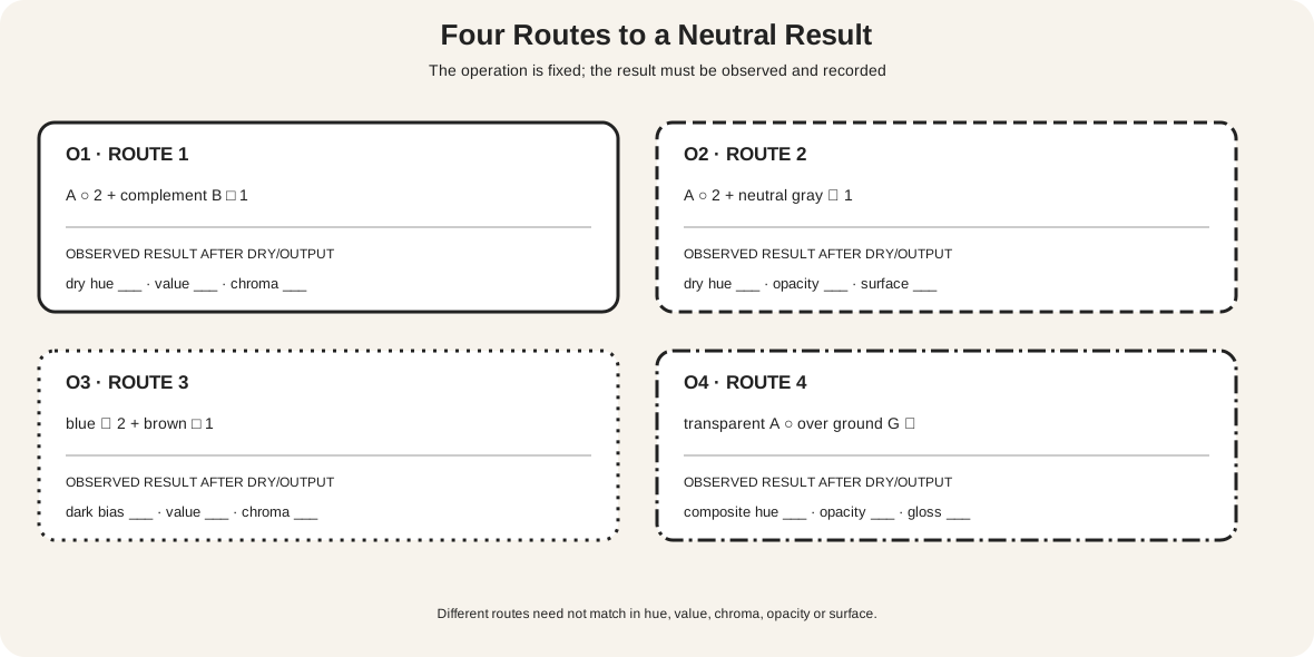
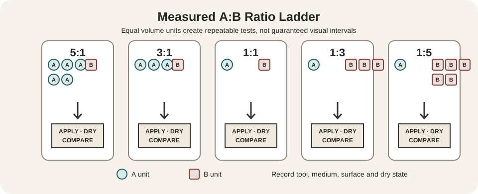
The second diagram is a record form, not a recipe card. It compares four operations:
- color A plus its practical complementary paint B;
- color A plus a prepared neutral gray;
- two chromatic colors combined into a dark mixture;
- a transparent chromatic layer viewed over a chosen ground.
Each panel fixes counted input units and leaves five result fields blank: observed hue bias, value, chroma, opacity and surface. Fill them only after the paint dries or the intended output is produced.
Golden distinguishes a neutral-gray study without hue or chroma from the use of neutral grays to reduce other colors.[3] Its watercolor material also describes chromatic neutrals beyond black, white and gray.[4] Those are different outcomes. Adding gray may lower chroma while changing value and opacity. Complementary pigments may approach a colored neutral, but their undertones and strengths rarely cancel in a perfectly symmetrical way.
The accepted Complementary Colors in Art page separates adjacency from physical mixing and maps the teaching-wheel pairs. Use its operation test before assuming that an opposite label predicts a neutral result.
Black, white and gray are active materials
Achromatic does not mean inactive. Black can create a dominant shape, fine contour, absorbent stain, glossy layer or mixed dark. White may be opaque paint, paper, canvas ground, porcelain body, reflected highlight or an emitted screen value. Gray can be a prepared neutral, an optical blend, a weathered material or a chromatic mixture.
Name the material and role. “White occupies 60 percent as exposed paper” is more informative than “the empty space is neutral.” “The dark is a blue-orange mixture” preserves a studio decision that “black” would conceal.
Check surface and thickness. A glossy black and matte black can separate under angled light even when a small screen sample gives them similar values. Thin white over a dark ground may reveal undertone; an opaque white addition may raise value and reduce chroma differently. The color category does not replace material observation.
Make chromatic neutrals in paint
Choose one target value and prepare a real neutral-gray reference. Then create three possible chromatic neutrals using different operations. Keep total volume, support and application size controlled.
For each mixture, record:
- product and pigment identifiers;
- exact counted ratio;
- wet hue bias, value, chroma and opacity;
- dry observations under one documented light;
- comparison with neutral gray and the intended surrounding palette;
- surface, granulation or separation that changes the reading.
Do not correct a mixture without documenting the correction. If a red-green mixture leans violet-brown, that is useful evidence. Additions may lower chroma while shifting value or hue. A one-step “mud” judgment loses information that could make the color controllable.
Earth colors are often convenient chromatic neutrals, but their names do not guarantee one hue or opacity. Paint out every candidate. Use the site's repeatable mixing record to preserve wet and dry evidence rather than relying on memory.
Define neutrals in a digital workflow
Declare the working color space. Store neutral and near-neutral tokens with exact values and roles. An encoded gray in sRGB has equal red, green and blue channel values, but that numerical definition belongs to that encoding. CSS Color documents conversions and the behavior of several color spaces; equal numerical changes are not necessarily equal perceptual changes.[5]
Build a small matrix at three values. Put true encoded grays in one column and low-chroma alternatives in adjacent columns. Test them on every intended background, at actual component size and with text or icons present. A near-neutral border that looks quietly blue on white may disappear or turn comparatively warm on a blue-gray panel.
Proof final output. Capture, color profiles, display settings, gamut limits and print conversion can alter subtle biases. The Metropolitan Museum of Art's account of color fidelity makes those transformations explicit.[7] Sampling a reproduction is evidence about that file, not direct measurement of the original object.
Grisaille in Saint John the Baptist
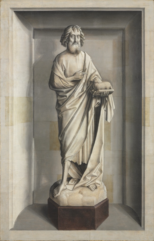
The Cleveland Museum of Art dates Saint John the Baptist to about 1475–85 and attributes it to the circle of Dieric Bouts. The medium is oil on wood in grisaille. Cleveland describes grisaille here as a monochromatic method using shades of gray to imitate sculpture.[8]
The standing saint, lamb, folded drapery and niche are modeled through a broad value range. Cast shadows and crisp architectural boundaries help a painted surface appear sculptural. The example shows how an achromatic strategy can support complex volume and depth rather than merely remove color.
Slight beige and brown traces are visible in the reproduction, especially around the frame and base. They may involve support, aging, material or capture. The documented grisaille method remains the central fact; the screen view should not be converted into a claim of mathematically equal RGB grays.
Muted chromatic structure in Hammershøi
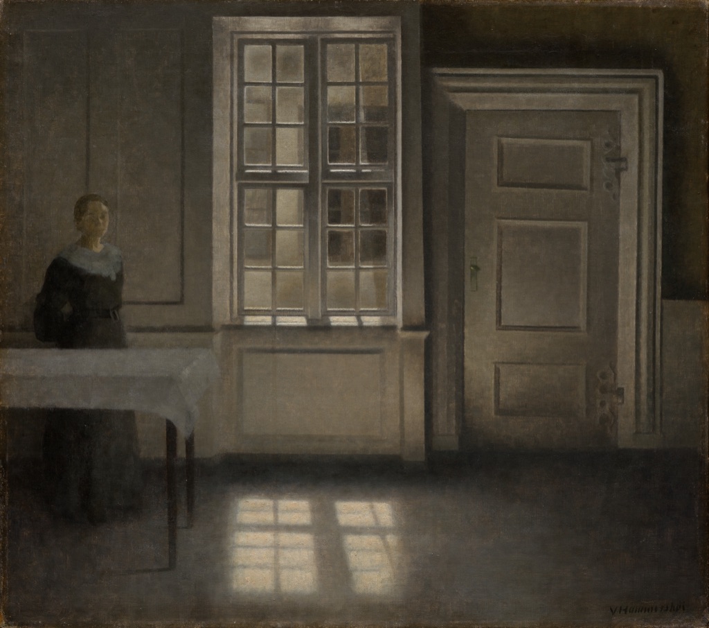
Vilhelm Hammershøi painted Strandgade, Sunshine about 1906 in oil on canvas. Cleveland describes an almost empty interior, a woman in shadow, light from a window and muted tones.[9]
At first glance the reproduction may seem gray. Closer comparison reveals warm brown walls and floor, cooler green-gray and violet-gray passages, pale cream light and a near-black dress. These colors are low in chroma but not uniformly hue-free.
Value and edge organize the window, door and rectangular reflection. Residual hue differences keep the quiet surfaces distinct. “Muted chromatic palette” is therefore more precise than “achromatic,” while still acknowledging that many colors sit near neutral.
The museum connects the interior to psychological complexity. That interpretation belongs to its object record; a general rule that muted neutrals always create one mood would exceed the evidence.
Restrained color in Needlefish (Yagara)
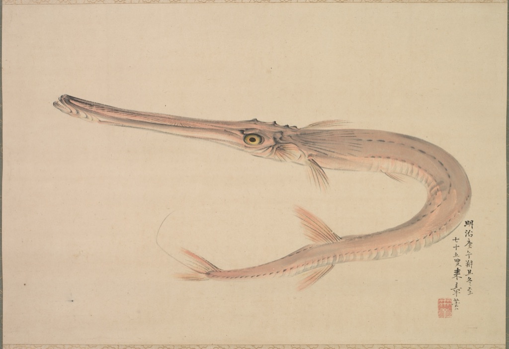
Nakajima Raishō's Needlefish (Yagara) dates to 1870. Cleveland records a hanging scroll in ink and color on paper.[10]
The fish curves across a large cream field. Its body carries pale pink and gray washes with dark ink contours; the eye is yellow; black calligraphy and a red seal occupy the lower right. None of these colors needs to be vivid to remain identifiable.
The work clarifies the difference between restraint and achromatism. Pink-gray is a chromatic neutral, black ink supplies an achromatic dark, and the paper is a warm material ground rather than abstract digital white. Their areas and edges determine how the sparse image holds together.
Diagnose classification mistakes
| Claim or symptom | Problem | Better test |
|---|---|---|
| “Neutral means gray” | low-chroma hues are excluded | compare the sample with a value-matched gray |
| “Brown is achromatic” | residual hue is ignored | identify its orange, red or yellow bias |
| “Adding black makes a neutral” | value change is confused with chroma reduction | record dry hue, value and chroma separately |
| “Complementaries make gray” | actual pigment strengths and ratios are omitted | mix labelled increments and observe results |
| “White paper is empty” | support becomes invisible in the analysis | measure its area and compositional edges |
| “The RGB values look almost equal” | encoding is treated as perception | specify color space, surround and output |
| “Grayscale proves the original was achromatic” | conversion removed hue evidence | examine the unconverted source beside references |
Accessible neutral diagrams
Do not rely on tiny chroma differences to communicate a category. W3C guidance requires another cue when color carries information.[11] Print row and step IDs, use shapes and border patterns, label the neutral zone, and repeat exact values in an HTML table.
In the lab diagram, use operation names, counted input symbols and blank written result lines. A viewer must understand what was mixed and what remains to be observed when all fills are removed. Keep normal-size text at or above the 4.5:1 contrast baseline.[12]
Watch: Chromatic, Achromatic and Neutral Colors through Formal Analysis
Choose a museum-led whole-work analysis, a close reading, or a foundations overview for considering chromatic, achromatic and neutral colors.
Introducing Formal Analysis: Landscape
Follow how recurring shapes, colours and intervals contribute to a larger visual organisation.
Watch on YouTubeFrequently Asked Questions
A chromatic colour retains an identifiable hue family under the declared viewing or measurement conditions.
An achromatic colour has no identifiable hue in the working classification, as with a defined black, white or gray.
Not always. Neutral is often used more broadly for low-chroma colours, material whites and blacks, and mixtures that read as restrained in context.
No. Grays can range from very light to very dark; value and chroma are separate dimensions.
Begin with identified pigments, make measured opposing or near-opposing mixtures, document ratios and ground, and judge the fully dried samples under stable light.
Discussion
Which example on this page most clearly shows that low chroma and middle value are separate decisions?
Reader Insights
State how little hue is enough for the working classification.
Describe hue, value and chroma independently.
Material, ground, light and surround can shift a neutral reading.
Join the Conversation
Share one precise observation or a useful museum example below.
References
- Getty Art & Architecture Thesaurus, “Color (perceived attribute).” https://www.getty.edu/vow/AATFullDisplay?subjectid=300056130
- Getty Conservation Institute, Color Science in the Examination of Museum Objects. https://www.getty.edu/publications/resources/virtuallibrary/0892365862.pdf
- Golden Artist Colors, “Neutral Grays.” https://goldenartistcolors.com/resources/neutral-grays
- Golden Artist Colors, “Watercolors.” https://goldenartistcolors.com/inspiration/watercolors
- W3C, “CSS Color Module Level 4.” https://www.w3.org/TR/css-color-4/
- Yale University Press, Interaction of Color. https://yalebooks.yale.edu/book/9780300146936/interaction-of-color/
- The Metropolitan Museum of Art, “On Color Fidelity.” https://www.metmuseum.org/perspectives/color-photography-standards-van-gogh-sunflowers
- Cleveland Museum of Art, “Saint John the Baptist.” https://www.clevelandart.org/art/1951.354
- Cleveland Museum of Art, “Strandgade, Sunshine.” https://www.clevelandart.org/art/2023.38
- Cleveland Museum of Art, “Needlefish (Yagara).” https://www.clevelandart.org/art/1991.56
- W3C Web Accessibility Initiative, “Understanding SC 1.4.1: Use of Color.” https://www.w3.org/WAI/WCAG21/Understanding/use-of-color
- W3C Web Accessibility Initiative, “Understanding SC 1.4.3: Contrast (Minimum).” https://www.w3.org/WAI/WCAG22/Understanding/contrast-minimum.html