by Tom Gurney
Tom Gurney BSc (Hons) is an art history expert with over 20 years experience
Page created on September 2, 2026 / Page updated on September 13, 2026
Email: tomgurney1@gmail.com / Phone: +44 7429 011000
Separating Three Colour Questions before Interpreting Them
Hue, value and saturation answer three different questions about color. Hue names the family: red, yellow, green, blue or a position between them. Value compares how light or dark a color appears. Saturation describes how vivid or grayish it appears, but its exact meaning depends on the color system. In the Munsell system, the corresponding dimension is called chroma.
Separate the questions before trying to correct a color. If the family is wrong, adjust hue. If it is too light or dark, compare value. If it is too intense or muted, compare chroma or the relevant model's saturation control. Paint, light, screens and reproductions can make these properties interact, so a one-control change is a test, not a guarantee.
At a Glance
- Hueidentifies a colour family or position within a declared model.
- Valuedescribes relative lightness or darkness.
- Saturation or chromadescribes distance from a neutral axis within a named system.
- Key safeguarddo not treat the three properties as interchangeable.
- Contextsurround, material, illumination and reproduction change the judgement.
Contents
Three properties, three questions
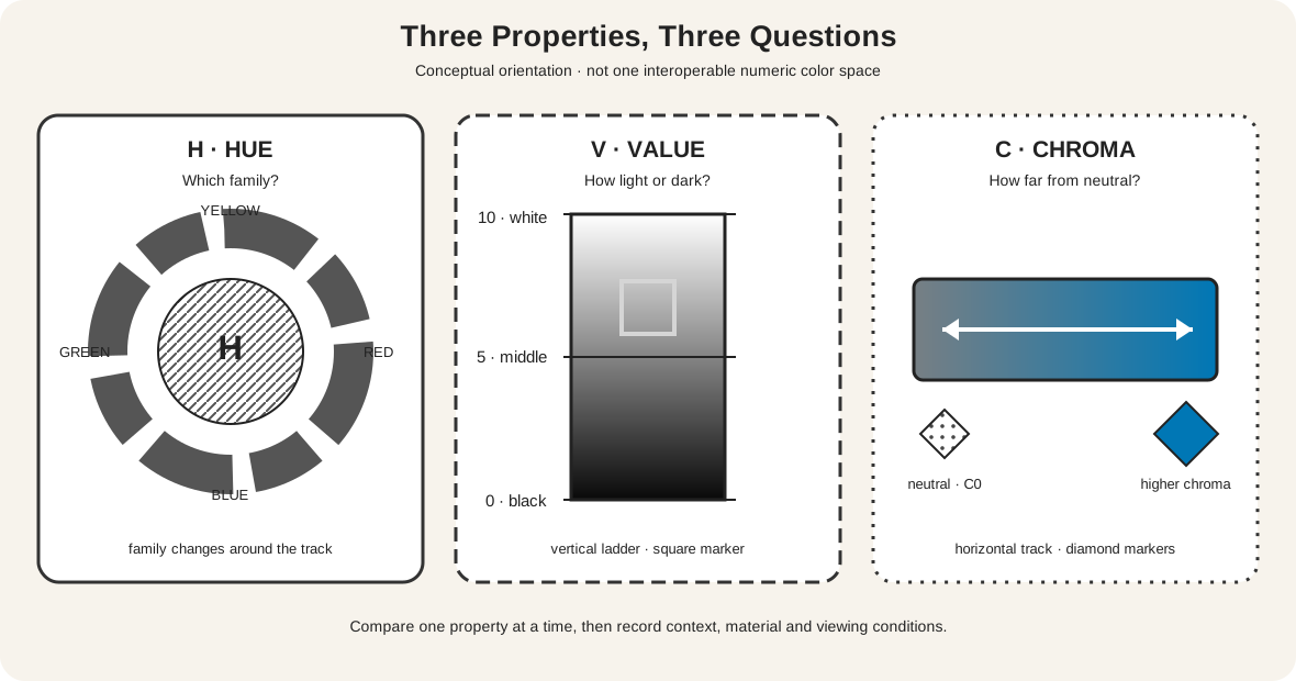
The Munsell notation recorded by the National Institute of Standards and Technology writes a chromatic color as hue, then value/chroma: 7.5YR 5/4 is one example.[1] The notation is useful here because it refuses to hide three judgments inside one color name.
- Hue: what family is it? Hue places a color within an ordered family sequence. A yellow-green and a blue-green can have similar value yet differ in hue.
- Value: how light or dark is it? In Munsell notation, 0 is ideal black and 10 ideal white.[2] A colored sample occupies a position between those endpoints under stated viewing conditions.
- Chroma: how far from neutral is it? Munsell chroma describes departure from a neutral gray at the same value.[1][3] A low-chroma blue is grayish; a higher-chroma blue is more strongly blue, without necessarily being lighter.
The diagram is a conceptual orientation, not a claim that every color model shares one geometry or scale. Its circular H track indicates families; its vertical V ladder marks light-to-dark comparison; its horizontal C track moves away from neutral. The letters, shapes, numerals and patterns carry the distinctions if the fills are removed.
In ordinary art discussion, intensity, saturation and chroma are often treated as near-synonyms; museum teaching resources use this approachable vocabulary.[6][8] That can be adequate for a first observation—“the red is more muted”—but not for a measurement. Say which system, tool or comparison you mean when precision matters.
Saturation and chroma are not universal numbers
Munsell chroma, HSL saturation, HSV saturation and a paint manufacturer's chroma comparison are not interchangeable scales. Each belongs to a defined method. A value of 50% in one interface cannot be copied into another system and assumed to describe the same appearance.
The W3C specification defines HSL as a way of expressing sRGB colors through hue angle, saturation and lightness.[5] It also warns that HSL lightness does not produce perceptually even lightness across hues. A yellow and a blue can share an HSL lightness percentage and still look radically different in value. When HSL saturation is zero, hue has no effect: every hue angle resolves to the same gray for the chosen lightness.
Conservation language can add another meaning. An Art Institute of Chicago technical entry uses “saturating” for the optical effect of a varnish while also describing bold, saturated passages in a painting.[10] Neither use is a portable coordinate. Context tells you whether the word describes color appearance, a digital control or a material treatment.
For clear writing, use chroma when discussing Munsell notation or a deliberate gray-to-vivid comparison, and name HSL saturation when reporting the software control. Use saturation alone only when the intended visual comparison is unmistakable.
A fixed-hue digital matrix

Every colored cell in this matrix uses the encoded HSL hue 205°. The columns change HSL saturation—20%, 55%, 90%—while the rows change HSL lightness—75%, 55%, 35%. The coordinate printed in each cell is as important as its fill.
Read across one row to see the encoded color move from grayish blue toward a stronger blue family while HSL lightness remains fixed. Read down one column to see the encoded color darken as HSL lightness falls while hue and saturation remain fixed. The companion grayscale cells report a deterministic relative-luminance calculation from the displayed sRGB values.
This demonstration does two jobs. It shows what independent controls mean inside one specified model, and it exposes the model's boundary. Repeat the grid at another hue angle and equal HSL lightness rows will not necessarily produce equal calculated luminance or equal apparent value.[5] The grid is therefore a software-coordinate exercise, not a perceptual atlas and not a recipe for blue paint.
What happens in paint
Real paint does not offer independent sliders. Golden's mixing guidance uses hue, chroma and value as practical observations, while its material documentation emphasizes masstone, undertone, opacity and transparency.[4] Art Institute research on Cézanne likewise connects adjusted pigment mixtures, hue, opacity and spatial form.[11] Those properties make a mixture move along several dimensions at once.
Adding white to a blue paint usually raises its value, but it can also expose an undertone, reduce apparent chroma or shift the hue. Adding black usually lowers value, yet a particular black may cool, warm or dull the mixture. A complement may reduce chroma while also shifting value and hue. Transparent color over a light ground can appear unlike the same paint laid thickly or over a dark ground.
That coupling is evidence, not failure. Make a controlled paint-out:
- Record manufacturer, color name, pigment code, binder and support.
- Place the unchanged color in the first square.
- Change one material variable by a measured amount in each later square.
- Let the samples dry, then compare hue direction, value and chroma separately.
- Record opacity, surface and lighting, because they affect the comparison.
- Repeat beside a neutral scale and a known neighboring hue rather than relying on memory.
The full color-mixing guide covers mixture charts and troubleshooting. The primary, secondary and tertiary guide explains family tiers. Neither tier membership nor a wheel position predicts the result of a particular tube pair.
Diagnose the property that is actually wrong
A useful correction begins with matched conditions. View the target and test at the same size, angle, illumination and background. Squinting or stepping back can reduce distracting detail when comparing value structure, but it does not create an objective measurement.
Ask in this order:
- Hue: does the test lean toward the correct neighboring family? A green may need to move toward yellow rather than merely become lighter.
- Value: is the test lighter or darker than the target? Compare against a neutral scale or temporarily reduce surrounding distractions.
- Chroma: at approximately matched hue and value, is the test more vivid or more grayish?
- Context: does the comparison change when both samples share the same neutral surround?
- Material or output: are opacity, gloss, display profile, paper or illumination responsible for the difference?
Do not “fix saturation” simply by dragging a control until the image feels stronger. First identify whether the problem is insufficient value separation, a hue error, or excessive chroma. A small value correction can clarify a form without making every color more vivid.
Context changes the judgment
Josef Albers built Interaction of Color around comparison and the instability of color appearance.[7] A target patch can look lighter, darker, warmer, cooler, stronger or weaker when its surround changes. That does not make observation useless; it makes the comparison conditions part of the evidence.
Use a removable neutral window to isolate two small regions of a painting or reproduction. Then reveal the surrounding colors again. If the isolated match fails in context, record both results. For digital work, duplicate the same encoded chip against two backgrounds and keep the numeric chip unchanged. Labels should state that the difference is contextual, not a hidden alteration to the target.
This is also why an eyedropper reading is not the final account of a painting. It samples a reproduction pixel after capture, processing and display. The Metropolitan Museum of Art describes how photography, RGB editing, profiles, CMYK conversion and output gamut mediate reproduced color.[9] A pixel can document that file; it cannot by itself identify the object's pigment, surface or appearance in the gallery.
A narrow range in Whistler's Nocturne
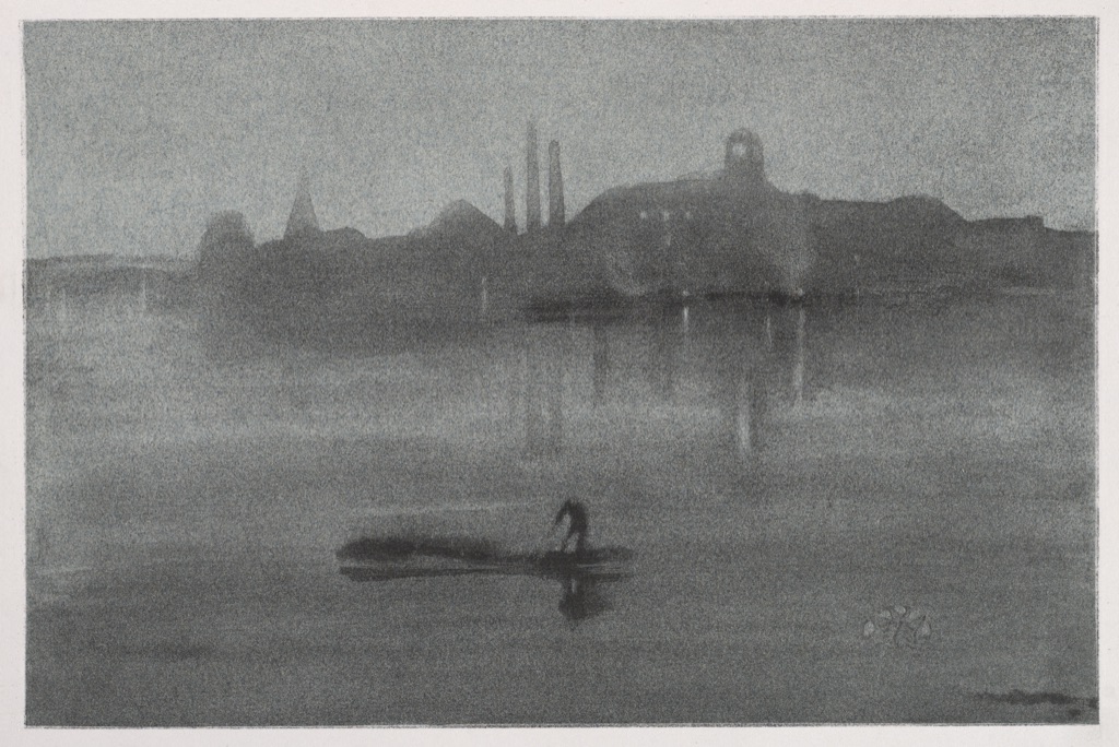
The Cleveland Museum of Art identifies James McNeill Whistler's Nocturne as an 1878 lithograph with chine collé.[14] In the museum reproduction, waterfront forms, reflections and sky occupy a compressed range of dark and middle grays. Small silhouettes and marks remain legible through edge, placement and modest value differences rather than through vivid hue contrast.
Calling the image “low saturation” alone would miss the interaction of medium and value. It is a print on layered paper, not a desaturated HSL photograph. The visible restraint may be described as low chroma in the reproduction, while the narrow tonal organization is a separate value observation.
Test the distinction by imagining an intense blue substituted at the same approximate value. Chroma would rise, but the main light-dark organization could remain. Then imagine the existing gray darkened until shapes merge. Value separation would fall even if hue and chroma stayed restrained.
Concentrated chroma and value in Turner
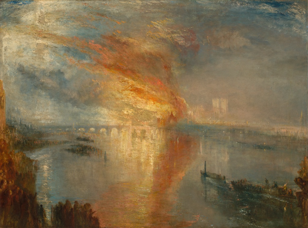
J. M. W. Turner's The Burning of the Houses of Lords and Commons, 16 October 1834 is an 1835 oil painting. The Cleveland Museum describes its brilliant swathes of color and variable atmospheric effects.[15] In the reproduction, a concentrated orange-yellow fire cuts through cooler blue-gray air and water. Dark foreground figures and boats provide a second, value-based structure.
The fire attracts attention through more than hue. It occupies a warmer family, reaches higher apparent chroma than much of the atmosphere, and contains light passages adjacent to darker smoke and silhouettes. Naming all three properties is more informative than calling it “bright,” a word that might mean light, vivid, luminous or prominent.
The image does not prove the identity of Turner's pigments or the exact appearance of the painting under current gallery light. Those require technical and direct evidence. It does support a careful visible comparison within this museum reproduction.
Monet's compact red accent
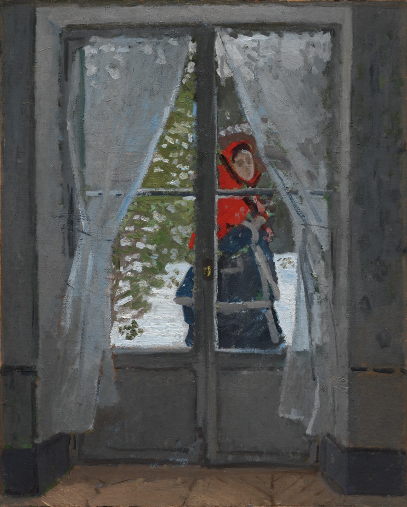
The Cleveland Museum dates Claude Monet's The Red Kerchief (Femme à la capeline rouge) to about 1868–73 and identifies the passing figure as Camille Monet outside on a snowy day.[16] The museum specifically notes the attention drawn by her red cape.
In the reproduction, the compact red-orange shape is surrounded by broad whites, gray-violets and muted greens. Its prominence is not explained by area—it is small—or by value alone. Its hue difference and relatively high chroma give it force, while the window frame and pale snow organize the value field around it.
Convert the reproduction to grayscale as a diagnostic and the cape does not disappear, but its special color contrast is reduced. That result illustrates why grayscale can reveal one part of the structure without replacing color analysis. The conversion itself follows a chosen encoding and luminance formula; it is not a universal record of human perception.
Analyze hue, value and chroma in any artwork
Begin with description before explanation:
- Name two or three dominant hue families without identifying pigments from appearance.
- Locate the lightest and darkest large areas, then note whether the value range is broad or compressed.
- Compare chroma only between colors of roughly similar hue and value when possible.
- Record where a small high-chroma accent interrupts a muted field.
- Check whether edges, labels, shapes or position still carry the composition when hue differences weaken.
- Separate what is visible in the reproduction from museum facts, technical analysis and interpretation.
Then make a value thumbnail using three to five neutral steps. Make a second thumbnail that preserves hue families while deliberately compressing chroma. Comparing the two reveals whether the composition depends primarily on light-dark grouping, family contrast, chroma contrast or their combination.
Common confusions
| Confusion | Why it fails | Better description |
|---|---|---|
| “Saturation means brightness” | Brightness may refer to light output, value or vividness | Name value, chroma or the exact digital control |
| “Higher saturation is lighter” | Chroma and value are separate comparisons | Match value before comparing vividness |
| “HSL 50% lightness is perceptually equal for every hue” | HSL is not perceptually uniform | Verify contrast and appearance for the actual colors |
| “The grayscale proves the true value” | Conversion depends on encoding and method | Treat it as one diagnostic alongside direct comparison |
| “Adding white changes only value” | Paint mixtures can also shift hue and chroma | Make and label dried test swatches |
| “A muted color has no hue” | Low-chroma colors can still lean toward a family | Compare against neutral and neighboring families |
| “A reproduction identifies the pigment” | Capture and display mediate the object | Consult conservation evidence and qualify observation |
Accessible color comparisons
W3C guidance says color cannot be the only visual means of conveying information.[12] Label every swatch with its coordinate or material identity. Use shapes, row and column headings, border patterns and position as redundant cues. Do not ask a learner to “choose the green square” when the answer can be “choose diamond C3 in column 3.”
Test diagrams under protanopia, deuteranopia, tritanopia and grayscale simulation, but do not treat simulation as proof of universal experience. The decisive test is whether all relationships remain available without distinguishing the fills. Ordinary-sized explanatory text should also meet the usual 4.5:1 contrast baseline.[13]
Watch: Hue, Value and Saturation through Formal Analysis
Choose a museum-led whole-work analysis, a close reading, or a foundations overview for considering hue, value and saturation.
Introducing Formal Analysis: Landscape
Follow how recurring shapes, colours and intervals contribute to a larger visual organisation.
Watch on YouTubeFrequently Asked Questions
Hue identifies a colour family or position within a declared colour model.
Value describes how light or dark a colour appears relative to a stated scale or surrounding colours.
Saturation describes colour intensity within a named model; chroma is a related but not universally interchangeable measure.
Yes. A colour family can appear across many lightness levels and intensities.
Identify hue families, compare light-dark structure, then assess vivid-to-muted relationships while recording material and viewing context.
Discussion
Which artwork on this page changes most when hue, value and chroma are considered as separate variables?
Reader Insights
Name hue, value and chroma independently.
Numeric saturation only makes sense within a named model.
The same sample can read differently beside a new neighbour.
Join the Conversation
Share one precise observation or a useful museum example below.
References
- National Institute of Standards and Technology, “Munsell Color Code.” https://www.nist.gov/glossary-term/39476
- U.S. Geological Survey, “Munsell Color Code.” https://pubs.usgs.gov/of/2006/1195/htmldocs/munsellcode.htm
- United States Department of Agriculture, “Munsell Method of Color Notation.” https://www.govinfo.gov/content/pkg/GOVPUB-A-PURL-gpo151850/pdf/GOVPUB-A-PURL-gpo151850.pdf
- Golden Artist Colors, “Color Mixing Guide.” https://goldenartistcolors.com/resources/color-mixing-guide
- W3C, “CSS Color Module Level 4.” https://www.w3.org/TR/css-color-4/
- National Gallery of Art, “Picturing France: Classroom Guide.” https://www.nga.gov/sites/default/files/migrate_images/content/dam/ngaweb/education/learning-resources/teaching-packets/pdfs/pic_france_classroom.pdf
- Yale University Press, “Interaction of Color.” https://yalebooks.yale.edu/book/9780300146936/interaction-of-color/
- Smithsonian National Museum of Asian Art, “Colors.” https://asia.si.edu/explore-art-culture/art-stories/colors/
- The Metropolitan Museum of Art, “On Color Fidelity.” https://www.metmuseum.org/perspectives/color-photography-standards-van-gogh-sunflowers
- Art Institute of Chicago, “Near the Lake: Technical Entry.” https://publications.artic.edu/renoir/reader/paintingsanddrawings/section/135638/p-52
- Art Institute of Chicago, “Color and Form in Cézanne.” https://www.artic.edu/pdf/static/download-collection.publications.digital-publications-articles.show-362.pdf
- W3C Web Accessibility Initiative, “Understanding SC 1.4.1: Use of Color.” https://www.w3.org/WAI/WCAG21/Understanding/use-of-color
- W3C Web Accessibility Initiative, “Understanding SC 1.4.3: Contrast (Minimum).” https://www.w3.org/WAI/WCAG22/Understanding/contrast-minimum.html
- Cleveland Museum of Art, “James McNeill Whistler: Nocturne.” https://www.clevelandart.org/art/1941.89
- Cleveland Museum of Art, “J. M. W. Turner: The Burning of the Houses of Lords and Commons, 16 October 1834.” https://www.clevelandart.org/art/1942.647
- Cleveland Museum of Art, “Claude Monet: The Red Kerchief.” https://www.clevelandart.org/art/1958.39