by Tom Gurney
Tom Gurney BSc (Hons) is an art history expert with over 20 years experience
Page created on September 2, 2026 / Page updated on September 13, 2026
Email: tomgurney1@gmail.com / Phone: +44 7429 011000
Why Colour Tiers Depend on the System You Declare
Primary, secondary, and tertiary are tier labels inside a declared color system. In the traditional 12-position RYB teaching wheel used on this site, red, yellow, and blue are primary; orange, green, and violet are secondary; and the six positions between them are called tertiary or intermediate.
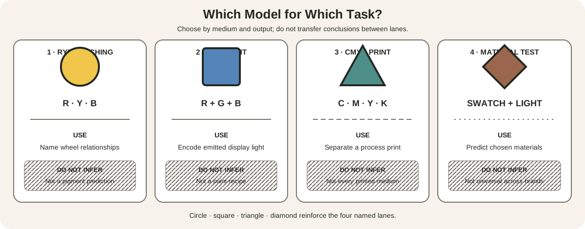
Those memberships are not universal. RGB emitted light uses red, green, and blue as primaries. Process printing begins with cyan, magenta, yellow, and a practical black channel. Always name the model before naming the tier.

At a Glance
- RYB teaching modelred, yellow and blue are named primaries; orange, green and violet are secondaries.
- Tertiary positionssit between a primary and adjacent secondary in this declared 12-position sequence.
- System dependenceRGB emitted light and CMY process colour assign different source and derived roles.
- Material limittier labels do not predict exact mixtures from real pigments.
- Best practicename the system, operation and material before classifying a colour set.
Contents
The short RYB answer
The National Gallery of Art teaches red, yellow, and blue as paint primaries and orange, green, and purple as their secondaries.[1] Its classroom guide defines the six tertiary paint families as mixtures of a primary with its adjacent secondary.[2] This page uses violet rather than purple in the formal wheel labels, while recognizing purple as an ordinary family name.
| Tier | RYB hue families | Conventional construction |
|---|---|---|
| Primary | Yellow, red, blue | Starting families in this teaching model |
| Secondary | Orange, violet, green | Each placed between two primaries |
| Tertiary / intermediate | Yellow-orange, red-orange, red-violet, blue-violet, blue-green, yellow-green | Each placed between one primary and an adjacent secondary |
“Construction” describes the diagram. It does not promise that any red and any blue paint will produce a clean violet, or that equal measured amounts will land at the visual midpoint. Actual pigments have different undertones, opacity, transparency, tinting strength, and binders.[4]
Tier membership changes with the system
The word primary means a selected source component within the system. It does not identify an intrinsically pure color shared by every medium.
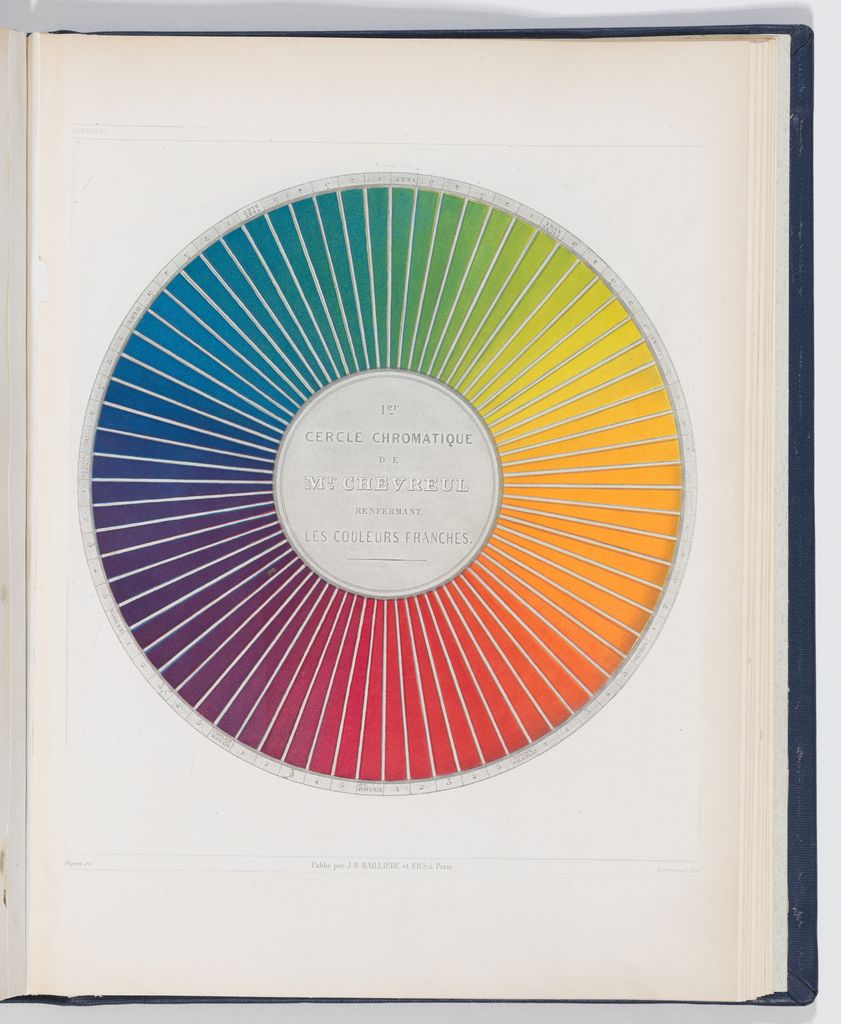
In the RYB teaching model, the source families are red, yellow, and blue. Its purpose here is to organize traditional artist vocabulary and wheel relationships. The full artist's wheel guide explains its 12 positions and limitations.
In RGB, red, green, and blue channels describe emitted light. Pairwise additions give yellow from red plus green, magenta from red plus blue, and cyan from green plus blue. Adding all three at sufficient encoded intensity tends toward the display's white point. These are device values, not instructions for combining paint.
In process printing, cyan, magenta, and yellow are the three chromatic input inks. Their nominal pairwise overlaps correspond to blue, red, and green. Black is added as a separate practical channel for density, neutral control, text, economy, and production reasons. CMYK is therefore not simply an RYB wheel with renamed colors, and a percentage recipe remains incomplete without a profile, press, ink, paper, and viewing condition.[9][10]
The same names can change tiers. Red is primary in RYB and RGB, but is nominally a secondary combination in CMY. Green is secondary in RYB, primary in RGB, and a two-ink combination in CMY. Cyan and magenta are RGB secondaries but process-color inputs. Tier is a relationship within a model, not a rank of artistic importance.
The declared 12-position RYB sequence
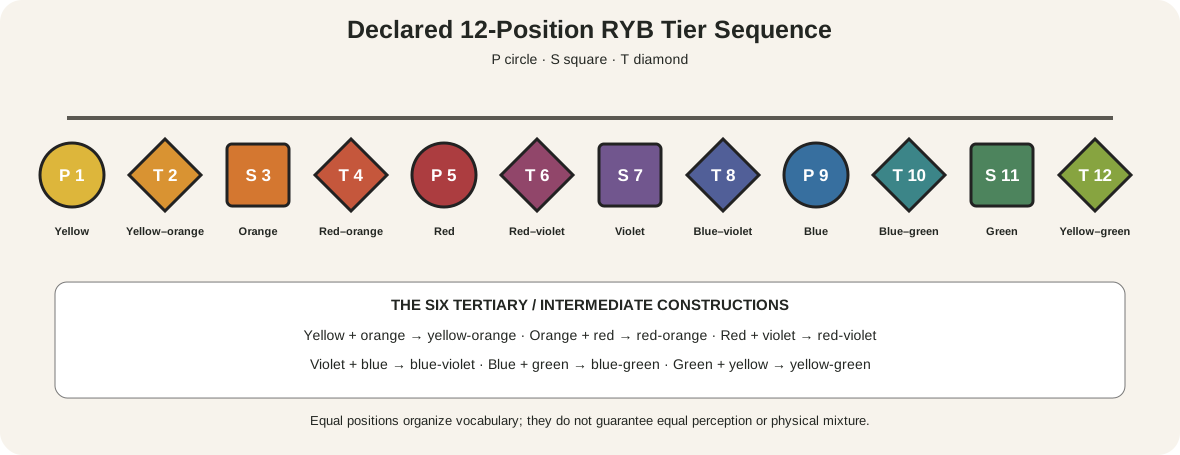
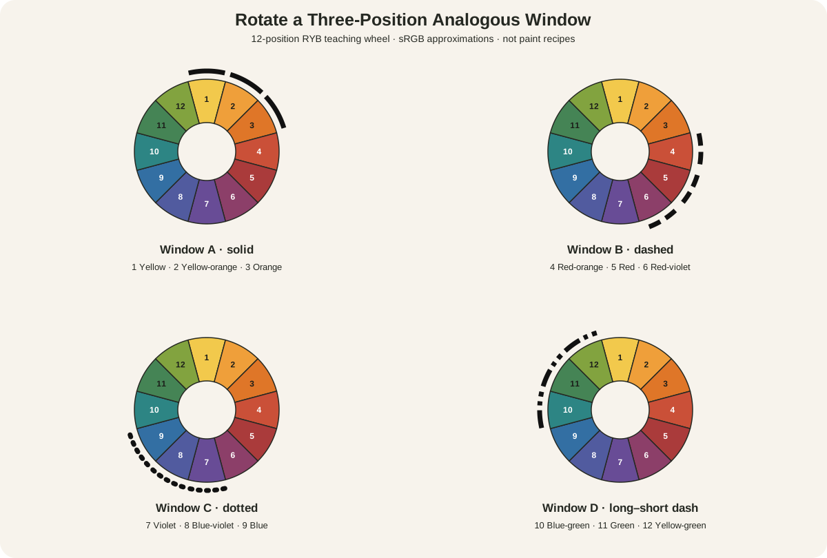
The site's sequence starts at yellow and moves through warm families to red, violet, blue, green, and back to yellow:
| Position | Family | Tier | Adjacent construction in the model |
|---|---|---|---|
| 1 | Yellow | P | primary |
| 2 | Yellow-orange | T | yellow + orange |
| 3 | Orange | S | yellow + red |
| 4 | Red-orange | T | orange + red |
| 5 | Red | P | primary |
| 6 | Red-violet | T | red + violet |
| 7 | Violet | S | red + blue |
| 8 | Blue-violet | T | violet + blue |
| 9 | Blue | P | primary |
| 10 | Blue-green | T | blue + green |
| 11 | Green | S | blue + yellow |
| 12 | Yellow-green | T | green + yellow |
P, S, and T letters make the structure readable without hue. Primary circles recur every four positions, secondary squares sit midway between them, and tertiary diamonds occupy the remaining positions. The equal spacing belongs to the teaching diagram. It does not measure equal wavelength, perceptual distance, or mixing strength.
Naming compounds consistently helps. On this page the first term modifies the second: red-orange is an orange leaning toward red, while yellow-orange is an orange leaning toward yellow. Printed wheels and teaching traditions sometimes reverse that emphasis. Position numbers and named parents remove the ambiguity.
What the tiers are useful for
Tier labels give a class, studio, or design team a compact way to discuss a declared wheel. They make it possible to reconstruct where a family sits, identify which anchor families frame it, and compare palette restrictions. A note that says “RYB primaries plus blue-green” is more reproducible than “bright colors,” even before exact materials are listed.
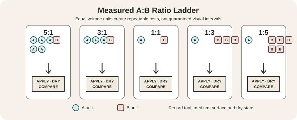
The hierarchy also supports controlled exercises. Start with three RYB primary-family paints and observe the three pairwise results. Add a measured step on either side of each result and compare those six samples with the intermediate names. The exercise exposes where a selected palette agrees with the ideal wheel and where undertone or tinting strength pulls it away.
Do not turn the tiers into a prescribed order for making art. An artist can begin with an earth color, a premixed violet, a fluorescent ink, or a found material. A secondary family is not required to be physically mixed from two primaries during the work. The label describes its position in the teaching system, not its manufacturing history.
The tiers are also incomplete as compositional analysis. Knowing that red, yellow, and blue are present does not tell you their values, areas, edges, locations, or relationship to neutrals. Use the classification as one observation, then describe what the work actually does.
Why “tertiary” needs a declaration
Smithsonian teaching material uses tertiary for a primary mixed with its adjacent secondary, matching this page's 12-position wheel.[3] Adobe uses the same six compound names.[6] That is a widespread current classroom convention, but it is not the only one.
The Franklin Institute allows a primary-plus-secondary or two-secondary mixture under the tertiary label.[7] Other art vocabulary reserves tertiary for more neutralized mixtures involving all three primaries or two secondaries.[8] Older decorative-arts systems may name russet, olive, and citrine as tertiaries.
There is no value in pretending these sources agree. When reading a book, paint chart, curriculum, or historical document, inspect its definitions and diagram. In this guide, tertiary and intermediate refer only to the six named positions between an RYB primary and adjacent secondary. A source using another convention is not automatically wrong; it is using a different taxonomy.
Tertiary also does not mean muddy, impure, unimportant, or inferior. It tells you how a color is categorized in the declared structure. Chroma, value, mixture clarity, and usefulness are separate properties.
Test the materials behind the labels
A labeled wheel is a map. A paint-out shows what selected materials do. Golden notes that masstone, undertone, opacity, and transparency affect how a pigment appears and mixes.[4] Its mixing guidance separates hue, value, and chroma and encourages observation of actual results.[5]
Make a six-pair test with the exact paints you intend to use:
- Record the manufacturer, color name, pigment code, and binder for each chosen red, yellow, and blue.
- Paint each color thinly and thickly on the intended ground.
- Mix the three primary pairs at measured ratios, not by an unrecorded brushful.
- Make two biased steps between every primary and its adjacent secondary.
- Let physical samples dry fully, then record hue direction, value, chroma, opacity, and surface.
- Compare the results with the wheel names without forcing a failed mixture into an ideal category.
The complete measured color-mixing method explains chart construction and troubleshooting. A dull violet from a particular red-blue pair does not invalidate the word secondary. It shows that the ideal tier and material outcome are different kinds of information.
For digital work, record the color space and encoded values. For print, retain the intended ICC profile and proof conditions. A screen preview can help anticipate a conversion, but it cannot certify the final ink-on-paper appearance.
A palette existed before the modern tier chart
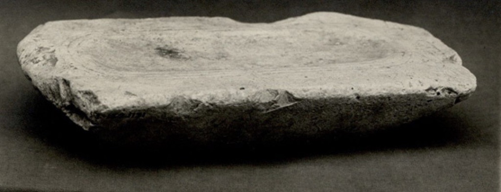
The Met identifies this small limestone Painting Palette as a Middle Kingdom object from Lisht North, dating to approximately 1981–1640 BCE.[12] Its shallow working surface and worn stone make color an activity involving a tool, material, and hand.
The object is not evidence that an ancient Egyptian painter used the modern RYB primary-secondary-tertiary taxonomy. Projecting the diagram backward would replace historical evidence with a familiar classroom structure. Instead, the palette establishes a useful boundary: artists prepared and applied materials long before today's tier terms, and historical practices must be reconstructed from objects, texts, analysis, and context.
The photograph also has limits. It records the stone under museum imaging conditions on an RGB display. It cannot restore every substance once prepared on it or reproduce the object's texture and scale.
Three sources can mean a different system
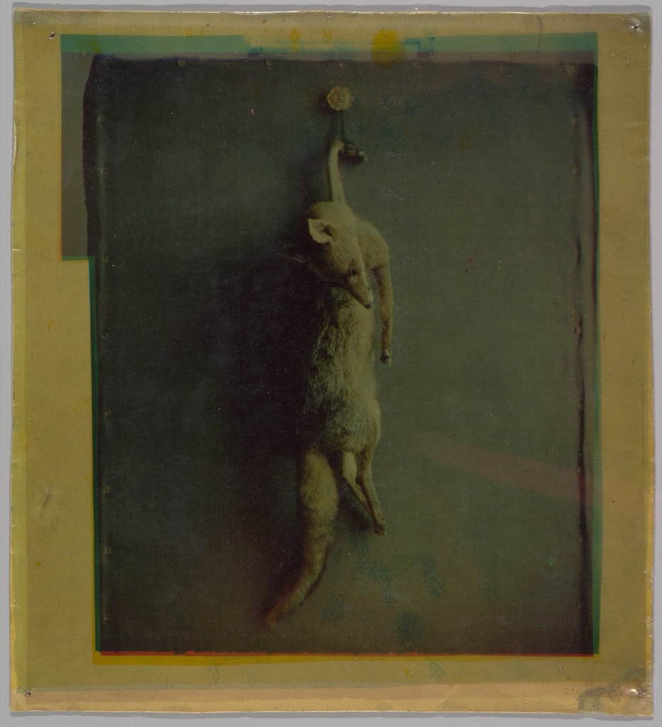
Louis Ducos du Hauron's Fox, made around 1870, is a three-color assembly print. The Met explains that his process used negatives exposed through green, orange-red, and blue-violet filters, followed by positives made on gelatin sheets carrying primary-color carbon pigments. Superimposed layers produced one color photograph.[13]
The object is valuable precisely because its three-source process does not line up neatly with the site's RYB wheel labels. Filter colors, image-forming layers, and the final assembly have distinct roles. “Three primaries” is not enough description; the production method determines what the sources do.
Visible colored borders, imperfect registration, fading, and the physical layering are part of the present object. They prevent the image from being treated as a frictionless digital demonstration. A historical process can be understood through its components without being renamed to fit a later simplified chart.
A primary palette is not the whole composition

The Cleveland Museum of Art describes Piet Mondrian's 1927 Composition with Red, Yellow, and Blue as a grid restricted to red, yellow, and blue with black and white.[14] In the current museum image, two red rectangles occupy the upper-left edge, a blue band sits low, and a narrow yellow strip touches the right edge. Black lines divide a much larger field of pale painted rectangles.
Calling the work a primary-color composition identifies its restricted RYB palette, but the tier label does not explain the whole painting. Area is radically unequal. The three colors do not mix into secondaries. Black lines, white and gray fields, cropping, edge placement, and asymmetry organize the surface. The blue, red, and yellow are material paint passages, not abstract wheel chips.
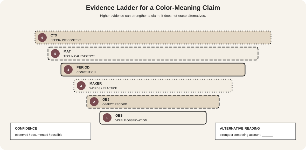
The museum record supports the description of the palette. Interpretation should remain tied to its evidence rather than claiming that primaries automatically create harmony, energy, or universality.
Classify a color set without guessing
When a chart, artwork, or file is labeled primary or secondary, ask four questions:
- Which model? RYB teaching, RGB light, CMY/CMYK print, a historical theory, or a brand palette?
- What is being classified? Hue families, light channels, inks, paints, or design roles?
- What operation creates the next tier? Ideal wheel placement, emitted-light addition, printed overlap, or physical mixing?
- What evidence is available? A diagram, encoded file, proof, dried swatch, technical record, or only a reproduction?
Brand systems use primary, secondary, and tertiary for levels of design importance rather than color mixing. That is another legitimate taxonomy, but it should not be confused with wheel construction.
Common mistakes
| Mistake | Why it fails | Better practice |
|---|---|---|
| Calling red, yellow, and blue the universal primaries | The set belongs to a traditional teaching model | Say “RYB teaching primaries” |
| Treating RGB additions as paint recipes | Emitted light and pigment layers behave differently | Test the actual medium |
| Calling black a fourth chromatic primary | K is a practical process channel with a different role | Describe CMY relationships and CMYK production separately |
| Assuming tertiary always means six intermediates | Historical and current sources use the word differently | State the adopted definition |
| Expecting equal mixtures to make visual midpoints | Pigments differ in strength and behavior | Measure several ratios and compare dried samples |
| Assuming secondary means less important | Tier describes derivation, not compositional rank | Analyze area, placement, value, and context |
| Identifying paint from a reproduction's pixels | Capture and rendering mediate the object | Use technical evidence and qualify the reading |
Make tier diagrams accessible
W3C requires another visual means when color conveys information.[11] Print P, S, or T inside every token; use different shapes and border patterns; number positions; and provide the complete names in a table. For ordinary-sized text, the usual minimum contrast ratio is 4.5:1.[15]
Color-vision simulations are useful checks, not substitutes for redundant design. The diagram should still communicate every tier under protanopia, deuteranopia, tritanopia, and grayscale rendering.
Watch: Primary, Secondary and Tertiary Colors through Formal Analysis
Choose a museum-led whole-work analysis, a close reading, or a foundations overview for considering primary, secondary and tertiary colors.
Introducing Formal Analysis: Landscape
Follow how recurring shapes, colours and intervals contribute to a larger visual organisation.
Watch on YouTubeFrequently Asked Questions
In the traditional RYB artist-teaching model they are red, yellow and blue; other systems define different source colours.
Within a declared model, secondary colours are constructed from pairs of its named primaries.
In this guide they are the six intermediate RYB positions between each primary and its adjacent secondary; other texts use the term differently.
RGB models emitted light, while RYB is a traditional artist-teaching framework for hue relationships.
No. Actual pigments differ in undertone, opacity, transparency, tinting strength, binder and ground interaction.
Discussion
Which example on this page most clearly shows why a tier label needs its system and operation stated?
Reader Insights
RYB, RGB and CMY assign roles differently.
Source, mixture, emission and process separation are not interchangeable.
A teaching tier cannot replace labelled physical samples.
Join the Conversation
Share one precise observation or a useful museum example below.
References
- National Gallery of Art, “The Elements of Art: Color.” https://www.nga.gov/educational-resources/elements-art/elements-art-color
- National Gallery of Art, “Picturing France: Classroom Guide.” https://www.nga.gov/sites/default/files/migrate_images/content/dam/ngaweb/education/learning-resources/teaching-packets/pdfs/pic_france_classroom.pdf
- Smithsonian Folkways, “Elements of Art Teacher's Guide.” https://folkways-media.si.edu/docs/folkways/lessons/SFLN012_WS01_Elements_of_art.pdf
- Golden Artist Colors, “Color Wheel.” https://goldenartistcolors.com/resources/color-wheel
- Golden Artist Colors, “Color Mixing Guide.” https://goldenartistcolors.com/resources/color-mixing-guide
- Adobe, “Understanding Primary, Secondary, and Tertiary Colors.” https://www.adobe.com/creativecloud/design/discover/secondary-colors.html
- The Franklin Institute, “Color Formulas.” https://fi.edu/en/science-and-education/science-recipes/color-formulas
- University of Nebraska Pressbooks, “Foundation Drawing for Art 1100.” https://pressbooks.nebraska.edu/1100foundations/front-matter/life-drawing/
- International Color Consortium, “Profile.” https://www.color.org/profile/
- The Metropolitan Museum of Art, “On Color Fidelity.” https://www.metmuseum.org/perspectives/color-photography-standards-van-gogh-sunflowers
- W3C Web Accessibility Initiative, “Understanding SC 1.4.1: Use of Color.” https://www.w3.org/WAI/WCAG21/Understanding/use-of-color
- The Metropolitan Museum of Art, “Painting Palette.” https://www.metmuseum.org/art/collection/search/556954
- The Metropolitan Museum of Art, “Louis Ducos du Hauron: Fox.” https://www.metmuseum.org/art/collection/search/286318
- Cleveland Museum of Art, “Piet Mondrian: Composition with Red, Yellow, and Blue.” https://www.clevelandart.org/art/1967.215
- W3C Web Accessibility Initiative, “Understanding SC 1.4.3: Contrast (Minimum).” https://www.w3.org/WAI/WCAG22/Understanding/contrast-minimum.html