by Tom Gurney
Tom Gurney BSc (Hons) is an art history expert with over 20 years experience
Page created on September 2, 2026 / Page updated on September 13, 2026
Email: tomgurney1@gmail.com / Phone: +44 7429 011000
From Wheel Geometry to Relationships That Actually Work
A color scheme is a declared relationship among selected colors. It can describe neighboring hues, opposites, equal intervals or variations within one family. Color harmony is the way those colors work with every other part of the image or object. A wheel can classify the selection; it cannot certify that the result is coherent, balanced or successful.
Use a scheme as a starting constraint. Then compose area, dominance, value, chroma, neutrals, edges, texture and material behavior. The same three wheel positions can produce radically different outcomes when any of those variables changes.
At a Glance
- Core ideaa colour scheme names a hue structure; harmony describes how the complete relationship functions.
- Five structuresanalogous, complementary, split-complementary, triadic and monochromatic.
- Beyond geometryarea, dominance, value, chroma, neutrals and edges shape the result.
- Material matterspaint, glaze, print and screen output require different tests.
- Use labels carefullysome artworks do not fit one scheme cleanly, and that is useful evidence.
Contents
Five common scheme structures
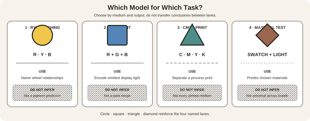
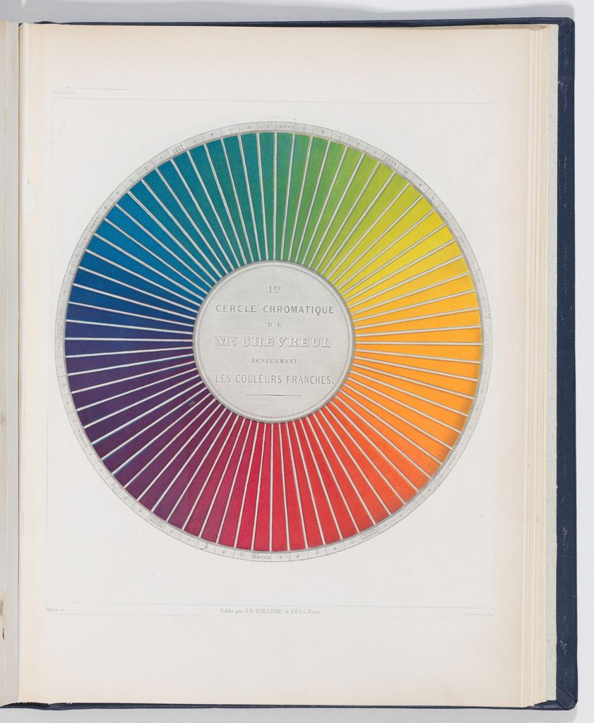
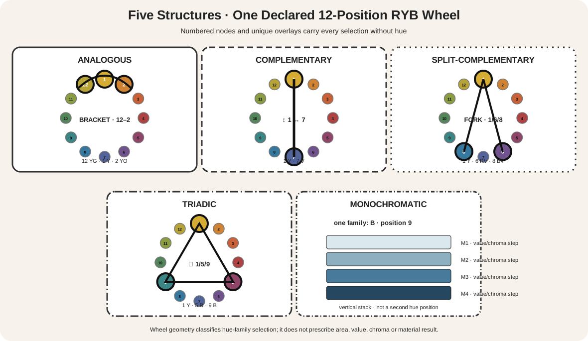
The comparison uses one fixed 12-position RYB teaching wheel so the geometry remains consistent. National Gallery teaching material supplies the familiar artist-wheel relationships while also distinguishing paint from screen light.[2] The artist's color wheel explains that model and why its displayed colors are not paint recipes.
| Scheme | Hue-family selection on this wheel | What the selection does not decide |
|---|---|---|
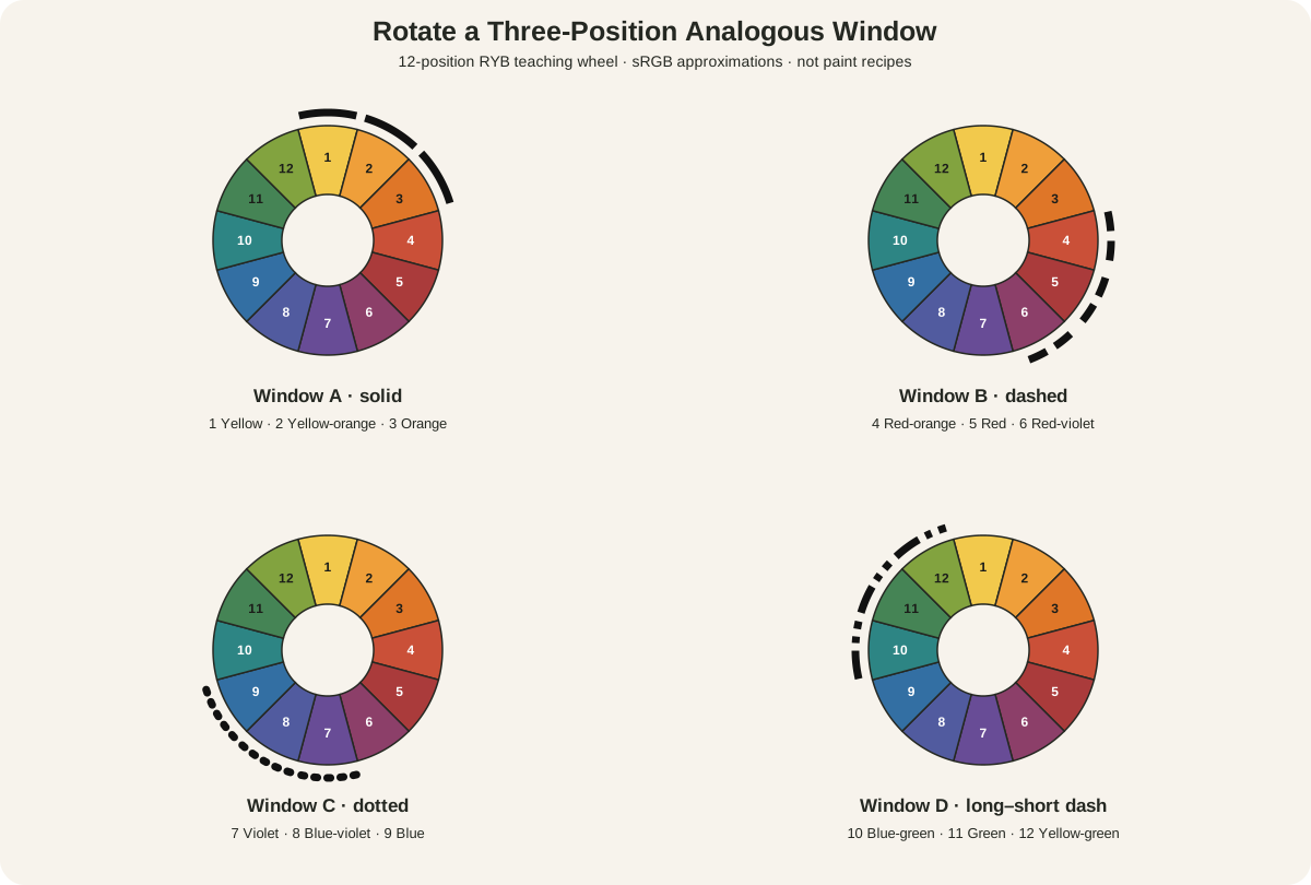
| Analogous | a short run of neighboring positions | dominant family, value span, accent, material result |
| Complementary | two opposite positions | area ratio, chroma, edge behavior, whether they are physically mixed |
| Split-complementary | one anchor plus the two neighbors of its opposite | which color leads, how wide the split feels, material intensity |
| Triadic | three positions four steps apart | equal or unequal area, value hierarchy, chroma hierarchy |
| Monochromatic | one hue family varied in value and chroma | mixture method, value range, neutral participation |
University of Tennessee teaching material documents these scheme families.[1] The diagram gives each structure a different line symbol as well as numbered positions. Its equal wheel spacing belongs to the declared model; it does not measure equal perceptual distance or pigment strength.
The list is a useful survey, not a complete catalogue. Rectangular, square, double-complementary, near-complementary and custom palette structures are also possible. Choose the smallest classification that accurately describes the relationship you need.
Why a scheme is not a promise of harmony
The Getty's formal-analysis framework treats hue, value and intensity as separate color characteristics and relates them to the rest of a composition.[3] Getty's Bauhaus material describes formal composition as an act of balancing and emphasizes the relativity of color appearance.[4] These points prevent a circular diagram from becoming an aesthetic rule.
Two complementary hue families can be equal in area and high in chroma, or one can occupy a tiny muted accent against a broad field. An analogous selection can have almost no value separation, or it can run from near-white to near-black. A monochromatic work can be spatially forceful. A triad can be quiet if two members are scarce and muted.
Josef Albers's Interaction of Color made comparison and experiment central to learning color.[5] An unchanged patch can appear different against a new surround. Harmony therefore cannot be reduced to isolated swatches; it belongs to relationships at a particular scale and in a particular context.
Choose the structure for the problem
Start with the artistic or communication need, not a promised mood.
- Choose an analogous range when you want to work inside a compact neighboring hue interval, then establish separation through value, chroma, edge or a controlled accent.
- Choose a complementary pair when clear hue opposition is useful, then decide whether one family dominates, whether both remain vivid and whether they meet at active edges.
- Choose a split-complementary structure when one anchor needs two flanking families around the opposite position. Test the exact wheel and split width rather than assuming it will be automatically softer.
- Choose a triadic structure when three distributed hue anchors help organize the work. Give each a role instead of assuming three equal blocks are balanced.
- Choose monochromatic when one family can carry the work through value, chroma, opacity and material variation. State what counts as the family and how neutrals are treated.
The accepted analogous-color guide and triadic-scheme guide provide full construction and analysis for those families. The other named structures receive their own depth elsewhere in this cluster; the purpose here is comparison.
Geometry is only the first decision
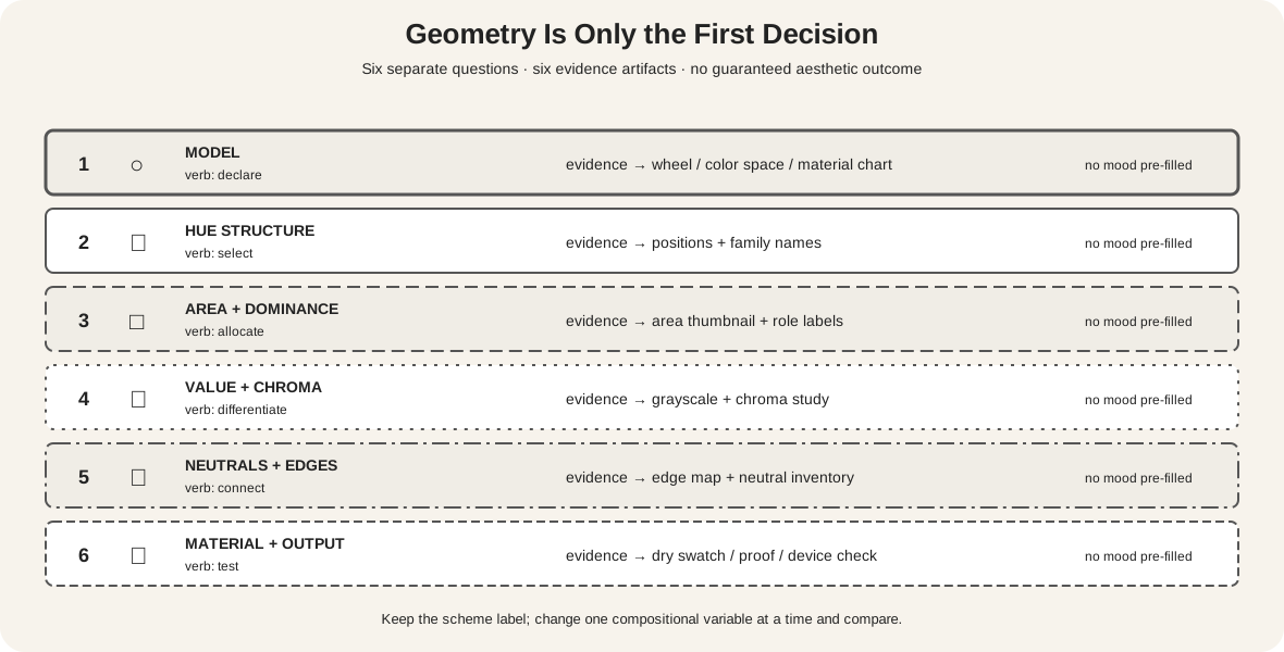
The decision matrix keeps six questions separate:
- Model: Which wheel, color space or material chart supplies the relationships?
- Hue structure: Which families and positions are selected?
- Area and dominance: How much of the work belongs to each family, and which leads?
- Value and chroma: Which differences remain when hue is weakened, and where is intensity concentrated?
- Neutrals and edges: What do white, black, gray, earth colors, gaps and boundaries do?
- Material and output: What changes in paint, glaze, paper, firing, capture, display or print?
No row pre-fills “calm,” “dynamic” or “harmonious.” Those are interpretations to test against the actual work and context. The matrix instead names an evidence artifact: wheel annotation, area thumbnail, value study, chroma study, edge map, dried swatch or output proof.
Build a scheme study that can be tested
First declare the source model. If you use this site's RYB wheel, list position numbers and family names. If you extract colors from a digital image, record the file and color space. If you work in paint, specify the exact products and support.
Then make three small studies from the same selected hue families:
- Divide the first into equal areas. This exposes the raw selection but is not a recommended final composition.
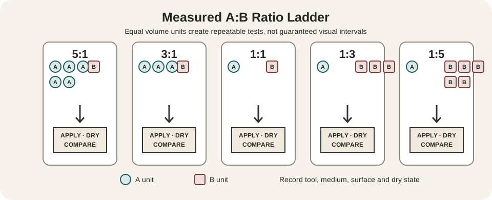
- Give one family about two-thirds of the area and divide the remainder unequally. Keep encoded or material colors unchanged.
- Retain the second study's areas, then lower the chroma or change the value of the secondary roles.
Compare which changes come from geometry and which come from hierarchy. A scheme name stays the same while the visual emphasis changes.
For paint, create labeled, dried samples. Golden notes that pigments vary in undertone, opacity and behavior, so an ideal wheel position does not predict a tube's mixture.[6] Record any neutralizing mixtures separately. The white, gray and black mixture guide defines those operations, while the three-property diagnostic helps isolate family, lightness and chroma changes.
Audit a proposed palette
Before committing a large work, inspect the scheme under four transformations. First, reduce every sample to the same area. This reveals the nominal hue-family selection without dominance. Second, restore intended areas and ask whether a small accent has more visual weight than its size suggests. Third, make a grayscale version to test value grouping. Fourth, produce a deliberately lower-chroma version while retaining the same hue positions and areas.
Write one sentence after each comparison. “The blue-green anchor occupies 70 percent” is an observation. “The red-orange accent is the only high-chroma passage” states a controlled difference. “The palette feels unified” is an interpretation that needs those observations beneath it.
For an interface or instructional graphic, add a fifth audit: remove the color fills entirely. Labels, shape, order and contrast must still communicate selection and state. For a physical artwork, compare the samples under the intended illumination and against the intended ground. A palette that works on a white mixing sheet can change against stained canvas, colored paper or glazed ceramic.
Keep rejected studies. A failed analogous version may reveal that value steps collapsed; a failed complementary version may expose excessive equal-area competition. Those records turn “harmony” from taste alone into a traceable design decision.
When no scheme label fits cleanly
Many works use a broader field of earth colors, neutrals, incidental reflections and material variations around a few dominant hue families. Do not force all visible colors into one textbook polygon. Identify the structural anchors, state which colors are subordinate, and say when the classification is approximate.
A work can also contain nested relationships: an analogous blue-green field may hold one orange accent, or a largely monochromatic passage may sit inside a broader triadic composition. Describe the scale at which the label applies. “The background uses neighboring blue-green families” is narrower and more defensible than naming the entire work analogous.
If two models give different classifications, report the model rather than choosing the more attractive result. A relationship plotted on the RYB teaching wheel may not map to equal intervals in a perceptual space. The discrepancy is useful evidence about the tool, not a reason to conceal the method.
Extract a palette without overstating the evidence
A reproduction-based palette study can be useful if its scope is honest. Select five to eight regions from one museum image, note their locations and record the sampled file values. Add an area estimate for each family rather than presenting equal swatch chips.
Next, group near-neighbor samples into broader hue families. Identify the dominant family, the highest-chroma accent and the widest value separation. Only then compare the pattern with a scheme definition. A work can contain incidental colors that do not function as major anchors.
The Metropolitan Museum of Art explains that capture, RGB editing, device profiles, gamut and CMYK output mediate reproduced color.[8] The International Color Consortium similarly treats profiles as transformations among device conditions.[15] Your extraction describes that reproduction under your display conditions. It is not a chemical analysis of the object.
Make the inference visible in the label: “image-sampled neighboring yellow, orange and green families” is stronger than “the artist used an analogous formula.”
Scheme relationships can change over time
The National Gallery of Art's pigment-alteration research shows that color change can damage relationships intended in historical color studies and paintings.[7] Yellowing, fading, darkening or chemical transformation may shift hue, value and chroma unevenly.
This does not make present viewing invalid. It changes the question. Describe the current object or reproduction, consult conservation evidence where available, and distinguish a reconstructed earlier relationship from today's appearance. A scheme classification based on altered color needs the same qualification.
Historical writing also resists a one-variable account. In a statement reproduced by the National Gallery, Georges Seurat related harmony to similar and contrary qualities in tone, color and line, considered under a dominant and a scheme of lighting.[14] That formulation belongs to Seurat's context, but it usefully shows that “harmony” has long exceeded a list of hue intervals.
Neighboring families in Vuillard's Orchard
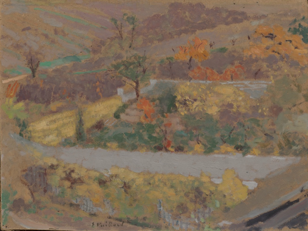
Édouard Vuillard's Orchard is an 1897 oil painting on board. The Cleveland Museum of Art points to orange, yellow and green as neighboring wheel colors in the work.[11] That supports an analogous-family observation in the museum reproduction.
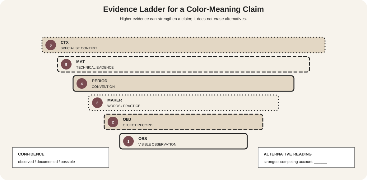
The same record notes Maurice Denis's statement that Vuillard paid little attention to color theory. A present-day classification is therefore not proof that the artist began with a formal scheme. It is a way to describe visible relationships.
In the image, the neighboring families do not act as equal chips. Yellowed vegetation spreads broadly, green clusters interrupt it, and small orange notes concentrate among trees. Muted violet-gray and pale road passages complicate the family map. Area, surface, edge and value make the classification useful rather than mechanical.
Complementary combination on brown paper
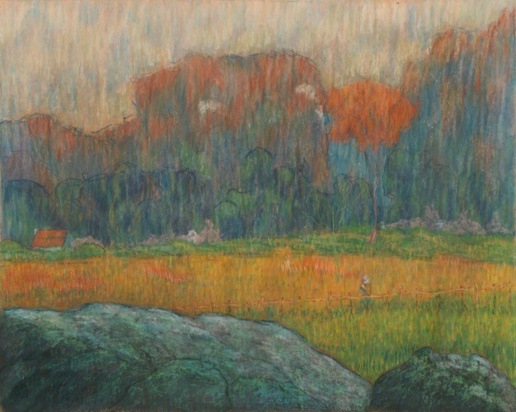
Claude-Emile Schuffenecker's Landscape with Figure and Houses, made about 1891, is pastel on brown wove paper.[12] Cleveland states that the artist combined complementary colors to increase intensity and chose textured brown paper to strengthen the effect.
The reproduction shows orange-red vertical strokes among blue-green and teal passages. Yet the complement relation is only part of the image. The brown support remains visible, large cool rocks occupy the foreground, a small figure provides scale and repeated vertical marks bind different families together.
If the orange and teal areas were displayed as equal swatches, the study would discard their actual distribution and support. A better palette record includes approximate area, value, chroma and the brown ground as an active participant.
Harmony made through glaze and firing
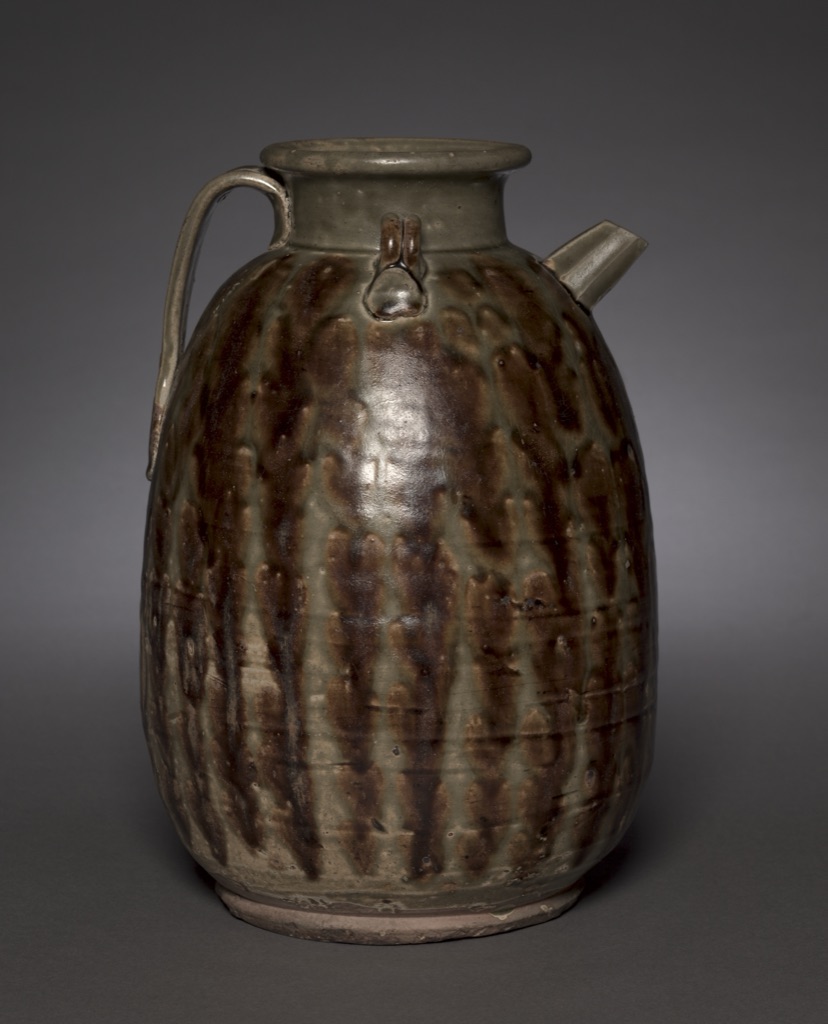
The Cleveland Museum describes this Changsha ware Ewer from the 800s as having an overall color harmony and bold decoration.[13] It identifies stoneware with olive-green glaze and iron-brown splashes, noting that the glazes run into one another during firing.
This is harmony language without evidence of a modern wheel formula. The object's rounded body, vertical runs, gloss, pooled transitions and exposed base all shape the color relation. Green and brown are materials transformed by heat on a three-dimensional vessel, not detachable screen values.
The example sets a boundary for the hub: named schemes are valuable comparative tools, but color harmony can also be discussed through material continuity, surface, distribution and form. Classification should serve looking rather than replace it.
Compare schemes without stereotypes
| Shortcut | Problem | Better question |
|---|---|---|
| Analogous is always calm | value or chroma contrast can be severe | What creates separation within the narrow hue range? |
| Complementary is always loud | one family may be muted or tiny | How are area and intensity distributed? |
| Split-complementary is automatically balanced | the chosen split and hierarchy still matter | Which hue leads and where do the flanks appear? |
| Triadic means three equal colors | equal spacing does not prescribe equal area | What role does each anchor perform? |
| Monochromatic means flat | one family can span strong values and textures | Which non-hue contrasts organize the work? |
| Matching wheel positions proves intention | classification may be retrospective | What documentary or technical evidence exists? |
| Sampled pixels reproduce the object | capture and output transform color | What exactly does the sample describe? |
Make scheme diagrams accessible
W3C requires more than color when information depends on visual distinction.[9] Name every selected family, print position numbers, use different node shapes, and give each overlay a distinct line pattern. An accompanying table should state the selection rule without requiring the diagram.
Check protanopia, deuteranopia, tritanopia and grayscale simulations, then confirm that identity and hierarchy remain readable when fills converge. Ordinary explanatory text should meet the usual 4.5:1 contrast baseline.[10] For a functional design, test interaction states and error messages without color as the sole cue.
Watch: Color Harmony and Color Schemes through Formal Analysis
Choose a museum-led whole-work analysis, a close reading, or a foundations overview for considering color harmony and color schemes.
Introducing Formal Analysis: Landscape
Follow how recurring shapes, colours and intervals contribute to a larger visual organisation.
Watch on YouTubeFrequently Asked Questions
Colour harmony describes how colour relationships function together in a work; it is not guaranteed by choosing a named wheel geometry.
Common teaching structures include analogous, complementary, split-complementary, triadic and monochromatic arrangements on a declared wheel.
No. Area, value, chroma, dominance, edges, material and context determine the visible result.
Declare the model and hue structure, vary area and dominance, compare value and chroma, introduce neutrals deliberately, and test the intended material or output.
Yes. Different passages may suggest different structures, or no single scheme label may describe the work adequately.
Discussion
Which example on this page shows most clearly that wheel geometry alone cannot create harmony?
Reader Insights
Declare the wheel and exact hue positions.
Compare area, dominance, value and chroma.
A diagram proposes a relationship; the finished medium tests it.
Join the Conversation
Share one precise observation or a useful museum example below.
References
- University of Tennessee Institute of Agriculture, “Color Schemes.” https://utia.tennessee.edu/publications/wp-content/uploads/sites/269/2023/10/W885.pdf
- National Gallery of Art, “The Elements of Art: Color.” https://www.nga.gov/educational-resources/elements-art/elements-art-color
- J. Paul Getty Museum, “Understanding Formal Analysis.” https://www.getty.edu/education/teachers/building_lessons/formal_analysis.html
- Getty Research Institute, “Color: Bauhaus Building the New Artist.” https://www.getty.edu/research/exhibitions_events/exhibitions/bauhaus/new_artist/form_color/color/
- Yale University Press, “Interaction of Color.” https://yalebooks.yale.edu/book/9780300146936/interaction-of-color/
- Golden Artist Colors, “Color Wheel.” https://goldenartistcolors.com/resources/color-wheel
- National Gallery of Art, “Pigment Alteration and Color Change.” https://www.nga.gov/research/publications/facture-vol-7-change/pigment-alteration-and-color-change
- The Metropolitan Museum of Art, “On Color Fidelity.” https://www.metmuseum.org/perspectives/color-photography-standards-van-gogh-sunflowers
- W3C Web Accessibility Initiative, “Understanding SC 1.4.1: Use of Color.” https://www.w3.org/WAI/WCAG21/Understanding/use-of-color
- W3C Web Accessibility Initiative, “Understanding SC 1.4.3: Contrast (Minimum).” https://www.w3.org/WAI/WCAG22/Understanding/contrast-minimum.html
- Cleveland Museum of Art, “Édouard Vuillard: Orchard.” https://www.clevelandart.org/art/2020.120
- Cleveland Museum of Art, “Claude-Emile Schuffenecker: Landscape with Figure and Houses.” https://www.clevelandart.org/art/2014.2
- Cleveland Museum of Art, “Ewer.” https://www.clevelandart.org/art/2005.57
- National Gallery of Art, “Picturing France 1830–1900.” https://www.nga.gov/sites/default/files/migrate_images/content/dam/ngaweb/education/learning-resources/teaching-packets/pdfs/picturing_france.pdf
- International Color Consortium, “Profile.” https://www.color.org/profile/