by Tom Gurney
Tom Gurney BSc (Hons) is an art history expert with over 20 years experience
Page created on September 2, 2026 / Page updated on September 13, 2026
Email: tomgurney1@gmail.com / Phone: +44 7429 011000
Using Equal Hue Intervals with Unequal Visual Roles
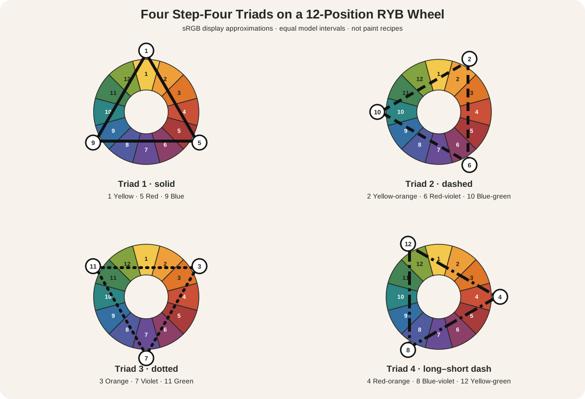
A triadic color scheme uses three hue families placed at equal intervals around a chosen color wheel. On the 12-position RYB artist teaching wheel used here, move four positions each time: select one hue, count four steps to the second, then four more to the third. Joining those positions makes a triangle.
That geometry identifies a palette; it does not guarantee balance, beauty, energy, or any other effect. The result still depends on how much of each family appears, how light or dark and intense or muted it is, where it sits, what surrounds it, and which material carries it. Name the wheel first, then judge the actual artwork.
At a Glance
- Core structurethree hue positions separated by equal intervals on a declared wheel.
- This guidemaps four triads on a 12-position RYB teaching wheel.
- Not any three coloursthe interval and declared sequence define the structure.
- Hierarchy still mattersarea, value, chroma, edge and repetition can make one family lead.
- Material limitscreen geometry does not predict mixtures from actual paint, textile or glaze.
Contents
The four triads on a 12-hue RYB wheel
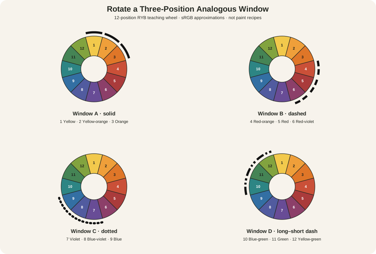
The diagram uses the same traditional RYB order as the Artist's Color Wheel. The National Gallery of Art uses this familiar artist-teaching framework while distinguishing pigment colors from the red, green, and blue light of screens.[3] The colored sectors below are therefore sRGB display approximations of RYB labels, not samples or mixing recipes.
| Positions | Hue families on this wheel | Overlay line |
|---|---|---|
| 1–5–9 | Yellow, red, blue | Solid |
| 2–6–10 | Yellow-orange, red-violet, blue-green | Dashed |
| 3–7–11 | Orange, violet, green | Dotted |
| 4–8–12 | Red-orange, blue-violet, yellow-green | Long–short dash |
Each set advances by four positions and returns to its starting point after three moves. Rotating all three corners one step produces the next valid triad. Adobe describes its Triad rule in comparable geometric terms: colors are arranged around three equidistant points on a color wheel.[1]
The model matters. A triad selected on this evenly divided RYB teaching wheel may not land on the same numeric coordinates in an HSB, Lab, perceptually uniform, or pigment-specific system. Even within RYB instruction, printed samples vary. Keep the family names and positions stable; test the actual paints, inks, papers, threads, or digital color values you intend to use.
A triad is more than any three colors
Three unrelated swatches do not become triadic merely because there are three of them. A triad requires equal intervals in the declared model. Red, yellow, and blue occupy positions 5, 1, and 9 on this wheel, so each is four steps from the next. Red, orange, and blue are three hue families, but their intervals are unequal here.
The word “harmony” can also mislead. A wheel relation is a repeatable selection method, not an objective score for whether colors look good together. Yale's description of Josef Albers's Interaction of Color emphasizes color relativity: boundaries, surrounding colors, and arrangements change how a color appears.[6] The same three swatches can feel assertive in one composition and quiet in another.
A digital harmony tool is useful for generating candidates. Adobe Color lets a base swatch control linked positions and can preview a palette under several forms of color-vision deficiency.[2] But screen previews remain light emitted by a particular display. Golden notes that real pigments differ in opacity, transparency, masstone, undertone, and mixing behavior.[4] Use digital values for digital work; make physical tests for physical work.
Choose a triad in four steps
- Name the model. For this exercise, write “12-position RYB teaching wheel.” If you use different software or a different physical wheel, record it.
- Choose one starting family. Pick a hue that serves the subject or material rather than searching for a supposedly universal “best” triad.
- Count equal intervals. Move four positions to find the second family and four more for the third. Check the position numbers, not color appearance alone.
- Choose actual materials. Select specific paints, papers, threads, or digital values within those families. Test their value, chroma, opacity, and mixtures before committing to a large work.
Golden separates hue, chroma, and value in its technical guide.[5] That separation is especially helpful with triads. Hue determines whether a color belongs to the selected family; value determines its relative lightness or darkness; chroma describes whether it appears brilliant or subdued. You can preserve three hue families while varying the other two qualities widely.
Control emphasis instead of obeying a formula
Equal spacing on the wheel does not require equal area in the artwork. Nor does equal area produce equal attention: a tiny light, high-chroma shape near the center may attract more notice than a broad muted field at the edge.
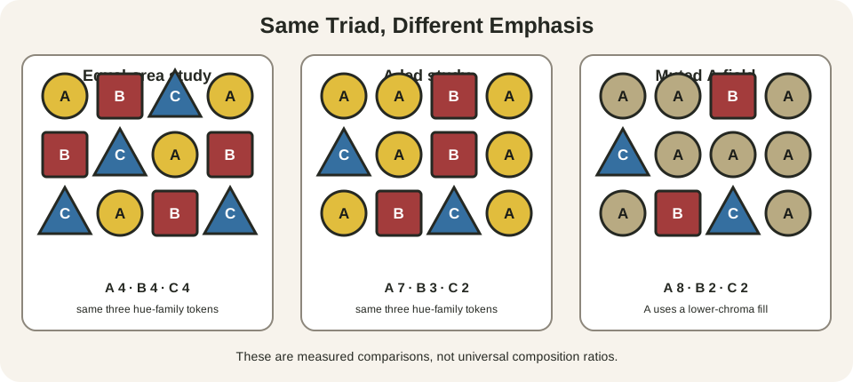
The first panel gives A, B, and C four tiles each. The second makes A extensive, B supporting, and C scarce. The third keeps A extensive but reduces its chroma, allowing two smaller B and C groups to compete more strongly. The counts are experiments, not a rule. There is no evidence-led percentage that fits every triadic artwork.
Use five controls deliberately:
- Area: enlarge one family or repeat it across the ground; confine another to small motifs.
- Value: give one family the lightest lights or darkest darks, or spread the value range across all three.
- Chroma: mute the most extensive family and reserve high intensity for smaller accents, or reverse that relation.
- Placement: move a scarce family to a focal edge, face, hand, symbol, or directional junction.
- Repetition: echo small amounts of each family in several regions so the eye can connect them.
Neutrals do not automatically break the scheme. White paper, dark line, bare canvas, gray, brown, or a neutral mixture can mediate the three families. Ask whether a fourth hue family competes as a major participant, not whether every pixel fits one of three ideal swatches.
Mixtures between the selected families can also remain part of the palette. Yellow and red paints may produce oranges; red and blue may produce violets; blue and yellow may produce greens. Those mixtures occupy regions between the chosen anchors, so a painted work can contain far more than three visible samples while still being organised around three starting families. The exact mixtures depend on the pigments, as the Golden material guidance makes clear.[4]
Be equally precise with near-neutrals. A dark made from two members of the triad may retain a green, violet, or brown bias. Repeat that biased dark in small passages if it helps unify the work, and label it by its ingredients in a studio study instead of assuming it is a generic black.
Build a small triadic study
Make three rectangles of the same size. Label your hue families A, B, and C and assign each a distinct shape—circle, square, and triangle—on your plan.
In study one, give each family similar area but different values. In study two, make A dominant by area, B supporting, and C a small accent. In study three, keep the areas from study two but lower A's chroma. Do not change more than one main variable between adjacent studies.
Photograph or photocopy each study in grayscale. If all important shapes collapse into one mid-value mass, the hue differences were doing nearly all the separating. That may be intentional, but it should be a decision. Return to the color version and compare which region leads, which connects areas, and which punctuates them.
For paint, make dried swatches before the composition. A screen triad cannot tell you whether your chosen yellow is opaque, your blue is strongly tinting, or your red and blue mixture will remain vivid. Record the tube names and pigment codes rather than assuming the family label predicts the result.
Read a possible triad in an artwork
Museum teaching materials use triadic harmony as one way to discuss color in collection objects.[7] Treat it as a lens, not a verdict. First list what you can see; then test whether three dominant families fit equal positions on the declared wheel. Finally, identify exceptions, neutrals, faded areas, and material effects.
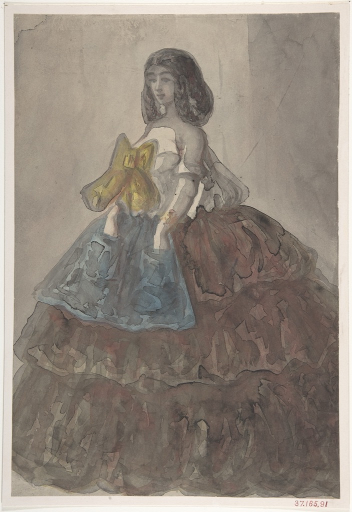
The Met identifies gray, pale red, blue, and yellow wash in Constantin Guys's Woman in a Tiered Gown with a Large Bow.[10] In the present reproduction, the muted red-brown skirt occupies the largest colored area, blue sits mainly in the apron, and yellow concentrates in the bow. These can be read as subdued versions of a red–yellow–blue triad, but their unequal area and low chroma make the sheet quieter than three fully saturated, equal fields would be. Gray wash and bare paper are major participants in the appearance.
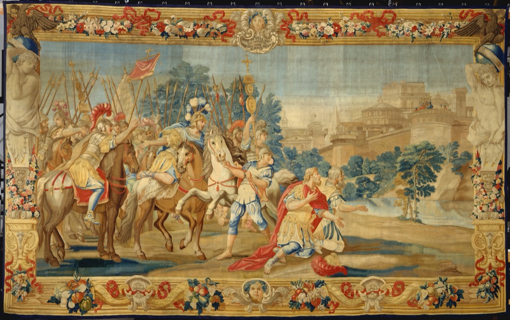
The Met's record for The Crusaders Reach Jerusalem specifically notes red, blue, and yellow garments.[11] Those families recur in figures, ribbons, flowers, borders, and equipment across a much larger field of pale architecture, sky, flesh, brown horses, and vegetation. The triad helps you trace repeated accents, yet it does not exhaust the tapestry's palette. Scale also matters: a color that seems small in the full image may cover a substantial woven area in the object, which measures almost six metres across.
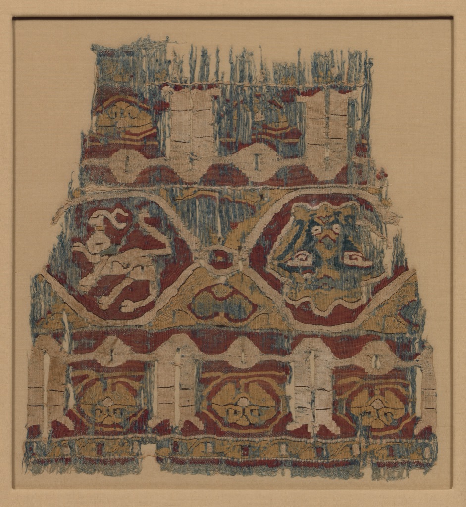
The 11th-century Fustat textile fragment is described by the Met as enlivened with red, blue, and yellow animals and medallions.[12] The same families now appear muted across worn linen and silk, structured by bands, repeated curves, creatures, and inscription-like forms. Here material, age, loss, and the warm mount alter the current relationships. A triadic reading identifies a repeated three-family structure without pretending the colors match modern wheel chips.
None of these observations proves that the maker consciously applied a later diagram called a triadic scheme. They show how a declared model can organise close looking while the object record keeps material and historical claims grounded.
Common triadic mistakes
| Mistake | Why it fails | Better test |
|---|---|---|
| Calling any three-color palette triadic | The wheel intervals may be unequal | Name the model and verify the three positions |
| Using three fully saturated colors equally | Geometry does not control attention | Vary area, value, chroma, or placement in small studies |
| Treating a fixed percentage as law | Subject, scale and material change visual weight | Compare at least three area distributions |
| Matching screen swatches to paint tubes | Emitted light cannot predict pigment opacity or mixing | Make labeled physical swatches and dried mixtures |
| Adding black or white without checking the family | The adjustment can shift hue and chroma | Compare the changed sample with the original family position |
| Reading an artwork from color alone | Value, line, texture, subject and ground may carry structure | Examine a grayscale view and the full object record |
| Claiming the artist intended a triad | Visible grouping is not documentary evidence | Say “can be read as” unless a reliable source establishes intent |
Make triadic diagrams accessible
Do not identify A, B, and C only by red, yellow, and blue. W3C requires another visual means for information conveyed through color.[8] Use printed names, position numbers, shapes, line patterns, direct labels, and a written table. When text sits over a colored region, normal-size text generally needs at least 4.5:1 contrast under WCAG's minimum-contrast criterion.[9]
Color-vision simulations are a diagnostic, not a substitute for these cues. If two families approach each other under a simulation, the labels and composition should still remain intelligible. For an artwork, provide useful alternative text that names subject, placement, and major color families rather than listing colors without spatial meaning.
Watch: Triadic Color Schemes through Formal Analysis
Choose a museum-led whole-work analysis, a close reading, or a foundations overview for considering triadic color schemes.
Introducing Formal Analysis: Landscape
Follow how recurring shapes, colours and intervals contribute to a larger visual organisation.
Watch on YouTubeFrequently Asked Questions
It selects three hue positions separated by equal intervals on a declared colour wheel.
They are positions 1–5–9, 2–6–10, 3–7–11 and 4–8–12 in the declared sequence used here.
No. The three positions must be equally spaced within the named wheel or system.
No. Equal wheel intervals do not require equal visual weight; area, value and chroma can establish a useful hierarchy.
Keep the hue families fixed while making small studies with different area, value and chroma roles, then test the intended materials.
Discussion
Which example on this page keeps the triadic interval while giving one colour family the clearest lead?
Reader Insights
Equal spacing defines the triad.
Equal geometry can support unequal area and intensity.
Historic works need not have been designed from a modern wheel label.
Join the Conversation
Share one precise observation or a useful museum example below.
References
- Adobe, “After Effects Reference: Triad color rule.” https://helpx.adobe.com/pdf/after_effects_reference.pdf
- Adobe, “Color Palette Generator and Color Wheel Tool.” https://color.adobe.com/create/color-wheel
- National Gallery of Art, “The Elements of Art: Color.” https://www.nga.gov/educational-resources/elements-art/elements-art-color
- Golden Artist Colors, “Color Wheel.” https://goldenartistcolors.com/resources/color-wheel
- Golden Artist Colors, “Color Mixing Guide.” https://goldenartistcolors.com/resources/color-mixing-guide
- Yale University Press, “Interaction of Color.” https://yalebooks.yale.edu/book/9780300146936/interaction-of-color/
- Wichita Falls Museum of Art, “Color in Art, Color in Life.” https://wfma.msutexas.edu/explore/museum-from-home/curators-clues/color-in-art-color-in-life
- W3C Web Accessibility Initiative, “Understanding Success Criterion 1.4.1: Use of Color.” https://www.w3.org/WAI/WCAG21/Understanding/use-of-color
- W3C Web Accessibility Initiative, “Understanding Success Criterion 1.4.3: Contrast (Minimum).” https://www.w3.org/WAI/WCAG22/Understanding/contrast-minimum.html
- The Metropolitan Museum of Art, “Constantin Guys: Woman in a Tiered Gown with a Large Bow.” https://www.metmuseum.org/art/collection/search/337272
- The Metropolitan Museum of Art, “The Crusaders Reach Jerusalem.” https://www.metmuseum.org/art/collection/search/187476
- The Metropolitan Museum of Art, “Textile Fragment.” https://www.metmuseum.org/art/collection/search/448111