by Tom Gurney
Tom Gurney BSc (Hons) is an art history expert with over 20 years experience
Page created on September 2, 2026 / Page updated on September 13, 2026
Email: tomgurney1@gmail.com / Phone: +44 7429 011000
Following Light through Screens, Surfaces and Filters
Additive color combines emitted light. Subtractive color describes materials or filters that absorb parts of incident light before the remainder reaches an observer. The words identify different energy paths; they are not rival recipes for one universal set of primary colors.
A monitor, a painted canvas, a stained-glass window and an inked sheet can display related color names while producing them differently. Reliable color decisions begin by naming the source, the interacting material, the output device or surface, and the observer.
At a Glance
- Additive colouremitted light combines toward a defined white in an RGB space.
- Subtractive colourmaterials absorb parts of incident light and return or transmit the remainder.
- CMYKa defined process-print model, not a universal recipe for every paint.
- Always declarename the device, material, profile, illuminant and output conditions.
- Best diagnostictrace the light path before choosing a colour model.
Contents
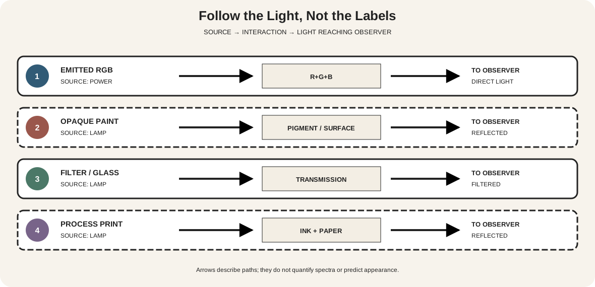
Follow the light path
Use a three-part question: where does the light begin, what happens to it, and what reaches the eye?
| Situation | Source | Interaction | Light reaching observer |
|---|---|---|---|
| RGB display or projection | powered emitters | channel intensities combine | directly emitted light |
| opaque painting | lamp or daylight | pigments and surface absorb, scatter and reflect | selected reflected light |
| stained or filtered glass | lamp, sun or projection source | glass/filter transmits some wavelengths and absorbs others | selected transmitted light |
| process print | lamp or daylight | ink layers and paper absorb, scatter and reflect | selected reflected light |
The National Gallery of Art organizes color around object, light and observer, and its conservation glossary defines spectral reflectance as the fraction of incident light a material reflects at each wavelength.[2][3] That framework is more useful than memorizing overlapping circles because it works for mixed situations.
A light box behind colored glass, for example, supplies illumination; the glass modifies it. The colored pane is not equivalent to a red, green or blue display emitter. An opaque paint layer receives illumination and returns part of it, while a transparent glaze can transmit light into lower layers before some returns. Both are subtractive interactions, but their paths and material variables differ.
Additive RGB: name the space and the white
In an RGB system, three channel values control specified red, green and blue primaries. After the encoded values have been converted to linear-light values, the contributions add. W3C's CSS Color specification states that linearized RGB spaces are additive and defines their gamut through the primary chromaticities and white point.[1]
At zero output from all three channels, an ideal emissive display contributes no light and appears black under suitable viewing conditions. At full output from all three, the system produces its declared white point. Full red plus full green yields the system's yellow direction; green plus blue yields cyan; blue plus red yields magenta. Those statements belong to the specified RGB system, not to tubes of paint.
“RGB” alone is incomplete. sRGB, Display P3, Adobe RGB and Rec. 2020 use defined primaries, transfer functions and white points. W3C notes that real devices cannot reproduce every visible color and that different RGB spaces have different gamuts.[1] A triplet such as 0, 180, 255 is interpretable only with a color space, encoding and display path.
Do not add gamma-encoded channel numbers as though they were physical light powers. Software used for compositing or interpolation may need to linearize values first. The visible result also depends on display calibration, peak luminance, ambient light and the viewer.
Subtractive color: absorption plus the remainder
A subtractive material does not manufacture “the opposite color.” It absorbs some incident wavelengths and transmits or reflects what remains. Multiple colorants can remove more of the available spectrum, often lowering returned light as the mixture deepens.
This general account covers several non-identical systems:
- opaque paints combine absorption with strong scattering and surface reflection;
- transparent dyes and filters primarily modify transmitted light;
- glazes interact with the ground and lower layers;
- printing inks work with paper, screening, overprint order and press conditions;
- stained glass has thickness, texture, joints and changing illumination.
Real pigments do not behave like perfect mathematical filters. They have irregular reflectance curves, different opacity and tinting strength, particle and binder effects, and sometimes chemical incompatibilities. Golden's mixing guide shows that changing the actual red, yellow or blue pigment changes the secondary mixtures.[6] An ideal subtractive diagram explains direction; a labelled dry sample records a material result.
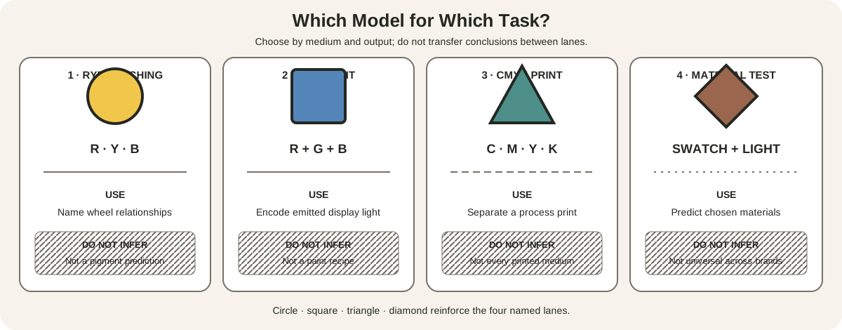
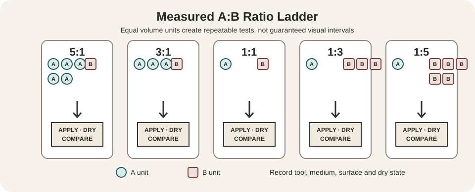
For studio ratios, application and drying, follow the site's dedicated color-mixing chart. Tier membership across declared RYB, RGB and process-color systems is mapped in the separate tier vocabulary reference. Neither route turns model coordinates into guaranteed material outcomes in an actual studio test directly.
CMYK is a process-print model
CMYK uses cyan, magenta, yellow and black process inks. Adobe describes cyan, magenta and yellow as subtractive because translucent inks absorb portions of white light passing into and returning from paper. Their idealized full overlap is black; practical printing adds black K to improve shadow depth and detail.[4]
The K plate also supports registration, neutral stability and economical dark coverage in many workflows. It is not evidence that C, M and Y are “wrong”; it is a practical component of a production system.
Process colors differ from spot colors. A process color is separated into CMYK screen components, while a spot color uses a specified additional ink or plate. Adobe notes that content authored in RGB or Lab can be converted during color separation.[5] Conversion is not a change of labels only: the output profile, rendering intent, total ink, black generation, substrate and press condition shape the result.
Do not call cyan, magenta and yellow the best universal primaries for all paints. Process inks are selected for a printing workflow. Artist paints have different spectral, scattering and handling behavior. Likewise, an inkjet printer may use more than four cartridges while accepting an RGB file; file model, internal conversion and physical ink set are separate layers.
Three declared models, three different tests
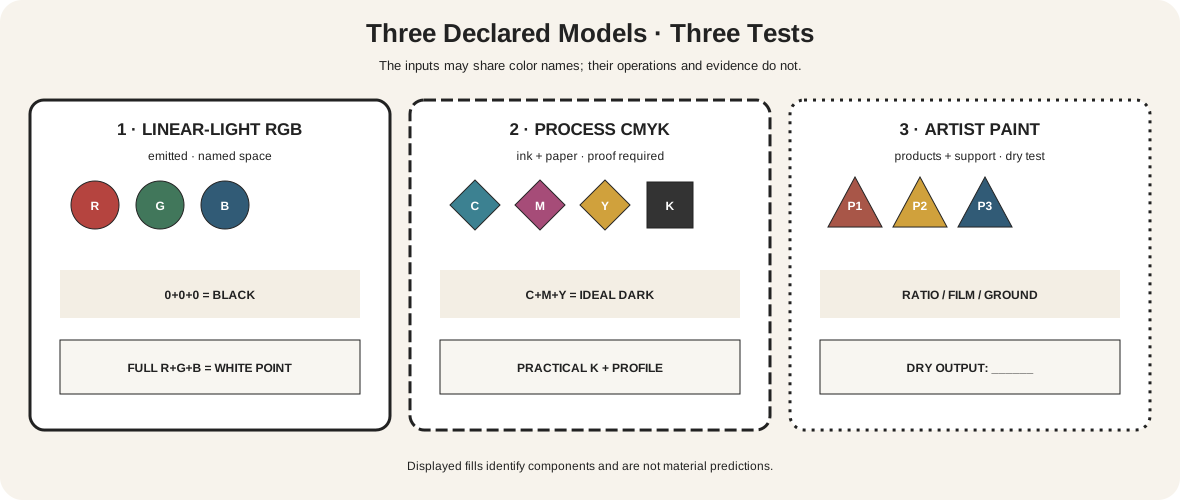
The model comparison contains three panels.
Panel 1: linear-light RGB. Inputs are R, G and B channel powers in one named space. The zero state is black; the full three-channel state is that space's white point. Test on the intended calibrated display, not from printed swatches.
Panel 2: idealized process subtraction. Inputs are C, M, Y and practical K. The diagram names the theoretical C+M+Y dark and the real proof required on a specific printer, paper and profile. It does not promise that three inks make a perfect neutral black.
Panel 3: artist paint. Inputs are actual P1, P2 and P3 products. Output boxes remain blank until mixtures dry. Record pigment codes, brand, binder, support, ratio, thickness and light. A paint wheel can guide sampling, but it cannot replace the chart.
These panels deliberately avoid forcing one set of colors across every system. Their common feature is documentation: declared inputs, operation, conditions and observed output.
A repeatable four-part comparison
Run four small studies rather than one spectacular demonstration.
1. Projected or emitted light
Use a display with a named RGB space or three controllable light sources designed for color mixing. Create R-only, G-only and B-only states, then RG, GB, BR and RGB. Record the numerical values, application, device, profile, brightness setting, room light and date. If using projectors, overlap on a neutral surface and record geometry.
Never stare into high-intensity sources or improvise unsafe electrical equipment. Use manufacturer-rated components and normal viewing levels.
2. Transparent filters
Place one identified filter at a time in front of a diffuse white source, then layer pairs in the same order and reverse the order. Record filter identity, source, layer count and transmitted appearance. Keep heat-generating lamps away from vulnerable plastics. The exercise demonstrates selection by transmission; it is not a pigment-mixing recipe.
3. Paint
Apply original colorants and pair mixtures at counted ratios on one support. Include thin and thick films and a white-tint row where appropriate. Let all samples dry. Compare reflected results under the same illumination used for originals. The limited-palette workflow helps identify gaps without adding paint impulsively.
4. Print proof
Create a file containing named RGB patches, a grayscale ramp, fine lines and overprint targets. Preserve the source profile. Convert a copy through the intended printer profile, note the rendering intent, and produce a proof on the named paper. If separations are available, inspect C, M, Y and K independently.
Put the four records side by side, but do not demand matching numerical values. The comparison reveals which transformations occurred at each boundary.
Device color needs profiles and conditions
The International Color Consortium describes profiles as the bridge between device encodings, allowing scanner or camera RGB to be transformed toward display or printer output.[7] Characterization records what a device produces; calibration adjusts it toward chosen targets. Neither makes every color reproducible.
A practical workflow is:
- retain the source file and embedded profile;
- view on a characterized, calibrated display under stable surroundings;
- soft-proof through the exact output profile;
- check gamut warnings without treating them as visual verdicts;
- choose a rendering intent for the job;
- make and annotate a physical proof;
- compare under specified illumination.
The Metropolitan Museum of Art traces how museum photography moves through capture, RGB editing, color targets, profiles and different outputs.[8] The reproduced object on this page has undergone such a chain. A screen sample describes that rendition, not the original pigment, glass or ink.
Marcel Meys and the Autochrome screen
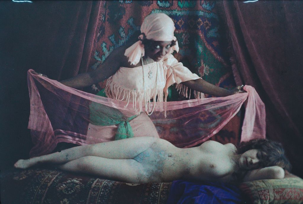
Marcel Meys's Reclining Nude with Slave, about 1905–10, is recorded by Cleveland as a full-plate Autochrome.[9] The image contains dark surrounding fabrics, pink translucent cloth, green and blue passages, a pale reclining figure and a seated figure in white.
Autochrome is a revealing historical hybrid. The Met explains that it is a transparent image on glass viewed by transmitted light or projection. A silver-gelatin image works with a screen of minute potato-starch grains dyed red, green and blue.[9] NGA describes the grains as filters through which exposure light passed before reaching the emulsion, producing a unique positive plate.[10]
It is classified as an additive-screen color process because the tiny filtered light contributions combine in viewing. Yet each grain is itself a subtractive filter. The system label describes the image-forming result; the energy-path account reveals the interacting layers.
This JPEG is a reproduction of a backlit transparency. Its pixels do not expose the original starch mosaic reliably at every zoom level, and its color cannot establish the historic viewing illumination.
Tiffany glass: selected transmitted light
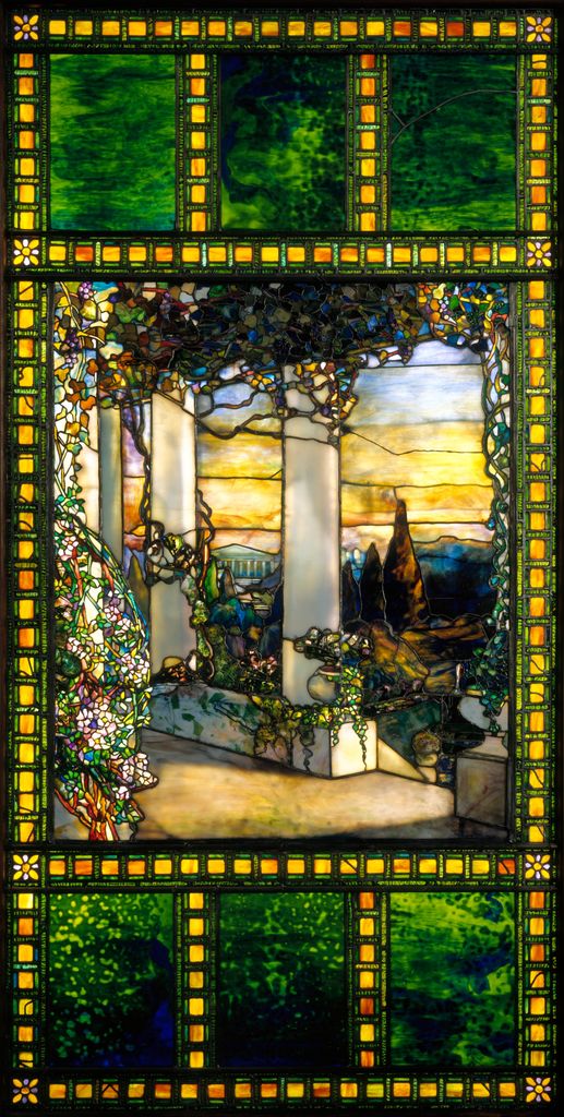
The Tiffany Glass & Decorating Company's Hinds House Window, about 1900, is made from leaded glass. Cleveland states that thousands of richly colored pieces were arranged and layered to form the scene and that the window would have glowed in afternoon sunlight.[11]
Amber border modules, green upper fields, pale columns and dense garden fragments surround a distant sunset. Lead lines remain structural darks. The appearance depends on light passing through colored and layered glass, plus surface reflection and the room around it.
Calling this “additive RGB” would be inaccurate: the panes do not operate as three calibrated emitters. Calling it simply “subtractive” is incomplete unless the illumination and transmission path are named. A different sky, lamp or backing can change the result without altering the glass.
Redon's lithograph: printed color without an assumed CMYK recipe
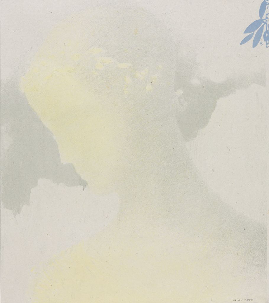
Odilon Redon's Beatrice of 1897 is a color lithograph on China paper laid on wove paper. Cleveland identifies printer Auguste Clot and publisher Ambroise Vollard and calls it Redon's fullest experiment with color lithography.[12]
Muted yellow, gray and green passages allow a profile to emerge softly, while a small blue botanical form enters from the upper right. Paper supplies most of the light field. Printed layers, support and illumination create the visible result.
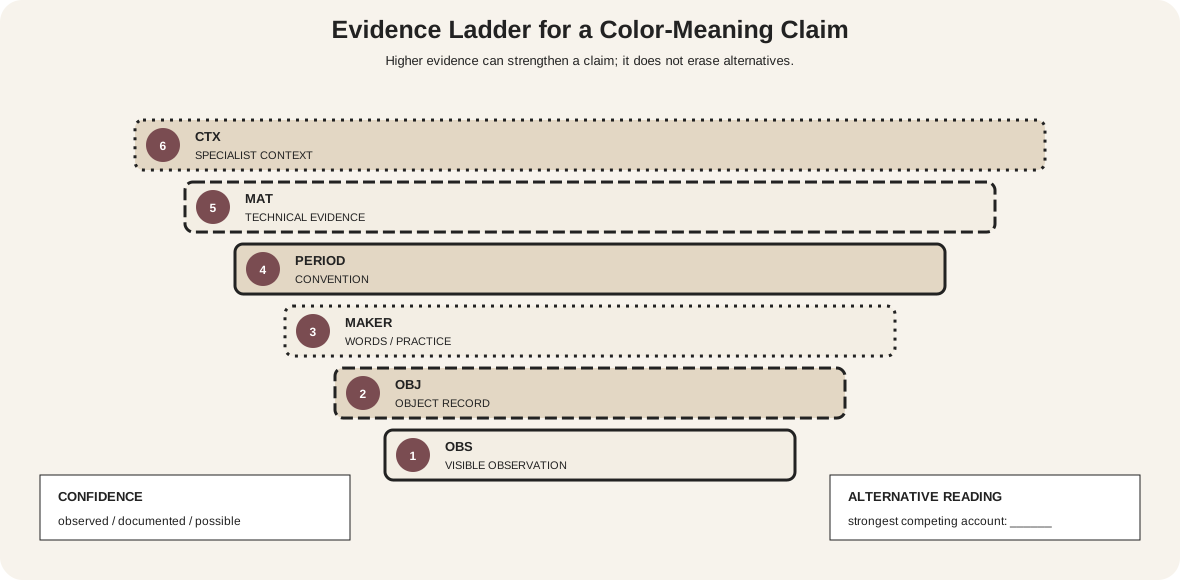
The term “color lithograph” does not identify modern four-process CMYK separations. Without plate or technical evidence, do not reverse-engineer a C/M/Y/K recipe from the reproduction. The work is valuable here precisely because “printed color” is a material category broader than one contemporary model.
Troubleshoot model mistakes
| Claim or symptom | What is missing | Better check |
|---|---|---|
| “RGB makes brighter colors” | named space, device and output level | compare declared gamuts and measured devices |
| “all channels at 255 means white” | encoding and white point | name the RGB space and display condition |
| “cyan plus magenta must equal blue” | ink, paper, screening and profile | inspect a printed proof |
| “RYB is scientifically wrong” | task and material context | distinguish teaching geometry from measured pigment behavior |
| “this JPEG reveals the palette” | capture and output chain | consult object-specific technical evidence |
| print looks duller than screen | gamut and illumination differ | soft-proof and make a physical proof |
| dark paint became muddy | ideal diagram replaced material testing | chart the exact pigments and dry films |
Accessible system diagrams
Color cannot carry model identity by itself.[13] Use R/G/B, C/M/Y/K and P1/P2/P3 labels, distinct shapes, equations, path arrows and numbered stages. Every important diagram fact should also appear in prose or a table.
Check grayscale plus protanopia, deuteranopia and tritanopia simulations. These simulations are defect detectors, not complete accounts of human vision. Maintain the normal-text contrast baseline of 4.5:1.[14]
For artwork images, alt text should name composition, material evidence and major separations without pretending to reproduce exact color sensation. A person unable to distinguish the hues should still be able to follow which source, interaction and output define the model.
Watch: Additive and Subtractive Color through Formal Analysis
Choose a museum-led whole-work analysis, a close reading, or a foundations overview for considering additive and subtractive color.
Introducing Formal Analysis: Landscape
Follow how recurring shapes, colours and intervals contribute to a larger visual organisation.
Watch on YouTubeFrequently Asked Questions
Additive colour describes emitted light channels combining within a defined system, commonly RGB, toward a specified white.
Subtractive colour describes materials that absorb portions of incident light and reflect or transmit the remainder.
No. CMYK is a defined process-print model; artists’ paints vary by pigment, binder, opacity, layer thickness and ground.
Appearance depends on colour space, profile, display, calibration, brightness, ambient light and viewing conditions.
Trace whether light is emitted, reflected or transmitted, then name the actual device, material and intended output before testing.
Discussion
Which example on this page makes the path of light easiest to distinguish from a familiar colour-model label?
Reader Insights
Identify source, interaction with material and light reaching the viewer.
RGB, CMYK and physical media require named conditions.
A screen preview cannot substitute for a material or print proof.
Join the Conversation
Share one precise observation or a useful museum example below.
References
- W3C, “CSS Color Module Level 4.” https://www.w3.org/TR/css-color-4/
- National Gallery of Art, “Seeing Color: Object, Light, Observer.” https://www.nga.gov/educational-resources/seeing-color-object-light-observer
- National Gallery of Art, “Glossary of Conservation Terminology.” https://www.nga.gov/research/conservation/scientific-research/glossary-terminology
- Adobe, “Color Models and Color Spaces.” https://helpx.adobe.com/uk/creative-cloud/apps/colors/understand-color-modes.html
- Adobe, “Spot versus Process Colors.” https://helpx.adobe.com/ca/creative-cloud/apps/colors/spot-and-process-colors.html
- Golden Artist Colors, “Color Mixing Guide.” https://goldenartistcolors.com/resources/color-mixing-guide
- International Color Consortium, “Frequently Asked Questions.” https://www.color.org/faqs.pdf
- The Metropolitan Museum of Art, “On Color Fidelity.” https://www.metmuseum.org/perspectives/color-photography-standards-van-gogh-sunflowers
- The Metropolitan Museum of Art, “Original Autochromes Produced Using the First Color Photographic Process.” https://www.metmuseum.org/fr/perspectives/on-view-january-2530-original-autochromes-produced-using-the-first-color-photographic-process
- National Gallery of Art, “Stieglitz's Practices and Processes.” https://www.nga.gov/research/publications/alfred-stieglitz-key-set/stieglitzs-practices-and-processes
- Cleveland Museum of Art, “Hinds House Window.” https://www.clevelandart.org/art/1966.432
- Cleveland Museum of Art, “Beatrice.” https://www.clevelandart.org/art/1931.50
- W3C Web Accessibility Initiative, “Understanding SC 1.4.1: Use of Color.” https://www.w3.org/WAI/WCAG21/Understanding/use-of-color
- W3C Web Accessibility Initiative, “Understanding SC 1.4.3: Contrast (Minimum).” https://www.w3.org/WAI/WCAG22/Understanding/contrast-minimum.html