by Tom Gurney
Tom Gurney BSc (Hons) is an art history expert with over 20 years experience
Page created on September 2, 2026 / Page updated on September 13, 2026
Email: tomgurney1@gmail.com / Phone: +44 7429 011000
Building Meaning from Evidence, Not Colour Charts
Color symbolism is meaning assigned to color within a particular work, practice or culture. It is not a fixed dictionary in which red always means passion, blue always means calm and yellow always means joy. A convincing interpretation connects visible color to evidence about the object, maker, audience, material, place and time.
Color–emotion research can reveal recurring associations among surveyed groups. It cannot diagnose a viewer, prove what an artist intended or replace art-historical evidence. Treat psychology as one possible evidence family, not a shortcut from hue name to meaning.
At a Glance
- Core ruledescribe the visible colour relationship before proposing meaning.
- Evidence laddermove from object and material to context, reception and qualified interpretation.
- Psychology limitstudies describe associations under defined conditions, not universal commands.
- History mattersfading, restoration, material value and dating can change a reading.
- Cultural careavoid transferring one culture’s colour meanings into another context.
Contents
Begin with description, not a meaning chart
Write down what is visible before interpreting it. Identify the color family, approximate lightness and intensity, occupied area, position, repetition, edge and neighboring colors. Record the support and medium if they are known.
“A small, high-intensity red rectangle sits inside a broad gray field” is an observation. “The red means danger” is a hypothesis. To test it, ask whether the work contains warning text, bodily imagery, political emblems, ritual materials, an artist statement or comparable objects using red in the same role.
The Met notes that red has been associated with multiple political ideologies, while some artists make color the subject rather than a symbol for something else.[1] The same visible hue can therefore participate in incompatible claims. Context selects among possibilities.
Keep formal function distinct from symbolic meaning. A red accent may attract attention because of area, value, chroma and contrast even when no red-specific code is intended. The three-coordinate color reference supports that formal account. The symbolic claim needs additional evidence.
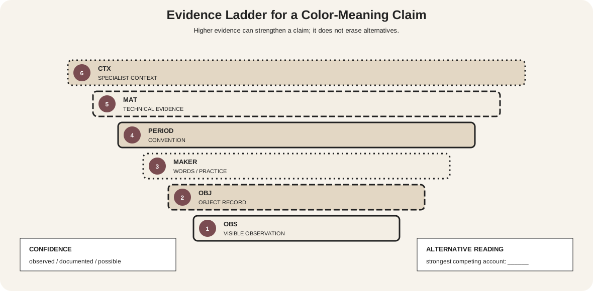
An evidence ladder for interpretation
The ladder has six rungs. They are not automatic scores; they show what kind of support a claim possesses.
- Visible observation: the reproduced or directly viewed colors, shapes, positions and repetitions.
- Object record: title, medium, date, place, function, inscription, accession history and current attribution.
- Maker evidence: letters, interviews, notes, preparatory work or documented working practice.
- Period convention: securely sourced uses within the relevant community and time.
- Material evidence: pigment, dye, glaze, fading, trade, cost, restoration or technical examination.
- Contextual scholarship: a specialist argument joining those facts while acknowledging uncertainty.
A high rung does not erase lower evidence or alternative readings. A technical report can establish cinnabar, but it does not alone explain what red meant. An artist's letter can describe a desired mood, but it may apply to one series rather than an entire career.
Record confidence separately:
- observed: directly visible or measured;
- documented: explicitly stated in a reliable object or primary record;
- supported interpretation: argued from several converging sources;
- possible: plausible but not distinguished from alternatives;
- unsupported: asserted from a generic color code.
Use the strongest warranted term. “Cleveland identifies green here with paradise” is more precise than “green symbolizes paradise everywhere.”
Psychology describes associations, not commands
A systematic review of 132 peer-reviewed articles found recurring color–emotion correspondences, including links between lighter colors and positive emotions and darker colors and negative emotions. It also documented many-to-many mappings, varied methods and cultural differences.[6] That is evidence that associations can be patterned—not that one hue causes one response in every person.
A study of 4,598 participants across 30 nations found strong cross-national similarities in color–emotion associations, alongside differences predicted by national, linguistic and geographic proximity.[7] A separate comparison of Western, Mainland Chinese and Macanese groups found that implicit red–green valence effects differed more across groups than red–white effects.[8]
These results encourage qualified language:
- say “participants in this study associated…” rather than “the color makes people feel…”;
- name the tested color terms or samples, task, population and comparison;
- distinguish explicit word association from implicit response and from viewing an artwork;
- do not generalize from a screen patch to a materially complex object;
- do not use color to infer personality, mental health or cultural identity.
An artwork supplies composition, imagery, scale, texture, narrative and setting that a laboratory patch may not. The viewer supplies experience, language and attention. A survey association can suggest a question; it cannot close the interpretation.
Separate three kinds of psychological claim
A reported association joins a color term or sample with an emotion concept under a stated task. A measured effect records a change in performance, judgment or physiology under controlled conditions. A person's experience of an artwork is a situated response to the whole object. These are not interchangeable outcomes.
Check whether a study compared hues at equal lightness and chroma, whether participants saw calibrated samples, and whether the result concerned preference, arousal, memory or meaning. “Red was selected with anger more often than blue” does not demonstrate that a red painting raises aggression. Nor does a group average invalidate a viewer who reports a different association.
For gallery interpretation, psychological evidence is most useful when its boundaries are visible. State sample size, population and task; present the finding as probabilistic; then return to the work's imagery, material and history. If the source does not test art, do not rewrite it as an art experiment.
Same hue word, different contexts
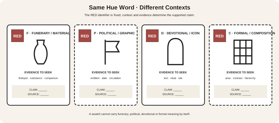
The four columns hold the label RED constant while changing the evidence around it.
| Context | Evidence to seek | What not to assume |
|---|---|---|
| funerary/material | findspot, substance, body or burial relation, comparable objects | all red is blood or life |
| political/graphic | emblem, organization, date, circulation and audience | one ideology owns red permanently |
| devotional/iconographic | text, ritual function, garment/object convention and site | a Western convention applies globally |
| formal/compositional | area, contrast, repetition, edge and hierarchy | visual emphasis proves symbolism |
Add other contexts when the object requires them: court rank, trade guild, gendered dress, protest, national flag, theatrical lighting, medicine, ecology or personal memory. Never select a context because it confirms the first association that came to mind.
The Met's history of cochineal stresses that color meaning is bound to material source, labor, trade and rarity as well as visual appearance.[2] A costly imported dye and a convenient synthetic substitute may occupy different social histories even if a reproduction makes them look similar.
A repeatable interpretation worksheet
Create one sheet for one color claim.
Object identity: artist or maker, title, date range, place, medium, institution, accession and current attribution.
Visible evidence: name the passage, area, value, chroma, edge, repetition and relationship to figures, text or objects. Mark whether the observation comes from direct viewing, a conservation image or a standard reproduction.
Material evidence: list identified pigments, dyes, stones, glass or inks only when a source establishes them. Note fading, alteration, cleaning, restoration and uncertain identification.
Context evidence: copy no long quotations. Summarize the relevant inscription, maker statement, ritual use, political circulation, literary source or period convention and cite it.
Comparison set: find at least two securely related objects. State why they are comparable—same workshop, patronage, ceremony, movement, publication or material network.
Alternative reading: write the strongest competing explanation. The color may organize attention, describe a material, follow convention, quote another work or have no stable symbolic role.
Claim and confidence: write one sentence whose strength matches the evidence. If evidence conflicts, preserve the conflict rather than averaging it away.
This worksheet turns “blue means spirituality” into a research question: which blue material, in which object, used where, documented by whom, for which audience and with what alternatives?
Material history changes meaning
Hue names can hide expensive substances and long supply chains. Cochineal red came from an insect source and moved through colonial trade, workshops and textile markets.[2] Lapis lazuli, indigo, copper greens, gold leaf and synthetic dyes carried other constraints. Availability can govern who used a color, how much area it occupied and what status it acquired.
Technical change can also remove the very color used in an interpretation. Organic lakes fade; copper pigments alter; varnish yellows; cleaning changes contrast. Before claiming that white symbolizes purity, ask whether the passage was originally pink. Before reading a dark robe as deliberate mourning, check whether its details or glazes have been lost.
The Met explains that capture, profiling, editing, gamut and print output all transform a museum image.[9] A web reproduction adds uncertainty on top of the object's condition. Use exact pixels only to document the displayed file, never to identify a pigment or reconstruct an original symbolic scheme.
Maya jade and cinnabar in a tomb context
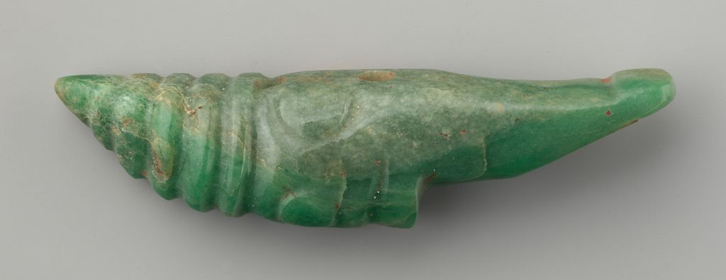
This hand-shaped Maya jadeite ornament, made between the 3rd and 9th centuries, retains small traces of red material. The Met identifies the object as jadeite and discusses the combination of green jade and blood-red cinnabar in Maya tombs as highly symbolic, connected with eternal life and rebirth into divine realms.[3]
That interpretation depends on more than green and red. The evidence includes material identification, archaeological tomb context and wider Maya uses of jade and cinnabar. The carved hand form, drill holes and worn surface are part of the object record.
A careful claim is therefore specific: in documented Maya funerary contexts, the juxtaposition of jade and cinnabar has been interpreted in relation to rebirth. It would be unsound to extract “green plus red means rebirth” and apply it to an unrelated European portrait.
The photograph's gray surround and lighting help show surface and traces but are not the object's original setting. Meaning belongs to the material object and context, not the studio background.
A prayer niche with meaning—and a dating problem

The Cleveland prayer niche, or mihrab, combines white calligraphy with turquoise, cobalt, green, gold and dark ceramic mosaic. A mihrab marks the qibla wall facing Mecca. Cleveland states that the green arabesque relates to the Prophet Muhammad and paradise, while the surrounding Qur'anic passage is the Chapter of Light.[4]
Color, word, pattern and architectural function converge. Green is not interpreted in isolation: it runs behind sacred text inside a focal mosque form, while the inscription itself develops imagery of divine light.
The object's date is materially unsettled. Its style suggested about 1500, but thermoluminescence testing indicated that the tiles were fired between 1941 and 1961. Cleveland lists the date as “c. 1500s or mid-1900s” and notes continuing examination.[4]
That uncertainty changes the responsible claim. The visible program and the museum's iconographic reading can be described; an unqualified assertion about a 16th-century commission cannot. A later reconstruction, replica or composite may repeat older conventions, but its production history is a different question.
Van Gogh's roses: a documented mood altered by fading
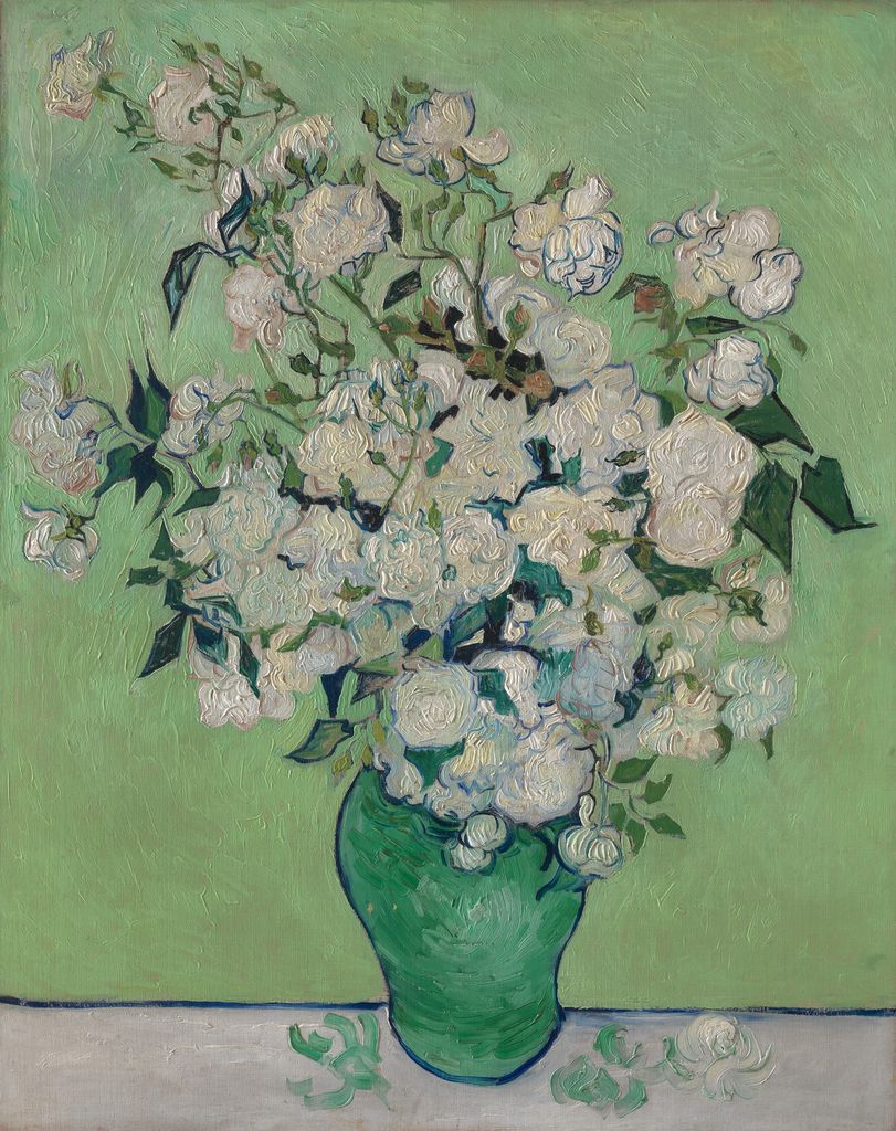
Vincent van Gogh painted Roses in 1890. Today pale blossoms sit in a green vase against a green field, with blue contours and dark leaves articulating the mass. The Met's exhibition research explains that the roses were originally pink and that Van Gogh considered pink and green expressive of springtime's mood.[5]
The artist-associated statement is unusually useful, but it applies to this spring flower group and its relationships. It does not establish pink as a universal happiness code or green as a fixed symbol throughout Van Gogh's art.
Fading is central. The red lake component has diminished, moving formerly pink flowers toward white and changing their complementarity with green.[5] An interpretation based only on the present reproduction would miss the planned relation.
Separate three times: the artist's 1890 palette and stated seasonal aim; the object's altered present surface; and the current digital rendering. The meaning claim is strongest when those layers are not collapsed.
Symbols may be contested, layered or absent
Colors can be appropriated and reassigned. A political red may shift across parties, nations and decades. A devotional color can coexist with workshop economics. A uniform can signal rank to one audience and become merely decorative to another. Some viewers may bring associations the maker never anticipated.
Do not force agreement. Record whether the claim describes maker intention, period reception, later reception or your present reading. Those are different historical subjects.
Also allow a null result. A color may have been selected for availability, balance, legibility or pleasure without acting as a symbol. The Met's “Color and Form” examples include artists for whom color functions as subject itself.[1] “No documented symbolic meaning found” is a legitimate conclusion.
The NGA's place-based symbolism prompts connect visual details with title, place, ceremonial practice and artist process rather than offering a universal key.[12] That method keeps interpretation open but accountable.
Diagnose weak claims
| Weak claim | Problem | Evidence-led revision |
|---|---|---|
| red means love | universal dictionary | identify the object-specific image, text or convention |
| blue is calming | association becomes causal effect | cite population and task, then keep artwork response open |
| white means purity here | present hue assumed original | check materials, fading and conservation history |
| the artist used green for jealousy | intention invented | locate a statement or label it as a possible reading |
| this culture believes… | community treated as timeless and uniform | name group, place, period, source and variation |
| the pixel proves cinnabar | reproduction confused with material | use analytical or authoritative object evidence |
| high contrast proves danger | formal salience confused with symbol | separate compositional function from contextual meaning |
Accessible discussion of color meaning
Meaning cannot be communicated by color alone.[10] Diagrams need printed hue names, context headings, symbols, sequence numbers and full adjacent explanations. A swatch is an example, not the definition.
Check grayscale and common CVD simulations to reveal lost distinctions. Keep normal explanatory text at or above the 4.5:1 contrast baseline.[11] Avoid tasks that require a learner to identify an unlabeled hue correctly before accessing the historical argument.
Alt text should name the relevant material, composition, inscription or alteration evidence. It should not prescribe an emotion. “A green vase holds pale roses against a green field” supports inquiry; “a soothing painting” closes it without evidence.
Watch: Color Symbolism and Psychology through Formal Analysis
Choose a museum-led whole-work analysis, a close reading, or a foundations overview for considering color symbolism and psychology.
Introducing Formal Analysis: Landscape
Follow how recurring shapes, colours and intervals contribute to a larger visual organisation.
Watch on YouTubeFrequently Asked Questions
No. Meanings vary with culture, period, material, subject, use, audience and the relationships within a specific work.
No. It can report associations under defined conditions, but it does not issue universal emotional commands.
Begin with description, identify material and historical context, consult reliable evidence, and phrase the conclusion at the strength the evidence supports.
Yes. Chemical change can alter the colours now visible, so conservation evidence may be essential to reconstruct an earlier relationship.
A reliable claim connects precise visual evidence with documented material, cultural, iconographic, historical or reception evidence and acknowledges uncertainty.
Discussion
Which example on this page most clearly changes once material history or cultural context is added?
Reader Insights
Name hue, value, intensity, area and placement before meaning.
Separate what is visible from what sources document.
Use qualified language when evidence is partial or contested.
Join the Conversation
Share one precise observation or a useful museum example below.
References
- The Metropolitan Museum of Art, “Color and Form.” https://www.metmuseum.org/zh/perspectives/color-drawings-and-prints
- The Metropolitan Museum of Art, Cochineal Red: The Art History of a Color. https://resources.metmuseum.org/resources/metpublications/pdf/Cochineal_Red_the_art_history_of_a_color.pdf
- The Metropolitan Museum of Art, “Ornament.” https://www.metmuseum.org/art/collection/search/314832
- Cleveland Museum of Art, “Prayer Niche (Mihrab).” https://www.clevelandart.org/art/1962.23
- The Metropolitan Museum of Art, “Van Gogh: Irises and Roses.” https://www.metmuseum.org/exhibitions/listings/2015/van-gogh
- Royal Society Open Science, “Do We Feel Colours? A Systematic Review of 128 Years of Psychological Research Linking Colours and Emotions.” https://pmc.ncbi.nlm.nih.gov/articles/PMC12325498/
- Psychological Science, “Universal Patterns in Color–Emotion Associations Are Further Shaped by Linguistic and Geographic Proximity.” https://journals.sagepub.com/doi/10.1177/0956797620948810
- Scientific Reports, “The Good, the Bad, and the Red: Implicit Color–Valence Associations across Cultures.” https://pmc.ncbi.nlm.nih.gov/articles/PMC10017663/
- The Metropolitan Museum of Art, “On Color Fidelity.” https://www.metmuseum.org/perspectives/color-photography-standards-van-gogh-sunflowers
- W3C Web Accessibility Initiative, “Understanding SC 1.4.1: Use of Color.” https://www.w3.org/WAI/WCAG21/Understanding/use-of-color
- W3C Web Accessibility Initiative, “Understanding SC 1.4.3: Contrast (Minimum).” https://www.w3.org/WAI/WCAG22/Understanding/contrast-minimum.html
- National Gallery of Art, “The Elements of Art: Symbolism and Place.” https://www.nga.gov/educational-resources/elements-art/elements-art-symbolism-and-place