by Tom Gurney
Tom Gurney BSc (Hons) is an art history expert with over 20 years experience
Page created on September 2, 2026 / Page updated on September 13, 2026
Email: tomgurney1@gmail.com / Phone: +44 7429 011000
Tracking What White, Gray and Black Actually Change
A tint is a color mixed with white. A shade is a color mixed with black. In the controlled vocabulary used here, a tone is a color mixed with gray made from black and white. These terms name what was added; they do not completely predict how the resulting paint will look.
The broad direction is useful: a tint normally becomes lighter, a shade darker, and a tone more muted. Yet a real mixture can also change hue, chroma, opacity and apparent temperature. Record the exact materials and examine the dry swatch before deciding what changed.
At a Glance
- Tinta colour mixed with white in the declared material or model.
- Shadea colour mixed with black.
- Toneused here for a colour mixed with neutral gray; other traditions use the word more broadly.
- Not one-axis changeseach operation may alter hue, value, chroma, opacity and temperature.
- Best evidencerecord exact materials, ratios, ground and fully dried observations.
Contents
The direct distinction
National Gallery of Art teaching material defines tint as a hue produced by adding white and shade as a hue produced by adding black.[1] The Franklin Institute adds the third classroom operation: tone is a single color mixed with gray made only from black and white.[2] A Museum of Modern Art education video uses the same three-part distinction.[4]
| Term | Declared operation | Broad expected direction | What still requires observation |
|---|---|---|---|
| Tint | Starting color + white | lighter | hue shift, chroma, opacity, temperature |
| Tone | Starting color + black-and-white gray | more muted; value follows the gray used | hue shift, value, chroma, opacity, temperature |
| Shade | Starting color + black | darker | hue shift, chroma, opacity, temperature |
The starting material need not be a theoretically pure hue. You can tint an earth red, tone a premixed blue-green or shade a violet mixture. To make the record reproducible, name the tube or prepared mixture instead of writing only “blue.”
The definitions also do not rank colors. A tint is not weak, a shade is not dirty, and a tone is not dull in the sense of poor quality. Each word identifies an operation within a declared vocabulary.
Why tone needs a stated meaning
Tone carries several established meanings in art. It may refer broadly to a step in a light-dark scale, the overall cast of a color, or the unified color/value character of a work. Museum writing describes Edmond François Aman-Jean's Portrait of a Woman as having a “restrained, tonal palette,” for example.[10] That phrase does not establish that gray was mixed into every passage.
This page uses the narrower studio formula—color plus black-and-white gray—whenever it labels a mixture as a tone. When discussing an artwork, tonal palette is treated as broader catalogue language. A source using tone for value, cast or overall character is not necessarily mistaken; it is answering a different question.
The restriction matters because other methods also mute color. Golden explains that adding a complement can reduce chroma while changing value.[6] A complementary mixture may resemble a gray-added tone, but this page records it as complement-neutralized so the recipe remains visible.
Three mixture ladders with fixed counts
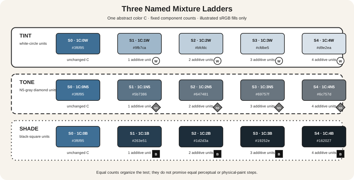
Each lane begins with the same abstract color unit, marked C. The tint lane adds white circles, the tone lane adds N5-gray diamonds, and the shade lane adds black squares. Stage 0 is unchanged C; stages 1–4 pair one color unit with one to four additive units. Every stage prints the exact component count.
The fills are fixed sRGB illustrations. They make the construction readable on a screen but do not simulate a named paint. Equal component counts are also not equal perceptual intervals. Golden's cross-medium color wheel notes that a visual midpoint need not occur at a 1:1 ratio because pigments have different tinting strengths.[5]
Use the graphic as a labeling template. Replace C, W, N5 and B with exact materials, then paint the stages. If the first addition causes a larger visual jump than the next three, the chart has revealed the materials' behavior rather than failed to match a diagram.
What white can change
White usually raises value, but its effect is not confined to a light-dark axis. It can make a transparent color more opaque, reveal an undertone, reduce apparent chroma or pull a family warmer or cooler. Golden's mixing documentation separates masstone, undertone and tinting strength for this reason.[3]
Compare two whites with the same color and ratio. A strongly tinting opaque white may overwhelm the starting color quickly, while another white yields a slower progression. Compare thin and thick applications too. A pale-looking transparent wash over white paper is not the same operation as mixing white paint into the color.
Golden's digital color-wheel resource explicitly distinguishes oil/acrylic tints made with white from watercolor applications diluted with water.[5] Water changes concentration and transparency; it does not insert white pigment. Likewise, adding a transparent medium makes a glaze, not automatically a tint. Name the material action even if two samples look similarly pale in one photograph.
What black can change
Black usually lowers value, yet different blacks have undertones, opacity and tinting strength. A small addition may cool one mixture, warm another or reduce chroma so strongly that its hue family becomes hard to judge. “Add black until darker” is therefore too imprecise for a reusable recipe.
Build shade steps with a small, measured black increment. Keep the starting-color quantity constant, mix thoroughly and allow each swatch to dry. If the hue bends unexpectedly, record the direction rather than correcting it invisibly. A second ladder with another black will show whether the shift belongs to the starting color, the darkener or their interaction.
Darkening without black is a separate problem. A darker same-family paint, a complement or a transparent layer may achieve a useful dark passage, but it should not be relabeled a technical shade unless black was the declared additive. The complete color-mixing chart method covers broader mixture choices.
What gray can change
A gray-addition tone is most predictable when the gray itself is documented. Golden's Neutral Grays form engineered value steps related to Munsell notation.[7] The manufacturer notes that ordinary mixtures of black and white do not always make a perfectly neutral gray; they may lean warmer or cooler.
The gray's value matters. Adding a dark gray can reduce chroma and value together. A pale gray may mute while lifting value. A gray near the starting color's value can reduce chroma with less disruption to the light-dark relationship, although the actual result still requires a swatch.[6][7]
This gives tone-making a precise studio purpose: change chroma while choosing how much value movement is acceptable. It is not a guarantee that hue will remain fixed, and it does not replace the broader hue, value and saturation guide.
Record the operation before judging the result
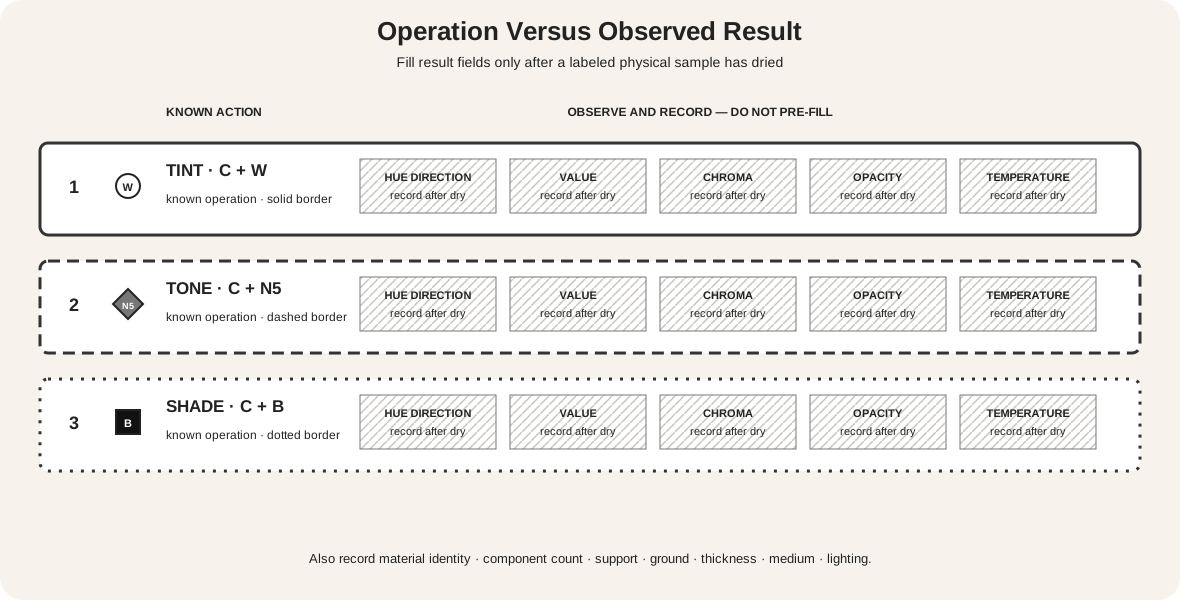
The observation card separates evidence from expectation. Its first column records the known operation: C + W, C + N5 or C + B. The remaining fields stay blank until the physical sample is dry.
For each row, record:
- the starting color and additive, including manufacturer, product name, pigment code and binder;
- the component count or measured mass/volume;
- support, ground, application thickness and medium;
- hue movement toward a neighboring family;
- value movement against the same neutral scale;
- chroma change compared at approximately matched value;
- opacity and temperature changes under consistent illumination.
Golden notes that wet-to-dry shifts may affect value, transparency, sheen and saturation or chroma in several media.[3] Evaluate a dry film, and keep lighting and surround consistent. A phone photograph is useful documentation, but not the sole judge of a small color difference.
A digital tint is a declared simulation
Software often offers HSL lightness, HSL saturation, opacity, blend modes and color pickers. None is automatically equivalent to adding a particular white, gray or black paint. The W3C defines HSL as an encoding of sRGB colors and defines alpha through compositing.[8] Lowering opacity reveals or combines with what lies behind the layer; it does not add white pigment.
If you create a digital tint scale, state the operation: “sRGB colors interpolated toward encoded white” is precise. If you change HSL lightness, report that control instead. If you place a translucent blue over a white background, call it a compositing example. Similar screen appearances can result from different calculations.
Reproduction introduces another layer. The Metropolitan Museum of Art describes how capture, RGB editing, profiles, gamut limits, CMYK conversion and output affect color fidelity.[9] A museum image can support a qualified visual comparison, but sampled pixels do not disclose the painter's mixture.
Aman-Jean's restrained tonal palette
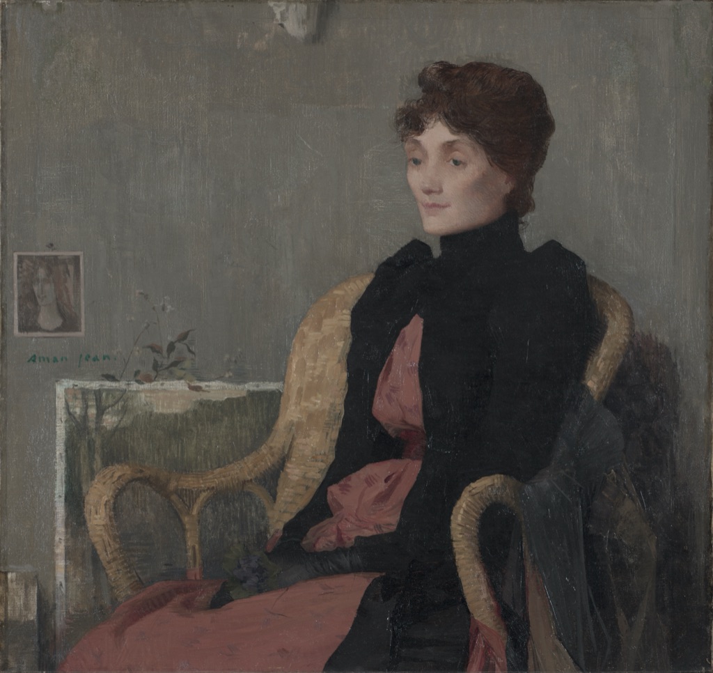
The Cleveland Museum of Art identifies Edmond François Aman-Jean's Portrait of a Woman as an oil painting of about 1891 and describes its restrained tonal palette and flat decorative shapes.[10] In the reproduction, gray-green walls and furnishings surround a muted pink dress, while the sitter's black jacket creates the darkest large mass.
Here tonal describes the coordinated character of the palette. The visible pink may invite the word tint, and the gray-green field may look toned, but appearance alone cannot establish white or gray additions. The productive observation is relational: muted middle-value fields make the dark jacket and the face's lighter value interval especially legible.
This vocabulary discipline preserves what the museum states, what is visible in its image and what remains unknown. Technical pigment or cross-section evidence would be required to reconstruct individual recipes.
Pale color with sharp contrast in Conti
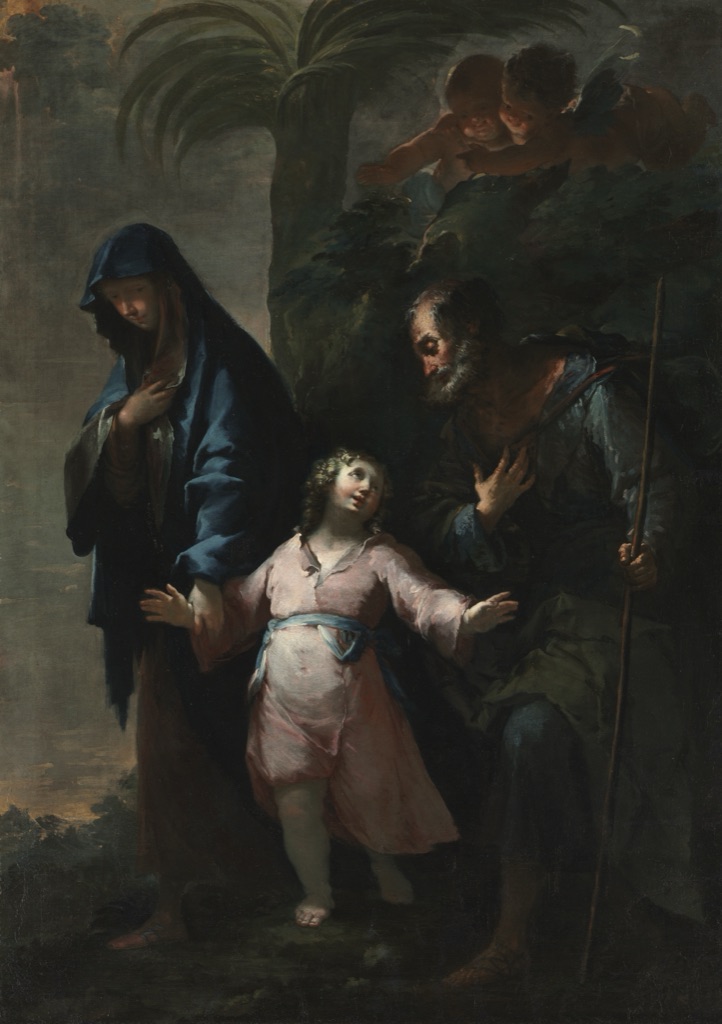
Francesco Conti's Return to Nazareth dates to 1735 and is painted in oil on canvas.[11] Cleveland's description specifically says that its pale colors coexist with sharp contrasts of dark and light as figures emerge from deep shadow.
That pairing corrects a common mistake: a palette containing pale passages is not necessarily low in value contrast. The central pink garment and lit flesh occupy light intervals beside deep green-black foliage and clothing. Hue, value range and possible tint-like appearance must be described separately.
The reproduction does not demonstrate that Conti made the pink by adding white to one named red, nor that the dark passages are black-added shades. It demonstrates why a visible result is not the same evidence as a documented operation.
Pale washes are not automatically tints
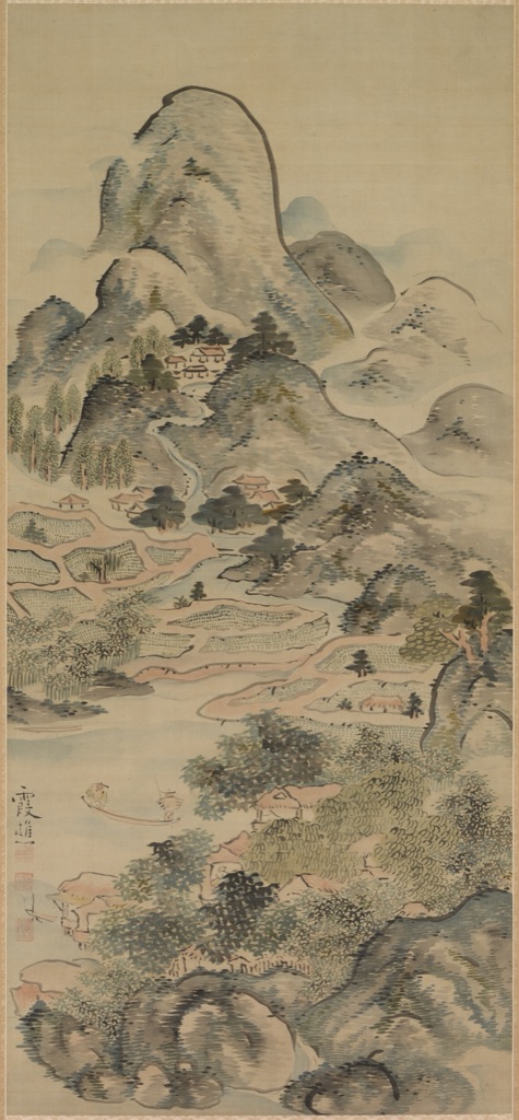
Ike Taiga's Fishing in a Springtime Valley, made in the 1700s, is a hanging scroll in ink and color on silk.[12] In the museum image, broad pale mountain and sky passages alternate with dark ink contours and clustered marks. The silk support remains integral to the appearance of the light fields.
Calling every pale blue-green passage a tint would import an unverified white-paint formula. Ink-and-color washes can become pale through dilution, thin application, absorption and the light support showing through. The correct first description is a pale or low-chroma wash in the reproduction; a technical mixture term requires material evidence.
The scroll also shows that dark accents need not cover large areas to structure a light composition. Line density, placement, support and transparency contribute alongside value.
Test one color three ways
Choose a documented starting paint and make three parallel sets on the intended support:
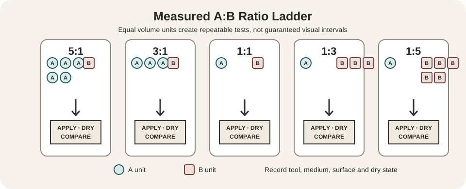
- Tint with the selected white at
4:1,2:1,1:1,1:2and1:4color-to-white ratios. - Tone with one stated gray at the same five ratios.
- Shade with the selected black at those ratios, using a finer measurement method if the black is overpowering.
Keep application thickness and drying time comparable. Label every swatch before painting it. After drying, reorder duplicates by observed value without reading the recipes; then restore the labels and note where component ratio and visual interval diverge.
Repeat one row over a light and dark ground. If the apparent sequence changes, record ground and opacity rather than assuming the mixture itself changed. A useful chart makes those dependencies visible.
Common mistakes
| Mistake | Why it fails | Better practice |
|---|---|---|
| Calling every pale color a tint | Dilution, glazing, support or an inherently light paint can look pale | Reserve tint for documented white addition |
| Calling every dark variant a shade | Darkening can use another color, layering or reduced illumination | Record black addition only when it occurred |
| Treating tone as one universal term | It can mean gray mixture, value step, cast or overall palette | State the intended meaning |
| Assuming a 1:1 ratio is a visual midpoint | Materials have unequal tinting strength | Make several measured stages |
| Expecting neutral gray from any black and white | The components can carry hue bias | Inspect and label the gray itself |
| Using HSL lightness as a paint formula | Encoded sRGB controls do not model pigment mixture | Name the software operation |
| Inferring recipes from museum pixels | Capture and display mediate color | Separate visible comparison from technical evidence |
Make mixture charts accessible
W3C guidance requires another visual means wherever color communicates information.[13] Write every ratio and component name. Give tint, tone and shade different symbols and border patterns. Number the stages and state the direction of change in words. A grayscale print should retain the complete procedure even if the illustrated colors converge.
Test the chart under protanopia, deuteranopia, tritanopia and grayscale simulation. These checks do not replace labels or user testing. Keep normal explanatory text at or above the usual 4.5:1 contrast baseline.[14]
Watch: Tints, Tones and Shades through Formal Analysis
Choose a museum-led whole-work analysis, a close reading, or a foundations overview for considering tints, tones and shades.
Introducing Formal Analysis: Landscape
Follow how recurring shapes, colours and intervals contribute to a larger visual organisation.
Watch on YouTubeFrequently Asked Questions
A tint is a colour mixed with white, with the exact result depending on the materials, ratio, ground and application.
A shade is a colour mixed with black; it can alter hue and chroma as well as lower value.
This guide uses tone for a colour mixed with neutral gray, while acknowledging that the term has broader uses in art writing.
No. White can also change chroma, opacity, temperature and apparent hue depending on the mixture.
Use one identified colour, exact counted additions, a fixed support and thickness, then label and compare the fully dried results.
Discussion
Which mixture operation on this page changes more than the single property you initially expected?
Reader Insights
Record white, gray or black rather than using the terms loosely.
Exact ratios make comparisons repeatable.
Hue, value, chroma, opacity and gloss may all shift.
Join the Conversation
Share one precise observation or a useful museum example below.
References
- National Gallery of Art, “The Elements of Art: Color Worksheet.” https://www.nga.gov/sites/default/files/migrate_images/content/dam/ngaweb/education/learning-resources/lessons-activities/elements-of-art/color-worksheet.pdf
- The Franklin Institute, “Color Formulas.” https://fi.edu/en/science-and-education/science-recipes/color-formulas
- Golden Artist Colors, “Updated Modern Mixing Poster.” https://goldenartistcolors.com/static/6d87ecba4734f4eda9c4dbf1d248b986/updated-modern-mixing-poster.pdf
- ArtBabble and Museum of Modern Art, “Art Terms in Action: Tint, Shade & Tone.” https://artbabble.org/video/moma/art-terms-action-tint-shade-tone
- Golden Artist Colors, “Digital Color Wheel.” https://goldenartistcolors.com/inspiration/digital-color-wheel
- Golden Artist Colors, “Color Mixing Guide.” https://goldenartistcolors.com/resources/color-mixing-guide
- Golden Artist Colors, “Neutral Grays.” https://goldenartistcolors.com/resources/neutral-grays
- W3C, “CSS Color Module Level 4.” https://www.w3.org/TR/css-color-4/
- The Metropolitan Museum of Art, “On Color Fidelity.” https://www.metmuseum.org/perspectives/color-photography-standards-van-gogh-sunflowers
- Cleveland Museum of Art, “Edmond François Aman-Jean: Portrait of a Woman.” https://www.clevelandart.org/art/1972.120
- Cleveland Museum of Art, “Francesco Conti: Return to Nazareth.” https://www.clevelandart.org/art/1974.2
- Cleveland Museum of Art, “Ike Taiga: Fishing in a Springtime Valley.” https://www.clevelandart.org/art/1961.47
- W3C Web Accessibility Initiative, “Understanding SC 1.4.1: Use of Color.” https://www.w3.org/WAI/WCAG21/Understanding/use-of-color
- W3C Web Accessibility Initiative, “Understanding SC 1.4.3: Contrast (Minimum).” https://www.w3.org/WAI/WCAG22/Understanding/contrast-minimum.html