by Tom Gurney
Tom Gurney BSc (Hons) is an art history expert with over 20 years experience
Page created on September 2, 2026 / Page updated on September 13, 2026
Email: tomgurney1@gmail.com / Phone: +44 7429 011000
Reading Colour Temperature as a Relative Relationship
Warm and cool colors are comparative descriptions of how hues relate. Introductory art teaching commonly groups red, orange, yellow and red-violet as warm, while blue, blue-green and blue-violet are called cool.[1] That map is a useful starting point, not a permanent temperature stamped onto every paint or pixel.
A blue can be warmer than another blue; a yellow can lean cooler than another yellow. Change the neighboring color and the same sample may be judged differently. Good analysis therefore states the comparison: “this reddish blue is warmer than that greenish blue,” not simply “blue is cool.”
At a Glance
- Conventional mapreds, oranges and yellows are often called warm; blues and blue-greens cool.
- Relative judgementone red, yellow or blue can look warmer or cooler than another within its family.
- Keep separatevisual temperature is not the same as measured physical temperature.
- Other variablesvalue, chroma, area and surround can alter the reading.
- Avoid formulaswarm does not always advance, cool does not always recede, and neither has one universal meaning.
Contents
The conventional warm and cool map
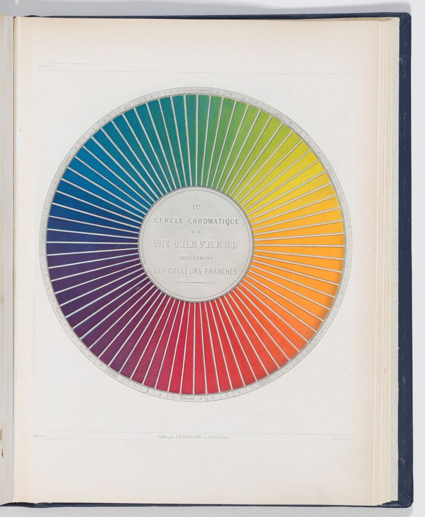
Warm colors are associated in many teaching resources with fire and sunlight; cool colors with ice, water and sky.[1] The National Gallery of Art also presents warm colors as appearing to project and cool colors as appearing to recede.[2] These conventions provide shared vocabulary for looking and making.
They do not prove a universal bodily sensation, emotion or spatial result. Color perception changes with surrounding colors, illumination, medium, scale and the viewer's adaptation. Cultural and historical meanings require their own evidence. The National Museum of Asian Art emphasizes that light, making, medium, aging, culture and tradition can all alter how color is perceived.[8]
Use the conventional map to form a hypothesis. Then test the actual relationship in the work.
Do not confuse two meanings of temperature
Artists use “warmer red” or “cooler blue” to compare hue bias. Lighting specialists also use color temperature, measured in kelvins, to describe the appearance of an illuminant. The vocabulary overlaps, but the quantities do not. A lamp with a stated color temperature is not measuring a painted orange's compositional warmth.
Illumination nevertheless affects the comparison. View two paint samples under one stable light, then check them under the light expected for display. Record the source and conditions. If their ranking changes, keep both observations instead of treating one as an error. For a screen study, record display settings and avoid judging beside strong ambient color.
This distinction prevents a common shortcut: claiming that a “warm” gallery lamp makes every surface warm in the same way. The light's spectrum, the object's reflectance, surrounding fields and adaptation all contribute to appearance. The resulting experience needs observation, not a label transferred from the lamp.
Relative temperature within one hue family
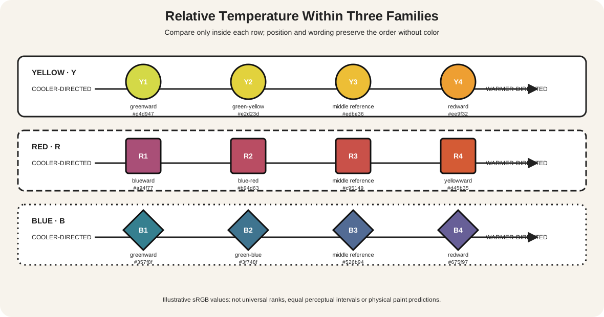
The first diagram contains three separate rows. Each row orders four illustrative samples from a declared cooler bias to a declared warmer bias.
| Family row | Cooler-directed end | Warmer-directed end | Evidence to record |
|---|---|---|---|
| yellow Y1–Y4 | greener yellow | redder or more orange yellow | sample ID, mixture or encoded value, comparator |
| red R1–R4 | bluer red | yellower or more orange red | mass tone, undertone, dried result, comparator |
| blue B1–B4 | greener blue | redder or more violet blue | thin and thick application, ground, comparator |
The rows are independent. They do not claim that Y2 has one measurable temperature relationship to B2. Nor do equal spaces between the graphic samples represent equal perceptual intervals.
Winsor & Newton explains why a finite universal warm/cool chart is misleading: color bias depends on the neighboring color. Its example notes that one green-shade ultramarine may appear cooler beside another ultramarine yet warmer beside cerulean blue.[3] Golden's within-family paint list likewise orders products from cooler to warmer instead of placing each family in one undivided bin.[4]
This comparative language is more precise in the studio. Say “warmer than,” “cooler than” and “between these two references.” Always preserve the reference samples.
Temperature is not value or chroma
Temperature describes a directional hue relationship. Value describes lightness and darkness. Chroma describes strength or distance from neutral. These properties interact in a composition, but one cannot be substituted for another.
A light, vivid blue may attract more attention than a dark, muted orange. A large cool field may dominate a tiny warm mark. A hard edge can separate two low-chroma colors more strongly than a soft edge separates two saturated colors. Getty's formal-analysis guidance treats hue, value and intensity as distinct while also asking how color joins texture, space and composition.[5]
When comparing temperature, first try to hold value and chroma reasonably close. Then reverse the exercise: keep the hue family pair but alter value, chroma, area or edge one variable at a time. The differences reveal what the temperature relationship contributes and what other controls are doing.
For tests that isolate these properties, consult Hue, Value and Saturation in Art. Color Theory for Artists then helps select a model appropriate to paint, screen or print.
One fixed sample, four surrounds
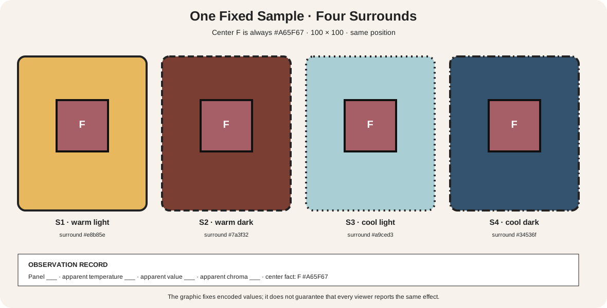
The second diagram repeats center sample F four times. Its encoded value, dimensions and position remain identical. Only the surrounding field changes.
| Panel | Fixed center | Surround | What to report |
|---|---|---|---|
| S1 | F, same value and size | warm light surround | apparent temperature, value and chroma separately |
| S2 | F, same value and size | warm dark surround | apparent temperature, value and chroma separately |
| S3 | F, same value and size | cool light surround | apparent temperature, value and chroma separately |
| S4 | F, same value and size | cool dark surround | apparent temperature, value and chroma separately |
Do not ask which center “really is” warmer: numerically they are the same digital sample. Ask how each appears in context. Josef Albers's Interaction of Color organizes study around comparisons, reversed grounds and the capacity of one color to appear as two.[6]
Repeat the test at normal viewing size. Cover three panels and reveal them in pairs. Record the first judgement, then verify the invariant values. If the center seems to shift in temperature, value or chroma, name which impression changed. A single word such as “warmer” can otherwise conceal several simultaneous effects.
Do warm colors advance and cool colors recede?
They can contribute to that reading. Museum teaching material describes warm colors as tending to project and cool colors as tending to recede, and discusses Cézanne's use of such contrast to model form.[2] Treat this as a tendency to investigate, not a law that overrides everything else.
Create two small studies. In the first, put a warm shape over a cool ground. In the second, reverse their positions while holding shape size, value difference and edge quality as closely as possible. Then vary one competing cue:
- make the supposedly receding color much lighter or higher in chroma;
- sharpen its edge while softening the other;
- enlarge it until it becomes the majority field;
- add overlap, scale or linear perspective that contradicts temperature;
- place both colors on a new surround.
Record which spatial reading survives. “The orange projects here because it is warm” is too broad if it is also lighter, sharper, larger and in front by overlap. A useful statement names the relationship and competing evidence.
Compare paint by bias, not tube name
Select two paints from one named family—for example, a greener blue and a redder blue. Paint each at full-strength mass tone and in a thin application that reveals undertone. Use the intended support and let all samples dry.
Next make pairwise strips:
- sample A beside sample B;
- A and B beside one stable neutral;
- A and B beside the planned warm accent;
- A and B in the intended area proportions;
- A and B mixed separately with the same second paint.
Label product name, pigment index where available, ratio, medium, thickness, support, lighting and date. Winsor & Newton recommends hand-painted charts because bias is easiest to judge through actual paint and undertone.[3] Golden's ordered lists are useful orientation, but they do not replace tests of the products and ratios in hand.[4]
A “warm blue” is still blue in the broad conventional map. The phrase means warmer relative to a specified blue comparator. It does not guarantee a particular mixture. Pigment strength, transparency, undertone and additional components can change the result.
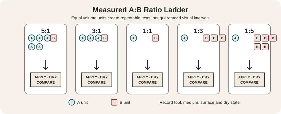
The accepted color-mixing chart supplies a repeatable record for wet and dried mixtures. Use it before scaling up a temperature-dependent passage.
Build a digital comparison
Declare the working color space and record exact values. Duplicate one center object rather than recreating it by eye. Lock width, height, position, opacity and effects, then change only the surround tokens.
CSS Color defines encoded colors and conversions but does not make HSL or RGB steps perceptually uniform.[14] Do not infer that moving a slider by equal numbers creates equal visual differences. If a project requires measured perceptual spacing, use a suitable color space and still verify the intended output.
Test the composition at actual scale, then in grayscale and common color-vision simulations. Grayscale can reveal value structure, but it removes the hue evidence needed to judge warm/cool relations. If the design depends on temperature to distinguish states, add labels, shapes, icons or patterns.
For print, proof in the destination process. The Metropolitan Museum of Art traces several transformations between an artwork and its reproduction: capture, RGB editing, profile choices, gamut limits and CMYK output.[7] Values sampled from a museum JPEG describe that file under stated conditions, not the object's physical pigments or illumination.
Warm and cool tension in Homer's Boy with Anchor
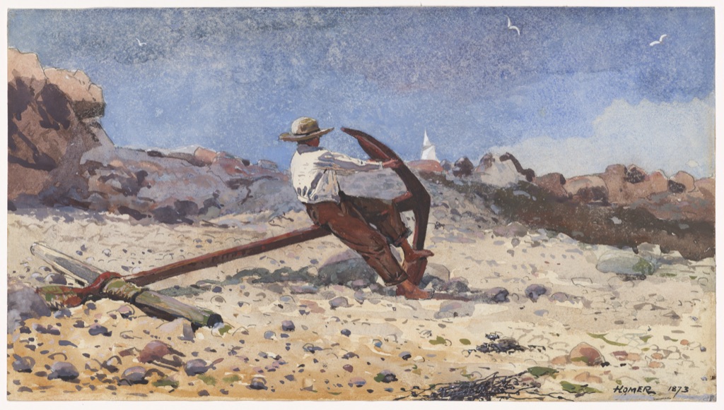
Winslow Homer's Boy with Anchor dates to 1873. Cleveland records watercolor and graphite on paper and describes blue, gray and brown transparent washes, denser passages, blotting and a formal tension between warm and cool colors, outline and wash, transparency and opacity.[9]
In the reproduction, the broad blue sky occupies much of the upper field. Beige, peach and brown passages spread across the beach, rocks, seated figure and rust-red anchor. Yet a two-bin map would miss the structure: blue-gray also enters the rocks; warm notes vary from pale sand to dark anchor; white paper and opaque highlights interrupt both groups.
Temperature works with area, value, material density and edge. The museum's interpretation supports the warm/cool tension. Any claim about exact pigments or present surface color would require examination beyond this screen image.
Sparse red against ink in Monkeys by a Stream
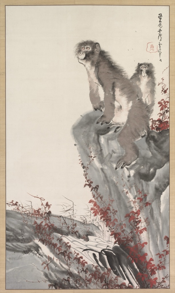
Nagasawa Rosetsu's Monkeys by a Stream, about 1796, is a hanging scroll in ink and color on paper. Cleveland explicitly describes a few highly contrasting warm and cool colors with sweeping brushstrokes over ink washes and loose lines.[10]
The reproduction gives large areas to open paper and gray-black ink. Red leaves climb diagonally around the rock and repeat in seals and inscription. The red occupies far less area than the pale ground, yet its repeated small shapes and clearer hue identity make it conspicuous.
This is not evidence that every warm mark always advances. Placement, repetition, edge and contrast help the red register. The ink washes also resist a simple “cool color” label: some are near-achromatic and change with concentration and paper tone. Describe what each passage does before attaching a category.
Cool dominance and sharp red accents in Hiroshige
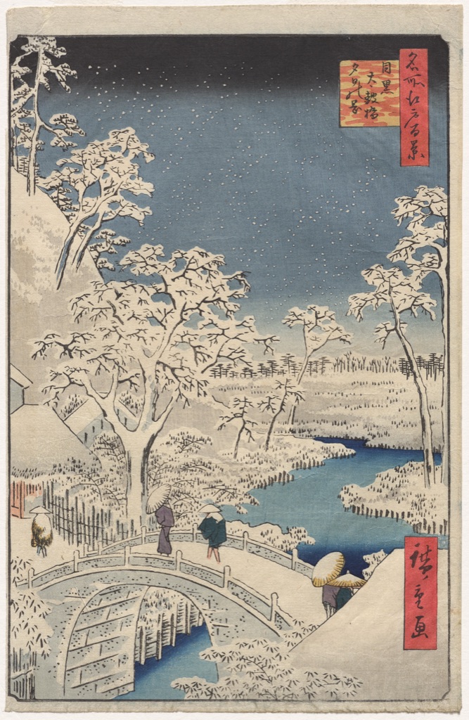
Utagawa Hiroshige's Meguro Drum Bridge and Sunset Hill, from One Hundred Views of Famous Places in Edo, is an 1857 color woodblock print.[11] Snow-covered trees and bridge surround a blue river beneath a blue-gray sky.
Two red title cartouches occupy relatively small areas near the right edge. They remain prominent through stronger chroma, sharp rectangular boundaries, repeated vertical placement and dark calligraphy. Smaller yellow, violet and green details mark figures below.
The work can be described as cool-dominant without claiming that every passage is cool. The red accents demonstrate why palette category and compositional role are separate questions. They punctuate rather than overturn the majority field.
Diagnose common mistakes
| Claim or symptom | Problem | Controlled next step |
|---|---|---|
| “All blues are cool” | comparison within the blue family is ignored | rank two or more blues against fixed references |
| “This red is warm” | no comparator or context is named | state warmer than what and on which surround |
| “Warm colors always advance” | a tendency is turned into a law | control value, chroma, area, edge and overlap |
| “The palette feels warm” | emotional meaning replaces description | map actual areas and cite contextual evidence |
| “The digital chips are equally spaced” | encoded increments may not be perceptually equal | measure in an appropriate space and inspect output |
| “Grayscale proves the temperature plan” | hue information has been removed | use grayscale only for value structure |
| “The reproduction shows the exact object colors” | capture, profile, display and lighting are ignored | qualify the image and separate observation from fact |
Make temperature diagrams accessible
Because color cannot be the only carrier of information, pair it with readable identifiers and geometry.[12] Print every family, sample and directional label. Use separate row shapes, border patterns, panel IDs and an adjacent table. For the context comparison, identify center F in every panel and state its exact invariant value.
Remove all fills and confirm that family membership, cooler-to-warmer order, fixed centers and changed surrounds remain understandable. Test grayscale and common CVD simulations. For ordinary-size explanatory copy, meet or exceed 4.5:1 contrast.[13]
Watch: Warm and Cool Colors through Formal Analysis
Choose a museum-led whole-work analysis, a close reading, or a foundations overview for considering warm and cool colors.
Introducing Formal Analysis: Landscape
Follow how recurring shapes, colours and intervals contribute to a larger visual organisation.
Watch on YouTubeFrequently Asked Questions
Warm and cool are conventional and relative descriptions of colour relationships, often grouping reds/yellows against blues while allowing variation within each family.
A blue can appear warmer than another blue when it leans toward violet rather than green, depending on the comparison and model.
No. Spatial effect also depends on value, chroma, edge, area, scale, overlap, subject and surrounding colours.
No. Visual warm/cool language is distinct from physical correlated colour temperature used for illumination.
Compare labelled samples side by side and against multiple surrounds while holding value, chroma, area and viewing conditions as stable as possible.
Discussion
Which artwork on this page most clearly overturns a simple warm-advances and cool-recedes rule?
Reader Insights
Temperature is often clearest between related hues.
Value and chroma can overpower a warm/cool distinction.
Surround, material and illumination belong to the evidence.
Join the Conversation
Share one precise observation or a useful museum example below.
References
- National Gallery of Art, “The Elements of Art: Color.” https://www.nga.gov/educational-resources/elements-art/elements-art-color
- National Gallery of Art, Picturing France 1830 to 1900. https://www.nga.gov/content/dam/ngaweb/Education/learning-resources/teaching-packets/pdfs/picturing_france.pdf
- Winsor & Newton, “Understanding Warm and Cool Colours.” https://www.winsornewton.com/blogs/guides/understanding-warm-and-cool-colours
- Golden Artist Colors, “Cool to Warm Listing for Golden Heavy Body Acrylics.” https://goldenartistcolors.com/static/64b37ff7200be73625ab01c01998ec54/cool-to-warm-order-for-golden-heavy-body-acrylics.pdf
- J. Paul Getty Museum, “Understanding Formal Analysis.” https://www.getty.edu/education/teachers/building_lessons/formal_analysis.html
- Yale University Press, Interaction of Color. https://yalebooks.yale.edu/book/9780300146936/interaction-of-color/
- The Metropolitan Museum of Art, “On Color Fidelity.” https://www.metmuseum.org/perspectives/color-photography-standards-van-gogh-sunflowers
- National Museum of Asian Art, “Colors.” https://asia.si.edu/explore-art-culture/art-stories/colors/
- Cleveland Museum of Art, “Boy with Anchor.” https://www.clevelandart.org/art/1954.128
- Cleveland Museum of Art, “Monkeys by a Stream.” https://www.clevelandart.org/art/1985.192
- Cleveland Museum of Art, “Meguro Drum Bridge and Sunset Hill.” https://www.clevelandart.org/art/1924.971
- W3C Web Accessibility Initiative, “Understanding SC 1.4.1: Use of Color.” https://www.w3.org/WAI/WCAG21/Understanding/use-of-color
- W3C Web Accessibility Initiative, “Understanding SC 1.4.3: Contrast (Minimum).” https://www.w3.org/WAI/WCAG22/Understanding/contrast-minimum.html
- W3C, “CSS Color Module Level 4.” https://www.w3.org/TR/css-color-4/