by Tom Gurney
Tom Gurney BSc (Hons) is an art history expert with over 20 years experience
Page created on September 2, 2026 / Page updated on September 13, 2026
Email: tomgurney1@gmail.com / Phone: +44 7429 011000
Working with Neighbouring Hues without Losing Structure
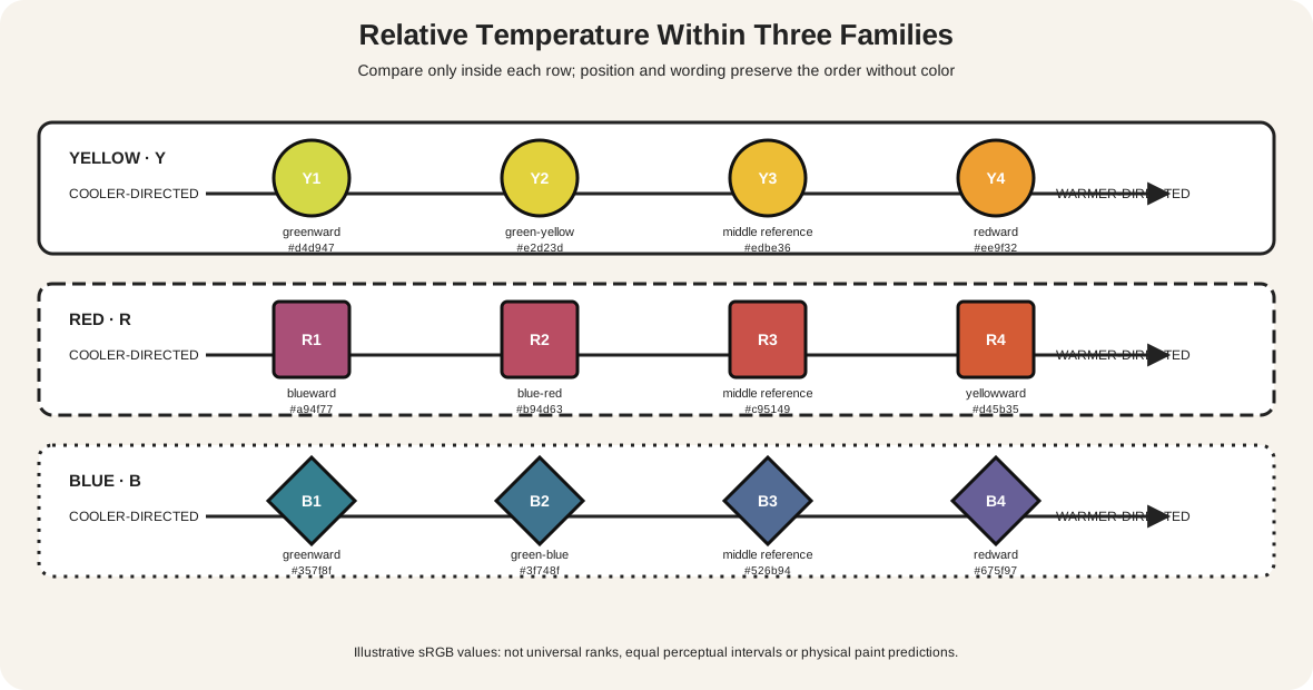
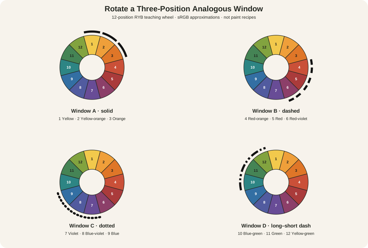
Analogous colors are neighboring hue families on a declared color wheel. Using this page's 12 named RYB positions, blue, blue-green, and green form one three-hue analogous range because their positions are consecutive. Red-violet, red, and red-orange form another.
Adjacency is a selection method, not a guarantee of calm, unity, harmony, realism, or beauty. The result still depends on value, chroma, area, placement, edges, material, subject, and surrounding colors. Name the wheel and the selected range first; then describe what the actual work does.
At a Glance
- Core structurea compact run of neighbouring hues on a declared wheel.
- This guideuses a 12-position RYB teaching wheel and rotating three-hue windows.
- Design variablesvalue, chroma, area, edge and accent determine the visible result.
- Material limitwheel positions do not predict exact paint mixtures.
- Accessibilitylabels, positions and patterns repeat every important colour distinction.
Contents
How analogous colors sit on the wheel
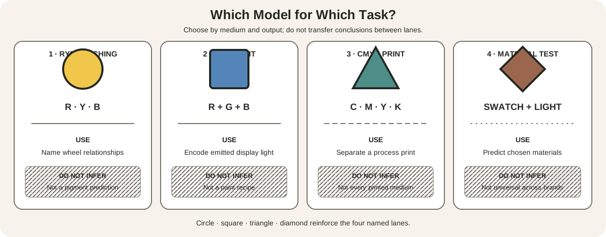
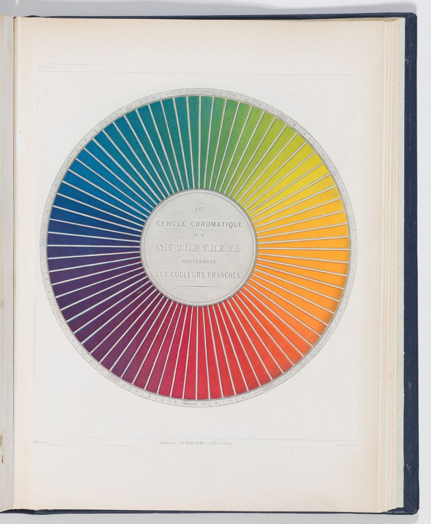
The National Gallery of Art defines analogous schemes as colors next to each other on the color wheel and gives blue, blue-green, and green as an example.[1] The numbered sequence below follows the site's Artist's Color Wheel, a traditional 12-hue RYB teaching model. NGA also distinguishes the red-yellow-blue primaries taught for paint from the red-green-blue light used by screens.[2]
The overlay shows four representative three-position windows. Rotate any window one position and another valid group appears. A complete rotation gives these 12 named windows:
| Positions | Neighboring hue families |
|---|---|
| 12–1–2 | Yellow-green, yellow, yellow-orange |
| 1–2–3 | Yellow, yellow-orange, orange |
| 2–3–4 | Yellow-orange, orange, red-orange |
| 3–4–5 | Orange, red-orange, red |
| 4–5–6 | Red-orange, red, red-violet |
| 5–6–7 | Red, red-violet, violet |
| 6–7–8 | Red-violet, violet, blue-violet |
| 7–8–9 | Violet, blue-violet, blue |
| 8–9–10 | Blue-violet, blue, blue-green |
| 9–10–11 | Blue, blue-green, green |
| 10–11–12 | Blue-green, green, yellow-green |
| 11–12–1 | Green, yellow-green, yellow |
Three hues are useful because the window is easy to see and enumerate, but three is not a natural law. A narrow palette might use blue and blue-green; a broader one might span violet through blue-green. State the chosen range. As it expands, decide whether “analogous” still describes the dominant structure or merely one passage within a more varied palette.
The wheel sectors are sRGB approximations of RYB family names. Their equal diagram widths are not equal perceptual distances and are not paint recipes. Printed wheels vary, and real pigments do not occupy tidy wedges.
Range width changes what the label can explain. A two-position blue–blue-green range foregrounds a tight transition. Adding green makes the sequence more evident; extending through yellow-green increases variety and brings the palette closer to yellow. A window can also cross the wheel's printed starting point: green–yellow-green–yellow is just as consecutive as yellow–yellow-orange–orange. The numbered positions prevent the page break in a circular diagram from becoming a false boundary.
When an artwork contains many intermediate mixtures, classify the anchor families rather than trying to assign every brushstroke to a named wedge. A blue-to-green passage may include turquoise, teal, gray-green, and mixtures altered by white or earth colors. The analogous description remains useful when those variants cluster around neighboring anchors, but it should not hide a strong remote family or a large neutral structure.
Choose an analogous palette in five steps
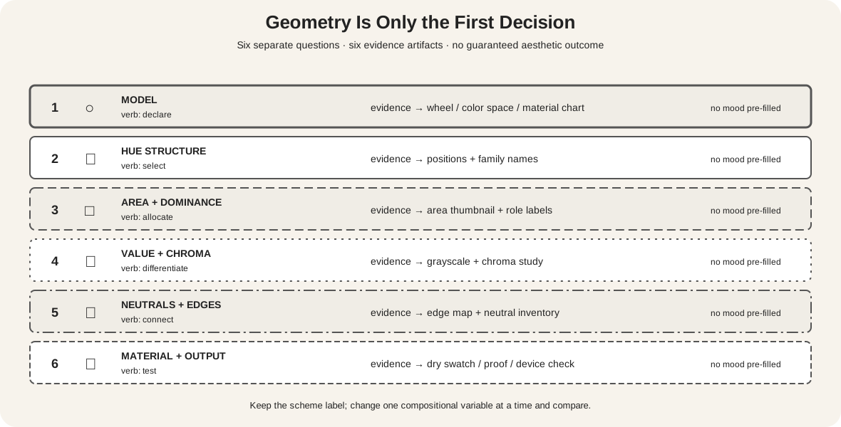
- Declare the model. Write “12-position RYB teaching wheel,” or name the digital system or physical wheel you are actually using.
- Mark a consecutive range. Choose a central family and one neighbor on each side, then record the position numbers and names.
- Select actual materials. Choose specific paints, papers, fibers, inks, or digital values within those families. Family names do not reveal opacity, undertone, tinting strength, or dried appearance.
- Build a value plan. Decide where the lightest light, middle values, and darkest dark will occur. Neighboring hues can collapse together when their values are too similar.
- Test area and chroma. Compare a broad muted field with smaller intense passages. Move or repeat the scarce family and observe what becomes prominent.
Golden Artist Colors cautions that pigments differ in transparency, opacity, masstone, and undertone.[3] Its mixing guidance separates hue, chroma, and value as useful controls.[4] A blue-green made from one blue and yellow pair may be clearer or duller than another. A violet may shift redward or blueward when lightened. Make dried samples for physical work instead of matching a screen chip.
Keep neighboring hues legible
Close hue relationships do not remove the need for structure. Josef Albers's Interaction of Color is built around color's relativity: a color changes in appearance according to its context.[5] Put the same green beside yellow-green and then beside blue-green and it may appear to shift even though the sample itself has not changed.
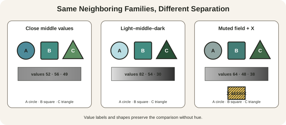
The first study keeps A, B, and C near the same middle value. Their shapes remain identifiable, but the palette depends heavily on hue separation. The second retains the same families while assigning a light, middle, and dark role. The third keeps the range but mutes its largest field and introduces a small patterned X accent from outside it.
Use these controls deliberately:
- Value: separate adjacent families with light, middle, and dark roles, or keep values close when a soft boundary is intentional.
- Chroma: mute an extensive family and reserve higher intensity for a smaller passage.
- Area: let one family dominate rather than dividing the surface mechanically into equal thirds.
- Placement: a small shape near a face, edge, intersection, or isolated field may attract attention beyond its area.
- Edges and texture: a crisp boundary can separate close hues; broken brushwork or weaving can optically mingle them.
- Neutrals: paper, gray, brown, black, white, or a mixed neutral can support the range without becoming another hue family.
An accent beyond the range does not automatically cancel an analogous reading. Ask whether neighboring families still organize most of the work and whether the exception has a clear role. Avoid turning that practical judgment into a rigid percentage.
Make a small analogous study
Draw three identical rectangles. Label the selected families A, B, and C, and assign circle, square, and triangle symbols so the plan can be understood without color.
In rectangle one, give all three families similar middle values. In rectangle two, make A light, B middle, and C dark while keeping their areas comparable. In rectangle three, make A the largest but least intense field; keep B supporting; repeat C as several smaller marks. If useful, add one tiny hatched X accent outside the range.
Photograph or photocopy each study in grayscale. If important shapes disappear, decide whether that merger is intentional. Return to color and compare where the eye pauses, which family connects regions, and whether the accent clarifies or overwhelms the neighboring sequence.
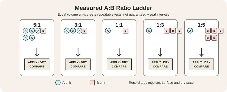
For paint, label tube names and pigment codes, record mixtures, and wait for samples to dry. The Color Mixing Chart for Artists provides the full measured-chart method. Here the purpose is narrower: test whether the chosen materials can produce the value and chroma roles your analogous composition needs.
Read analogous relationships in artworks
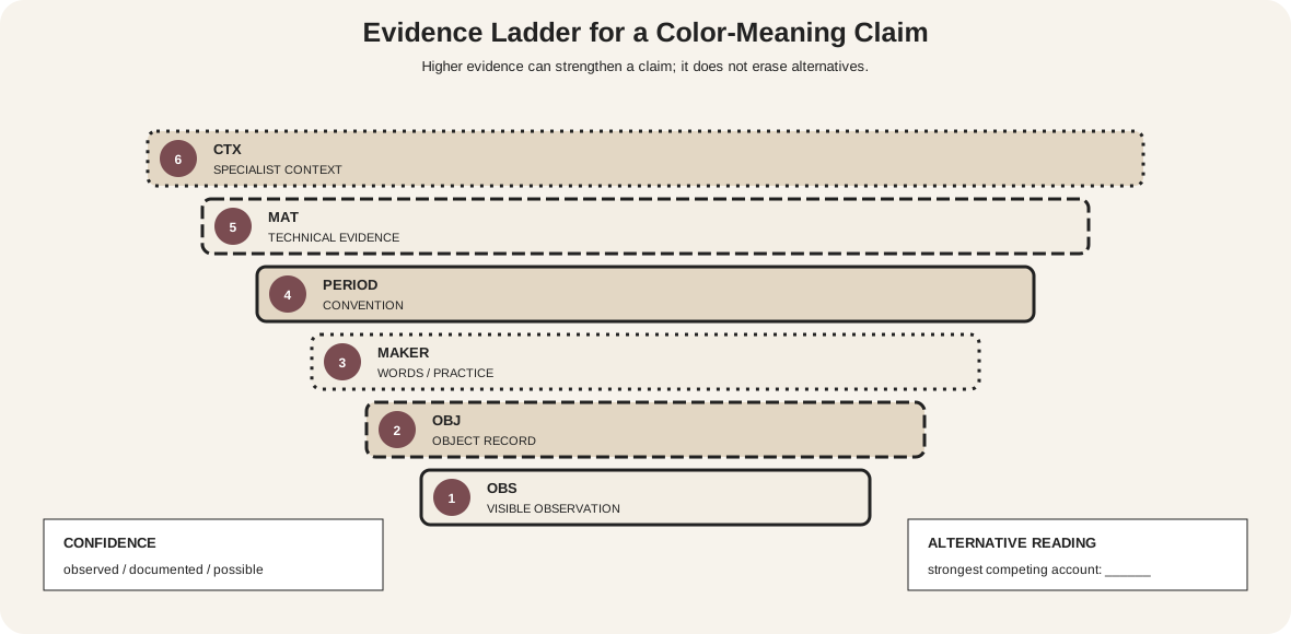
Color schemes are lenses for close looking, not automatic evidence of intention. Begin with visible families and their distribution. Then check the museum record for materials, condition, and reproduction limits. Say a work “can be read through” an analogous range unless reliable documentation establishes a deliberate scheme.
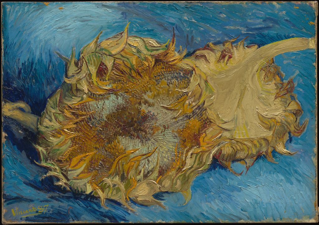
The Met's imaging team describes orange and its adjacent yellow and green in Vincent van Gogh's Sunflowers, adding that blue supplies contrast.[8] The yellow-orange-green passage spreads across petals, centers, stems, and leaves, while the blue ground sits outside that neighboring range. This is more informative than forcing the entire painting into one category: an analogous cluster can organize the subject while an exception changes the total relationship.
The object is an 1887 oil painting, accession 49.41.[9] Thick paint, pale tints, dull olive passages, and dark drawn strokes vary the neighboring families internally. The Met also warns that online reproductions of the painting differ and explains its recent color-managed capture.[8] The downloaded museum image is therefore evidence for visible placement, not a substitute for the object or a set of extractable paint formulas.
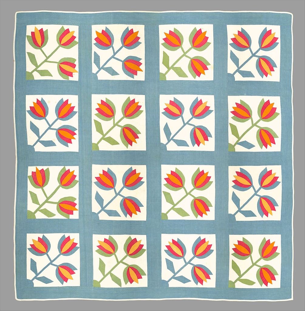
The Met records that this nineteenth-century Tulip Quilt alternates green and blue in the leaves and stems.[10] Those adjacent families repeat against white blocks and a blue surround. Red, orange, and yellow flowers form a second, warmer neighboring run, so the design contains two local analogous groupings rather than one uninterrupted range.
Material history complicates what we see. The museum notes that some blue fabric may originally have appeared blue-green before a yellow component of the green dye faded.[10] The current palette is not a timeless wheel exercise: cloth, dye chemistry, use, and age participate in it. Repetition and stable leaf shapes help the alternating cool colors remain readable even where their values approach each other.
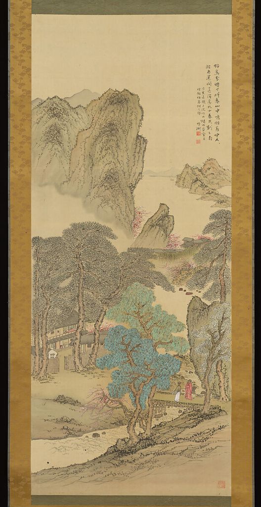
The Met identifies Okuhara Seiko's 1899 hanging scroll as an example of the blue-green mode of landscape painting.[11] In the present image, turquoise-blue and green strokes concentrate in a large foreground tree and appear more quietly through the landscape. Ink contours, pale silk, brown-gray mountains, mounting, red seals, and small pink blossoms structure the whole object.
The neighboring blue-green passage is therefore only one layer of the work's organization. Its effect depends on reserved paper/silk, fine repeated marks, and differences in density. Calling the entire scroll simply “analogous” would discard too much evidence; describing a dominant blue-green mode alongside ink and small warm accents is more precise.
Across these three objects, analogous relationships do not behave identically. Van Gogh couples an adjacent cluster with a strong outside-range field; the quilt alternates two local runs through repetition; Okuhara embeds a blue-green mode in ink, neutral material, and sparse accents.
Common mistakes
| Mistake | Why it fails | Better test |
|---|---|---|
| Calling any similar-looking colors analogous | The hue families may not be consecutive | Name the model and positions |
| Assuming exactly three hues are required | Three is a teaching window, not a universal limit | Declare the width of the range |
| Expecting automatic calm or harmony | Value, chroma, area and context can produce many effects | Describe visible relationships |
| Using equal value everywhere | Shapes may collapse when hue carries all separation | Check a grayscale version |
| Matching paint to screen swatches | Emitted light cannot predict pigment behavior | Make labeled dried tests |
| Treating an accent as “breaking the rule” | A small exception can clarify the dominant range | Compare its area and placement |
| Claiming the artist followed a modern wheel | Appearance is not documentary evidence | Say “can be read as” unless sourced |
Make analogous diagrams accessible
Do not identify neighboring positions only by their colored fills. W3C requires another visual means when color conveys information.[6] Use printed hue names, position numbers, letters, shapes, line patterns, direct labels, and a written table. Normal-sized text generally needs at least 4.5:1 contrast.[7]
Color-vision simulations help reveal weak distinctions, but they do not replace redundant cues. A reader should still be able to follow the selected sequence, value plan, and accent when two displayed hues approach each other. Artwork alternative text should describe placement and subject as well as major color families.
Watch: Analogous Colors through Formal Analysis
Choose a museum-led whole-work analysis, a close reading, or a foundations overview for considering analogous colors.
Introducing Formal Analysis: Landscape
Follow how recurring shapes, colours and intervals contribute to a larger visual organisation.
Watch on YouTubeFrequently Asked Questions
They are a compact group of neighbouring hue families on a declared colour wheel.
Three neighbouring positions are a common teaching choice, but the exact span should be declared rather than treated as universal.
No. Value, chroma, area, placement, edges, material and subject determine how the relationship works.
Yes. A small contrasting accent can be added, but its area and intensity should be recorded because it may alter the scheme’s visual balance.
Select actual labelled paints, make value and chroma studies, compare dried samples on the intended ground, and document the result.
Discussion
Which artwork on this page keeps neighbouring hues most clearly distinguishable, and which variable does the work?
Reader Insights
Name the chosen wheel and exact neighbouring positions.
Close hues still need a readable light-dark structure.
A tiny intense outsider can outweigh a broad analogous field.
Join the Conversation
Share one precise observation or a useful museum example below.
References
- National Gallery of Art, “Monet's Waterscapes.” https://www.nga.gov/educational-resources/sense-place-france/monets-waterscapes
- National Gallery of Art, “The Elements of Art: Color.” https://www.nga.gov/educational-resources/elements-art/elements-art-color
- Golden Artist Colors, “Color Wheel.” https://goldenartistcolors.com/resources/color-wheel
- Golden Artist Colors, “Color Mixing Guide.” https://goldenartistcolors.com/resources/color-mixing-guide
- Yale University Press, “Interaction of Color.” https://yalebooks.yale.edu/book/9780300146936/interaction-of-color/
- W3C Web Accessibility Initiative, “Understanding SC 1.4.1: Use of Color.” https://www.w3.org/WAI/WCAG21/Understanding/use-of-color
- W3C Web Accessibility Initiative, “Understanding SC 1.4.3: Contrast (Minimum).” https://www.w3.org/WAI/WCAG22/Understanding/contrast-minimum.html
- The Metropolitan Museum of Art, “On Color Fidelity.” https://www.metmuseum.org/perspectives/color-photography-standards-van-gogh-sunflowers
- The Metropolitan Museum of Art, “Vincent van Gogh: Sunflowers.” https://www.metmuseum.org/art/collection/search/436524
- The Metropolitan Museum of Art, “Tulip Quilt.” https://www.metmuseum.org/art/collection/search/16295
- The Metropolitan Museum of Art, “Okuhara Seiko: Landscape in Blue and Green.” https://www.metmuseum.org/art/collection/search/897148