by Tom Gurney
Tom Gurney BSc (Hons) is an art history expert with over 20 years experience
Page created on September 2, 2026 / Page updated on September 13, 2026
Email: tomgurney1@gmail.com / Phone: +44 7429 011000
Using Opposites through Area, Edge and Material
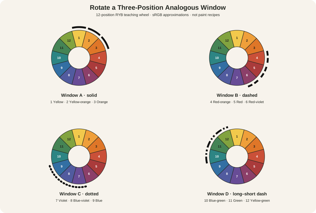
Complementary colors are two hue families positioned directly opposite one another on a declared color wheel. On the 12-position RYB teaching wheel used here, red and green are complements; so are blue and orange, and yellow and violet.[1]
Opposition describes a wheel relationship. It does not promise maximum contrast, visual vibration, balance, harmony or a neutral gray mixture. Those results depend on the actual colors, their area, value, chroma, edges, support, medium and viewing conditions.
At a Glance
- Core structuretwo positions opposite each other on a declared colour wheel.
- This guideuses six axes on a 12-position RYB teaching wheel.
- Visual variablesarea, value, chroma, boundary and repetition determine the effect.
- Mixing limitopposite wheel positions do not predict an exact neutral from real paints.
- Best testcompare adjacency, unequal areas, optical alternation and dried physical mixtures separately.
Contents
The six complementary pairs
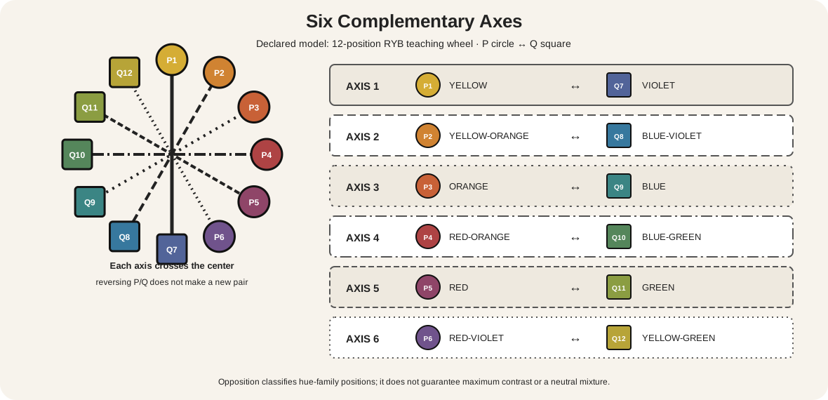
The page uses the same numbered RYB sequence as the site's declared artist-wheel reference:
| Axis | Position P | Opposite position Q | Pair |
|---|---|---|---|
| 1 | 1 yellow | 7 violet | yellow / violet |
| 2 | 2 yellow-orange | 8 blue-violet | yellow-orange / blue-violet |
| 3 | 3 orange | 9 blue | orange / blue |
| 4 | 4 red-orange | 10 blue-green | red-orange / blue-green |
| 5 | 5 red | 11 green | red / green |
| 6 | 6 red-violet | 12 yellow-green | red-violet / yellow-green |
Each axis crosses the wheel center and joins positions six steps apart. Reversing P and Q does not create a seventh pair: blue/orange and orange/blue are the same axis. The diagram prints both position numbers and hue names, uses a circle for P and a square for Q, and gives every diameter a distinct line pattern.
Sessions College documents the 12 named RYB positions and defines complementary colors as opposites on its artist wheel.[2] These equal positions are part of that teaching model. They do not measure equal perceptual distance, pigment strength or mixing power.
How to identify a complementary relationship
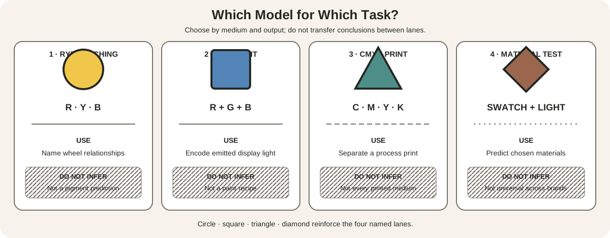
First name the model. Then name one hue family and find the position exactly across its center. If the selection uses either neighbour of the opposite instead, it is not a pure complementary pair. The split-complementary guide explains that anchor-and-flanks construction.
Next decide which visible colors count as structural. A painting may have red and green details without being organized around their opposition. Describe the scale: “the lower painted scene uses adjacent red and green fields” is more precise than “the whole manuscript is complementary.”
Finally separate classification from effect. Ask what is observed: greater edge activity, an unequal dominant/accent relation, a value separation, a muted mixture, or simply two opposite family labels. A scheme name alone cannot answer those questions.
One pair, four different operations
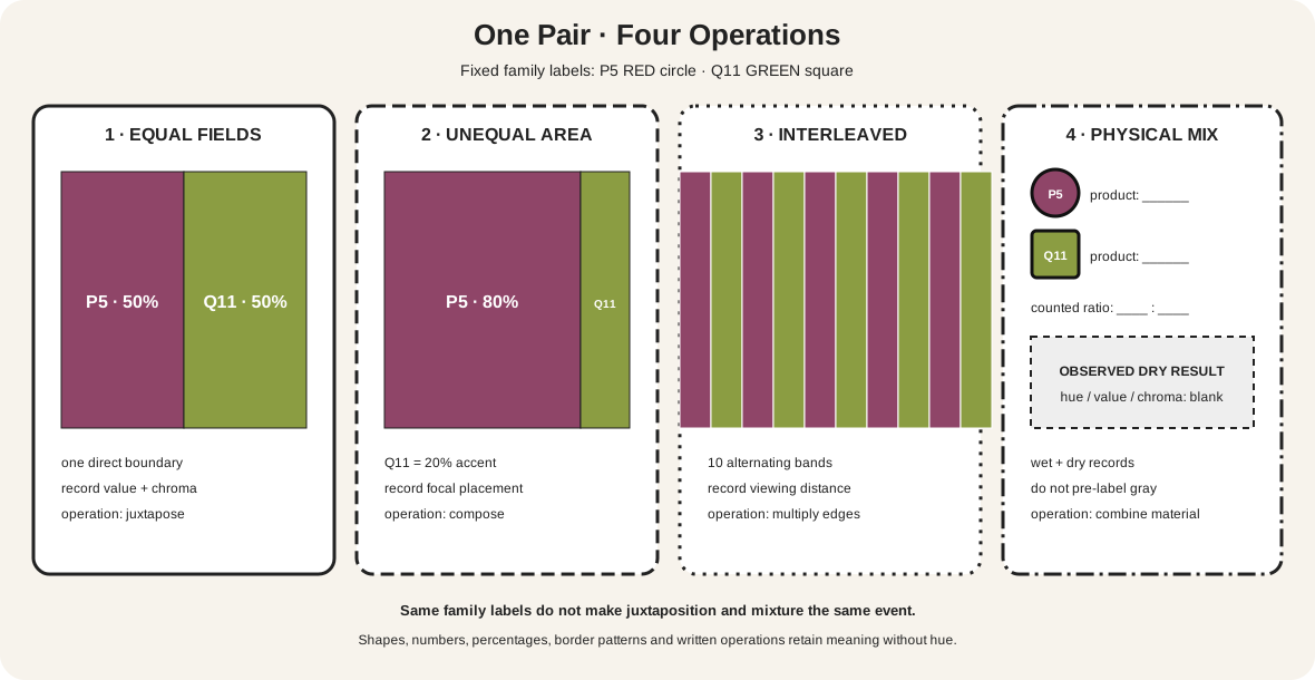
The diagram keeps P5 red and Q11 green fixed while the operation changes.
| Test | Fixed pair | Changed control | Evidence to record |
|---|---|---|---|
| separated equal fields | P5 red / Q11 green | one boundary; 50/50 area | edge appearance, value and chroma of each field |
| unequal composition | P5 red / Q11 green | P 80%; Q 20% | dominant role, accent location and value hierarchy |
| interleaved edges | P5 red / Q11 green | ten alternating bands | total boundary length and viewing distance |
| physical mixture | named red paint / named green paint | counted ratio | wet and dry sample, value, hue bias and chroma |
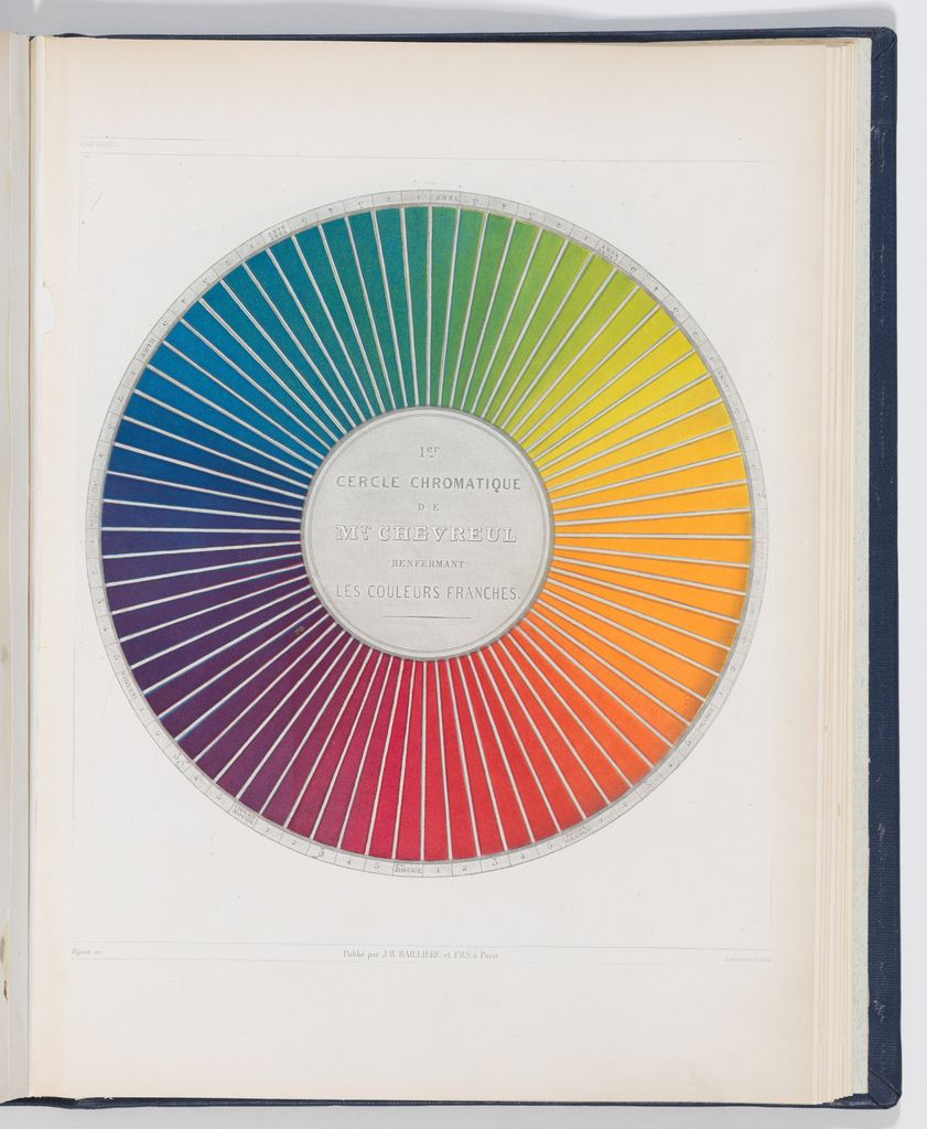
The first three place colors beside one another; the fourth combines materials. That distinction is essential. National Gallery teaching material describes adjacent complements as making each other appear more intense, in the historical context of Chevreul and nineteenth-century painting.[3] A paint mixture instead changes the light absorbed and reflected by the combined pigments.
None of these tests automatically measures “maximum” contrast. Two opposite hues can be close in value and low in chroma. A black-white edge can carry more luminance contrast. Josef Albers's experimental approach is useful here because it asks viewers to compare color in context rather than rely on an isolated label.[7]
Why complements can appear more intense together
Put a small red square on a middle green field, then place the same red square on a neutral gray field. Keep the red sample, size and lighting unchanged. Compare at one viewing distance and write down what differs.
The National Gallery describes the first red as appearing more red beside green than beside a neutral.[3] This is a relational observation. It does not mean the red's material composition changed, and it does not mean every observer, display or pair produces an identical magnitude.
Boundary length matters. Ten narrow alternating bands create many more red-green contacts than two large fields with one central seam. Area matters too: a small vivid green mark can punctuate a large muted red field, while equal vivid fields may compete. Value can override hue identity when one role is very dark and the other very light.
Use a grayscale proof to inspect value structure, then return to color to assess the hue relation. Grayscale cannot preserve complementary identity, but it can reveal whether an effect attributed to opposition is actually being carried by light-dark contrast.
Audit the boundary, not just the swatches
Trace every place where P touches Q. Mark hard contacts with a solid line, broken contacts with a dashed line and neutral interruptions with a gap. Then count or estimate the total contact length at the scale where the work will be seen. This creates evidence that two equal swatch chips cannot provide.
Repeat the audit at three distances. At close range, brush marks, weave or pixels may separate the families. From farther away, small alternating marks can merge into a different overall reading. Record whether the pair still separates, whether one role disappears, and whether the focal edge moves.
Next, keep the drawing fixed and make one version with both families muted, one with P vivid and Q muted, and one with the chroma roles reversed. Do not alter value at the same time. The comparison isolates intensity hierarchy from hue opposition. If the result changes most when value changes, say so; there is no benefit in crediting the wheel for work done by another variable.
Mixing complementary paints
A wheel can suggest a neutralizing direction; only a physical sample can show what particular paints do. Golden's mixing guidance recommends using complements to reduce intensity, but actual pigments have their own bias, opacity, tinting strength and mixture path.[4]
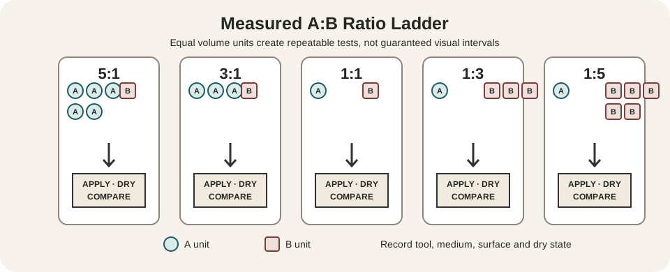
Make a counted-ratio ladder rather than one anonymous puddle:
- Apply each paint alone at the same useful thickness.
- Mix 4:1, 2:1, 1:1, 1:2 and 1:4 by counted, repeatable units.
- Include a thin application and an opaque application where the medium allows.
- Label product names, support, medium additions and date.
- Let every sample dry before judging hue bias, value and chroma.
Do not pre-label the center “gray.” It may lean brown, green, violet or another family; its value may rise or fall. Record the observed result. If a mixture becomes dull faster than expected, the cause may be high tinting strength, unequal quantities, pigment bias, opacity or too many components—not failure of the wheel definition.
The site's mixing chart for artists develops repeatable material records. Its color-tier systems reference also explains why tier names and mixture recipes belong to declared systems.
Building a complementary composition
Choose the pair only after naming the role it must play. If one hue describes a large subject or environment, make it the dominant field and reserve the other for smaller events. If edge activity is important, test where the two families touch. If calm continuity is needed, lower chroma, separate the pair with neutrals, reduce boundary length or create a strong value hierarchy.
Make three thumbnails with the same two family targets:
- equal area and equal apparent chroma;
- one family near 75 percent and the other near 25 percent;
- a neutral-majority design with both colors as unequal accents.
Then make value variants without changing the family labels. The Getty's formal-analysis framework treats hue, value and intensity as distinct properties and relates them to the composition as a whole.[6] A successful test therefore records more than which two wheel positions were chosen.
Keep boundaries deliberate. A hard red-green edge can become a focal event; a broken, textured boundary can distribute attention; a neutral interval can stop direct contact. For paint, decide whether colors meet wet, overlap after drying or remain separate. For collage and textiles, seams, weave and material reflectance become part of the relation.
Complementary pairs in digital work
Start by declaring the encoded system. CSS HSL belongs to sRGB calculations and is not a numerical version of the RYB artist wheel.[5] A 180-degree HSL relation can be useful in an interface, but it should not be silently labelled as the same construction as an RYB red-green axis.
Store the chosen values and test them in the actual layout. Check area, boundary length, text contrast and interaction states. If the pair identifies categories, selected controls or errors, add text, icons, shapes or patterns so function does not depend on hue.
Proof the output. A wide-gamut display, ordinary sRGB screen and CMYK print may reproduce the pair differently. The Metropolitan Museum of Art explains that artwork color is mediated by capture, RGB editing, device profiles, gamut and print conversion.[8] A sampled reproduction palette describes that image under stated conditions; it does not reveal original pigments.
Red and green as adjoining manuscript fields
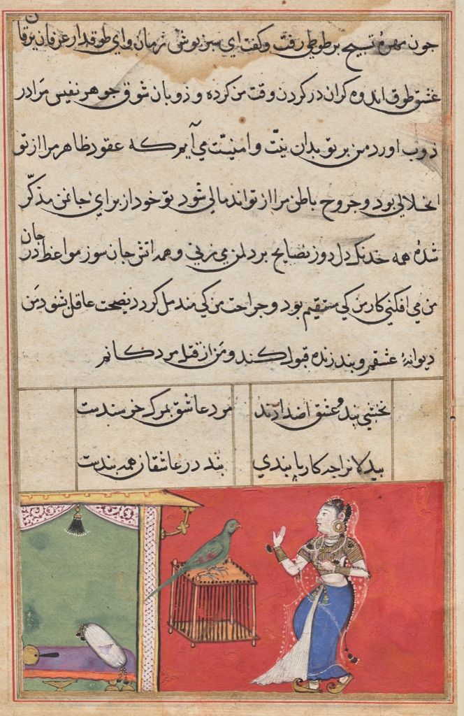
This page from the Tuti-nama (Tales of a Parrot) was made at Akbar's Mughal court around 1560. Cleveland records gum tempera, ink and gold on paper and explicitly describes the lower scene's brightly colored red and green background.[9]
The two fields meet along a tall vertical architectural edge. Red occupies most of the right-hand scene behind Khujasta; green occupies the smaller chamber behind the parrot. The pair is not evenly divided, and the long contact helps make the separation legible.
The relationship belongs to one part of a larger page. Black script, pale paper, patterned textiles, orange, blue, white and gold remain active. The museum description supports the red-green observation but does not establish that the unknown maker used a modern complementary-wheel theory.
A small orange accent across a blue robe
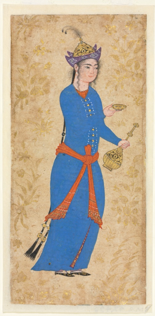
Princess with Wine Bottle and Cup (recto) comes from Safavid Iran and dates to about 1550–1600. It is opaque watercolor and gold on paper. Cleveland specifically identifies the bright blue robe and orange sash and tunic as contrasting colors of Safavid fashion.[10]
The area ratio is extreme. Blue forms nearly the whole garment; orange crosses it as a narrow tied band and small neckline. Gold objects and floral decoration sit against a broad tan ground, while violet headwear introduces another family.
On the declared RYB wheel, blue and orange form an exact opposite pair. The example shows that pair identity does not demand equal area. Its strongest lesson is compositional: a smaller complement can organize a large field through placement and recurrence.
Repeated blue and orange-red foliage
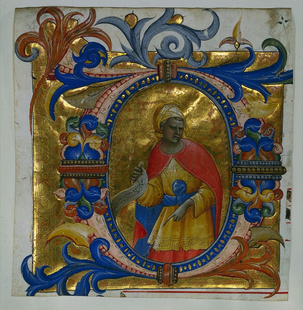
Lorenzo Monaco's Initial D[eus in loco] with a Prophet Excised from a Gradual dates to 1409–10. Cleveland records ink, tempera and gold on vellum and calls attention to its blue and orange-red foliage.[11]
Those hues repeat around the initial and meet at many curved boundaries. The relationship is close to the blue/orange axis, but “orange-red” also signals that a named museum description need not land on one ideal wheel chip. Yellow clothing, red drapery, green details, pale vellum and a large punched-gold field complicate the pair.
Again, this is a present-reproduction and museum-evidence reading, not proof of a modern scheme intention. Reflective gold changes with illumination and viewing angle in a way a flat screen image cannot reproduce.
Diagnose common mistakes
| Claim or symptom | What is missing | Better test |
|---|---|---|
| “These colors are complementary” | no wheel or model is named | state the model and exact positions |
| “Opposites always have maximum contrast” | contrast dimension is undefined | compare hue, value and chroma separately |
| “They vibrate” | no boundary or viewing condition is described | vary edge length, scale and distance |
| “Mixing them makes gray” | pigments and ratio are absent | create a labelled dry ratio ladder |
| “Equal area creates balance” | balance is treated as automatic | compare unequal thumbnails and focal roles |
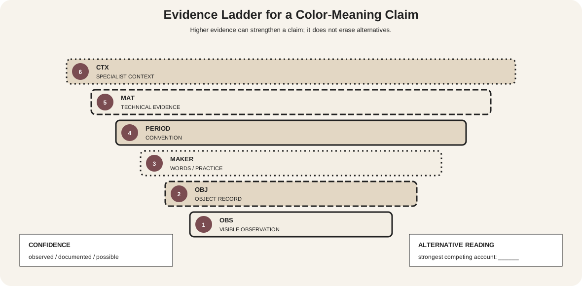
| “The artist used the scheme” | classification is mistaken for intention | cite documentary evidence or label inference |
| “The sampled pixels are the object” | reproduction mediation is ignored | name file, profile and sampling region |
| “The diagram is clear” | meaning disappears without color | add P/Q labels, numbers, shapes and patterns |
Make pair diagrams accessible
W3C guidance requires a non-color cue whenever hue communicates information.[12] Print both names and positions; use different node shapes for the pair; vary diameter patterns; and repeat the relationship in a table. A mixture chart should retain written ratios and blank observation fields when fills are removed.
Test grayscale and common color-vision simulations, then perform the stronger check: hide every colored fill. Axis identity, role, operation and state should still be recoverable. For ordinary-size text, retain at least the standard 4.5:1 contrast ratio.[13]
Watch: Complementary Colors through Formal Analysis
Choose a museum-led whole-work analysis, a close reading, or a foundations overview for considering complementary colors.
Introducing Formal Analysis: Landscape
Follow how recurring shapes, colours and intervals contribute to a larger visual organisation.
Watch on YouTubeFrequently Asked Questions
They are hue positions opposite one another on a declared colour wheel.
A 12-position RYB teaching wheel includes red–green, yellow–violet and blue–orange axes, plus the intermediate opposite pairs.
Strong chromatic contrast at a shared boundary can heighten the visible distinction, but value, chroma, area and surround also matter.
No. Actual results depend on pigment identity, ratio, opacity, binder, ground and drying conditions.
Vary area, value and chroma deliberately, and test a small accent against the larger field under the intended conditions.
Discussion
Which artwork on this page uses the most unequal complementary areas, and how does that change the hierarchy?
Reader Insights
Opposites belong to a named model.
Where the hues meet can matter more than isolated swatches.
Record pigments, ratios, ground and dry result.
Join the Conversation
Share one precise observation or a useful museum example below.
References
- National Gallery of Art, “The Elements of Art: Color.” https://www.nga.gov/educational-resources/elements-art/elements-art-color
- Sessions College, “Color Wheel and Color Calculator.” https://www.sessions.edu/color-calculator/
- National Gallery of Art, “Picturing France 1830–1900.” https://www.nga.gov/sites/default/files/migrate_images/content/dam/ngaweb/education/learning-resources/teaching-packets/pdfs/picturing_france.pdf
- Golden Artist Colors, “Color Mixing Guide.” https://goldenartistcolors.com/resources/color-mixing-guide
- W3C, “CSS Color Module Level 4.” https://www.w3.org/TR/css-color-4/
- J. Paul Getty Museum, “Understanding Formal Analysis.” https://www.getty.edu/education/teachers/building_lessons/formal_analysis.html
- Yale University Press, “Interaction of Color.” https://yalebooks.yale.edu/book/9780300146936/interaction-of-color/
- The Metropolitan Museum of Art, “On Color Fidelity.” https://www.metmuseum.org/perspectives/color-photography-standards-van-gogh-sunflowers
- Cleveland Museum of Art, “The parrot addresses Khujasta at the beginning of the forty-seventh night.” https://www.clevelandart.org/art/1962.279.300.b
- Cleveland Museum of Art, “Princess with Wine Bottle and Cup (recto).” https://www.clevelandart.org/art/1947.496.a
- Cleveland Museum of Art, “Initial D[eus in loco] with a Prophet Excised from a Gradual.” https://www.clevelandart.org/art/1949.536
- W3C Web Accessibility Initiative, “Understanding SC 1.4.1: Use of Color.” https://www.w3.org/WAI/WCAG21/Understanding/use-of-color
- W3C Web Accessibility Initiative, “Understanding SC 1.4.3: Contrast (Minimum).” https://www.w3.org/WAI/WCAG22/Understanding/contrast-minimum.html