by Tom Gurney
Tom Gurney BSc (Hons) is an art history expert with over 20 years experience
Page created on September 3, 2026 / Page updated on September 13, 2026
Email: tomgurney1@gmail.com / Phone: +44 7429 011000
How Opaque Watercolour Supports Flat Colour, Fine Detail and Revision
Gouache is an opaque water-miscible paint, closely related to watercolor and historically called bodycolor. Pigment is commonly held by a water-soluble gum binder. Compared with a transparent watercolor wash, gouache usually contains a higher proportion of pigment and can cover the surface beneath it. Its dried film tends to scatter light softly, producing the matte colour for which the medium is known.[1][2]
There is no single recipe shared by every historical and modern gouache. Opacity can come from a high pigment load, naturally opaque pigments, added white or inert extenders. Older bodycolor often used lead white; zinc white became important in the nineteenth century. A precise account should therefore name the actual formulation or follow the collection record rather than claiming all gouache contains chalk.
At a Glance
- Core mediumgouache is an opaque water-based paint, traditionally using gum arabic or a related water-soluble binder.
- Opacity variespigment choice, formulation, dilution and added white determine how fully a passage covers.
- Reactivationmany traditional gouache layers can be softened or disturbed again with water.
- Historical vocabularybodycolour, opaque watercolour and gouache can overlap but should follow object-specific records.
- Look formatte passages, flat or layered colour, crisp revision and the relationship between paint and paper or prepared support.
Contents
- What is gouache painting?
- Binder, opacity and the painted surface
- Flat colour and layered correction
- Eight gouache works to look at
- Bodycolor, gouache and watercolor
- From manuscripts to modern design
- Artists associated with gouache and bodycolour
- Reactivation, care and close looking
- Watch Gouache Painting in Practice
Binder, opacity and the painted surface
Water makes gouache flow; gum keeps pigment attached after the water evaporates. Because the binder remains water-sensitive, a dry layer can often be reactivated. A wet brush may lift or mingle earlier colour, which permits revision but can also create unintended disturbance. Thick passages may crack if their binder and support cannot accommodate movement.
Opacity is a relationship among pigment, particle concentration, binder and film thickness. Some pigments cover strongly on their own; others remain relatively translucent unless combined with an opacifier. Manufacturers and historical workshops have adjusted flow, shelf life and surface with further ingredients, so two colours in one set—or two works both labelled gouache—may handle and age differently. MoMA's research into Matisse's cut-outs found colour-dependent differences in stability within gouache-painted papers.[12]
The matte appearance comes from diffuse reflection at a pigment-rich, microscopically uneven surface. It reduces the mirror-like glare associated with a smooth varnished oil film, which helps broad colour shapes remain legible under changing viewing angles. Matte surfaces are also vulnerable to polishing: rubbing or cleaning can compact particles and create a darker or shinier patch that cannot simply be washed away.
Gouache can be applied from creamy, covering colour to diluted washes. Flat shapes suit design and illustration, while drybrush reveals paper texture and fine opaque touches create highlights over dark passages. Unlike transparent watercolor, gouache can move from dark to light by painting pale colour over a darker ground. Yet painters often combine both systems on one sheet.
Wet gouache may dry lighter or darker depending on pigment, thickness and dilution. Its matte surface can make adjacent colour relationships appear direct and even, but repeated mixing may become chalky. These are handling tendencies, not rules that determine style. The eight works below use bodycolor for minute natural history, landscape, architectural fantasy and figure painting.
Flat colour and layered correction
Opacity makes gouache particularly effective when an image is organised as adjoining shapes. A painter can establish a dark ground, cover it with a lighter form and redraw an edge after drying. This differs from transparent watercolor, where preserving the paper often requires planning the lightest areas from the beginning. Yet a corrected gouache passage may become thicker or change sheen, so revision does not disappear without trace.
Dilution changes that logic. A thin gouache mixture behaves more like a wash, allowing the support or undercolour to influence it. A loaded brush can leave a dense, almost velvety mark; a drier brush skips across paper fibres. Designers have valued the medium's capacity for clean silhouettes and even photographed colour, while painters have exploited broken layers and visible reconsideration. Matte does not mean visually dull: reduced glare can make hue relationships unusually immediate.
Colour matching also requires patience. Since a wet mixture may shift as water leaves it, painters often judge a dried sample before adjusting a passage. Adding water may restore movement but can lower opacity and disturb the binder-to-pigment balance. Historical sheets show that control came through attentive handling rather than a perfectly predictable formula.
Gouache is sometimes described as “forgiving” because a dry dark can be covered by a lighter layer. That is only partly true. Rewetting may pull the lower colour upward, thick overpainting can crack or look raised, and repeated adjustment can change the surface from velvety to patchy. Conversely, a carefully diluted passage can retain the brightness of the paper much like transparent watercolour. The medium rewards planning and revision at the same time; neither quality cancels the other.
Its colour also depends strongly on reproduction. A matte original photographs without much specular glare, one reason gouache appealed to commercial artists, but cameras and printing processes still compress subtle differences among dense, diluted and gum-rich passages. A flat digital swatch cannot show drybrush catching the sheet, a rubbed correction or the slight sheen where binder has pooled. Original-object looking remains important even for a medium associated with reproduction.
Eight gouache works to look at
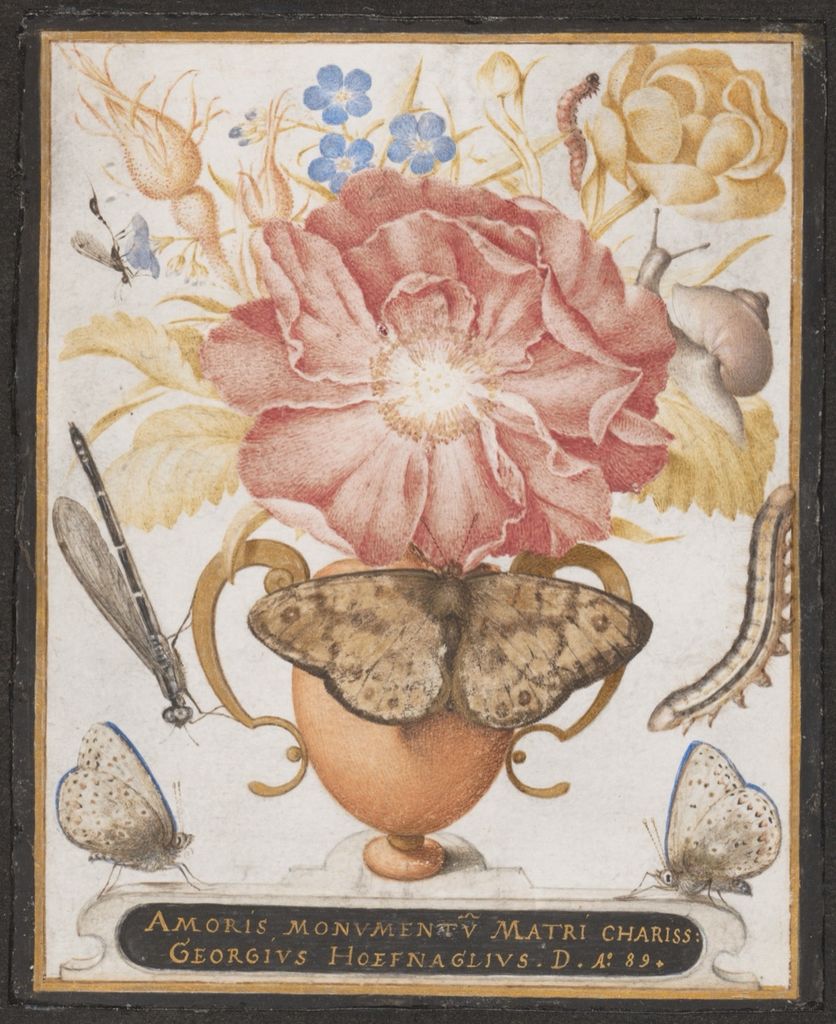
Still Life with Flowers, a Snail and Insects
Joris Hoefnagel's 1589 still life combines watercolor, gouache and shell gold on vellum.[3] Individual flowers, insects and a snail are arranged with extraordinary precision. Opaque touches give petals and bodies substance while transparent passages preserve delicacy.
Vellum provides a smooth, pale animal-skin support rather than paper. Gold catches light differently from both transparent and body colour. The page demonstrates that gouache's history extends well before modern graphic design and often belongs to mixed techniques.
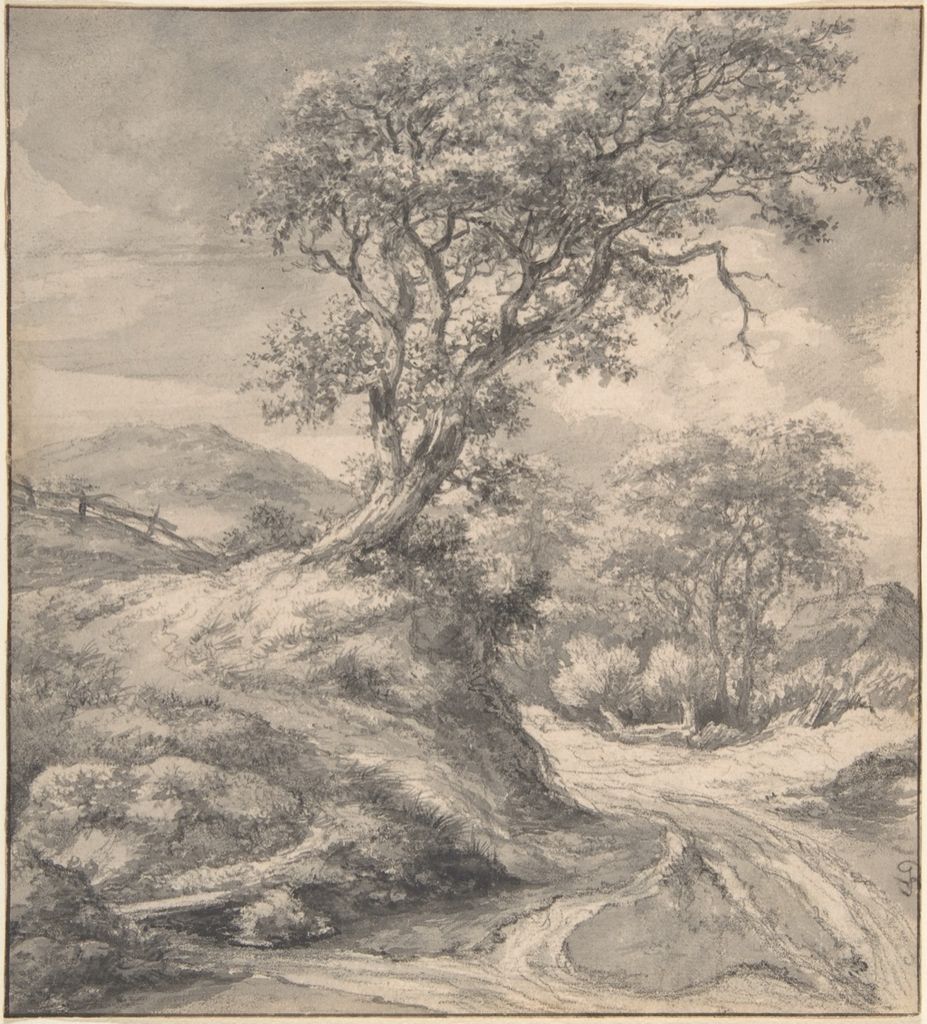
Dune Landscape with Oak Tree
Jacob van Ruisdael's Dune Landscape with Oak Tree, 1650–55, combines black chalk, grey wash, gouache and ink framing lines.[4] A dark oak anchors the sheet while low dunes and sky open around it. Restrained bodycolor strengthens selected lights and masses.
The work does not use gouache as an all-over opaque field. It adds weight within a drawing-and-wash structure. Exact medium labels matter because “gouache painting” can describe both a complete surface and targeted bodycolor additions.
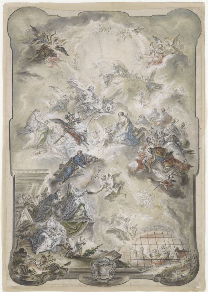
Design for a Wall Panel or Ceiling
Johann Baptist Enderle's design, made by 1771, uses pen, watercolor and gouache to preview a large decorative scheme.[5] Figures rise through clouds within an ornamental frame. Opaque highlights clarify bodies and architecture over freely washed shadow.
Gouache was valuable for presentation designs because it could simulate painted decoration quickly and permit light-over-dark correction. The small sheet translates an imagined wall or ceiling into a portable proposal.
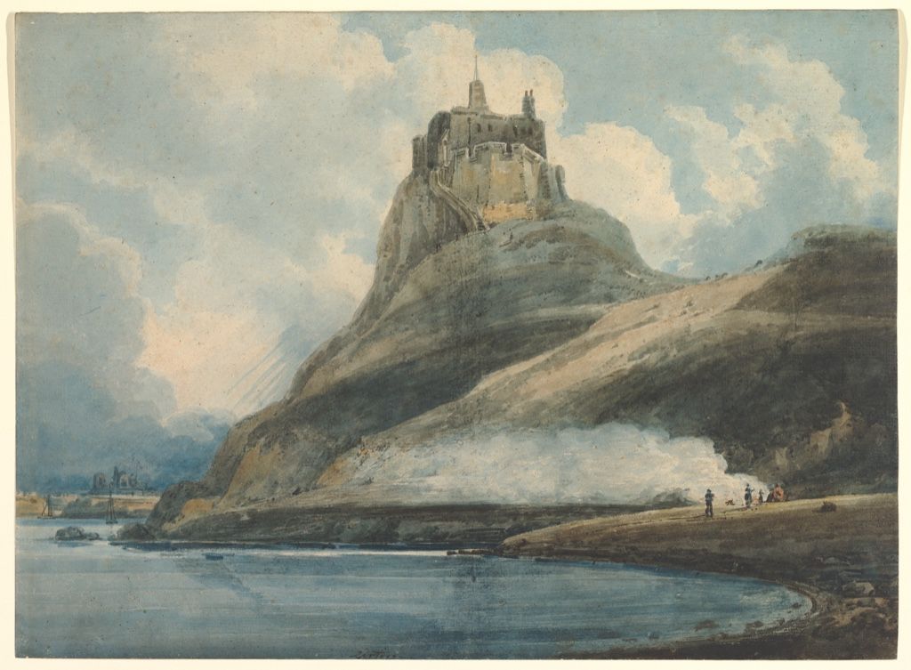
Lindisfarne Castle, Holy Island
Thomas Girtin's 1796–97 view combines watercolor and bodycolor.[6] The castle rises from a dark rocky mass beneath a broad sky. Opaque colour reinforces land and cloud while transparent wash maintains atmospheric breadth.
The balance unsettles a rigid divide between “pure” watercolor and gouache. British painters selected bodycolor when it served tone, weather and exhibition strength. The medium relationship is visible passage by passage.
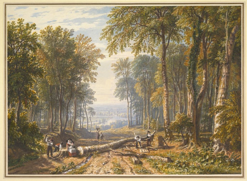
Woodcutters at Park Place, Henley
William Havell's landscape of about 1826 uses graphite, watercolor, gouache, gum arabic and scratching out.[7] Trees frame distant river scenery while small labouring figures occupy the foreground. Added gum deepens or glosses selected colour; scratching recovers bright marks.
The sheet is built additively and reductively. Opaque paint covers, gum saturates and a sharp tool removes. Gouache participates in a toolkit rather than supplying every effect alone.
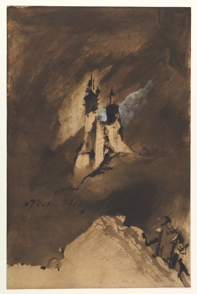
Souvenir of a Castle in Vosges
Victor Hugo's 1857 imaginary castle combines iron-gall ink and wash with white gouache; a paper stencil established the building's outline.[8] Dark ink spreads into brooding atmosphere while white accents break through like mist or moonlight.
Here gouache functions as light over darkness. The stencil makes absence constructive: a reserved silhouette becomes architecture, then brushwork turns it into a memory-image. Process and fantasy are inseparable.
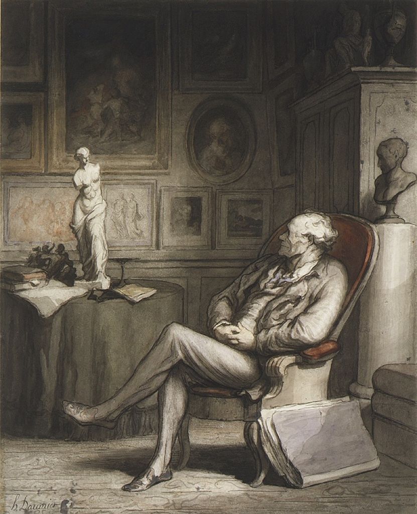
The Connoisseur
Daumier's The Connoisseur, about 1860–65, combines pen, wash, watercolor, lithographic crayon and gouache over black chalk.[9] A figure leans toward a framed picture, his posture exaggerated into an instantly legible social type.
Opaque highlights and dark wash model the body economically. The mixed surface connects caricature drawing, print culture and painting. Gouache helps the figure read forcefully without concealing the searching chalk beneath.
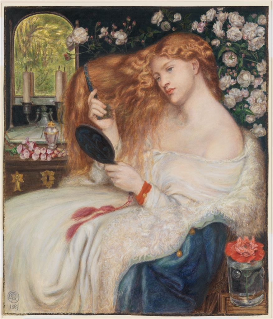
Lady Lilith
Dante Gabriel Rossetti's Lady Lilith of 1867 is watercolor and gouache.[10] The figure combs long hair before a mirror amid flowers and richly patterned surroundings. Dense bodycolor makes the small work rival the saturation and finish of oil.
Layered opacity supports jewel-like colour and exact detail, while watercolor passages keep transitions alive. The work belongs to a nineteenth-century effort to make water-based painting ambitious enough for exhibition beside oils.
Bodycolor, gouache and watercolor
“Bodycolor” emphasises physical opacity: colour has enough body to obscure what lies below. In British historical records it often names watercolor mixed with white. “Gouache,” a French-derived term, became more common in English during the twentieth century.[2] Museums may use both in one label so contemporary readers can recognise the medium.
Transparent watercolor depends strongly on light reflected from bare paper. Gouache reflects more light from pigment within the paint layer and can operate over tinted grounds. The categories still overlap. A single sheet may reserve white paper in one place, float transparent wash in another and add gouache highlights last.
Distemper is another broad water-based category, traditionally pigment bound with animal glue or size and often used on walls or scenery. Egg tempera uses an emulsion binder, most famously egg yolk. Similar matte appearances do not make these materials interchangeable. The Watercolor Painting page examines the related transparent tradition, while the Art Mediums hub uses binder and support to keep them distinct.
From manuscripts to modern design
Opaque water-based colour has long histories in manuscript illumination, miniature painting and decorative work across many cultures. European bodycolor supported botanical and natural-history images, portrait miniatures, fan painting and topographical views. Its capacity for exact colour and correction also made it useful to designers.
During the nineteenth century, manufactured moist colours and zinc white broadened practice. Watercolor exhibition societies debated transparency and bodycolor even as artists freely mixed them. Later illustrators, poster designers, animators and commercial artists valued gouache because flat matte shapes reproduced well in print and photography.
In design work, opacity helped a proposal resemble its intended final colour rather than a lightly tinted drawing. Architectural decorators could model ceiling or wall schemes at small scale; illustrators could redraw silhouettes and supply clean separations; animation studios could create saturated backgrounds and colour studies. These uses were not a lesser branch of painting. They made gouache a bridge among singular artworks, collaborative production and mechanically reproduced images.
Twentieth-century artists also treated it as an independent fine-art medium. Henri Matisse selected colours while studio assistants painted sheets with gouache; he then cut and repeatedly arranged the dry shapes for his late cut-outs. The process separated painting colour from placing form, joining gouache to collage, mounting and collaborative studio labour.[11][12]
Artists associated with gouache and bodycolour
Joris Hoefnagel demonstrates the medium's precision on vellum, where opaque detail works beside transparent colour and shell gold. Jacob van Ruisdael and Thomas Girtin used bodycolour selectively within landscape drawing rather than as an all-over coating. Victor Hugo and Daumier combined white or coloured gouache with dark inks, washes and drawing media. Dante Gabriel Rossetti built exhibition-scale saturation in water-based colour, while Matisse detached painted colour into movable paper shapes.
The range guards against a narrow modern definition. Gouache can be a highlight, a presentation design, one material in a mixed-media drawing or the dominant colour system of a finished work. Catalogue wording such as “watercolour and bodycolour” should be preserved rather than normalised into a single generic label.
Reactivation, care and close looking
Water sensitivity is useful in the studio and challenging in conservation. Moisture can soften paint, move pigment or change tidelines. Thick matte layers may be friable, and unbound pigment can sit loosely at the surface. Paper and vellum respond to humidity; light can fade colour. Glazing and controlled display protect works but discourage assumptions that a dry sheet is chemically inert.
Risks vary colour by colour. MoMA records that some gouaches in Matisse's cut-outs are stable while others fade quickly, and that abrasion was serious enough for Matisse to want the works glazed.[12] Smithsonian display guidance places watercolours and works with organic pigments among light-sensitive categories requiring limited exposure.[13] These findings argue for object-specific assessment: “opaque” does not mean permanent, and a protective frame does not make unrestricted bright display safe.
Start close looking by identifying what gouache does locally. Does it cover a tinted sheet, reinforce a light, flatten a design or model a figure? Compare matte passages with shiny gum or metallic gold. Look for graphite, ink, reserve and scratching. A mixed-media label is not clutter: it is the key to understanding how opaque bodycolor works with the rest of the sheet.
Watch: Gouache Opacity, Layering and Working Method
Choose a fundamentals lesson, an artist-led architectural demonstration, or a classroom exploration of opaque watercolour handling.
Introduction to Gouache
Review materials, opacity, blending and the differences between wet and dry handling.
Watch on YouTubeFrequently Asked Questions
Gouache is an opaque water-based paint, traditionally made with pigment and a water-soluble binder such as gum arabic.
Gouache is formulated or handled for greater opacity, while transparent watercolour relies more strongly on light returning from the paper through thin washes.
The terms overlap historically, but museum usage can reflect period, formulation and cataloguing tradition; use the object record where possible.
Many traditional gouache paints can be softened or disturbed with water, although behaviour varies by formulation, age and added media.
Because paper, pigments and matte surfaces can be light- and moisture-sensitive, follow institutional guidance and avoid assuming every formulation behaves identically.
Discussion
Which work on this page uses gouache opacity most differently from transparent watercolour, and where is that contrast visible?
Reader Insights
Gouache, bodycolour and opaque watercolour may reflect historical cataloguing.
Opacity can change within one work through dilution and layering.
Matte paint on paper is vulnerable to abrasion, moisture and prolonged light.
Join the Conversation
Share one precise observation or a useful museum example below.
References
- Metropolitan Museum of Art, “Watercolor.” https://www.metmuseum.org/perspectives/materials-and-techniques-drawing-watercolor
- Victoria and Albert Museum, “What is watercolour?” https://www.vam.ac.uk/articles/what-is-watercolour
- Metropolitan Museum of Art, “Still Life with Flowers, a Snail and Insects.” https://www.metmuseum.org/art/collection/search/382608
- Metropolitan Museum of Art, “Dune Landscape with Oak Tree.” https://www.metmuseum.org/art/collection/search/337493
- Metropolitan Museum of Art, “Design for a Wall Panel or Ceiling.” https://www.metmuseum.org/art/collection/search/393432
- Metropolitan Museum of Art, “Lindisfarne Castle, Holy Island, Northumberland.” https://www.metmuseum.org/art/collection/search/341793
- Metropolitan Museum of Art, “Woodcutters at Park Place, Henley.” https://www.metmuseum.org/art/collection/search/399141
- Metropolitan Museum of Art, “Souvenir of a Castle in Vosges.” https://www.metmuseum.org/art/collection/search/400924
- Metropolitan Museum of Art, “The Connoisseur.” https://www.metmuseum.org/art/collection/search/333915
- Metropolitan Museum of Art, “Lady Lilith.” https://www.metmuseum.org/art/collection/search/337500
- Metropolitan Museum of Art, “Gouache, Paper, Scissors: Characterization of Pigments and Colorants in Henri Matisse’s Cut-Outs.” https://www.metmuseum.org/-/media/files/about-the-met/conservation-and-scientific-research/department-of-scientific-research/2017_nics_as_book_of_abstracts.pdf
- Museum of Modern Art, “Henri Matisse: The Cut-Outs.” https://www.moma.org/interactives/exhibitions/2014/matisse/the-cut-outs.html
- Smithsonian National Museum of Asian Art, “Light Duration Guidelines.” https://asia.si.edu/research/conservation-scientific-research/exhibitions-conservation/light-duration-guidelines/