by Tom Gurney
Tom Gurney BSc (Hons) is an art history expert with over 20 years experience
Email: tomgurney1@gmail.com / Phone: +44 7429 011000
How Visual Parts Begin to Act as a Whole
The nine principles of art used in this guide are balance, emphasis, movement, pattern, proportion, rhythm, unity, variety and contrast. They describe ways that visual elements can be organised so that parts of an artwork carry weight, attract attention, repeat, differ and belong together.[1][2][3]
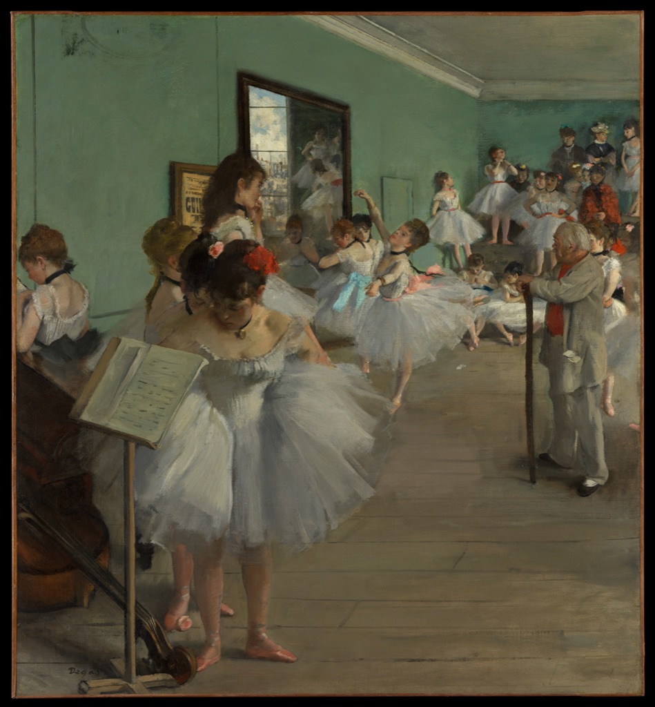
Edgar Degas · The Dance Class · 1874 · The Metropolitan Museum of Art · Public Domain. Repeated tutus, changing poses and unequal visual weight let several principles operate together; a close reading appears below. Source details.
At a Glance
- Nine principlesbalance, emphasis, movement, pattern, proportion, rhythm, unity, variety and contrast.
- Their purposedescribe relationships and organising effects.
- Elementsthe visual components available to organise.
- Compositionthe complete arrangement where those choices meet.
- Best methoddescribe visible evidence before naming an effect.
Contents
These principles are tools for looking, not rules that every artist must follow. Begin with the effect you notice—perhaps a strong focal point, a steady beat of repeated forms or an uneasy distribution of weight—and then ask which relationships are producing it.
Teaching lists vary: some institutions combine movement with rhythm, place contrast within emphasis or treat repetition as a separate heading, so seven-, eight- and nine-part models can all be encountered.[1][2][3] This guide keeps nine closely related ideas distinct while recognising those other groupings.
Nine principles at a glance
Balance
Balance concerns how visual weight is distributed, whether the two sides feel evenly matched or deliberately unequal. To recognise it, compare the size, darkness, colour, detail and position of the forms around an imagined centre.[1]
Emphasis
Emphasis gives one part of a work greater visual priority than its surroundings. Notice where your eye lands first and whether isolation, placement, scale, detail or a sharp difference makes that area stand out.[1]
Movement
Movement is the sense of action or the path your eye appears to follow through an image. Directional lines, repeated poses, diagonals and linked edges can lead attention even when the artwork itself is still.[1]
Pattern
Pattern appears when a motif, shape, line or colour returns in an organised structure. Look for recurrence that makes neighbouring areas feel related rather than for any single repeated mark in isolation.[1]
Proportion
Proportion describes size relationships among parts and between a part and the whole. A figure, object or interval feels proportionate—or deliberately disproportionate—because it is judged beside something else.[2]
Rhythm
Rhythm is visual pacing created by recurrence, interval and variation. Follow the repeated features and notice whether their spacing feels steady, interrupted, compressed or opens out.[3]
Unity
Unity is the sense that separate parts belong to a coherent whole. Shared colours, repeated shapes, aligned edges or consistent handling can connect varied passages without making them identical.[2]
Variety
Variety introduces controlled difference in form, colour, size, texture or direction. It is visible where changes sustain attention while the larger arrangement still feels connected.[3]
Contrast
Contrast is a marked difference between visual qualities such as light and dark, large and small, smooth and rough, or muted and bright. Look for neighbouring features whose difference becomes clearer because they are seen together.[2]
From elements to organising effects
The elements of art are the visual components available to notice: line, shape, form, space, colour, value and texture. Principles describe relationships among those components. A dark shape is an element; placing it alone within a pale open field may give it emphasis. Repeating a line introduces recurrence; changing the intervals between those lines can establish rhythm.
This distinction moves close looking from inventory to effect. First describe what is present, then ask how its position, repetition, scale or difference directs the experience of the whole. The same element can serve several principles at once, and the same principle can be produced through different elements.[1][3]
Principles in combination
Pattern, repetition and rhythm. Repetition is the recurrence of an element or motif; it can build a pattern when the recurrence forms a recognisable structure. When spacing, alternation or change gives that recurrence a pace, it also contributes to rhythm.[1]
Movement and rhythm. Movement concerns directional action or an eye path, while rhythm concerns pacing through recurrence and interval. Rhythm can produce movement, but a single diagonal, gesture or sweep may create movement without a regular beat.[3]
Emphasis and contrast. Emphasis establishes visual priority, whereas contrast is a degree of difference. Contrast often helps a focal area stand out, but strong differences can be spread across a work without producing one dominant focus.[1]
Unity and variety. Unity holds parts in a coherent relationship, while variety prevents that relationship from becoming monotonous. A work can feel unified because colours or shapes recur and varied because none of those recurrences is exactly the same.[2]
Proportion and scale. Proportion compares the sizes of parts with one another or with the whole. Scale places size against a reference such as a body, an architectural setting or the viewer, so the two ideas meet without meaning precisely the same thing.[2]
Four artworks, several principles
Degas: emphasis inside a moving room
Edgar Degas's The Dance Class, 1874, is in The Metropolitan Museum of Art, accession 1987.47.1.[4] The tall room does not settle around a single central axis: empty green wall occupies much of the upper left, while dancers, mothers and the ballet master gather more densely across the middle and right. That uneven distribution creates asymmetrical balance rather than mirror-like stability.
Attention travels through a chain of pale tutus, bent arms and angled bodies from the foreground towards the back of the room. One dancer performing near the centre receives emphasis through her open pose and surrounding space, yet the variations among waiting figures keep the eye moving. Repeated costumes establish unity and rhythm; changes in gesture, scale and position keep the scene varied rather than mechanically regular.
Edgar Degas · The Dance Class · 1874 · The Metropolitan Museum of Art · 1987.47.1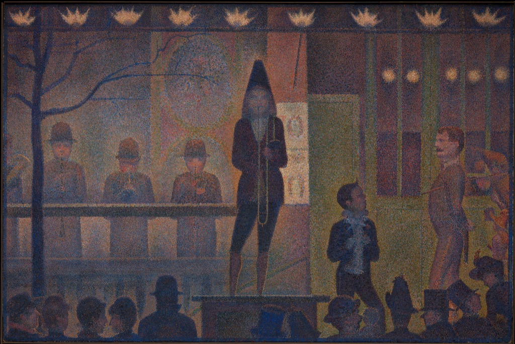
Seurat: rhythm after dark
Georges Seurat's Circus Sideshow (Parade de cirque), 1887–88, belongs to The Metropolitan Museum of Art, accession 61.101.17.[5] Horizontal bands organise the stage, railing and dark row of spectators, while gaslights repeat across the upper edge. Their spacing establishes a measured rhythm that is echoed by the block-like figures below.
The tall, dark trombonist stands against a lighter field and receives emphasis through contrast and position. At the same time, repeated rectangles, heads and circular lights make the scene feel unified. Subtle differences in height, spacing and colour prevent the pattern from becoming a flat grid, so proportion and variety remain active within the strict structure.
Georges Seurat · Circus Sideshow (Parade de cirque) · 1887–88 · The Metropolitan Museum of Art · 61.101.17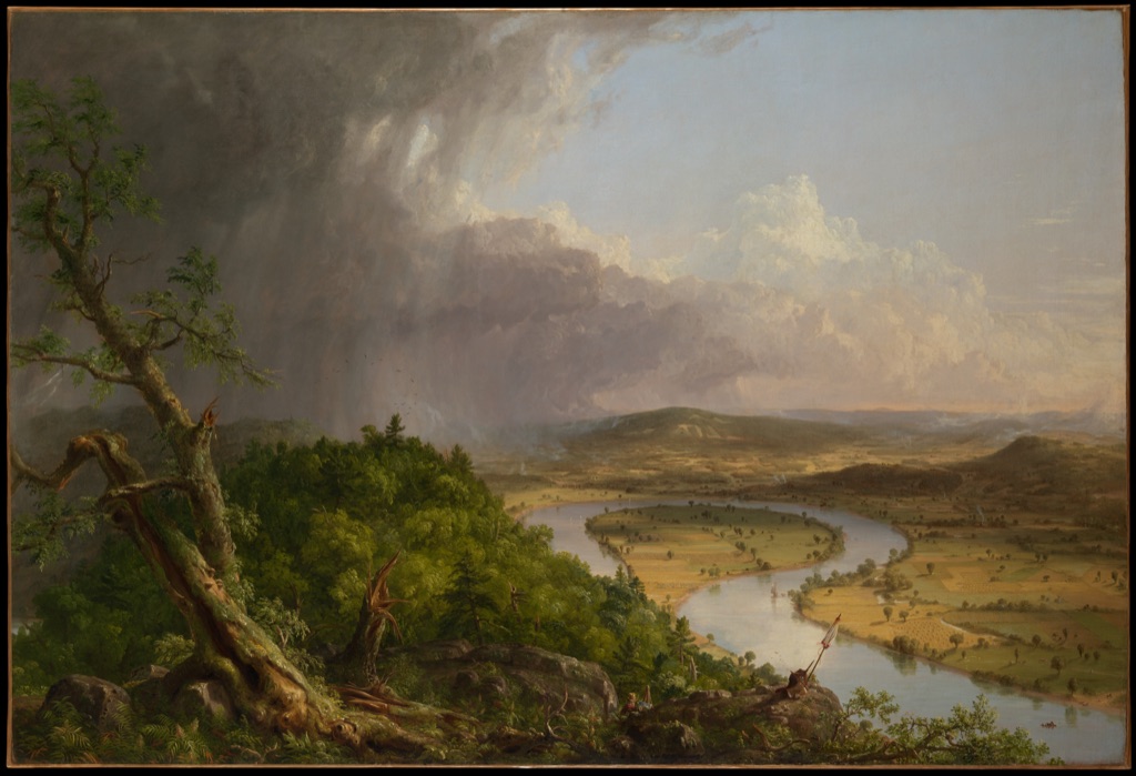
Cole: contrast across a landscape
Thomas Cole's View from Mount Holyoke, Northampton, Massachusetts, after a Thunderstorm—The Oxbow, 1836, is held by The Metropolitan Museum of Art, accession 08.228.[6] The panorama sets storm-darkened trees and broken ground on the left against a bright, cultivated valley on the right. That large contrast divides the view, but the curling river draws the two sides into one continuous movement.
The visual weight is strongly unequal: the near tree and clouds press heavily against the expansive light of the distance. Small fields, buildings and the artist's tiny figure near the lower centre sharpen the work's proportions by giving the landscape human reference points. Variety accumulates across weather, terrain and scale, while the repeated curves of cloud, hillside and river help the panorama hold together.
Thomas Cole · View from Mount Holyoke, Northampton, Massachusetts, after a Thunderstorm—The Oxbow · 1836 · The Metropolitan Museum of Art · 08.228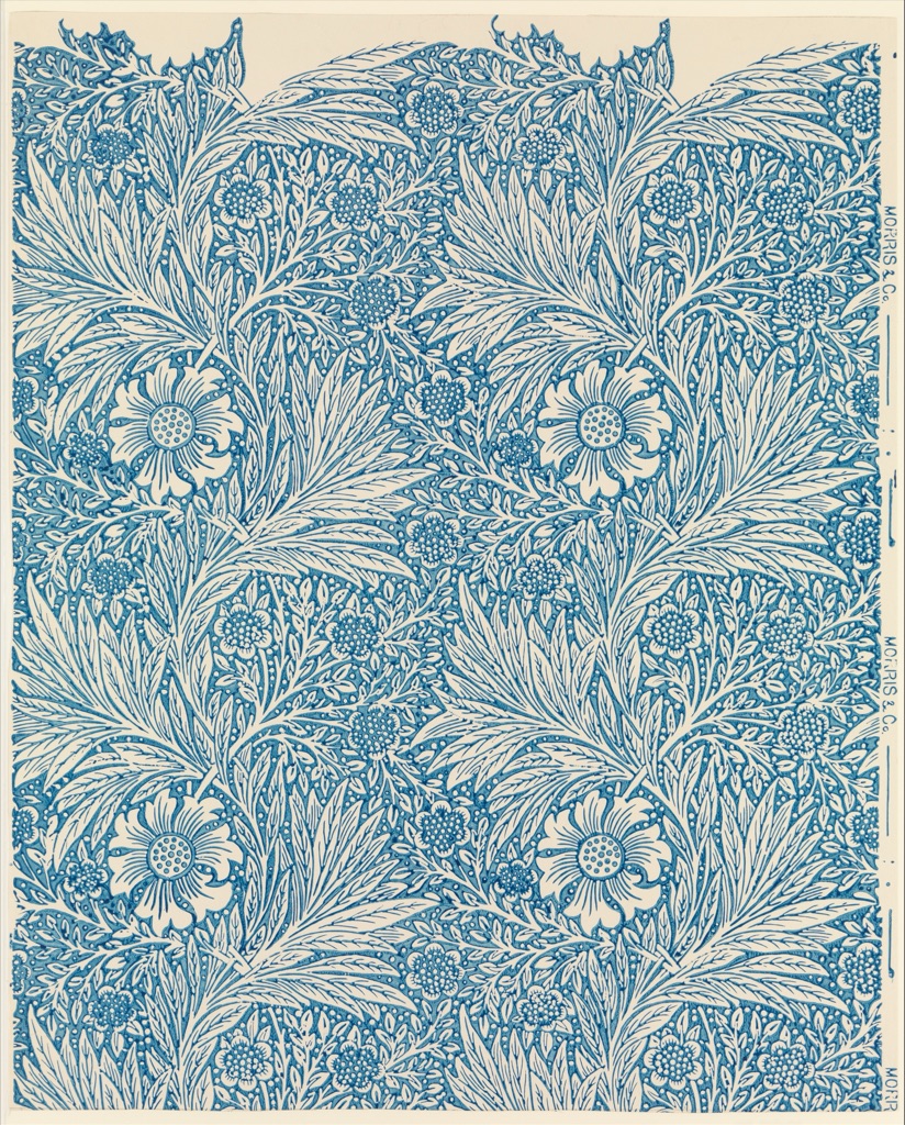
Morris: pattern with room for variety
Marigold, 1875, was designed by William Morris, manufactured by Morris & Company and printed by Jeffrey & Co.; the wallpaper sheet is in The Metropolitan Museum of Art, accession 23.163.4c.[7] Large blossoms, smaller flowers and curling leaves recur across the blue-and-cream surface. The repeating units create pattern, while the intervals between large and small motifs establish a lively rhythm.
Unity comes from the restricted colour scheme and the continuous flow of foliage. Variety appears in the changing sizes, directions and internal details of the plants, so the surface remains animated within its repeat. The cream margin and visible print edge also reveal the sheet as a designed object with a measured proportion, not an endless field detached from its material support.
Designed by William Morris · Manufactured by Morris & Company · Printed by Jeffrey & Co. · Marigold · 1875 · The Metropolitan Museum of Art · 23.163.4cPrinciples and composition
Elements name visual components; principles describe relationships and organising effects; composition is the complete arrangement in which those choices meet.[1][3] Balance or contrast can be discussed on its own, but in an actual artwork it operates beside every other decision about placement, scale, interval, colour and space.
Keeping the levels separate makes analysis clearer. Identify the visible components, trace the relationships that guide attention, and then step back to consider how the whole arrangement behaves. Composition in Art concerns that final level directly; here it remains a boundary rather than another summary of the nine principles.
Explore each principle
Each subject below names one focused way of examining an artwork. The overview on this page stands on its own; the directory simply keeps the nine ideas easy to scan.
Keep looking
Choose an unfamiliar artwork and let your gaze travel across it once without naming anything. On the second pass, notice where attention pauses, which area seems heaviest and whether a line, edge or sequence carries you towards another part.
Now compare what repeats with what changes. Do recurring shapes form a clear pattern? Does their spacing create a pace? Look for the strongest difference, then ask whether it produces a focal point or remains distributed across the work. Finally, consider whether the variations feel joined into a whole and how the sizes of the parts relate.
The principles become useful when they sharpen what you can see rather than supply a verdict. For broader routes through foundational ideas and existing art-history pages, return to Art Topics.
Watch: Principles through Formal Analysis
Choose a museum introduction to formal analysis, an overview of foundational vocabulary, or a focused close reading.
Introducing Formal Analysis: Landscape
Follow how visible relationships of placement, contrast and distance become evidence.
Watch on YouTubeFrequently Asked Questions
The nine principles used here are balance, emphasis, movement, pattern, proportion, rhythm, unity, variety and contrast.
No. They are analytical tools for describing relationships and organising effects within artworks.
Elements name visual components, while principles describe relationships among those components.
Teaching traditions group overlapping ideas differently, sometimes combining movement with rhythm or contrast with emphasis.
Yes. One visual decision can contribute simultaneously to balance, emphasis, rhythm, unity and other relationships.
Discussion
Which relationship most strongly guides your attention through one work on this page?
Reader Insights
Describe what repeats, differs or carries visual weight before naming a principle.
A focal point may depend on contrast, placement, balance and surrounding space together.
Check how local relationships contribute to the complete composition.
Join the Conversation
Share one precise relationship or a useful museum example below.
References
- J. Paul Getty Museum, “Understanding Formal Analysis — Principles of Design”
- Museum of Modern Art, “A Vocabulary for Discussing Art — Principles of Design”
- Massachusetts College of Art and Design, “Principles and Elements”
- The Metropolitan Museum of Art, Edgar Degas, The Dance Class, 1874
- The Metropolitan Museum of Art, Georges Seurat, Circus Sideshow (Parade de cirque), 1887–88
- The Metropolitan Museum of Art, Thomas Cole, View from Mount Holyoke, Northampton, Massachusetts, after a Thunderstorm—The Oxbow, 1836
- The Metropolitan Museum of Art, William Morris, Marigold, 1875