by Tom Gurney
Tom Gurney BSc (Hons) is an art history expert with over 20 years experience
Page created on September 3, 2026 / Page updated on September 13, 2026
Email: tomgurney1@gmail.com / Phone: +44 7429 011000
How Transparent Wash, Paper and Reserved Light Create a Responsive Image
Watercolor—or watercolour in British spelling—is paint whose pigment is carried in water and usually bound with a gum such as gum arabic for lasting adhesion. It is most often brushed onto paper. When transparent washes dry, light passes through the colour, reflects from the sheet and returns to the eye, making the paper an active source of luminosity.[1][2]
Transparency is central to much watercolor practice, but it is not an absolute rule. Artists mix strong pigment, opaque bodycolor or gouache, ink, graphite and wax resist; they blot, scrape and lift colour. Historical labels record these combinations precisely. Watercolor is best understood as a versatile water-miscible medium, not necessarily a pale or preliminary sketch.
At a Glance
- Core mediumpigment is dispersed in water with a water-soluble binder, commonly gum arabic.
- Light sourcetransparent passages often depend on light returning from the paper rather than added white.
- Working rangewash, wet-in-wet diffusion, dry brush, lifting, glazing and opaque additions can coexist.
- Historical breadthwatercolour has global histories and should not be reduced to one British landscape tradition.
- Carepaper, pigments and washes can be vulnerable to light, moisture, abrasion and prolonged display.
Contents
Paint, water and paper
Pigment supplies colour, while gum binder fixes the dry particles to the support. Water controls flow and dilution but leaves through evaporation. A light wash contains relatively little pigment; successive washes can deepen colour. Too much reworking may disturb an earlier layer or roughen paper fibres, though sizing helps a sheet withstand wetting.[1]
Paper's colour, weight and texture shape every mark. Smooth hot-pressed sheets support fine detail; rougher surfaces break brushstrokes into sparkling irregularities. Laid paper preserves a linear mould pattern, while wove paper offers a more even surface. Artists may stretch a damp sheet to reduce cockling or work with buckling as part of the process and final appearance.
Sizing changes how quickly the wash enters the fibres. A well-sized surface keeps colour nearer the top of the sheet, giving a painter more time to move or lift it and allowing sharper edges; a more absorbent sheet takes colour rapidly and may produce softer, less reversible marks. The Met notes gelatin-sized paper as a common watercolour support.[12] Age, abrasion or earlier wetting can alter that sizing unevenly, so one sheet may accept the same wash differently across its surface.
Because the white of the paper often supplies the brightest light, painters reserve it by leaving areas untouched, using masking or applying a wax resist. They can also lift damp colour with a brush or cloth and scrape dry paint back toward the sheet. Added opaque white creates a different light: it sits on the surface instead of shining from beneath.
Washes, edges and revisions
Wet-on-wet colour spreads into damp paper, producing soft edges, blooms and mingling hues. Wet-on-dry brushwork gives firmer boundaries. A graded wash changes from dark to light; a flat wash aims for even colour. Drybrush catches the high points of textured paper and can describe grass, stone or glittering water.
These categories often meet within one work. A painter might map a composition in graphite, float broad sky washes, place crisp architectural details after drying, lift a reflection and finish with opaque accents. Water introduces chance, but skilled watercolor depends on anticipating how much moisture remains in brush and sheet.
Sequence changes the result. A transparent yellow laid before blue can glow differently from a mixture prepared on the palette; repeated brushing may dull a luminous passage by suspending settled pigment. Some artists work from broad pale shapes toward dark accents, while others establish decisive marks early and wash around them. Granulating pigments settle visibly into paper texture, whereas staining colours can resist lifting. These are tendencies of particular materials, not fixed rules for every historical paint.
Water creates several related edge effects. A bloom or backrun occurs when wetter paint pushes into a passage that has begun to settle, leaving a branching or tide-like boundary. It may be accidental in one context and deliberately exploited in another. A bead of wash carried along a tilted sheet can help maintain an even band. Drying shifts colour and value, so a wet passage cannot be judged solely by its first intensity. These behaviours explain why control in watercolour often means managing timing and moisture rather than eliminating variation.
Not every dark is made by adding black, and not every light is bare paper. Layered complements can create chromatic shadow; concentrated colour can be nearly opaque; gum-rich passages can dry with more gloss. Bodycolour or reserved paper may sit beside transparent wash. Exact medium descriptions—and close inspection—are more reliable than trying to classify a whole sheet from reproduction alone.[2][12]
Scale matters too. A small sheet can invite close, private inspection, while exhibition watercolors grew large and densely worked in the nineteenth century. Mounts and frames may make a fragile paper object resemble an oil painting, but its surface still responds to water, abrasion and light in distinct ways. The reverse, edges and watermark can preserve evidence about manufacture and use.
Eight watercolors to look at
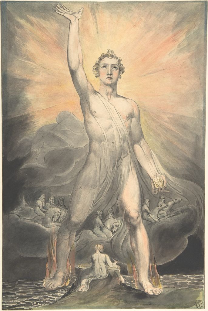
Angel of the Revelation
William Blake's Angel of the Revelation, about 1803–5, combines watercolor, pen and black ink over graphite.[3] A monumental angel spans sea and land while a small visionary figure writes below. Radiant washes, emphatic outlines and patterned flames create an image that feels illuminated from within.
Ink anchors forms that transparent colour might otherwise dissolve. The sheet demonstrates watercolor's relationship to drawing and book illustration: line and wash are partners, not rival media.
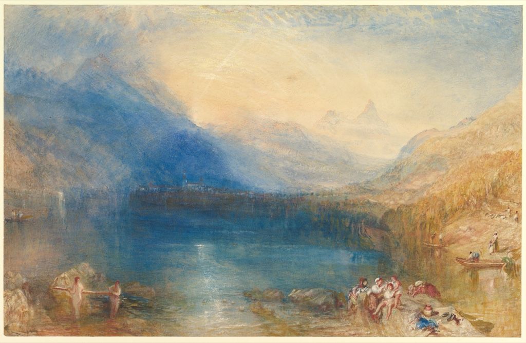
The Lake of Zug
Turner's 1843 Lake of Zug combines transparent watercolor, bodycolor, graphite and reductive methods.[4] A pale sun radiates over lake and mountains while small foreground figures establish scale. Colour seems suspended in light rather than contained by contour.
Turner removed as well as added material, exposing or brightening the paper. The work overturns “pure watercolor” myths: its extraordinary atmosphere comes from transparent and opaque colour, reserve and abrasion working together.
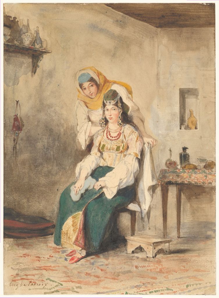
Saada and Préciada
Eugène Delacroix made this watercolor over graphite in Tangier in 1832.[5] Saada and her daughter sit close together, their garments described through warm colour and economical drawing. Areas of bare paper keep the study immediate and spacious.
The work emerged from travel and observation, but it also reflects a European artist's selective gaze in colonial-era North Africa. Material spontaneity should not make cultural framing invisible. Quick decisions of wash and reserve are both formal and historical evidence.
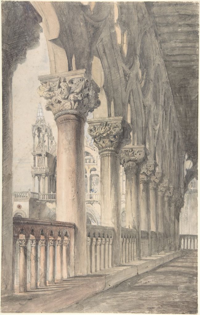
Loggia of the Ducal Palace, Venice
John Ruskin's 1849–50 study records carved capitals, columns and patterned stone in watercolor over graphite.[6] Precise drawing organises the architecture while transparent colour distinguishes marble and shadow. The sheet is analytical without being mechanically uniform.
Ruskin used watercolor as an instrument of close study. Its portability and capacity for exact colour made it valuable before colour photography, while the visible pencil keeps measurement and observation present.
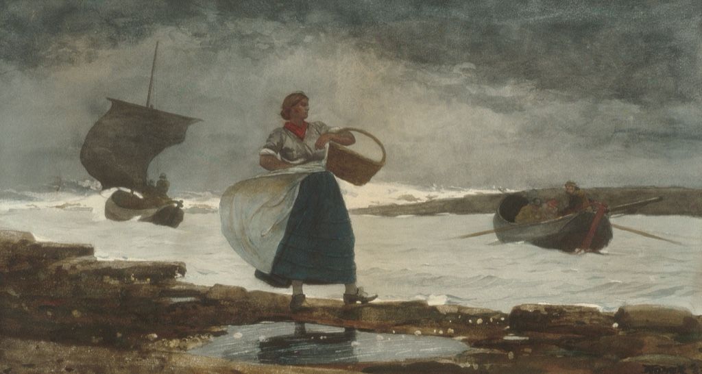
Inside the Bar
Winslow Homer's Inside the Bar of 1883 shows a woman carrying a basket through breaking surf at Cullercoats in northeast England.[7] Transparent greys and blues describe weather, wet clothing and moving water; graphite supports the figure's structure.
Reserved and lifted lights make foam flash without thick white paint. The medium's speed suits changing coastal conditions, yet the composition is carefully balanced. Immediate appearance can be the product of repeated selection.
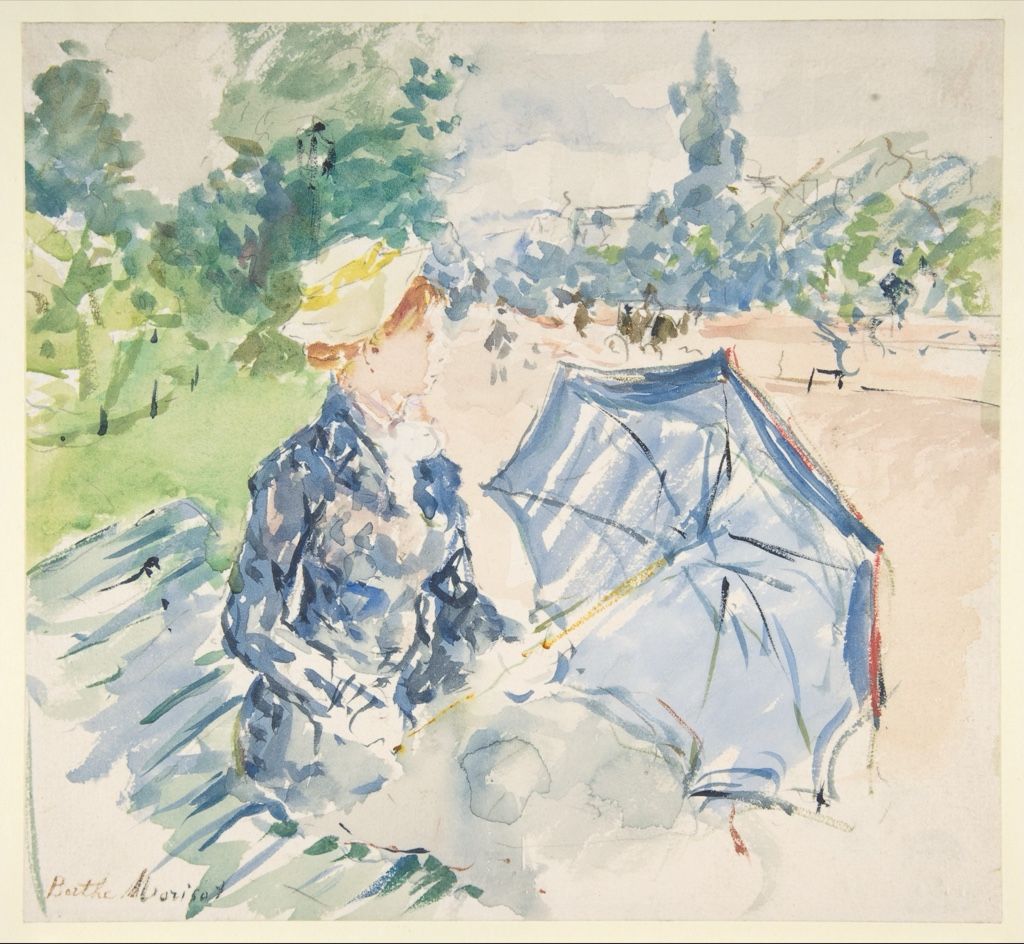
A Woman Seated at a Bench on the Avenue du Bois
Berthe Morisot's 1885 watercolor places a fashionable seated woman amid foliage and passing space.[8] Broad washes establish the setting while darker, more exact touches hold face, hat and dress. Much of the paper remains open.
The incomplete-looking edge is purposeful. Rather than fill every area, Morisot lets marks gather where perception concentrates. Watercolor's blank support becomes visual air and movement.
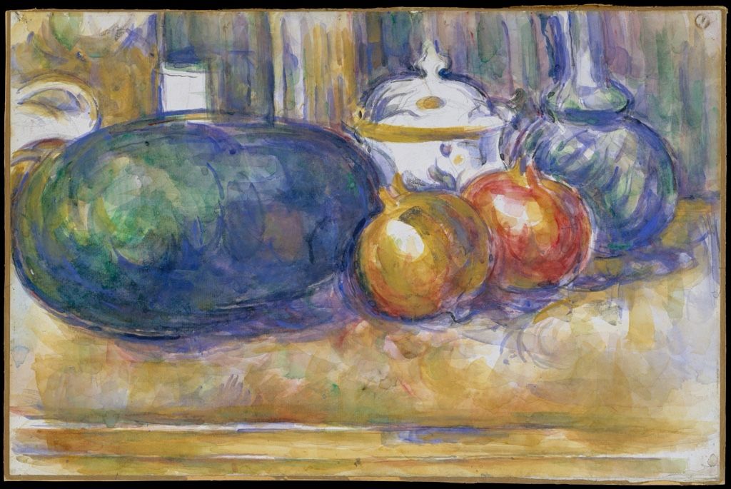
Still-Life with a Watermelon and Pomegranates
Cézanne's late still life, made 1900–1906, lays watercolor over graphite on laid paper.[9] Fruit and vessels emerge through separated patches of colour. Pencil contours are reconsidered rather than hidden, and unpainted intervals keep forms permeable.
The sheet shows that watercolor can build structure without continuous shading. Repeated coloured planes test relationships among round fruit, table edge and surrounding space. Revision remains legible.
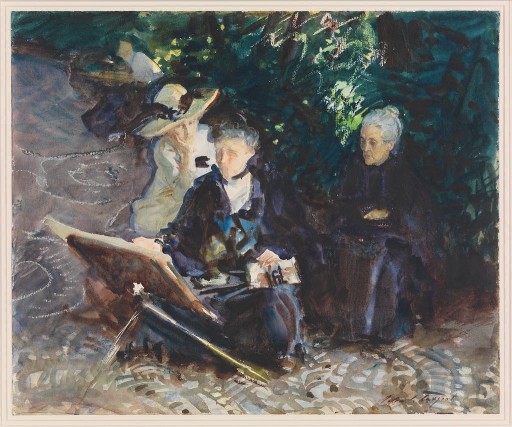
In the Generalife
John Singer Sargent's In the Generalife of 1912 combines watercolor, wax crayon and graphite.[10] Sunlit garden architecture, plants and water are captured through broad washes and rapid dark accents. Wax resists colour in selected areas, preserving flashes of light.
Sargent's apparent fluency depends on material sequence. Transparent pools, dry marks and resistant wax each behave differently. Their contrast makes heat and brightness convincing without the slow layering of his oil portraits.
A global medium and a British art form
Water-based painting belongs to many cultures and reaches back to antiquity. It appears in illuminated manuscripts, Asian painting traditions, maps, botanical and natural-history studies, portrait miniatures and architectural records. No single European history contains the medium. The V&A's Renaissance survey, for example, follows watercolour across Europe, Asia and the Americas and includes Mughal natural-history painting within histories of cultural exchange.[13]
The English word “watercolour” also gathers works made in distinct workshop traditions. Their binders, supports, brush conventions and functions may not be identical, even when museum catalogues group them as water-based colour. Treating portability or translucency as universal can erase the difference between a bound manuscript leaf, a hanging scroll, a botanical record and an exhibition sheet. A global history must therefore connect related material behaviours without pretending that all traditions developed from one origin.
In Britain, however, watercolor acquired a distinctive public identity between about 1750 and 1850. Improved wove papers, manufactured cakes and moist colours expanded technical possibilities. Artists including Girtin, Cozens and Turner made landscape watercolor an ambitious exhibition art, and specialist societies strengthened its status.[1][2]
Nineteenth-century tubes improved portability, but materials did not cause style on their own. Travel, publishing, scientific recording, tourism and an art market for works on paper all mattered. American painters such as Homer and Sargent later used watercolor for finished works as well as travel studies.
Artists associated with watercolour
William Blake joined transparent colour to ink, text and visionary book design. J. M. W. Turner expanded watercolour's tonal and atmospheric range through layering, bodycolour and removal. Eugène Delacroix used it in travel studies and figure observations whose seeming immediacy still requires attention to cultural viewpoint. Ruskin made colour and drawing instruments of architectural scrutiny.
Winslow Homer used reserved paper and direct washes to structure weather, bodies and water. Berthe Morisot let open paper and selective marks evoke shifting perception. Paul Cézanne built form through separated colour planes, while John Singer Sargent combined wash, graphite, wax and decisive accents. Together they demonstrate that watercolour can serve vision, record, experiment and finished exhibition art rather than one subordinate role.
Watercolor compared with gouache and oil
Gouache is commonly described as opaque watercolor or bodycolor. Its higher pigment load and added white or other opacifying formulation can cover the paper, though modern paints vary. Many historical sheets combine watercolor and bodycolor, so the boundary is practical rather than absolute.
Oil uses a drying-oil binder and usually permits longer wet blending, thicker films and deep glazes on prepared canvas or panel. Watercolor dries quickly and can be reactivated by moisture. Yet watercolor can be saturated and oil can be thin. The Art Mediums hub treats binder and support as better evidence than stereotype.
Light, display and close looking
Works on paper are sensitive to light. Some pigments fade, paper discolours and acidic mounts can stain or embrittle a sheet. Light damage is cumulative and cannot be reversed by later darkness. Museums therefore limit illumination and display duration, which is why watercolor collections may rotate.[11][14] Glazing protects from handling and dust but can make texture harder to see; ultraviolet-filtering material reduces one risk but does not make continuous bright display harmless.
Water sensitivity also varies within one object. A graphite line, gum-rich wash, opaque bodycolour and later annotation may respond differently to moisture. Paper conservators test individual components before treatment and preserve evidence such as watermarks, deckled edges, mounts and inscriptions. Flattening every ripple or removing every old attachment could erase information about how the sheet was made, handled or displayed.
Look first for reserved paper, then distinguish transparent wash from opaque additions. Follow edges from soft to crisp and note graphite, ink or wax that remains visible. Search for blooms, backruns, scraping and lifted highlights. Finally, read the exact medium line: it turns a general impression of lightness into a record of how the image was built.
Watch: Watercolour Materials, Technique and Surface
Choose museum-led views of Renaissance watercolours, a still-life studio lesson, or Turner's physical manipulation of the sheet.
Renaissance Watercolours: Materials and Techniques
Examine how water-based colour, drawing media and prepared surfaces worked together in Renaissance objects.
Watch on YouTubeFrequently Asked Questions
Watercolour uses pigment dispersed in water with a water-soluble binder, commonly gum arabic, and is often valued for transparent interaction with paper.
Its colour, texture, sizing and absorbency affect edge, wash, lifting, granulation and the light returned through transparent paint.
Some passages can be lifted, softened, glazed or covered, but the result depends on pigment staining, paper sizing, moisture and previous handling.
Transparent watercolour relies more strongly on light from the support, while gouache is formulated or handled for greater opacity; artists can combine both.
Paper and some pigments are light-sensitive, so institutions limit exposure to reduce fading and support deterioration.
Discussion
Which watercolour on this page uses the untouched paper most actively as part of its light and structure?
Reader Insights
Hard, soft, lost and backrun edges record water movement and timing.
Unpainted or lightly washed areas can be the brightest light in the image.
A thin film can still organise strong value, colour and spatial contrasts.
Join the Conversation
Share one precise observation or a useful museum example below.
References
- Metropolitan Museum of Art, “Watercolor Painting in Britain, 1750–1850.” https://www.metmuseum.org/essays/watercolor-painting-in-britain-1750-1850
- Victoria and Albert Museum, “What is watercolour?” https://www.vam.ac.uk/articles/what-is-watercolour
- Metropolitan Museum of Art, “Angel of the Revelation.” https://www.metmuseum.org/art/collection/search/340852
- Metropolitan Museum of Art, “The Lake of Zug.” https://www.metmuseum.org/art/collection/search/337499
- Metropolitan Museum of Art, “Saada and Préciada.” https://www.metmuseum.org/art/collection/search/336046
- Metropolitan Museum of Art, “Loggia of the Ducal Palace, Venice.” https://www.metmuseum.org/art/collection/search/342383
- Metropolitan Museum of Art, “Inside the Bar.” https://www.metmuseum.org/art/collection/search/11125
- Metropolitan Museum of Art, “A Woman Seated at a Bench on the Avenue du Bois.” https://www.metmuseum.org/art/collection/search/337864
- Metropolitan Museum of Art, “Still-Life with a Watermelon and Pomegranates.” https://www.metmuseum.org/art/collection/search/343735
- Metropolitan Museum of Art, “In the Generalife.” https://www.metmuseum.org/art/collection/search/12116
- Metropolitan Museum of Art, “American Drawings and Watercolors.” https://www.metmuseum.org/exhibitions/listings/2002/american-drawings-and-watercolors
- Metropolitan Museum of Art, “Watercolor.” https://www.metmuseum.org/perspectives/materials-and-techniques-drawing-watercolor
- Victoria and Albert Museum, “About the Renaissance Watercolours display.” https://www.vam.ac.uk/articles/about-the-renaissance-watercolours-display
- Smithsonian National Museum of Asian Art, “Light Duration Guidelines.” https://asia.si.edu/research/conservation-scientific-research/exhibitions-conservation/light-duration-guidelines/