by Tom Gurney
Tom Gurney BSc (Hons) is an art history expert with over 20 years experience
Page created on September 2, 2026 / Page updated on September 13, 2026
Email: tomgurney1@gmail.com / Phone: +44 7429 011000
Turning Paint Mixtures into Repeatable Evidence
A color mixing chart is a record of what specific paints do when you combine them under controlled conditions. It is more useful than a list saying “blue plus yellow makes green,” because a chart preserves the identities of the blue and yellow, their proportions, the medium, the surface, and the dried result. Change any of those variables and the mixture may change too.
The most reliable chart is therefore the one you paint from your own palette. A printed or on-screen guide can show how to organise the test, but it cannot reproduce the way physical pigments absorb, scatter, transmit, and reflect light. Use the diagrams below as worksheets, not as color promises.
At a Glance
- Core ideaa useful chart records actual paints, ratios, grounds and dried results.
- Start with labelspigment codes and opacity matter more than a familiar colour name.
- Separate questionsdiagnose hue, value and chroma independently.
- Medium matterswatercolour, gouache, acrylic and oil need different notes.
- Safetyfollow manufacturer guidance and control exposure while making charts.
Contents
Quick paint-mixing reference
| What you want to change | First controlled adjustment | What to watch |
|---|---|---|
| Hue family | Add a neighboring paint in a small measured increment | A strong-tinting pigment may move the mixture abruptly |
| Value | For opaque media, test a measured white or a darker paint; for watercolor, first test water concentration | White, black, and water also change opacity or chroma |
| Chroma | Add a measured lower-chroma paint or a small amount of a near-opposing hue | Too much can overshoot into a dull or differently biased mixture |
| Transparency | Test a compatible transparent medium or a more transparent paint | A thinner film is not the same as a mixture with white |
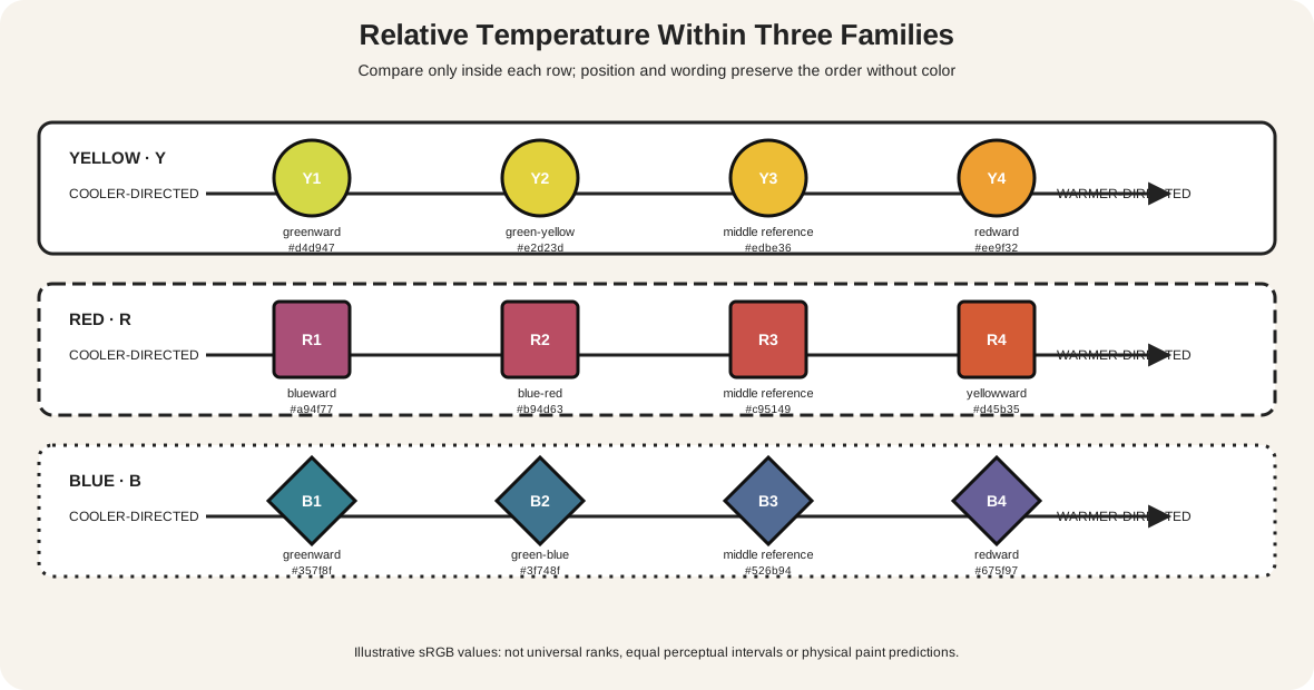
| Warm/cool relationship | Compare two candidate paints that lean in different hue directions | “Warm” and “cool” are relative to the colors beside them |
| Repeatability | Record full paint identities, ratio, medium, surface, tool, date, and dry state | A tube name alone may conceal a different pigment formula |
These are starting moves, not universal recipes. Make one change at a time, apply a sample, let it reach its stable state, and compare again.
Read the paint label before the color name
Begin by copying the manufacturer, range, tube name, and pigment code onto your chart. Colour Index codes identify pigment families: PW denotes a white pigment, PY yellow, PR red, PV violet, PB blue, PG green, PBr brown, and PBk black. The number narrows the identity further; for example, PW6 is titanium white and PB29 is ultramarine.[5]
This matters because two tubes called “primary red,” “cerulean hue,” or “sap green” may contain different pigments. One tube may be a single-pigment color while another may already combine several. Liquitex notes that mixing two multi-pigment tube colors can put many separate pigments into one result.[8] That is not automatically wrong, but it makes the mixture harder to diagnose and duplicate.
Also record the label's transparency or opacity marking. A transparent paint allows more light to pass through the film and return from the surface; an opaque paint hides more of what lies beneath.[1][8] Equal-looking dabs on a palette can therefore produce different effects when brushed thinly over white paper or layered over another color.
Make a six-paint mixing chart
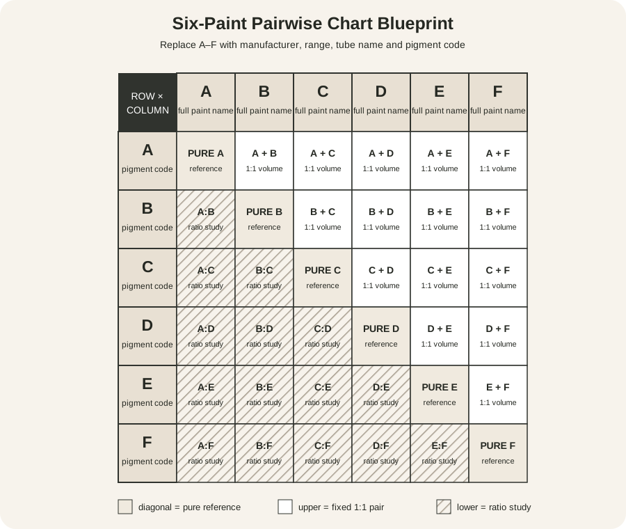
A six-paint chart creates 15 unique pairs, plus six unmixed reference samples. That is large enough to reveal useful behavior without turning into an unmanageable wall of swatches.
Replace A–F with the complete identities of six paints you actually own. Use the diagonal for each paint by itself. Use the upper triangle for one consistent pair test, such as 1:1 by volume. Reserve the lower triangle for something that answers a second question: unequal ratio ladders, thin versus thick application, a white-tint comparison, or a watercolor dilution range. Letters, pair names, borders and hatching repeat every distinction so the worksheet does not depend on color perception alone.[13]
Do not duplicate both halves of a symmetric grid unless you intend them to be identical. The unused half is valuable space for testing why the same pair can behave differently.
A repeatable chart method
- Choose one medium and one surface. Use the paper, ground, or panel you normally paint on. Mixing oil and watercolor results on one chart would make the comparisons ambiguous.
- Draw and label the grid first. Write the full paint identities along the top and left edges. Add the date and surface description.
- Make unmixed reference swatches. Apply each paint at a consistent full-strength thickness, then scrape or extend a thinner passage beside it. Golden calls these appearances masstone and undertone.[1]
- Choose a unit. A small palette-knife scoop, weighed amount, measured drop, or consistent brush load can work. The unit matters less than using it consistently and recording what it was.
- Mix away from the chart. Combine the measured units thoroughly on a clean palette, then apply the mixture with the same tool and film thickness used for neighboring cells.
- Clean between mixtures. A trace of a strong pigment can alter several later cells. Use separate rinse water where appropriate and wipe the palette and tool completely; Royal Talens likewise makes clean-brush discipline part of its chart method.[7]
- Let every sample dry or cure as the medium requires. Acrylic's water-based emulsion can make wet color appear lighter; some transparent acrylic colors dry markedly deeper.[1] Watercolor concentration and paper brightness also change the appearance of a wash.[6]
- Annotate the result. Note whether the mixture is lighter or darker than expected, high or low in chroma, transparent or covering, smooth or granulating, glossy or matte, and easy or difficult to control.
Photographing the chart can help with indexing, but keep the physical original. A camera, screen, ambient light, and display profile each mediate the color you see.
Why equal amounts do not look like a midpoint
Tinting strength is a paint's ability to change the character of another color.[1] Golden compares strength by adding the same amount of titanium white to different paints; its published tint charts use ten parts white to one part color.[2] A small amount of phthalo or quinacridone paint may dominate a much larger quantity of a weaker earth color.
That means 1:1 is a measurement midpoint, not necessarily a visual midpoint. Golden's chart guidance explicitly notes that a visually balanced middle mixture may require unequal quantities.[3] Use equal parts for a controlled comparison, then build a ratio ladder to find the range you need.
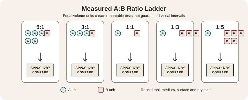
Start with five physical mixtures: 5:1, 3:1, 1:1, 1:3, and 1:5. Apply, dry, and label all five. If most of the visible change occurs between 1:3 and 1:5, add finer steps there rather than making arbitrary increments across the entire ladder. Introduce a powerful color into a weaker one little by little; it is easier to approach a target than to rescue a large pile that has overshot it.
For a white-tint comparison, keep the white and ratio fixed across several paints. Titanium white is generally more opaque and forceful than a transparent mixing white, so identify the exact white rather than writing only “+ white.” Golden uses 1:1 and 1:4 color-to-white tints as comparable wheel samples.[3]
Match a target by separating three questions
When a mixture is “wrong,” decide how it is wrong before adding more paint.
- Hue: Is it too red, yellow, green, blue, or violet relative to the target? Add the smallest useful amount of a paint that moves it in the needed direction.
- Value: Is it too light or too dark? Compare it with a neutral value scale if hue distracts you. Test the value correction separately, because white or black may also reduce chroma or shift hue.
- Chroma: Is it too intense or too muted? Lower chroma with a measured amount of a less intense paint or a near-opposing hue. Do not assume that every opposite pair makes the same neutral.
Mix a small sample, place it beside the target, and view both under the same light. A dab on a white palette often appears darker and more intense than the same mixture surrounded by colors in a painting. If possible, judge a test on the intended ground at the intended thickness.
Color bias helps when choosing starting paints. Winsor & Newton gives the practical example that different yellows mixed with different blues produce different greens; for the brightest mixture, select base colors whose biases lean toward each other.[4] If you want a subdued green, a less direct pair may be exactly right. “Clean” and “muddy” describe fitness for a purpose, not moral grades assigned to mixtures.
Variables a useful chart makes visible
Masstone and undertone
Masstone is the appearance of a paint applied densely enough to cover the surface. Undertone appears when the paint is spread thinly or extended over white.[1] A blue that looks almost black in masstone may reveal a green or violet direction in undertone. Record both before predicting its mixtures.
Single and multiple pigments
A single-pigment tube gives you a relatively direct test of one colorant in one binder. A convenience mixture may save time and be beautiful, but its components can pull a new mixture in several directions. Copy every printed pigment code so that an unexpected result can be traced.
Opacity, film thickness, and medium
An opaque yellow may cover a dark ground while a transparent yellow glows only when light returns through it. A thick and thin application of the same paint can look like two different colors. Added gloss, matte, glazing, or impasto medium changes the pigment concentration, surface, and light scattering. Keep those variables constant in the main matrix and test them deliberately in separate rows.
Wet and dry appearance
Do not make final corrections to a changing film. Acrylic may darken as its initially milky emulsion clears during drying.[1] Watercolor commonly lightens as the wash dries and water leaves the paper. Oil color can change in gloss or apparent depth as it sets. Your chart becomes predictive only when its samples are evaluated in the state in which the painting will be seen.
Watercolor, gouache, acrylic, and oil need different notes
For watercolor, use water concentration as a recorded variable. Daniel Smith recommends showing deep, middle, and light applications so transparency and granulation can be compared.[6] Use consistent paper, brush, water source, and stroke count; more water changes both concentration and how far pigment travels.
Gouache usually relies more on opaque body color. Record whether a light passage comes from white paint, added water, or both. Hill's Plums combines watercolor and gouache, a reminder that transparent and opaque passages can coexist on one sheet.[11]
For acrylic, work efficiently, keep tools from drying between cells, and reserve judgment until the samples are dry. For oil, record the medium and approximate film thickness, and allow enough time for the surface to settle before comparing sheen and depth. In either medium, do not add unmeasured medium to only some cells.
Diagnose common mixing problems
| Problem | Likely variable to inspect | Next controlled test |
|---|---|---|
| The mixture turned dull | Pigment choices, color bias, or too many component pigments | Repeat with two known single-pigment paints, then compare |
| One paint swallowed the other | Unequal tinting strength | Build smaller increments around the weaker paint |
| The dry sample is too dark | Wet–dry shift or film thickness | Apply a measured lighter test and compare only when dry |
| Every cell looks contaminated | Tool, rinse water, or palette residue | Refresh cleaning materials and repeat one reference pair |
| A mix cannot be repeated | Missing paint identity, ratio, or medium record | Rebuild one labeled ratio ladder with a fixed unit |
| The chart differs from the painting | Different ground, thickness, lighting, or surrounding colors | Put a new test on the intended ground beside the target |
| Adding white made it chalky | Strong opaque white reduced chroma and transparency | Test less white or a transparent mixing white identified by pigment code |
| Adding black shifted the hue | The black's own bias and strength affected the mixture | Test a dark chromatic pair and compare hue, value, and chroma separately |
Turn paintings into mixing questions
Do not try to reverse-engineer an artist's palette from a digital reproduction. Instead, use an artwork to define observable targets and then document your own experiments.
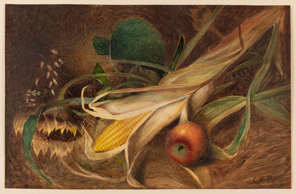
In Charles Ethan Porter's Still Life with Corn, select three visible families: the bright corn, the red-green apple, and the deep brown ground. For each, ask whether your first mixture misses mainly in hue, value, or chroma. Because the work is watercolor on paper, also test whether changing water concentration gets closer before adding white.[10]
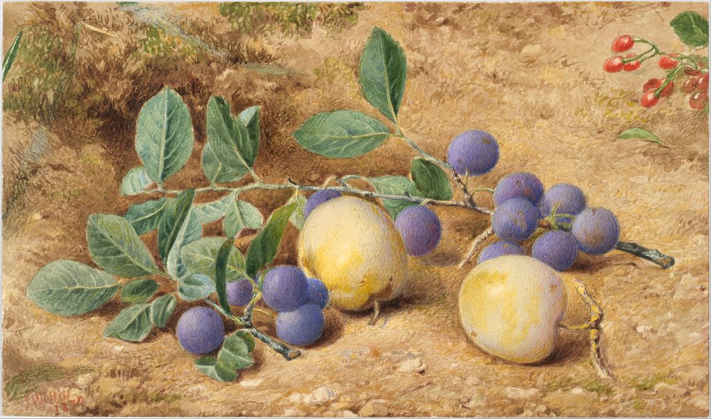
John William Hill's Plums includes watercolor, graphite, and gouache on off-white Bristol board. Compare the dark violet-blue fruit, pale yellow fruit, green leaves, and warm ground. Make one transparent test and one opaque test for a chosen family, then label the material difference rather than treating the two samples as interchangeable.[11]
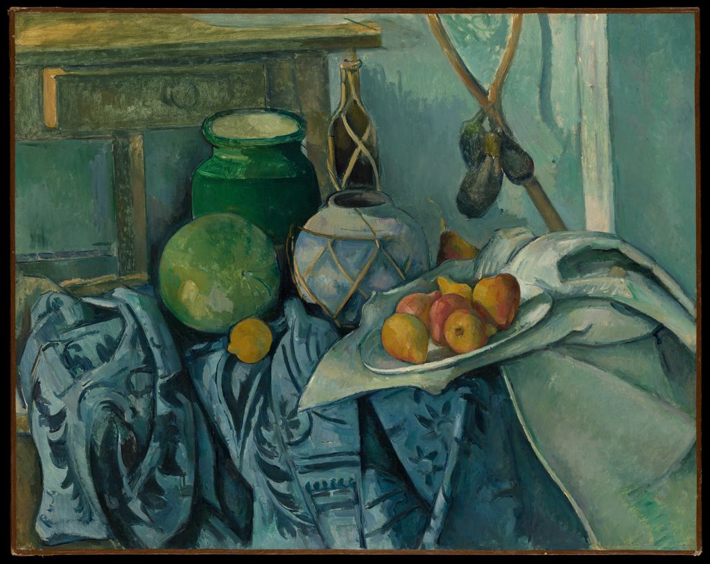
In Cézanne's oil Still Life with a Ginger Jar and Eggplants, the blue-green field is not one flat tube color. Identify at least four distinct passages: a light blue-green, a dark green vessel, a muted blue-gray cloth, and the near-black eggplants. Build separate ladders from the same base paints and record which adjustment changes value without pulling the hue too far.[12]
These exercises describe your mixtures and the present reproduction. They do not establish which pigments the artist used.
Work safely while making charts
Read every product label and safety data sheet before use. In the United States, covered art materials are reviewed for chronic hazards and carry an ASTM D-4236 conformance statement; materials that present hazards require cautionary labeling.[9] Follow the actual manufacturer's instructions for ventilation, skin contact, cleanup, storage, and disposal.
Do not use food utensils or eating surfaces. Avoid creating airborne pigment or sanding dried paint unless the product guidance and appropriate controls specifically permit it. Keep solvents closed when not in use, keep paint and rinse water away from children and pets, and follow local disposal rules. A hue name does not tell you whether a material is safe.
Watch: Color Mixing Chart for Artists through Formal Analysis
Choose a museum-led whole-work analysis, a close reading, or a foundations overview for considering color mixing chart for artists.
Introducing Formal Analysis: Landscape
Follow how recurring shapes, colours and intervals contribute to a larger visual organisation.
Watch on YouTubeFrequently Asked Questions
Record paint names and pigment codes, measured ratios, support or ground, application thickness, medium, drying time and observations.
Pigments differ in tinting strength, opacity, transparency and undertone, so equal volume does not imply equal visual influence.
Use the full product label and pigment code because different formulations sold under similar colour names can behave differently.
Arrange labelled source paints, make measured pair mixtures and ratio ladders, include tints where relevant, and assess fully dried samples.
Low chroma may follow from the pigments selected, too many components, unequal tinting strength, contamination, value shifts or the optical effect of the ground.
Discussion
Which recorded variable has made the biggest difference to the usefulness of your own mixing charts?
Reader Insights
Use a consistent tool rather than guessing from brush loads.
A colour name alone is not a repeatable specification.
Many materials shift in value, chroma or gloss as they dry.
Join the Conversation
Share one precise observation or a useful museum example below.
References
- Golden Artist Colors, “Color Mixing Guide.” https://goldenartistcolors.com/resources/color-mixing-guide
- Golden Artist Colors, “Strong and Weak Colors.” https://goldenartistcolors.com/resources/strong-and-weak-colors
- Golden Artist Colors, “Digital Resources: Making a Color Wheel.” https://goldenartistcolors.com/inspiration/digital-color-wheel
- Winsor & Newton, “Why does Winsor & Newton refer to colour bias rather than Munsell ratings?” https://www.winsornewton.com/en-ca/blogs/guides/colour-bias-versus-mansell-ratings
- Royal Talens, “Colour Index.” https://www.royaltalens.com/pages/colour-index
- Daniel Smith Artists' Materials, “How to make color mixing charts.” https://danielsmith.com/tutorials/color-mixing-charts-how-to-make-them-and-why/
- Royal Talens, “Colour mixing chart.” https://www.royaltalens.com/blogs/watercolour-paint/colour-mixing-chart
- Liquitex, “Acrylic Painting Terms.” https://eu.liquitex.com/blogs/acrylic-knowledge/acrylic-painting-terms
- US Consumer Product Safety Commission, “Art Materials.” https://www.cpsc.gov/business--manufacturing/business-education/business-guidance/art-materials
- The Metropolitan Museum of Art, “Charles Ethan Porter: Still Life with Corn.” https://www.metmuseum.org/art/collection/search/700610
- The Metropolitan Museum of Art, “John William Hill: Plums.” https://www.metmuseum.org/art/collection/search/11096
- The Metropolitan Museum of Art, “Paul Cézanne: Still Life with a Ginger Jar and Eggplants.” https://www.metmuseum.org/art/collection/search/435881
- W3C Web Accessibility Initiative, “Understanding Success Criterion 1.4.1: Use of Color.” https://www.w3.org/WAI/WCAG21/Understanding/use-of-color