by Tom Gurney
Tom Gurney BSc (Hons) is an art history expert with over 20 years experience
Page created on September 2, 2026 / Page updated on September 13, 2026
Email: tomgurney1@gmail.com / Phone: +44 7429 011000
Building a Three-Hue Fork without Losing Hierarchy
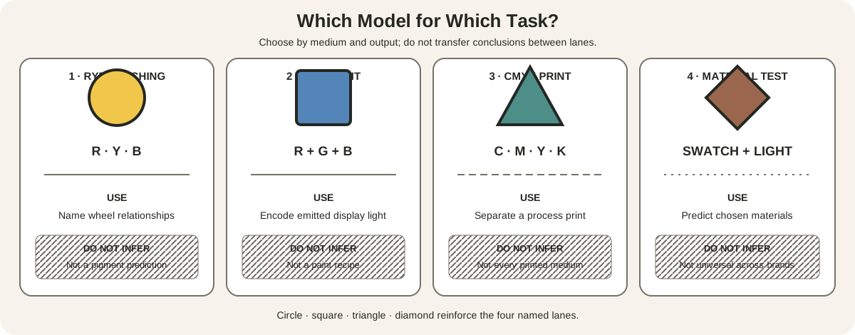
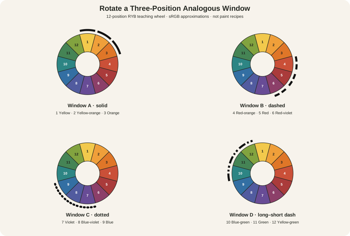
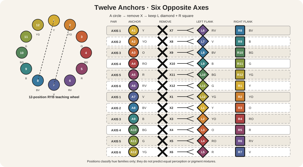
A split-complementary color scheme selects one anchor hue, finds its exact opposite on a declared color wheel, removes that opposite, and uses the two hues immediately beside it. On the 12-position RYB teaching wheel used here, a blue anchor does not pair with orange. It pairs with orange's neighbours: yellow-orange and red-orange.[1]
That rule selects hue families. It does not decide how much space each family occupies, which one leads, how light or vivid it is, or what happens in paint, pastel, glaze, print or light. Split-complementary is therefore a construction, not a promise that a work will be softer, balanced or harmonious.
At a Glance
- Core structureone anchor hue plus the two neighbours flanking its direct opposite on a declared wheel.
- This guidemaps all 12 anchors on a 12-position RYB teaching wheel.
- Not a guaranteethe triplet does not decide area, value, chroma, edge or dominance.
- Material limitwheel positions do not predict exact paint mixtures or printed output.
- Best testkeep the triplet fixed while varying area, value rank, chroma role and neutral support.
Contents
How to build the scheme exactly
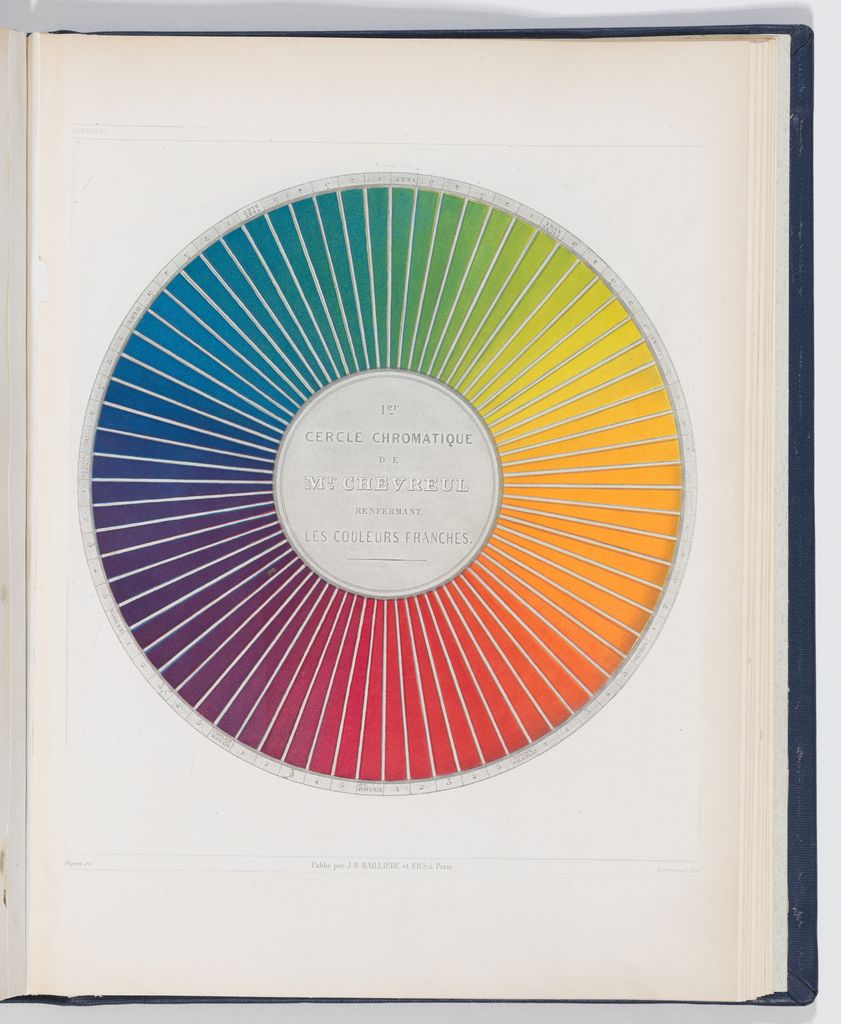
Use a wheel with its model and sequence written down. This page uses the site's 12-position RYB teaching wheel:
- yellow
- yellow-orange
- orange
- red-orange
- red
- red-violet
- violet
- blue-violet
- blue
- blue-green
- green
- yellow-green
Choose an anchor, marked A. Count six positions to its opposite, marked X. Exclude X. Select the immediate neighbour on each side of X, marked L and R. Sessions College gives the same structural definition: one color and the two adjacent tertiary colors of its complement.[1]
For blue, A9 leads to orange at X3; removing orange leaves yellow-orange L2 and red-orange R4. The final triplet is therefore blue, yellow-orange and red-orange. Naming the removed opposite matters. It prevents a common error in which orange is retained and one flank is added, producing a different structure.
The site's wheel construction guide explains the declared RYB model. University of Tennessee teaching material also distinguishes hue, value and intensity within a 12-position artist-wheel sequence.[2] Equal positions are a teaching convention, not equal perceptual distances or guarantees about mixtures.
All 12 split-complementary anchors
Every row follows A → remove X → keep L + R.
| Anchor A | Removed opposite X | Left flank L | Right flank R | Final triplet |
|---|---|---|---|---|
| 1 yellow | 7 violet | 6 red-violet | 8 blue-violet | yellow / red-violet / blue-violet |
| 2 yellow-orange | 8 blue-violet | 7 violet | 9 blue | yellow-orange / violet / blue |
| 3 orange | 9 blue | 8 blue-violet | 10 blue-green | orange / blue-violet / blue-green |
| 4 red-orange | 10 blue-green | 9 blue | 11 green | red-orange / blue / green |
| 5 red | 11 green | 10 blue-green | 12 yellow-green | red / blue-green / yellow-green |
| 6 red-violet | 12 yellow-green | 11 green | 1 yellow | red-violet / green / yellow |
| 7 violet | 1 yellow | 12 yellow-green | 2 yellow-orange | violet / yellow-green / yellow-orange |
| 8 blue-violet | 2 yellow-orange | 1 yellow | 3 orange | blue-violet / yellow / orange |
| 9 blue | 3 orange | 2 yellow-orange | 4 red-orange | blue / yellow-orange / red-orange |
| 10 blue-green | 4 red-orange | 3 orange | 5 red | blue-green / orange / red |
| 11 green | 5 red | 4 red-orange | 6 red-violet | green / red-orange / red-violet |
| 12 yellow-green | 6 red-violet | 5 red | 7 violet | yellow-green / red / violet |
The twelve anchor-labelled constructions sit around six opposite axes. They are not six interchangeable triplets. If yellow-orange becomes the anchor, its flanks are violet and blue; that does not reproduce blue's yellow-orange and red-orange set. Preserve the anchor label whenever the intended hierarchy matters.
Split-complementary versus related schemes
A complementary scheme keeps the anchor and its exact opposite: blue and orange on this wheel. Split-complementary removes orange and uses the two hues beside it. The split version has three named families, but that alone does not make it milder; large, vivid, similar-value fields can compete sharply.
An analogous scheme selects a short neighbouring run. Yellow-orange and red-orange flank orange, so the two split partners are related through that missing opposite. They are not a free-standing analogous palette detached from the blue anchor.
A triadic scheme selects three approximately equal intervals. On this wheel, blue, red and yellow are four positions apart. Blue, yellow-orange and red-orange instead form a fork around the opposite axis. The triadic color scheme guide develops that equal-interval geometry, while the color-harmony overview compares the scheme families without treating any one as an aesthetic verdict.
The same triplet can make different pictures
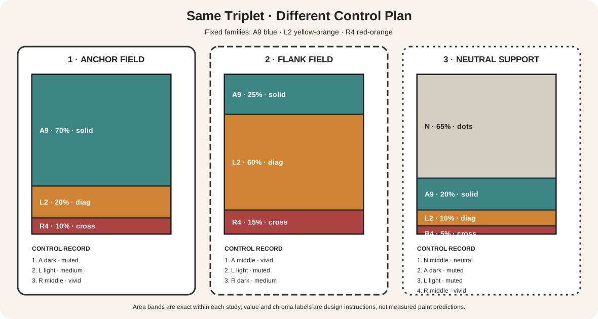
The diagram holds three families fixed: A9 blue, L2 yellow-orange and R4 red-orange. Only control plans change.
| Study | Area plan | Value plan | Chroma plan | Likely structural reading |
|---|---|---|---|---|
| 1: anchor field | A 70%, L 20%, R 10% | A dark; L light; R middle | A muted; L medium; R vivid | broad blue field with a concentrated red-orange accent |
| 2: flank field | L 60%, A 25%, R 15% | L light; A middle; R dark | L muted; A vivid; R medium | warm field interrupted by a cooler blue role |
| 3: neutral support | neutral 65%, A 20%, L 10%, R 5% | neutral middle; A dark; L light; R middle | A and L muted; R vivid | sparse three-family events on an active ground |
None is the correct split-complementary composition. Each is a testable plan. A hue selection can remain identical while dominance, focus and legibility change. Getty's formal-analysis framework separates hue, value and intensity and asks how they operate with the rest of a composition.[5] Josef Albers's experimental approach likewise makes comparison more useful than an isolated formula.[6]
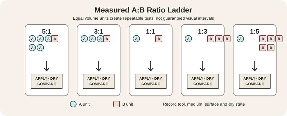
Make these studies at thumbnail scale before enlarging a work. If they are painted, label and dry them. If they are digital, save the exact color values and profile. Do not silently shift a family while claiming that only area changed.
A practical paint workflow
First choose actual paints, support and intended lighting. Match each paint approximately to one of the three declared hue families, but keep its product name on the record. Golden notes that pigments differ in opacity and undertone; an ideal wheel location cannot predict a tube's behaviour.[3]
Then prepare a small card for each family:
- Apply the paint at useful working thickness and as a thinner passage.
- Mix a value ladder without changing more variables than necessary.
- Make one lower-chroma version and record how it was produced.
- Place every sample against the intended ground.
- Let the samples dry and record any shift in value, chroma or gloss.
Arrange the dried cards in the intended area proportions. Start with one dominant family, one support and one smaller accent; this is a trial, not a law. If the three roles fight, diagnose the control. Reduce the area or chroma of a flank, increase value separation, introduce a neutral interval, or change where hard edges occur. Do not change the selected hue families until you have identified what the first trial actually failed to do.
Mixtures between opposing regions may neutralize, but the outcome depends on the pigments and ratio. The site's color-mixing chart separates wheel prediction from material evidence, and its three-property color diagnostic helps isolate what changed.
A practical digital workflow
Declare the working color space before copying angles. CSS HSL is an encoding tied to sRGB calculations; it is not the RYB teaching wheel and is not perceptually uniform.[4] A 30-degree move in one model does not automatically mean one named RYB step in another.
Begin with named family targets, then choose digital colors by eye and by output testing. Record hex or component values only after deciding what role each family performs. Build three artboards with the same stored swatches and different area plans. Add a grayscale proof to test value grouping and a low-chroma proof to see whether layout survives without vivid accents.
Finally test the real destination. Wide-gamut display, ordinary sRGB display, office print and commercial CMYK can reproduce the same file differently. The Metropolitan Museum of Art describes capture, editing, profiles and output gamut as mediation layers in artwork reproduction.[7] Keep an exported proof with the source file and avoid presenting a screen sample as a pigment identification.
How to tell whether a palette qualifies
Ask four questions in order:
- Which wheel or color system is being used?
- Which hue is the anchor?
- What is the anchor's exact opposite?
- Are the other two selected families the immediate neighbours of that opposite?
If question one is unanswered, the geometry is ambiguous. If the opposite remains, the palette may be complementary plus an extra hue. If only one flank is present, the structure is incomplete. If the partners are equally spaced from the anchor, test for a triad instead.
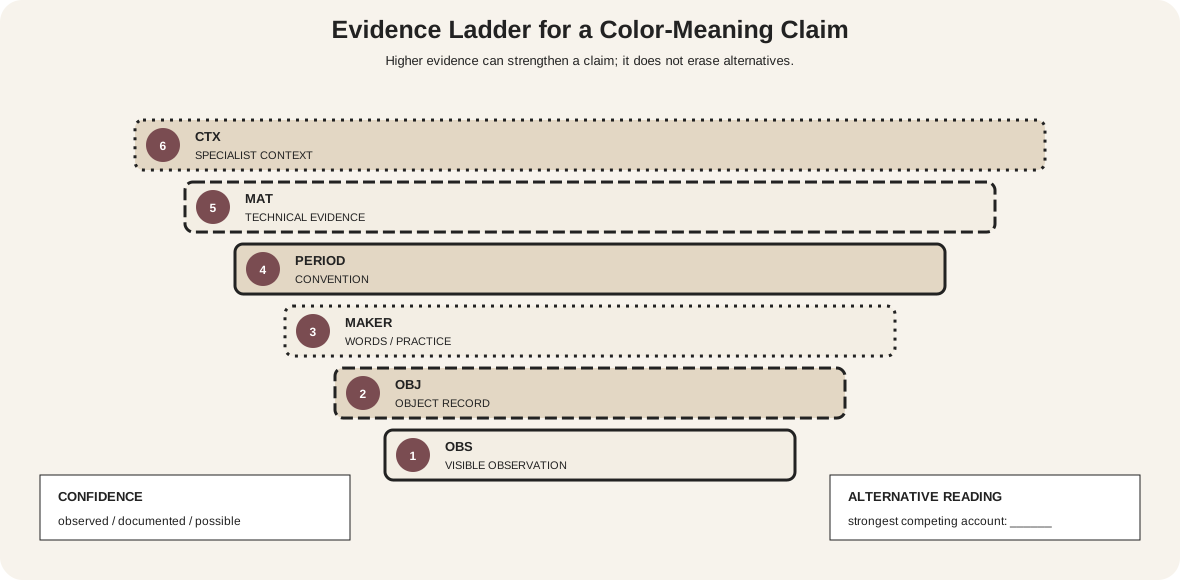
Real artworks rarely contain only three flat colors. Count structural families rather than every reflected, mixed or incidental patch. State the scale of the claim: “the central figure group approximates a red / blue-green / yellow-green fork” is more defensible than forcing the entire object into three swatches.
Blue and warm flanks on a maiolica bowl
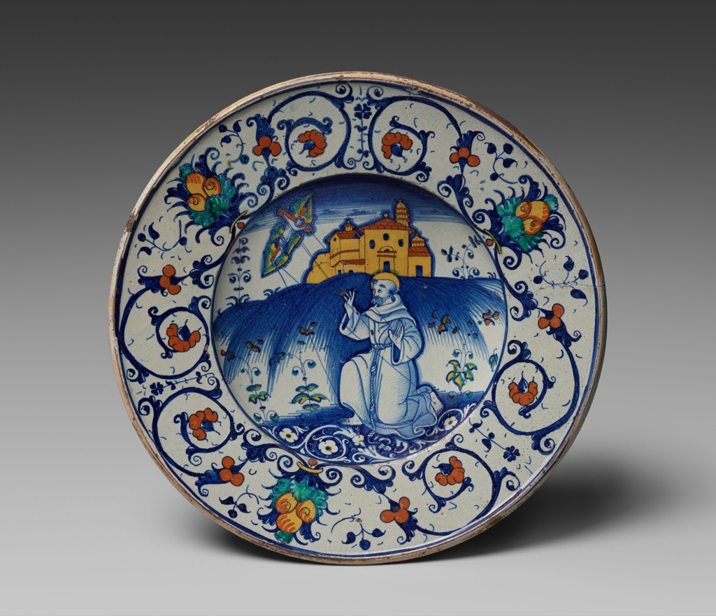
This Bowl Depicting Saint Francis Receiving Stigmata was made in Deruta, Italy, in 1531. The Cleveland Museum of Art records it as tin-glazed earthenware and releases its image under CC0.[8]
In the museum reproduction, blue drawing occupies the landscape, figure contours and scrolling border. Orange-red flowers and yellow-orange architecture and fruit punctuate the pale ground. On the declared wheel, that can be read as a blue anchor with the two flanks of orange.
The claim is observational. The museum does not state that the maker followed a modern split-complementary system. White glaze, small green leaves, object curvature, firing and the distribution of ornament all exceed the three-family diagram. The scheme is useful because it directs attention to role and recurrence, not because it replaces the material history.
Unequal roles in Renoir's pastel
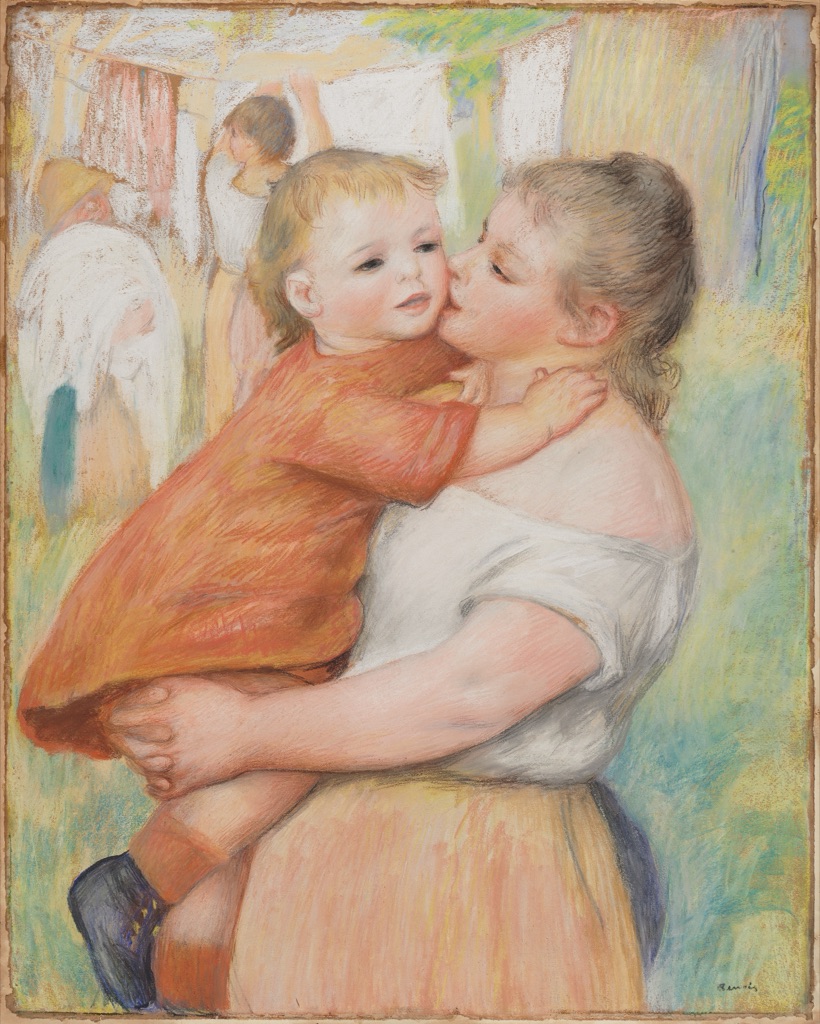
Pierre-Auguste Renoir's Laundress and Her Child (Aline and Pierre), made about 1886, is pastel on brown paper. Cleveland describes warm orange and yellow against cool blues and greens, and explains that irregular pastel particles produce a velvety brilliance through diffuse reflection.[9]
The child's orange-red garment is a large, concentrated warm shape. Blue-green and yellow-green strokes appear through the outdoor surround, while pale clothing and exposed brown paper create quieter intervals. Read at a broad family level, this approaches a red-orange anchor split by the neighbours of blue-green.
It is not a clean three-chip demonstration. Flesh, gray, white reserve, yellow passages and support remain essential. Nor does the record establish the painter's use of the scheme. The example instead shows why area, material and ground must accompany any retrospective palette label.
A restrained fork in Miller's watercolor
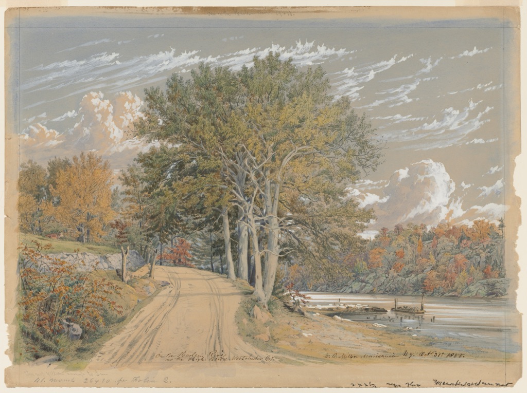
William Rickarby Miller's On the Harlem River dates to 1855. The museum identifies watercolor with gouache over graphite and describes its autumn color and light effects.[10]
The reproduction distributes low-chroma blue and blue-gray through sky and water. Yellow-orange and red-orange passages gather in the foliage. That relationship approximates the blue-anchor construction, but broad gray, beige and green regions prevent a pure split-complementary classification.
This is precisely why the example is useful. A scheme can organize selected passages without accounting for every color. The pale paper, graphite drawing, white gouache and restrained chroma also make this reading materially unlike the glossy bowl, even though the family names overlap.
Diagnose common failures
| Symptom | Likely cause | Controlled next test |
|---|---|---|
| The palette is really complementary plus one | the exact opposite was not removed | label X and rebuild from its two neighbours |
| All three colors compete | area, value and chroma are too similar | keep hues fixed; mute or shrink one role |
| One flank disappears | it is too close in value or too scarce | increase value separation or repeat it strategically |
| Paint turns dull at boundaries | wet mixtures or pigment properties are neutralizing | separate layers, dry first, or change edge handling |
| Digital and print versions disagree | profiles or gamut were ignored | proof in the destination profile and revise values |
| The label fits only sampled pixels | reproduction and object evidence were conflated | state the file, region, model and level of inference |
| The diagram fails without color | roles depend only on hue | add A/L/R labels, numbers, shapes and patterns |
Make the scheme readable without hue alone
W3C guidance requires information not to depend on color as the sole cue.[11] In a wheel, print every hue name and position. Give the anchor, left flank, right flank and removed opposite different letters and shapes. In comparison panels, label areas and value ranks rather than asking a viewer to infer them from fills.
Check grayscale and common color-vision simulations, but do not treat simulation as the only test. The construction should remain recoverable from text and geometry when all fills are removed. For ordinary-size explanatory copy, maintain at least the standard 4.5:1 contrast ratio.[12]
Watch: Split-Complementary Colors through Formal Analysis
Choose a museum-led whole-work analysis, a close reading, or a foundations overview for considering split-complementary colors.
Introducing Formal Analysis: Landscape
Follow how recurring shapes, colours and intervals contribute to a larger visual organisation.
Watch on YouTubeFrequently Asked Questions
It combines one anchor hue with the two hues that flank its direct opposite on a declared colour wheel.
Locate the anchor, find its exact opposite, then select the immediate neighbour on each side of that opposite.
No. A triadic scheme uses three evenly spaced positions; a split-complementary scheme replaces one opposite with its two flanks.
No. Area, value, chroma, edge, repetition, material and subject determine the visible hierarchy.
Use identified pigments, make measured swatches and mixtures, assign unequal roles, and assess fully dried samples on the intended ground.
Discussion
Which example on this page gives the three hues the most unequal roles, and what makes that hierarchy legible?
Reader Insights
Anchor, removed opposite and two flanks should be named.
A dominant, support and accent often clarify the scheme.
Real paint and output conditions can shift every relationship.
Join the Conversation
Share one precise observation or a useful museum example below.
References
- Sessions College, “Color Wheel and Color Calculator.” https://www.sessions.edu/color-calculator/
- University of Tennessee Institute of Agriculture, “Clothing and Textiles Project Area Guide.” https://utia.tennessee.edu/publications/wp-content/uploads/sites/269/2023/10/W885.pdf
- Golden Artist Colors, “Color Wheel.” https://goldenartistcolors.com/resources/color-wheel
- W3C, “CSS Color Module Level 4.” https://www.w3.org/TR/css-color-4/
- J. Paul Getty Museum, “Understanding Formal Analysis.” https://www.getty.edu/education/teachers/building_lessons/formal_analysis.html
- Yale University Press, “Interaction of Color.” https://yalebooks.yale.edu/book/9780300146936/interaction-of-color/
- The Metropolitan Museum of Art, “On Color Fidelity.” https://www.metmuseum.org/perspectives/color-photography-standards-van-gogh-sunflowers
- Cleveland Museum of Art, “Bowl Depicting Saint Francis Receiving Stigmata.” https://www.clevelandart.org/art/1988.95
- Cleveland Museum of Art, “Laundress and Her Child (Aline and Pierre).” https://www.clevelandart.org/art/1977.167
- Cleveland Museum of Art, “On the Harlem River.” https://www.clevelandart.org/art/1997.6
- W3C Web Accessibility Initiative, “Understanding SC 1.4.1: Use of Color.” https://www.w3.org/WAI/WCAG21/Understanding/use-of-color
- W3C Web Accessibility Initiative, “Understanding SC 1.4.3: Contrast (Minimum).” https://www.w3.org/WAI/WCAG22/Understanding/contrast-minimum.html