by Tom Gurney
Tom Gurney BSc (Hons) is an art history expert with over 20 years experience
Page created on September 2, 2026 / Page updated on September 13, 2026
Email: tomgurney1@gmail.com / Phone: +44 7429 011000
How Separate Marks Combine—or Stay Distinct—in Viewing
Optical color mixing occurs when separate colored marks are perceived together as a combined field. The paint remains divided on the surface: a blue dash is still beside a yellow dash. What changes is the viewer's reading as the marks become small enough, distant enough or densely repeated enough to integrate.
That definition describes a relationship among surface, mark and observer—not a magic property of dots. A useful account therefore names the materials, dimensions, viewing conditions and evidence. “It mixes in the eye” is a starting point; the practical question is when, how strongly and with what visible remainder of the separate marks.
At a Glance
- Core operationseparate colour marks contribute to a combined appearance at a stated viewing distance.
- Keep separateoptical mixture is not the same as premixed paint, glaze or emitted-light addition.
- Main variablesmark size, spacing, proportion, edge, contrast, surface and distance.
- Historical carePointillism, Divisionism and Neo-Impressionism overlap but are not interchangeable labels.
- Best testcompare the same two fields from recorded near, middle and far positions.
Contents
Keep four operations separate
Optical mixture is easiest to understand beside processes it is often confused with.
| Operation | What is physically present | What to test |
|---|---|---|
| separated-mark optical mixture | adjacent patches remain materially separate | mark scale, spacing and viewing distance |
| physical paint mixture | colorants are combined before or during application | pigment identity, ratio, film thickness and drying |
| transparent layering | light passes through or reflects among superimposed films | layer order, transparency, ground and thickness |
| simultaneous contrast | a color's appearance changes with its surround | fixed sample against controlled contexts |
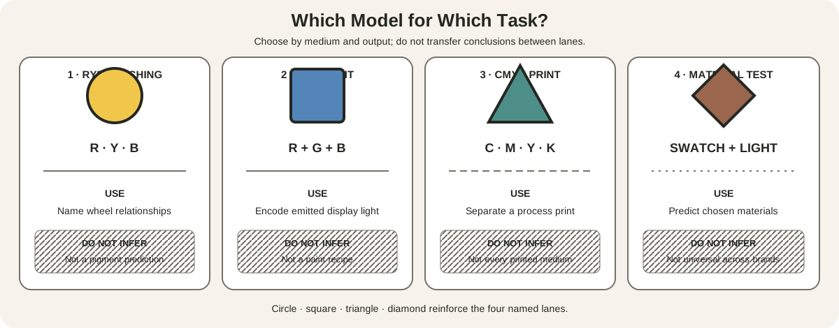
Projected colored lights and screen channels form another system. They can produce an additive result, but that does not turn adjacent oil-paint strokes into little lamps. The separate strokes are material surfaces reflecting light. A screen photograph of them is a new encoded image. The dedicated additive and subtractive color guide owns the full comparison; here the boundary prevents a material error.
Physical and optical mixtures can also appear in the same painting. An artist may blend a violet on the palette, place it beside orange and then break both passages with smaller marks. Describe each local operation instead of assigning one mechanism to the whole work.
The National Gallery of Art defines optical mixing through small dabs that appear to blend when seen from a distance, as distinct from intermediate tones mixed on the palette.[1] Its longer Neo-Impressionism guide describes paints applied straight from the tube and integrated in perception.[2] Those accounts support the core distinction without promising that every pair produces a brilliant or predictable third color.
Pointillism, division and Neo-Impressionism
Pointillism describes the use of points or small dots. Getty's controlled vocabulary notes both a Pointillist style and the narrower dot-or-short-dash technique, while acknowledging that scholars distinguish the two.[7] Neo-Impressionism names the historical movement and its broader effort to systematize color, tone and line.
The NGA guide reports that Georges Seurat preferred “divisionism” or “chromo-luminisme” to “Pointillism.”[2] This matters because a count of dots cannot summarize the method. Direction, interval, size, value, coverage and the larger composition all participate.
MoMA describes Seurat applying pure color in small dabs rather than blending it on a palette and placing complementary hues adjacently so they coalesced for the viewer.[3] His followers did not all make identical marks. Dots, short strokes, blocks and directional touches can preserve division. Conversely, an image with stippling may use small marks for modeling or texture without pursuing optical mixture.
Use the historical labels precisely:
- call a work Neo-Impressionist when reliable art-historical evidence supports that classification;
- call the handling pointillist when the surface is built from points or small dabs;
- describe an optical-mixture effect only when separate colors and a distance-dependent integration can be observed or documented;
- avoid treating every Impressionist broken stroke as a scientific color demonstration.
Mark scale and viewing distance
There is no universal distance at which marks “become one.” Their apparent size changes with both physical width and viewing distance. A one-millimetre dash in a postcard-sized study and a five-centimetre tile in a mural can occupy comparable visual roles from very different positions.
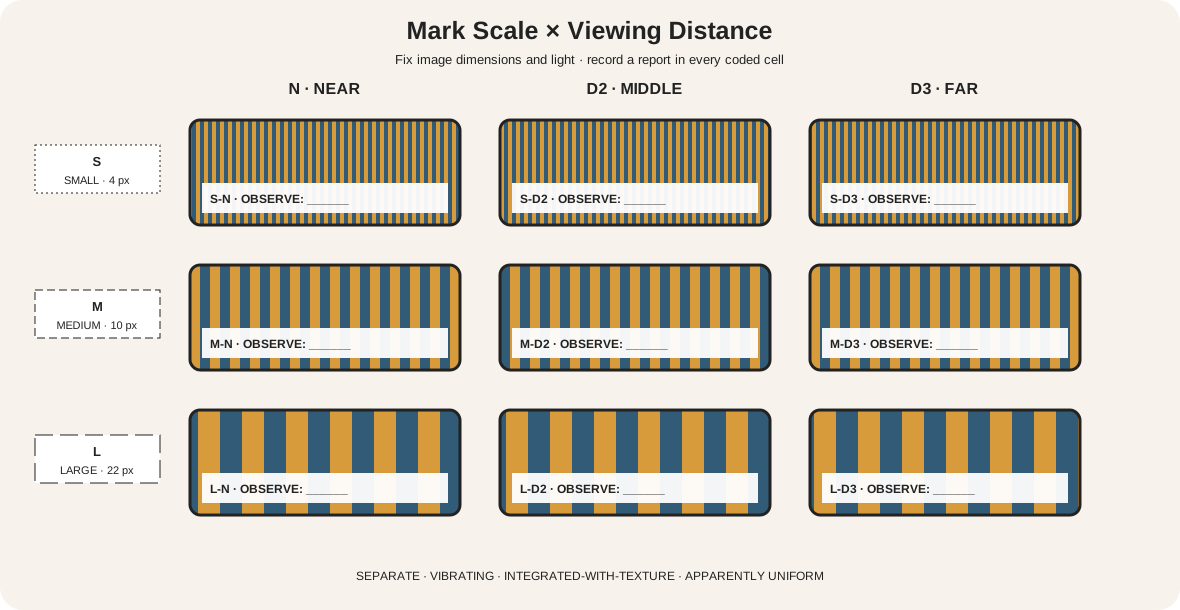
The matrix uses three fixed mark widths—small S, medium M and large L—crossed with three viewing states: near N, middle D2 and far D3. Every cell is an observation, not a forecast. Record one of four readings:
- separate: A and B are easily identified as individual marks;
- vibrating: the boundary activity dominates while both components remain legible;
- integrated-with-texture: a combined field is readable, yet the divided surface persists;
- apparently uniform: the components are difficult to resolve under the stated condition.
Do not substitute metres for the viewing labels until the work has a fixed size. For a studio panel, mark the floor at measured intervals. For a book or screen study, keep the image dimensions constant and measure eye-to-image distance. If the display is resized, start a new record.
The observer is part of the condition. Vision correction, acuity, illumination, glare and attention can alter the transition. Several viewers may report different thresholds without any of them being “wrong.” The point of the matrix is reproducibility: another person can repeat the same geometry and compare a report.
Build a controlled two-field study
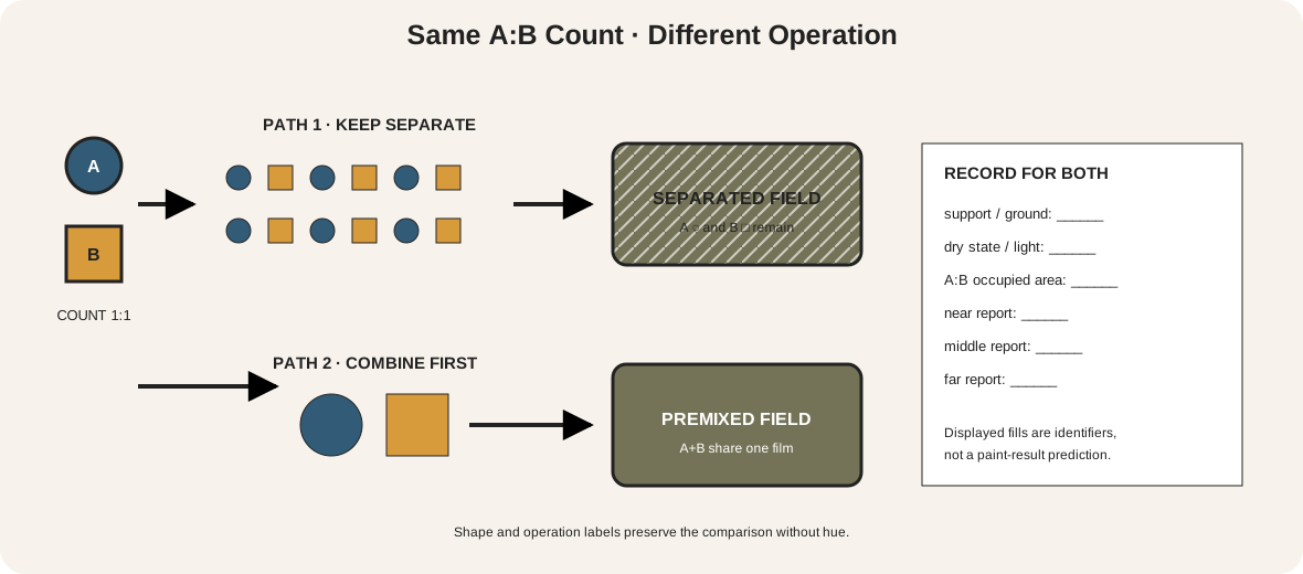
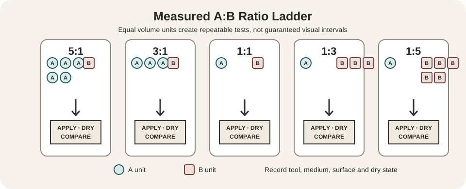
Prepare two equal rectangles on the same support. Choose named colorants A and B, then decide a counted coverage ratio such as one A mark for one B mark. In the separated field, alternate the marks without overlap. In the premixed field, combine the same counted amounts thoroughly before application.
Keep the comparison disciplined:
- use the same support and ground;
- keep total covered area approximately equal;
- use consistent paint thickness and tool pressure;
- let both fields reach the same dry state;
- record mark width, gap width and A:B count;
- observe under one named light at three distances;
- photograph only after the direct observation has been written.
The two fields need not match. That difference is the lesson. Physical mixing changes which colorants share the film, while separation preserves local reflections and many boundaries. A divided field may look livelier, lighter, darker or simply more textured. Those are observations for the chosen pair, not rules for all pigments.
Run a second sheet with the same colors but a different ratio—perhaps two A marks for every B mark. Then change mark size while preserving ratio. This separates three questions that are often collapsed: what colors are present, how much area each occupies and whether the components remain resolvable.
The site's color-mixing protocol provides the recording structure for physical mixtures. Use the HVS guide to describe changes in family, lightness and intensity without calling every subdued result “gray.”
Variables that change the reading
Coverage ratio strongly affects the dominant field. Equal mark counts do not guarantee equal visible area if one stroke spreads farther. Measure the occupied area or use a fixed stencil.
Value contrast controls edge visibility. A dark-light pair can retain a flickering texture after hue distinctions weaken. Match value when the goal is to study hue integration; deliberately separate value when the goal is structural vibration.
Mark geometry includes width, length, direction and spacing. Parallel strokes can imply flow; scattered points can distribute activity evenly; clustered marks can make local mixtures while preserving larger boundaries. A single average mark size hides these differences.
Surface and film matter. Canvas weave, paper tooth, gloss, impasto and exposed ground interrupt coverage. A pale ground entering every interval becomes a third visual component, even if the artist loaded only two paints.
Illumination changes the available reflected light and may add glare or shadow across raised paint. Record the lamp, daylight condition and viewing angle. Do not compare a raking-light close-up with a softly lit distant view as if only distance changed.
Surround and composition affect interpretation. The same divided patch can read as sky, water, fabric or an abstract field because edges and neighboring areas organize it. The controlled-context exercise in the color theory guide isolates surround effects; those effects should not be used as a synonym for spatial integration.
Louis Hayet: a pale field built from many strokes
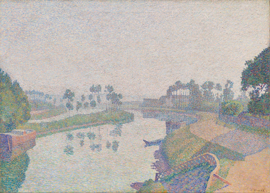
Louis Hayet painted Banks of the Oise at Dawn in 1888. Cleveland identifies him as an early Neo-Impressionist practitioner and describes the method as small strokes or dots that visually blend from a distance.[4]
The museum specifically names pink, orange, blue, yellow and green strokes in the pale sky and its river reflection. In the reproduction, these marks are easiest to distinguish along the trees, bank and lower-right foreground. Farther back, repeated light strokes organize broad atmosphere while darker clusters hold the banks and figures.
The work does not resolve into one flat average. Some zones integrate more readily than others because mark density, contrast and subject structure vary. That unevenness is useful: optical mixing can be local and graded across a painting.
Hayet's gray-tone color-chart interest, recorded by the museum, also warns against a simplistic “pure primaries make bright light” story. Pale and grayed notes are part of the orchestration. The evidence supports a distance-dependent method, not a claim that every visible color is unmixed tube paint.
Henri-Edmond Cross: coalescence and retained grain
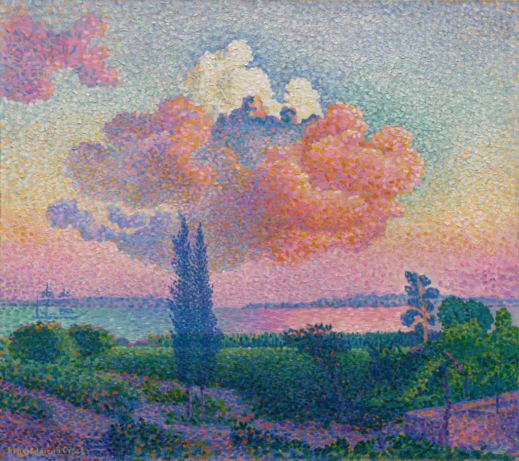
Henri-Edmond Cross made The Pink Cloud around 1896. Cleveland records that after settling at Saint-Clair he adopted Pointillism, applying small dots or dashes of complementary colors that mix in the beholder's eye.[5]
At whole-image scale, the pink cloud reads as a large illuminated mass above a darker band of land. Closer inspection reveals orange, yellow, violet, blue and rose touches distributed through it. The pale surrounding sky uses smaller, quieter strokes; the foreground carries denser dark greens, blues and warm accents; two cypress shapes retain strong silhouettes.
The composition therefore manages two scales at once. The cloud, water and terrain must cohere from farther away, while the close surface remains materially busy. The dark cypresses and horizon prevent the optical field from dissolving all structure.
Compare the cloud's center, edge and neighboring sky separately. The center can integrate as a pink mass while the edge becomes a mosaic and the surrounding strokes remain a light field. “The painting mixes optically” is less informative than identifying where each state occurs.
William Wood: why small marks are not enough
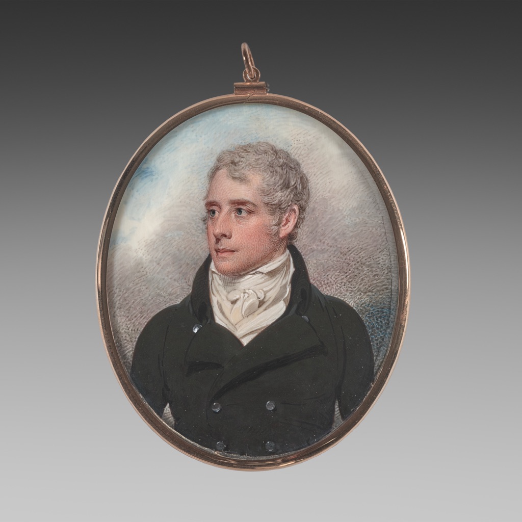
William Wood's Portrait of Sandford Peacocke is a watercolor miniature on ivory from 1801. Cleveland describes Wood's distinctive network of small dots and dashes following the contours of a sitter's face.[6]
Those marks model cheek, forehead, hair and background at an intimate scale. They may integrate during normal viewing, but the object record does not frame the work as Neo-Impressionist or as an optical-color experiment. It predates the movement by decades.
This is a necessary counterexample. Smallness, repetition and visual integration can serve modeling, texture and delicate transitions. To call every stippled surface Pointillist would erase historical context; to claim optical-mixture intent would exceed the evidence.
Describe what can be seen: contour-following strokes, distributed flesh tones, dark clothing and pale ground. Then separate that observation from any assertion about theory or artistic purpose.
Reproduction can manufacture or erase mixture
The Metropolitan Museum of Art explains that capture, color profiles, editing, gamut and output conditions all mediate a digital reproduction.[8] Optical-mixing works add a spatial problem: resizing may average neighboring source pixels, sharpening may exaggerate boundaries and compression may introduce new blocks.
Use three image records when possible: the complete work at stable dimensions, a labelled detail and the museum's object page. Never enlarge a small thumbnail and call the resulting pixels original brushwork. A monitor also emits encoded RGB light; its display behavior is not proof that the original pigments mixed additively. CSS Color defines digital color spaces and their gamut boundaries, which helps describe the screen representation without identifying paint.[11]
For a digital exercise, make a fixed grid of alternating A/B shapes and save it losslessly. View it at 100 percent, then at recorded smaller sizes. If resampling creates a flatter field, state that the software has combined pixel information. That is evidence about reproduction scale, not about a physical canvas.
For print, note printer, paper and screening. Printed dots may overlay another spatial pattern on the photographed marks. Judge the artwork's method from direct examination or authoritative technical records when available.
Diagnose common failures
| Symptom | Probable cause | Controlled next step |
|---|---|---|
| marks never integrate | they remain too large or too widely spaced | repeat at a smaller scale before changing color |
| field becomes an unwanted dark vibration | value contrast is dominating | make a value-matched pair |
| one color overwhelms the other | visible area or tinting strength is unequal | measure coverage and test a new ratio |
| close study works but mural fails | scale and viewing geometry changed | rebuild the distance matrix at final dimensions |
| photo looks smoother than painting | resizing or capture averaged detail | compare a lossless 100-percent crop with direct view |
| “pointillist” label feels uncertain | dots were mistaken for historical evidence | check museum classification and object scholarship |
| diagram fails in grayscale | color alone carries A/B identity | retain symbols, patterns and printed coordinates |
Make the evidence accessible
Color must not be the only way a diagram communicates identity or state.[9] Label A and B inside the marks, distinguish them by circle and bar shapes, print ratios, and give every matrix cell a row-and-column code. Adjacent prose should contain the complete procedure.
Test the diagrams in grayscale and under protanopia, deuteranopia and tritanopia simulations. These checks do not predict every observer's experience; they expose avoidable reliance on hue. Explanatory text should meet the 4.5:1 contrast baseline for normal-sized text.[10]
Artwork alt text should describe composition, mark distribution and the evidence relevant here without pretending to reproduce the color experience. Captions must identify creator, title, date, medium, institution and accession.
Watch: Optical Color Mixing through Formal Analysis
Choose a museum-led whole-work analysis, a close reading, or a foundations overview for considering optical color mixing.
Introducing Formal Analysis: Landscape
Follow how recurring shapes, colours and intervals contribute to a larger visual organisation.
Watch on YouTubeFrequently Asked Questions
It occurs when separate colour marks contribute to a combined appearance in viewing while remaining physically distinct on the surface.
No. Premixed paint combines colourants before application; optical mixing depends on separate marks and viewing conditions.
No. Small dots may remain distinct, coalesce partly or serve modelling and texture depending on scale, spacing, contrast and distance.
Make separated and premixed comparison fields with controlled proportions, then record observations from fixed near, middle and far distances.
Yes. Resampling, compression, screen pixels, zoom and print resolution can manufacture or erase apparent mixtures.
Discussion
Which example on this page changes most between near and far viewing, and which mark variable drives the change?
Reader Insights
Separate marks, premixed paint, glaze and emitted light are different processes.
Optical effects are observer- and scale-dependent.
Digital resizing can alter the very evidence being studied.
Join the Conversation
Share one precise observation or a useful museum example below.
References
- National Gallery of Art, “Picturing France: Classroom Guide.” https://www.nga.gov/sites/default/files/migrate_images/content/dam/ngaweb/education/learning-resources/teaching-packets/pdfs/pic_france_classroom.pdf
- National Gallery of Art, “Picturing France 1830–1900.” https://www.nga.gov/content/dam/ngaweb/Education/learning-resources/teaching-packets/pdfs/picturing_france.pdf
- Museum of Modern Art, “Georges-Pierre Seurat.” https://www.moma.org/collection/artists/5358
- Cleveland Museum of Art, “Banks of the Oise at Dawn.” https://www.clevelandart.org/art/2019.18
- Cleveland Museum of Art, “The Pink Cloud.” https://www.clevelandart.org/art/2020.106
- Cleveland Museum of Art, “Portrait of Sandford Peacocke.” https://www.clevelandart.org/art/1942.1159
- Getty Art & Architecture Thesaurus, “Pointillist (style).” https://www.getty.edu/vow/AATFullDisplay?subjectid=300419441
- The Metropolitan Museum of Art, “On Color Fidelity.” https://www.metmuseum.org/perspectives/color-photography-standards-van-gogh-sunflowers
- W3C Web Accessibility Initiative, “Understanding SC 1.4.1: Use of Color.” https://www.w3.org/WAI/WCAG21/Understanding/use-of-color
- W3C Web Accessibility Initiative, “Understanding SC 1.4.3: Contrast (Minimum).” https://www.w3.org/WAI/WCAG22/Understanding/contrast-minimum.html
- W3C, “CSS Color Module Level 4.” https://www.w3.org/TR/css-color-4/