by Tom Gurney
Tom Gurney BSc (Hons) is an art history expert with over 20 years experience
Page created on September 3, 2026 / Page updated on September 13, 2026
Email: tomgurney1@gmail.com / Phone: +44 7429 011000
How Distance Softens Colour, Contrast and Detail
Aerial perspective, also called atmospheric perspective, is the use of gradual changes in tone, colour, contrast, clarity, and detail to make distance visible on a flat surface.[1] Nearby forms often appear more distinct and strongly contrasted; farther forms may look paler, softer, cooler, or less saturated because they are seen through more atmosphere. Artists can observe these effects, exaggerate them, combine them with other depth cues, or deliberately refuse them.
The word “aerial” can be misleading. Aerial perspective does not mean a bird's-eye or overhead viewpoint. A painting made from ground level can use atmospheric recession, while a view from above can remain crisp from foreground to horizon. The term describes how represented atmosphere changes spatial relationships, not where the imagined viewer stands.[1]
Nor is it a rule that every distant object must become blue. Haze, moisture, dust, smoke, illumination, local colour, and the artist's purpose all affect what happens. A warm sunset may merge distant forms into glowing orange; ink painters may create depth through pale washes and blank mist; a printmaker may retain hard outlines while reducing tonal separation. Aerial perspective is best recognised as a pattern of relationships across the image rather than a fixed colour formula.
At a Glance
- Core effectdistant forms become paler, lower in contrast and less detailed.
- Main evidencevalue, colour, saturation, edge clarity and texture.
- Strongest settingslandscapes, harbours, weather and layered terrain.
- Works withoverlap, scale, placement and linear perspective.
- Important limitatmospheric change varies with light and weather, and artists may exaggerate or suppress it.
Contents
How atmospheric depth works
Look first for a sequence from near to far. Foreground shapes may have dark accents, visible textures, sharp boundaries, and a broad range from light to dark. In the middle distance, small details often group into larger masses. Farther away, adjacent values may draw closer together, outlines may weaken, and colour differences may narrow. These changes help the eye read layers of space even when no straight architecture is present.[1][3][4]
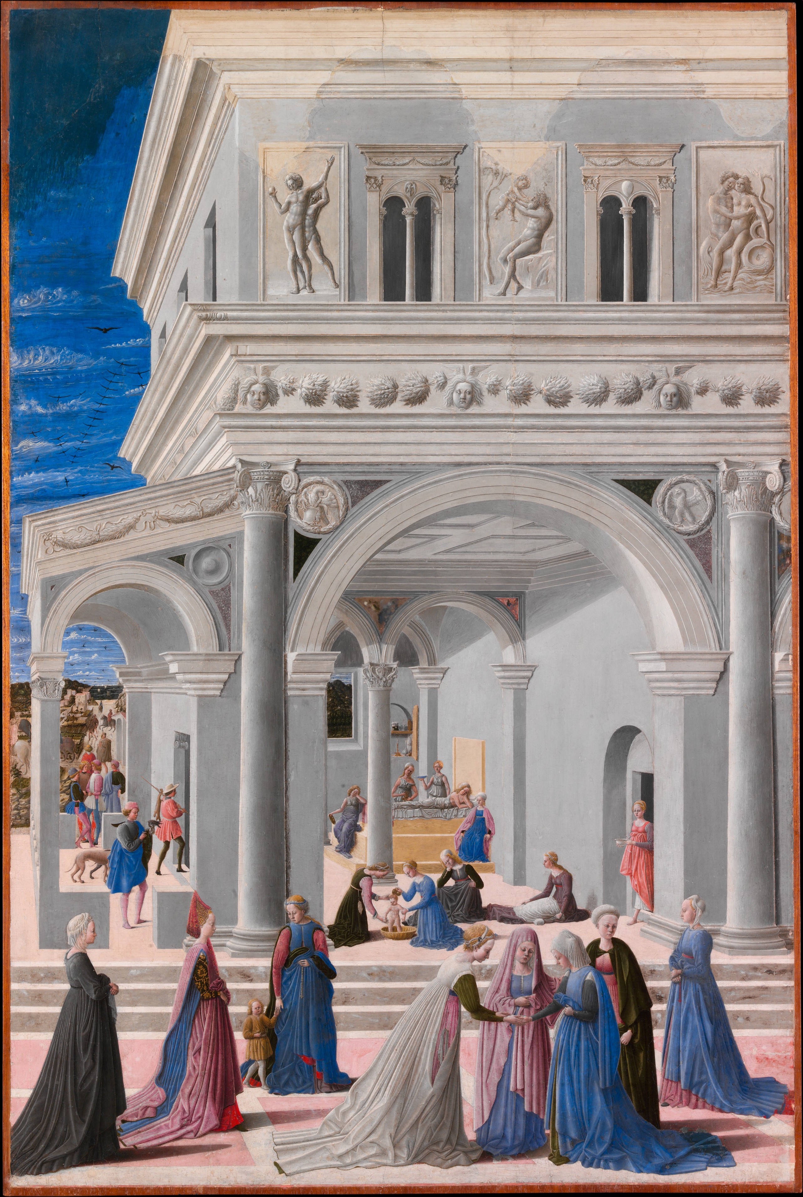
Atmospheric and linear perspective can cooperate, but they do different jobs. Linear perspective organises receding parallel edges through convergence; aerial perspective primarily organises distance through tone and colour.[2] A road can narrow towards the horizon while its distant edges also soften. Trees can overlap and diminish in scale as their greens become less intense. No single cue needs to carry the whole illusion.
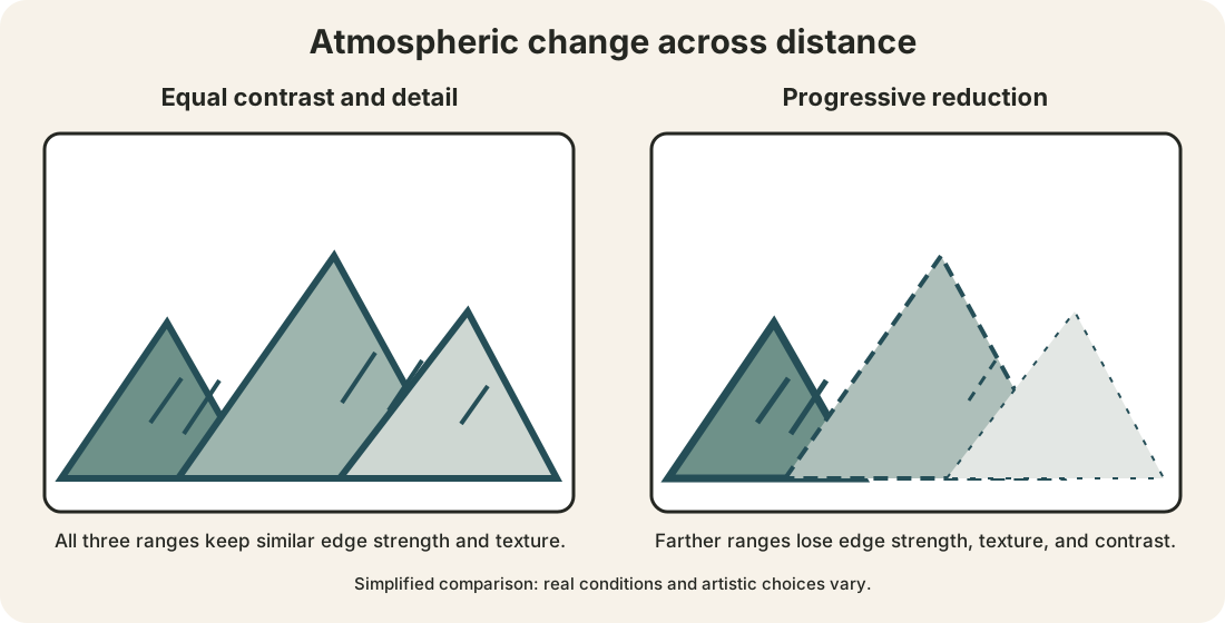
The comparison diagram isolates one variable. Both panels repeat the same mountain contours. The first keeps contrast and mark density relatively even. The second progressively reduces contrast, edge weight, and surface detail towards the horizon. The second sequence is more likely to read as atmospheric recession, but it is a simplified teaching model, not a law of optics or a recipe for every landscape.
A simplified comparison
Read the line weight, dash pattern, internal marks, and value separation from foreground to distance. The right panel makes the farthest ridge less assertive without relying on hue alone. In a finished artwork those changes may interact with overlap, scale, placement, light, and subject matter.
Eight aerial-perspective examples
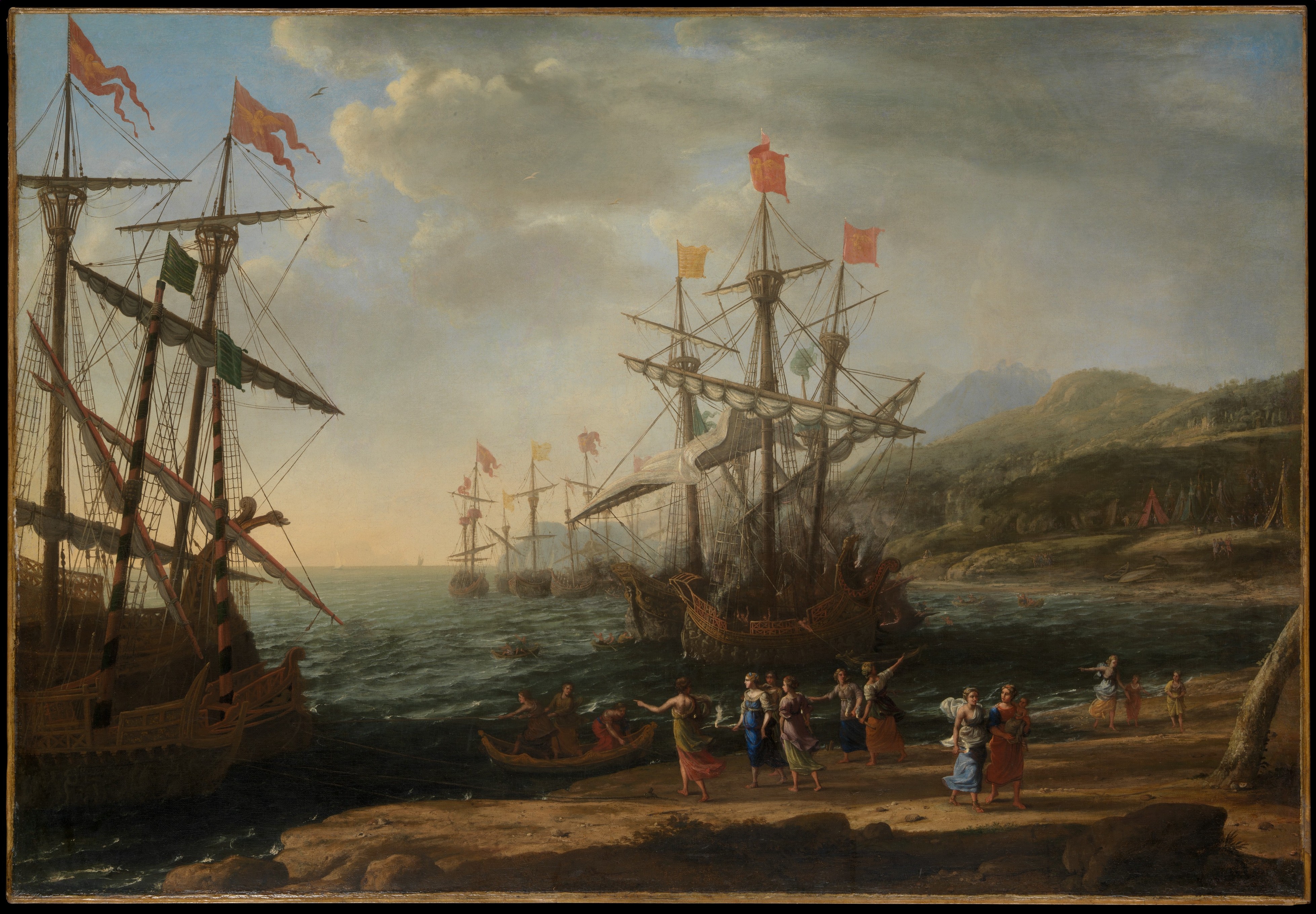
Claude Lorrain — The Trojan Women Setting Fire to Their Fleet
Claude Lorrain's landscape of about 1643 stages the episode from Virgil within an immense harbour setting. Dark trees and animated figures establish a close foreground, while architecture, water, ships, and hills recede in successively lighter zones. The eye moves from the strongly framed action at the sides towards a luminous opening near the centre.[8]
The atmospheric organisation is inseparable from light. Distant land is not simply painted “less accurately”; its reduced contrast establishes a different spatial condition from the crisp silhouettes and shaded earth nearby. Overlap and diminishing scale support the effect, but the broad transition from dark enclosure to pale horizon gives the scene its exceptional reach. Claude uses distance to enlarge the narrative world: the fire is one event inside a landscape that seems to continue far beyond it.
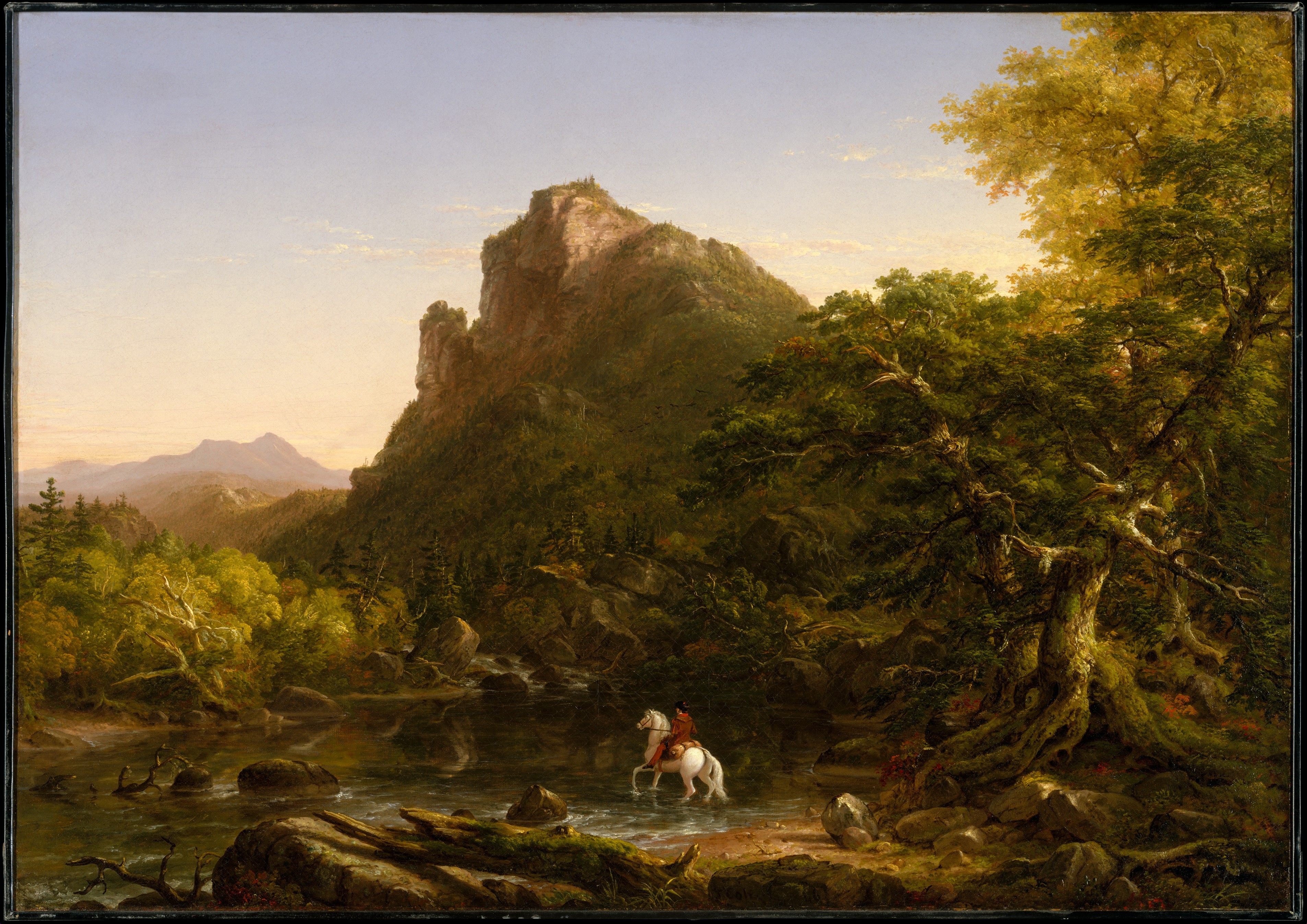
Thomas Cole — The Mountain Ford
In Thomas Cole's The Mountain Ford of 1846, a rider and animals cross water beneath dense trees. Dark trunks, rocks, and foliage occupy the immediate foreground. Beyond them, a bright opening leads across a valley towards mountains whose edges, internal divisions, and colour contrasts become progressively quieter.[9][16]
The composition makes atmospheric change easy to compare because the foreground behaves almost like a threshold. It is close, enclosed, textural, and strongly divided. The distant terrain is more open and optically unified. Yet the transition is gradual rather than a binary split: intermediate trees and slopes bridge the two conditions. Cole therefore makes depth through a chain of calibrated differences, allowing the small crossing to feel embedded within a much larger terrain.
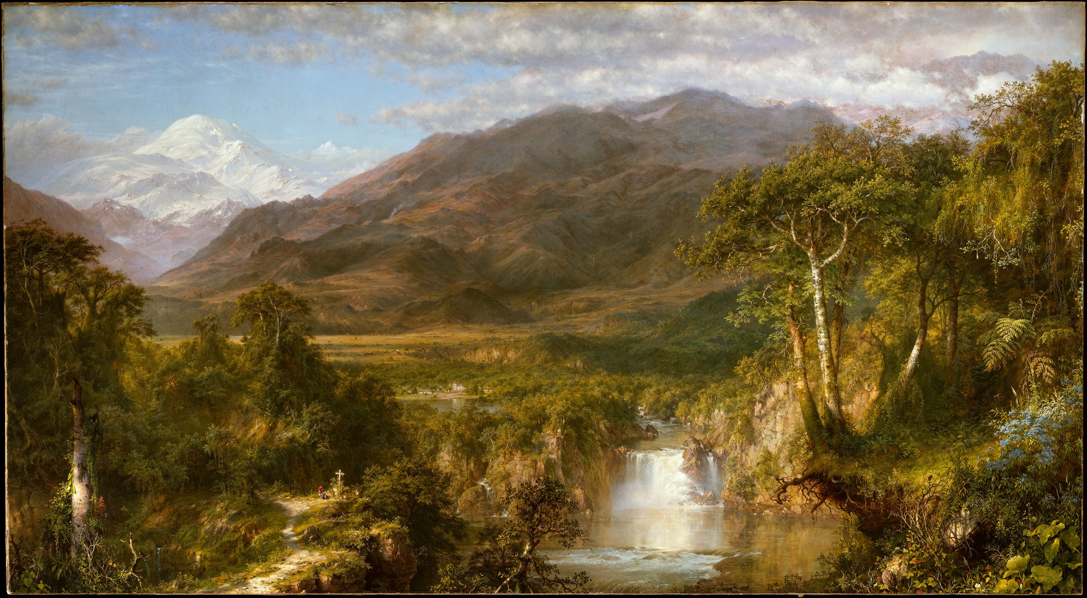
Frederic Edwin Church — Heart of the Andes
Frederic Edwin Church's Heart of the Andes of 1859 rewards a more detailed reading than the general overview on the Perspective in Art page. In the foreground, individual leaves, stones, tree bark, water, and a tiny wayside cross are sharply articulated. Across the middle distance, plant and land forms join into larger groups. The snow-covered peak emerges through pale atmosphere at the back.[10]
Several cues reinforce one another. Overlap orders vegetation; water opens a visual path; repeated forms diminish; contrast and saturation fall away towards the mountains. The distant peak is still a focal presence, so reduced detail does not mean reduced importance. Its brightness and placement let it command attention while its softened boundaries keep it far away. Church demonstrates how atmospheric perspective can produce both close inspection and overwhelming scale within one field.
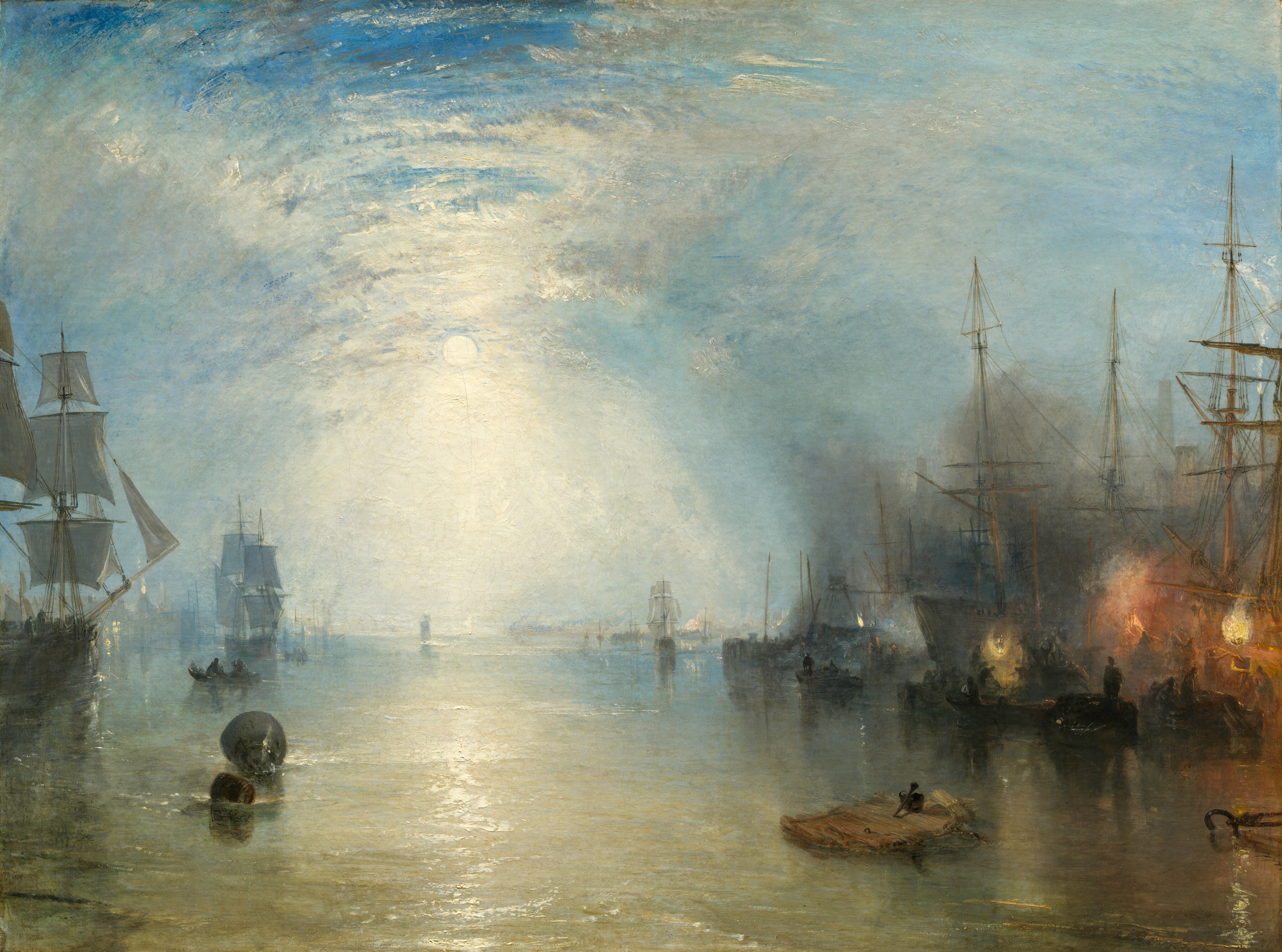
J. M. W. Turner — Keelmen Heaving in Coals by Moonlight
Turner's Keelmen Heaving in Coals by Moonlight of 1835 replaces clear daylight recession with smoke, mist, reflected moonlight, and fire. Dark boats and figures concentrate near the foreground activity; orange flames puncture the night; pale illumination spreads across water and sky. Farther forms remain visible, but their edges and tonal separations partially dissolve.[11]
Here atmosphere is not a transparent veil laid evenly over a landscape. It is part of the subject: coal smoke, humid air, artificial firelight, and moonlight mingle around labouring vessels. The reduced clarity establishes depth while also making orientation unstable. Turner shows why atmospheric perspective should not be reduced to blue mountains. Distance can be built from luminous greys, smoke-darkened silhouettes, reflections, and uncertain boundaries, and those same effects can convey an industrial environment.[11]
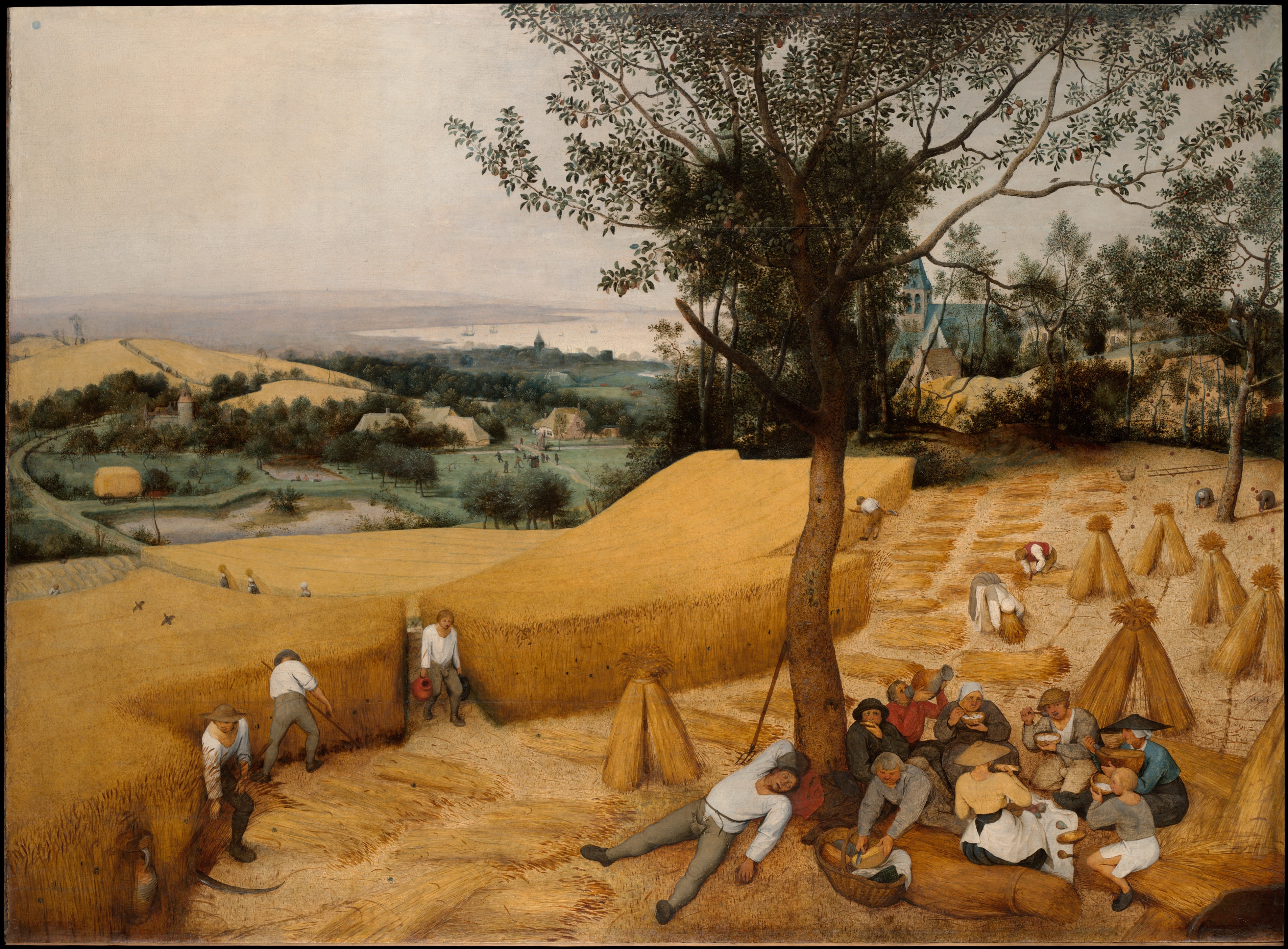
Pieter Bruegel the Elder — The Harvesters
Pieter Bruegel the Elder's The Harvesters of 1565 spreads summer labour across a broad landscape. Large workers, cut grain, food, and a shaded tree fill the foreground. Paths, fields, houses, and smaller figures connect that close zone to a distant band of water and pale hills.[12]
Bruegel combines clear sectional organisation with atmospheric recession. The foreground retains strong contrasts and numerous specific actions. Farther areas become smaller in scale, lighter in value, and less individually differentiated. The elevated viewpoint reveals much of the terrain, but that is not what makes the aerial perspective: the decisive evidence is the visual change between near, middle, and far zones. This distinction helps separate an aerial view from aerial perspective even when an artwork happens to contain both.
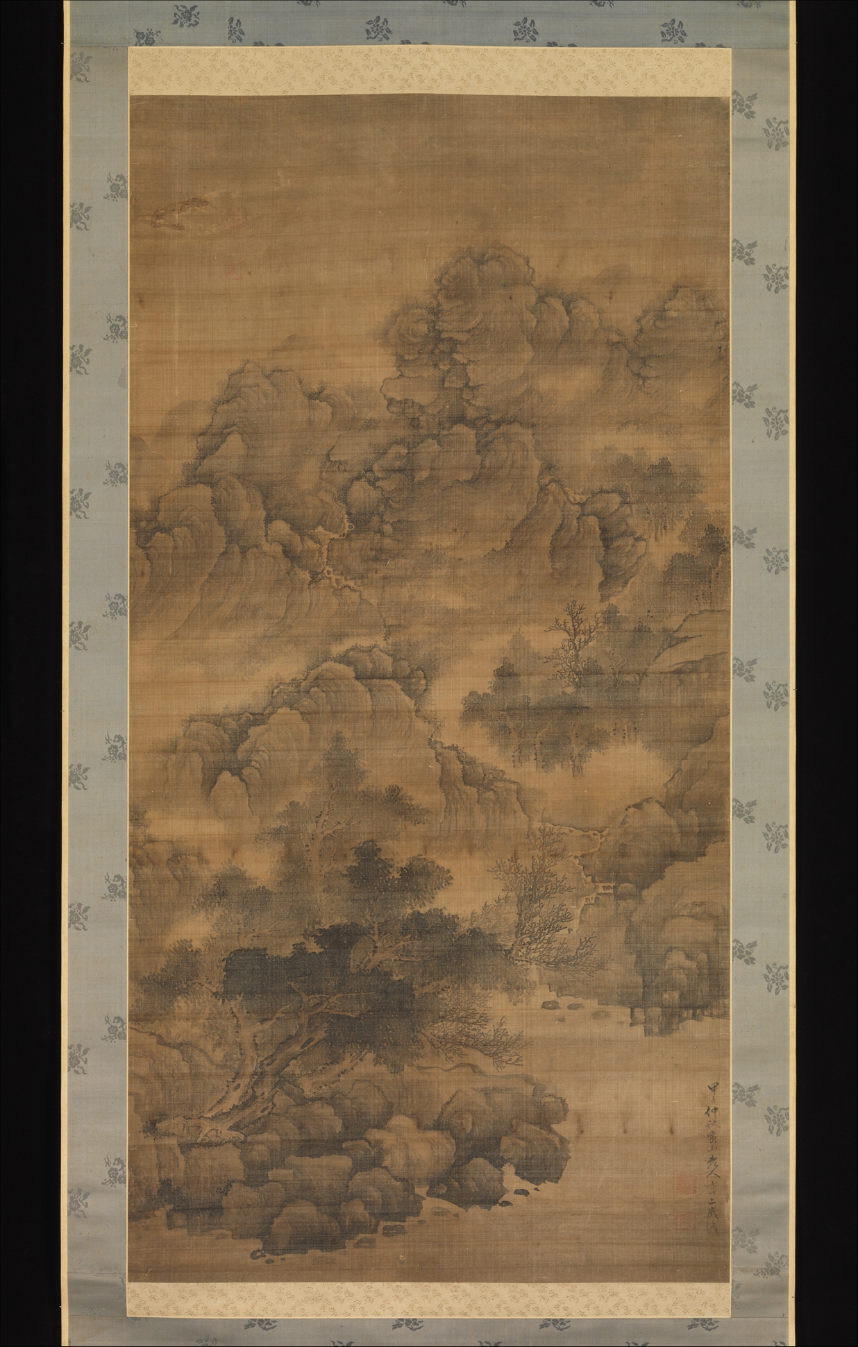
Fa Ruozhen — Cloudy Mountains
Fa Ruozhen's hanging scroll Cloudy Mountains of 1684 creates recession without organising the scene around a Western vanishing-point grid. Dark rocks, trees, and forceful brushwork anchor the lower zone. Higher mountain forms emerge in lighter ink, while pale or unpainted intervals interrupt continuous contours and suggest mist.[13]
Those intervals are active spatial devices. They separate one mass from another while leaving their exact physical connection uncertain. Dark-to-light transitions, overlapping peaks, and changes in mark density make the eye alternate between solid terrain and atmospheric emptiness. The work expands the category beyond European oil painting: tonal recession can operate through ink and reserved paper, and spatial depth can remain inseparable from the rhythm of the surface.[13]
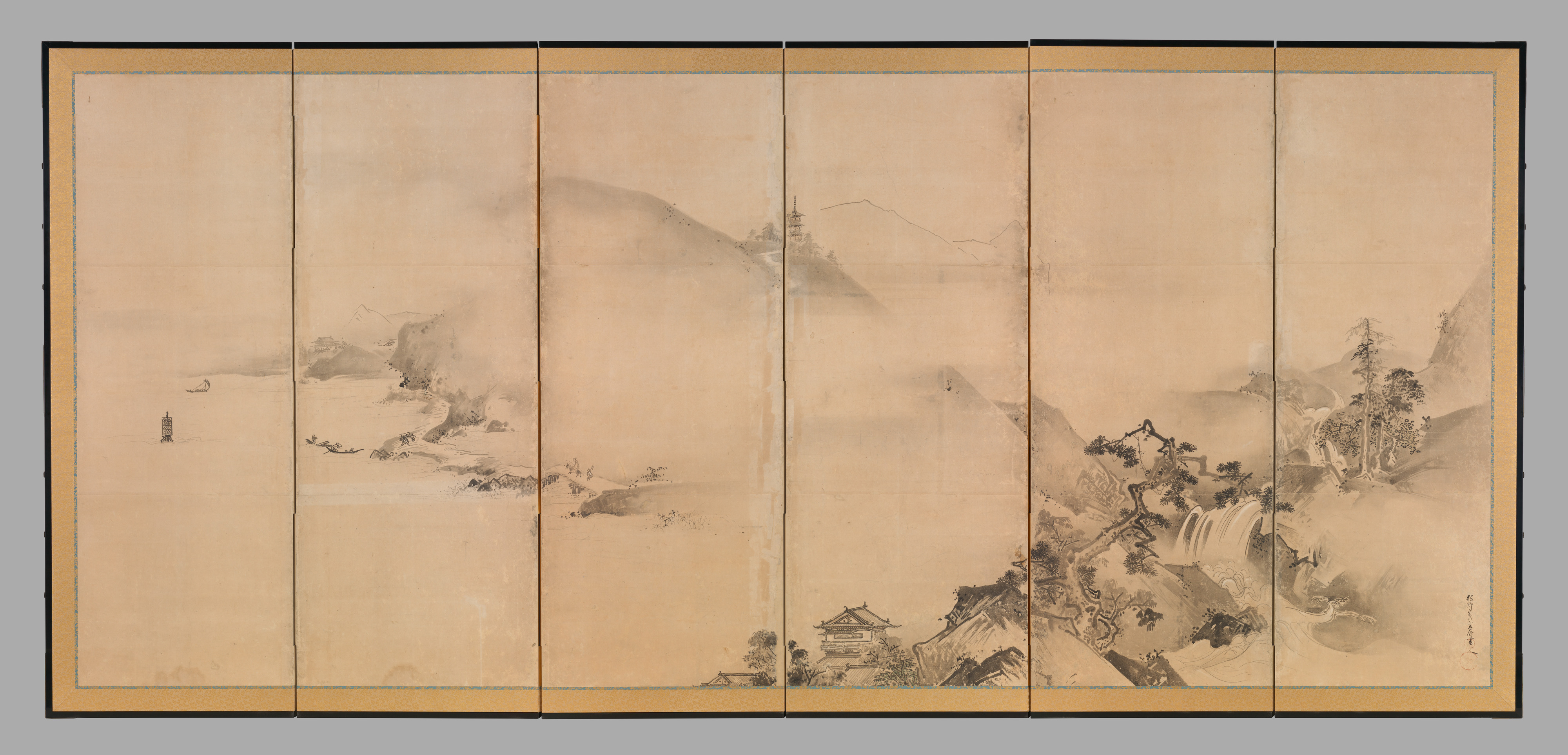
Kanō Tan'yū — Landscapes of the Four Seasons
Kanō Tan'yū's paired folding screens from the 1630s extend landscape across a wide, physically segmented support. Shorelines, trees, buildings, boats, and mountains gather in clusters, while pale passages open between them. The screens do not offer one uninterrupted window; folds and gold-toned emptiness remain part of the work's designed environment.[14]
Depth nevertheless develops through overlap, ink value, changes of scale, and intervals that can be read as water, air, or mist. Darker articulated forms tend to press forward, while pale mountains withdraw. Because the composition moves across two screens, atmospheric distance also creates tempo: dense passages slow inspection and open passages release it. Aerial perspective here is not only an illusion behind the surface but a way to coordinate viewing across an architectural object.
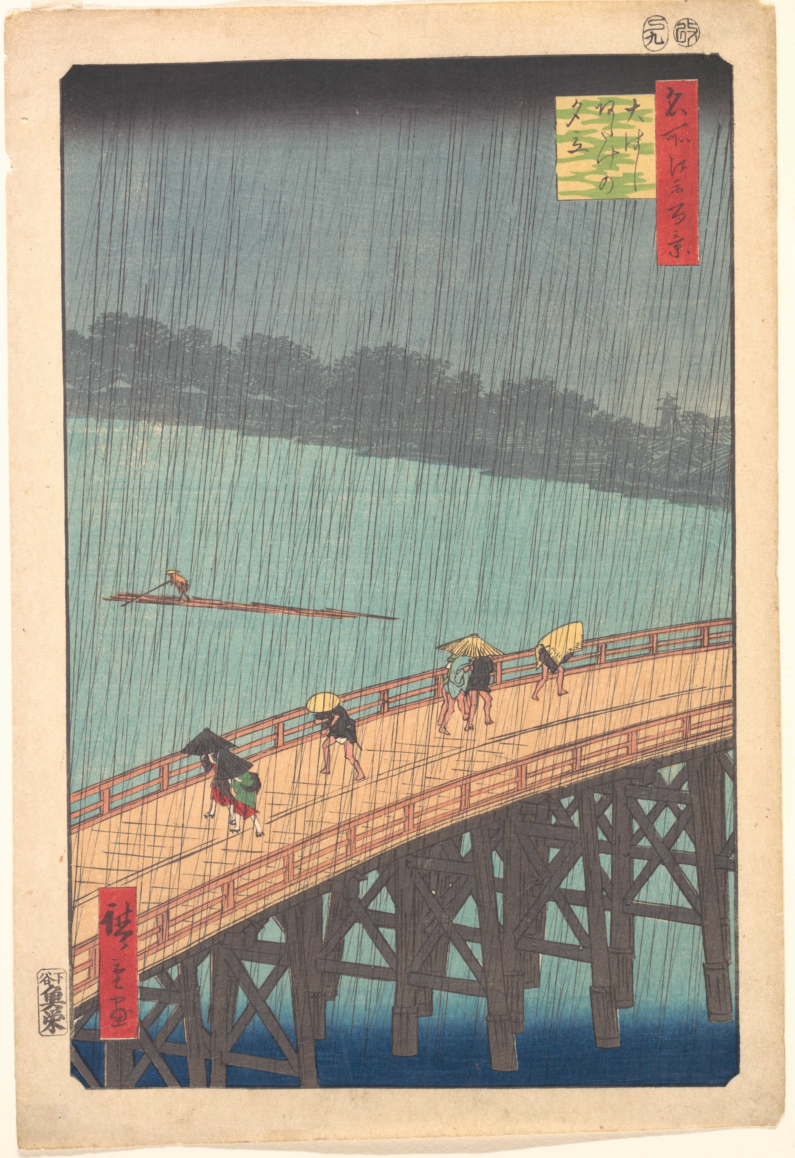
Utagawa Hiroshige — Sudden Shower over Shin-Ōhashi Bridge and Atake
In Hiroshige's 1857 print, people hurry across a diagonally rising bridge beneath dense slanting rain. The far bank is muted behind weather, while the bridge, figures, and rain strokes retain assertive graphic contours.[15] The shower makes distance tangible because the foreground structure and the veiled opposite shore occupy visibly different conditions.
The print also prevents an easy equation between softness and depth. Many marks remain crisp, and the repeated rain lines insist on the flat sheet even as they describe atmosphere. Colour areas, cropping, scale, and diagonal movement work alongside the muted distance. Weather therefore participates in aerial perspective without dissolving the work's graphic order. The result is both spatial and patterned: we look through rain, but we also look at a surface animated by its marks.[15]
A concise history
Artists used tonal and colour changes to suggest distance long before the term became standard. The National Gallery notes atmospheric depth in early fifteenth-century Netherlandish painting and its later adoption by Italian artists.[1] This history matters because it resists attaching all spatial invention to a single person or city. Techniques travelled, changed across media, and often developed through workshop practice as much as written theory.
Leonardo da Vinci gave sustained attention to how air affects the appearance of receding landscape. His notes describe distant forms as increasingly faded and indistinct, and the rocky setting of The Virgin of the Rocks uses softened transitions to suggest great depth.[5][6] He is central to the European history of aerial perspective, but not its sole global inventor. Comparable strategies of pale distance, mist intervals, or reduced detail appear within different pictorial traditions for different purposes.
From seventeenth-century landscape through Romantic and nineteenth-century painting, atmospheric effects could make distance luminous, sublime, humid, smoky, or industrial. Printmakers and ink painters adapted recession to media built from line, flat colour, wash, or blank paper. Modern artists could exaggerate expected changes or reverse them, making distant zones more saturated or abrupt than foreground ones. The convention remains effective precisely because it is flexible: it can imitate perception, structure composition, establish mood, or call attention to the difference between observed and invented space.
How to recognise it
Begin by comparing, not by naming a colour. Which zone has the strongest dark-light range? Where are small textures most legible? Do outlines weaken, marks become sparser, or adjacent values draw closer together as forms recede? Is the change gradual, or does weather create a sudden veil? Then check supporting cues: overlap, diminishing scale, higher placement, or converging paths may confirm the same near-to-far sequence.[3][7]
Next distinguish subject from method. Mountains, clouds, and haze do not automatically produce aerial perspective. The question is whether their treatment establishes relative distance. Likewise, an overhead city view is not aerial perspective merely because it seems airborne. It may use atmospheric change, but viewpoint and atmospheric recession remain separate decisions.
Finally ask what the changes do beyond proving depth. Claude opens a narrative towards light; Turner makes atmosphere materially uncertain; Church balances minute foreground inspection against vast distance; Fa Ruozhen and Kanō Tan'yū use mist-like intervals to pace the surface; Hiroshige makes weather both spatial veil and graphic rhythm. Artists may weaken, suppress, or invert familiar cues when clarity, pattern, symbolism, or expressive tension matters more than continuous illusion. Aerial perspective is not a correctness test. It is one adaptable way of deciding how near and far should look—and how moving between them should feel.
Explore perspective in art
All seven evidence-checked guides are available in this local perspective group.
Watch Atmospheric Perspective Change Depth
Choose a focused principles lesson, a science-and-painting explanation, or a historical comparison with linear perspective.
Lesson 13: Perspective Principles: Atmospheric Perspective
Follow a focused explanation of how value, saturation and edge changes make nearer and farther planes behave differently.
Watch on YouTubeFrequently Asked Questions
It is the use of changes in colour, value, contrast, edge clarity and detail to distinguish near from far on a flat surface.
More atmosphere lies between viewer and distant forms, scattering light and reducing contrast, although weather, illumination and local colour can produce many variations.
No. Linear perspective organises receding directions through convergence, while aerial perspective primarily uses optical changes in tone, colour and clarity.
Yes. Ink, drawing and printmaking can create recession through lighter values, weaker edges, fewer marks and reserved paper without relying on blue.
No. Artists may flatten, reverse, simplify or suppress expected atmospheric changes to prioritise pattern, symbolism, clarity or expressive tension.
Discussion
Which example makes distance feel greatest through colour and contrast—and which relies most strongly on mist, weather or open intervals?
Reader Insights
Look for changes in sharpness, contrast and mark density before assuming that distant forms must simply become blue.
A work may lighten distant forms, narrow its colour range, reduce saturation, or combine those changes in different proportions.
Weather effects can establish depth while also shaping mood, narrative scale, rhythm or deliberate uncertainty.
Join the Conversation
Share one precise observation or a useful museum example below.
References
- National Gallery, London, “Aerial perspective,” glossary. https://www.nationalgallery.org.uk/paintings/glossary/aerial-perspective
- National Gallery, London, “Linear perspective,” glossary. https://www.nationalgallery.org.uk/paintings/glossary/linear-perspective
- Ashmolean Museum, Focus on Perspective in Art: Teacher Notes. https://www.ashmolean.org/sites/default/files/ashmolean/documents/media/focus_on_perspective_in_art_teacher_notes.pdf
- The Metropolitan Museum of Art, Looking to Connect with European Paintings: Visual Approaches for Teaching in the Galleries, “Illusion.” https://resources.metmuseum.org/resources/metpublications/pdf/looking_to_connect_with_european_paintings_visual_approaches_for_teaching_in_the_galleries.pdf
- National Gallery, London, “Leonardo and The Virgin of the Rocks.” https://www.nationalgallery.org.uk/exhibitions/past/leonardo-experience-a-masterpiece/leonardo-and-the-virgin-of-the-rocks
- Museo Galileo, “Leonardo: Aerial perspective.” https://brunelleschi.imss.fi.it/menteleonardo/emdl.asp?c=13419&k=13397&rif=13408&xsl=1
- The Metropolitan Museum of Art, The Art of Renaissance Europe: A Resource for Educators. https://resources.metmuseum.org/resources/metpublications/pdf/The_Art_of_Renaissance_Europe_A_Resource_for_Educators.pdf
- The Metropolitan Museum of Art, “The Trojan Women Setting Fire to Their Fleet,” object 435908. https://www.metmuseum.org/art/collection/search/435908
- The Metropolitan Museum of Art, “The Mountain Ford,” object 10496. https://www.metmuseum.org/art/collection/search/10496
- The Metropolitan Museum of Art, “Heart of the Andes,” object 10481. https://www.metmuseum.org/art/collection/search/10481
- National Gallery of Art, Washington, “Keelmen Heaving in Coals by Moonlight.” https://www.nga.gov/artworks/1225-keelmen-heaving-coals-moonlight
- The Metropolitan Museum of Art, “The Harvesters,” object 435809. https://www.metmuseum.org/art/collection/search/435809
- The Metropolitan Museum of Art, “Cloudy Mountains,” object 75745. https://www.metmuseum.org/art/collection/search/75745
- The Metropolitan Museum of Art, “Landscapes of the Four Seasons,” object 53009. https://www.metmuseum.org/art/collection/search/53009
- The Metropolitan Museum of Art, “Sudden Shower over Shin-Ōhashi Bridge and Atake,” object 55433. https://www.metmuseum.org/art/collection/search/55433
- The Metropolitan Museum of Art, “Heilbrunn Timeline: The Hudson River School.” https://www.metmuseum.org/essays/the-hudson-river-school