by Tom Gurney
Tom Gurney BSc (Hons) is an art history expert with over 20 years experience
Page created on September 3, 2026 / Page updated on September 13, 2026
Email: tomgurney1@gmail.com / Phone: +44 7429 011000
How Artists Position the Viewer Inside a Pictorial World
Perspective in art is the family of choices that establishes a relationship between a viewer, a flat surface, and a represented world. It can make a painted room seem to extend behind the wall, turn a few marks into a body projecting towards us, or organise a landscape into near and distant zones. The term includes mathematical systems built from converging lines, but it is much broader than linear perspective alone. Overlap, scale, position, focus, texture, tone, and colour can all contribute to an impression of depth.[1]
This matters because perspective is never only a test of whether an image looks “real”. It can direct attention, stage a story, place a viewer high above or close beside an event, and make space feel orderly, unstable, intimate, or immense. Artists may combine several depth cues, suppress them, or let different systems pull against one another. A picture can therefore be spatially convincing without resembling a window, and it can be deliberately coherent without describing a continuous optical world.
At a Glance
- Broad meaningthe relationship among a viewer, picture surface and represented space.
- Linear cueshorizons, vanishing points, orthogonals and diminishing intervals.
- Non-linear cuesoverlap, scale, placement, texture, tone, colour and focus.
- Local projectionforeshortening compresses bodies and objects aimed through depth.
- Interpretive questionask what kind of space the artist builds and how that space directs attention.
Contents
What perspective describes
Three parts of the viewing situation are useful to separate. The picture plane is the physical surface of the image: canvas, paper, panel, wall, or screen. In an illusionistic picture it can be imagined as a transparent boundary between the viewer's space and the represented space beyond it.[5] The viewpoint is the position from which that represented space appears to be seen. The depth cues are the visible relationships that encourage us to interpret one form as nearer, farther, projecting, or receding.
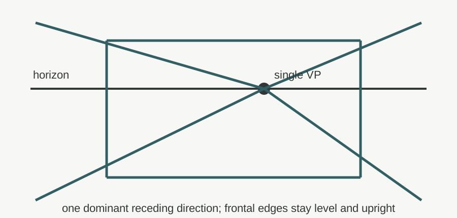
None of these parts has to be announced. A low horizon can imply that the viewer is close to the ground; an elevated view can reveal the top surfaces of streets, tables, or roofs. One form covering another tells us which is in front. Repeated objects that become smaller can make distance measurable. Edges may converge towards a vanishing point, the point in fictive space at which represented receding parallels appear to meet.[2] Distant forms may become paler, cooler, less detailed, or lower in contrast. A limb aimed towards the viewer may appear compressed through foreshortening.[4]
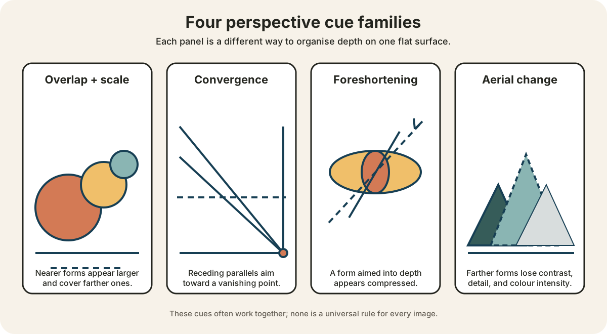
The diagram above isolates four cue families. In actual art they rarely remain so separate. Overlap and scale may reinforce a converging floor; a foreshortened figure may also cross the picture plane; atmospheric change may extend a landscape far beyond an architectural foreground. The important question is not “Which rule did the artist use?” but “Which relationships are doing the spatial work here?”
Four perspective cue families
In the first panel, progressively smaller circles overlap, so size and occlusion mark a near-to-far sequence. In the second, receding parallels aim towards one marked vanishing point. In the third, an elongated form seen end-on appears compressed along its depth axis. In the fourth, mountain shapes become lighter, less strongly outlined, and less saturated as they recede. The differences remain readable through size, overlap, line direction, dash pattern, value, and stroke weight rather than colour alone.[1][3][4]
Eight ways artists organise depth
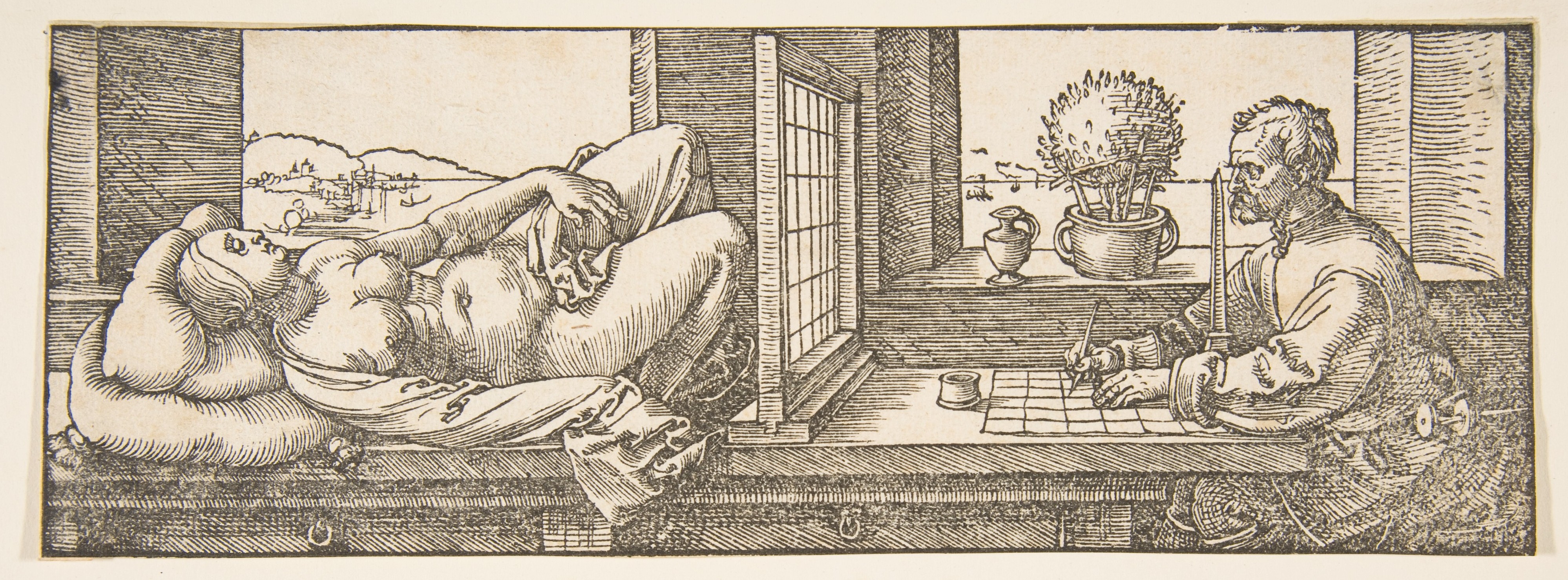
Albrecht Dürer — Draughtsman Making a Perspective Drawing of a Reclining Woman
Albrecht Dürer's woodcut makes the mechanics of viewing unusually explicit. A draughtsman sits on one side of an upright grid while a reclining model occupies the other. The grid is both a practical measuring device and a visible analogy for the picture plane: the scene is translated section by section onto the sheet. The observer's fixed position matters because the apparent alignment and compression of the body would change if his eye moved.[9]
The image also prevents perspective from seeming like a property hidden inside an artwork. It is a relationship constructed among a body, an observer, an intervening plane, and a record. Dürer's tiny Met sheet is a later impression dated about 1600, not evidence that all artists used this exact apparatus or that measured projection is the origin of every spatial image. It is valuable because it shows one historical method in operation. As a woodcut it also belongs to the site's wider collection of drawings and works on paper, where line can carry both descriptive and technical information.
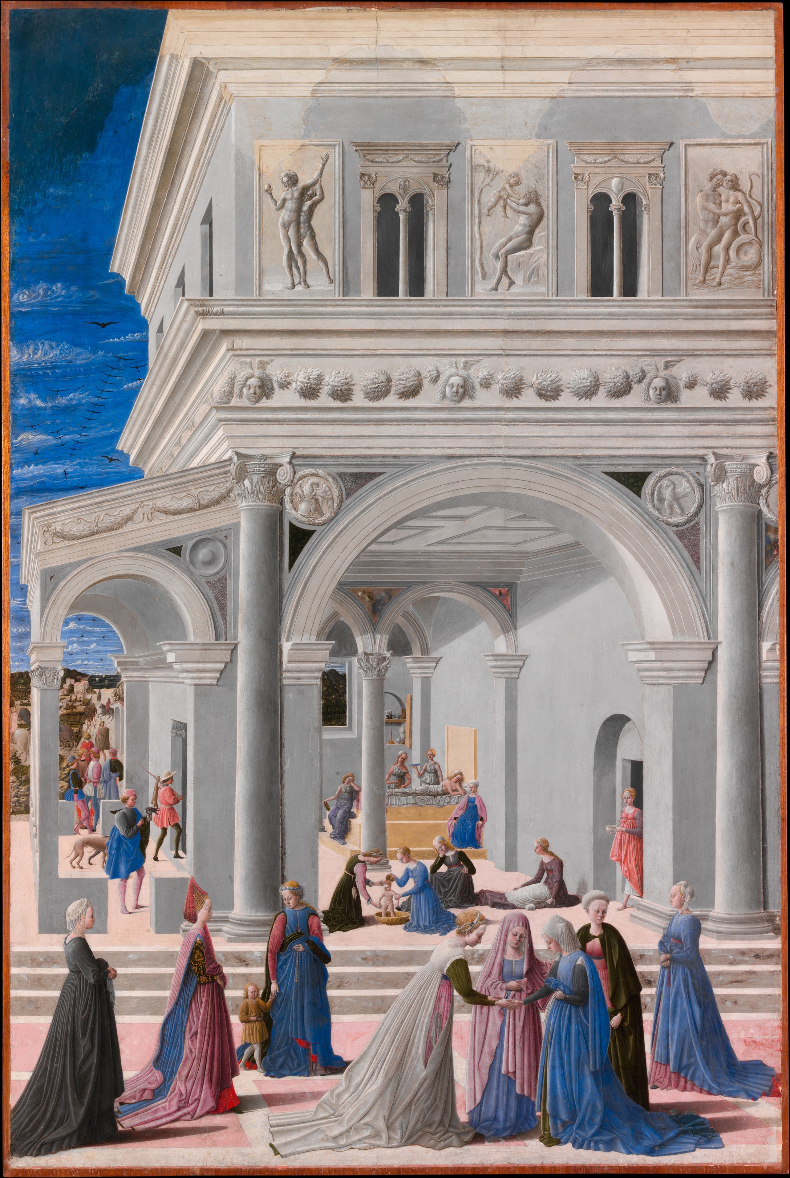
Fra Carnevale — The Birth of the Virgin
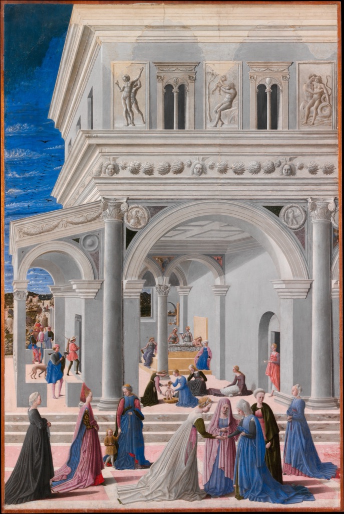
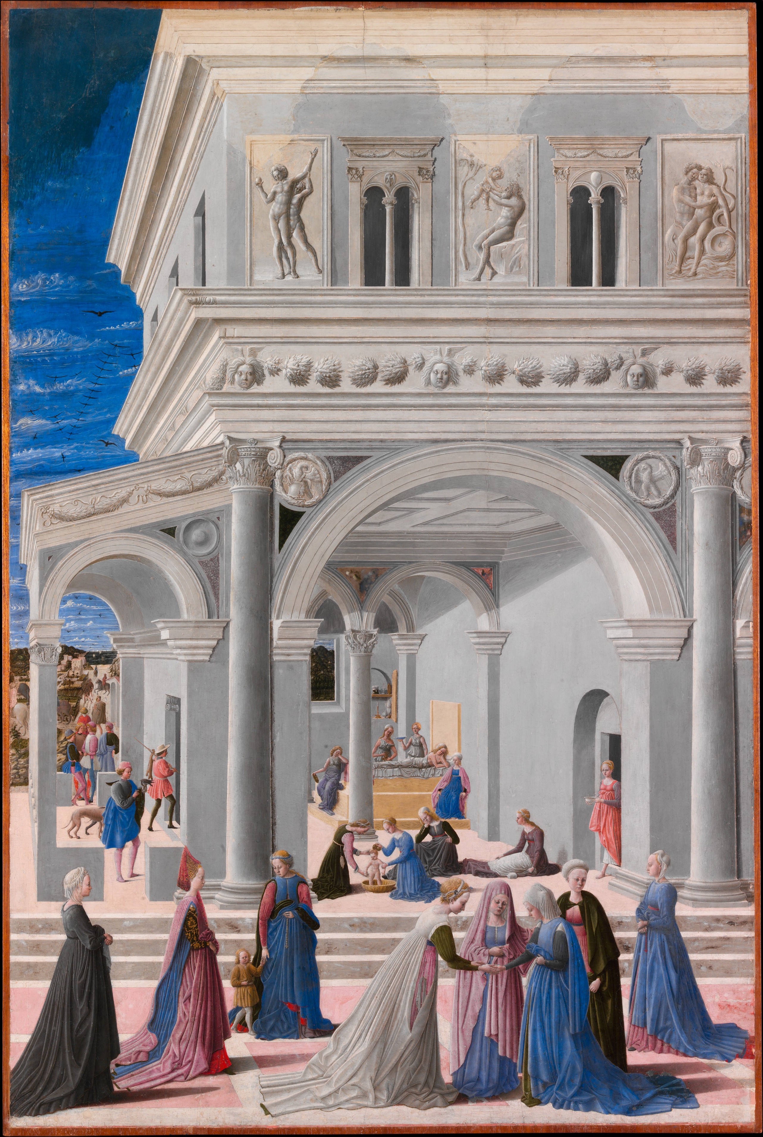
In Fra Carnevale's The Birth of the Virgin of 1467, architecture behaves like a spatial instrument. Floor tiles, cornices, wall edges, and the repeated sides of arches narrow as they recede. The figures also change scale, while openings at the rear and left reveal further zones beyond the main room. Together these relationships make the palace interior seem deep enough to enter.[10]
The convergence does more than imitate a building. It distributes attention across the narrative. The principal domestic episode occupies the foreground, yet the architecture encourages the eye to travel among attendants, thresholds, distant figures, and glimpses of landscape. The scene therefore demonstrates a crucial feature of one-point organisation: a shared geometric structure can unify many separate incidents without making every line or figure point mechanically to one spot. The Met's Renaissance teaching resource uses this painting to illustrate how fifteenth-century artists ordered deep space and directed attention.[7]
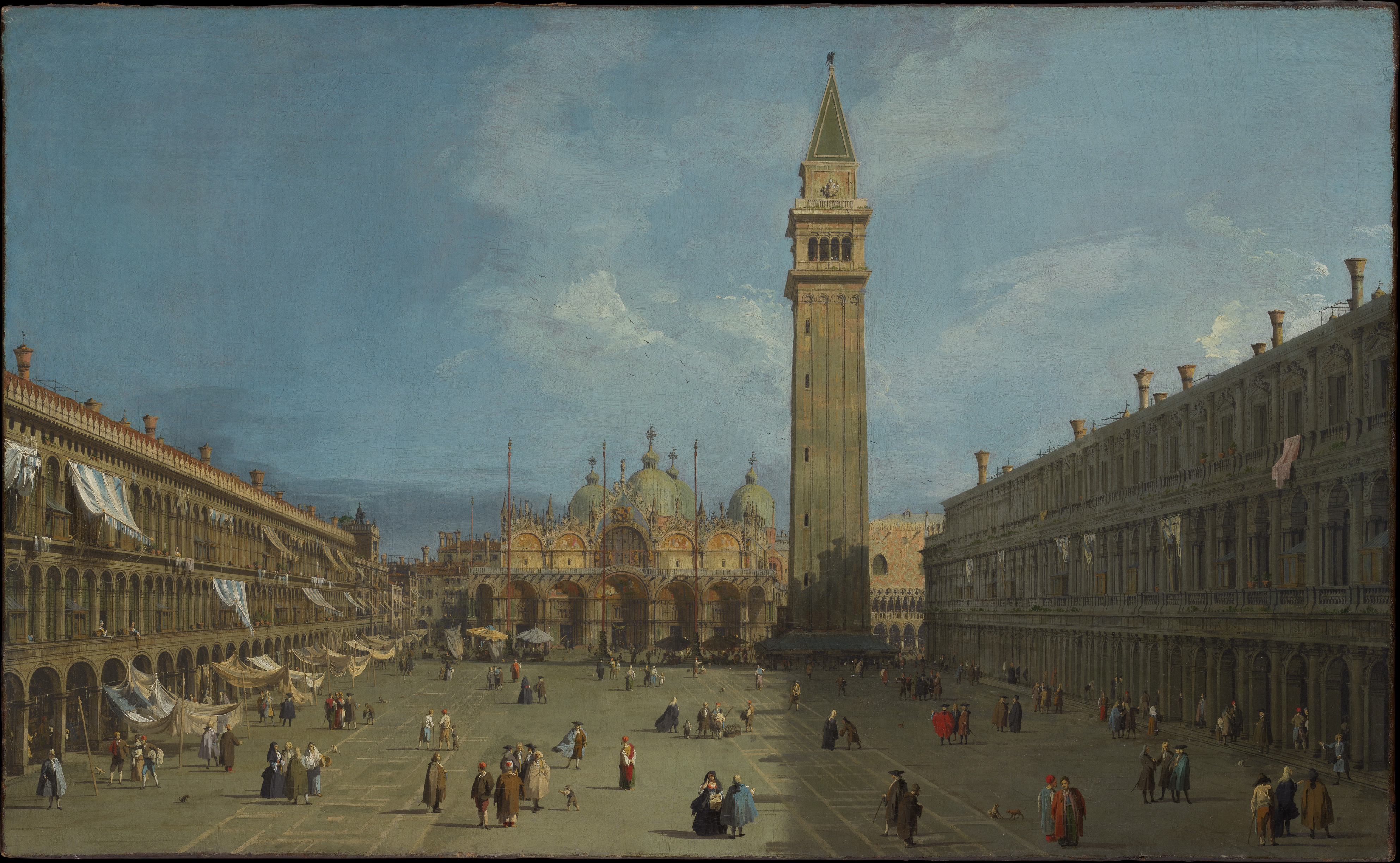
Canaletto — Piazza San Marco
Canaletto's Piazza San Marco, painted in the late 1720s, opens a much wider urban field. The long arcades on each side establish powerful diagonals, the paving carries repeated intervals into the square, and the crowds diminish towards the basilica. Yet Venice is not reduced to a bare diagram. The Campanile rises as a strong vertical, façades turn at different angles, and the distant architecture closes some paths while opening others.[11]
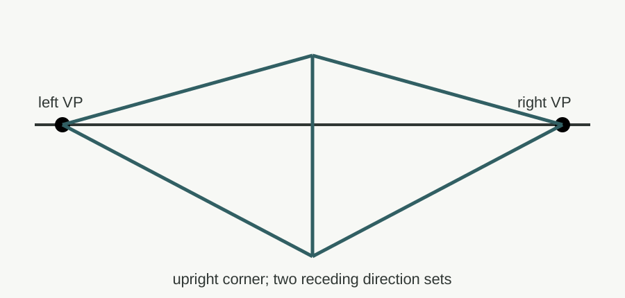
This is a useful reminder that vanishing points are analytical tools, not magnets to which every visible edge must be forced. Different sets of parallel edges may have different directions in fictive space, while irregular buildings and small deviations keep the view particular. Perspective makes the square navigable and gives the crowd a common ground; it also makes an expansive civic setting feel controlled. Readers interested in the building, light, and subject history can continue to the dedicated page for Canaletto's Piazza San Marco.
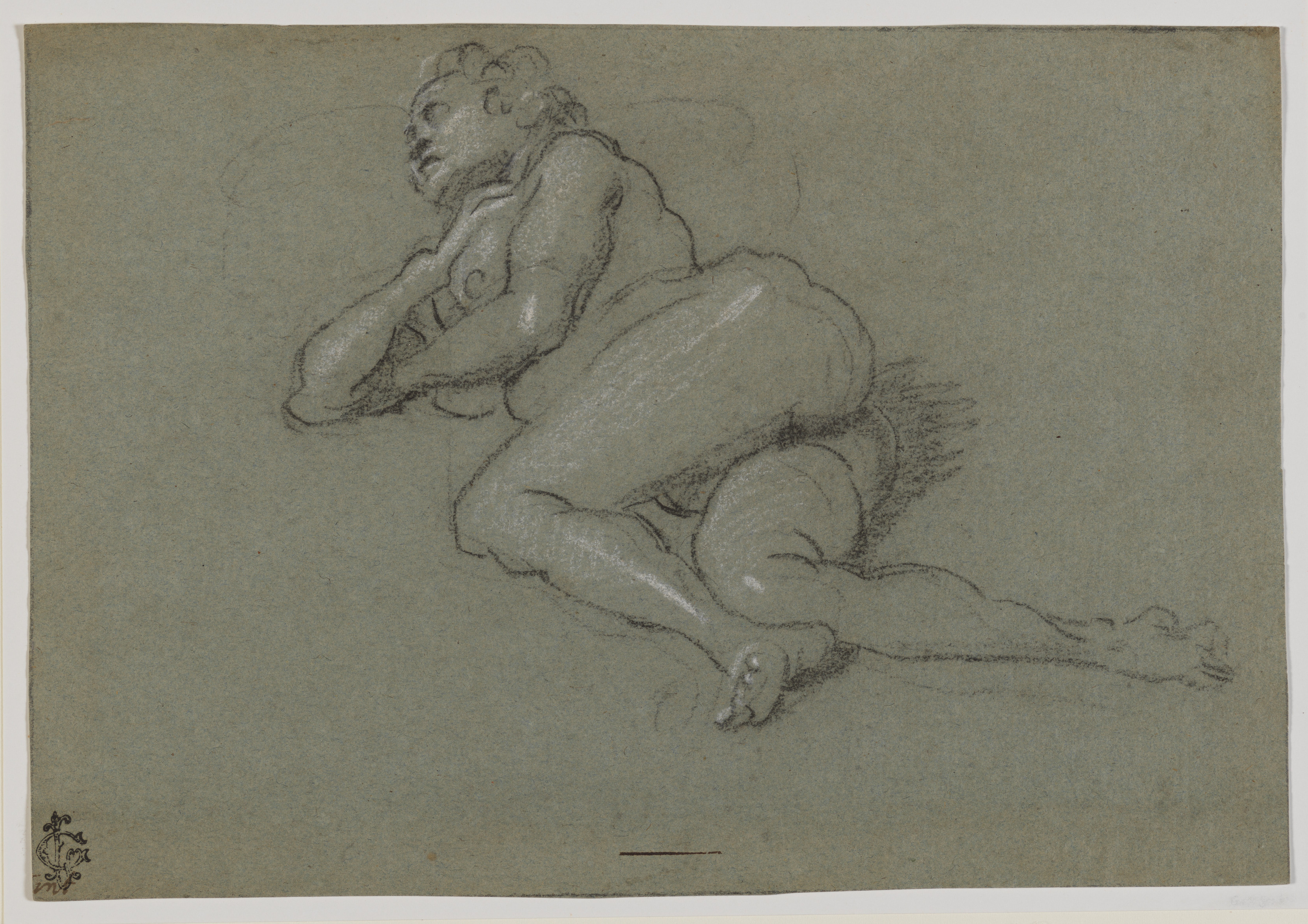
Domenico Tintoretto — Reclining Female Nude
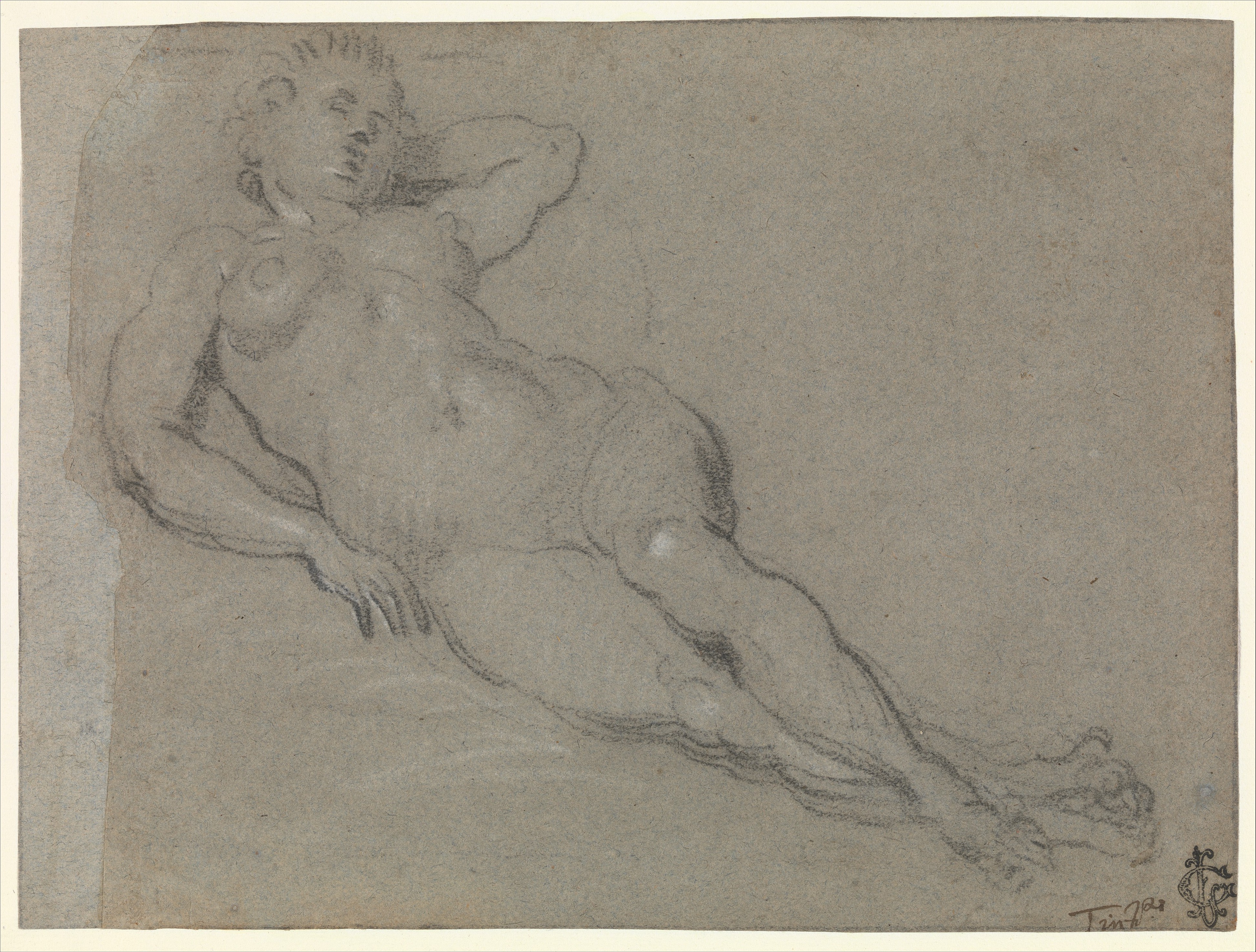
Domenico Tintoretto's late-sixteenth-century chalk drawing replaces streets and rooms with the more difficult geography of a body. The reclining figure turns through depth: limbs overlap, the torso is seen at an angle, and lengths directed away from the viewer appear shorter than they would in profile. That apparent compression is foreshortening.[4] White chalk catches raised surfaces while black chalk models folds and contours, allowing volume to survive the compression.[12]
Foreshortening need not make a figure perfectly measurable. It gives the body a direction relative to the viewer and can intensify immediacy, weight, or instability. Related reclining-nude studies by Domenico are described by the Met as heavily foreshortened and rooted in the Tintoretto workshop's practice of drawing from live models.[12] Here, the uneven turns and overlaps are part of the sheet's observational force. The figure does not demonstrate an abstract law; it shows an artist testing how a living form changes when it is aimed into pictorial depth.
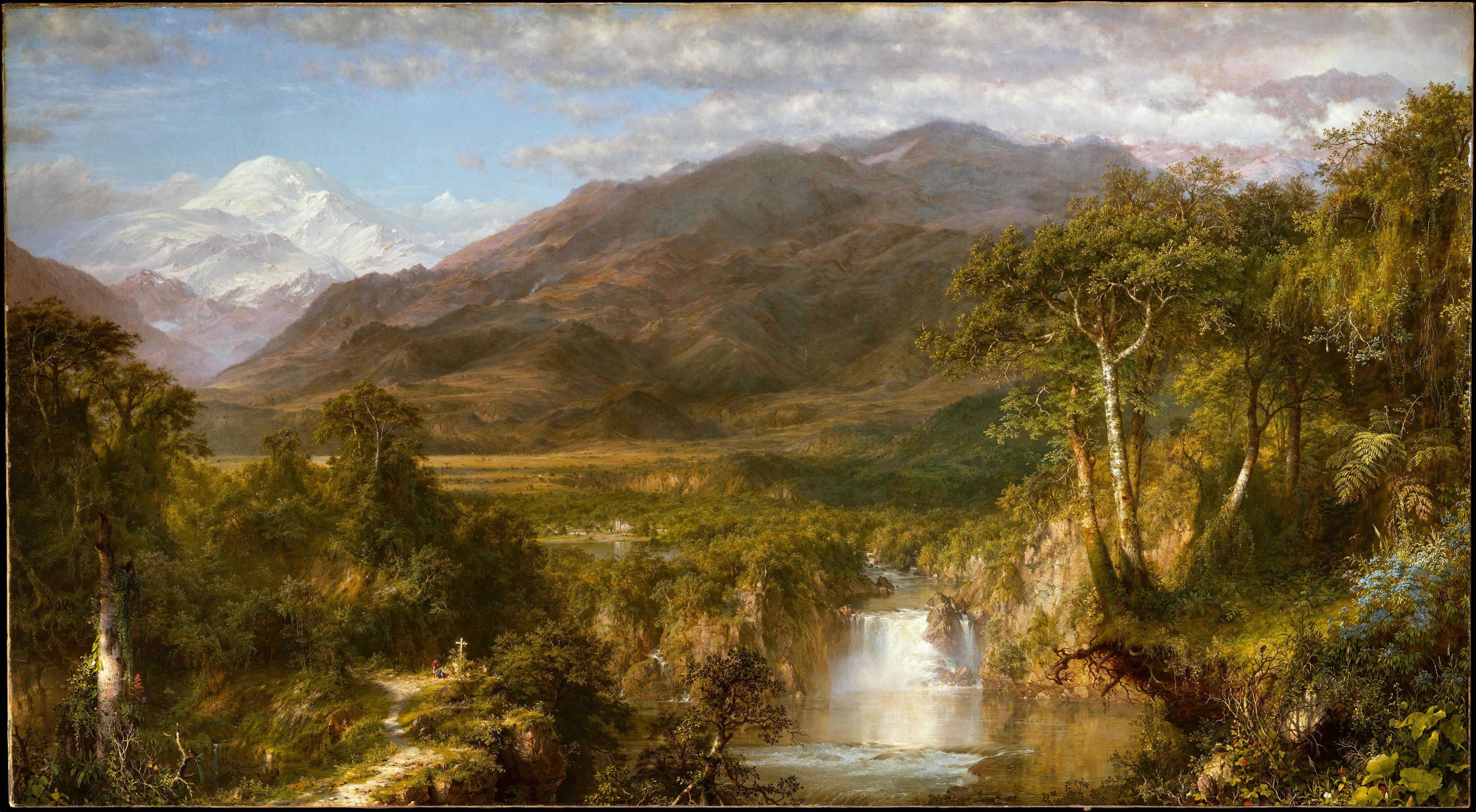
Frederic Edwin Church — Heart of the Andes
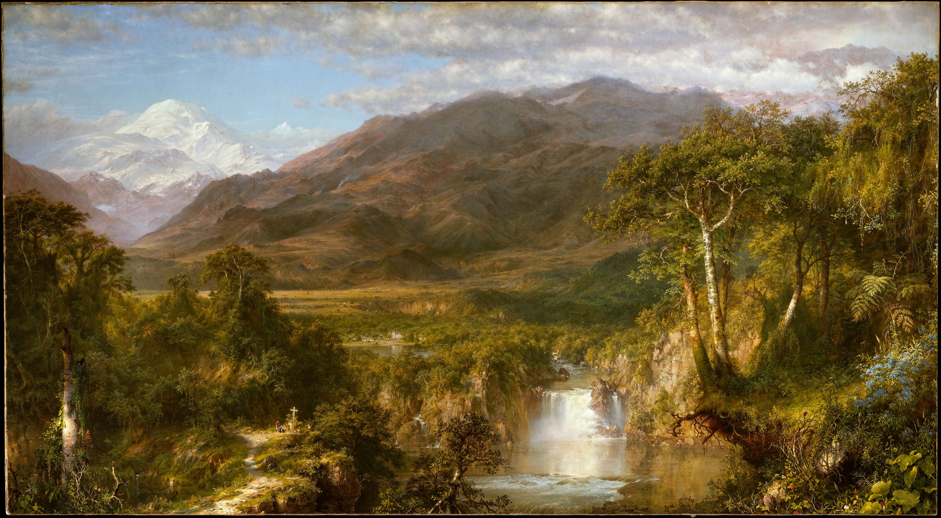
Frederic Edwin Church's Heart of the Andes of 1859 creates enormous distance without relying on a tiled floor or a corridor of straight lines. Dark plants, rocks, water, and tree trunks occupy the foreground. Smaller forms overlap through the middle distance, while mountains rise in paler, less sharply differentiated layers beneath the sky. Changes of value, contrast, colour intensity, and detail work with scale and occlusion to extend the landscape.[13]
These changes belong to aerial or atmospheric perspective: the pictorial use of tonal and colour shifts associated with viewing things through greater depths of air.[3] But the painting is a highly composed vision, not a transparent survey. Near detail gives the eye many stopping places, water opens a route inward, and the distant peaks provide a luminous release. Church combines cue families so that the landscape feels both minutely present and almost unbounded. The result shows why perspective is as much about pacing attention as calculating distance.
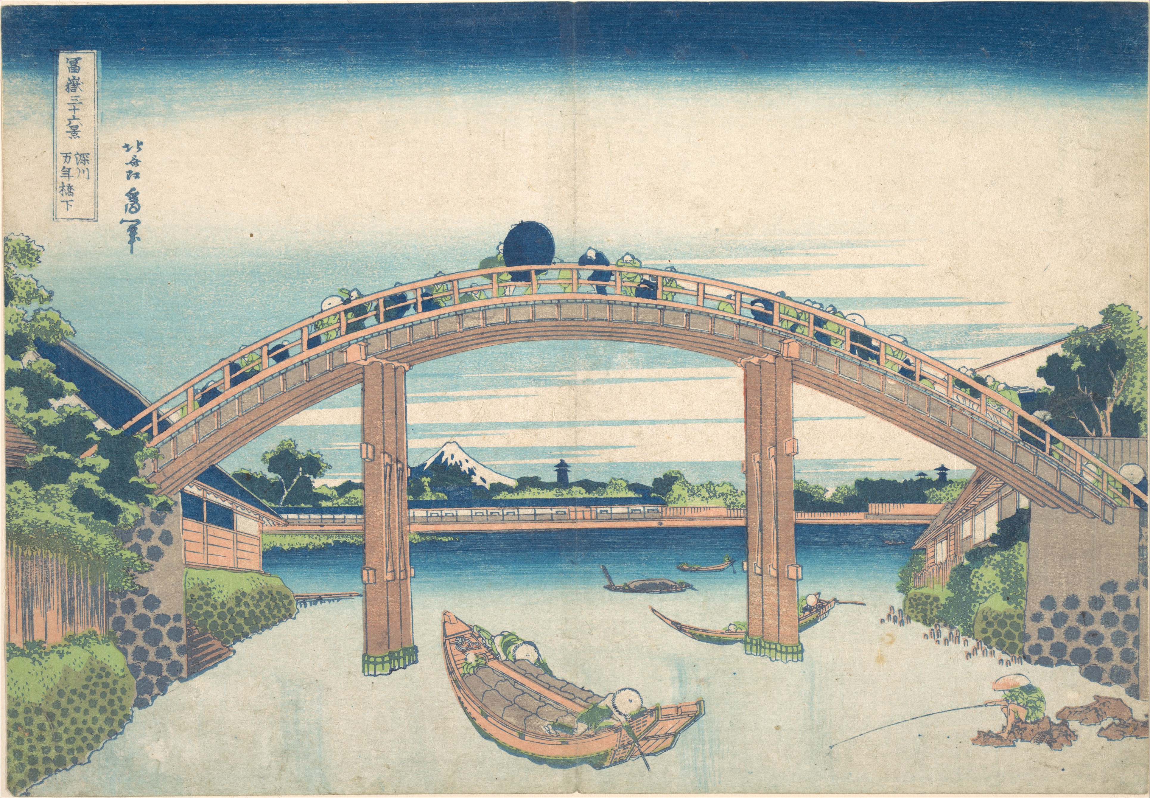
Katsushika Hokusai — Under the Mannen Bridge at Fukagawa
In Hokusai's Under the Mannen Bridge at Fukagawa, made about 1830–32, a great blue arch spans the upper half of the print. We look down towards a loaded boat and fishermen near the river, across overlapping banks and bridge supports, and through the opening to a very small Mount Fuji. The print's elevated, oblique view lets top, side, and distant forms coexist, while dramatic framing makes the bridge seem close enough to pass beneath.[14]
Depth here comes from a coordinated set of differences: the bridge is large and cropped by the sheet; people, craft, and landscape occupy distinct scales; one form interrupts another; and Fuji is held inside an architectural frame. It would be misleading to judge the print only by how neatly its edges conform to a single Western grid. Hokusai uses geometry, scale, colour blocks, and contour to make distance legible while preserving the designed flatness and rhythm of the woodblock surface. The represented route through space and the pattern across paper remain active at the same time.
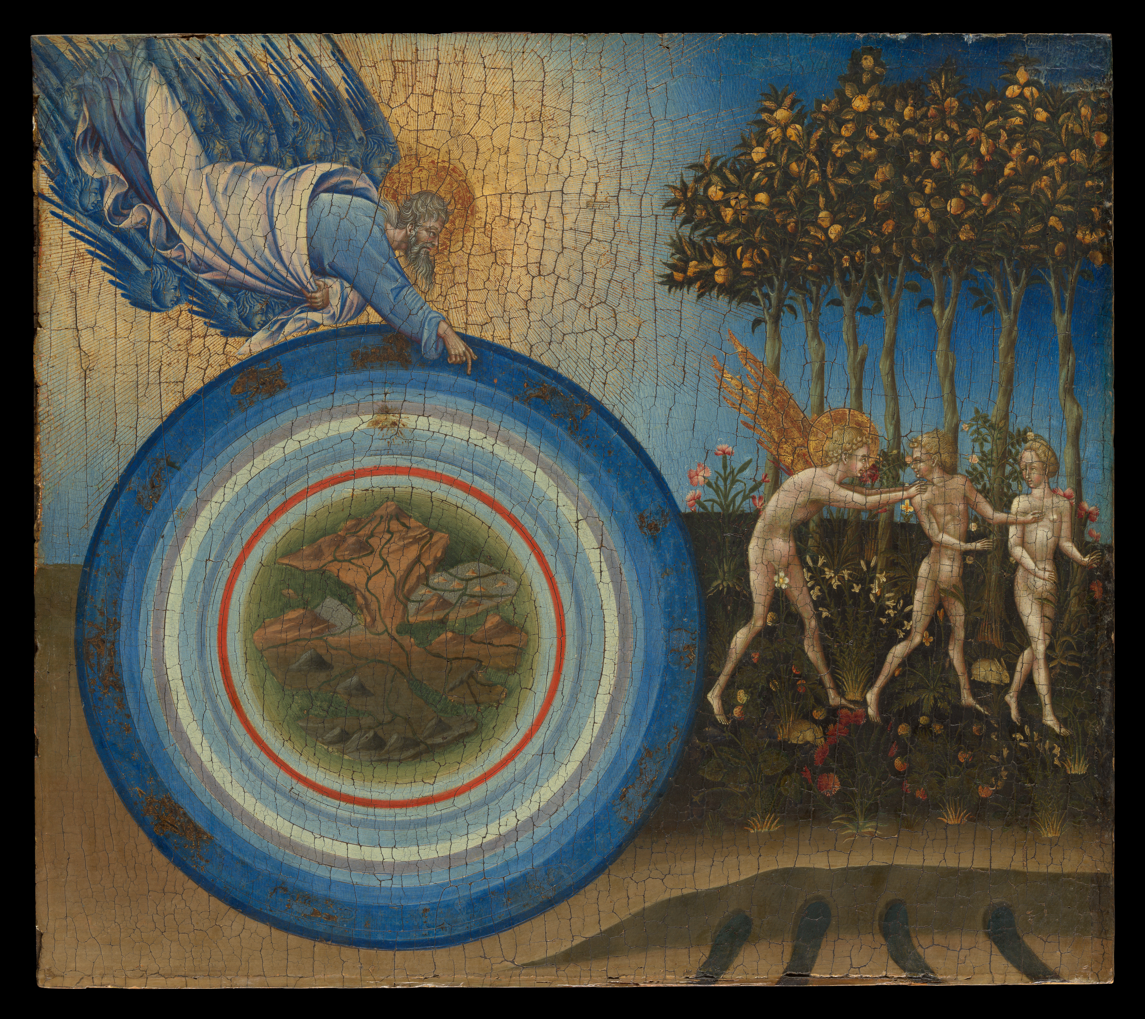
Giovanni di Paolo — The Creation of the World and the Expulsion from Paradise
Giovanni di Paolo's 1445 panel joins two moments from Genesis. At the left, God gestures above a circular cosmos made of concentric zones; at the right, an angel leads Adam and Eve across a flowering garden. Gold ground, diagrammatic circles, repeated trees, and a lateral narrative order matter more than a single continuous viewpoint.[15]
That choice should not be described as an unsuccessful attempt at Florentine naturalism. In discussing the companion panel Paradise, the Met notes that Giovanni could prioritise graceful compositional rhythm over perspectival or spatial naturalism to intensify a visionary effect.[15] The same caution helps here. The panel distinguishes divine cosmos, garden, and movement through symbolic and narrative relationships. Its order is precise even though it does not ask us to imagine one spectator standing before one uninterrupted world. Perspective analysis becomes more useful when it recognises such positive alternatives instead of arranging images on a ladder from flat to advanced.
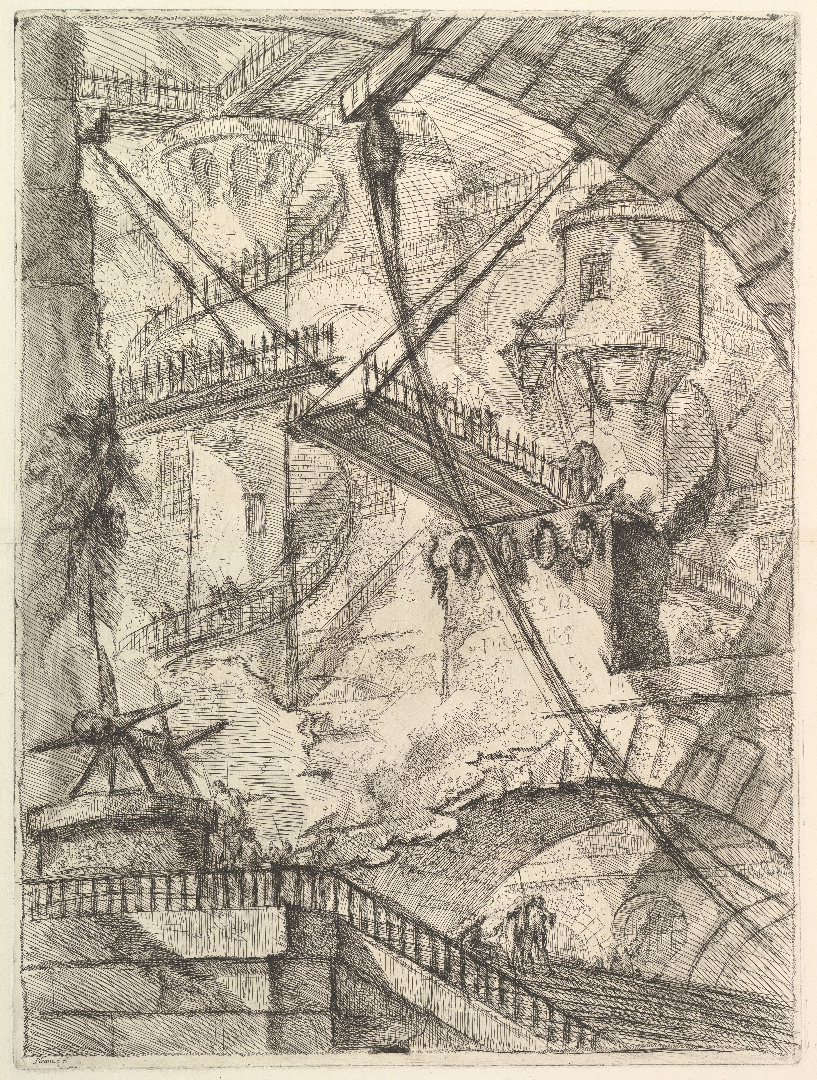
Giovanni Battista Piranesi — The Drawbridge
Piranesi's The Drawbridge, from the Carceri d'invenzione of about 1749–50, offers almost the opposite problem. Stairs, platforms, arches, chains, and bridges produce abundant evidence of depth. Tiny figures give the architecture an overwhelming scale, shadows divide near from far, and a low viewpoint makes the structures tower. Yet following the connections soon becomes difficult: routes disappear, levels compete, and plausible fragments resist becoming one secure map.[16]
The uncertainty is expressive rather than simply defective. The Met describes the spatial anomalies and ambiguities of the Carceri series as means of conveying vastness and strength.[16] Piranesi demonstrates that strong perspective cues do not guarantee calm or logical space. They can be multiplied until the viewer's effort to orient themselves becomes the subject. Where Fra Carnevale gathers incidents within a stable architectural order, Piranesi uses architecture to keep orientation in suspense.
A concise history without an origin myth
Mathematical linear perspective became a defining achievement of fifteenth-century Italian art, but artists did not suddenly discover depth at one moment. Ancient accounts describe illusionistic painting, and artists used modelling, overlap, scale, and foreshortening long before the Renaissance geometry associated with a single viewpoint was formalised.[6] Spatial traditions also developed differently across media, periods, and cultures.[8] The useful historical question is therefore not “Who invented perspective?” in the broadest sense, but which system is being discussed, how it was recorded, and what work it enabled artists to do.
In fifteenth-century Florence, artists revived and developed a mathematical ordering of receding space. Leon Battista Alberti described an underlying geometry in De pictura in 1435, presenting the painting as a structured view and explaining how a focal point and measured recession could coordinate a scene.[1][7] Filippo Brunelleschi's celebrated experiments belong to this history, and his dedicated page explains the evidence and limits of the linear-perspective account. These developments made a reproducible system available for architecture, figures, and narrative, but they did not replace every other way of organising images.
Later artists extended, combined, taught, and challenged these systems. Aerial perspective could make irregular landscape recede where straight-line construction was less visible. Print culture helped circulate diagrams and viewing devices. City painters could exploit several architectural directions; draughtsmen could test the compression of bodies; artists working with Japanese woodblock traditions could absorb and transform imported spatial devices while retaining other conventions. Modern art would further expose the picture surface, tilt or fracture viewpoints, and use inconsistency as a deliberate resource. Perspective remained a field of choices, not a solved problem.
How to read perspective in an artwork
Start with what the image asks your eye to treat as near and far. Look for overlap before searching for vanishing points. Compare repeated sizes and intervals. Notice whether high placement suggests distance, whether texture becomes less distinct, and whether light or colour changes across zones. If straight edges converge, group only those that could plausibly be parallel in the represented world. Then locate the implied viewpoint: high, low, central, displaced, fixed, or unstable.
Next ask what those choices accomplish. Do they make a story easy to follow, give a body weight, lead towards a focal incident, open a landscape, or obstruct orientation? Do the cues agree, or does the surface retain a competing flat order? The site's guide to space as an element of art considers depth alongside interval, scale, compression, and the physical or illusionistic field. Perspective is the more specific question of how a viewpoint and spatial relations are organised within that field.
Finally, resist treating accuracy as the only standard. A coherent linear construction can be expressive, but so can a gold-ground cosmos, an elevated print, a flattened room, or an impossible prison. Perspective is best understood as visual rhetoric: it positions us, establishes relationships, and shapes the manner in which an image unfolds. Once the cue families are visible, the question changes from “Is the perspective correct?” to “What kind of space has this artist chosen, and why does it feel this way?”
Explore perspective in art
All seven evidence-checked guides are available in this local perspective group.
Watch Three Different Routes into Pictorial Depth
Choose a historical experiment, a geometric explanation, or an atmospheric lesson to compare distinct perspective systems.
Linear Perspective: Brunelleschi's Experiment
See how a fixed viewpoint and picture plane make one influential measured spatial system intelligible.
Watch on YouTubeFrequently Asked Questions
Perspective is the family of choices that establishes relationships among a viewer, a flat picture surface and a represented world.
No. Convergence is one important system, but overlap, scale, placement, focus, texture, colour, value and foreshortening can also make depth legible.
Space is the broader physical or illusionistic field of an artwork; perspective asks more specifically how viewpoint and spatial relationships are organised within it.
Yes. Many works create coherent spatial, symbolic or decorative orders without one continuous measured grid, and some deliberately use inconsistency for expressive effect.
Start with near/far cues and the implied viewpoint, then ask how those relationships control attention, narrative, scale, bodily presence or spatial uncertainty.
Discussion
Which work most clearly positions you as a viewer—and which creates the richest sense of space without depending on one continuous linear grid?
Reader Insights
Identify overlap, scale and placement before looking for vanishing points so the analysis is led by visible evidence.
Converging edges reveal a system only when they could represent the same direction in the depicted world.
A perspective can clarify narrative, create bodily immediacy, stage grandeur or deliberately make orientation uncertain.
Join the Conversation
Share one precise observation or a useful museum example below.
References
- National Gallery, London, “Linear perspective,” glossary. https://www.nationalgallery.org.uk/paintings/glossary/linear-perspective
- National Gallery, London, “Vanishing point,” glossary. https://www.nationalgallery.org.uk/paintings/glossary/vanishing-point
- National Gallery, London, “Aerial perspective,” glossary. https://www.nationalgallery.org.uk/paintings/glossary/aerial-perspective
- National Gallery, London, “Foreshorten,” glossary. https://www.nationalgallery.org.uk/paintings/glossary/foreshorten
- National Gallery, London, “Picture plane,” glossary. https://www.nationalgallery.org.uk/paintings/glossary/picture-plane
- The Metropolitan Museum of Art, Looking to Connect with European Paintings: Visual Approaches for Teaching in the Galleries, “Illusion.” https://resources.metmuseum.org/resources/metpublications/pdf/looking_to_connect_with_european_paintings_visual_approaches_for_teaching_in_the_galleries.pdf
- The Metropolitan Museum of Art, The Art of Renaissance Europe: A Resource for Educators, “Linear Perspective.” https://resources.metmuseum.org/resources/metpublications/pdf/The_Art_of_Renaissance_Europe_A_Resource_for_Educators.pdf
- Ashmolean Museum, Focus on Perspective in Art: Teacher Notes. https://www.ashmolean.org/sites/default/files/ashmolean/documents/media/focus_on_perspective_in_art_teacher_notes.pdf
- The Metropolitan Museum of Art, “Draughtsman Making a Perspective Drawing of a Reclining Woman,” object 366555. https://www.metmuseum.org/art/collection/search/366555
- The Metropolitan Museum of Art, “The Birth of the Virgin,” object 435848. https://www.metmuseum.org/art/collection/search/435848
- The Metropolitan Museum of Art, “Piazza San Marco,” object 435839. https://www.metmuseum.org/art/collection/search/435839
- The Metropolitan Museum of Art, “Reclining Female Nude,” object 459451; and related sheet, object 459448. https://www.metmuseum.org/art/collection/search/459451 ; https://www.metmuseum.org/art/collection/search/459448
- The Metropolitan Museum of Art, “Heart of the Andes,” object 10481. https://www.metmuseum.org/art/collection/search/10481
- The Metropolitan Museum of Art, “Under the Mannen Bridge at Fukagawa,” object 56387. https://www.metmuseum.org/art/collection/search/56387
- The Metropolitan Museum of Art, “The Creation of the World and the Expulsion from Paradise,” object 458971; and “Paradise,” object 436512. https://www.metmuseum.org/art/collection/search/458971 ; https://www.metmuseum.org/art/collection/search/436512
- The Metropolitan Museum of Art, “The Drawbridge,” object 337060; and “The Round Tower,” object 337725. https://www.metmuseum.org/art/collection/search/337060 ; https://www.metmuseum.org/art/collection/search/337725