by Tom Gurney
Tom Gurney BSc (Hons) is an art history expert with over 20 years experience
Page created on September 3, 2026 / Page updated on September 13, 2026
Email: tomgurney1@gmail.com / Phone: +44 7429 011000
How Separate Marks Build Tone, Texture and Colour across Viewing Distance
Stippling builds tone, texture or colour from dots and very short touches. Greater density can darken an area; changes in dot size, colour and spacing can describe surface or volume. The term names a mark-making operation rather than one movement, medium or visual theory.[1]
Painters can stipple with a brush, pen or other tool. Dots may remain individually visible or merge at viewing distance. They can imitate texture, create a soft tonal field or keep colours physically separate.
At a Glance
- Core actiondots or very short touches accumulate into tone, texture, form or colour.
- Density matterscloser spacing can darken a passage or make it appear more continuous from a distance.
- Not identical to Pointillismstippling names a mark-making action; Pointillism names a historically specific Neo-Impressionist practice.
- Distance changes perceptionseparate deposits can read individually nearby and merge into larger forms farther away.
- Look for variationsize, colour, pressure, spacing and direction prevent the surface from becoming mechanically uniform.
Contents
How stippling builds an image
A single dot contains little direction, but thousands create relationships. Tight spacing produces weight; open spacing lets the ground participate. A painter can vary pressure and load, repeat equal touches or alternate hues. Overlap can make a passage dense and opaque, while isolated touches allow light from the preparation to remain active. Unequal dots create rhythm without giving the field a single linear direction. NGA guidance on painting fundamentals places dots among the elementary marks from which complex surfaces grow.[2]
Stippling differs from hatching, which uses repeated lines, and from dry brush, which drags a broken stroke across texture. A short touch can sit between dot and dash, so rigid classification is less useful than describing shape, density and placement.
Distance changes the effect. Nearby, the surface may look granular; farther back, marks group into figures and colour fields. The existing Optical Color Mixing guide explains how separated hues may integrate perceptually without becoming the same physical mixture.[8]
Four paintings to compare
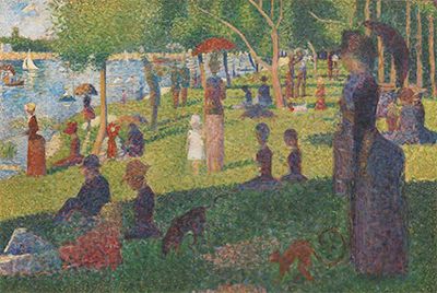
Study for A Sunday on La Grande Jatte
Seurat's oil study at the Metropolitan Museum uses small, lively touches to establish figures, grass, water and shade. The museum identifies it as one of many studies made around the monumental composition.[3] The marks vary in length and density rather than obeying a mechanical dot grid.
This flexibility matters. Stippling can participate in search and revision. Short touches test colour relationships and masses before the more controlled surface of a finished work.
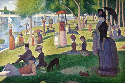
A Sunday on La Grande Jatte—1884
The Art Institute of Chicago's large A Sunday on La Grande Jatte—1884 extends separated marks across a carefully organised park scene. Its object history records Seurat's sustained reworking between 1884 and 1886.[4] The surface is systematic, but not uniformly made from identical dots.
Some passages contain small touches, others longer strokes or overlaid borders. “Pointillism” became a popular label, while Seurat and his circle were also discussed through Divisionism and Neo-Impressionism. Stippling accurately describes many marks but does not by itself explain the movement's colour aims or social history.[5]
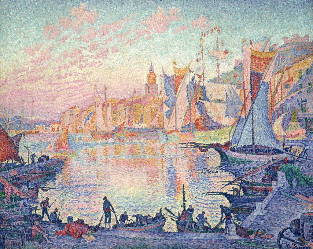
The Port at Sunset Saint-Tropez
Signac's Saint-Tropez harbour enlarges separated colour marks into mosaic-like units. Musée d'Orsay accounts of Neo-Impressionism trace how artists developed Seurat's example into individual approaches.[6] At close range, pink, orange, blue and violet touches remain distinct; at distance they organise water, sails and evening light.
Many marks are rectangular dabs rather than round dots. Calling the work “stippling” can describe the repeated touches, but Pointillism or Divisionism provides the more specific historical context. Technique and movement overlap without being synonyms.
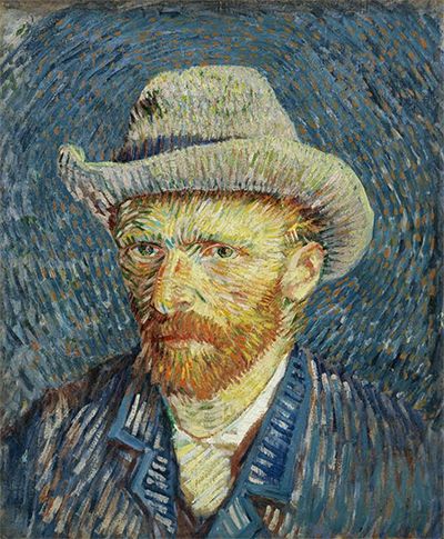
Self-Portrait with Grey Felt Hat
Van Gogh's Self-Portrait with Grey Felt Hat shows what happens when separated colour becomes strongly directional. Short blue, orange and green strokes radiate around the head and model the jacket. Van Gogh Museum research connects the Paris-period portrait to his encounter with Neo-Impressionist colour.[7]
Some tiny touches approach stippling, yet many are unmistakable dashes. Their direction describes planes and energy in a way a neutral dot would not. The portrait is a useful counterexample to the habit of calling every separated mark Pointillist stippling.
Stippling and Pointillism
Pointillism usually refers to the late nineteenth-century Neo-Impressionist use of separated touches, especially in the work of Seurat and Signac. Divisionism emphasises the separation of colour and its perceptual aims. Stippling is older and wider: it can be monochrome, descriptive and unrelated to modern colour theory.[1][5]
Printed halftone dots are mechanically organised to reproduce tone; digital pixels are image-display units. Both can resemble stippling when enlarged, but their production systems differ. A painter's dots vary through hand pressure, material load and surface resistance.
The distinction prevents historical overreach. A Renaissance drawing with dotted shadow is not Pointillist, and a Neo-Impressionist painting may include dashes, blocks and interwoven strokes alongside dots.
How to analyse stippled marks
Move between close and normal viewing distances. Record whether marks are round, square, elongated or irregular; whether they overlap; and whether the ground remains visible. Map changes in density before interpreting them.
Then ask what the dots accomplish. They may model shadow, distinguish foliage from skin, keep complementary colours apart or create an even decorative field. Compare nearby passages to see whether one system governs the whole painting.
Finally, separate observation from movement attribution. Dots establish stippling; Pointillism requires historical context and a broader colour practice. Reproductions can merge marks or introduce pixels, so high-resolution museum images and object examination are essential. The value of the term lies in making the painted touch more precise, not in replacing one loose label with another.
Watch: Stippling, Pointillism and Optical Mixture
Choose a National Gallery of Art interpretation of Seurat, a practical museum art class, or a National Gallery account of his method.
How Does Seurat Connect Pointillism to Workers' Rights?
Connect Seurat's systematic points to labour, modernity and the social setting of his pictures.
Watch on YouTubeFrequently Asked Questions
Stippling builds tone, texture, form or colour through dots or very short separate touches.
No. Stippling is a broad mark-making method; Pointillism is a historically specific Neo-Impressionist approach to separated colour.
Closer or heavier deposits can make areas appear darker or more continuous, while wider spacing preserves more of the ground.
Nearby, individual marks and gaps are visible; farther away, they may combine perceptually into larger tones, colours and forms.
Compare dot size, spacing, colour, pressure and grouping, then describe how their appearance changes with viewing distance.
Discussion
Which work on this page changes most dramatically as you imagine moving from close surface inspection to a distant view?
Reader Insights
The technique is relational: near and far views reveal different structures.
Compare crowded, sparse and transitional passages.
Separated dots do not automatically make every work Pointillist.
Join the Conversation
Share one precise observation or a useful museum example below.
References
- Getty, “Hatching and Stippling.” https://www.getty.edu/art/collection/terms/hatching-and-stippling/
- National Gallery of Art, “Explore the Basics of Painting.” https://www.nga.gov/educational-resources/explore-basics-painting
- Metropolitan Museum of Art, “Study for ‘A Sunday on La Grande Jatte.’” https://www.metmuseum.org/art/collection/search/437658
- Art Institute of Chicago, “A Sunday on La Grande Jatte—1884.” https://www.artic.edu/artworks/27992/a-sunday-on-la-grande-jatte-1884
- Metropolitan Museum of Art, “Neo-Impressionism.” https://www.metmuseum.org/essays/neo-impressionism
- Musée d'Orsay, “Signac collector.” https://www.musee-orsay.fr/en/whats-on/exhibitions/signac-collector
- Van Gogh Museum, “Self-Portrait with Grey Felt Hat.” https://www.vangoghmuseum.nl/en/collection/s0016V1962
- TheHistoryOfArt.org, “Optical Color Mixing in Art.” https://www.thehistoryofart.org/topics/elements-of-art/color/optical-color-mixing/