


 by Tom Gurney
Tom Gurney BSc (Hons) is an art history expert with over 20 years experience
Email: tomgurney1@gmail.com / Phone: +44 7429 011000
Relationship, Process and Evidence
Architectural diagrams are drawings that make a chosen relationship visible. They can locate a route through a building, group rooms by programme, trace the path of sunlight, compare structural forces or reduce a city to lines of connection. Their power comes from omission as much as depiction. A floor plan records walls and openings at a stated scale; a diagram may set walls aside so that a brief, sequence or conflict becomes easier to examine. It need not resemble the building it eventually helps to design. A beautiful circle of rooms can still be a poor plan; a crude set of arrows can expose a problem that a polished perspective conceals. [1], [2], [3], [17], [19], [21]
Diagramming belongs both before and after construction. An architect can sketch possible adjacencies before choosing a building footprint. An analyst can redraw an existing street system to test how its paths connect, then compare that abstraction with what people actually do. A museum can preserve successive sheets from one project, revealing that an initial relation changed during negotiation. These roles cannot be folded into a single claim that a diagram “generated” a building. Its questions, scale, maker and evidence determine what the marks mean. [9], [12], [13], [14], [18], [31], [32], [33], [34], [35]
At a Glance
- Core ideaA diagram deliberately selects a relationship—programme, movement, geometry, climate, force or spatial network—rather than reproducing every visible part of a building. [1], [2], [3], [17]
- Not the same as a planPlans usually locate measured elements; an adjacency or Form diagram can express relationships before the geometry of those elements is settled. [12], [13], [14], [17]
- Common formsBubbles and links, pathways and arrows, point–line–surface systems, proportional construction, sun paths, structural/load diagrams and axial networks. [5], [6], [7], [8], [9], [10], [17], [22], [31], [32], [33], [34]
- When usedBefore design, during iteration, in client or workshop discussion, for environmental/structural study and to analyse existing buildings or cities. [1], [2], [3], [9], [10], [11], [12], [13], [14], [26], [31], [32], [33], [34], [35]
- What it can clarifyWhich activities need proximity, how people move, where light or load travels, and which spatial connections merit a closer look. [10], [17], [28], [29], [30], [31], [32], [33], [39], [40]
- What it cannot prove aloneA built route's actual use, the safety of a structure, the final plan, accessibility for all bodies or the cause of a completed work. [14], [17], [18], [31], [34], [35]
- How to read itAsk what its lines, dots, colours and boundaries stand for, whether time and direction matter, and which occupants or constraints are absent. [17], [19], [20], [21], [31], [32], [33], [34], [35]
- Read beside evidenceCompare diagrams with briefs, revised drawings, measured plans, material tests, observations and the building itself. [1], [2], [12], [13], [14], [18], [26], [33], [34], [35]
Contents
- What a diagram selects
- Geometrical rules, proportion and measured detail
- Programme, movement and the twentieth-century shift
- Louis Kahn's Form at Rochester
- Circulation, event and changing occupation
- Site, roads and the problem of urban scale
- Light, climate and structure on one sheet
- Generative diagrams and the translation problem
- Analytical diagrams of buildings and cities
- How to read a diagram beside architecture
What a diagram selects
A diagram is not simply a sketch with fewer lines. Two equally spare drawings may answer very different questions. A rectangle with a doorway could be a schematic plan of a room. Replace the rectangle with a circle labelled “library” and connect it to “court” and “street”; the new drawing may ask how the library relates to public access, without claiming those spaces are circular or adjacent on the finished site. If an arrow between them indicates a staff route rather than a public route, its direction and label matter more than its graphic elegance. The meaningful abstraction is a decision about which facts to keep. [1], [2], [17], [19], [20], [21]
Architectural collections preserve this diversity. RIBA's drawings range from early conception to technical development; the CCA's Cedric Price BMI/HQ record lists circulation and structural diagrams alongside diagrammatic plans and axonometric sheets. A page can carry more than one method of thinking, and the methods should not be merged because all are “architectural drawings.” An axonometric might make a three-dimensional arrangement graspable. A circulation diagram can ignore that arrangement's material finish while examining routes through it. A structural diagram may direct attention to loads or supports that a perspective renders invisible. [1], [2], [9]
The selective nature of a diagram is also its danger. A red route can imply urgency, but the colour might encode no measured time. A bold connection between two activities can suggest easy passage despite a locked door or stepped level. A simplified court may have no room for a queue or wheelchair turn. A diagram should therefore carry a legend, stated scale or explicit “not to scale” warning, an author and date where known, and a sentence identifying its question. Without those, a reader can mistake an argument for a survey. [17], [31], [32], [33], [34], [35]

Text alternative for the diagram
Four invented labelled fields make a route, relation, sunlight and load different uses of an arrow.
Geometrical rules, proportion and measured detail
Some of the oldest surviving architectural diagramming codifies a geometrical operation. Gothic builders used drawn rules to make recurring forms such as pinnacles reproducible in workshops. The Met's teaching film on Mathes Roriczer reconstructs a process that moves from base figure to elevation, making proportions instructive rather than portraying one finished skyline. Such drawings can be close to fabrication: a line instructs another line, and a rule can be repeated at a different scale. But even a successful geometrical derivation does not explain quarrying, joints, load, labour or the site on which the element eventually stands. [3], [4]
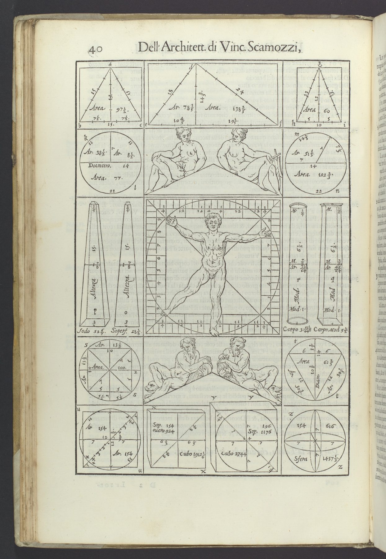
The Renaissance left diagrams whose ambitions differ from a single building instruction. Vincenzo Scamozzi's 1615 woodcut from L'Idea della Architettura arrays human figures, circles, squares, triangles and numerical measures. The central stretched figure is an argument about ideal proportion and architecture's relation to the human body. It is not a plan of a villa, nor evidence that actual dwellings accommodated every body it depicts. The ideal is normative: it proposes which ratio an architect ought to admire. A modern reader can admire the inventive drawing while also noticing that its universal body is specific, gendered and culturally located. [5]
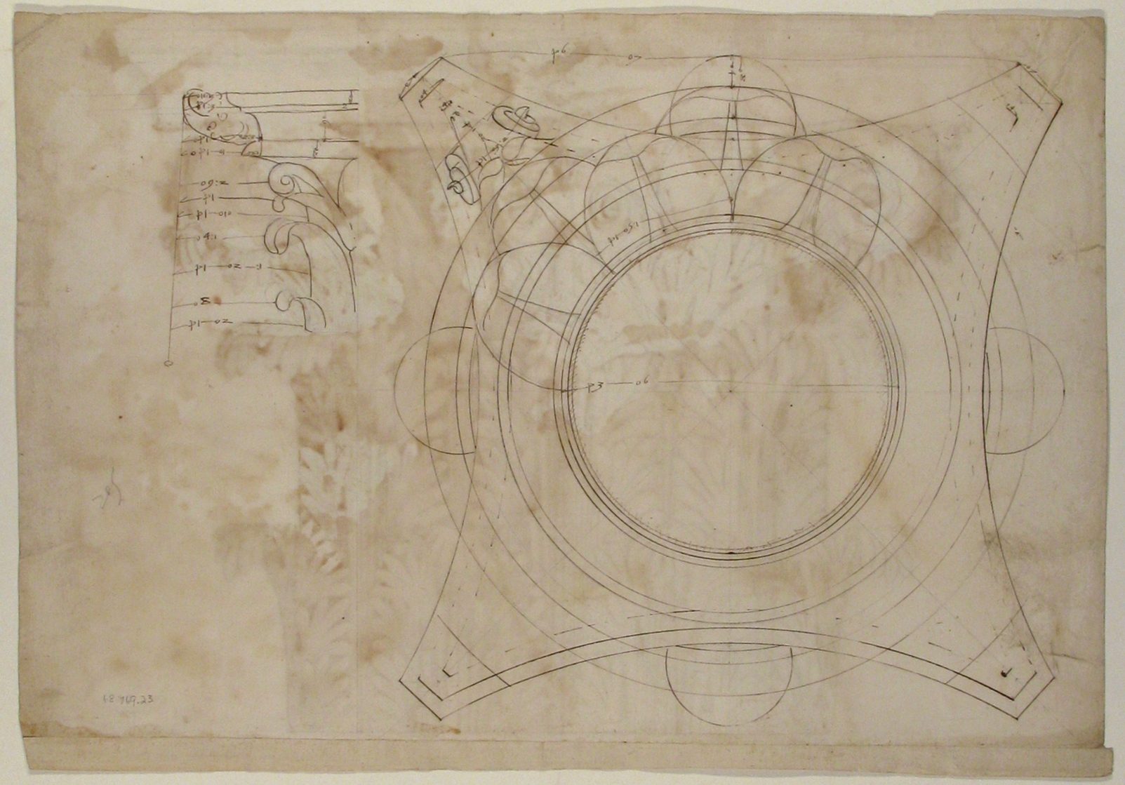
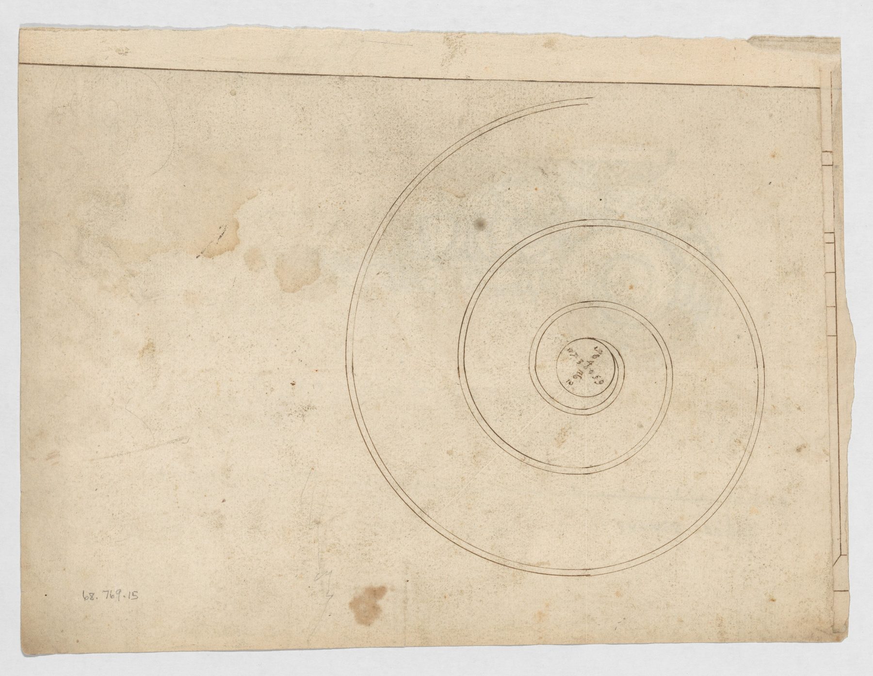
The Met holds a French sixteenth-century sheet with a Corinthian capital elevation on one side and a plan diagram with detail on the other. On the verso, a circular centre, compass geometry and projected corner forms help a draughtsperson understand a carved capital in plan rather than only as a frontal profile. Another sheet records the construction of an Ionic volute as nested curves. These are neither generic bubble charts nor finished façades. They are operational drawings for form and detail, with lines that calculate relations a carved surface would conceal. Looking at the correct side of each sheet matters because “the architectural drawing” is not one undifferentiated image. [6], [7]
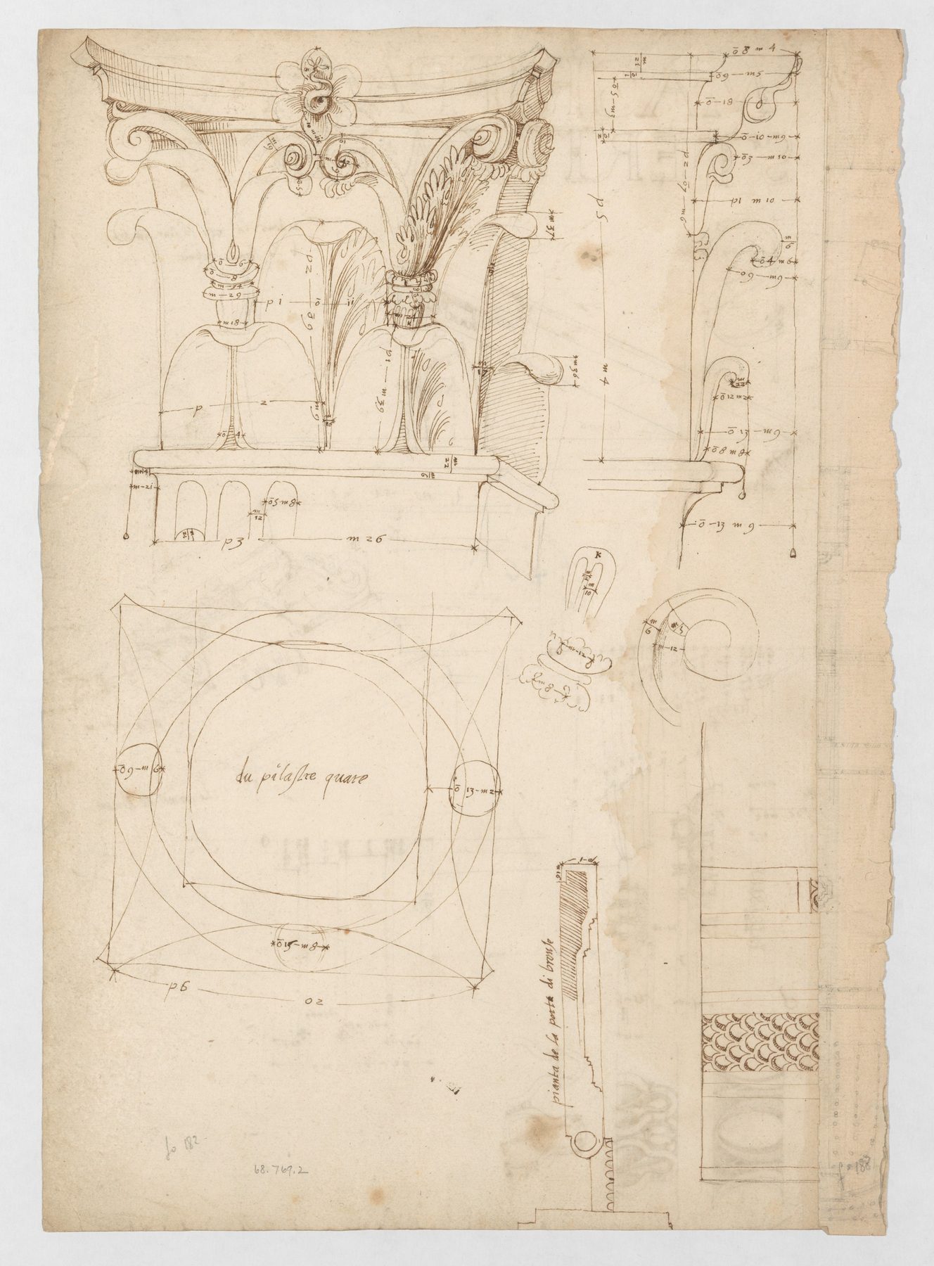
An annotated Pantheon-detail sheet combines capital projection, dimensional notes, a column diagram and a door detail. Such a survey-like operation can tell a later draughtsperson how a visible Roman element appears and how its parts relate. It does not by itself reveal how the original Roman designers chose proportions centuries earlier. Diagrams may reconstruct or analyse inherited architecture as readily as they propose new architecture. RIBA's Palladio holdings likewise include surveys, working sketches and more resolved drawings: the status of the sheet has to be read from context, not inferred from the fact that it uses geometry. [2], [8]

Text alternative for the diagram
Three invented circles mark ideal, survey and proposal; no historical Met sheet is reproduced.
Programme, movement and the twentieth-century shift
The twentieth-century rise of programme diagrams did not erase geometry, plans or presentation images. Hyungmin Pai's historical study traces a change in how architectural design was published and argued between 1918 and 1943: the portfolio of a completed object shared attention with analyses of functions and relations. What is newly prominent is the claim that a building can be reasoned from the way people work, live or circulate, rather than chiefly judged as a composed exterior. This was a shift in architectural rhetoric and method, not a universal date at which every architect stopped drawing façades. [15], [16]
Movement lines preceded many familiar room bubbles. The Spanish dissertation by Rovenir Bertola Duarte follows early efficiency investigations associated with the Gilbreths and Christine Frederick. Routes through domestic or industrial work could be traced and compared. A shorter route between stove, sink and storage might reduce wasted motion; the same drawing, however, may normalise a particular division of domestic labour. Once movement is transformed into a chart of which rooms “should connect,” people can disappear into a line between abstract zones. A diagram of convenience is not automatically a diagram of dignity, safety or equitable work. [17]
A bubble diagram is useful precisely because it is not yet a floor plan. A school can begin with “classroom,” “library,” “quiet study,” “public entrance” and “staff service,” placing close-working activities near one another and marking conflicts. At this stage a cluster can be moved without pretending a wall, door or fire escape has been solved. Later, area requirements, daylight, acoustic separation, accessible passage and structural span may force a different arrangement. The bubble diagram can help the designer formulate the brief, then be revised by evidence that its simplicity had suppressed. [17], [26], [30], [31]
Kyoto University's student study of more than 100 artist residencies illustrates this use of classification. Rather than begin with one presumed artist dwelling, researchers compared ways lodging, gallery, studio and city life could relate. Their diagrams became alternatives for further design work, not a guarantee that one accommodation pattern would satisfy every residency. Kyoto University's built Research Commons describes another layered programme: a working room, courtyard, older library and campus history were treated as related temporal and spatial conditions. Such diagrams can carry institutional memory and flexible use, while the final room still depends on furniture, doors, maintenance and people. [29], [30]

Text alternative for the diagram
Five invented school activities form a node network, with teal close links and red dashed conflicts; the nodes are not literal rooms.
Louis Kahn's Form at Rochester
Louis Kahn's early work for the First Unitarian Church in Rochester is a particularly clear case of a diagram proposing an architectural relation without fixing the plan. A congregation's brief and responses framed the project in 1959. Kahn drew what he called a Form diagram: a central square associated with the sanctuary, surrounded by the ambulatory, corridor and school. The school was not an arbitrary outer band. It participated in an idea about gathering, learning and the differentiated yet unified life of the congregation. Fehmi Dogan's Georgia Tech dissertation reads this as a conceptual-spatial proposition: the diagram shaped how Kahn understood the institution and how spaces could be related. [12], [13], [14]
The rings should not be treated as literal concentric masonry on the finished site. Drawings of the church changed through the project, and Penn's archive preserves 29 presentation drawings and a model, with further documentation of a later addition. The “Form” was compelling partly because its relation could survive alteration in size, circulation and material. To read only the initial diagram as though it were the executed floor plan would miss negotiation with the client, the development of construction drawings and Kahn's revised ways of distributing rooms. [12], [13], [14]

Text alternative for the diagram
A new, invented congregation relation graphic; it is not Kahn’s Rochester Form sheet or any tracing.
This case also unsettles the neat slogan “concept first, building later.” The religious and educational idea became concrete through drawing spatial hierarchy; the hierarchy, in turn, made aspects of the institution's brief discussable. Dogan's comparison with Stirling and Libeskind suggests that designers construct spatial concepts while working, not always translating an untouched verbal idea into geometry. A diagram can be a site of thought, not just a report of thought already complete. That insight allows the Rochester sheet to remain historically specific instead of becoming a formula for every school, church or library. [14]
Circulation, event and changing occupation
Routes can describe circulation as measurable connection, but also as a sequence of events. Cedric Price's unbuilt 1977 Westpen livestock facility is revealing because the architecture was conceived through moving people and animals. The CCA essay follows pens for collecting, drafting, catching, dipping, draining and drying; gates and passages mattered because their configuration could change how the operation worked. “Circulation” here cannot be reduced to a clean visitor arrow: different creatures occupy different positions, and activity is timed. The proposal is not a completed farm facility to be surveyed, but its diagram clarifies how a working programme could generate spatial questions. [9], [10]
Bernard Tschumi's Manhattan Transcripts address a different kind of movement. The Centre Pompidou describes their interweaving of space, movement and event: photographs can register an action, plans transform an architectural setting, and diagrammatic tracks register figures moving through it. The Episode 4: The Block object from 1981 makes the compound format plain. A route is not merely a corridor; it can become an argument about what happens, what a drawing remembers, and what an architecture might provoke. Unlike an engineering path diagram, the notation is deliberately speculative and cultural. [22], [23]
For the Parc de la Villette competition, Tschumi separated points, lines and surfaces: a grid of follies, routes of movement and fields for programme. Their overlay resists a single monument-like master image. It does not mean each coloured line literally instructed a contractor where to put every door, nor that all later visitor behaviour was anticipated. The Pompidou's French interview and lecture make useful companions to the notations because Tschumi explains how concept and representation interact over time. His completed park must still be read against built paths, events, altered programmes and its public use. [22], [24], [25]

Text alternative for the diagram
Three invented zones with separate morning and evening pathways; neither a Price nor a Tschumi drawing.
An urban movement study by Van Ginkel Associates, preserved by the CCA as Movement in Midtown, shows the same term at another scale. The archive concerns Manhattan streets across 34th to 63rd Streets; routes, crossings and destinations form a larger network than a single building's internal passage. The record establishes that movement was studied, not that every proposed circulation change was executed or caused a particular traffic outcome. A city diagram becomes a question about infrastructure and public space only when compared with streets and users outside its paper boundary. [11]
Site, roads and the problem of urban scale
The 1859 map of Central Park held by the New York Public Library states its double purpose in its title: it shows the original topography and diagrams roads and walks “now under construction.” Contour lines, water, carriage routes and pedestrian routes share one long sheet. The image is neither a purely natural landscape map nor a finished photograph of the park. It records an existing terrain and a projected/ongoing network together, making the designers' intervention readable against landform. Because it belongs to a staged project, a path drawn there should not be assumed to describe every later edge, crossing or planting. [37]
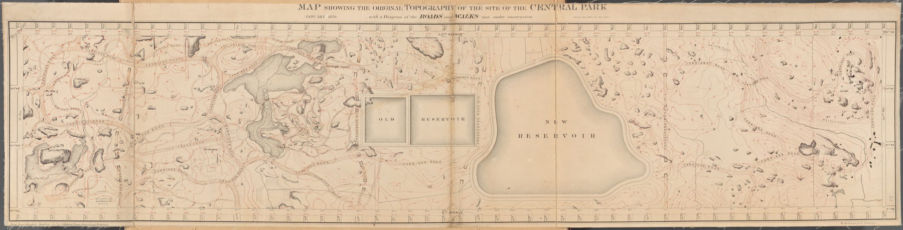
The map's scale exposes the limits of a simple adjacency bubble. On a large site, routes have gradients, widths, crossing conditions and differing users. One could mark “lake connected to meadow,” but that link would conceal the distance, the crossing of a transverse carriage road and the time a person needs to walk it. The usefulness of a diagram changes with the question: a map can compare broad interventions against topography while a local section or material study can address the bridge, kerb or stair that the map leaves small. [11], [33], [37]
The Bartlett's account of space syntax describes an observed-and-modelled pedestrian question at Trafalgar Square, informing its 2003 redesign. Here diagrammatic connectivity and actual pedestrian observation were brought together. That is a stronger evidentiary claim than reading one coloured map as proof that a street will be busy. Even observed movement depends on when the observation was made, weather, events, closures and the people included. The spatial network is significant, but it does not replace the social and temporal conditions of public space. [32], [33], [34], [35]

Text alternative for the diagram
Invented contour, route and crossing layers; no Central Park map element is copied.
Light, climate and structure on one sheet
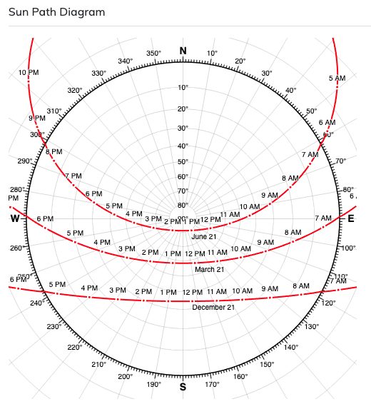
Environmental diagrams can make forces visible that a plan's wall lines do not. A sun-path plot names orientation, season and hour: it can help ask when light reaches a court or when shade falls across a window. A conceptual study of a roof might draw arrows for structural loads; a ventilation study might trace air movement and openings. None of these is a universal template. A sun chart needs a location and date to make site-specific claims; a load arrow needs assumptions about material, supports and weight; an airflow arrow must be tested against actual climate and occupant control. [9], [26], [28], [39], [40]
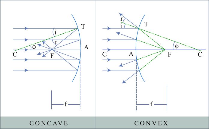
The Commons sun-path teaching image plots three seasonal tracks against compass bearings and altitude. Its shape is a compact reminder that “southern light” changes across the year, not evidence for the best orientation of a particular school. A MIT daylighting teaching figure compares concave and convex reflection by tracing incident and reflected rays. The optics change even when the surface line differs only in curvature. Such a figure makes a physical relation teachable; a façade detail would still require glare, weather, reflectance, maintenance and room use to be resolved. [39], [40]

Text alternative for the diagram
An invented room diagram has a gold sunlight ray, red load arrow and teal access path; no numerical performance is asserted.
Akihisa Hirata's discussion at Kyoto University offers a more entangled way to think about environmental and social diagrams. He considers people, objects, wind and light together rather than reducing a room to a separate sunlight score. His account is a contemporary argument for making relationships of use and atmosphere matter in design. It does not license every simulation as a measured prediction of what a finished room will feel like, especially when openings, furniture and occupation may change. [28]
Structural and environmental drawings become productive when they sit beside other records. ETH Zürich's German design-stage guidance separates early design propositions from the later pre-project's functional, technical and programme checks. A visually coherent roof-force diagram should thus provoke engineering calculation, joint and material tests, not stand in for them. Historical teaching around Hannes Meyer and Karel Teige likewise introduced sun and ergonomic diagrams as design questions, but their drawn variables cannot exhaust a dwelling's politics or lived variation. [26], [27]
Generative diagrams and the translation problem
A generative diagram is often described as a seed from which a building grows. That metaphor can be helpful if treated critically. The Turkish/English METU dissertation studies UNStudio's Möbius House, Arnhem Central and Mercedes-Benz Museum as projects that use topological or movement-based diagrams. In the Mercedes-Benz Museum, the trefoil and double-helical gallery routes help describe two intertwined visitor sequences. The diagram expresses a powerful circulation idea; it is not a complete account of the building's concrete construction, fire strategy, galleries, vehicle logistics or later public experience. [18]

Text alternative for the diagram
Invented route-through-tests sequence; it does not represent UNStudio’s Mercedes-Benz Museum.
The dissertation's conclusion is valuable because it resists an overconfident causal story. It cannot fully reconstruct how a first diagram was chosen or how every drawn relation became a built component. In practice, clients, engineers, architects and sites negotiate the translation. A concept may survive through revisions even though no contour in the early graphic maps precisely onto a finished wall. Conversely, a route may retain a recognizable shape while its intended experience changes with displays and visitor flows. The diagram's influence is real, but not a master cause from which all other decisions mechanically follow. [18]
Computational generation makes these choices explicit. Kawakubo and Tsuji's Japanese architectural research models directed room adjacency and uses it to generate rectangular arrangements. The computational graph can test many permutations rapidly, but it works only on the relationships and constraints encoded in it. A relation between kitchen and dining area can be assigned priority while daylight, cost or household variation may remain outside the model. Kyoto's AIR study shows a prior human task of classifying programme alternatives: selecting what to encode is itself design work. Diagrams can multiply possible layouts; they do not absolve the designer of judging the outcomes. [30], [31]
Odysseas Kontovourkis's University of Bath study makes the problem concrete through a hypothetical ferry terminal, where passengers share a broad destination but may move for different reasons and at different speeds. His 2009 doctoral abstract describes a real-time programme whose rules and parameters an architect could change to evaluate a proposed circulation scheme or explore new ones. It also says a single programme cannot exhaust non-emergency passengers' varied needs and desires. A generated route could therefore be useful as an adjustable question, not as a portrait of every person who later enters a terminal. The thesis's ferry-terminal scenario is a research test, not a documented completed terminal that ought to be credited to the software. [36]
The Spanish UPC study contrasts structured node-and-link thinking with more fluid, “rhizomatic” movement processes in projects by Neutelings Riedijk, MVRDV and UNStudio. These are complementary ways to read contemporary work, not eras in which one method permanently replaced the other. A chart of stable adjacencies might make a programme negotiable, while a flow diagram may better show how circulation changes with time. Both can become reductive when a graphic promise of dynamism exceeds what a building's doors, schedules and users can support. [17]
Analytical diagrams of buildings and cities
Once a building or city exists, a diagram can analyse its spatial configuration rather than generate a new design. The UCL Space Syntax Laboratory studies relations among spaces at scales from rooms to street networks. An axial representation commonly reduces an environment to lines that express potential sight or passage through connected open space. A colour scale can then encode a measure such as integration, letting investigators ask why some routes are more topologically accessible than others. It is a model of chosen geometry, not a direct census of feet. [32], [33], [34], [35]
Tony Rotondas's openly released Brasília map colour-codes an axial integration analysis across the capital's street pattern. The brilliant lines can be read as differences in modelled global accessibility under the chosen method. Their colour alone cannot tell us exactly how many people walked an avenue on a given day, whether a child found a crossing safe or how the network changed after the data were drawn. The value lies in making a network comparison visible and testable, with the analytical convention stated rather than concealed. [34], [35], [38]
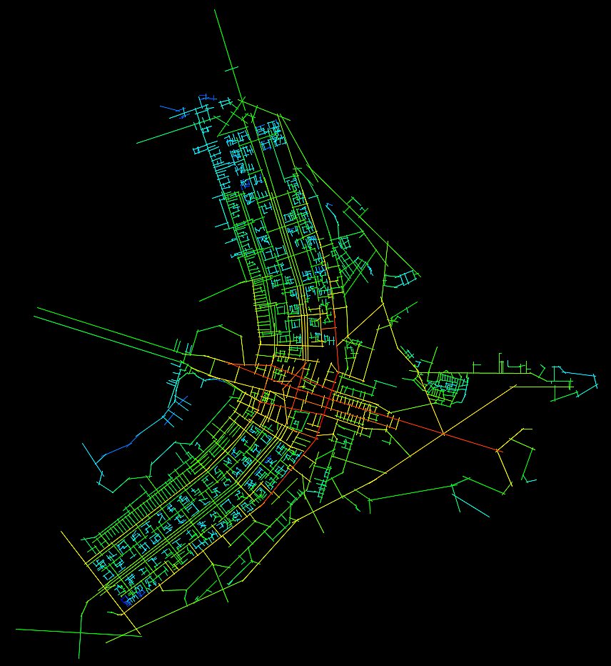
Michael Batty and Sanjay Rana's UCL working paper is an important brake on false precision. Axial lines do not arise from the environment in one unique, inevitable way; choices about how to cover convex spaces or represent sightlines affect the map. Scale, boundary and line drawing can change a calculated hierarchy. A later UCL paper likewise distinguishes description of spatial connectivity from prediction of movement. If a diagram is used to justify a street intervention, it needs documentation of how lines were drawn, what was observed and what would count as the intervention working. [34], [35]

Text alternative for the diagram
Invented network lines and red observation marks; it is not a Brasília map.
The analytical and generative roles can meet without collapsing into one another. A proposed walkway can be diagrammed before building, then the constructed route can be surveyed, its connectivity modelled and actual visitors observed. A difference between prediction and observation is not simply “the diagram failed”: new entrances, programme changes, social habits or altered site boundaries may have changed the test. This is why an archival series of diagrams and plans is more informative than one emblematic image. It shows revisions and the shifting question that each sheet attempted to answer. [1], [9], [12], [13], [14], [18], [33], [34], [35]
How to read a diagram beside architecture
Begin with the diagram's status. Is it an ideal rule, a measured survey, a programme study, a proposed route, a structural calculation or an analysis of an existing environment? Scamozzi's proportional figure, Kahn's First Unitarian Form, Price's Westpen operations, Tschumi's event notation and a Brasília axial map all use abstraction, but they do not make the same sort of claim. Their differences matter more than the shared word diagram. The label is incomplete until it names the problem, scale and source of its information. [5], [10], [12], [13], [14], [22], [31], [32], [33], [34], [35], [38]
Then read the notation. A line could mean a wall, a walking path, a relationship, a line of sight, a load or a ray of light. A node could mean a room, a task, a person or a location in a graph. A dashed edge may mean a provisional connection, a future phase or uncertainty. Direction, thickness and colour sometimes encode measurable values and sometimes merely organise an argument. A caption should say which. The absence of a legend is not a minor design flaw when one wants to use the diagram as evidence. [17], [19], [20], [21], [31], [32], [33], [34], [35], [39], [40]
Most importantly, ask who and what are missing. An efficient kitchen trace might leave out the worker's fatigue or unpaid labour. A church Form may need reinterpretation as congregational use evolves. A park overlay can show paths while leaving out maintenance, night-time safety and altered events. A topological street map may omit tactile orientation, crossing wait and access to a destination behind a closed gate. Asking these questions does not make diagrams useless. It makes them accountable to buildings and people beyond their marks. [14], [17], [19], [20], [21], [22], [23], [28], [32], [33], [34], [35]
Finally, compare states. Keep the initial concept, revised plan, technical study, built condition and subsequent use distinct. The Penn archive's many Kahn sheets, the CCA's different Price diagram types and UCL's observed Trafalgar case demonstrate why one iconic graphic is seldom enough. A diagram is strongest when it opens a decision to scrutiny: one can see what was assumed, what was changed and what the completed architecture still asks us to investigate. [1], [2], [9], [10], [11], [12], [13], [14], [18], [26], [33], [34], [35]

Text alternative for the diagram
Five invented project-state cards with revision links and a return question from use to a new diagram.
Explore RELATED Artworks and Records
Four distinct drawings let a plan, a project sheet and a historical route be compared with diagrams.
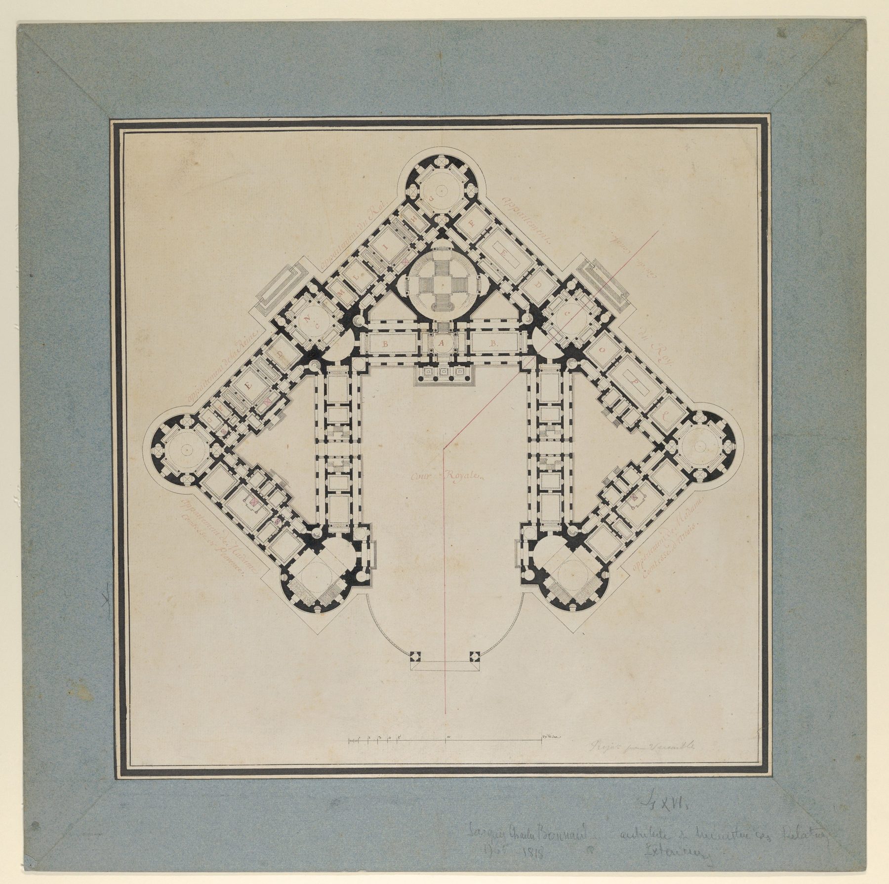
Rambouillet renovation plan
Unexecuted plan; inscriptions have an attribution issue.
The Met · Open Access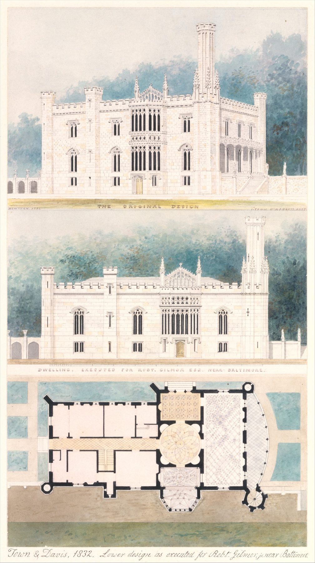
Glen Ellen presentation
Perspective, elevation and plan on one project sheet.
The Met · Open Access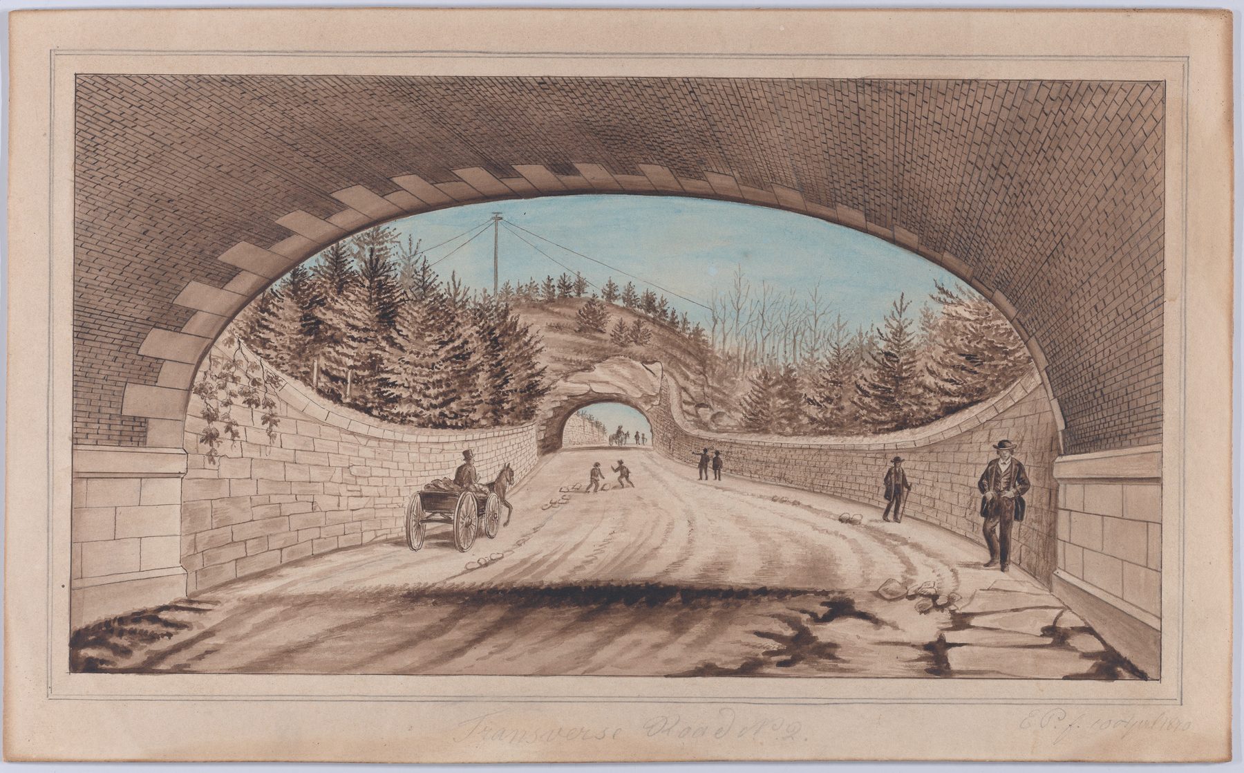
Central Park transverse road
A historic route seen from pedestrian and carriage level.
The Met · Open Access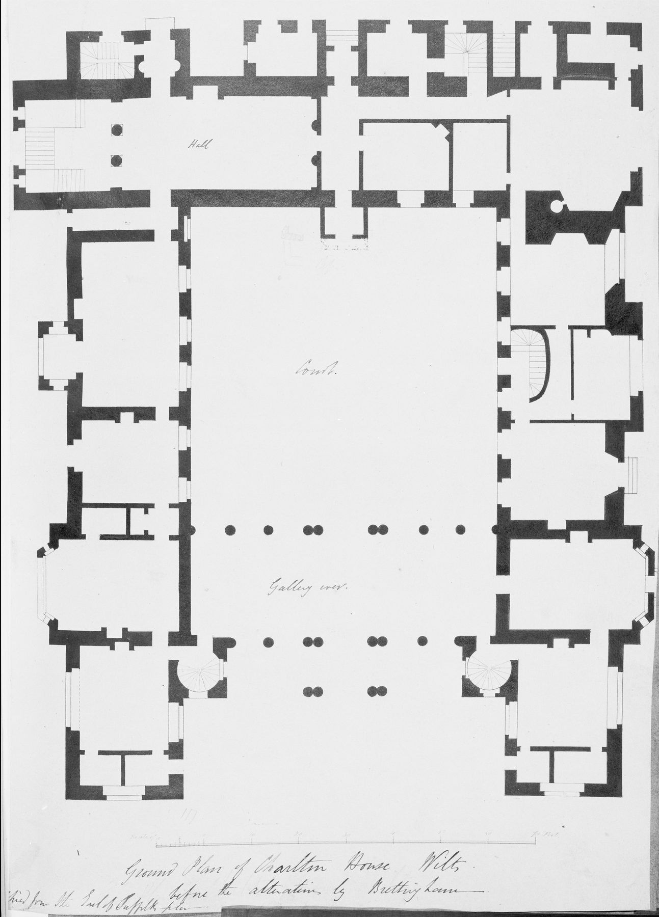
Charlton House floor plan
A measured room disposition, distinct from abstract adjacency.
The Met · Open AccessWatch: Architectural Diagrams and Notation
Institutional videos on geometry, movement and architectural concept.
Bernard Tschumi: Concept & Notation
French interview with English subtitles on notation and architecture.
Original illustrated preview, not a film still.
Learning from Roriczer's Pinnacle
A short institutional lesson in rule-derived Gothic geometry.
Original illustrated preview, not a film still.
Bernard Tschumi: Notations
French lecture exploring how project notations are read.
Original illustrated preview, not a film still.Frequently Asked Questions
No. A floor plan normally locates spatial elements, while a diagram may select programme, movement or forces before exact geometry is settled. [1] [9] [12] [17]
No. Its central sanctuary and surrounding activities expressed a conceptual-spatial hierarchy; the drawings evolved throughout the project. [12] [13] [14]
No. It can encode desired adjacency, but area, daylight, accessible travel, structure, cost and lived use require further decisions. [17] [26] [30] [31]
In Tschumi’s proposal they distinguish follies, movement routes and programme fields; they are an overlay strategy rather than every final building detail. [22]
Only with a stated site, date and solar conditions, and it still requires weather, shading and room-use tests. [28] [39] [40]
No. Its colour normally encodes a modelled spatial relationship; observed movement is a separate empirical question. [32] [33] [34] [35] [38]
References
- RIBA Collections
- RIBA Palladio holdings
- The Met, Italian Renaissance architectural drawings
- The Met, Learning from Roriczer's Pinnacle
- The Met, Scamozzi proportion diagrams
- The Met, Corinthian capital plan diagram
- The Met, Ionic volute construction diagram
- The Met, Pantheon detail and column diagram
- CCA, Cedric Price BMI/HQ sheets
- CCA, Westpen is conceived as a diagram
- CCA, Movement in Midtown archive
- Penn Architectural Archives, First Unitarian Church
- Penn, Kahn First Unitarian container list
- Georgia Tech, Dogan 2003 dissertation
- MIT repository, Hyungmin Pai dissertation
- MIT Press, The Portfolio and the Diagram
- UPC, Duarte 2015 Spanish dissertation
- METU, Unfolding Diagrams dissertation
- Politecnico di Milano, Lunelli thesis abstract
- USP, Souza thesis abstract
- ITU, Kürtüncü thesis abstract
- Centre Pompidou, Bernard Tschumi Concept & Notation
- Centre Pompidou, Manhattan Transcripts Episode 4
- Centre Pompidou, Tschumi interview
- Centre Pompidou, Notations lecture
- ETH Zürich, design-stage guidance
- ETH Zürich, historic design reader
- Kyoto University, Hirata discussion
- Kyoto University, Research Commons
- Kyoto University, artist-residency study
- AIJ/J-STAGE, directed room adjacency study
- UCL Bartlett, Space Syntax Laboratory
- UCL Bartlett, Space Syntax human dimension
- UCL CASA, Batty and Rana axial-line paper
- UCL CASA, 2017 space-syntax paper
- University of Bath, circulation thesis abstract
- NYPL, Central Park topography and roads map
- Commons, Brasília axial integration map
- Commons/MIT OCW, daylight reflection diagram
- Commons, sun-path diagram example
- The Met, Open Access policy
Explore RELATED Architecture
These built-place pages show why plans, perspective, photographs and later records must be read together.
Florence Cathedral
Geometrical rules and building trials are different design evidence.
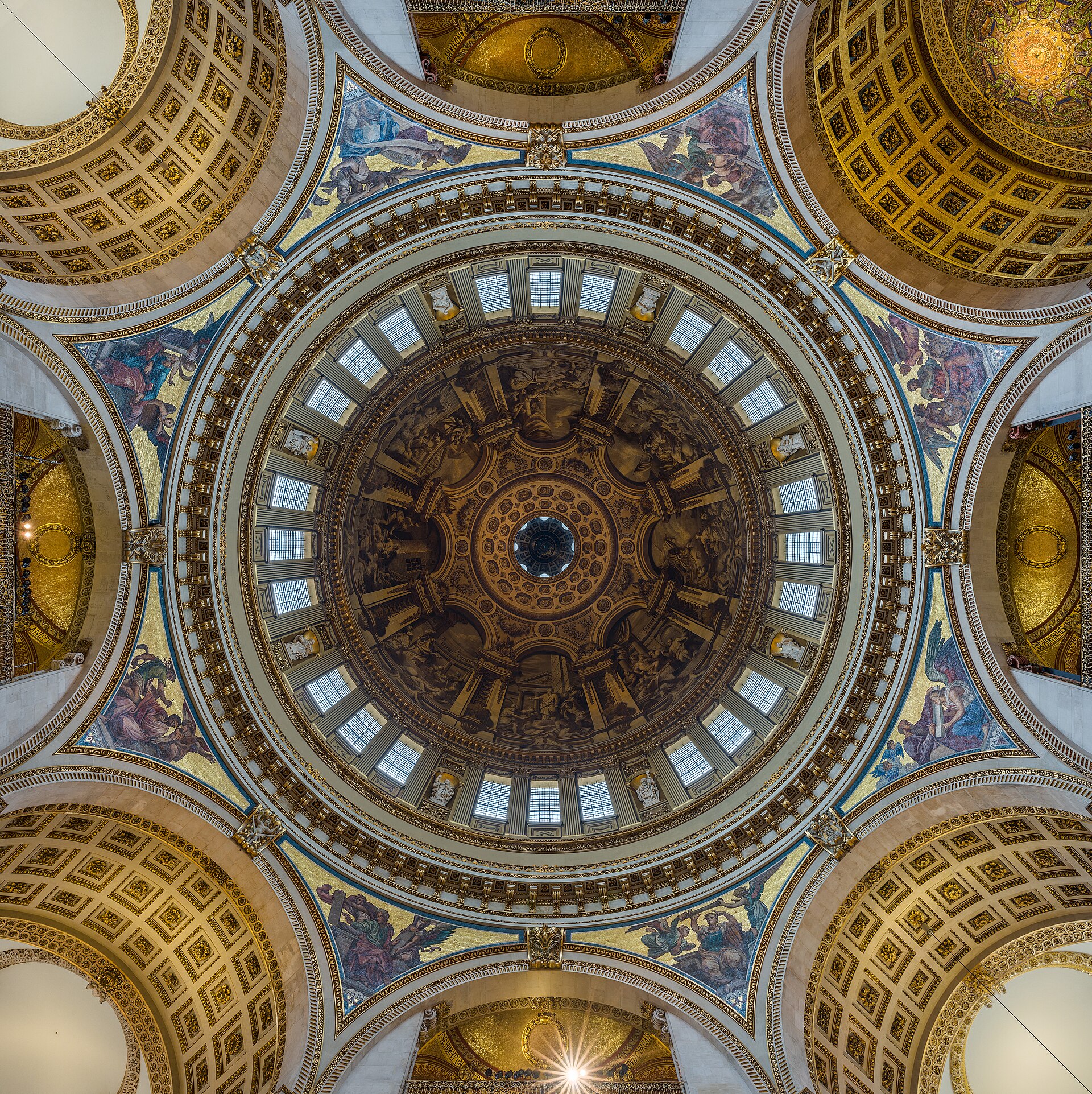
St Paul’s Cathedral
Concept graphics cannot by themselves settle construction sequence.
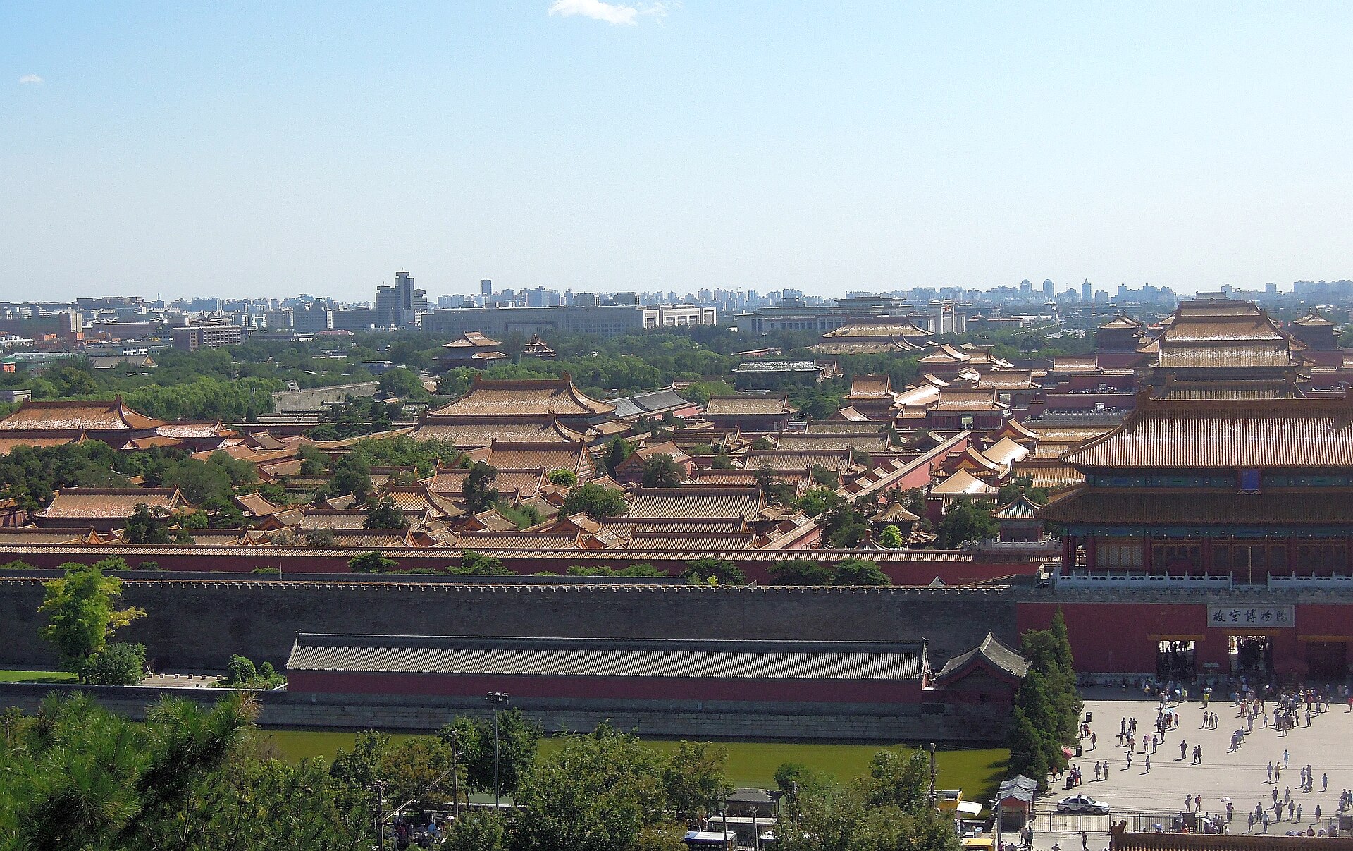
Forbidden City
Palace hierarchy can be read against movement and occupation.

Machu Picchu
Topography makes simple route lines more complex.

Borobudur
Site, circulation and ritual sequence ask different questions.
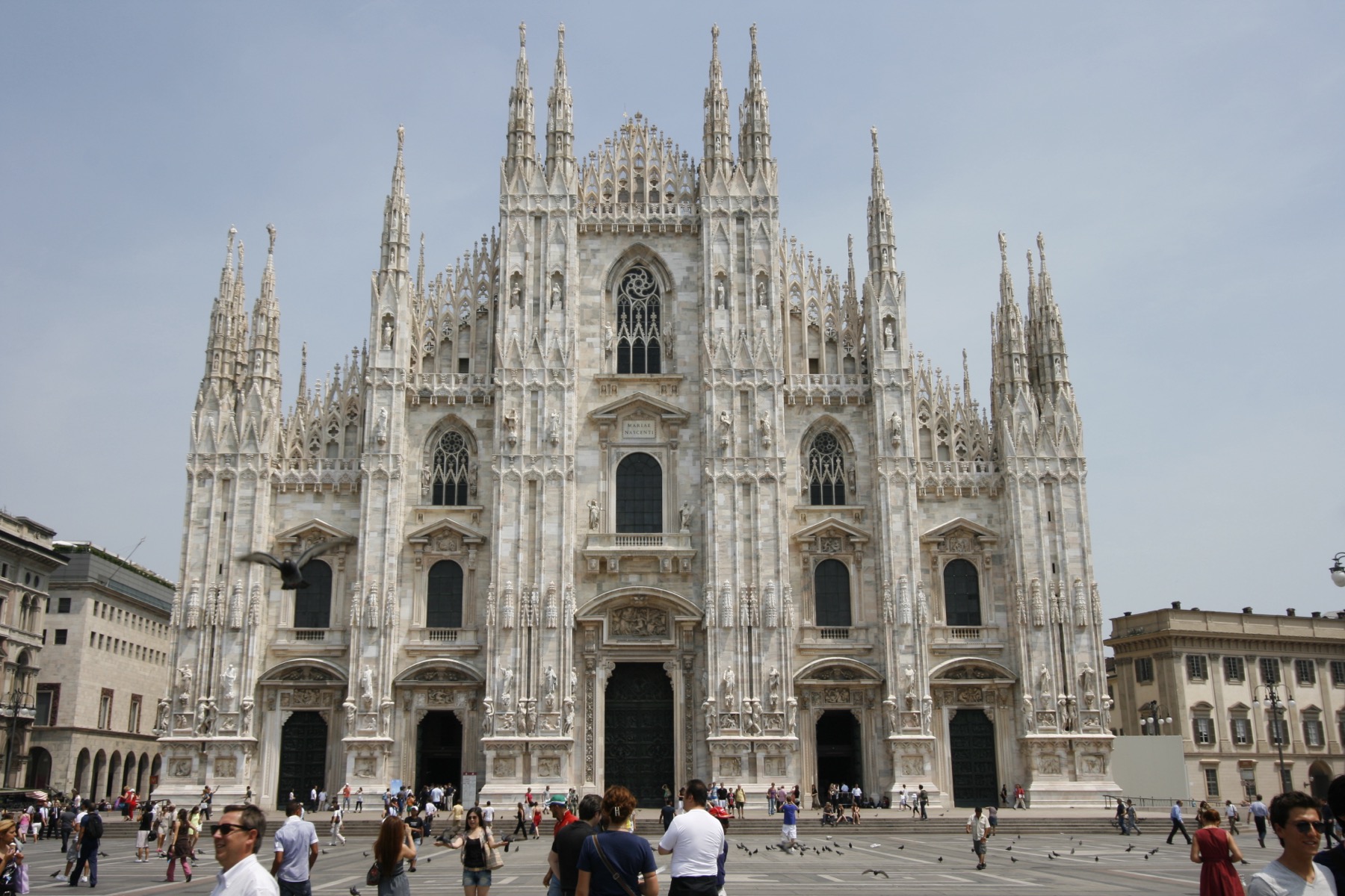
Milan Cathedral
Geometry evolves alongside a long building campaign.
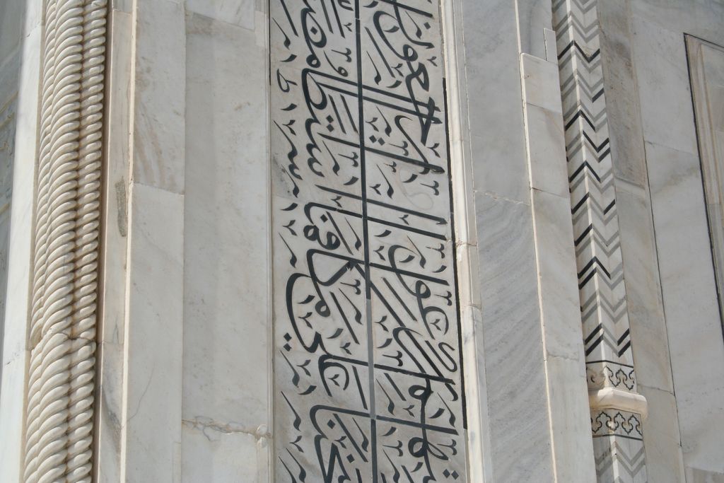
Taj Mahal
Plan order and lived garden routes are not identical.
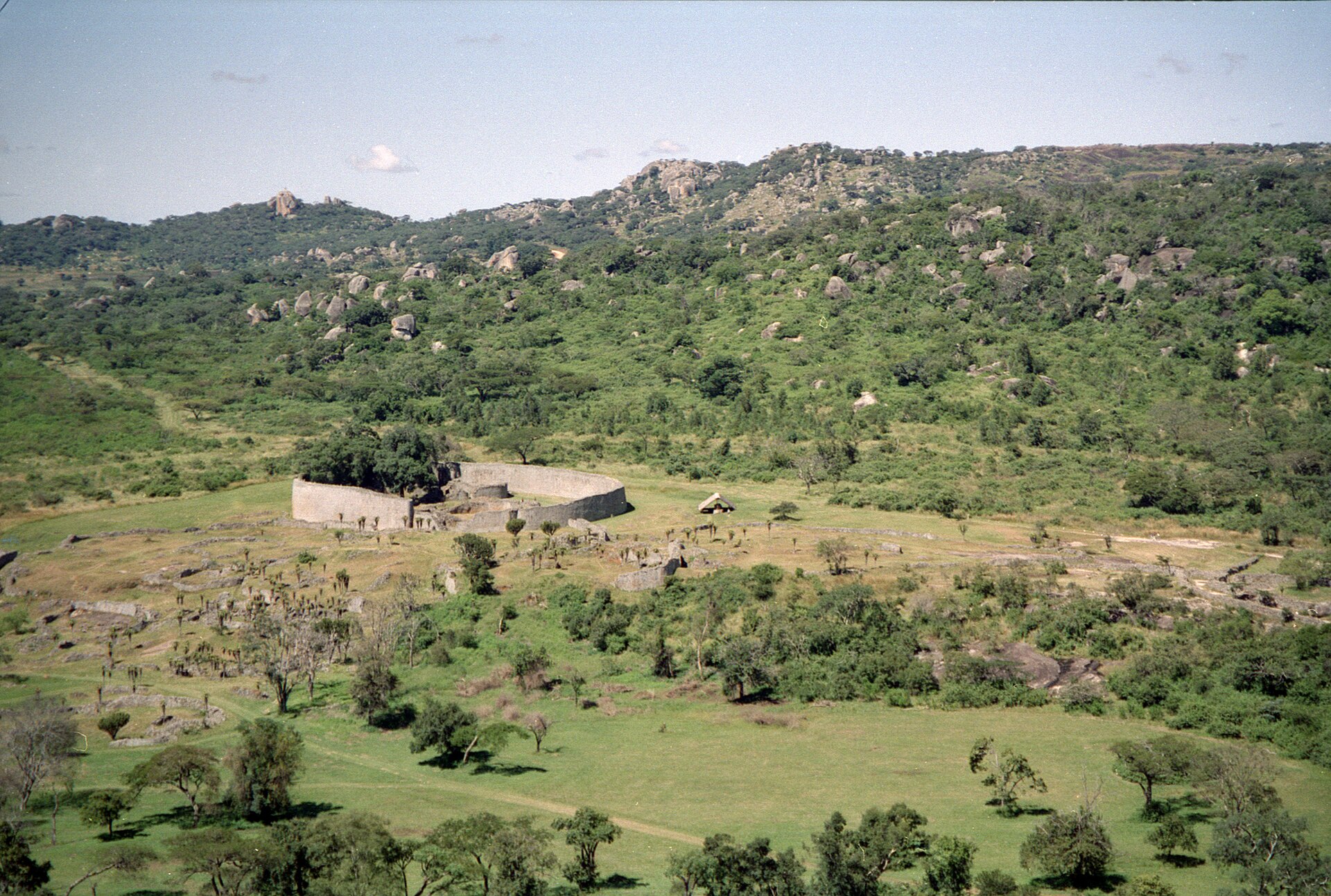
Great Zimbabwe
A site network needs comparison with surviving fabric.