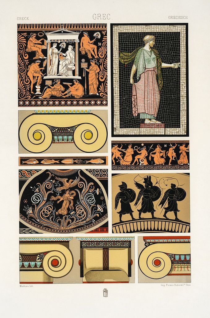
by Tom Gurney
Tom Gurney BSc (Hons) is an art history expert with over 20 years experience
Email: tomgurney1@gmail.com / Phone: +44 7429 011000
Reading Architectural Polychromy
Architectural polychromy is the deliberate use of several colours as part of a building. Colour may be painted onto stone, plaster or timber; fired into tile and brick; assembled through mosaic; cut into inlay; or produced by contrasting marbles and other materials. It can clarify structure, animate sculpture, establish hierarchy, alter apparent depth and bind an interior or façade into a visual system.
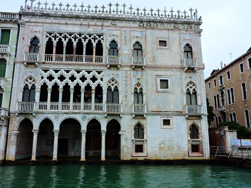
Ca d'Oro polychrome facade Venice. Ca' d'Oro (correctly Palazzo Santa Sofia) is a palace on the Grand Canal in Venice, northern Italy. In “Reading Architectural Polychromy”, this view records the form, material and setting discussed in the passage. Source image dated 2016; that date records the image, not the original construction. Dimitris Kamaras from Athens, Greece, Ca d'Oro polychrome facade Venice; CC BY 2.0. Resized proportionally; no crop, retouch or upscaling.
Much historical architecture looks less colourful now than it did. Pigments fade, washes erode, interiors are overpainted, sculpture is cleaned and fragments enter museums. Yet recovering colour is not a matter of turning every pale surface bright. Scientific analysis identifies traces and layers; historical interpretation connects them; reconstruction inevitably fills some gaps. The most responsible account separates detected evidence from plausible continuation and imaginative completion.[1]
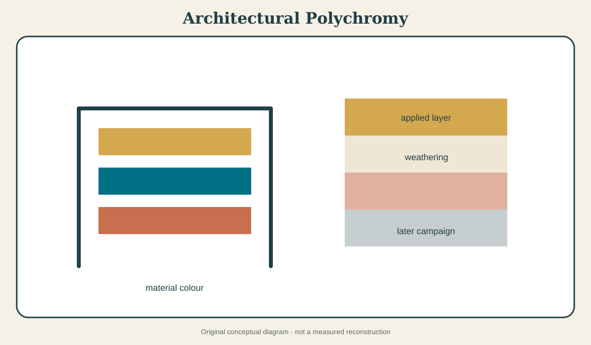
At a Glance
- Meaningcolour designed as an architectural system, whether applied or inherent in assembled materials.
- Evidencepigment particles, paint stratigraphy, binders, protected traces, tool and surface preparation, archival descriptions, images and comparative fabric.
- Methodsmicroscopy, multispectral and ultraviolet imaging, elemental and molecular analysis, cross-sections, archival study and 3D mapping.
- Essential distinctionfinding a pigment proves material at a sampled point; it does not automatically recover the complete colour scheme.
- Conservation principleavoid both the myth of naturally white architecture and the false certainty of seamless repainting.
Contents
- Colour is not an afterthought
- Applied and material colour
- How colour is detected
- Ancient polychromy and the white-classical myth
- Medieval portals: Angers, Bordeaux and Lausanne
- Nineteenth-century architectural polychromy
- Colour, hierarchy and perception
- Reconstruction as an argument
- How to read colour on a building
- Conservation: between denial and overpainting
Colour is not an afterthought
When paint has disappeared, carved form seems self-sufficient. A capital reads through light and shadow; a portal figure appears conceived for bare stone; a Greek temple becomes an abstract composition of pale marble. Surviving traces complicate that picture. Colour could be planned with carving from the start, marking borders, differentiating materials, sharpening distant features and changing how relief works.
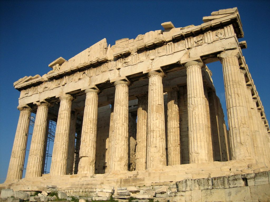
Research on the Parthenon sculptures published through Antiquity connects carving and polychromy, showing that surface and form need to be investigated as one process.[2] Fine incisions, differential finishing and pigment evidence can indicate where patterns and colours were intended. Applied colour did not necessarily conceal sculpture. It could activate it.
The same principle applies to medieval portals. Deep mouldings and reliefs provide protected recesses where pigment survives. Different colours can separate overlapping figures and make an inscription legible. Gilding catches low light. A thin wash can unify stone from different quarries. “Painted architecture” includes many techniques and intensities beyond the modern image of opaque household paint.
Applied and material colour
Applied polychromy places a coloured layer on a substrate. Pigment is mixed or bound in lime, oil, glue, casein or other media according to material and period. Fresco relates colour to wet plaster; secco work sits on a dry surface; limewash can carry colour while remaining vapour-permeable. Each leaves different evidence and tolerates different environments.
Material polychromy assembles colour through the building fabric. Alternating brick and stone make striped masonry. Glazed tiles produce saturated, reflective fields. Mosaic combines small units into image and pattern. Marble revetment uses vein, hue and book-matching. Inlay cuts one material into another. The colour cannot be peeled conceptually from construction because it is the construction.
The categories overlap. A terracotta unit may be glazed and later painted. Coloured marble can receive gilded lettering. A mosaic depends on a prepared backing whose paint history changes. Investigation should record the complete stratigraphy rather than decide too early that a colour is “natural” or “added.”
Weather changes both. Pigment fades and binder fails; stone darkens or bleaches; glaze crazes; metal patinates; replacement units introduce another hue. Current colour is historical evidence but not a transparent image of the first campaign.
How colour is detected
The first evidence may be visual: red in a deep fold, blue beneath a later coating, gilding sheltered by an overhang. Magnification distinguishes particles and tool marks from dirt. Raking light reveals raised paint edges or prepared patterns.
Ultraviolet, infrared and multispectral imaging can make different materials respond visibly. Elemental analysis may identify components associated with pigments; molecular methods can distinguish compounds. Tiny cross-sections show layers in sequence. Binder analysis helps explain technique. No single test answers every question.
Sampling has a geography. A red particle from one robe does not prove that every garment was red. A cross-section from a sheltered lower moulding may preserve layers absent at the exposed top. Researchers map sample location and condition so laboratory certainty does not become architectural overreach.
Getty antiquities-conservation resources and the Met’s Chroma project make this interdisciplinary process visible.[1][3] Conservators, scientists, archaeologists, historians and digital modellers contribute different evidence. Their reconstructions are strongest when they publish uncertainty and show alternatives.
Ancient polychromy and the white-classical myth
Ancient Mediterranean sculpture and architecture retained enough pigment to overturn the assumption that whiteness was the intended default. The Met’s Chroma presented reconstructions alongside original works and evidence, allowing viewers to see both analytical method and interpretive result.[1]
The history of the white-classical ideal matters. Excavated and weathered marble entered European collections; cleaning removed colour; neoclassical taste elevated whiteness into moral and aesthetic value. That reception shaped museums and modern architecture. Recovering polychromy therefore changes not only an ancient object but the modern story told about antiquity.
Reconstruction can provoke because saturated colour conflicts with inherited expectation. Surprise is not evidence either way. The correct response is to inspect pigment, pattern, chronology and stated confidence. Some areas can be reconstructed strongly; others remain open.
Architecture adds further complexity. Exterior colour responds to intense sun and long viewing distance. Terracotta, painted mouldings, roof tiles and metal attachments contribute. A sculptural reconstruction isolated under gallery lights cannot reproduce the complete temple’s weather, scale and surrounding coloured materials.
Medieval portals: Angers, Bordeaux and Lausanne
The west portal of Angers Cathedral has become a major case for multidisciplinary research. French Ministry of Culture, City of Angers and Université catholique de l’Ouest material records pigment evidence, historical campaigns and the project to study and present the portal’s colour.[4][5][6] The sources are especially valuable because they do not treat the work as one pristine medieval layer.
Colour could be renewed. Later repainting may alter iconography or palette while remaining historically significant. Weather and shelter preserve patches unevenly. A proposed protective or interpretive intervention has to decide which layers to expose, stabilise or represent.
At Bordeaux, CNRS Archeovision work maps surviving pigment and explores three-dimensional reconstruction.[7] RetroColor3D is important methodologically: a spatial model can attach colour evidence to exact architectural locations. It can also mark uncertainty rather than paint every unsampled area seamlessly.
Lausanne Cathedral’s painted portal offers another conserved threshold where figures, mouldings and architectural surfaces retain a powerful colour programme.[8] Comparison among Angers, Bordeaux and Lausanne reveals both common losses and monument-specific histories. One palette should not be borrowed to fill another portal.
Nineteenth-century architectural polychromy
The nineteenth century did not merely rediscover ancient and medieval colour; it made new systems. Archaeological reports, world exhibitions, industrial chemistry and improved colour printing put polychromy at the centre of design debate. Churches, museums, stations and houses combined coloured brick, tile, stone, paint and metal.
Owen Jones was a major advocate. His Alhambra studies, exhibition work and Grammar of Ornament treated colour and pattern as principles for modern design. The Victoria and Albert Museum also places that work within imperial collecting and Victorian classification.[9] Jones’s method could challenge white neoclassicism while abstracting forms from the cultures that made them.
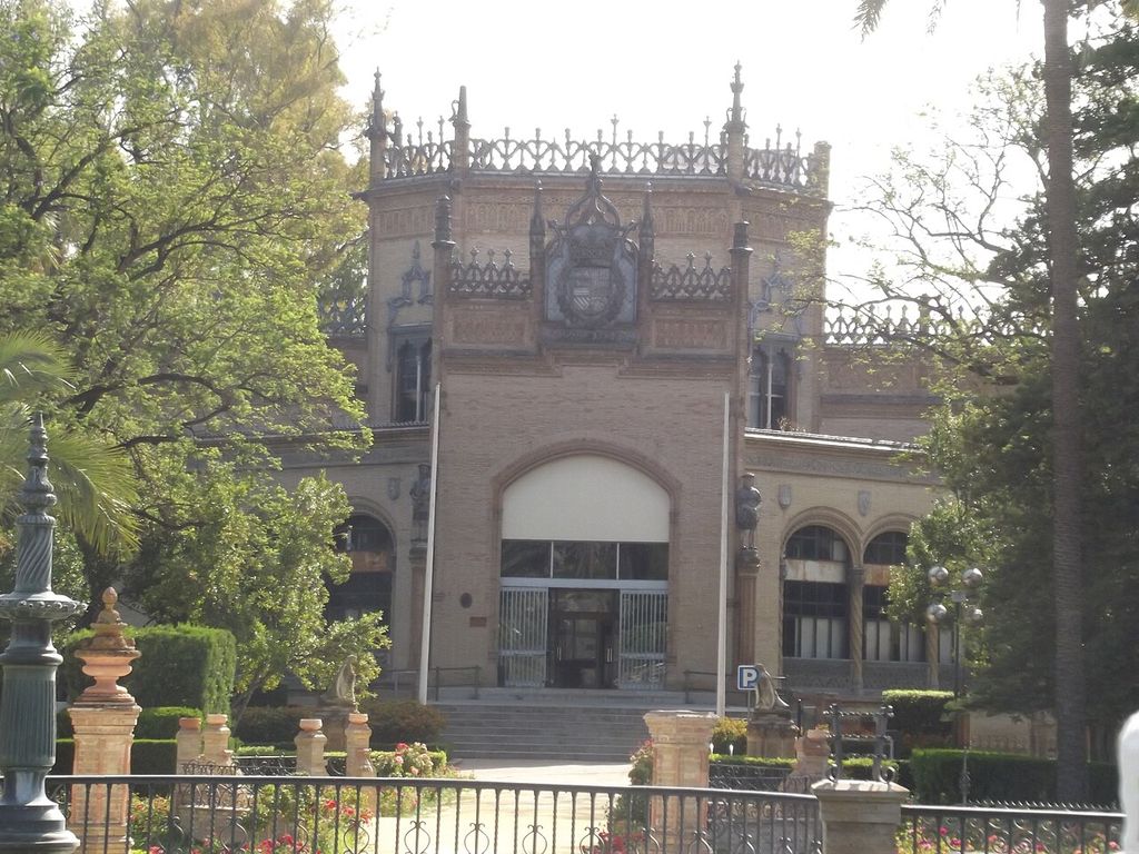
Polychrome brick and ceramic Royal Pavilion, Seville. A walk around Parque de María Luisa, from the Plaza de America to Plaza de Espana, following our tour guide of Seville, who talked along the way!. In “Nineteenth-century architectural polychromy”, this section drawing records the form, material and setting discussed in the passage. Source image dated 2014; that date records the image, not the original construction. Elliott Brown from Birmingham, United Kingdom, Polychrome brick and ceramic Royal Pavilion, Seville; CC BY-SA 2.0. Resized proportionally; no crop, retouch or upscaling.
Research at University College London on British architectural polychromy between 1840 and 1870 situates the debate within religion, archaeology, manufacture and professional identity.[10] “Constructional colour” could mean material contrast rather than applied paint. Polychromy became an argument about truth to material, not merely taste.
Debate crossed styles. Gothic Revivalists used coloured brick and encaustic tile; classical designers reconsidered ancient colour; designers inspired by Islamic architecture explored pattern and glaze. Industrial production expanded availability while provoking questions about authenticity and labour.
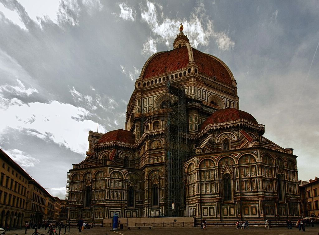
Polychrome marble exterior of Florence Cathedral. The Basilica di Santa Maria del Fiore is the cathedral church (Duomo) of Florence, Italy, begun in 1296 in the Gothic style to the design of Arnolfo di Cambio and completed structurally in 1436 with the dome…. In “Nineteenth-century architectural polychromy”, this view records the form, material and setting discussed in the passage. Source image dated 2011; that date records the image, not the original construction. Kevin Poh, Polychrome marble exterior of Florence Cathedral; CC BY 2.0. Resized proportionally; no crop, retouch or upscaling.
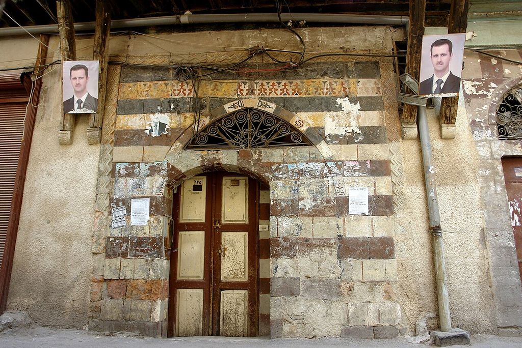
Bashar al Assad and Byzantine legacy, polychrome architecture, Aleppo, Syria. Ultimately, Byzantine architecture in the West gave way to Romanesque and Gothic architecture. In “Nineteenth-century architectural polychromy”, this plan helps identify polychrome brick architecture. Source image dated 2008; that date records the image, not the original construction. James Gordon from Los Angeles, California, USA, Bashar al Assad and Byzantine legacy, polychrome architecture, Aleppo, Syria; CC BY 2.0. Resized proportionally; no crop, retouch or upscaling.
Colour, hierarchy and perception
Colour can make structure legible by differentiating shaft, capital and arch. It can also work against apparent structure, turning a wall into a continuous pattern or making a vault seem immaterial. Neither effect is inherently more truthful.
Scale determines strategy. Broad bands read across a square; fine stencil is encountered indoors; gilded detail catches moving light. Adjacent colours change one another perceptually. A faded palette may preserve relationships even when intensity is lost.
Hierarchy appears through expense and concentration. Rare pigments, gold, glazed tile or coloured marble can mark altar, throne, tomb, entrance or principal room. Repeated colours connect spaces along a route. A threshold may be more saturated than surrounding wall, announcing passage.
Political meaning follows commission. Imperial polychromy can gather materials and motifs from distant territories. Religious colour can make doctrine and ritual visible. Civic schemes can coordinate identity. Interpretation requires patron, inscription, economy and audience; colour itself is not a universal code.
Reconstruction as an argument
A reconstruction has at least four evidence levels:
- direct detection at a specific location;
- secure repetition from several surviving instances;
- comparative inference from related work or documented convention;
- illustrative completion required to make an image coherent.
Those levels should be visible in the publication. Solid, hatched and neutral zones can distinguish them. Alternative versions may be more honest than one authoritative image.
Digital models help because layers can be switched on and assumptions revised. Lighting simulations test how colour behaves at viewing distance. Yet high-resolution rendering can create false confidence. A photorealistic image is not more certain than its evidence.
Physical replicas reveal material interaction and scale. They can test pigment saturation and carving. Replica surfaces age differently from ancient ones, and modern binders or lighting can mislead. The most useful display keeps original, analysis and reconstruction in dialogue.
How to read colour on a building
Look in protected places: under cornices, within drill holes, behind later fittings, at mortar edges and inside deep folds. Compare exposed and sheltered faces. Do not scrape or wet a surface; sampling belongs to authorised specialists.
Map rather than merely list colours. Record substrate, location, layer sequence, finish and condition. Ask whether the hue comes from pigment, glaze, stone, staining or biological growth. Old photographs may show a now-lost scheme but introduce their own colour and exposure limits.
Separate campaign questions. Was a surface repainted for maintenance, liturgical change, new taste or restoration? A later scheme may be coherent and significant. Searching for the “first” layer should not automatically justify destroying everything above it.
For material colour, inspect joints and procurement. Is striped masonry integral or a later veneer? Do replacement tiles match chemistry as well as hue? Does polishing change apparent colour? Architecture makes chromatic evidence physical.
Conservation: between denial and overpainting
Colour is often thin, fragile and difficult to see. Cleaning that benefits stone can remove paint. Consolidants alter saturation and gloss. Shelter changes moisture and daylight. Conservation must begin with documentation and small tests.
One danger is colour denial: assuming traces are accidental and cleaning towards uniform pale material. The opposite is overconfident completion: repainting an entire façade from a few particles. Both replace evidence with expectation.
Treatment options include stabilising surviving traces, selective retouching, protective shelter, reversible projected interpretation, digital reconstruction or full repainting where a living tradition and evidence justify it. No option is neutral. Each changes public understanding.
Material polychromy has other needs. Salt beneath glaze, delaminating marble veneer and incompatible brick replacement require structural and environmental diagnosis. Matching colour while ignoring porosity or thermal movement can accelerate loss.
Architectural polychromy finally asks us to hold two truths together. Historical buildings were often more colourful than their weathered remains suggest. We cannot recover every colour with equal confidence. The responsible page makes the first truth vivid without sacrificing the second.
Scientific evidence: what each method can and cannot show
Visual inspection begins the investigation but rarely ends it. Raking and ultraviolet light can reveal surface differences; portable microscopy distinguishes particles and layer boundaries; cross-sections show the order of grounds, paint and later coatings. Elemental analysis can identify components consistent with particular pigments, while molecular techniques may refine the identification.[2][3]
No instrument automatically reconstructs appearance. A detected element may belong to contamination, a ground or a later treatment. A microscopic sample represents one tiny point and may have lost its upper layer. Pigment identity does not supply original saturation, binder, particle size or optical effect.
The evidential chain should therefore state location, stratigraphy, analytical result and inference separately. Multiple samples can map a scheme; archival accounts or protected traces add context. The strongest reconstruction is convergent, not merely colourful.
Ancient surface and the problem of the museum white cube
The Met's Chroma project made ancient colour visible through objects, technical evidence and reconstructions.[1] Its importance extends beyond correcting a misconception. It shows that carving and paint were conceived together: incised patterns guide textile colour, drilled details catch shadow and gilding distinguishes attributes.
Modern display often isolates sculpture under neutral white light. That condition differs from a temple exterior, sanctuary or coloured architectural setting. Even an accurate pigment sample cannot restore changing sun, viewing distance or surrounding surfaces.
Reconstruction can nevertheless expose the bias built into whiteness. The responsible label explains which colours are directly detected, which are based on comparison and which remain hypothetical. Several alternatives may be more honest than one total image.
Three medieval portals, three evidential situations
Angers has become a major case because surviving and recovered evidence permits sustained research into the cathedral portal's colour across centuries.[4][5][6] The project joins stone history, painted layers, documentation and public interpretation. It demonstrates that a portal may hold multiple legitimate colour campaigns rather than one recoverable “original.”
Bordeaux's RetroColor3D work uses digital visualisation to test and communicate colour on the Royal Portal.[7] A projection or model can restore spatial coherence without applying paint to fragile stone. Yet the image remains an argument shaped by sampling, lighting and chosen completion.
Lausanne's painted portal presents another history of exceptional survival, intervention and display.[8] Comparison prevents a single cathedral from becoming the universal medieval palette. Different stone, exposure, workshop and restoration histories produce different evidence.
Together the cases establish method: locate residues, separate campaigns, reconstruct only to the level supported, and publish uncertainty. “Medieval churches were coloured” is the beginning of inquiry, not its conclusion.
Brick, stone, ceramic and the nineteenth-century debate
Architectural polychromy may be integral to construction. Alternating brick and stone, coloured terracotta, tile and patterned masonry produce colour through material placement rather than a coating. Because these systems weather differently, their palette changes with soot, moisture and replacement.
Nineteenth-century designers argued over the historical legitimacy and moral value of colour. Owen Jones used comparative plates to promote principles of ornament and colour drawn from many traditions.[9] British architects explored “constructional polychromy,” often making colour follow courses, arches and structural divisions; UCL's doctoral research locates that debate within the period 1840–1870.[10]
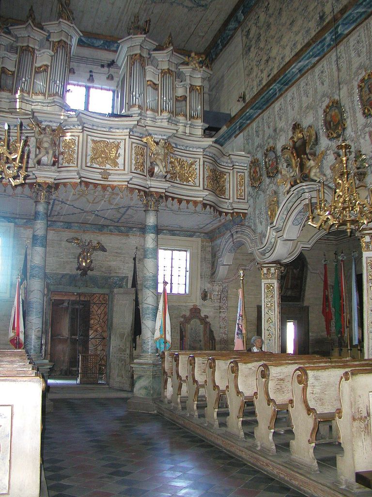
KOŚCIÓŁ PW. ŚW. MICHAŁA ARCHANIOŁA W SZALOWEJ, fot. M. Klag (MIK, 2000) (3533886896). II Małopolskie Dni Dziedzictwa Kulturowego, wrzesień 2000 W Beskidzie Niskim, u podnóża Góry Maślanej położona jest niewielka wieś Szalowa. In “Brick, stone, ceramic and the nineteenth-century debate”, this painting helps identify architectural polychromy facade. Source image dated 2009; that date records the image, not the original construction. mik Krakow, KOŚCIÓŁ PW. ŚW. MICHAŁA ARCHANIOŁA W SZALOWEJ, fot. M. Klag (MIK, 2000) (3533886896); CC BY-SA 2.0. Resized proportionally; no crop, retouch or upscaling.
The phrase can imply truthfulness, but material colour is not automatically honest. A coloured facing may conceal another structure; a thin tile can simulate mass; a paint scheme can reveal geometry more clearly than variegated masonry. The historical claim should describe the architect's theory and the actual wall assembly separately.
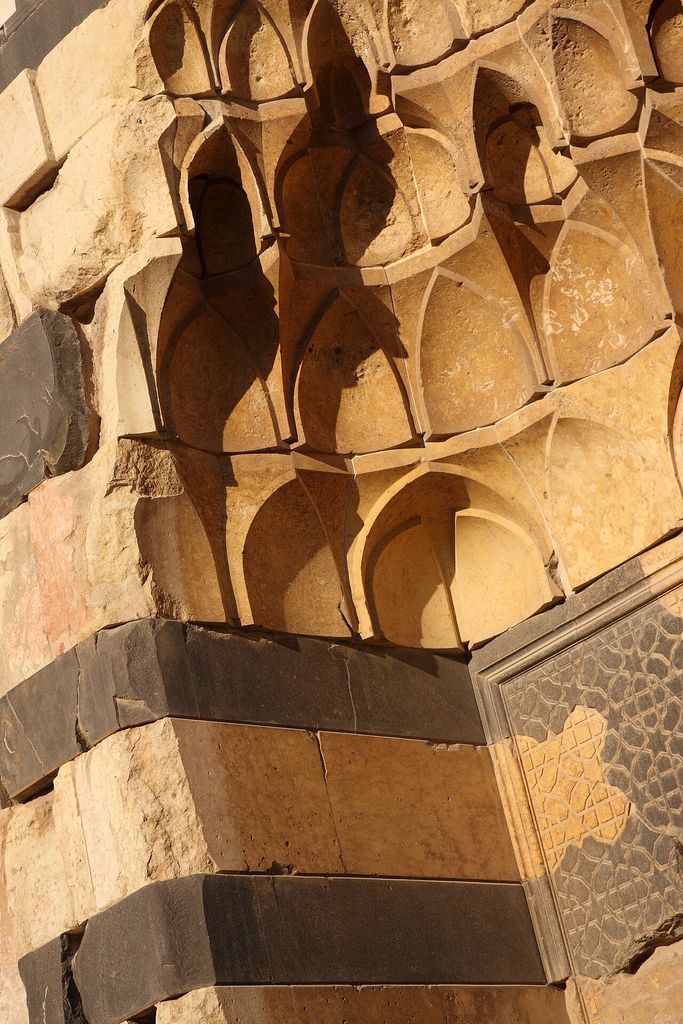
Byzantine legacy, polychrome architecture in Syria - 2. Ultimately, Byzantine architecture in the West gave way to Romanesque and Gothic architecture. In “Brick, stone, ceramic and the nineteenth-century debate”, this plan helps identify polychrome brick architecture. Source image dated 2010; that date records the image, not the original construction. James Gordon from Los Angeles, California, USA, Byzantine legacy, polychrome architecture in Syria - 2; CC BY 2.0. Resized proportionally; no crop, retouch or upscaling.
Colour, colonial collection and borrowed authority
European pattern books and exhibitions gathered colour systems from Islamic, South Asian and other architectures. They widened design knowledge, but colonial access and unequal attribution shaped what was recorded. A plate could make a specific building's surface available as a decontextualised resource.
Responsible comparison restores names, places and media. It asks whether a designer encountered a monument, a publication, an object or an exhibition display. It also distinguishes exchange from appropriation rather than celebrating every resemblance as neutral diffusion.
This context matters to restoration. Repainting a European revival interior according to its documentary scheme is different from inventing an “Oriental” palette from a general pattern book. Both use colour; only one may be evidence-led conservation.
Public reconstruction and reversible display
Projection, augmented imagery and physical replicas allow colour to be explored without coating original fabric. They can switch between campaigns, display uncertainty and demonstrate how daylight alters a palette. Because they are reversible, they are valuable interpretive tools.
They are not neutral. Projector brightness, camera white balance and screen gamut change colour. A digital texture can cover erosion and make a fragment look complete. Public presentation should show the underlying evidence and date the reconstruction.
Where repainting is proposed on architecture, the threshold is higher. The team needs surviving stratigraphy, a clear conservation aim, compatible materials, test panels and a maintenance plan. Colour should return as documented history, not as a promise to make the building more entertaining.
A colour record for future comparison
Every investigation should publish more than an attractive reconstruction. Sample coordinates, photographs before and after cleaning, cross-section images, analytical method, colour measurements and uncertainty allow later scholars to reassess the conclusion. A digital model without this audit trail is an illustration, not reproducible research.
Colour notation needs context. A spectrophotometer records a small surface under defined conditions; the viewer experiences texture, gloss, shadow and adjacent hues. Weathered and protected areas should be distinguished rather than averaged into one nominal swatch.
Open data is particularly important when treatment removes deposits or when fragile evidence may not survive resampling. Conservation creates knowledge and irreversibly changes the object at the same time.
Experiencing partial colour
Fragments do not need complete repainting to alter perception. A line of red ground, a gilded attribute or alternating masonry can reveal that the building once used colour structurally. Carefully lit magnification can make traces accessible without pretending they dominate at normal distance today.
Interpretation can present several scales: naked-eye residue, microscopic layer, mapped distribution and hypothetical whole. The visitor then sees how evidence grows into an argument. This is more intellectually engaging than a binary switch between white original and fully saturated reconstruction.
Architectural polychromy is ultimately a history of surfaces in time. Colour was applied, renewed, weathered, covered, discovered and reimagined. Preserving that sequence gives the building more history, not less beauty.
Colour as maintenance history
Repainting was often expected. A building could retain its colour identity through successive schemes that changed pigment, tone and extent. The earliest layer is not automatically the only significant one.
Maintenance accounts can date scaffolding, materials and painters where the surface alone cannot. Mapping campaigns reveals how later communities understood the architecture. Conservation then chooses whether to expose, retain or represent those layers rather than assuming that stripping equals discovery.
Watch: evidence, portal and reconstruction
Choose Polychromy and You, The Polychromy of Greek and Roman Sculpture and Architecture or The Colors of Architecture in Nineteenth-Century France. Together, the films connect architectural form with material, use and historical setting.
Polychromy and You
Sarah Bond and Mark Abbe discuss evidence, reconstruction and public assumptions about ancient colour
Watch on YouTubeDiscussion
Which building or designed landscape most clearly demonstrates Architectural Polychromy, and what physical evidence supports that reading?
Reader Insights
Name the material, joint, opening, route or view you can observe.
Give the place, approximate date and a reliable source.
Separate documented history from your interpretation.
Join the Conversation
Share a concise observation or useful source below.
References
- Metropolitan Museum of Art, “Chroma: Ancient Sculpture in Color.” View source
- Antiquity, “A goddess in new clothes: the carving and polychromy of the Parthenon sculptures.” View source
- Getty Museum, Antiquities Conservation and polychromy resources. View source
- Université catholique de l’Ouest, Angers polychrome-portal colloquium. View source
- French Ministry of Culture, Angers polychrome-portal exhibition. View source
- City of Angers, “Laissez-vous conter le portail de la cathédrale Saint-Maurice.” View source
- CNRS Archeovision, Bordeaux portal and RetroColor3D. View source
- Lausanne Cathedral, painted-portal dossier. View source
- Victoria and Albert Museum, “Owen Jones and The Grammar of Ornament.” View source
- University College London, thesis on British architectural polychromy, 1840–1870. View source